NASA and NOAA are very good at manipulating data to get the results they want! Back in the early 70’s when I was an engineer at GE I was using their system to do statistical work include multiple regression and while doing that work I found how easy it was to make the results what you wanted then to be; I’m not saying I did that but only that how you pick starting point and use or don’t use (out riders) for example can make all the difference in a plot.
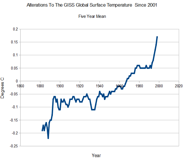
My focus is normally on data tampering to the US temperature record, but our friends at NOAA and NASA have been equally busy tampering with the global temperature record. They did a huge amount of damage to global temperatures prior to 2001, but the graph below just shows the post-2001 tampering.

Note that in the 2001 version, there was a little over 0.3C warming from 1940 to 2000, and now there is almost 0.6 warming during that same time period.
2001 version : wayback.archive.org/……./FigA.txt
2014 version : data.giss.nasa.gov/gistemp/graphs_v3/Fig.A.txt
They accomplished this spectacular feat of data corruption, through an impressive hockey stick of cooling the past and warming the present.