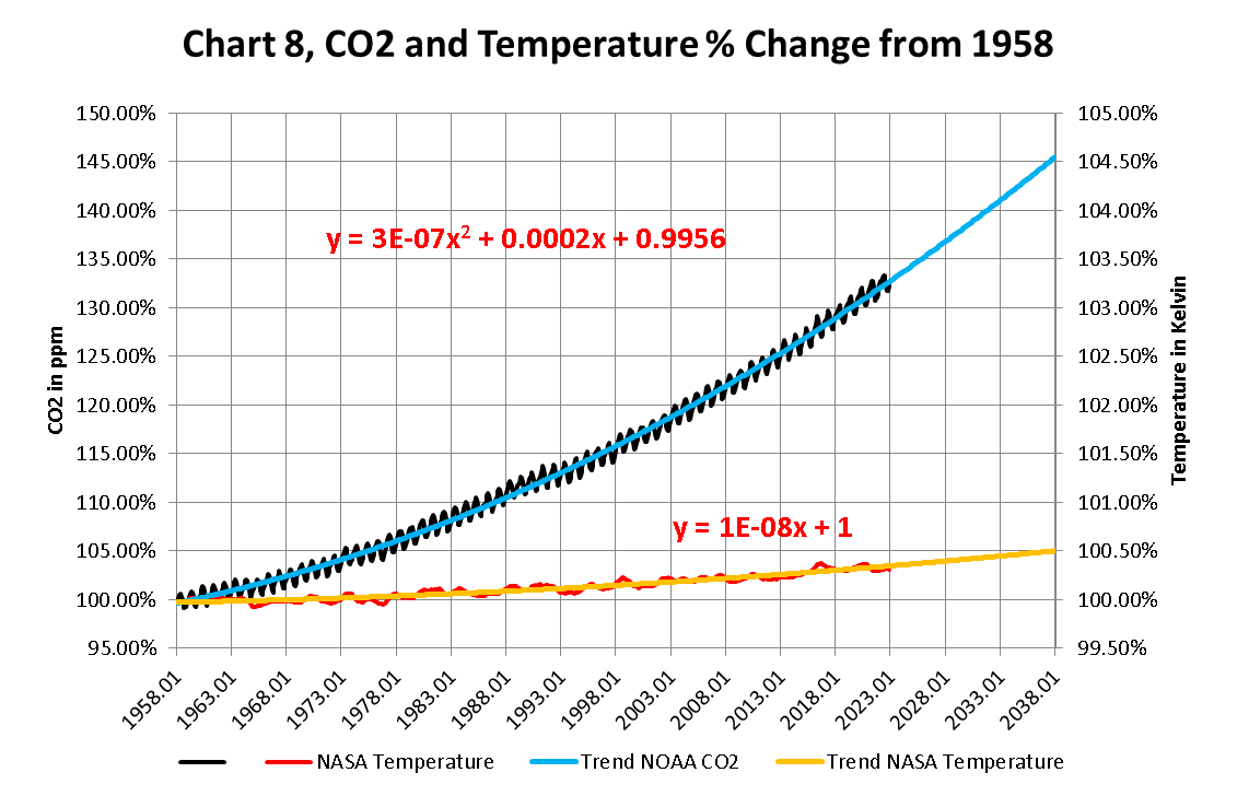
The attached report on Global Weather for February 2025 Data has charts showing the relationship between CO2 growth and Temperature increases going up since we started to accurately measure CO2 in the atmosphere in 1958. These Charts were created by showing CO2 as a percent increase from when it was first measured in 1958, the Black plot, the scale is on the left and it shows CO2 going up by about ~34.0% from 1958 to January 2024. That is a very large change as anyone would have to agree.
Now how about temperature, well when we look at the percentage change in temperature also from 1958, using Kelvin (which does measure the actual change in heat), we find that the changes in global temperature (heat) is about ~.3% and may reach .5% by 2028. To even be able to see this minuscule change we had to reduce the scale of the Temperature Axis by a factor of ten.