This problem with manipulating data is destroying science!
People delving into GHCN’s temperature homogenization keep coming up with evidence that the adjustments provided biased results.
View original post 240 more words

This problem with manipulating data is destroying science!
People delving into GHCN’s temperature homogenization keep coming up with evidence that the adjustments provided biased results.
View original post 240 more words
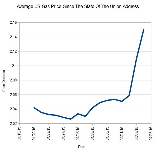
Great Chart 🙂
On January 20, President Obama took credit for a drop in gas prices which he didn’t want to see and did everything he could to prevent. Since then, gas prices have shot upwards in a hockey stick.
It’s amazing that they can get away with such blatant data tampering!
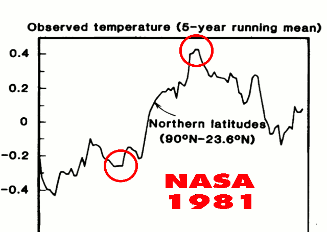
Earlier today I showed Gavin’s spectacular data tampering before 1980, to create the lower half of the hockey stick.
1981 version : 1981_Hansen_etal_1.pdf
1999 version : 1999_Hansen_etal_1.pdf
Current version : Fig.B.gif (407×678)
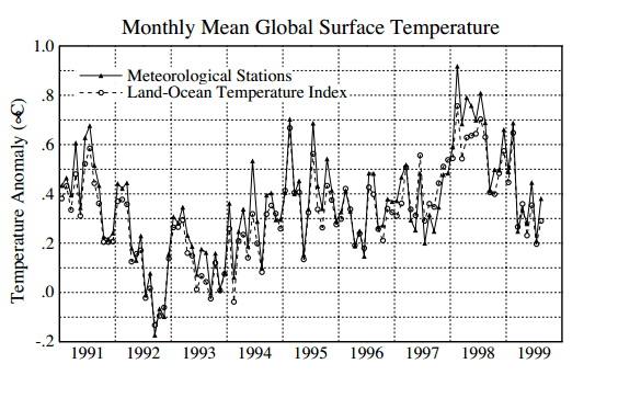
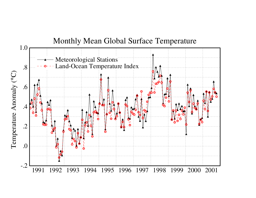
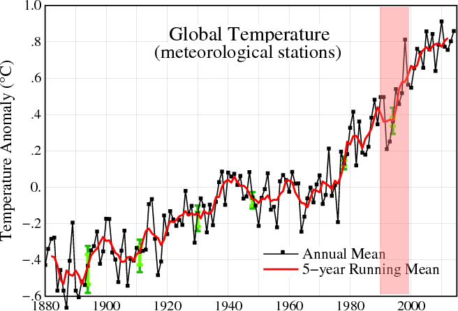
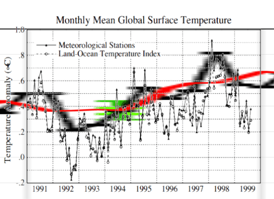
But that is only half of the hockey stick. Some of Gavin’s finest tampering is done in the 1990’s data.
Hansen 1999 showed no net warming during the 1990’s
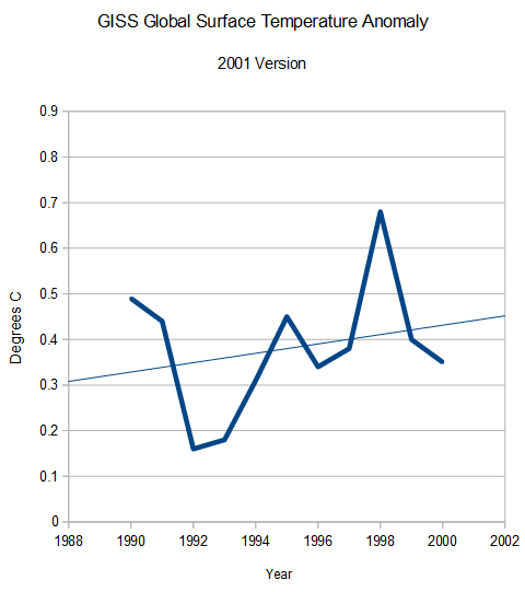
In 2001, the GISS website also showed no net warming during the 1990’s
But GISS now shows the 1990’s as the fastest warming decade.
They built the rest of the hockey stick by simply making up data.
This image shows how the 1990’s station data has been altered since Hansen 1999.
The animation below shows the spectacular alterations to GISS 1990’s surface between 2001 and 2015, tripling the warming during the decade.
We also know that the post 2000 warming is fake, because none…
View original post 28 more words

The Progressive will and have done ANYTHING to advance their cause, they are just like Islamic Jihadists maybe we should call them Environmental Jihadists!
![]() By Larry Bell ~
By Larry Bell ~
 An internal 2009 email to top officials recognized that, “The number of Americans who say the global warming threat has been exaggerated is at an all-time high,” and that outreach pitches directed to polar ice cap and polar bear “mascots” were losing effectiveness. [Note: the poll at left is from 2010. Source: BBC.]
Accordingly, it urges the agency to shift its emphasis to respiratory illness justifications which will “make this issue real for many Americans who would otherwise oppose many of our regulatory actions.”
Newly released by Anthony Watts at the popular blog site, “Watts Up With That,” the memo was obtained by attorney and Competitive Enterprise Institute Senior Fellow Chris Horner through…
View original post 785 more words
Mother nature presents to the believers at NASA and NOAA, the real climate, which she produces, and which they can not understand, why it doesn’t match what their expensive climate models say should be happening. To them Mother Nature must be wrong not their fancy models! I’d say their is little hope for them and lets hope future “real” scientists use the movement as a sample of what not to do again!
In 1981, Hansen reported high temperatures at the Northern Latitudes (23.6N – 90N) around 1940, followed by a strong cooling. But that didn’t support the theory, so NASA’s finest simply made the 1940’s blip disappear through repeated data tampering.
1981 version : 1981_Hansen_etal_1.pdf
1999 version : 1999_Hansen_etal_1.pdf
Current version : Fig.B.gif (407×678)
They climategate team didn’t like the 1940’s blip, so they disappeared it.
From: Tom Wigley <wigley@ucar.edu>
To: Phil Jones <p.jones@uea.ac.uk>
Subject: 1940s
Date: Sun, 27 Sep 2009 23:25:38 -0600
Cc: Ben Santer <santer1@llnl.gov>It would be good to remove at least part of the 1940s blip, but we are still left with “why the blip”.
What else would you expect from NASA that have to start supporting to move to a Climate treaty!!
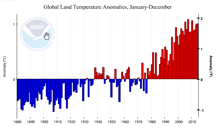
After the announcement of hottest year ever, the reason given to ignore satellite temperatures was because “we don’t live in the troposphere.” Apparently we must be fish, because the land temperatures were not the hottest ever. And I am pretty sure that we do actually live in the troposphere.
Climate at a Glance: Time Series | National Climatic Data Center (NCDC)
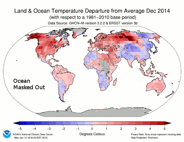
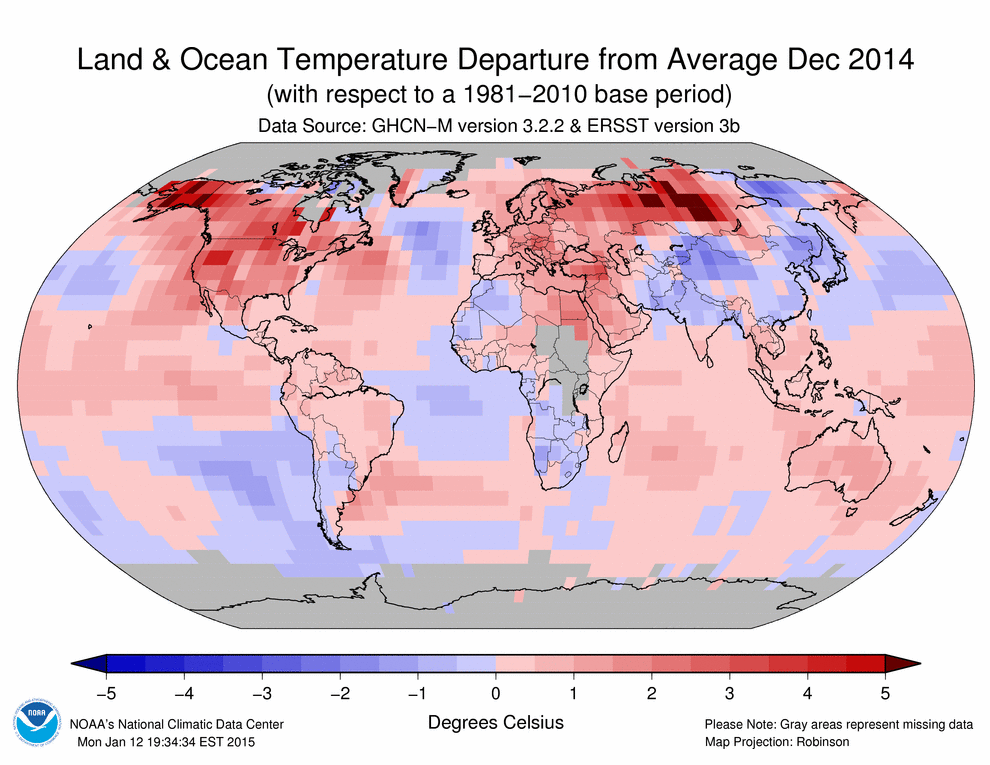
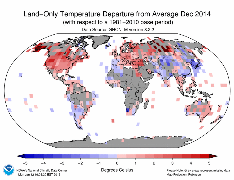
But it is much worse than it seems. 58% of the land temperatures reported by NCDC for December were completely fake – as shown in the animation below which has ocean temperatures masked out.
Land-ocean 201412.gif (990×765)
Land 201412.gif (990×765)
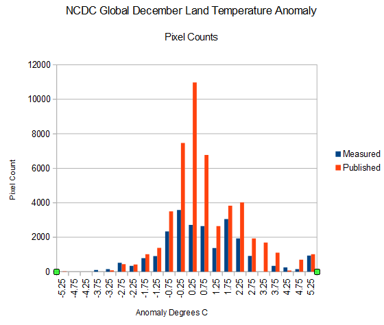
The graph below shows the pixel counts of measured and published land temperatures. As you can see, the vast majority of fake pixels have positive anomalies. Their algorithms (which “work as designed”) skew fake data towards high temperatures..
The reported December land anomaly was 1.36C, but the…
View original post 15 more words
There is one key assumption that drives the system and the physics and that is the expected CO2 sensitivity values as establish by the 1979 NAS Charney report of 1.5C to 4.5 C with the expected value being 3.0 C. IF that 3.0C number is different than the GCM’s don’t work; and it seems that more current papers fall in the lower range or even below. If the CO2 is really .5C to 1.5C with an expected value of 1.0C than there must be other factors besides CO2 alone and than makes room for other factors.
by Judith Curry
Are climate models the best tools? A recent Ph.D. thesis from The Netherlands provides strong arguments for ‘no’.
View original post 1,690 more words
Hey it’s only a “TYPO” they really meant Global Cooling … 🙂
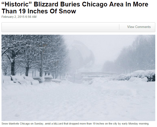
Last summer, after the coldest winter and iciest spring on record on Lake Michigan, experts warned that global warming threatened Chicago
The city continues to suffer from global warming today.
There has been so much of the data manipulation going on that its now almost impossible to know what is really happening.
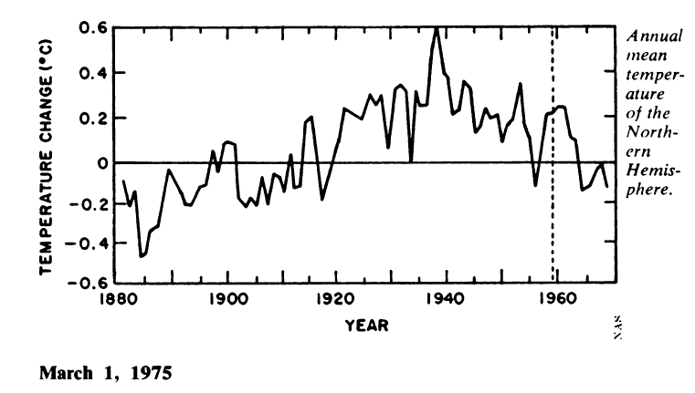
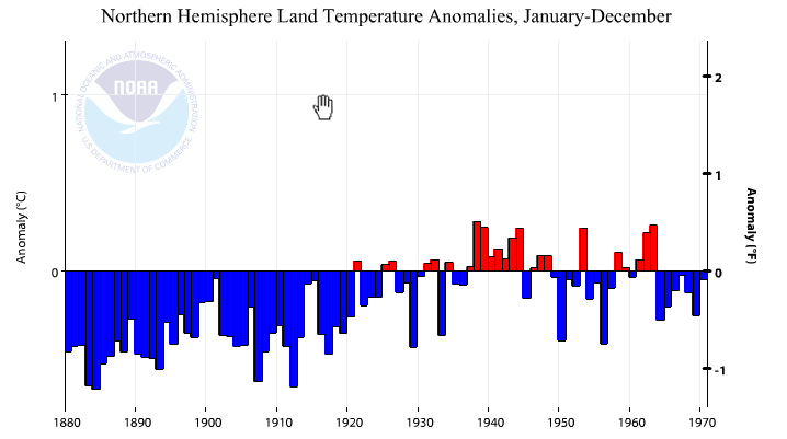
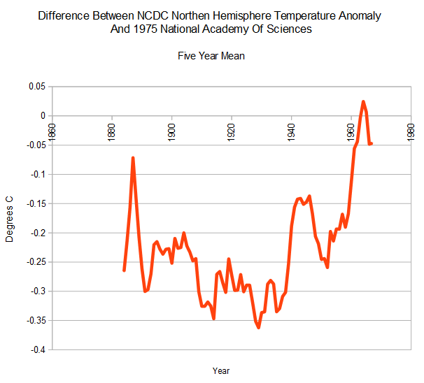
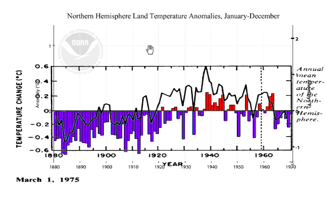
In 1975, the National Academy of Sciences showed no net Northern Hemisphere warming from 1900 to 1970, and about 0.5C cooling from the 1930’s to 1970
But this didn’t make climategate scientists happy, because it wrecked their global warming theory, which their livelihood depends on.
From: Tom Wigley <wigley@ucar.edu>
To: Phil Jones <p.jones@uea.ac.uk>
Subject: 1940s
Date: Sun, 27 Sep 2009 23:25:38 -0600
Cc: Ben Santer <santer1@llnl.gov>It would be good to remove at least part of the 1940s blip, but we are still left with “why the blip”.
So NCDC made the most of the 1930’s/194o’s warmth disappear.
The next graph is an overlay of the 1975 NAS graph on the current NCDC graph, normalized to the most recent years.
They pulled their standard trick of cooling all pre-1963 temperatures.
This animation shows their data tampering to hide the “1940s blip”
According to…
View original post 94 more words
Record snow along with record heat must be something new here maybe dark energy is the cause?
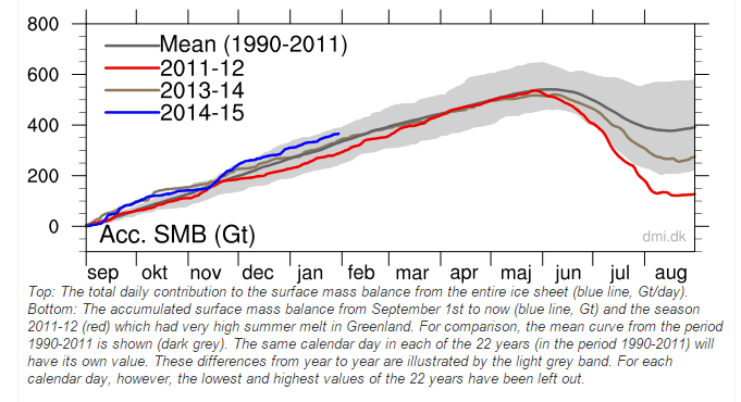
The Greenland Ice Sheet is getting buried with snow again this year
The ice sheet has gained a near record 350 billion tons of snow since August
All of this excess snow has to go somewhere, so it flows as rivers of ice (glaciers) to the sea. Climate experts look at pictures of the glaciers falling into the sea, and cry about global warming. Because they are complete morons who don’t know the first thing about science.
I have created this site to help people have fun in the kitchen. I write about enjoying life both in and out of my kitchen. Life is short! Make the most of it and enjoy!
De Oppresso Liber
A group of Americans united by our commitment to Freedom, Constitutional Governance, and Civic Duty.
Share the truth at whatever cost.
De Oppresso Liber
Uncensored updates on world events, economics, the environment and medicine
De Oppresso Liber
This is a library of News Events not reported by the Main Stream Media documenting & connecting the dots on How the Obama Marxist Liberal agenda is destroying America
Australia's Front Line | Since 2011
See what War is like and how it affects our Warriors
Nwo News, End Time, Deep State, World News, No Fake News
De Oppresso Liber
Politics | Talk | Opinion - Contact Info: stellasplace@wowway.com
Exposition and Encouragement
The Physician Wellness Movement and Illegitimate Authority: The Need for Revolt and Reconstruction
Real Estate Lending


