NSIDC Turning tricks?
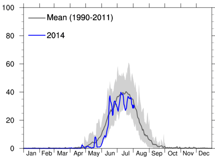
NSIDC shows Greenland melting out of control, far above average this summer.
Greenland Ice Sheet Today | Surface Melt Data presented by NSIDC
This makes no sense, because NCEP maps have showed Greenland temperatures well below normal this summer.
Now lets look at the DMI graph of the same thing. DMI shows Greenland melting well below normal this summer.
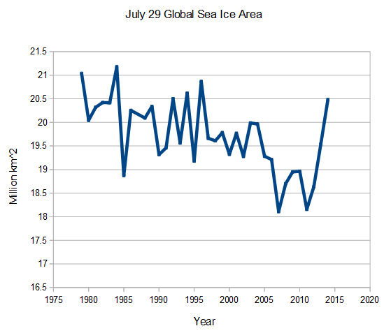
How did Mark Serreze’s NSIDC team pull off their Greenland nature trick? They included the cold 1980’s in their average, which was the coldest decade on record in that region.
There was essentially no melting that decade, which dragged the mean line way down. More evidence of why DMI is a better reference than NSIDC. DMI doesn’t have a global warming agenda. The NSIDC graph is extremely misleading, no doubt by design.
h/t to Chris Beal

 By Alan Caruba ~
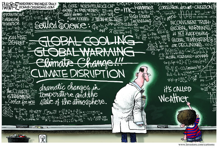
 In the same way Americans are discovering that the Cold War that was waged from the end of World War Two until the collapse of the Soviet Union in 1991 is not over, Americans continue to be subjected to the endless, massive, global campaign to foist the hoax of global warming–now called climate change—on everyone.