Analysis of Global Temperature Trends, January 2015 What’s really going on with the Climate?


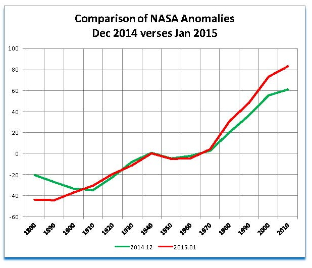
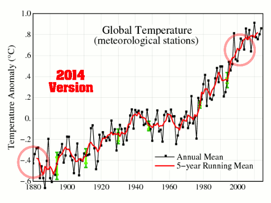
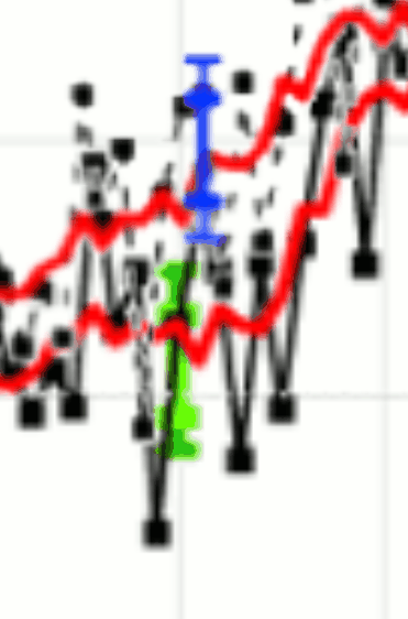
I have been publishing this report every month for the past year but this will be the last one as NASA has now corrupted the LOTI data so badly that any future issues of the table will be worthless. Yesterday after reviewing the January LOTI I found that the entire data series has been changed (See the previous post for the details) such that the past has been made significantly colder and the present significantly warming that what has been shown up though last month. Since the work shown here is based on the old information it is no longer relevant and there is no point to showing it. What follows now is the report from December 2014 with the inclusion of the new charts from the January data following it. The sections in italics with the underline are the explanations.

The analysis and plots shown here are based on the following: first NASA-GISS temperature anomalies (converted to degrees Celsius so non-scientists will understand the plots) as shown in their table LOTI, second James E. Hansen’s Scenario B data, which is the very core of the IPCC Global Climate models (GCM’s) and which was based on a CO2 sensitivity value of 3.0O Celsius, lastly, a plot based on an alternative climate model designated ‘PCM’ and based on a sensitively value of .65O Celsius.

The next three paragraphs have been added to this monthly temperature plot to clear up confusion regarding the methods used in this work. That confusion is my fault for not properly explaining what is shown here.

An explanation of the alternative model designated PCM is in order since many have interpreted this PCM model as a statistical least squares projection of some kind and nothing could be further from the truth. A decade ago when I started this work the first thing I did was look at geological temperature changes since it is well know that the climate is not a constant; I learned that in my undergrad climatology course in 1964. One quickly finds that there is a clear movement in global temperatures with a 1,000 some year cycle going back at least 3,000 to 4,000 years. There are also 60 to 70 year cycles in the Pacific and the Atlantic oceans that are well documented. We also know that there are greenhouse gases such as Carbon Dioxide and the National Academy of Sciences (NAS) estimated that Carbon Dioxide had a doubling rate of 3.0O Celsius plus or minus 1.5O Celsius in 1979

The IPCC still uses the NAS 3.0O Celsius as the sensitivity value of Carbon Dioxide and a number in that range is required to make the IPCC GCM’s work. The problem with using this value is it leaves no room for other factors and hence the need of the infamous Hockey Stick plots of the IPCC from Mann, Bradley & Hughes in 1999. The PCM model is based on a much lower value for Carbon Dioxide consistent with current research which places the value between 0.65O and 1.5O Celsius per doubling of Carbon Dioxide. If the long and short movement in temperatures and a lower value for Carbon Dioxide are properly analyzed and combined a plot that matched historical and current NASA temperature estimates very well can be constructed. This is not curve fitting.

The PCM model is such a construct and it is not based on statistical analyses of raw data. It is based on creating curves that match observations (which is real science) and those observations appear to be related to the movement of water in the world’s oceans. The movements of ocean currents is well documented in the literature all that was done here was properly combine the separate variables into one curve which had not been previously done. Since this combined curve is an excellent predictor of global temperatures unlike the IPCC GCM’s it appears to reflect reality a bit better than the convoluted IPCC GCM’s which after the past 19 years of no statistical warming have been shown to be in error.

Now, continuing from the first paragraph, to smooth out monthly variations a 12 month running average is used in all the plots. This information will be shown in four tables and updated each month as the new data comes in about the middle of the month. Since no model or simulation that cannot reasonably predict that which it was design to do is worth anything the information presented here definitively proves that NASA, NOAA and the IPCC just don’t have a clue.

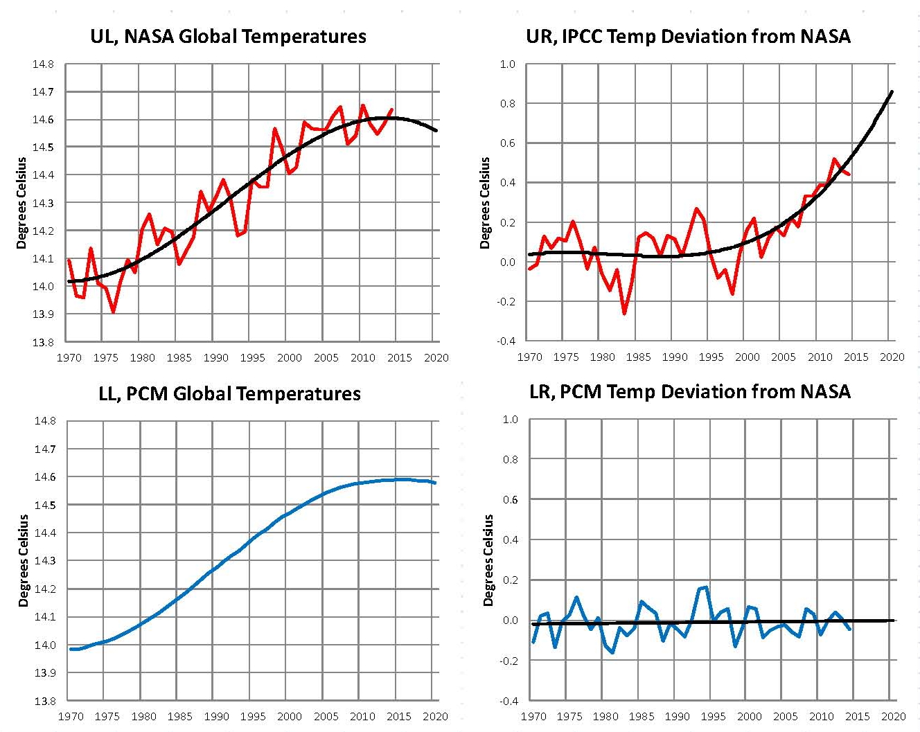
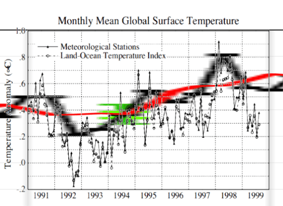
This chart is from the December data.

2014.12 PCM plot

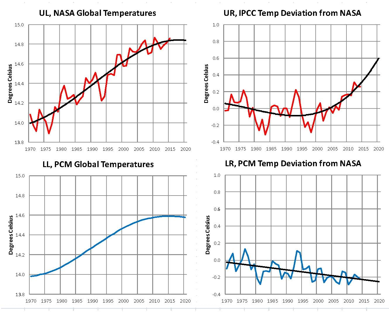
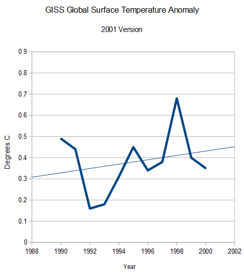
The next Chart was created from the January 2015 data and you can see that there is a major change since current temperatures have been moved up to more closely follow that of the IPCCC GCM’s. The anomalies are still not as much as the models indicate but they are a lot closer. I suspect that over the next 10 months they will get a lot closer so that The COP21 conference will have justification for the climate treaty that they want to initiate.

2015.01 PCM plot

The balance of this paper is from the December 2014 paper.

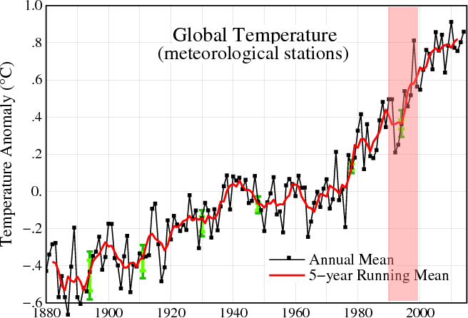
The first plot, UL is a plot of the NASA temperature anomaly converted to degrees Celsius and shown in red with a black trend line added. There has been a very clear reversal in the upward movement of global temperatures since about 2001 and neither the UN IPCC nor anyone else has an explanation for this 13 years later. Since CO2 has continued to increase at what could be argued an increasing rate this raises serious doubts about the logic programmed into all the IPCC global climate models.

The next plot UR, also in red, shows the IPCC estimates of what the Global temperature should be, based on Hansen’s Scenario B, with the NASA actual temperatures’ subtracted from them. Therefore this plot represents a deviation from what the Climate “believers” KNOW what the temperature should be; with a positive value indicating the IPCC values are higher than actual and a negative value indicating the IPCC values are lower than actual, as measured by NASA. A black trend line is added and we can clearly see that the deviation from expected is increasing at an increasing rate. This makes sense since the IPCC models project increased temperatures based primarily on the increasing level of CO2 in the earth’s atmosphere. Unfortunately, for them, the actual temperatures from NASA are trending down (even as they try to hide the down ward movement with data manipulation) since other factors are in play, therefore each year the gap between them widens. Since we have 13 years of observations’ showing this pattern it becomes hard to justify a continuing belief in the IPCC climate models, there is obviously something very wrong here.

The next plot LL shown in blue is based on the equations in the PCM climate model described in previous papers and posts here and since it is generated by “equations” a trend line is not needed. As can be seen the PCM, LL, and the NASA, UL, trend plots are very similar the reason being that in the PCM model there is a 68.2 year cycle that moves the trend line up and then down a total of .30O Celsius (currently negative .0070O Celsius per year); and we are now in the downward portion of that trend which will continue until around 2035. This short cycle is clearly observed in the raw NASA data in the LOTI table going back to 1868. Then there is a long trend, 1052.6 years with an up and down of 1.36O Celsius (currently plus .0029O Celsius per year) also observed in the NASA data. Lastly there is CO2 adding about .005O Celsius per year so they basically wash out which matches the current holding pattern we are experiencing. However within a few years the increasing downward trend of the short cycle will overpower the other two and we will see drop of about .002O Celsius per year and that will be increasing until till around 2025 or so. After about 2035 the short cycle will have bottomed and turn up and all three will be on the upswing again. These are all round numbers shown here as representative values.

The last plot LR in blue uses the same logic as used in the UR plot, here we use the PCM estimates of what the Global temperature should be with the NASA actual temperatures’ subtracted from them. A positive value indicates the PCM values are higher than actual and a negative value indicates the PCM values are lower than expected. A black trend line was added and it clearly shows that the PCM model is tracking the NASA actual values very closely. In, fact since 1970 the PCM model has rarely been off by more than +/- .1 degrees Celsius and has an average trend of almost zero error, while the IPCC models are erratic and are now approaching an error rate of +.5O above expected.

In summary, the IPCC models were designed before a true picture of the world’s climate was understood. During the 1980’s and 1990’s CO2 levels were going up and the world temperature was also going up so there appeared to be correlation and causation. The mistake that was made was looking at only a ~20 year period when the real variations in climate move in much longer cycles. Those other cycles can be observed in the NASA data but they were ignored for some reason. By ignoring those trends and focusing only on CO2 the models will be unable to correctly plot global temperatures until they are fixed.

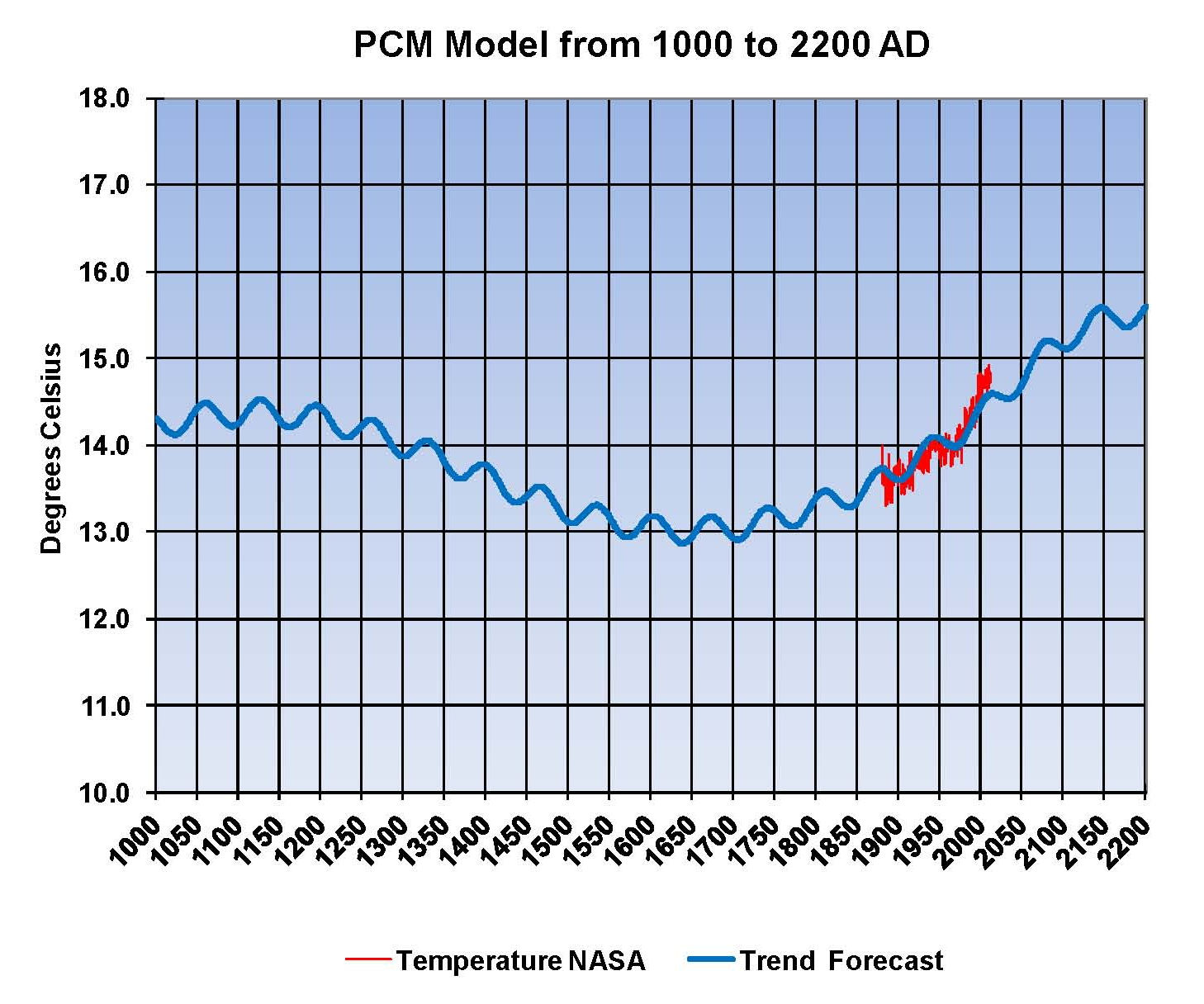
Lastly the next Chart shows what a plot of the PCM model would look like from the year 1000 to the year 2200. The plot matches reasonably well with history and fits the current NASA-GISS table LOTI date very closely. Again this plot is a combination of three factors a long cycle probably in ocean currents, a short cycle probably related more to atmospheric effect from the ocean and a factor for CO2 using a much smaller sensitivity value than the IPCC. I understand that this model is not based on physics but it is also not curve fitting. It’s based on observed reoccurring patterns in the climate. These patterns can be modeled and when they are you get a plot that works better than the IPCC’s GCM. If the conditions that create these patterns do not change and CO2 continues to increase to 800 ppm or even 1000 ppm than this model will work into the foreseeable future. Two hundred years from now global temperatures will peak at around 15.5 to 15.7 degrees C and then will be on the downside of the long cycle for the next 500 years. The overall effect of CO2 reaching levels of 1000 ppm or higher will be between 1.0 and 1.5 degrees C which is about the same as that of the long cycle.

Carbon Dioxide is not capable of doing what Hansen and Gore claim!

The change in data has clearly shifted the temperatures, in red, away from the PCM model plot, in Blue, so there is no long any justification for this model.

2015.01 PCM plot V2

The purpose of this post is to make people aware of the errors inherent in the IPCC models so that they can be corrected.

Sir Karl Raimund Popper (28 July 1902 – 17 September 1994) was an Austrian and British philosopher and a professor at the London School of Economics. He is considered one of the most influential philosophers of science of the 20th century, and he also wrote extensively on social and political philosophy. The following quotes of his apply to this subject.

If we are uncritical we shall always find what we want: we shall look for, and find, confirmations, and we shall look away from, and not see, whatever might be dangerous to our pet theories.

Whenever a theory appears to you as the only possible one, take this as a sign that you have neither understood the theory nor the problem which it was intended to solve.

… (S)cience is one of the very few human activities — perhaps the only one — in which errors are systematically criticized and fairly often, in time, corrected

NASA-GISS Data Manipulation is now proven FACT not Speculation!


When I started to study the issue of anthropogenic climate change about 10 years ago, I saw no reason to disbelieve anything that NASA published since as a young army Captain at Ft Campbell Kentucky I had watched the Saturn V launch of Apollo 11 that put Neil Armstrong and Buzz Aldrin on the moon on July 20, 1969. But now 46 years later its obvious that those days are long gone and NASA is run by politicians and nothing they do is based on science or engineering.

The famous saying from W. Edwards Deming, “In God we Trust, all others (must) bring data” use to hang in mission control in Huston but I doubt it’s there anymore and even if it is still there its meaning has been lost. NASA’s new mission is to prove that man is harming the planet and to spread science across the world. To “prove” (not determine if) that man through the burning of fossil fuels is causing the planet to overheat, extremely complex atmospheric models (GCM’s) have been built. Then reports are generated by a UN agency the Intergovernmental Panel on Climate change (IPCC) from the models that predict global temperatures into the future based on the concept that the level of CO2 in the atmosphere correlates to global temperature i.e. that more CO2 means hotter temperatures.

NASA’s role in this endeavor is to take temperature measurements from all over the world and then through software blend them into a global average. Many tables of temperatures are published each month by NASA-GISS (Goddard Institute of Space Studies) and one of them is the Land Ocean Temperature Index or LOTI. This table goes back to January 1880 and by month forward to the present with the most recent being issued on February 14, 2015 for January 2015. Over the last several years I have copied and printed out this LOTI data which is now 1621 values and then keyed them into a column on a spread sheet. This now represents 32 columns of values mostly in the past several years although I do have one from December 1998.

Over the years I have seen movement in the data which I first thought was random but since it movement of numbers seems to change the slope of the data curves that idea was quickly ruled out. But still even though it was obvious that data was being manipulated it was not materially effecting my work in climate modeling so I mostly showed the manipulation to colleagues and posted it on my blog but otherwise since the real scientists, known as flat earthers knew this any way I passed it over, but as of yesterday that has changed.

After copying the data into a word document and printing it out I observed that the numbers didn’t look right. The next step was to open the data file of past values and then start keying in the new data. Since it is in a column format, changes in the value of any month show right up. In the past to take out random changes due to rounding or other factors I have the spreadsheet set up to take the raw NASA data and make of new table of the average of a 10 year block of 120 values. This gives me 14 values with the last one from 2010 to 2019 containing only 61 values at present all the others have 120 values. This process ensures that a plot from this table will show a change only if there is a major change in the data. It was very obvious as I keyed in the January 2015 data from the NASA LOTI table that there had been a major shift.

Most of those that will read this understand that NASA does not publish temperatures but publish Anomalies instead. To determine an Anomaly a base period must be set and NASA has set this as 1951 to 1980 and that is set to 14.0 degrees C and then all other values are subtracted from that then multiplied by 100 so that 14.5 degrees C would give an Anomaly of 50 and 13.5 would give an Anomaly of -50. The reasons for doing this do not matter as it doesn’t change anything. The following chart shows the plot from LOTI values from December 2014 and January 2015

100 NASA DATA

Clearly there has been a major change in how NASA determines global temperatures which is significantly different than any of the past issues over the last 10 or more years that I have been looking at this data. The period from January 1800 to December 1889 dropped by almost a quarter of a degree and the period from January 2010 to January 2015 rose by almost a quarter of a degree; this makes the present almost one half of a degree warming than it was 30 days ago. Also of note is there was little to no change in the data in the period from January 1940 to December 1979, which just happens to include the NASA base period.

I don’t think there is any valid reason for doing this and the only reason was that in the United Nations Climate Change Conference (COP21) will be held in France at the Le Bourget site from 30 November to 11 December 2015 and the conference objective is to achieve a legally binding and universal agreement on climate, from all the nations of the world. To achieve this they have determined that they need to show that the planet is overheating and since it is not (by satellite data) they need to show it in another form, hence the data manipulation at NASA-GISS

I cannot stress this enough there can be no other reason for what was just done. We are going to be shown false data from NASA-GISS for the next 10 months until this conference such that they hope there will be support for the treaty that they want which will be a massive tax on America and Europe so that development can be forced on other areas. This will be in line with the already approved UN Agenda 21 which is already being implemented in the United States.

The real goal here has nothing to do with CO2 or climate those are only the tools to force a change from representative government to one controlled by the powerful elites (business leaders and politicians); such as now exists in the EU where the government body of the EU is not elected by the people yet their ruling are binding on the people. The result of this conference and treaty, if adopted will either give the sovereign power of the countries to the UN or to some other body. What will come of that is unknown but we do know from past history that concentrated power is never good.

Experts Say They Are Not Altering Data, And That the Surface Temperature Record Is Valid


There is no one connect with this administration that is capable of telling the truth on any subject!

Tony Heller's avatarReal Climate Science

As of 1975, scientists showed no net warming from 1900 to 1970

ScreenHunter_7026 Feb. 10 12.08ScreenHunter_7019 Feb. 10 07.52

But now they show a lot of warming from 1900 to 1970.

Fig.A (7)

NASA has massively changed their data many times.

NASANorthernLatititudes1981-1999-2015

gissfiga2002-2014 (4)

They have altered data outside their own error bounds.

ScreenHunter_6906 Feb. 07 16.55

Surface temperatures  and radiosonde have been massively diverging. The vast majority of reported warming since 1980 is due to Urban Heat Island effects.

ScreenHunter_937 Feb. 04 13.40

They are losing rural station data, and infilling it with urban data

all-raw-station-count-ghcn

The global surface temperature record is complete crap, and has no business being used by scientists other than as a case study in UHI confirmation bias.

View original post

Michael Mann Explains Why NCDC/GISS Data Tampering Is Fraudulent


Its easy to make cool pictures to show what you want, but that is not science. It would seen the these guys have come from Dream Works not MIT or Cal Tech

Tony Heller's avatarReal Climate Science

ScreenHunter_7071 Feb. 11 22.19

Mikey is severely math challenged, but shows off an important point.

You can’t extrapolate temperatures across ocean/land boundaries like NCDC does. The Gulf Stream is warm off of Massachusetts, but Massachusetts itself is frozen. There is a sharp dividing line at the coast.

ScreenHunter_7074 Feb. 11 22.30

YearTDeptNRCC (2)

ScreenHunter_7080 Feb. 12 05.18

GISS extrapolates 1200 km, which is like making the Liverpool weather forecast based on the weather in Nice, France.

View original post

US Temperatures Are Being Adjusted Upwards To Increase Warming By Almost Two Degrees


NASA-GISS is the biggest manipulator of data that every existed.

Tony Heller's avatarReal Climate Science

The climate fraudsters are all over the Internet today claiming that they are adjusting raw temperatures in a way which reduces warming. Let’s check that claim out.

The US has the only decent long term temperature record covering a large area of this planet. Temperatures here are being massively adjusted to increase warming, the exact opposite of what the fraudsters claim. Older temperatures are being adjusted down, and newer temperatures are being adjusted up.

ScreenHunter_7078 Feb. 12 00.34

ScreenHunter_7077 Feb. 12 00.22

The data tampering accounts for almost the entire claimed warming trend in the US.

View original post

Michael Mann Takes Climate Stupid To Dizzying New Heights


Since the real world doesn’t agree with their narrative they have resorted to fiction.

Tony Heller's avatarReal Climate Science

ScreenHunter_7071 Feb. 11 22.19

21 degrees above normal? The water is 39 degrees. Apparently  Mikey believes that the normal temperature of the water is 18 degrees F, 10 degrees below the freezing point of seawater.

ScreenHunter_7073 Feb. 11 22.28

The highest anomaly in the region is about 3C.  The man is a genius.

ScreenHunter_7074 Feb. 11 22.30

unnamed (3)

Mikey’s link shows the water just south of Cape Cod slightly below normal.

ScreenHunter_7075 Feb. 11 23.12

View original post

Paul Driessen on sugar daddys buying phony environment science from anxious whores


Since their GCM’s have proved to be wrong they are in a panic mode to rewrite history I’ll have more on this later today on my blog.

john1282's avatarJunkScience.com

Paul Driessen sure does a good job on this one on incest in the enviro gov and non gov elements.

Paul, a moral humanist and humanitarian, stands up for good science and against the negative impact of government agency overreach and excess regulation on the little people.

View original post 3,088 more words

Adjusting the temperature to fit the narrative


This problem with manipulating data is destroying science!

Bob Greene's avatarJunkScience.com

People delving into GHCN’s temperature homogenization keep coming up with evidence that the adjustments provided biased results. 

View original post 240 more words

Hockey Stick Update


Great Chart 🙂

Tony Heller's avatarReal Climate Science

On January 20, President Obama took credit for a drop in gas prices which he didn’t want to see and did everything he could to prevent.  Since then, gas prices have shot upwards in a hockey stick.

ScreenHunter_6820 Feb. 06 07.19

GasBuddy.com – Find Low Gas Prices in the USA and Canada

View original post

Gavin’s Spectacular Data Tampering In The 1990’s


It’s amazing that they can get away with such blatant data tampering!

Tony Heller's avatarReal Climate Science

Earlier today I showed Gavin’s spectacular data tampering before 1980, to create the lower half of the hockey stick.

NASANorthernLatititudes1981-1999-2015

1981 version : 1981_Hansen_etal_1.pdf
1999 version : 1999_Hansen_etal_1.pdf
Current version : Fig.B.gif (407×678)

But that is only half of the hockey stick. Some of Gavin’s finest tampering is done in the 1990’s data.

Hansen 1999 showed no net warming during the 1990’s

ScreenHunter_6734 Feb. 03 21.33pubs.giss.nasa.gov/docs/1999/1999_Hansen_etal_1.pdf

In 2001, the GISS website also showed no net warming during the 1990’s

FiG.C.2001

NASA Goddard Institute: Surface Temperature: Graphs

But GISS now shows the 1990’s as the fastest warming decade.

PaintImage66

They built the rest of the hockey stick by simply making up data.

This image shows how the 1990’s station data has been altered since Hansen 1999.

ScreenHunter_6746 Feb. 04 05.46

The animation below shows the spectacular alterations to GISS 1990’s surface between 2001 and 2015, tripling the warming during the decade.

GISSFigA2001-2015.gif

2001 : FigA.txt
Current : Fig.A.txt

We also know that the post 2000 warming is fake, because none…

View original post 28 more words