More Than Half Of NCDC December Land Temperatures Were Fake


What else would you expect from NASA that have to start supporting to move to a Climate treaty!!

Tony Heller's avatarReal Climate Science

After the announcement of hottest year ever, the reason given to ignore satellite temperatures was because “we don’t live in the troposphere.” Apparently we must be fish, because the land temperatures were not the hottest ever. And I am pretty sure that we do actually live in the troposphere.

ScreenHunter_6719 Feb. 03 07.37 Climate at a Glance: Time Series | National Climatic Data Center (NCDC)

But it is much worse than it seems. 58% of the land temperatures reported by NCDC for December were completely fake – as shown in the animation below which has ocean temperatures masked out.

NCDCLandRealVsPublished

Land-ocean 201412.gif (990×765)

Land 201412.gif (990×765)

The graph below shows the pixel counts of measured and published land temperatures. As you can see, the vast majority of fake pixels have positive anomalies. Their algorithms (which “work as designed”) skew fake data towards high temperatures..

ScreenHunter_6718 Feb. 03 07.26

The reported December land anomaly was 1.36C, but the…

View original post 15 more words

Questioning the robustness of the climate modeling paradigm


There is one key assumption that drives the system and the physics and that is the expected CO2 sensitivity values as establish by the 1979 NAS Charney report of 1.5C to 4.5 C with the expected value being 3.0 C. IF that 3.0C number is different than the GCM’s don’t work; and it seems that more current papers fall in the lower range or even below. If the CO2 is really .5C to 1.5C with an expected value of 1.0C than there must be other factors besides CO2 alone and than makes room for other factors.

curryja's avatarClimate Etc.

by Judith Curry

Are climate models the best tools? A recent Ph.D. thesis from The Netherlands provides strong arguments for ‘no’.

View original post 1,690 more words

Experts Warn That Global Warming Threatens Chicago


Hey it’s only a “TYPO” they really meant Global Cooling … 🙂

Tony Heller's avatarReal Climate Science

Last summer, after the coldest winter and iciest spring on record on Lake Michigan, experts warned that global warming threatened Chicago

ScreenHunter_6704 Feb. 02 09.50

Global warming threatens Chicago tourism | Chicago

The city continues to suffer from global warming today.

ScreenHunter_6706 Feb. 02 09.51

View original post

Hiding The Decline At NCDC


There has been so much of the data manipulation going on that its now almost impossible to know what is really happening.

Tony Heller's avatarReal Climate Science

In 1975, the National Academy of Sciences showed no net Northern Hemisphere warming from 1900 to 1970, and about 0.5C cooling from the 1930’s to 1970

ScreenHunter_6694 Feb. 02 08.21

But this didn’t make climategate scientists happy, because it wrecked their global warming theory, which their livelihood depends on.

From: Tom Wigley <wigley@ucar.edu>
To: Phil Jones <p.jones@uea.ac.uk>
Subject: 1940s
Date: Sun, 27 Sep 2009 23:25:38 -0600
Cc: Ben Santer <santer1@llnl.gov>

It would be good to remove at least part of the 1940s blip, but we are still left with “why the blip”.

di2.nu/foia/1254108338.txt

So NCDC made the most of the 1930’s/194o’s warmth disappear.

ScreenHunter_6693 Feb. 02 08.20 

 The next graph is an overlay of the 1975 NAS graph on the current NCDC graph, normalized to the most recent years.

ScreenHunter_6696 Feb. 02 08.38

They pulled their standard trick of cooling all pre-1963 temperatures.

ScreenHunter_6698 Feb. 02 09.00

This animation shows their data tampering to hide the “1940s blip

 NCDCvsNASNH

According to…

View original post 94 more words

Near Record Snow Burying Greenland


Record snow along with record heat must be something new here maybe dark energy is the cause?

Tony Heller's avatarReal Climate Science

The Greenland Ice Sheet is getting buried with snow again this year

ScreenHunter_6593 Jan. 31 08.05summit:status:webcam

The ice sheet has gained a near record 350 billion tons of snow since August

ScreenHunter_6594 Jan. 31 08.07Greenland Ice Sheet Surface Mass Budget: DMI

All of this excess snow has to go somewhere, so it flows as rivers of ice (glaciers) to the sea. Climate experts look at pictures of the glaciers falling into the sea, and cry about global warming. Because they are complete morons who don’t know the first thing about science.

ScreenHunter_6595 Jan. 31 08.14

View original post

Monckton Responds To Warmist Critics


Sadly, there is way to much power and money at stake here for the powers to be and their dutiful minions to not try to shut down dissent to their pet theories. They will come up with all kinds of bizarre solutions to why things are not as they seem and try to destroy all dissent.

However what that have not accounted for is the simple fact that Mother nature is a woman and as a woman she is not about to listen to a bunch of power hungry men telling her what she had better do or else! I, for one, would not want to cross her and indue her wrath which will surely be falling on all of them.

Nothing To See Here – Move Along


They will only be able to pretend for so long we have a house of cards (the US economy) built now and it will not take long to crash down.

Tony Heller's avatarReal Climate Science

During the last two weeks, dictator Obama snubs France, snubs Israel, announces that Republicans are enemies of the children, brags about low gas costs, shuts down Alaska oil, and then hops on a plane to Saudi Arabia.

images

Meanwhile, the press pretends that nothing is wrong.

View original post

Outed by FOIA – EPA strategy memo reveals deep flaws in the integrity of the agency, and lack of integrity of the press


To this administration in all its agencies under the direction of the tyrant Obama nothing matters but obedience to the message that he wants of sustainability not telling anyone that it also means the destruction of the country!

Smoking Gun Of Incompetence At The IPCC


The question should be have they gotten anything right … lol

Tony Heller's avatarReal Climate Science

In 2001, the UN IPCC said “Mild winter temperatures will decrease heavy snowstorms”

BepTksDCMAEkCHw (1)

IPCC Third Assessment Report – Climate Change 2001 – Complete online versions | GRID-Arendal – Publications – Other

Bdi6xZUCEAAYLXL

IPCC – Intergovernmental Panel on Climate Change

Since they made that forecast, UN headquarters has seen five of its ten largest snowstorms.

ScreenHunter_6453 Jan. 26 06.26

Updates on Historic Northeast Blizzard

View original post

The US Federal Government through its agencies, NOAA and NASA, intentionally publish False information to mislead the Citizens!


NOAA, NASA manipulates data to support the political agenda of the myth of manmade climate change otherwise known as Anthropogenic Climate change. And to keep their jobs the employees in the various agencies of the federal government have all been infected with the desire to keep their jobs i.e. publish data, tables and charts that purport to show that we are in the hottest year ever and that if we don’t tax carbon immediately that we are all going to die. The national media dutifully promotes this cause and those that believe in the cause of more taxes attack anyone that disputes the narrative calling them names such as a Flat Earther or Non Believer and other nastier names as suits them at the time. However there is a building problem in that the citizens of the country don’t see what the propaganda claims to be happening and as the disparity gets larger and larger every year the government and their minions, the national media, get more and more desperate.

Over the past several years I have been downloading a table of global temperatures that NASA publishes each month to use in my research. This table is identified as the Land Ocean Temperature Index (LOTI) which consists of a number which is generated by a very complex computer program. To calculate this table NASA first set an arbitrary global temperature by calculating a base global temperature from period from1951 to 1980 of 14.0 degrees Celsius (57.2 degrees Fahrenheit). Then they determine an anomaly by taking the temperature that they calculated subtracting 14.0 from it then they divide multiply the result by 100. This than gives a plus or minus value from base 0.0 which represents 14.0 degrees Celsius (C). This creates a whole number which is apparently easier for the scientists to work with. Example 14.5 would be an anomaly of 50 (.5 * 100). The only problem with this method is that the base is strictly arbitrary and can be any number one wants to use; but that doesn’t matter for what we’re going to talk about here.

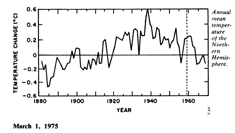
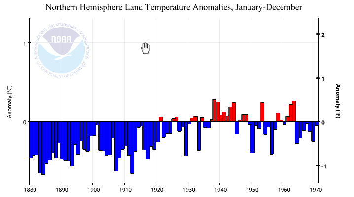
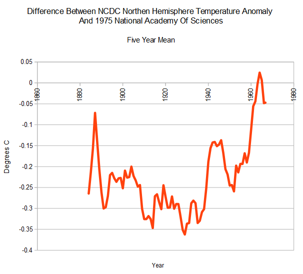
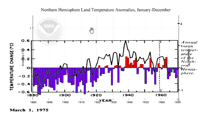
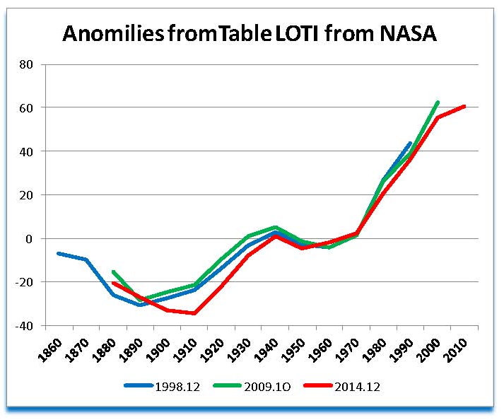
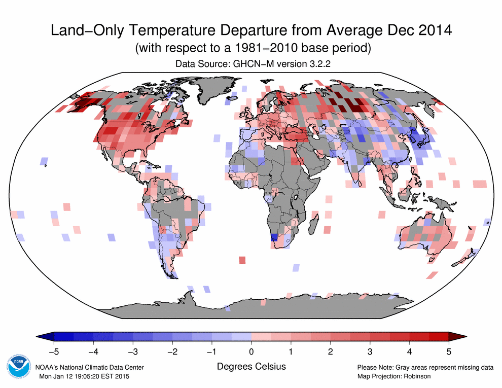
As the federal agencies try to support what the Obama administration wants to promote, they have had to resort to data manipulation that has become so blatant that even non technical people are able to see that something is very wrong. One of the tricks that these agencies use is to change history. They do this in how they calculate their data and in the form of what they show, for example we have the following Chart of anomalies from three different plots of the LOTI monthly tables for the indicated years. The first is from December 1998 (blue line), the second from October 2009 (green line) and the third from December 2014 (red line) which is the lasted one available at the time this paper was written.

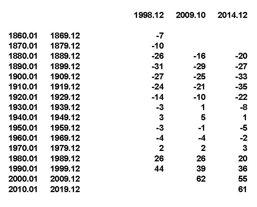
This plot was generated by break each indicated year into a ten year blocks of values and then creating an average for each block. By doing this we take out large changes in the monthly numbers; for example for the month of January 1980 from the LOTI issued in December 1998 the value was 30 and the LOTI value for the same month, January 1980, was 24 on the December 2014 report, which one was right? To my way of thinking some variances could be expected but they would cancel out with looking at blocks of numbers; this is not the case here. There is one other issue of note and that is when looking at this subject for the first time around 2005 the LOTI table went back to January 1980. Unfortunately at the time the methodology used by NASA was not understood by me, at the time, and the earlier tables were not saved. Each month as new data was published the current value was added to the table that had been developed. It never occurred to me that the published data was itself a variable. Why would numbers be changed constantly for if they are, of what value are they? Now that we understand how the numbers were derived lets analyze the Chart.

Manipulation Chart

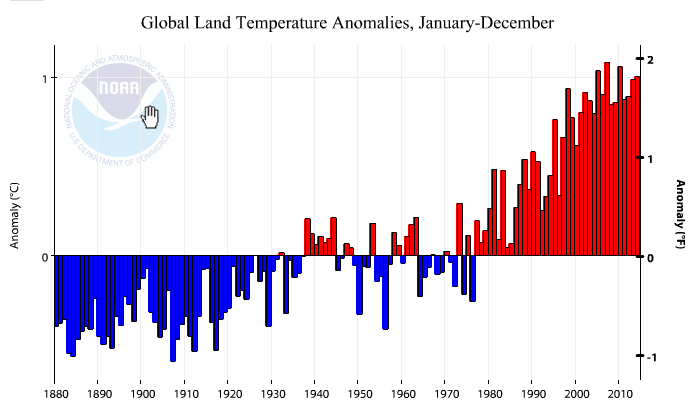
At this scale all three plot should be one on top the other, which they are not. Next it’s curious as to why NASA stopped publishing the anomalies prior to 1980. Also we can see that the plots prior to 1950 have major swings in them; and that the plots after 1980 do as well. Lastly why would the base temperature be calculated using the temperatures from 1951 to 1980 since there is a clear and large upward trend to the data?

The first things we’ll look at are the Blue and Green plots. Which follow each other reasonably with the only difference being dropping the numbers prior to 1980. What comes to mind is that those promoting anthropogenic climate changes did not want to show a decline in temperatures while carbon emissions were growing from 1860 through 1890. It would be interesting to see when this change was made; it wouldn’t be a surprise if it was in the period when James E. Hansen’s was put in charge of the Goddard Institute for Space Studies (GISS) section of NASA.

Next, what happened before 2014 that made such a large change in the red plot? Could it be that if we look at the plot from the periods from 1910 to 2000 there would be close to a full degree upward movement in temperature? Actually that change occurred sometime between October 2011and September 2012 but LOTI tables for that period have not been found yet so it is somewhere in those eleven months. If we go back to 1860 values that almost one degree increase drops by 1/3, is this intentional?

Lastly we look at the period from 2000 to the present. Interestingly it shows that the plot for October 2009 is higher than the plot for December 2014. The period from January 2000 to December 2009 was 62 on the October 2010 report. The same period was 55 on the December 2014 report which is enough to make 2014 hotter. Was this done so the Obama administration could say that 2014 was the hottest years ever?

For reference the following table is what was used to make the plot.

Manipulation Table