A lot of good science mixed with a lot of assumptions, albeit most are logical unlike today where politics always comes first.


A lot of good science mixed with a lot of assumptions, albeit most are logical unlike today where politics always comes first.
I would guess that “ALL” data is being manipulated to show in November December of this year that the World Climate is out of control because the CO2 level has gone over 400 ppm (for the first time ever) and this just happens to be the period of the UN COP21 conference in Paris where ‘they” will be looking for a world carbon tax that is mandatory on the EU and North America.
Bob Tisdale - Climate Observations
I was notified today of the rather remarkable plume of ENSO forecasts for 2015 from ECMWF (European Centre for Medium-Range Weather Forecasts). See their System 4 ENSO region sea surface temperature anomaly forecast webpage here.
View original post 465 more words

It is my understand that all these projections are based on economic projections first and then CO2 second assuming a CO2 release based on those projections. So this is really not a CO2 driven system but an economic driven system. That is what gives so many different outcomes. I’m not even sure this is science it seems to be more a study of social system.
More deceit piled on past deceit making the worlds biggest compost pile — yet it goes on and on and no one cares that they are living in a pile of manure. This blog and a few others are the exception, of course.
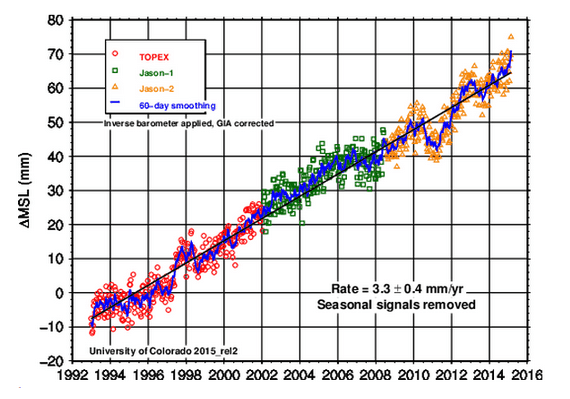
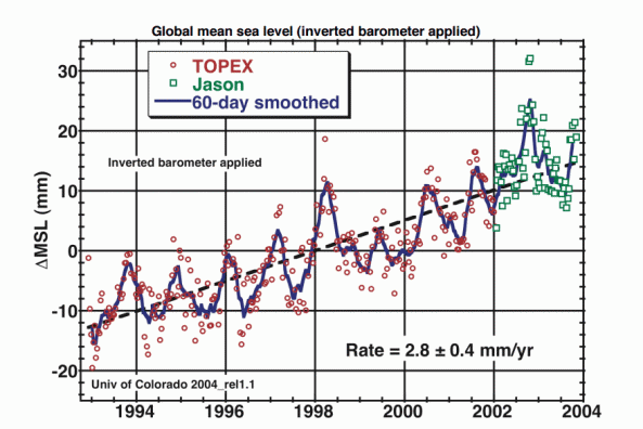
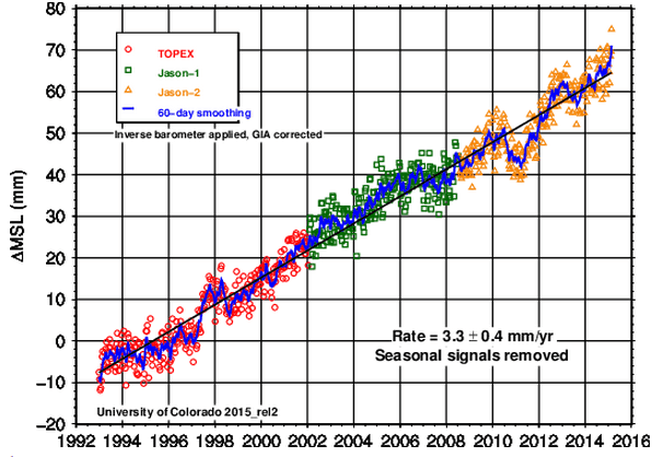
The University of Colorado shows sea level rising at a steady rate of 3.3 mm/year, which is a higher rate than 84% of tide gauges report
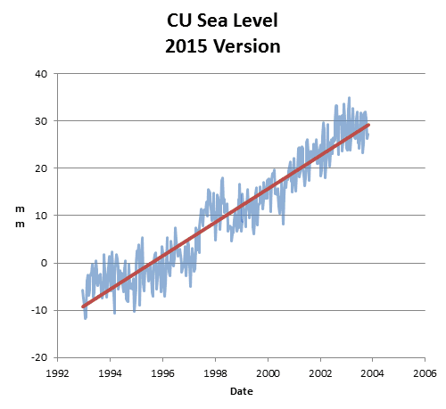
But they didn’t always show that. In 2004, they showed the rate of sea level rise as 2.8 mm/year
Overlaying the two graphs (of the same data sets) you can see that they don’t look anything like each other. In the old graph, there was a trough in 1997, and in the new graph there is a peak that year.
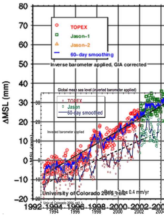
The next animation shows how their published data set has changed since 2004.
2004 : sl_ib_ns_cu2004_rel1.2_global.txt
2015 : 2015_rel2/sl_ns_global.txt
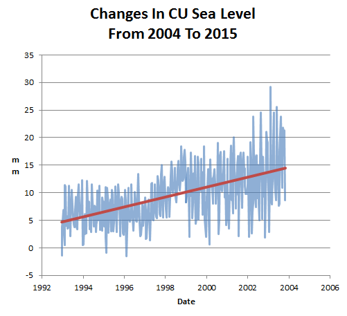
The next graph shows the changes made to the data. They added an extra 10 mm of sea level rise from 1993 to 2004.
As with every other US government funded climate data set, the data is continuously being altered to create the case for imaginary global…
View original post 23 more words
Just more Junk to add to the rest — they are hitting close to 100% Junk now — and after that we cross into the realm of magic.
According to the University of Colorado, sea level is rising at 3.3 mm/year
This is quite remarkable, because the average of all NOAA tide gauges is less than one third of that, at 1.01 mm/year. Eighty four percent of the tide gauges show lower rates than 3.3 mm/year.
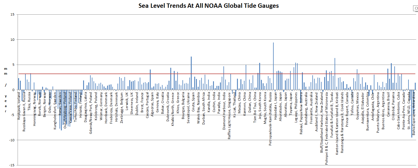
GlobalStationsLinearSeaLevelTrendsCSV.htm
In an actual field of science, this sort of huge discrepancy would concern the scientists. But climate science has nothing to do with science. It is propaganda.
Re-Post from the NoTricksZone
The Sun in April
By Frank Bosse and Prof. Fritz Vahrenholt
[Translated, edited by P Gosselin]
The sole real source of energy for our planet also was also below normal in April: The sunspot number (SSN) was 54.4. Taking the average of the previous 23 cycles, that is only 70% of what is average for this month into the cycle.
Compared to March activity rose some 46%. These short-term changes however are usual noise in the overall signal, which says the entire activity since the current cycle began has been only 53% of the mean value since 1750.

Figure 1: Current solar cycle 24 (red), the mean solar cycle (blue) and the similar solar cycle no. 7, which took place from 1823 to 1833 and was the last in the Dalton Minimum.
The comparison with solar cycle no. 7 could see increasingly large deviations in the months ahead, as solar activity increased markedly, as depicted by sharp peaks of the black line in Figure 1. Such a development appears highly improbable for solar cycle no. 24. What follows is a comparison of all cycles:

Figure 2: The accumulated solar cycle sunspot anomaly for all cycles 77 months into the cycle. The current cycle began in December 2008.

Figure 3: The speed of the solar wind, which impacts the Earth’s upper atmospheric layers, has fallen off since the early 1990s. It is expressed as the geomagnetic Ap Index. It is a measure of the sun’s impact on the Earth’s magnetic field. Source of the image: Climate4you.
Not only the Earth is impacted by the solar winds, but also the entire sun’s surroundings far out in space. The heliosphere reacts to the stream of particles from the sun. When it is weaker – as is the case during times of solar minima – more cosmic radiation from the Milky Way can penetrate into the Earth’s atmosphere. This is measured here on Earth, e.g. in Moscow since 1958:

Figure 4: Changes in cosmic radiation
During the solar sunspot number maxima (compared to 2000) the solar wind is stronger and thus reduces cosmic radiation by up to 20% when compared to the minima in activity. The current cycle (maximum is already over) is bringing only about an 8% reduction. Over the entire period since 2006 there has been significantly more cosmic radiation than any such period since 1958.
Another factor involved with solar activity is UV radiation. It strongly depends on the sunspot number because the ultraviolet radiation is produced in the areas near sunspots. Unlike the other visible ranges of the spectrum, sunspots in UV images appear brighter than the surrounding areas. Although UV radiation mainly has an impact in the stratosphere, there are top-down effects that lead to impacts to the troposphere.
The signals for solar activity all continue to point to “very low“. We can all wait with suspense to see what impacts the low solar activity will have.
Original German version here.
Empirical Evidence: Oceans Make Climate.
It seems intuitive obvious that something has been happening since 1980; maybe because the was the end of the 30 year period defining the 14.0 degree C base period when means the data tampering has to occur either before or after that period. Futher if you don’t look at the data prior to 1900 one can create the illusion of temperature movements that match increases of the CO2 levels.
My personal theory is that the Apsidal Precession of the earths orbit which reverses the perihelion and aphelion in relationship to the seasons combined with the unequal distribution of land and water create ocean currents are what drive climate. Obviously the small variation in solar flux and solar wind contribute to the observed changes that we call climate.
Anyone that follows the published NASA & NOAA data quickly finds that it is driven by politics not science. As shown in these charts the plots jump around a lot — but there is one consistency and that is period prior to 1951 gets colder and the period after 1980 gets warmer. The period from 1951 to 1980 always stays the same at zero since that is the base and it can’t be allowed change. This is proof that the numbers are manipulated. since it is the only period that never changes.
‘Temperature data fraud from NOAA and NASA enables the global warming scam. It can’t exist without the fraudulent claims from these agencies.
For example
(CNN) New climate change records have come along to remind us that Earth’s thermostat is steadily pushing upward.
More exactly, there are two global high temperature records and a smattering of climate change low points.March 2015 was the warmest March since record-keeping began in 1880, says the National Oceanic and Atmospheric Administration. And the first quarter of 2015 was the warmest first quarter on record in those same 136 years.
New records highlight global warming’s continued rise – CNN.com
There isn’t one word of truth to this. March was about average and cooler than 1983
vortex.nsstc.uah.edu/data/msu/v6.0beta/tlt/uahncdc_lt_6.0beta2.txt
rss_monthly_msu_amsu_channel_tlt_anomalies_land_and_ocean_v03_3.txt
January-March temperatures were nowhere near the warmest.
The April data shows a clear cooling trend this century, despite the current El Nino
The amount of sea ice on Earth…
View original post 66 more words
Interesting analysis appears to be real science! So that means no one will consider it.
by Fred Haynie
I conclude that, the IPCC’s model assumptions that long-term natural net rate of accumulation is constant and anthropogenic emission rates are the only contributor to total long-term accumulation of atmospheric CO2, is false.
View original post 2,592 more words
Whether they work not doesn’t matter Obama wants them and we will get them. These are just “glitches” nothing to worry about … lol
I have created this site to help people have fun in the kitchen. I write about enjoying life both in and out of my kitchen. Life is short! Make the most of it and enjoy!
De Oppresso Liber
A group of Americans united by our commitment to Freedom, Constitutional Governance, and Civic Duty.
Share the truth at whatever cost.
De Oppresso Liber
Uncensored updates on world events, economics, the environment and medicine
De Oppresso Liber
This is a library of News Events not reported by the Main Stream Media documenting & connecting the dots on How the Obama Marxist Liberal agenda is destroying America
Australia's Front Line | Since 2011
See what War is like and how it affects our Warriors
Nwo News, End Time, Deep State, World News, No Fake News
De Oppresso Liber
Politics | Talk | Opinion - Contact Info: stellasplace@wowway.com
Exposition and Encouragement
The Physician Wellness Movement and Illegitimate Authority: The Need for Revolt and Reconstruction
Real Estate Lending


