
More deceit piled on past deceit making the worlds biggest compost pile — yet it goes on and on and no one cares that they are living in a pile of manure. This blog and a few others are the exception, of course.
The University of Colorado shows sea level rising at a steady rate of 3.3 mm/year, which is a higher rate than 84% of tide gauges report
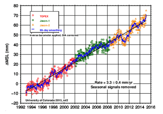
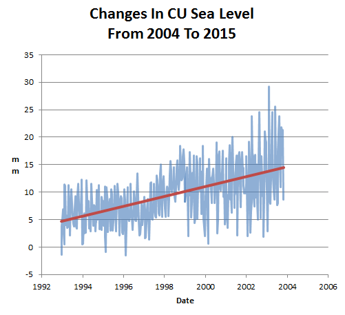
But they didn’t always show that. In 2004, they showed the rate of sea level rise as 2.8 mm/year
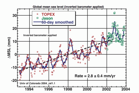
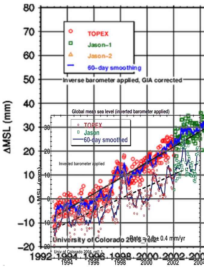
Overlaying the two graphs (of the same data sets) you can see that they don’t look anything like each other. In the old graph, there was a trough in 1997, and in the new graph there is a peak that year.
The next animation shows how their published data set has changed since 2004.
2004 : sl_ib_ns_cu2004_rel1.2_global.txt
2015 : 2015_rel2/sl_ns_global.txt
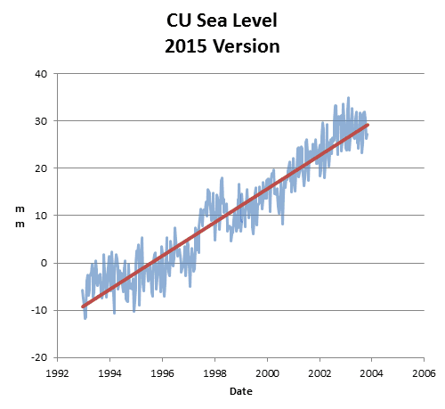
The next graph shows the changes made to the data. They added an extra 10 mm of sea level rise from 1993 to 2004.
As with every other US government funded climate data set, the data is continuously being altered to create the case for imaginary global…
View original post 23 more words
