Is Man-made Climate Change Real #5?


Part Five Geological Facts

This will be a short section placed here to show what the past was until recently when all this history mysteriously disappeared. The point to these Charts is that climate has NEVER been a constant with global temperatures ranging from a low of around 12 degrees C to a high of around 22 degrees C and CO2 ranging from under 300 ppm to as high as 7,000 ppm. We are presently at 400 ppm CO2 with a global temperature of around 14.6 degrees C which is historically low as can be seen on the following chart going back 600 million years. It would seem that a mean temperature of 17 degrees C, as shown here, and a CO2 level of over 1000 ppm would be more normal then what we have now so why the hysterical political movement to control CO2?

BB-04

The next chart is more current going back to the last ice age some 11,000 years ago. This chart is particularly interesting as it shows that there have been 4 cycles of cold and warm going back over 4,000 year. Based on those 4 cycles and considering the difficulty of determining exact dates and temperatures it can be said that over the past four thousand years there have been 4 cycles of about one thousand years duration with an amplitude of maybe 1.5 degrees C. And we are what would appear to be a peak of the forth cycle, indicating that we can expect a downward movement to start in the next hundred years or so. Based only on this observation It should be possible to develop a model that would be valid over this period of time and where we have human records to support these temperature changes.

BM-9

However, there are also some significant temperature variations with shorter durations as shown on the next Chart. This Chart is of the Atlantic Multidecadal Oscillation or AMO where there appears to be a 60 some year cycle of under one degree C there is also a larger cycle in the pacific known as La Nina and El Niño.

BM-8

The Pacific variations are not as consistent as those in the Atlantic are,but there is a greater variation as can be seen in the next chart where the La Nina and El Nino events are shown as a multivariate index called the ENSO.

FIGURE 19

The purpose to showing this four Charts is to establish that there are geological and even decadal variations in climate and none of these have anything to do with mankind or CO2; therefore any proper theory of Climate must consider these variables as a base to work from. Only when that is done can considerations be given to things like Carbon Dioxide, which probably is only a bit player in Climate.

In the next section we’ll put this all together and show what is really happening with Global Climate and also why the Warmists and their obedient media are so wrong.

Is Man-made Climate Change Real #4?


Part Four A Model for CO2 levels

Carbon Dioxide (CO2) has been measured very accurately since 1958 By NOAA-ESRL and the trend published monthly; for example this is the chart for January 2015 where the CO2 level was 399.96 ppm. There is little to no reason to not believe these postings by NOAA-ESRP since they are direct measurements using calibrated equipment at the Mauna Loa location in the Hawaiian Islands.

PART 3-1

These NOAA records go back to March 1958 and the pattern seen in the above Chart goes all the way back to that date which is a summer peak and a winter trough. NOAA and others have determined that in pre-industrial times the CO2 level was in the range of 270 to 280 ppm and then as the use of coal and then oil began the level of CO2 started to rise. Scientists observing this pattern assumed that all the increase was caused by man, however in ecological times CO2 has in fact risen and fallen and it appears to follow increases in temperatures and since there were no humans we could not have created these past changes so there is more to this than just a simple CO2 and temperature relationship.

The next Chart shows a diagram of the planet’s Carbon cycle. There is no doubt that man is adding to the CO2 in the atmosphere but the overall movement of CO2 into and out of the planet’s atmosphere is significantly great probably by 30 or more also indicating that CO2 caused by mankind is not the main player here. One must also understand that carbon Dioxide is a requirement for plant life and higher levels are better than lower levels. Commercial Greenhouse raise the level of CO2 to over 1000 ppm to speed up planet growth and 1200 ppm, 3 times where we are at now, would not cause any problems for plants or mankind.

PART 3-2

So since more CO2 is good and less CO2 is bad for all life on the planet why has it been targeted for removal? Well the only reason is that some have determined that the global temperature of the planet is directly linked to the level of CO2. Therefore CO2 must be removed from the atmosphere or we will destroy all life on the planet. This seems to be counter to Nature but Scientists have determined that they know what is really going on in the climate so we must trust them.

This theory of CO2 being the reason that the Global temperature is going up is based solely on the sensitivity level of CO2 being 3.0 degrees C as discussed in the previous post; so what we need next is to show what the future level’s of CO2 will be so we can see if there really is a direct link between CO2 and global temperature later in this series. The next Chart is of the entire NOAA published CO2 level from March 1958 to January 2015. There is no doubt that the level is going up and it even seems to be accelerating and the calculated mean level of CO2 will probably be over 400 ppm by the end of 2015.

PART 3-3

In order to make projections into the future we need to model this NASA CO2 data and the closest fit end up being a form of a logistics curve. If we assume a starting point of January 1600 as 270 ppm for CO2 than the following equation will produce a curve that matches the NASA-ESRL data mean and goes to 1000 ppm around 2300. This curve fits both historical and projected levels of CO2 in the available literature.

 CO2 = 270 + 730 / ( 1 + 8.75 * EXP ( .001733 * (4612 – M )))

M represents the number of months from January 1600 which means that January 2015 is M = 4981 and that gives a CO2 value of 399.98 ppm verses the actual of 399.96 or an error of .02 ppm which is basically no error. The following Chart shows a part of the curve generated by this equation.

PART 3-4

There is no question about the level of CO2 in the atmosphere; however there is uncertainty as to the source of all of the increase. But for discussion purposes we will concede that most if not all the increase is due to the use of fossil based fuels, i.e. coal, petroleum, natural gas and wood.


The next issue discussed here will be a look at some historical records on temperatures and CO2 levels.


Is Man-made Climate Change Real #3?


Part Three Carbon Dioxide and Water sensitivity

In looking at climate change one must look at the greenhouse effect which brings one to water H2O and carbon dioxide CO2; although there are other factors they are minimal and can be ignored since H2O and CO2 are the main contributors. We know from the previous post in this series that the total Greenhouse effect is 33.4 degrees Celsius and that requires only one assumption and that is that the global temperature is 14.6 degrees Celsius today. We are ignoring the current NASA January 2015 publication for Global temperatures since they are obviously false and the purpose of this series of technical papers is to show why. For the record, NASA states that the Global temperature for January 2015 was 14.94 degrees Celsius (an anomaly of 94). I believe that it is closer to 14.59 degrees Celsius (an anomaly of 59).

The makeup of the 33.4 degrees C of the Greenhouse effect is extremely important in understand climate; therefore the Global temperature. In the previous post where we established the 33.4 degree value for the Greenhouse effect we left the discussion with the problem of how much of that 33.4 degrees C is water and how much is CO2. To make that determination we need to know both the sensitivity value of water and CO2.so let’s get into that issue now.

The next Chart shows a plot of some of the debated CO2 values starting with .65 degrees C the cyan plot and moving up to 1.0 degrees C the light green plot, to 1.5 degrees c the yellow plot, to 2.0 degrees C the orange plot, to 2.5 degrees C the red plot to 3.0 degrees C the dark red plot. The X axis shows CO2 in ppm and the Y axis is in degrees Celsius. There is a black vertical line at 400 ppm the present level of CO2 in the atmosphere and another at 500 ppm in purple for what might be expect by 2050. The cyan rectangle is placed on the plot for .65 degrees C value and shows the area of current concern which is between the vertical Back line, where we are now, and where we could be in 35 years. It’s clear the remaining effect of CO2 with a sensitivity value from .65 degrees C will contribute very little to any future climate change.

The dark red rectangle in the Chart is placed on the plot for a sensitivity value of 3.0 degrees C which what the IPCC uses in their GCM’s. Because of the shape of the curve you can see that there could be a significant additional warming to the planet if the 3.0 degrees C value is correct. According to the IPCC in their Fifth Assessment Report (AR5) issued in 2014 this value (climate sensitivity or CO2 forcing) is likely to be in the range 1.5 to 4.5 degrees C with a best estimate of about 3.0 degrees C, and is very unlikely to be less than 1.5 degrees nor greater 4.5 degrees C. However there are scientists that think that the CO2 climate forcing values maybe as low as .4 degrees C. Since the GCM models are very, very sensitive to this number the admitted range of uncertainty is a major problem that sheds doubt to the validity of the GCM models.

IPCC REPORT 1

But since we already know that the values the IPCC uses were developed in 1979 by the NAS what has happens since then? The next chart shows 28 studies and the range of values that each author believes is the correct value for CO2 sensitivity that is expected. The older values are on the right and the newer ones on the left except for the NAS 3.0 degree C value which is shown twice once as the NAS in 1979 and the other as the IPCC’s AR5 from 2014 which is shown to the far left since it is still what the IPCC uses; one can see how far off it is from the more current studies.

The range in these studies is from about .02 degree C to 10.0 degree C with an estimated average of around 1.9 degrees C. It’s clear from Chart that 3.0 degrees C is higher than what much of the peer reviewed studies support and in reality values closer to MIT’s Lindzen of .65 degrees C work much better in practice. However whichever it is its surly not certain or there would not be such a wide range of estimates. Also it is very interesting that the trend is down which is significant since with time we normally get closer to the truth rather than further away.

IPCC REPORT 6

Much of the very wide range of estimates for CO2 forcing results from the way that solar insolation enters the planet’s atmosphere and how much water is assumed to be in the atmosphere. These are major factors and are not well understood or the range of values would not be what they are. The next Chart shows the incoming and outgoing radiation frequencies involved in calculating the forcing values incoming on the left and outgoing on the right. Also there two absorption bands for CO2 with a black and red oval around them; in the black one there is one common band with water and one that is not but since there is very little energy there they can probably both be dismissed. Then if we look at the outgoing radiation which is now in the Infrared (IR) we can see there is only one common band shown with the red oval. So the process in question is how much does the CO2 absorb incoming insolation, if any, and more importantly how much outgoing IR is absorbed and then how much of the re-radiated IR is then absorbed by the water H2O?

IPCC REPORT 3

CO2 is only .04% of the atmosphere and water is .25% overall and has a wide range from almost 0 to 5% so any calculation of what affect CO2 can have on trapping thermal energy is not an easy task. Complicating this even more is the question of how long does the water hold the heat as it does eventually send it out of the earth’s atmosphere. In my opinion this issue is so complicated that it may not be solvable with complex equations based on physics and chemistry and so a better method might be to back into it from the 33.4 degree value which is close to being reasonable. From geological records we know that the planet has never overheated even when CO2 was almost 20 times more than it is now at 7,000 ppm or we would not be here. We also know that the IPCC climate models appear to have a runaway positive feedback bias showing global temperatures at levels never experienced on the plant for high levels of CO2.

So first let’s assume a lower value for CO2 such as .65 degrees C since it would prevent the runaway heating effect. The next Chart shows a CO2 plot in green based on the .65 degree value. Also shown are two lines the first at 400 ppm where we are now and the second an arrow pointing to the right from the intersection of the curve and the 400 ppm. If this curve is correct then we can expect only another half degree Celsius increase due to Carbon Dioxide even if it doubles to 800 ppm.

IPCC REPORT 4

What so many people forget when they are discussing the subject of Climate Change or Anthropogenic Climate Change is that the primary greenhouse gas in the atmosphere is Water, just plain old H2O at .25% or 2,500 ppm. The Carbon Dioxide CO2 that so many are extremely worried about is only a minor player at only .04% or 400 ppm. The how that these two interact in our atmosphere along with incoming solar radiation and outgoing infrared (IR) is what keeps the atmosphere of the planet 33.4 degrees Celsius warmer than it would be without these two gases. In other words as previously discussed the planet would be an ice ball and probably devoid of life without them.

When studying climate in relationship to Water and the various other trace gases such as CO2, Ozone, and Methane one finds that there are only a few bands (frequencies) of visible (incoming) or Infrared radiation (outgoing) where the trace gases could affect water which is the repository of the heat making up that 33.4 degrees Celsius of warming as previously shown here   Ozone absorbs ultra violet which is very important to us but does not interact with the water or the Carbon Dioxide in the atmosphere so it can be dismissed for considerations involving changes in global temperature. Methane at present levels is only 1.8 ppm and so even though it could be a factor at higher levels it can also be dismissed for now; and so for all practical purposes that only leaves Water and Carbon Dioxide to consider for changes in the climate with the variations of these gases in the atmosphere.

When we look at the previous Chart of absorption bands it shows the radiation transmitted by the atmosphere or absorbed it would seem that the ratio of absorption of energy by Carbon Dioxide to Water is about 1 to 6 or in other words 16.7% CO2 and 83.3% H2O. We know following the logic used here that 5.5 degrees Celsius was the approximate amount of increase in the atmosphere from Carbon Dioxide using a forcing value of .65 degrees C and so if we subtract that from 33.4 degrees Celsius we get a remainder of 27.9 degrees Celsius. That must then be the amount contributed by the water itself to the process and we can make another chart showing the contribution due to water shown next. To make the chart we have water at 2500 ppm and we know the amount of increase in temperature must be 27.9 degrees Celsius so what sensitivity value will produce that curve? This Chart shows that if the sensitivity value of water is approximately 2.45 degrees C than we get the required value to made this logic work.

IPCC REPORT 5

This process makes sense since if the numbers were reversed and we made Carbon Dioxide have a sensitivity of 3.0 degrees Celsius (as the IPCC claims it is) than the warming from CO2 would be 26.0 and there would be no room for the water as there would only be 7.4 degrees available for the water. However, since we know the absorption bands of the CO2 and Water and we know the distribution on energy coming in and gong out we also know that this is not possible.

Therefore the ~.65 sensitivity value must be a close approximation of the actual situation in the atmosphere and the IPCC value that they use of 3.0 degrees Celsius must be wrong.


In the next section we’ll look at Carbon Dioxide (CO2) and see if we can develop an equation to forecast its past and future levels where we need to look at future Global temperatures.


Is Man-made Climate Change Real #2?


Part Two CO2 and Water

The issue of whether global climate is natural or manmade is complex, so much so that I do not believe we have the knowledge nor computer power to simulate global climate at sufficient resolution to justify trying to modify human behavior. However having said that commonsense tells us that pollution is bad and should be minimized, where possible, and in the US we have already done this and we are now passing into the realm where the benefits no longer justify the coasts. Energy and lots of it is fundamental to maintaining an advanced society and so the true nature of Climate is critical since the current mode in the political class is that Climate is affected by the production of energy and therefore must be controlled. This belief has manifested itself in the concept of anthropogenic climate change meaning that man is changing the global climate by his very existence. And this belief is being promoted by many to include Bill gates of Microsoft. Gates at a TED presentation in 2010 presented an equation on where CO2 comes from and that if we don’t stop the CO2 increase there will be dire consequences for mankind. In previous posts here I have explained that so further discussion here is not needed.

To determine whether climate is changing we need a base and that base is, what is the natural global temperature of the planet?

The natural or base temperature of the planet is directly controlled by solar radiation which is known with great accuracy and precision. Once that is known it’s a simple calculation to determine the base temperature. This is done using the following method. There are three sources of energy that determine the climate on the earth: the radiation from the sun which is said to be 1366 Wm2 The actual value based on the orbital range is from 1414.4 Wm2 in January to 1323.0 Wm2 in July and there is also an eleven year sun spot cycle with a range of 1.37 Wm2. The hot core of the planet adds ~0.087 W/m2 and the gravitational effects of the moon and the sun (tides) adds another ~.00738 Wm2. Of these three the sun’s radiation is by far the most important but considering all three the range during an eleven year solar cycle is from a high of ~1415.3 Wm2 to a low of ~1322.4 Wm2 so a more accurate mean would be 1368.34 Wm2.

The energy emitted by the planet must equal the energy absorbed by the planet and we can calculate this using the Stefan-Boltzmann Law. Which is the energy flux emitted by a blackbody is related to the fourth power of the body’s absolute temperature. In the following example the tidal and core temperatures are added after the albedo adjustment since they are not reduced by the albedo.

E       = σT4
σ     = 5.67×10⁻⁸ Wm2 K sec
A       = 30.6% (the planets albedo, this is not actually a constant)

σTbb4 x (4πRe2) = S πRe2 x (1-A)
σTbb4 = S/4 * (1-A)
σTbb4 = 1368.24/4 Wm2 * .694
σTbb4 = 247.46 Wm2
    Tbb = 254.36 K

Earth’s blackbody temperature                         Earth’s surface temperature

Tbb = 252.23O K (-20.92O C) low                         Ts = ~287.75O K (14.6 O C) today
Tbb = 254.36O K (-18.79O C) mean
Tbb = 256.54O K (-16.51O C) high

The difference between the calculated blackbody and the current temperatures is what we call the ‘greenhouse’ effect that averages 33.39O Celsius (C), today (18.79 C +14.6 C = 33.39 C), although the range is from 35.52O C to 31.11O C from variations in the earths orbit and the 11 year solar cycle. This documented variation means that the stated Blackbody radiation as shown here will give a 4.41O variation or let’s say 14.0O C plus or minus 2.2O C because of the Stefan-Boltzmann Law which has a 4th power amplification. This will result in a slow 11 year cycling fluctuation of energy in the tropics where the bulk of the energy comes that is not inconsequential.

It is also known that the bulk of this 33.4 degrees C is found in the water in the earth’s atmosphere, and that some of it comes from CO2. The water in the atmosphere acts as a kind of thermal buffer that delays the incoming radiation from the sun from leaving. If this were not the case there would be no life on earth and it would be nothing but an ice ball so we should be very glad that there is a greenhouse effect.

The above calculation is an exact calculation of the value of the TOTAL current greenhouse effect and is in agreement with accepted values although the one presented here is more exact then the 33 degrees C generally used. The main variable in this calculation is the planets albedo (the amount of reflected light of the planet) whose main component is the planets clouds. Since a small change in the albedo will change the amount of radiation absorbed by the planet and that small change in incoming radiation is multiplied by a factor of 4 the level and makeup of the clouds if more important than any other factor including CO2.

The IPCC climate models are not capable of handling the complexity of cloud formation and so adjustments and work-a-rounds are used and they are not models they are assumptions. In my opinion this is one the two reasons that the IPCC climate models tend to support a run-a-way thermal build up and why they are afraid of CO2. What the models have ignored is that the planet has had a very stable temperature for 600 million years despite CO2 being, at times, over 17 times greater levels than the present. Today’s IPCC climate models cannot handle the CO2 levels that existed in the past and so they are missing something.

Lastly in this section since the planet would have a stable temperature at any given level of CO2 that means that there must be some balance between the water and the CO2 for every level of CO2 and water. Since we know that the two must equal 33.4 degrees C and that water is the primary greenhouse gas that means that the effect from CO2 must be less than that of water. This brings us to the next problem the sensitivity value of CO2 as it must not be great than that of water by definition. The Sensitivity value is a number that describes the amount of effect the CO2 has on temperature. However the 1979 NAS Chaney report stated that it is probably 3.0 degrees C and that is what the IPCC uses today. If the CO2 sensitivity value is 3.0 degrees C than its affect on the climate must be greater than that of water and since that is not possible that means that the CO2 sensitivity value must be less than 3.0 degrees C.

If that is the case, which I think it is, than the CO2 sensitivity value cannot be 3.0 degrees C. And if that is true then the IPCC Climate models are wrong because they are programmed to use this value; and they will not work with a different value. Or I should say that they will not support the Politicians wishes if it is not 3.0 degrees C and then these scientists would lose their jobs.

This will give the reader a basic understanding of what the Greenhouse effect is and how it is calculated. The next post will be on CO2 and water sensitivity.

My NASA Data Manipulation Theory Verified 4 days after being posted.


Last Sunday February 15 I wrote a post here on why NASA was manipulating temperature date buy making the past colder and the present warmer.  Today right on clue The Huffingtonpost wrote two posts on this very subject.

Despite The Recent Snow, The U.S. Has Actually Been Having An Unusually Warm Winter

UN Negotiators Agree On Early Draft Of Climate Deal For Upcoming Paris Conference

Why would they have done this only a few days after the NASA data release, it takes time to write these posts and so the most likely reason is they were ready for this story before the NASA data was released.

The last part of what I wrote in that post is that this data manipulation will continue until the Paris UN Climate conference building up to a crescendo in October / November just in time for the conference. I will post what the NASA numbers will be before the next data release in mid March.

Here is the graphic from what I posted in NASS-GISS Date Manipulation is fact not speculation V2 a few days ago on this subject.

100 data manipulation


Is Man-made Climate Change Real #1?


Part One History

Climate Change as currently talked about in the government, the press and the blogs has a long history and there is a great divide between those that religiously accept the premise that man is changing the climate for the worse (the anthropogenic climate change theory), this group is known as the believers and those that agree that the climate is changing but not as a result of man and this group is known as the flat earthers. The divide between the two beliefs is wide as can be seen by the monikers given them. This debate, which is not settled, is complicated by the huge amount of government money that has been poured in to the issue to solve the problem that they have created.

Since climate moves in cycles from many decades to centuries a look at global climate only since WW II is not sufficient to determine cause and effect. Then we have politicians who, by definition, like power and they always use causes to enhance their positions and climate change is no exception. The following is a brief history of the key players in the, now, worldwide battle which is waged by politicians who pay scientists to publish work to support what the politicians want. Prior to WW II science was independent of government after WW II that was not the case which calls into question the motivations of hired guns!

Scientists have been studying global climate since thermometers and barometers were invented and the International Meteorological Organization (IMO) was founded in 1873 as a result. During WW II forecasting weather, for obvious reason, became a major interest for governments and after the war was over the IMO was placed under the newly formed United Nations (UN) and changed into the World Meteorological Organization (WMO) with an expanded role.

The National Aeronautics and Space Administration (NASA) was formed On July 29, 1958, and began operations on October 1, 1958 by absorbing the 46-year-old National Advisory Committee for Aeronautics (NACA) intact; its 8,000 employees, an annual budget of US$100 million, three major research laboratories (Langley Aeronautical Laboratory, Ames Aeronautical Laboratory, and Lewis Flight Propulsion Laboratory) and two small test facilities. In general NASA is responsible for the operations and control of manned and unmanned space fight and research in our solar system. In 1959 the Goddard Space Flight Center (GSFC) was established and of particular importance is the Goddard Institute for Space Studies (GISS) formed in 1961 and located at Columbia University in New York City, where much of the Center’s theoretical research is conducted. Operated in close association with Columbia and other area universities, the institute provides support research in geophysics, astrophysics, astronomy and meteorology. GISS in important as it publishes global temperatures month in various formats and the one used here is the Land Ocean Temperature Index (LOTI).

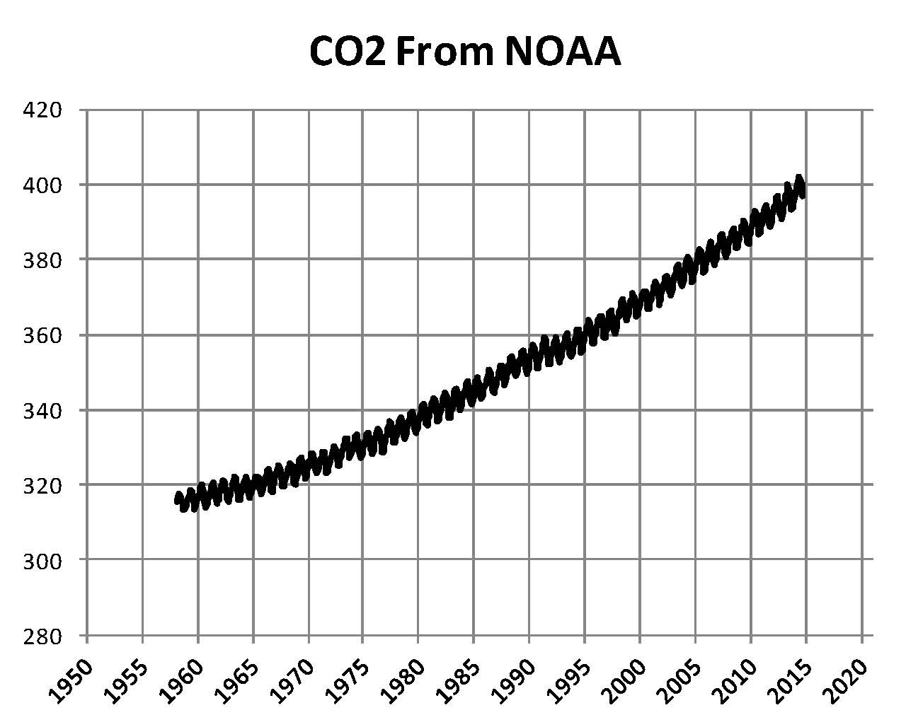
The National Oceanic and Atmospheric Administration (NOAA) was formed on October 3, 1970, out of existing agencies that were among the oldest in the federal government. Some of these were the United States Coast and Geodetic Survey, formed in 1807; the Environmental Science Services Administration (ESSA) formed in 1965 from the Weather Bureau formed in 1870; and the Bureau of Commercial Fisheries, formed in 1871. The purpose for NOAA was for better protection of life and property from natural hazards, for a better understanding of the total environment and for exploration and development leading to the intelligent use of our marine resources. NOAA’s ESRL Carbon Cycle Greenhouse Gases (CCGG) group makes ongoing discrete measurements from land and sea surface sites and aircraft, and continuous measurements from baseline observatories and tall towers. These measurements document the spatial and temporal distributions of carbon-cycle gases and provide essential constraints to our understanding of the global carbon cycle. Of particular importance is the Earth Systems Research Laboratory (ESRL) section formed in October 1, 2005. ESRL is important as it publishes the CO2 level of the planet monthly from its Mauna Loa facility.

Two years later in 1972 another UN agency the United Nations Environment Program (UNEP) was formed to assist developing countries do so with sound polices. United Nations Conference on the Human Environment, having met at Stockholm from 5 to 16 June 1972, made a statement part of which is, “… having considered the need for a common outlook and for common principles to inspire and guide the peoples of the world in the preservation and enhancement of the human environment …” and then they established a set of principles and an international forum, which would have a major impact on the world later.

In 1979 the National Academy of Science (NAS) formed an ad hoc committee to study the climate concern issue which was established because of a just published alarming report by the European Scientific Committee on Problems of the Environment (SCOPE) which had been formed in 1969 which showed CO2 levels reaching level up to 500 to 600 ppm by 2020. The NAS issued a report, now called the Charney Report, that took James Hansen’s high estimate of 4.0 C and added .5 degrees C to it and then took Syukuro Manabe’s low estimate of 2.0 C and subtracted .5 from it and then average the two which then gives us 1.5 C Low 3.0 C expected and 4.5 C high which is what the IPCC is still using today as shown in the IP{CC Fifth assessment report (AR5) finalized in 2014 thirty five years later, this is despite a downward trend in sensitivity estimates ever since then discussed later. Hansen (NASA) and Manabe (NOAA) were the only two that had climate models that were reviewed in the Charney Report.

The principle architect of the anthropogenic climate change theory was James Edward Hansen and according to Wikipedia he is “… an American adjunct professor in the Department of Earth and Environmental Sciences at Columbia University. Hansen is best known for his research in the field of climatology, his testimony on climate change to congressional committees in 1988 that helped raise broad awareness of global warming, and his advocacy of action to avoid dangerous climate change.” From 1981 to 2013, he was the head of the NASA Goddard Institute for Space Studies in New York City, a part of the Goddard Space Flight Center in Greenbelt, Maryland. Hansen, while at NASA in a leadership role, was the driver for the US governments push for control of energy and therefore we must look at his work since it is, if not the primary driver certainly one of the main drivers of world policy on climate today. Hansen retired from NASA in April of 2013 and is now active in the environmental movement.

From the NASA website, “In particular Hansen gave a presentation to the US congress in 1988 where he showed them what he thought would happen to Global Climate if we did not stop putting CO2 into the earth’s atmosphere. In the original 1988 paper, three different scenarios were used A, B, and C. They consisted of hypothesised future concentrations of the main greenhouse gases – CO2, CH4, CFCs etc. together with a few scattered volcanic eruptions. The details varied for each scenario, but the net effect of all the changes was that Scenario A assumed exponential growth in forcings, Scenario B was roughly a linear increase in forcings, and Scenario C was similar to B, but had close to constant forcings from 2000 onwards. Scenario B and C had an ‘El Chichon’ sized volcanic eruption in 1995. Essentially, a high and low estimate was chosen to bracket the expected value. Hansen specifically stated that he thought the middle scenario (B) the “most plausible”.

From NASA we find the following Chart of Hansen’s Various Scenario’s these three scenarios are the base for the IPCC climate models. Altithermal time means the period 6,000 to 10,000 years before the present (end of the last Ice Age) where the temperatures were .5 degrees higher than the NASA base of 14.0 degrees Celsius (explained later). Eemian times means 120,000 years before the present where the temperature was estimated to be 1.0 degrees higher than the NASA base. I have no idea why these times were picked as they have no significance to the present and are based on proxy data which means the uncertainty of the values is high.

BM-10

The next Chart shows the key value of 3.0 degrees Celsius as the CO2 Sensitivity value for a doubling of CO2 which was developed in part by NAS in 1979 with the help of Hansen to produce Scenario B. The equation shown in the next Chart is CO2 used to determine the increase in the planets temperature at any given level of CO2. It’s a log function and so matter what value is used 1, 2 or 3 the climate effect tappers off at some point. The vertical black line at 400 ppm is where we are now; and since it crosses the red plot at 26.0 degrees Celsius that is how much of the planets temperature is because of CO2. We will discuss this in more detail later as there is a problem with this value.

BM-15

Hansen’s work then lead to the formation of the Intergovernmental Panel on Climate Change (IPCC) in 1988. The IPCC was set up by the World Meteorological Organization (WMO) and the United Nations Environment Program (UNEP) to prepare, based on available scientific information, assessments on all aspects of climate change and its impacts, with a view of formulating realistic response strategies. This last group came about as the environmental movement became concerned of the rapid industrial development and the resulting in increases of CO2 from burning fossil fuels since CO2 is known to have an effect on climate by aiding in trapping Infar red radiation and adding to the temperature of the planet.

The IPCC doesn’t do research so the information they use comes predominantly from four sources the National Aeronautics and Space Administration Goddard Institute for Space Studies (NASA-GISS) and the National Oceanic & Atmospheric Administration Carbon Cycle Greenhouse Gas Group (NOAA-CCGG) in the U.S. and the Met Office Hadley Centre (UKMO) and the Climate Research Unit University of East Anglia (CRU) in the United Kingdom (UK). Others are involved as well such as the European Space Agency (ESA) but these four agencies at the direction of political elements within their governments are the primary drivers of this concept. In the balance of this paper we will use NASA and NOAA.

The first major program to began the task of changing how the entire world would adapt to the “required” reductions in CO2 was made public at the UN Conference on Environment and Development (Earth-Summit), held in Rio-de-Janeiro on June 13, 1992, where 178 governments voted to adopt the program called UN Agenda 21. The final text was the result of drafting, consultation, and negotiation, beginning in 1989 and culminating at the two-week conference. Agenda 21 is a 300-page document divided into 40 chapters that have been grouped into 4 sections that was published in book form the following year:

Section I: Social and Economic Dimensions is directed toward combating poverty, especially in developing countries, changing consumption patterns, promoting health, achieving a more sustainable population, and sustainable settlement in decision making.

Section II: Conservation and Management of Resources for Development Includes atmospheric protection, combating deforestation, protecting fragile environments, conservation of biological diversity (biodiversity), control of pollution and the management of biotechnology, and radioactive wastes.

Section III: Strengthening the Role of Major Groups includes the roles of children and youth, women, NGOs, local authorities, business and industry, and workers; and strengthening the role of indigenous peoples, their communities, and farmers.

Section IV: Means of Implementation: implementation includes science, technology transfer, education, international institutions and financial mechanisms.

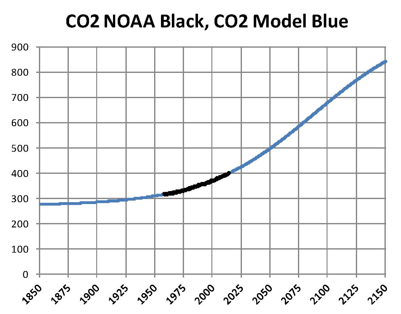
The goal of UN Agenda 21 is to create a world economic system that equalizes world incomes and standards of living and at the same time reduces CO2 levels back to the levels that existed prior to the industrial age of ~300 ppm. We are now at 400 ppm and growing at a geometrically increasing rate now a bit over 2 ppm per year and at that rate we will reach 500 ppm in 2050 at which point the UN Climate models and there spokespersons Al Gore and James Hansen say we will have an ecological and economic disaster that is irreversible.

The study of climate change centers on four items. The First is archeological records of climate as developed prior to this current debate. The Second is accurate measurements of current and past atmospheric CO2. The Third is accurate measurements of current and past global temperatures. The Fourth is a means of looking at these items to determine relationship, if any.

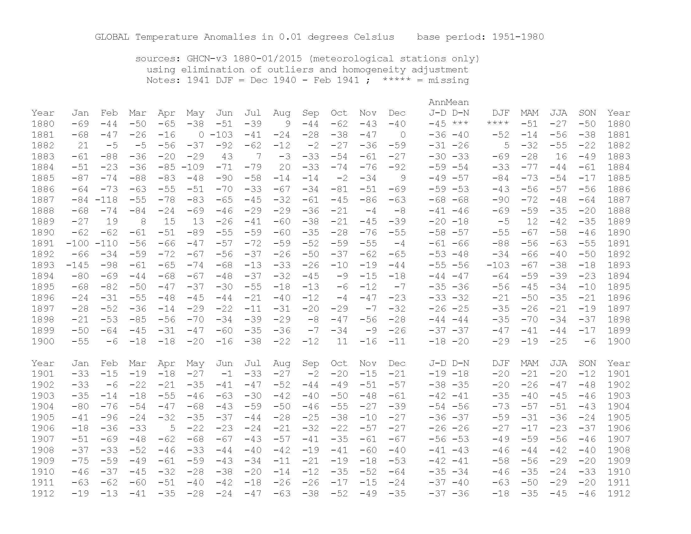
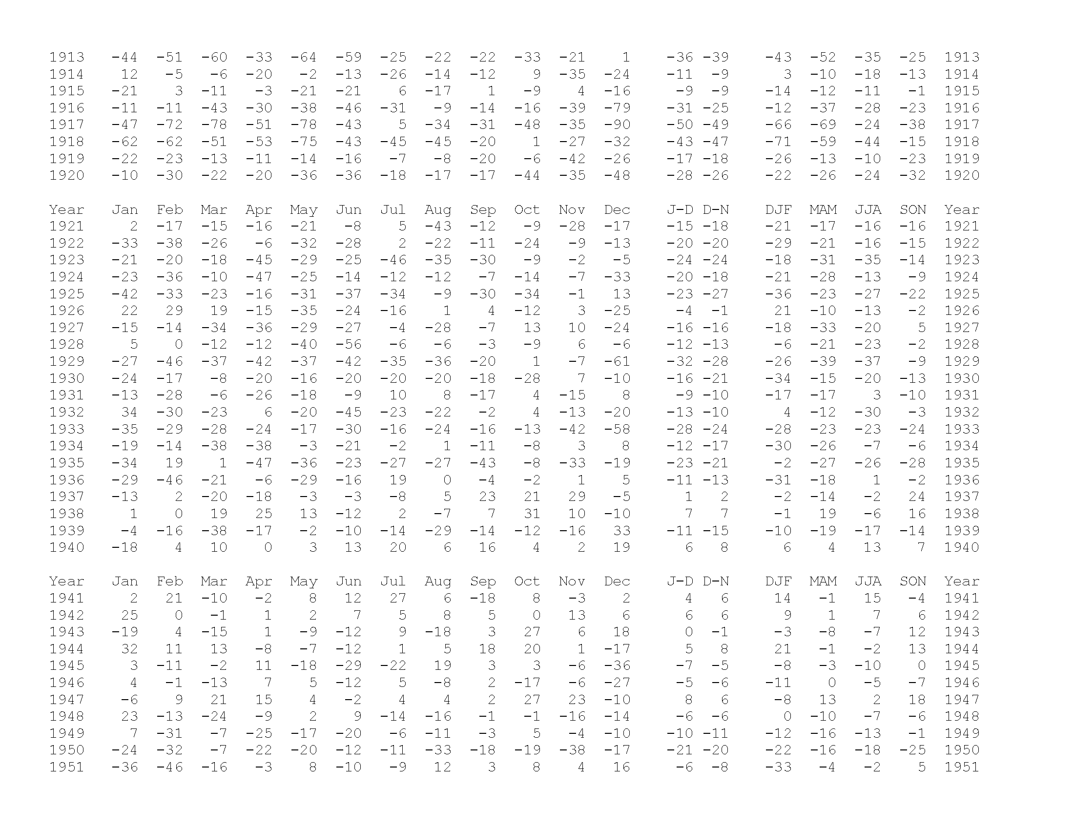
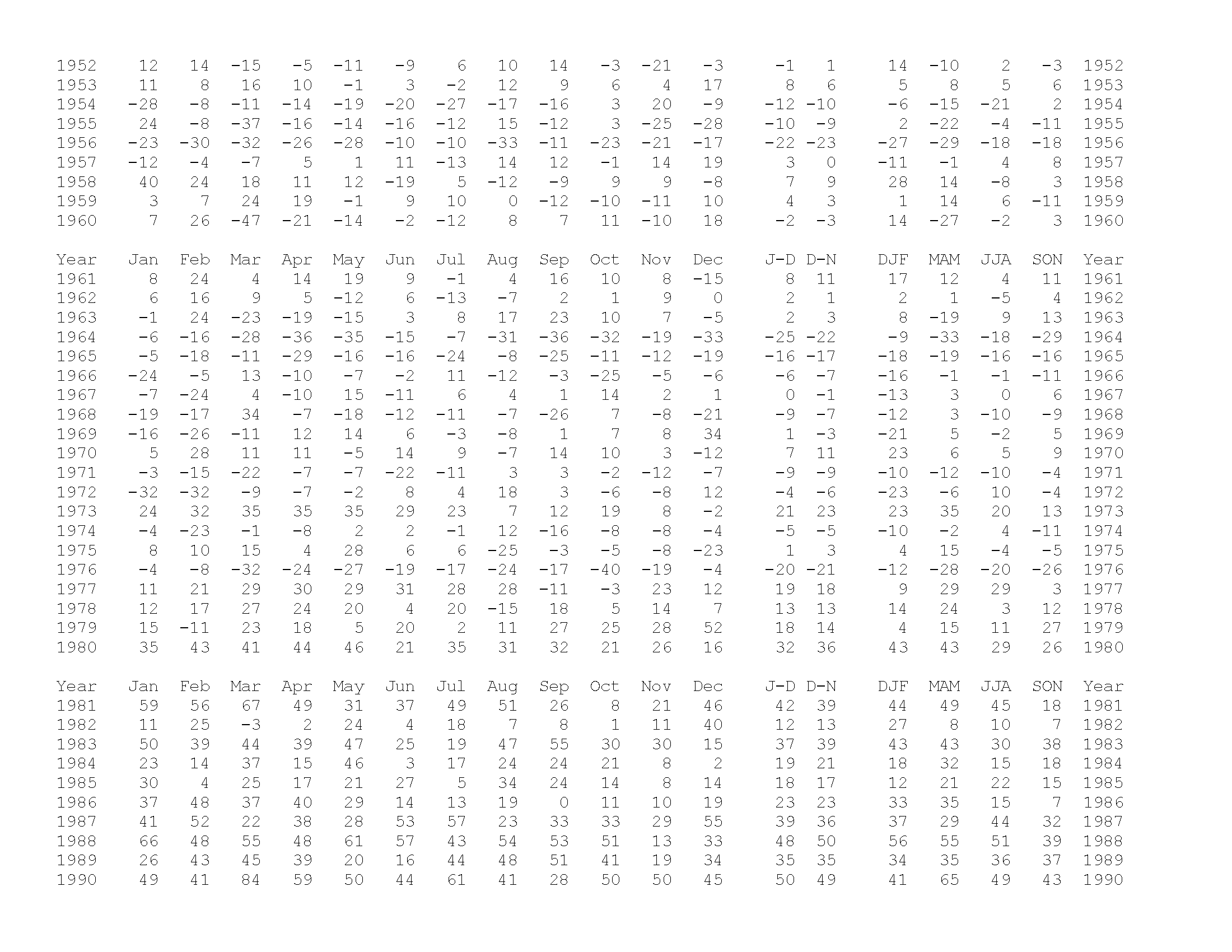
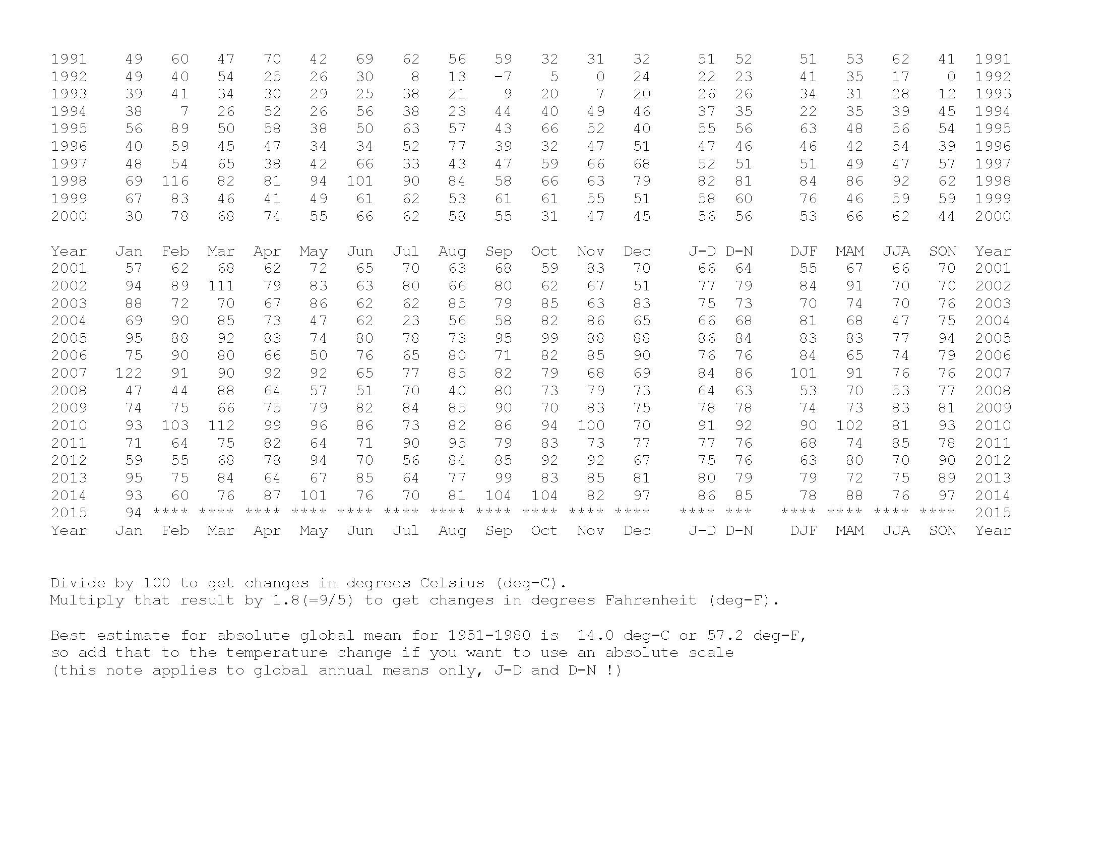
The first is generally available and not an issue. The second is also generally available for the past and the current values, since 1958 are published by NOAA each month as a part per million by volume (ppmv) . The third is also available from NASA but there are concerns over the methodology used by NASA to determine the global temperature; for now we’ll use what NASA publishes in the Land Ocean Temperature Index (LOTI) as the value. The fourth is complicated and the purpose here is to properly blend the variable so they can be compared.

Since NASA publishes temperatures as an anomaly an explanation is required. NASA publishes a Global temperature each month as an anomaly which is determined as follows. First a base temperature is determined and according to NASA it is 14.0 degrees Celsius which is the average temperature from 1951 to 1980. Next the current temperature is determined by software then the base is subtracted from it and the value is multiplied by 100. For example if the current temperature is 14.5 degrees C subtracting 14.0 we get .50 multiplying that by 100 gives us an anomaly of 50. If the current temperature is 13.5 we subtract 14.0 and get -.5 and multiplying that we get an anomaly of -50. If an actual temperature is required we reverse the process.

This completes the basic history of the current situation although most that read this already know the details its always good to review the facts before diving into the conflict. The next post will be on Carbon Dioxide and Water which are the two molecules that allow us to live on this planet.


Obama’s Climate change Plan for 2015!


Five days ago on February 14th the Obama administration through NASA released a new set of temperature data that purported to show that 2014 was the hottest year on record. Since that date in previous posts here I have show how that was done by changing history, which Obama is good at!  As it becomes know what NASA did in the coming weeks a new attack on the credibility of the Flat Earthers’ will be started which will go as far as censorship once Net Neutrality is imposed later this year. I will continue to post on this subject as long as I can before I am shut down!

In my professional opinion this data manipulation that was done for the February temperature release cannot be achieved in the process that NASA uses to produce the LOTI unless it was specifically programmed in; therefore it is not real and it is political.

There is no valid reason for doing this data manipulation and the only reason is that the United Nations Climate Change Conference (COP21) will be held in France at the Le Bourget site from 30 November to 11 December 2015 and the conference objective is to achieve a legally binding and universal agreement on climate, from all the nations of the world. To achieve this they have determined that they need to show that the planet is overheating and since it is not (by satellite data) they need to show it in another form, hence the data manipulation at NASA-GISS

I cannot stress this enough there can be no other reason for what was just done by NASA. We are going to be shown false data from NASA-GISS for the next 10 months leading up to this conference such that they hope there will be support for the treaty that they want which will be a massive tax on America and Europe so that development can be forced on other areas. This will be in line with the already approved UN Agenda 21 which is already being implemented in the United States.

As new monthly data is published I will show what NASA at the request of Obama is doing.I hope others see what is being done and will also go on the offensive there perversion of science needs to be stopped and I would hope that some of the remaining honest scientists at NASA come forward even though it may cost them their jobs it will at least not cost them their soul!

NASA-GISS Data Manipulation is FACT not Speculation V2!


Sunday, February 15, 2015, I posted a paper here were I accused NASA-GISS of data manipulation with the only possible purpose for doing this was to misleading the public about what they call Climate Change caused by Mankind. Since their theory is not sound and its based on speculation more than true science the results of their Global Climate Models (GCM’s) do not match measured global temperatures. Normally when this happens the scientific community has corrected their theories and eventually found the truth. In this case the politicians seeking power and taxes have prevented the truth from coming out as they have now taken over the scientific community for their own purposes which are not good. The NASA LOTI that was just published for January 2015 is a prime example of what has been done to a previously honest system. I place the blame for this solely at the feet of the former VP of the United States Al Gore.

100 data manipulation

This Chart was first shown here on February 15th with an explanation of how it was created from two sets of NASA-GISS data one for December 2014 (green plot) and the other for January 2015 (red Plot). Then earlier this morning I posted both sets of NASA data so it can be seen that I have made up nothing, I’m not NASA. To this chart I have added a black oval a blue arrow and a red arrow here. I must also say that since I have worked mostly in technical fields my entire carrier and I have taken many college level math and statistical courses, that I have a decent feel for data, cause and effect and forecasting

NASA uses a complex computer program that takes all the available world temperatures and through a formula they have developed they create the LOTI table each month representing a history of the world’s temperature back to January 1880. Now I realize that history today is not fixed but I did think that science was above revisionist history, but apparently not. The Chart above shows three things that cannot occur randomly and must be programmed in, therefore they were done intentionally and for a political purpose.

The first thing that stands out is that the two plots are not the same. The second thing is that temperatures from 1970 to the present have been shifted up red arrow and the next thing is that temperatures from 1910 back to 1880 have been shifted down blue arrow. Lastly there is a period from 1950 to 1970 where there was no change black oval. The black oval contains the base period for NASA so it can’t change by definition and it doesn’t change. That period was fixed a long time ago at 14.0 degrees Celsius and that value cannot be allowed to change.

Now enter the politics and the push for a climate change treaty where we have been told over the past 20 plus years that the use of fossil fuels is driving up CO2 and that is the reason we have climate change, formally global warming. In my next post later this week I’ll show how that was developed and why it was wrong. To support the climate treaty they need to show that the global temperature is, in fact, going up. The problem is that the increases in temperatures stopped almost ten years ago, although because of variations it wasn’t as obvious as it is now. BTW the satellite data does not support this increase.

The politicians needed to show that 2014 was very hot to support the adaption of the treaty planed for the end of 2015; and also that 2015 will be even hotter than 2014. NASA was therefore directed to show that temperatures were going up in support of this planned treaty. Can I prove this, no not directly but the published data shows that this is being done and the scientists at NASA would not do this unless they were directed to do this. So they pushed down temperatures from 1880 to 1910 blue arrow and then pushed up all the temperatures from 1970 to the present red arrow; giving us the red plot.

In my professional opinion this “change” cannot be done in the process that NASA uses to produce the LOTI unless it was programmed in; therefore it is not real and it is political. Further I assert that this false data will be continued for the rest of this year so that “they” can claim that “they” need this climate treaty or we are all doomed. According to “them” and this January 2015 release 2014 was the hottest year on record. The follow on for the next 10 months will be that 2015 will be even hotter than 2014.

There is no valid reason for doing this data manipulation and the only reason is that the United Nations Climate Change Conference (COP21) will be held in France at the Le Bourget site from 30 November to 11 December 2015 and the conference objective is to achieve a legally binding and universal agreement on climate, from all the nations of the world. To achieve this they have determined that they need to show that the planet is overheating and since it is not (by satellite data) they need to show it in another form, hence the data manipulation at NASA-GISS

I cannot stress this enough there can be no other reason for what was just done. We are going to be shown false data from NASA-GISS for the next 10 months until this conference such that they hope there will be support for the treaty that they want which will be a massive tax on America and Europe so that controlled development can be forced on other areas of the planet. This will be in line with the already approved UN Agenda 21 which is already being implemented in the United States.

The real goal here has nothing to do with CO2 or climate those are only the tools to force a change from representative government to one controlled by the powerful elites (business leaders and politicians); such as now exists in the EU where the government body of the EU is not elected by the people yet their ruling are binding on the people. The result of this conference and treaty, if adopted will either give the sovereign power of the countries to the UN or to some other body. What will come of that is unknown but we do know from past history that concentrated power is never good.


Sir Karl Raimund Popper (28 July 1902 – 17 September 1994) was an Austrian and British philosopher and a professor at the London School of Economics. He is considered one of the most influential philosophers of science of the 20th century, and he also wrote extensively on social and political philosophy. The following quotes of his apply to this subject.

If we are uncritical we shall always find what we want: we shall look for, and find, confirmations, and we shall look away from, and not see, whatever might be dangerous to our pet theories.

Whenever a theory appears to you as the only possible one, take this as a sign that you have neither understood the theory nor the problem which it was intended to solve.

… (S)cience is one of the very few human activities — perhaps the only one — in which errors are systematically criticized and fairly often, in time, corrected


Copy of NASA-GISS LOTI published for January 2015


I made some strong accusations Sunday and just so there is no  question about the source of my information that I used, here is the NASA-GISS LOTI for January 2015 exactly as available when it was issued. According to NASA they do not archive the older reports as the newer ones are ALL WAYS the most accurate one.

GLOBAL Land SEA Temperature 2015-01_Page_1GLOBAL Land SEA Temperature 2015-01_Page_2

GLOBAL Land SEA Temperature 2015-01_Page_3

GLOBAL Land SEA Temperature 2015-01_Page_4

Analysis of Global Temperature Trends, January 2015 What’s really going on with the Climate?


I have been publishing this report every month for the past year but this will be the last one as NASA has now corrupted the LOTI data so badly that any future issues of the table will be worthless. Yesterday after reviewing the January LOTI I found that the entire data series has been changed (See the previous post for the details) such that the past has been made significantly colder and the present significantly warming that what has been shown up though last month. Since the work shown here is based on the old information it is no longer relevant and there is no point to showing it. What follows now is the report from December 2014 with the inclusion of the new charts from the January data following it. The sections in italics with the underline are the explanations.

The analysis and plots shown here are based on the following: first NASA-GISS temperature anomalies (converted to degrees Celsius so non-scientists will understand the plots) as shown in their table LOTI, second James E. Hansen’s Scenario B data, which is the very core of the IPCC Global Climate models (GCM’s) and which was based on a CO2 sensitivity value of 3.0O Celsius, lastly, a plot based on an alternative climate model designated ‘PCM’ and based on a sensitively value of .65O Celsius.

The next three paragraphs have been added to this monthly temperature plot to clear up confusion regarding the methods used in this work. That confusion is my fault for not properly explaining what is shown here.

An explanation of the alternative model designated PCM is in order since many have interpreted this PCM model as a statistical least squares projection of some kind and nothing could be further from the truth. A decade ago when I started this work the first thing I did was look at geological temperature changes since it is well know that the climate is not a constant; I learned that in my undergrad climatology course in 1964. One quickly finds that there is a clear movement in global temperatures with a 1,000 some year cycle going back at least 3,000 to 4,000 years. There are also 60 to 70 year cycles in the Pacific and the Atlantic oceans that are well documented. We also know that there are greenhouse gases such as Carbon Dioxide and the National Academy of Sciences (NAS) estimated that Carbon Dioxide had a doubling rate of 3.0O Celsius plus or minus 1.5O Celsius in 1979

The IPCC still uses the NAS 3.0O Celsius as the sensitivity value of Carbon Dioxide and a number in that range is required to make the IPCC GCM’s work. The problem with using this value is it leaves no room for other factors and hence the need of the infamous Hockey Stick plots of the IPCC from Mann, Bradley & Hughes in 1999. The PCM model is based on a much lower value for Carbon Dioxide consistent with current research which places the value between 0.65O and 1.5O Celsius per doubling of Carbon Dioxide. If the long and short movement in temperatures and a lower value for Carbon Dioxide are properly analyzed and combined a plot that matched historical and current NASA temperature estimates very well can be constructed. This is not curve fitting.

The PCM model is such a construct and it is not based on statistical analyses of raw data. It is based on creating curves that match observations (which is real science) and those observations appear to be related to the movement of water in the world’s oceans. The movements of ocean currents is well documented in the literature all that was done here was properly combine the separate variables into one curve which had not been previously done. Since this combined curve is an excellent predictor of global temperatures unlike the IPCC GCM’s it appears to reflect reality a bit better than the convoluted IPCC GCM’s which after the past 19 years of no statistical warming have been shown to be in error.

Now, continuing from the first paragraph, to smooth out monthly variations a 12 month running average is used in all the plots. This information will be shown in four tables and updated each month as the new data comes in about the middle of the month. Since no model or simulation that cannot reasonably predict that which it was design to do is worth anything the information presented here definitively proves that NASA, NOAA and the IPCC just don’t have a clue.

This chart is from the December data.

2014.12 PCM plot

The next Chart was created from the January 2015 data and you can see that there is a major change since current temperatures have been moved up to more closely follow that of the IPCCC GCM’s. The anomalies are still not as much as the models indicate but they are a lot closer. I suspect that over the next 10 months they will get a lot closer so that The COP21 conference will have justification for the climate treaty that they want to initiate.

2015.01 PCM plot

The balance of this paper is from the December 2014 paper.

The first plot, UL is a plot of the NASA temperature anomaly converted to degrees Celsius and shown in red with a black trend line added. There has been a very clear reversal in the upward movement of global temperatures since about 2001 and neither the UN IPCC nor anyone else has an explanation for this 13 years later. Since CO2 has continued to increase at what could be argued an increasing rate this raises serious doubts about the logic programmed into all the IPCC global climate models.

The next plot UR, also in red, shows the IPCC estimates of what the Global temperature should be, based on Hansen’s Scenario B, with the NASA actual temperatures’ subtracted from them. Therefore this plot represents a deviation from what the Climate “believers” KNOW what the temperature should be; with a positive value indicating the IPCC values are higher than actual and a negative value indicating the IPCC values are lower than actual, as measured by NASA. A black trend line is added and we can clearly see that the deviation from expected is increasing at an increasing rate. This makes sense since the IPCC models project increased temperatures based primarily on the increasing level of CO2 in the earth’s atmosphere. Unfortunately, for them, the actual temperatures from NASA are trending down (even as they try to hide the down ward movement with data manipulation) since other factors are in play, therefore each year the gap between them widens. Since we have 13 years of observations’ showing this pattern it becomes hard to justify a continuing belief in the IPCC climate models, there is obviously something very wrong here.

The next plot LL shown in blue is based on the equations in the PCM climate model described in previous papers and posts here and since it is generated by “equations” a trend line is not needed. As can be seen the PCM, LL, and the NASA, UL, trend plots are very similar the reason being that in the PCM model there is a 68.2 year cycle that moves the trend line up and then down a total of .30O Celsius (currently negative .0070O Celsius per year); and we are now in the downward portion of that trend which will continue until around 2035. This short cycle is clearly observed in the raw NASA data in the LOTI table going back to 1868. Then there is a long trend, 1052.6 years with an up and down of 1.36O Celsius (currently plus .0029O Celsius per year) also observed in the NASA data. Lastly there is CO2 adding about .005O Celsius per year so they basically wash out which matches the current holding pattern we are experiencing. However within a few years the increasing downward trend of the short cycle will overpower the other two and we will see drop of about .002O Celsius per year and that will be increasing until till around 2025 or so. After about 2035 the short cycle will have bottomed and turn up and all three will be on the upswing again. These are all round numbers shown here as representative values.

The last plot LR in blue uses the same logic as used in the UR plot, here we use the PCM estimates of what the Global temperature should be with the NASA actual temperatures’ subtracted from them. A positive value indicates the PCM values are higher than actual and a negative value indicates the PCM values are lower than expected. A black trend line was added and it clearly shows that the PCM model is tracking the NASA actual values very closely. In, fact since 1970 the PCM model has rarely been off by more than +/- .1 degrees Celsius and has an average trend of almost zero error, while the IPCC models are erratic and are now approaching an error rate of +.5O above expected.

In summary, the IPCC models were designed before a true picture of the world’s climate was understood. During the 1980’s and 1990’s CO2 levels were going up and the world temperature was also going up so there appeared to be correlation and causation. The mistake that was made was looking at only a ~20 year period when the real variations in climate move in much longer cycles. Those other cycles can be observed in the NASA data but they were ignored for some reason. By ignoring those trends and focusing only on CO2 the models will be unable to correctly plot global temperatures until they are fixed.

Lastly the next Chart shows what a plot of the PCM model would look like from the year 1000 to the year 2200. The plot matches reasonably well with history and fits the current NASA-GISS table LOTI date very closely. Again this plot is a combination of three factors a long cycle probably in ocean currents, a short cycle probably related more to atmospheric effect from the ocean and a factor for CO2 using a much smaller sensitivity value than the IPCC. I understand that this model is not based on physics but it is also not curve fitting. It’s based on observed reoccurring patterns in the climate. These patterns can be modeled and when they are you get a plot that works better than the IPCC’s GCM. If the conditions that create these patterns do not change and CO2 continues to increase to 800 ppm or even 1000 ppm than this model will work into the foreseeable future. Two hundred years from now global temperatures will peak at around 15.5 to 15.7 degrees C and then will be on the downside of the long cycle for the next 500 years. The overall effect of CO2 reaching levels of 1000 ppm or higher will be between 1.0 and 1.5 degrees C which is about the same as that of the long cycle.

Carbon Dioxide is not capable of doing what Hansen and Gore claim!

The change in data has clearly shifted the temperatures, in red, away from the PCM model plot, in Blue, so there is no long any justification for this model.

2015.01 PCM plot V2

The purpose of this post is to make people aware of the errors inherent in the IPCC models so that they can be corrected.

Sir Karl Raimund Popper (28 July 1902 – 17 September 1994) was an Austrian and British philosopher and a professor at the London School of Economics. He is considered one of the most influential philosophers of science of the 20th century, and he also wrote extensively on social and political philosophy. The following quotes of his apply to this subject.

If we are uncritical we shall always find what we want: we shall look for, and find, confirmations, and we shall look away from, and not see, whatever might be dangerous to our pet theories.

Whenever a theory appears to you as the only possible one, take this as a sign that you have neither understood the theory nor the problem which it was intended to solve.

… (S)cience is one of the very few human activities — perhaps the only one — in which errors are systematically criticized and fairly often, in time, corrected