How can 2014 be the hottest year on record and at the same time we are getting record ice? One of the other is wrong!


How can 2014 be the hottest year on record and at the same time we are getting record ice? One of the other is wrong!
Black energy is absorbing the global warming heat so the satellites can’t messages it.
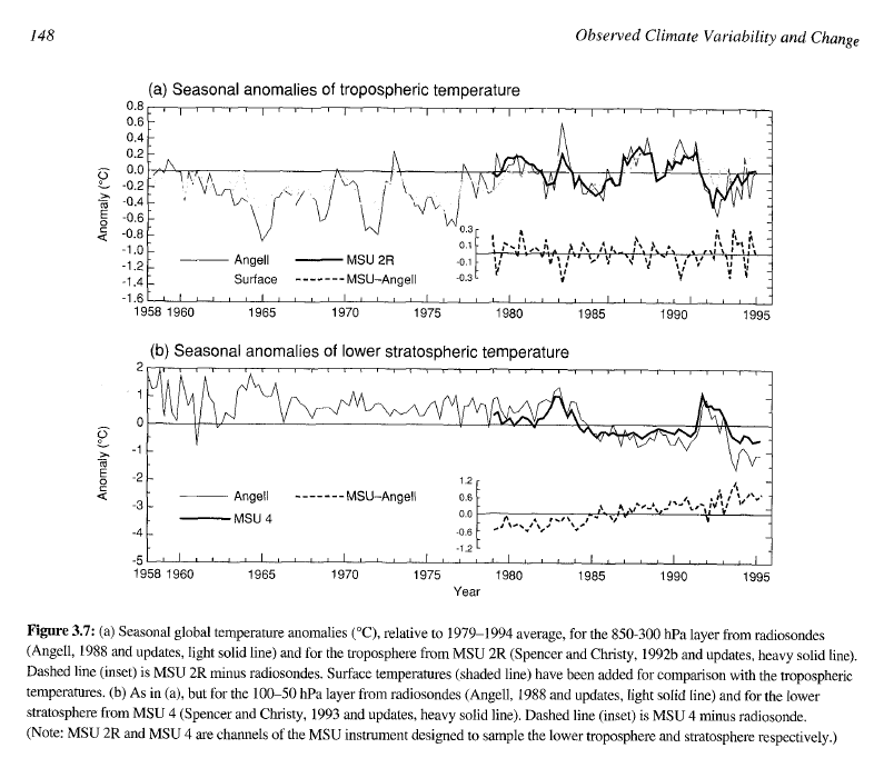
As of 1995, neither NOAA radiosonde nor NASA satellites showed any post 1958 warming. Graph below is from the 1995 IPCC report.
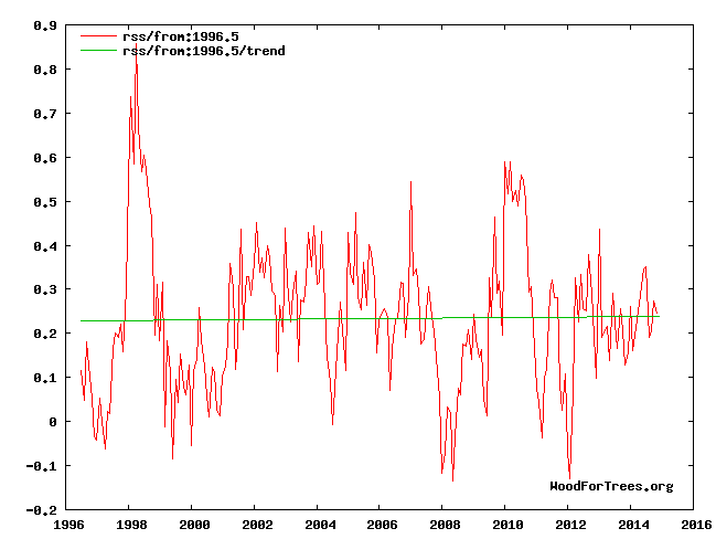
 Since 1996, there has also been no global warming.
Apparently all global warming occurred during 1995.
There are just way to many harmonics caused by the uneven blade loading same problem they had with the gear boxes!
De Bilt reports on yet another serious turbine failure. This time the 100m structure folded at a weld line some 30m off the ground. This is of great concern. Whereas most catastrophic failures are due to installation errors at the base bolts, this is a problem with the specification or execution of the construction of the monocoque structure – the main tower.
There’s a fundamental problem here. When steel is welded, the structure of the material either side of the joint, and the weld itself is different to the rolled steel sheet. This inevitably creates a location where stress gets concentrated more as the structure ages.
View original post 260 more words

The only real question is do we have Accuracy and precision and I think the answer is no — so beating small differences are meaningless to my way of thinking.
Anyone who reads this post would like the Post I just put on my blog under Climate Research. no one has believed the model I have despite it being dead on since it was finalized in 2009.
Guest post from Peter Morecambe aka ‘Galloping Camel’
CLIMATE SCIENCE
The Kyoto Protocol
Elites around the world tend to believe that rising levels of CO2 in our atmosphere will cause catastrophic climate changes. Collectively they wield enough power to shape energy policies in many nations according to commitments laid down in the “Kyoto Protocol” and subsequent accords. It is interesting to compare the fate of the Kyoto Protocol based on the work of “Climate Scientists” such as Michael Mann with that of the Montreal Protocol based on the work of people like McElroy.
The Montreal Protocol essentially banned the production of Freon and similar compounds based on the prediction that this would reduce the size of the polar “Ozone Holes”. After the ban went into effect the size of the ozone holes diminished. This may mean that the science presented by McElroy and his cohorts was “Robust” or it may…
View original post 1,866 more words
The entire 2 degree C limit was made up and based on nothing!
Bob Tisdale - Climate Observations
UPDATE: At the end of the post, I’ve added the graph being used as the Feature Image at WUWT.
# # #
Politicians from around the globe gather annually in the UNFCCC meetings so they can propose and fail to come to worthwhile agreements on how to limit global warming and its impacts. Year in, year out, same thing. For the results of the most recent failed gathering, see the WattsUpWithThat post GWPF Welcomes Non-Binding And Toothless UN Climate Deal. One of the primary factors that drive the politicians is an attempt to limit global warming to 2-deg C above preindustrial values, where preindustrial is considered the mid-to-late 1800s.
But where did that 2 deg C limit come from?
View original post 618 more words
The analysis and plots shown here are based on the following: first NASA-GISS temperature anomalies (converted to degrees Celsius) as shown in their table LOTI, second James E. Hansen’s Scenario B data, which is the very core of the IPCC Global Climate models (GCM’s) and which was based on a CO2 sensitivity value of 3.0O Celsius, lastly, a plot based on an alternative climate model designated ‘PCM’ and based on a sensitively value of .65O Celsius.
The next three paragraphs have been added to this monthly temperature plot to clear up confusion regarding the methods used in this work. That confusion is my fault for not properly explaining what is shown here.
An explanation of the alternative model designated PCM is in order since many have interpreted this PCM model as a statistical least squares projection of some kind and nothing could be further from the truth. A decade ago when I started this work the first thing I did was look at geological temperature changes since it is well know that the climate is not a constant; I learned that in my undergrad climatology course. One quickly finds that there is a clear movement in global temperatures with a 1,000 some year cycle going back at least 3,000 to 4,000 years. There are also 60 to 70 year cycles in the Pacific and the Atlantic oceans that are well documented. We also know that there are greenhouse gases such as Carbon Dioxide and the National Academy of Sciences (NAS) estimated that Carbon Dioxide had a doubling rate of 3.0O Celsius plus or minus 1.5O Celsius in 1979
The IPCC still uses the NAS 3.0O Celsius as the sensitivity value of Carbon Dioxide and a number in that range is required to make the IPCC GCM’s work. The problem with using this value is it leaves no room for other factors and hence the need of the infamous Hockey Stick plot of the IPCC from Mann, Bradley & Hughes in 1999. The PCM model is based on a much lower value for Carbon Dioxide consistent with current research which places the value between 0.65O and 1.5O Celsius per doubling of Carbon Dioxide. If the long movement the short movement and a lower value for Carbon Dioxide are properly analyzed and combined a plot that matched historical and current NASA temperature estimates very well can be constructed.
The PCM model is such a construct and it is not based on statistical analyses of raw data. It is based on creating curves that match observations (which is real science) and those observations appear to be related to the movement of water in the world’s oceans. The movements of ocean currents is well documented in the literature all that was done here was properly combine the separate variables into one curve which had not been previously done. Since this combined curve is an excellent predictor of global temperatures unlike the IPCC GCM’s it appears to reflect reality a bit better than the convoluted IPCC GCM’s which after the past 19 years of no statistical warming have been shown to be in error.
Continuing from the first paragraph, to smooth out monthly variations a 12 month running average is used in all the plots. This information will be shown in four tables and updated each month as the new data comes in about the middle of the month. Since no model or simulation that cannot reasonably predict that which it was design to do is worth anything the information presented here definitively proves that NASA, NOAA and the IPCC just don’t have a clue.
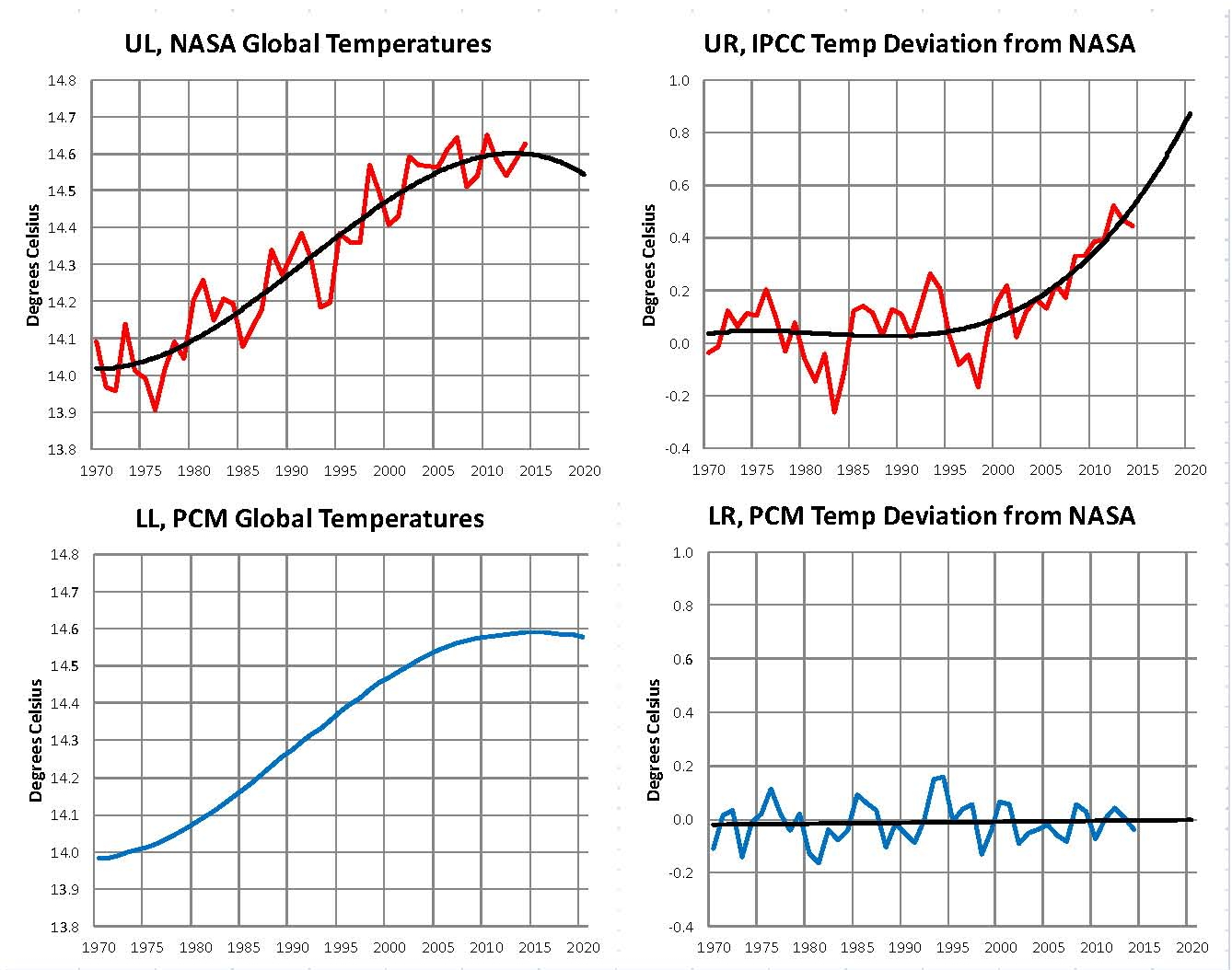
The first plot, UL is a plot of the NASA temperature anomaly converted to degrees Celsius and shown in red with a black trend line added. There has been a very clear reversal in the upward movement of global temperatures since about 2001 and neither the UN IPCC nor anyone else has an explanation for this 13 years later. Since CO2 has continued to increase at what could be argued an increasing rate this raises serious doubts about the logic programmed into all the IPCC global climate models.
The next plot UR, also in red, shows the IPCC estimates of what the Global temperature should be, based on Hansen’s Scenario B, with the NASA actual temperatures’ subtracted from them. Therefore this plot represents a deviation from what the Climate “believers” KNOW what the temperature should be; with a positive value indicating the IPCC values are higher than actual and a negative value indicating the IPCC values are lower than actual, as measured by NASA. A black trend line is added and we can clearly see that the deviation from expected is increasing at an increasing rate. This makes sense since the IPCC models project increased temperatures based primarily on the increasing level of CO2 in the earth’s atmosphere. Unfortunately, for them, the actual temperatures from NASA are trending down (even as they try to hide the down ward movement with data manipulation) since other factors are in play, therefore each year the gap between them widens. Since we have 13 years of observations’ showing this pattern it becomes hard to justify a continuing belief in the IPCC climate models, there is obviously something very wrong here.
The next plot LL shown in blue is based on the equations in the PCM climate model described in previous papers and posts here and since it is generated by “equations” a trend line is not needed. As can be seen the PCM, LL, and the NASA, UL, trend plots are very similar the reason being that in the PCM model there is a 68.2 year cycle that moves the trend line up and then down a total of .30O Celsius (currently negative .0070O Celsius per year); and we are now in the downward portion of that trend which will continue until around 2035. This short cycle is clearly observed in the raw NASA data in the LOTI table going back to 1880. Then there is a long trend, 1052.6 years with an up and down of 1.36O Celsius (currently plus .0029O Celsius per year) also observed in the NASA data. Lastly there is CO2 adding about .005O Celsius per year so they basically wash out which matches the current holding pattern we are experiencing. However within a few years the increasing downward trend of the short cycle will overpower the other two and we will see drop of about .002O Celsius per year and that will be increasing until till around 2025 or so. After about 2035 the short cycle will have bottomed and turn up and all three will be on the upswing again. These are all round numbers shown here as representative values.
The last plot LR in blue uses the same logic as used in the UR plot, here we use the PCM estimates of what the Global temperature should be with the NASA actual temperatures’ subtracted from them. A positive value indicates the PCM values are higher than actual and a negative value indicates the PCM values are lower than expected. A black trend line was added and it clearly shows that the PCM model is tracking the NASA actual values very closely. In, fact since 1970 the PCM model has rarely been off by more than +/- .1 degrees Celsius and has an average trend of almost zero error, while the IPCC models are erratic and are now approaching an error rate of +.5O above expected.
In summary, the IPCC models were designed before a true picture of the world’s climate was understood. During the 1980’s and 1990’s CO2 levels were going up and the world temperature was also going up so there appeared to be correlation and causation. The mistake that was made was looking at only a ~20 year period when the real variations in climate move in much longer cycles. Those other cycles can be observed in the NASA data but they were ignored for some reason. By ignoring those trends and focusing only on CO2 the models will be unable to correctly plot global temperatures until they are fixed.
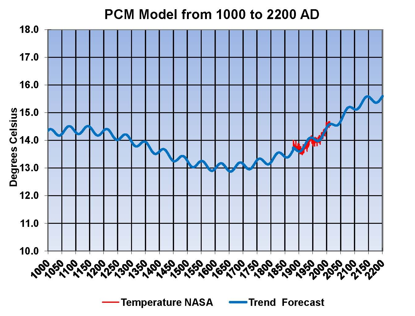
Lastly the next Chart shows what a plot of the PCM model would look like from the year 1000 to the year 2200. The plot matches reasonably well with history fits the current NASA-GISS table LOTI date very closely. Again this plot is a combination of three factors a long cycle probably in ocean currents, a short cycle probably related more to atmospheric effect from the ocean and a factor for CO2 using a much smaller sensitivity value than the IPCC. I understand that this model is not based on physics but it is also not curve fitting. It’s based on observed reoccurring patterns in the climate. These patterns can be modeled and when they are you get a plot that works better than the IPCC’s GCM’s. If the conditions that create these patterns do not change and CO2 continues to increase to 800 ppm or even 1000 ppm than this model will work into the foreseeable future.
The purpose of this post is to make people aware of the errors inherent in the IPCC models so that they can be corrected.
Sir Karl Raimund Popper (28 July 1902 – 17 September 1994) was an Austrian and British philosopher and a professor at the London School of Economics. He is considered one of the most influential philosophers of science of the 20th century, and he also wrote extensively on social and political philosophy. The following quotes of his apply to this subject.
If we are uncritical we shall always find what we want: we shall look for, and find, confirmations, and we shall look away from, and not see, whatever might be dangerous to our pet theories.
Whenever a theory appears to you as the only possible one, take this as a sign that you have neither understood the theory nor the problem which it was intended to solve.
… (S)cience is one of the very few human activities — perhaps the only one — in which errors are systematically criticized and fairly often, in time, corrected

Still no warming and the longer this goes on the worse the IPCC will look. My work indicated a slight downward trend leveling off between 2030 and 2035. I’ll be posting my monthly report this morning.
This is exactly what they are doing, making the past colder to make the present warmer!
Flashes between GISS 1999, and GISS 2014
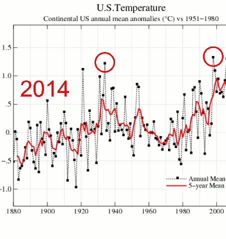
NASA GISS: Science Briefs: Whither U.S. Climate?
in the U.S. there has been little temperature change in the past 50 years, the time of rapidly increasing greenhouse gases — in fact, there was a slight cooling throughout much of the country
– James Hansen, 1999
If the present refuses to get warmer, the past must become cooler, and government scientists must ramp up the cheating.
All this event was, was a bunch of nobodies looking for handouts!
I have created this site to help people have fun in the kitchen. I write about enjoying life both in and out of my kitchen. Life is short! Make the most of it and enjoy!
De Oppresso Liber
A group of Americans united by our commitment to Freedom, Constitutional Governance, and Civic Duty.
Share the truth at whatever cost.
De Oppresso Liber
Uncensored updates on world events, economics, the environment and medicine
De Oppresso Liber
This is a library of News Events not reported by the Main Stream Media documenting & connecting the dots on How the Obama Marxist Liberal agenda is destroying America
Australia's Front Line | Since 2011
See what War is like and how it affects our Warriors
Nwo News, End Time, Deep State, World News, No Fake News
De Oppresso Liber
Politics | Talk | Opinion - Contact Info: stellasplace@wowway.com
Exposition and Encouragement
The Physician Wellness Movement and Illegitimate Authority: The Need for Revolt and Reconstruction
Real Estate Lending
