
I wouldn’t even give him the honor of having a brain at all!
Tag Archives: Sea level rise

Is Man-made Climate Change Real #6?
Part Six Anomalies
The IPCC, NASA NOAA and most scientists that study Climate change and Anthropogenic Climate Change use a system of measurement for Global temperatures that most of us are not familiar with called Anomalies. I’ve described this method in previous posts on my blog in this series but once more will not hurt. Basically, someone determines a Base period and then observations are measured against that base and therefore the result can be either higher or lower than the Base. The Base period should have some relevance to the subject but whether it does or not, it must be a constant or the system will not work.
NASA and NOAA work together on developing a Global temperature and when they set the system up they picked a period from 1951 through 1980. 30 years or 360 months, as their Base and when they did that they determined, obviously sometime after 1980, that the Global temperature was 14.0 degrees Celsius. Now this is important, there is no scientific reason to use that period and according to NASA it was because that is when most of the scientists at NASA and NOAA had grown up. A much better Base would have been the geological global mean estimated to be around 17.0 degrees Celsius but then all the values would be negative and that wouldn’t have looked good.
Now that they NASA and NOAA have their base they subtract it from the global temperature that they have calculated with their proprietary software. Keep in mind that there really is no Global temperature if for no other reason than the earth is a sphere and one side is always facing the sun (Hot) the source of all our energy and one side facing away from the sun (cold). Let’s do an example, for January 2015 NASA determined that the global temperature was 14.74 degrees Celsius so 14.74 minus 14.0 (the base) leaves .74 which they then multiple by 100 and that gives us an anomaly of 74. That value is published in many versions but we’re interested in a table called the Land Ocean Temperature Index LOTI and that table gives those values all the way back to January 1880. Most temperature data that comes from NASA or NOAA is in this anomaly format.
NOAA publishes the C02 information but they do not use this format they publish an actually value in this case CO2 in the atmosphere as parts per million volume (ppmv), for example the value for January 2015 was 399.96 ppmv. Sometimes the v is dropped so it would be 399.96 ppm. NOAA publishes the CO2 ppm value by month and they go back to March 1958 so there is not as much data to use in evaluations as with Global temperatures. In previous posts here, an equation was shown that will generate a curve that matches historical CO2 levels, present CO2 levels and CO2 levels as shown in IPCC reports such as the latest AR5. When we get to that part of this analysis we’ll show both and then drop the NOAA portions since it is for such a short period of time.
This completes the introduction and now we get to what we are going to do that’s different from previous Climate work by others. Basically we are going to convert CO2 levels to an anomaly using the same system that NASA uses for temperature. By doing that we’ll be comparing everything to the 1951 -1980 base period in the same kind of units. This should make any patterns or correlations more visible. We’ll start with showing the NASA Global temperature anomalies and then add on other items.
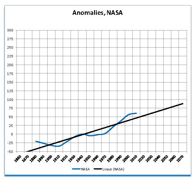
But first one other comment and that is we have had to make some adjustments in the NASA temperature data to make it more understandable. The first part is done by combining blocks of months and then taking an average. We are looking at climate changes not weather and so daily or even monthly movements do not mean anything. We picked ten years for a block for all the work here and we start with 1880 to 1899. This gives a smooth plot rather than the jagged ones that are normally seen and that makes it difficult to pick out climate from weather. Also in the case of NASA data we average 4 different current reports 2012.12, 2013.12, 2014.12 and 2015.01 the most current. This was done because of the process that NASA uses to determine the Global mean temperature creates some variation in the anomalies this averaging helps to minimize those variations. The following Chart was generated using this method. I have talked about this process in other posts here if the reader is interested.
The NASA global temperature anomalies using the method described here are shown in the blue plot on the Chart. We can see that there is a downward movement from 1880 to 1900 then an upward movement to 1940 then a downward movement to 1980 then a large upward movement to 2010. And lastly what looks like the beginning of another downward movement starting around 2010. In addition the entire series is moving up as shown by the black trend line.
There is no dispute on the patterns shown here the only issue is whether what this Chart shows is natural or manmade?
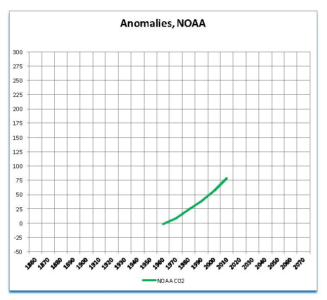
The next part of this analysis is looking at NOAA CO2 data in the same anomaly format and as previously stated there is much less information here than with Global temperatures. The first Chart shown below is a plot in Green of the CO2 data from NOAA and although most show this as a straight line, it is not it is a polynomial curve actually a logistic curve again as previously discussed here in Part Four. But first let’s look at just the NOAA data in anomaly format using the same base as the NASA Global temperatures, 1951 to 1980. The actual published NOAA CO2 plots in ppm are shown in Part Four
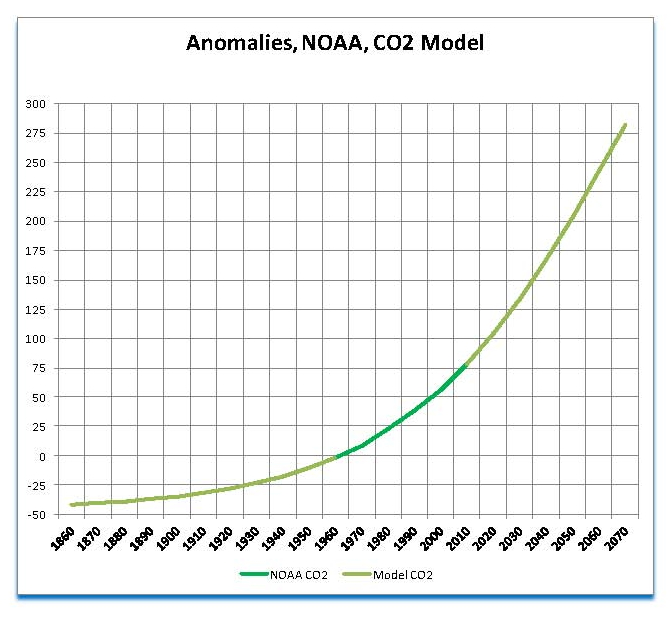
In the next Chart we’ll add the logistic curve to the actual NOAA data blocking out the common years in the CO2 model so you can see how the fit between the two data sets is very good. The actual NOAA is in green and the Modeled CO2 is in light green. Again as previously stated this logistics curve shows CO2 values that are in agreement with historical CO2 records, present CO2 and future projections of CO2 as published by the IPCC in their various assessments, the most current being AR5.
For the rest of this analysis we will use the logistic curve for CO2 and show it as a green plot labeled NOAA CO2 as there is no real difference.
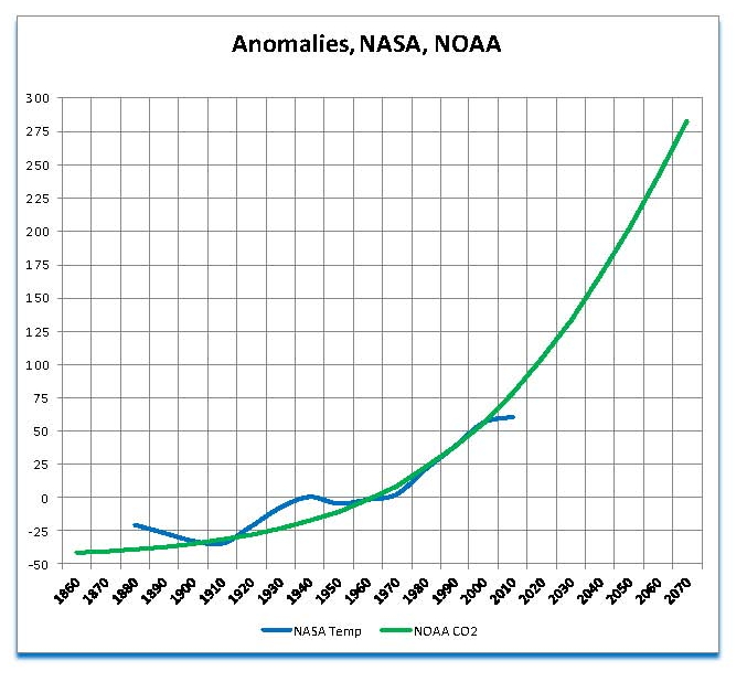
The next Chart shows the NASA Global Temperature and the NOAA CO2 anomalies combined. There does seem to be a relationship between the upward movement of CO2 and the upward movement in global temperature especially in the period from 1970 through 2000. We’ll continue this analysis to see if this apparent relationship is real or not.
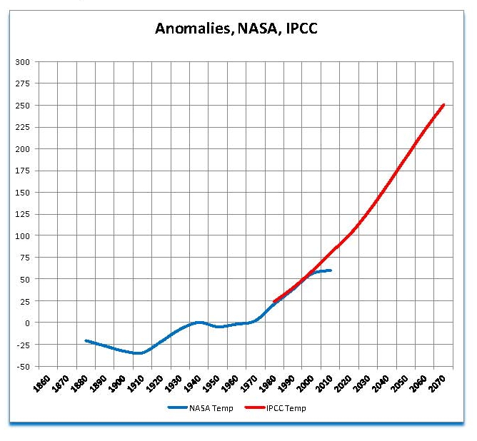
The next thing to look at now that we have past temperatures and a reasonable forecast of CO2 is what the IPCC estimates, based on the anthropogenic theory, Global temperatures will be in the future. They make this harder than it needs to be by tying the projections to economic projections, but since none of the proposed CO2 reductions have come to pass we’ll use the one business as usual, since it is the most likely. The next Chart shows just the past NASA Global Temperatures and the IPCC estimates of what future Global temperatures will be. Keep in mind that we are showing Anomalies not actual Global Temperatures.
There can be no dispute that the IPCC projection does appear to follow the NASA trend from 1980 through 2000. This trend would make Global temperatures about 15.75 degrees Celsius by 2050. This can be calculated by adding to the base of 14.0 degrees Celsius the y axis value of 175 for 2050 after diving it by 100 to turn it back into degrees Celsius. Also we do not see any deviations its strictly a smooth upward plot not like the actual from the past.
In the next Chart we’ll add back the NOAA CO2 plot and we’ll see that the IPCC projection and the CO2 projection are very close indicating that there is a very close relationship between the IPCC projection and the CO2 projection. Since the IPCC was chartered to show what the 1980 to 2000 trends would do IF THE RELATIONSHIP SHOWN THERE WAS VAILD this extension is of no surprise. This Chart is similar to the one shown in Part One that Hansen showed to Congress and is also widely used by the IPCC and NASA.

Now let’s zoom in and look at the 60 year period from 1960 through 2020 so we can see more detail; this is shown in the next Chart. There is a very clear and consistent relationship between all three measure NASA temperature, NOAA CO2 and the IPCC temperature projections using the Anomaly system from about 1975 through 2005. This is of no surprise as the IPCC developed their Global Climate Models, GCM’s, to show this. It was the prevailing view in the environmental movement, at that time, that there was a direct link between CO2 levels and Global temperature.
There is an obvious departure shown here between the correlation between CO2 and Global temperature. From 1880 to 1900 CO2 is below Global temperature then from 1910 to 1950 its above Global temperature; its only from 1975 to maybe 1995 the CO2 and NASA Global temperature growth rates match. That is only a 20 year out of 134 years where this is a match which is only 14.9%.
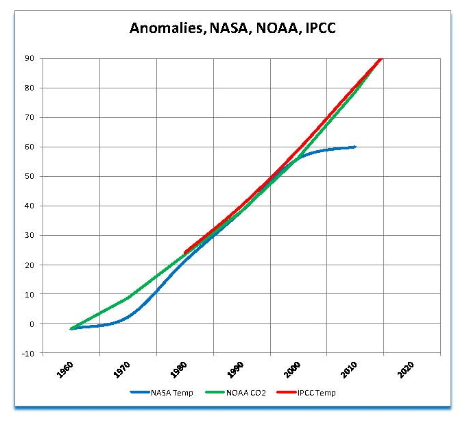
However, there is a developing problem as NASA Global temperatures are no longer following the IPCC projections even though CO2 is going up as expected. The current deviation is almost a quarter of a degree Celsius now which can be seen in the above Chart as the blue NASA plot is below the IPCC and NOAA plots by 20 units and if we divide by 100 that is .2 degrees Celsius.
Going back to the very first Chart in this series of the Global temperatures as calculated by NASA we saw that there appeared to be a pattern of ups and downs in the temperature and based on those ups and downs another down was due, and that is exactly what we see in the above Chart; the beginning of a down period.
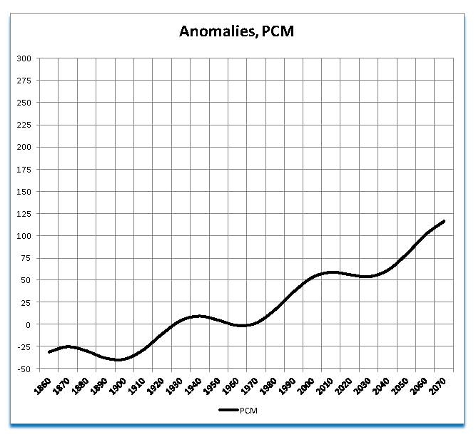
There are other theories about Climate Change one of which is based on variations in solar radiation which affects the Blackbody temperature and variation is the suns magnetic field which affects cloud formation and Albedo. We have also shown in Part Five that there are global movements in temperature that have been observed going back to the last Ice Age some 11,000 years ago, but especially in the past 4,000 years. Using modeling techniques and curve fitting an alternative Climate model designated PCM was developed in 2007 that has proved to be very accurate in projecting the Global temperature published in the NASA LOTI table.
This model is based on a long cycle of approximately 1000 years a short cycle of almost 70 years and a factor for CO2 using a sensitivity value under 1.0 degrees Celsius. Using the same method of looking at anomalies from the NASA base of 1951 to 1980 we have the following plot of the PCM model. We have the overall upward movement, and the cycle of ups and downs as was observed in the NASA Global temperature plot we first showed. So is this plot better than the IPCC’s plot at matching the NASA data?
In the next Chart we add the PCM model to previous one showing NASA Temperature NOAA CO2 and the IPCC Temperature projection plots. Although we do not have a perfect match going all the way back to 1880 it is just as good for the period 1970 though 2000 as the IPCC. But more importantly it is significantly better that the IPCC from 200 to the present since is shows a slight down trend just as does the NASA data.
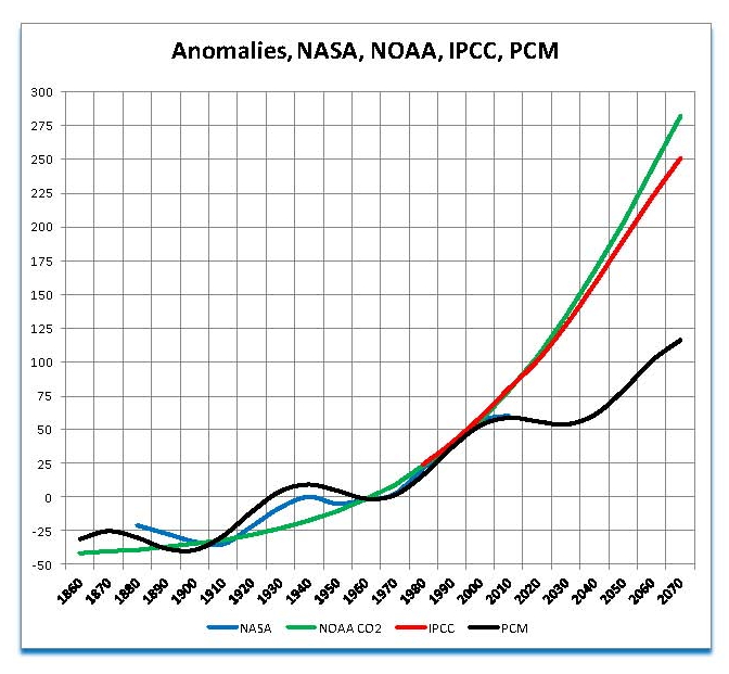
We’ll show one last Chart looking at the same 60 year period we used to look at the IPCC values close up. The next Chart adds the PCM model to that Chart and it’s very clear that the PCM model is significantly closer to that of the published NASA LOTI values for the entire period of NASA published Global temperatures. Although the PCM model does use a factor for CO2 it is not slowly dependant on CO2 for its projections; instead we have looked at past Global temperature movements and matched them with the more current CO2 sensitivity values found in the published papers and which was also previously shown in Part Three.

A model is only as good as its projections or forecasts so based on the above Chart it is beyond dispute that the PCM model is significantly better than that of the IPCC. Further, since the PCM projects cooling and the IPCC projects warming the disparity will only get worse and worse.
The next part will be a discussion of the logic and equations used to develop the PCM Global climate model
Now It’s OK To Lie About Climate Change – Yale Project
Of course they lie about Climate change their version of Climate change is not true mankind does not control the weather Mother nature does!
Dave Burton adds to our inspiration on Freeman Dyson]
Most of us know this but this is said very well and should be re-posted by anyone that read this. Also, and as stated, we need more CO2 not less and so its literally insane to try using geoengineering to remove it as some are starting to say.
This was a very good comment, deserving of top tier presentation, in my opinion.
View original post 821 more words
What Will NASA Do in 2015 to make the Earth Warmer?
Approximately ten or so years ago increases in Global temperatures slowed down and then actually reversed. This is fact not speculation for if you take any of the NASA LOTI releases put them in a spreadsheet and then draw a chart and add a trend line using the polynomial Order 3 option the resultant plot will turn down around 2010. The generated plot will also follow the NASA LOTI data very nicely going back to 1880, even with the data manipulation that they have resorted to, to hide the current move down in Global Temperatures.
This downturn has created an unexpected problem for those that want to change how we live in the U.S. with the UN Agenda 21 sustainable world they have already started to implement. Since the main premise was the CO2 emissions from power generation was their culprit that meant that source must be eliminated; however if the Global temperature was not going up than there was a “major” problem with their core belief which also included moving away from a free people to a system where the people were controlled, for their own good. The control of the people was required since the Warmest’s needed to reduce the people’s energy usage and the people would not support a reduced standard of living without coercion.
When NASA realized that they had a problem with CO2 going up and Global temperatures going down they resorted to manipulating the data though the “Homogenization” process they use to blend all the data collected into one Global temperature. The process they used created an upward movement in Temperatures’ that was obvious to anyone that looked and in the past on this blog I have talked about it. Because of the intentional change of data and trends that NASA has been doing I was mislead a few weeks ago when I issued my monthly report which I have done for the past year. I compared the January 2015 values to the wrong past values and although the change was in the same direction it was not to the same magnitude as I showed. For that I must apologize.
This post is using the correct data and will give the same result just to a slightly lesser degree. I have also added a forecast of what I think NASA will do with the temperatures over the next several months as they need to support the United Nations Climate Change Conference (COP21) which will be held in France at the Le Bourget site from 30 November to 11 December 2015 and the conference objective is to achieve a legally binding and universal agreement on climate, from all the nations of the world.
To achieve this they have determined that they need to show that the planet is overheating, whether it is or not, and since it is not (by satellite data) they need to show it in another form, hence the data manipulation at NASA-GISS.
This manipulation is shown in the next three Charts which all use LOTI data the first from December 1998 (Red) and the second from January 2015 (Blue) which trend lines as required in the same colors. The first is in the period January 1880 to December 1950 which is the entire temperature series up to the point that NASA uses to determine their anomaly. The anomaly is the base temperature that NASA uses to measure temperature changes from. The second Chart is the period used to determine the NASA anomaly which is from January 1951 to December 1980, 30 years. The third Chart, actually a series of Charts on the same period, is from January 1981 to the present. To support the need for a warmer present they will need to move the 1880 to 1950 data down, keep the 1951 to 1980 data constant and move the 1980 to the present data up as much as possible. If that can be shown in the following Charts then that proves what is being down since no other change would produce this effect.
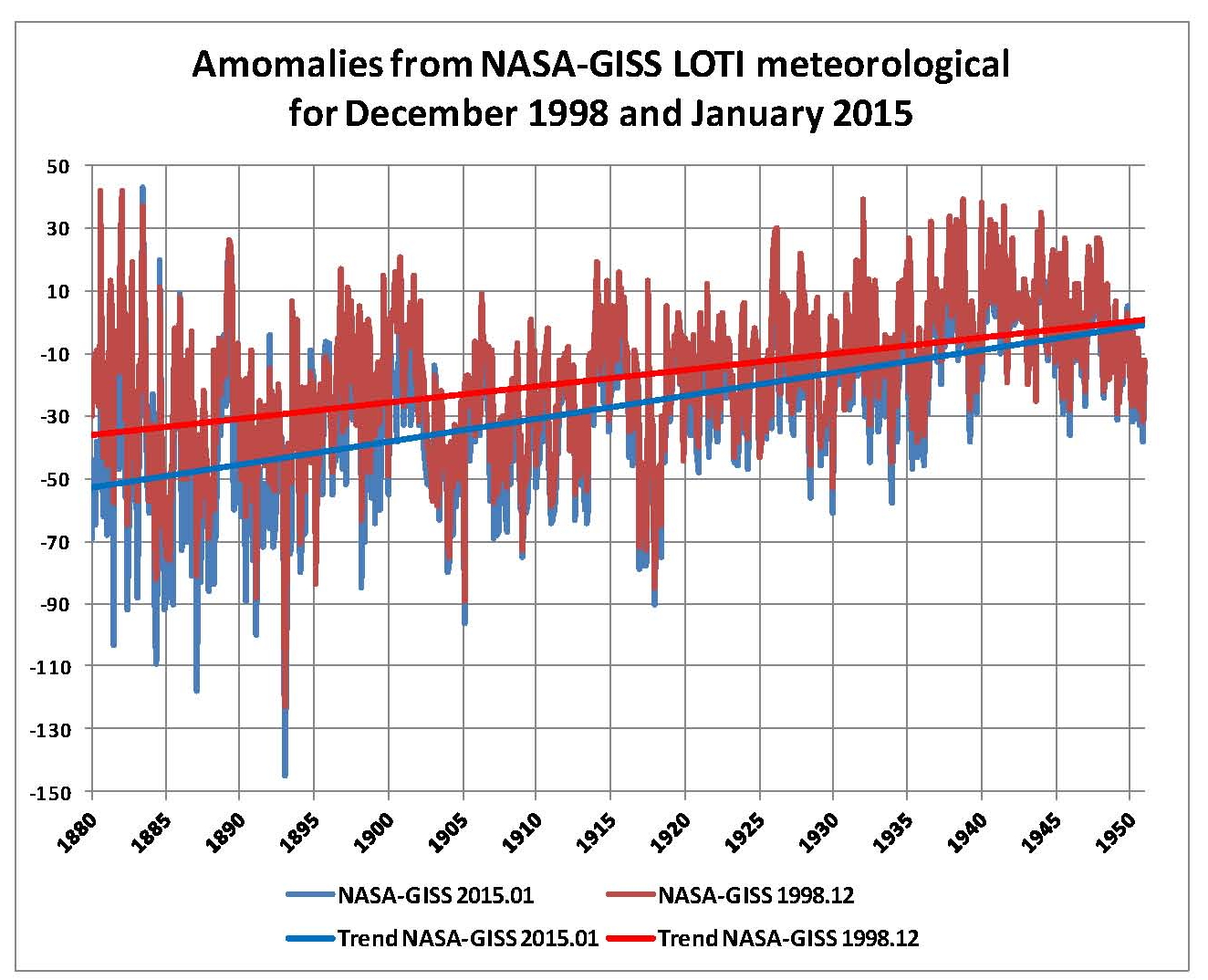
Clearly, in this Chart, the past temperatures have been moved down almost a quarter of a degree C in 1880 from the 1998 red plot to the 2015 blue plot. Further the two trends almost merge at the December 1950 date since they cannot change that period since it sets the anomaly value of zero or 14.0 degrees Celsius. Random changes or adjustments would not do this.

We can see in this Chart that there is some movement in both trend lines; both are slightly below 0 in 1951 and slightly above zero in 1980. They also appear to be offsetting so we’ll check that by adding all the anomalies from this period to see if they cancel and they do. There are 360 values in that period and the 1998 series adds up to -2 and the 2015 series adds up to 4. I would be willing to bet if we looked at rounding differences the differences would be even closer to zero. So again we have proof that the manipulation of the data is not without purpose since any programmed change, with a purpose, must keep this period at or almost at zero anomalies.
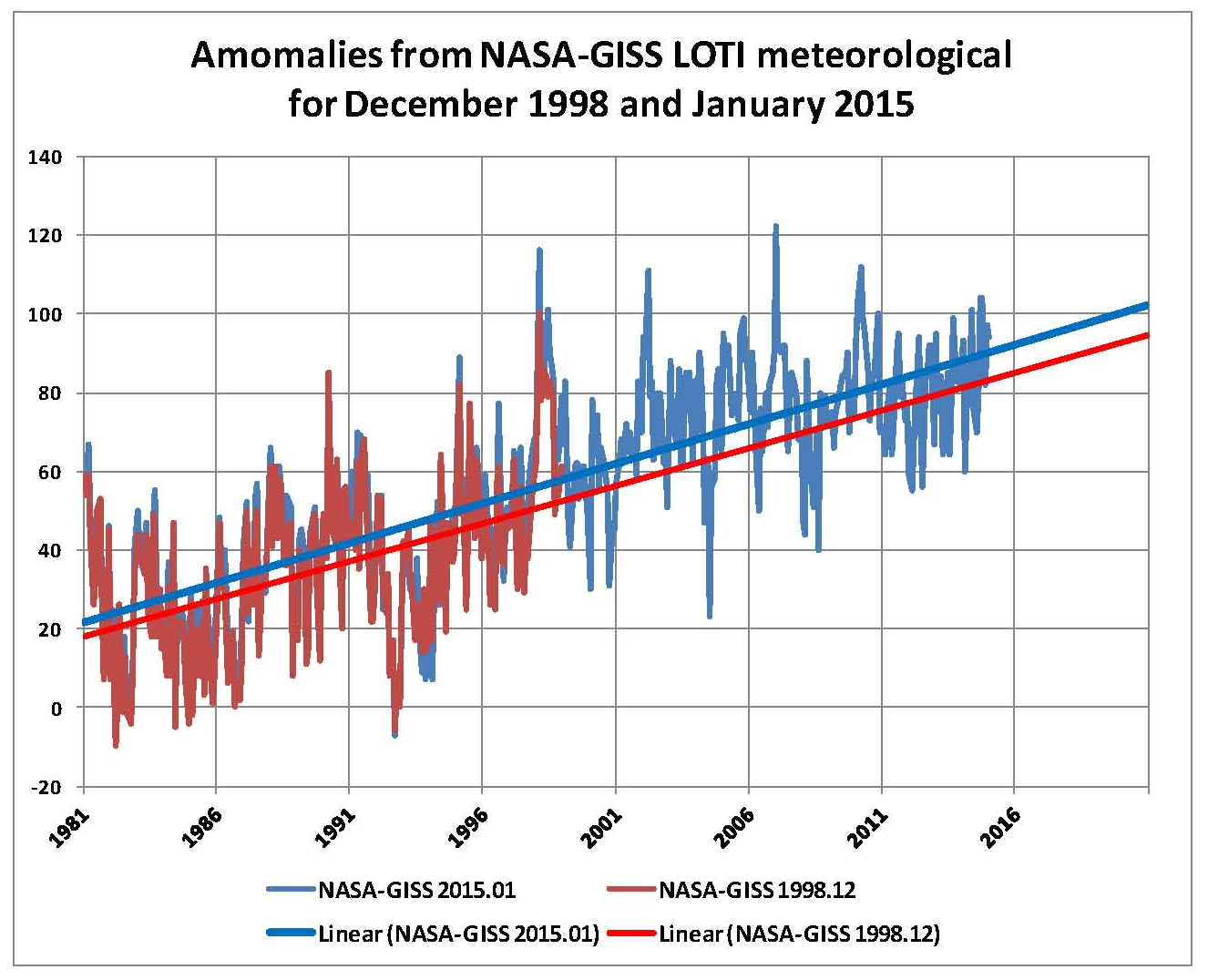
This next potion, from 1981 to the present, is a bit more complex since it is showing the planned results of the NASA data manipulation so we are going to show a series of Charts. Since the 1998 red plot only goes to 1998 we can’t do a one for one comparison but we can see that for the period where the two plots are common the blue plots are above the red on the upside and the red plots are below the blue on the down side indicating that the blue plot is showing a warmer temperature and this is verified when we add the trend lines which clearly show that the blue trend is shifted up. Because NASA had to keep the 1951 to 1980 period constant the trend lines are closer together in 1981 than they are later on in 2015; this is additional prove of the manipulation
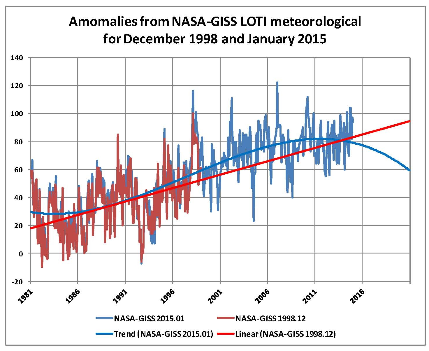
Next we get rid of the linear trend to the 2015 data and add a polynomial trend using a 3rd order to see if it gives a better fit to the data and it does. This trend clearly shows the Global temperature peak around 2010/2011 and the down trend ever since. This is especially true if we would ignore the last couple of years where the data manipulation has started.
Sir Karl Raimund Popper (28 July 1902 – 17 September 1994) was an Austrian and British philosopher and a professor at the London School of Economics. He is considered one of the most influential philosophers of science of the 20th century, and he also wrote extensively on social and political philosophy. The following quotes of his apply to this subject.
If we are uncritical we shall always find what we want: we shall look for, and find, confirmations, and we shall look away from, and not see, whatever might be dangerous to our pet theories.
Whenever a theory appears to you as the only possible one, take this as a sign that you have neither understood the theory nor the problem which it was intended to solve.
… (S)cience is one of the very few human activities — perhaps the only one — in which errors are systematically criticized and fairly often, in time, corrected
Is Man-made Climate Change Real #5?
Part Five Geological Facts
This will be a short section placed here to show what the past was until recently when all this history mysteriously disappeared. The point to these Charts is that climate has NEVER been a constant with global temperatures ranging from a low of around 12 degrees C to a high of around 22 degrees C and CO2 ranging from under 300 ppm to as high as 7,000 ppm. We are presently at 400 ppm CO2 with a global temperature of around 14.6 degrees C which is historically low as can be seen on the following chart going back 600 million years. It would seem that a mean temperature of 17 degrees C, as shown here, and a CO2 level of over 1000 ppm would be more normal then what we have now so why the hysterical political movement to control CO2?

The next chart is more current going back to the last ice age some 11,000 years ago. This chart is particularly interesting as it shows that there have been 4 cycles of cold and warm going back over 4,000 year. Based on those 4 cycles and considering the difficulty of determining exact dates and temperatures it can be said that over the past four thousand years there have been 4 cycles of about one thousand years duration with an amplitude of maybe 1.5 degrees C. And we are what would appear to be a peak of the forth cycle, indicating that we can expect a downward movement to start in the next hundred years or so. Based only on this observation It should be possible to develop a model that would be valid over this period of time and where we have human records to support these temperature changes.

However, there are also some significant temperature variations with shorter durations as shown on the next Chart. This Chart is of the Atlantic Multidecadal Oscillation or AMO where there appears to be a 60 some year cycle of under one degree C there is also a larger cycle in the pacific known as La Nina and El Niño.

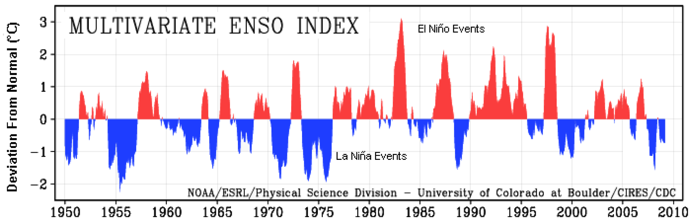
The Pacific variations are not as consistent as those in the Atlantic are,but there is a greater variation as can be seen in the next chart where the La Nina and El Nino events are shown as a multivariate index called the ENSO.
The purpose to showing this four Charts is to establish that there are geological and even decadal variations in climate and none of these have anything to do with mankind or CO2; therefore any proper theory of Climate must consider these variables as a base to work from. Only when that is done can considerations be given to things like Carbon Dioxide, which probably is only a bit player in Climate.
In the next section we’ll put this all together and show what is really happening with Global Climate and also why the Warmists and their obedient media are so wrong.
The Great Global Warming Swindle Full Movie
This is a good summary of the Climate Change movement which is not based on science but it is a political religious movement that has been forced on us by UN Agenda 21. The movement MUST BE STOPPED!
New result shows CO2 has almost no effect on temperature
I agree CO2 is not driving climate except mother nature!
An article in the Daily Mail today piqued my interest. It trumpets empirical results which they say empirically confirm the theoretical CO2 greenhouse effect for the first time:
 “Scientists have witnessed carbon dioxide trapping heat in the atmosphere above the United States, showing human-made climate change ‘in the wild’ for the first time.
A new study in the journal Nature demonstrates in real-time field measurements what scientists already knew from basic physics, lab tests, numerous simulations, temperature records and dozens of other climatic indicators.
They say it confirms the science of climate change and the amount of heat-trapping previously blamed on carbon dioxide.”
“These instruments, located at ARM research sites in Oklahoma and Alaska, measure thermal infrared energy that travels down through the atmosphere to the surface.
They can detect the unique spectral signature of infrared energy from CO2.
Other instruments at the two locations detect the unique signatures of…
View original post 548 more words
Global Warming Over The Past 70 years
This post is 100% right its just a money game and the politicians love it even more than the academics!
In 1946, cherry trees were blooming in Washington DC by mid-March
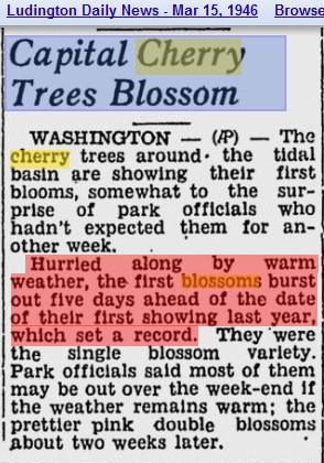
After 70 years of out of control warming, Washington and most of the rest of the country will be lucky to be above freezing by mid-March.
But cherry blossoms are just cherry picking. What about sea level and the polar meltdown?
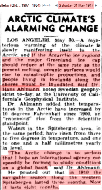
Scientists warned in 1947 that the poles had warmed 10 degrees, were melting, and were going to drown us all – unless we gave them money to study it.
temperatures in the Arctic have increased by 10 degrees Fahrenheit since 1900. An ‘enormous’ rise from the scientific standpoint. Waters in the Spitsbergen area, in the same period, have risen from three to five degrees in temperature, and one to one and a half millimetres yearly in level. ‘The Arctic change is so serious that I hope an international agency can speedily be formed…
View original post 58 more words
Is Man-made Climate Change Real #4?
Part Four A Model for CO2 levels
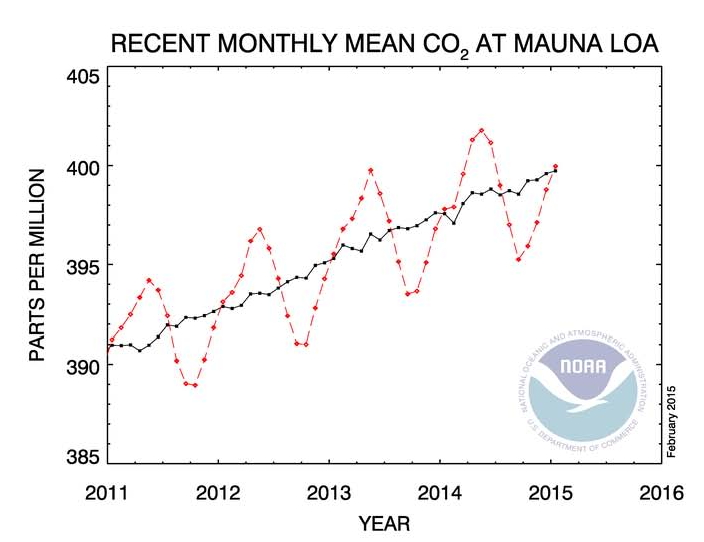
Carbon Dioxide (CO2) has been measured very accurately since 1958 By NOAA-ESRL and the trend published monthly; for example this is the chart for January 2015 where the CO2 level was 399.96 ppm. There is little to no reason to not believe these postings by NOAA-ESRP since they are direct measurements using calibrated equipment at the Mauna Loa location in the Hawaiian Islands.
These NOAA records go back to March 1958 and the pattern seen in the above Chart goes all the way back to that date which is a summer peak and a winter trough. NOAA and others have determined that in pre-industrial times the CO2 level was in the range of 270 to 280 ppm and then as the use of coal and then oil began the level of CO2 started to rise. Scientists observing this pattern assumed that all the increase was caused by man, however in ecological times CO2 has in fact risen and fallen and it appears to follow increases in temperatures and since there were no humans we could not have created these past changes so there is more to this than just a simple CO2 and temperature relationship.
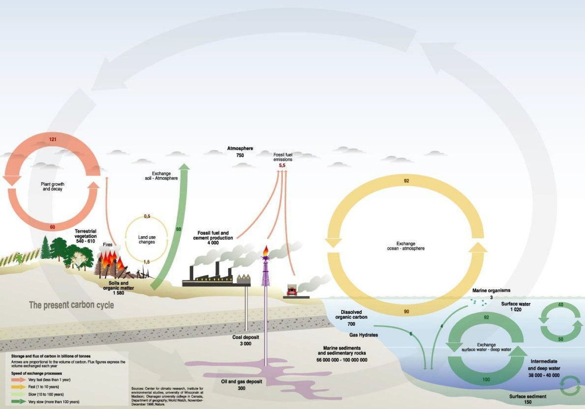
The next Chart shows a diagram of the planet’s Carbon cycle. There is no doubt that man is adding to the CO2 in the atmosphere but the overall movement of CO2 into and out of the planet’s atmosphere is significantly great probably by 30 or more also indicating that CO2 caused by mankind is not the main player here. One must also understand that carbon Dioxide is a requirement for plant life and higher levels are better than lower levels. Commercial Greenhouse raise the level of CO2 to over 1000 ppm to speed up planet growth and 1200 ppm, 3 times where we are at now, would not cause any problems for plants or mankind.
So since more CO2 is good and less CO2 is bad for all life on the planet why has it been targeted for removal? Well the only reason is that some have determined that the global temperature of the planet is directly linked to the level of CO2. Therefore CO2 must be removed from the atmosphere or we will destroy all life on the planet. This seems to be counter to Nature but Scientists have determined that they know what is really going on in the climate so we must trust them.
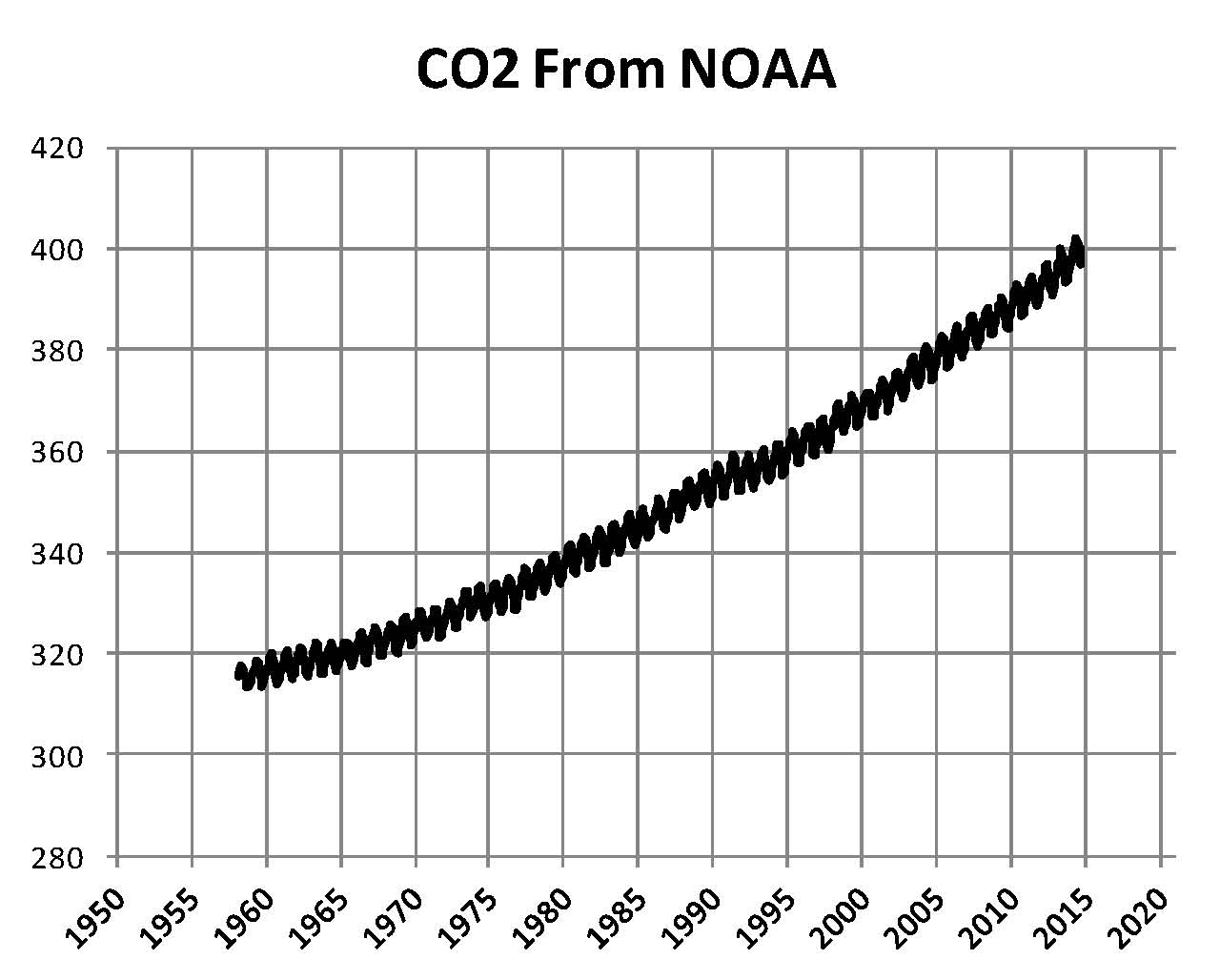
This theory of CO2 being the reason that the Global temperature is going up is based solely on the sensitivity level of CO2 being 3.0 degrees C as discussed in the previous post; so what we need next is to show what the future level’s of CO2 will be so we can see if there really is a direct link between CO2 and global temperature later in this series. The next Chart is of the entire NOAA published CO2 level from March 1958 to January 2015. There is no doubt that the level is going up and it even seems to be accelerating and the calculated mean level of CO2 will probably be over 400 ppm by the end of 2015.
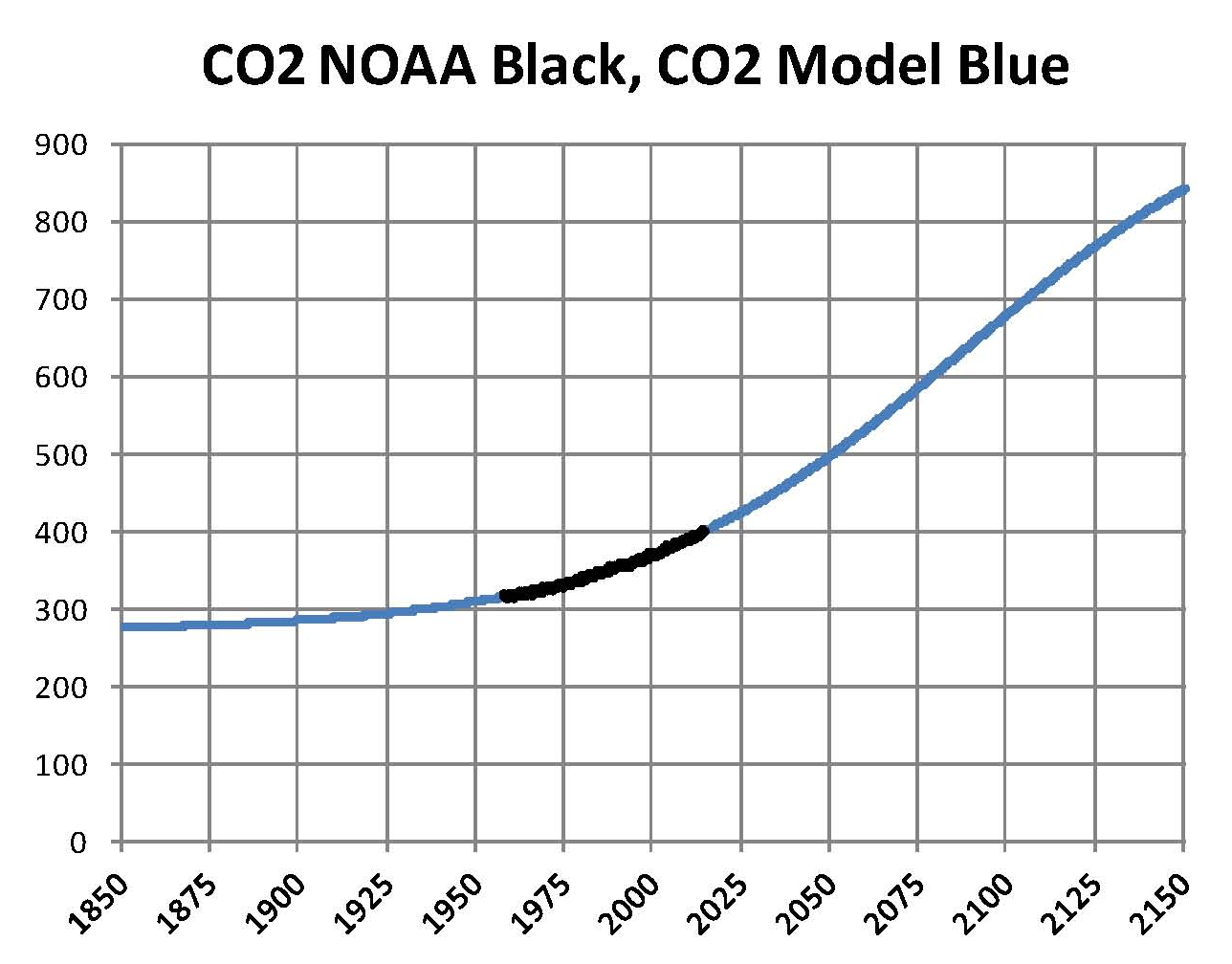
In order to make projections into the future we need to model this NASA CO2 data and the closest fit end up being a form of a logistics curve. If we assume a starting point of January 1600 as 270 ppm for CO2 than the following equation will produce a curve that matches the NASA-ESRL data mean and goes to 1000 ppm around 2300. This curve fits both historical and projected levels of CO2 in the available literature.
CO2 = 270 + 730 / ( 1 + 8.75 * EXP ( .001733 * (4612 – M )))
M represents the number of months from January 1600 which means that January 2015 is M = 4981 and that gives a CO2 value of 399.98 ppm verses the actual of 399.96 or an error of .02 ppm which is basically no error. The following Chart shows a part of the curve generated by this equation.
There is no question about the level of CO2 in the atmosphere; however there is uncertainty as to the source of all of the increase. But for discussion purposes we will concede that most if not all the increase is due to the use of fossil based fuels, i.e. coal, petroleum, natural gas and wood.
The next issue discussed here will be a look at some historical records on temperatures and CO2 levels.
