Part Eight Issues with Determining what the Blackbody Temperature of the Earth is.
In Part Two we discussed how the temperature of the planet was determined starting with the Blackbody temperature which is based on incoming solar radiation primarily in the visible and near visible frequencies. All the energy that is absorbed by the planet must, by the principles of science, eventually escape into space or the planet would have melted a long time ago. Therefore the energy emitted by the planet must equal the energy absorbed by the planet and we can calculate this using the Stefan-Boltzmann Law and that was also shown in Part Two. Using the Stefan-Boltzmann Law we determined that the planets Blackbody temperature was 254.36O Kelvin which corresponds to -18.79O Celsius or -1.82O Fahrenheit. Although this is true it’s a bit misleading since the planet is a sphere, its axis is tilted, its spinning and it contains a significant amount of water on the surface.
Why this matters is the result of the thermal properties of the actual diverse surfaces of the planet which are not consistent and this creates large thermal flows in the atmosphere and the oceans as the planet tries to equalize the incoming energy in the form of heat to achieve a true uniform global temperature; which by the way is not even possible. Much of this retention and movement of heat is what we call the greenhouse effect, climate and weather. To appreciate the complexity of the thermal flows let’s look at what the energy reaching the planet looks like ignoring the atmospheric clouds, water in the oceans, and the albedo in general, a perfectly round ball of rock with a magnetic field and an atmosphere of pure nitrogen. The plots shown here are not “exact” but should be very close considering the problems with orbital variations, axial orientation changes and 365.25 days per year.
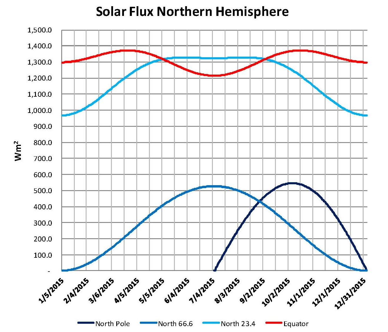
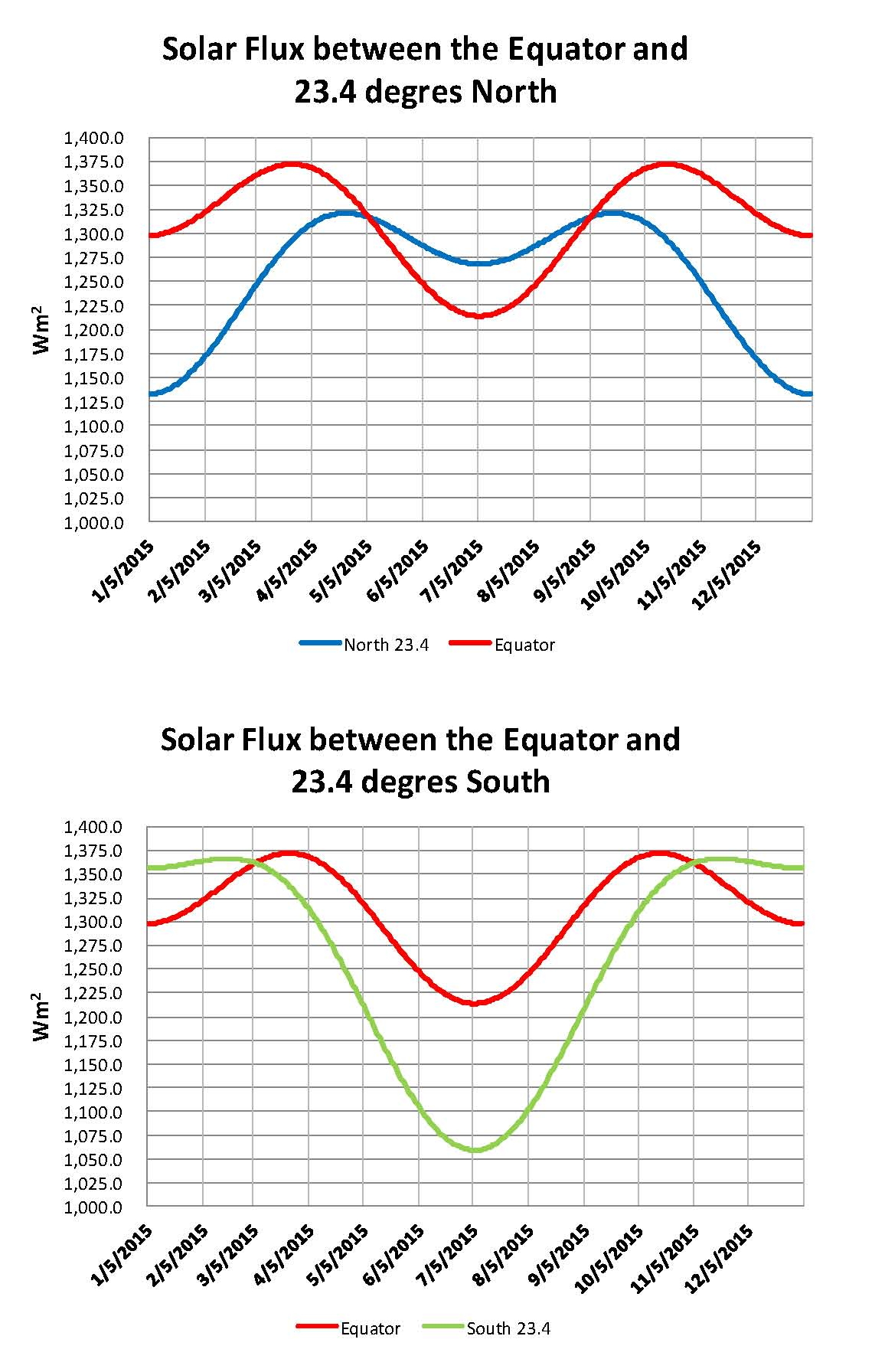
The first Chart, is of Northern Hemisphere and is a plot of the energy reaching the planet in three different areas; the equator shown in red, the Tropic of Cancer (23.4 degrees north latitude) shown in light blue, the Arctic circle (66.6 degrees north latitude shown in medium blue and the North pole shown in dark blue. Because of the tilt of the planets axis of 23.4 degrees there is a very large difference in the amount of solar flux that reaches the planet’s surface in the higher latitudes. We know that above the Arctic Circle there is total darkness for half the year, well that also means no heat energy arrives there either and this is clearly shown in these Charts.
Obviously the majority of the energy reaching the planet from the sun comes in between the equator and the Tropic of cancer; further we can see that the least energy is received in the first quarter of the year and the second least is in the four quarter. Second and third quarters have the most energy coming in. This unequal distribution of energy creates a thermal flow from the equator to the pole and because most of the land on the planet is also in the Northern hemisphere, where we are, that means that we see this energy flow and some assume that its climate change both because of the movement north of heat and also because of variations in the albedo (how much gets reflected back before reaching the surface) reaching the planet by cloud formation.

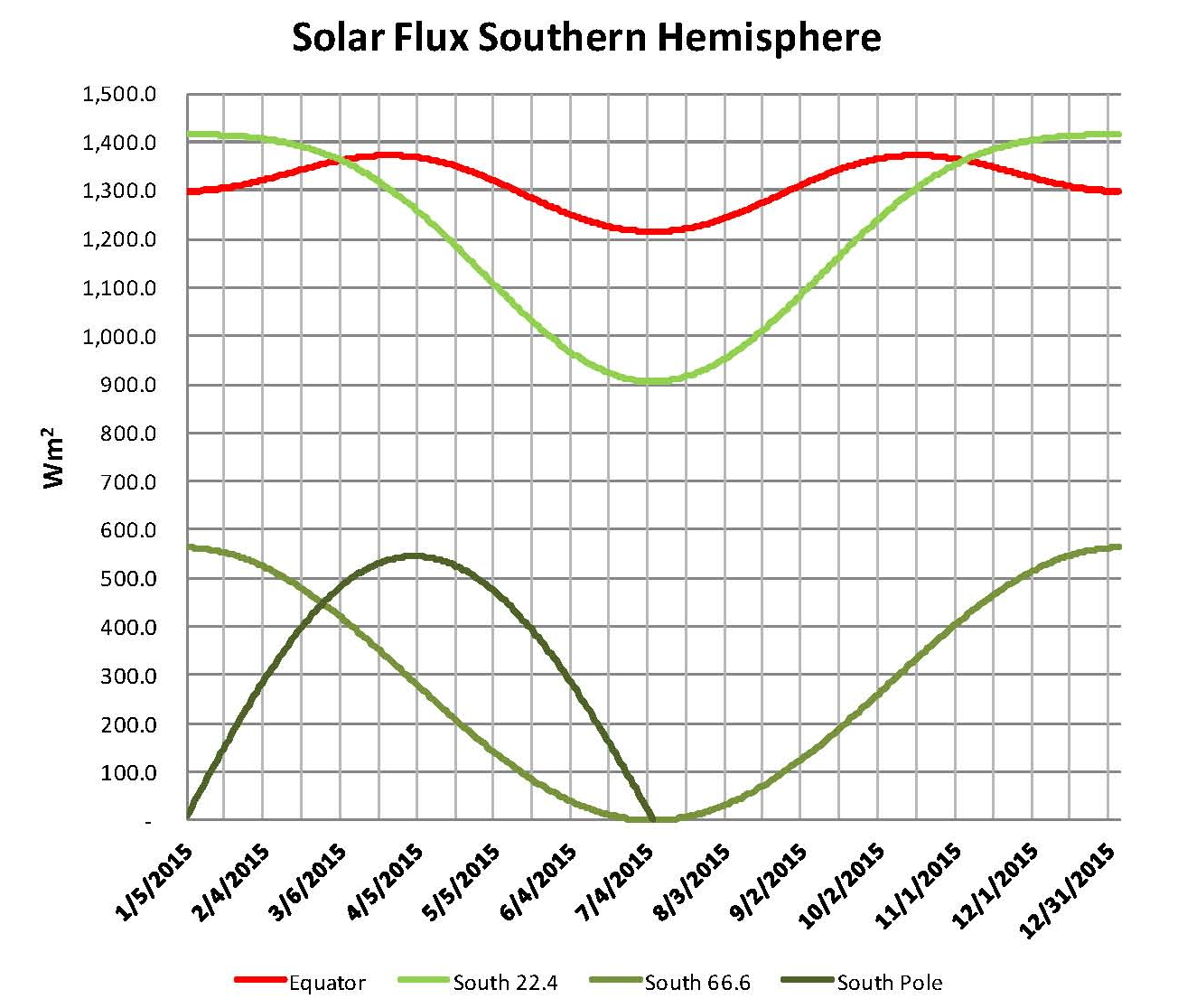
The Second Chart, is of the Southern Hemisphere and it is also a plot of the energy reaching the planet in three different areas; the equator shown in red, the Tropic of Capricorn (23.4 degrees south latitude) shown in light green, the Antarctic Circle (66.6 degrees south latitude shown in medium green and the South pole shown in dark green. This Chart is very similar to that of the north but reversed, just flipped winter and summer.
Obviously the majority of the energy reaching the planet from the sun comes in between the equator and the Tropic of Capricorn; further we can see that the least energy is received in the second and third quarters and fourth and first quarters have the most energy coming. This unequal distribution of energy also creates a thermal flow from the equator to the pole and because most of the water on the planet is in the Southern hemisphere that means that we don’t see this energy flow as much since it dampened by all the water although there still is a flow south of heat. We also have a large land mass at the South Pole with most of the planets ice stored there making this the coldest place on the planet as there is no water underneath the ice.

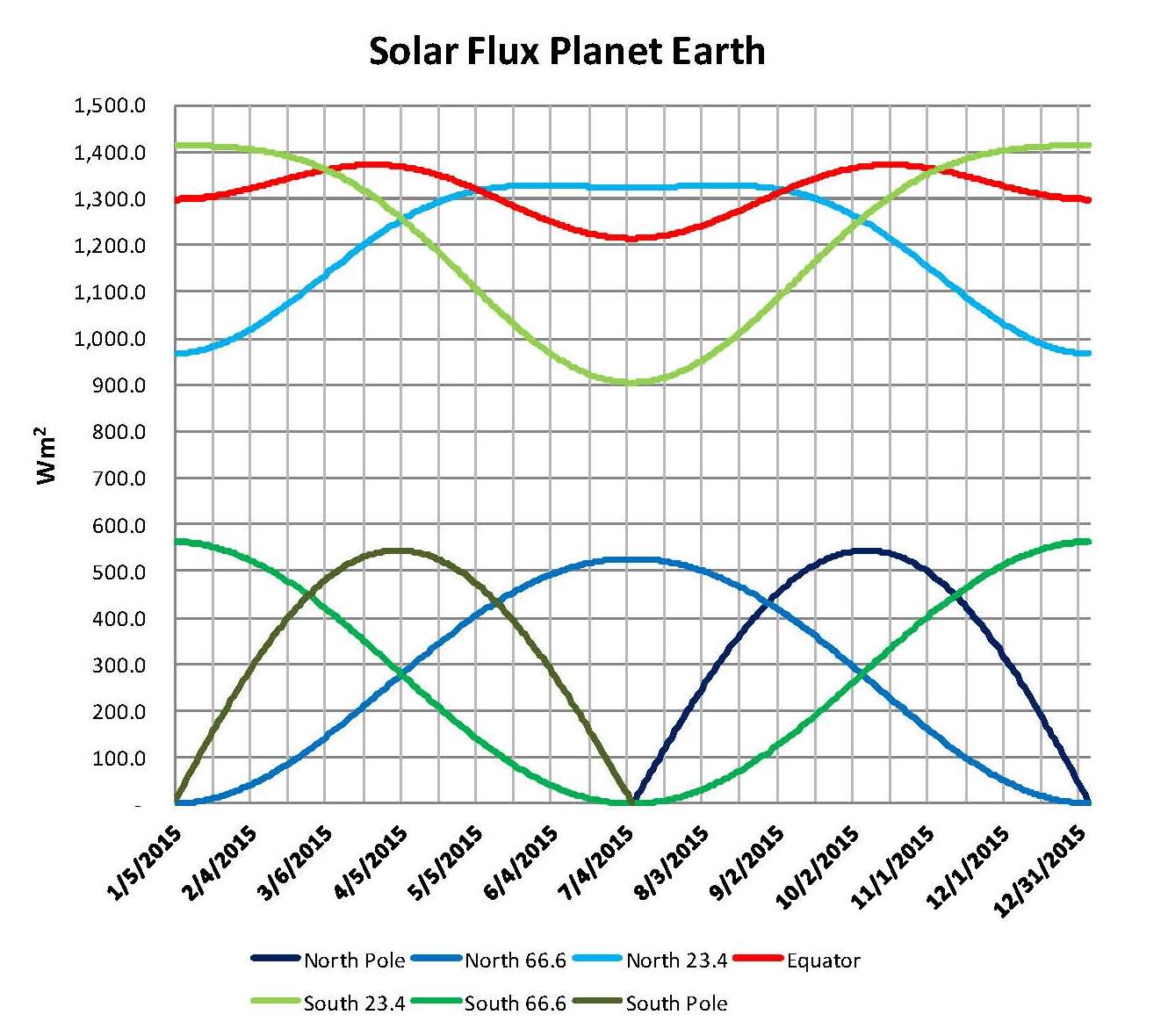
Putting these previous two Charts together we have the next Chart showing both the North and South Hemispheres together. Looking at this Chart one could say that it looks like the average energy input would be between 700 and 800 W/m2 but this Chart is really just the side facing the Sun the other side gets nothing so half of that or ~350 W/m2 would be more accurate, and the actual value is 342 W/m2 so we have a confirmation of that guess.
The plots of the Tropics of Cancer and Capricorn are interesting as there is a large difference between them because of the axial tilt of 23.44 degrees of the planet in relationship to the earth being 147,098,290 Km at Perihelion from the sun and being 152,098,232 Km from the sun at Aphelion. This effect is interesting since there is an approximate 10,000 year cycle to the orientation of the earth’s axis to the Perihelion (close) and Aphelion (far). In other words the patterns shown here will be reversed in 10,000 years and it will be hotter in the summer and colder in the winter in the northern hemisphere. I think this could explain the 1000 year warm cool cycle that we see developing around 4,000 years ago.

The next two Charts shows the differences between the Northern and Southern hemispheres in the areas where the Solar Flux is the strongest, in more detail. Because the Earth is closest to the sun in the Northern Hemispheres Winter and the North pole is pointed away from the Sun the difference between the winters and summers are small; while in the Southern Hemisphere the Earth is farther from the Sun in the Summer when the South pole is pointed toward the Sun and so the difference between Winter and summer is largest. Offsetting this is the fact that the southern hemisphere is mostly water which mitigates the differential.

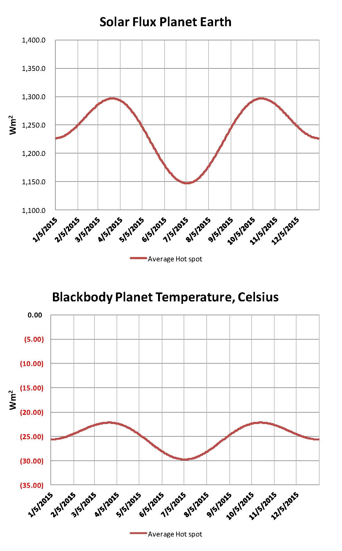
The next chart two Charts are based on an average of the values shown here for the Tropic of Cancer, the equator and the Tropic of Capricorn. However since the Earth is a sphere picking three lines is not the same are calculating the actual area and averaging that. So these Charts are good only to shows a relationship not an actual value. However, having said that what is shown is not all that far off since the actual area involved is close to equal.
The first Chart shows W/m2 in the area around the equator and the second Chart shows the W/m2 converted to degrees Celsius using the Stefan-Boltzmann Law. Looking at the scales on both charts you will find that on the first chart W/m2 there is a ~4% change in solar radiation and in the second Chart degrees Celsius there is a ~16% change because the Stefan-Boltzmann Law has a 4th power relationship from W/m2 to degrees Celsius.

The current (February 2015) global temperature according to NASA is 14.79 degrees Celsius and the generally accepted value for the total greenhouse effect is 33 degrees Celsius. So that makes the blackbody temperature -18.21 degrees Celsius; which is in general agreement with the scientific literature. This simple method used above, which was not meant to calculate the blackbody temperature, isn’t all that far off from the real number being about ~8 degrees C to low.