Good work showing that we still don’t know enough about what is going on in the oceans to make drastic changes in the way that we live.
Tag Archives: Carbon tax
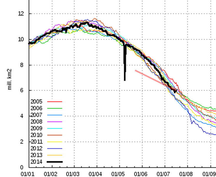
Sea Ice News Volume 5 Number 4 – Are polar satellite sea ice sensors going wonky?
It’s very simple if it comes from Washington DC or any government entities don’t believe it unless you personally check it out. NASA NOAA and the EPA are the worst of the lot — all behind the deceitful White House of course.
Arctic Makes Obscene Gesture Towards Nobel Laureate
He deserves a lot more than that but its a good start … lol
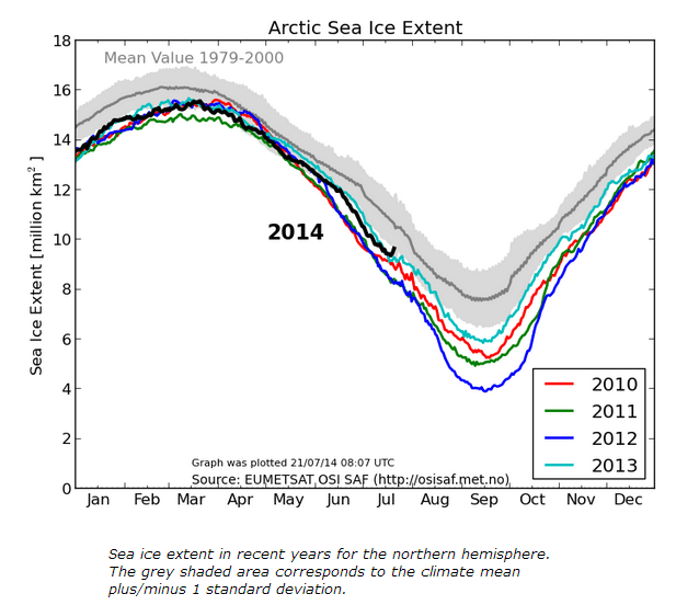
Nobel Laureate Al Gore predicted an ice free Arctic in 2014. Gaia may be unhappy about this, but this particular act of disobedience appears to have gone beyond good taste.
COI | Centre for Ocean and Ice | Danmarks Meteorologiske Institut
Nothing To See Here, Move Along
More nonsense from NASA and NOAA nothing really new there!
A few months ago, NASA, NOAA and a few other of their partners in global warming fraud suddenly started jacking up global temperatures and making pronouncements that 2014 is the hottest year ever.
This is complete nonsense, as more accurate satellite data shows 2014 close to the median since 1979. So I wasn’t surprised to see the McCarthy style attacks begin on John Christy, as the climategate criminals latest need is to discredit satellite temperatures.
TOBS Update: Something Seriously Wrong At USHCN
Sadly why would be expect anything different than what was found!
Last week I showed some graphs like the ones below, which demonstrate that the TOBS (time of observation bias) adjustment is bogus. Stations which took their readings during the morning on July 15, 1936 are actually cooling slightly relative to the July 15, 1936 afternoon stations. This behavior is the opposite of what TOBS was created to correct.
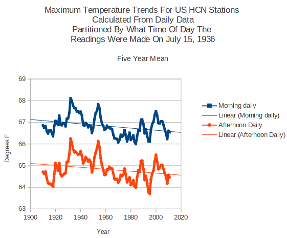

So this morning I tried the same experiment on the raw monthly USHCN data using the identical set of stations as was used in the daily analysis. In this case, something very unexpected appeared. The morning stations are warming much faster than the afternoon stations, which is what TOBS theory predicts.
This discrepancy makes no sense, because I am using the identical set of stations for both the monthly and daily data. The monthly data is supposed to be the average of the daily data.
So the next obvious experiment was to compare the monthly data for…
View original post 4,339 more words
Optical Illusions For Dummies
Maybe space aliens have hijacked the sat and are feeding us false images; Al Gore couldn’t possibly be wrong!

Another carbon tax domino falls – South Korea goes cold on ETS
Well it would seem that some politicians have realized their mistake, not much change of this here for now but there is still hope that sanity will prevail.
Analysis of Global Temperature Trends, June 2014
What really going on with the Climate?
The analysis and plots shown here are based on the following: first NASA-GISS temperature anomalies (converted to degrees Celsius) as shown in their table LOTI, second James E. Hansen’s Scenario B data, which is the very core of the IPCC Global Climate models which was based on a CO2 sensitivity value of 3.0O Celsius, lastly, a plot based on an alternative climate model designated ‘PCM’ and based on a sensitively value of .65O Celsius. To smooth monthly variations a 12 month running average is used in all the plots. This information will be shown in four tables and updated each month as the new data comes in about the middle of the month. Since no model or simulation that cannot reasonably predict that which it was design to do is worth anything the information presented here definitively proves that the IPCC just doesn’t have a clue.
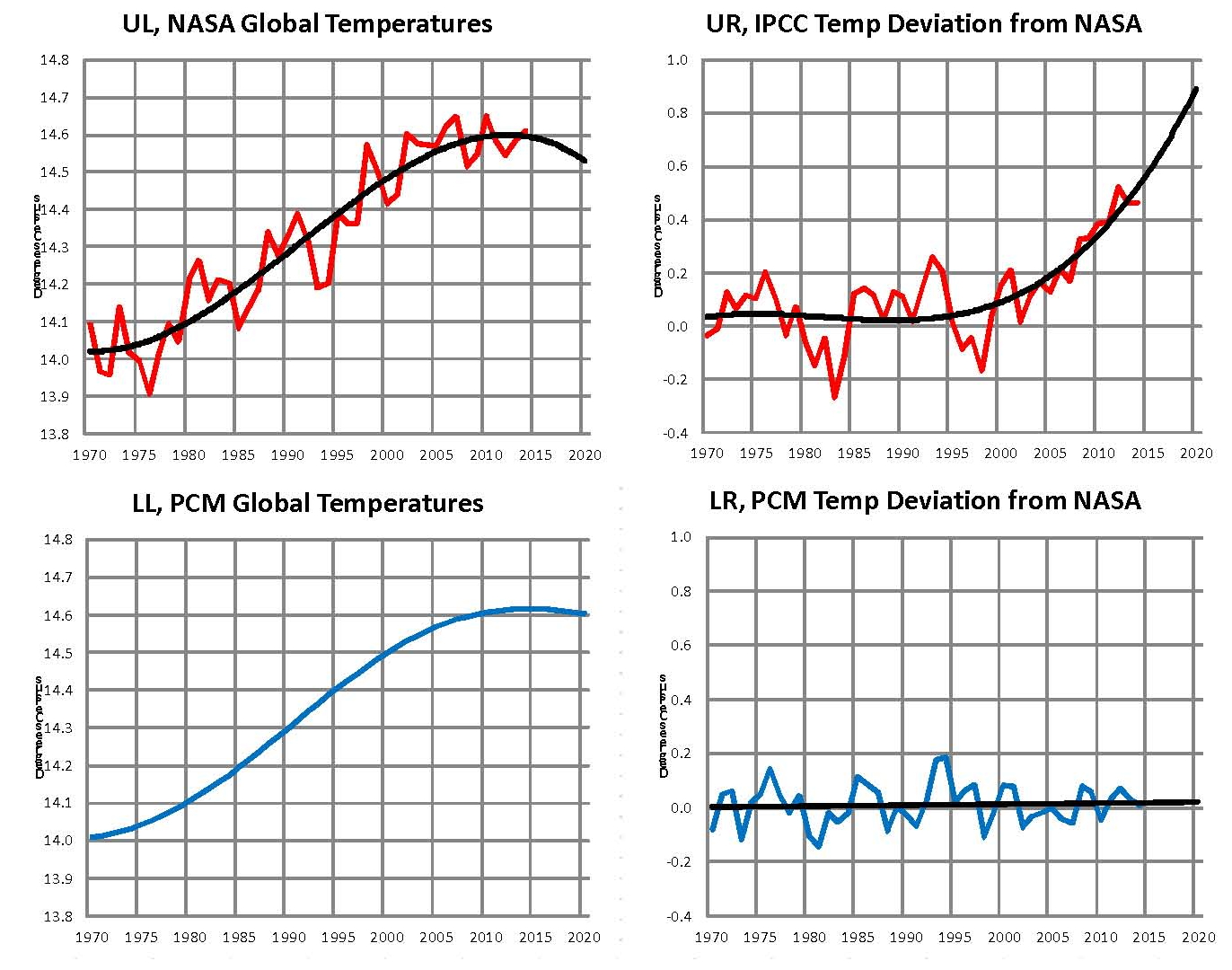
The first plot, UL is a plot of the NASA temperature anomaly converted to degrees Celsius shown in red with a black trend line added. There has been a very clear reversal in the upward movement of global temperatures since about 2001 and neither the UN IPCC nor anyone else has an explanation for this. Since CO2 has continued to increase at what could be argued an increasing rate this raises serious doubts about the logic programmed into all the IPCC global climate models.
The next plot UR, also in red, shows the IPCC estimates of what the Global temperature should be, based on Hansen’s Scenario B, with the NASA actual temperatures’ subtracted from them. Therefore this plot represents a deviation from what the Climate “believers” KNOW what the temperature should be; with a positive value indicating the IPCC values are higher than actual and a negative value indicating the IPCC values are lower than actual. A black trend line is added and we can clearly see that the deviation from expected is increasing at an increasing rate. This makes sense since the IPCC models project increased temperatures based primarily on the increasing level of CO2 in the earth’s atmosphere. Unfortunately, for them, the actual temperatures from NASA are trending down (even as they try to hide the down ward movement with data manipulation) since other factors are in play, therefore each year the gap between them widens. Since we have 12 years of observations’ showing this pattern it becomes hard to justify a continuing belief in the IPCC climate models, there is obviously something very wrong.
The next plot LL shown in blue is based on the equations in the PCM climate model described in previous papers and posts here and since it is generated by “equations” a trend line is not needed. As can be seen the PCM, LL, and the NASA, UL, trend plots are very similar the reason being that in the PCM model there is a 68.2 year cycle that moves the trend line up and then down a total of .30O Celsius (currently negative .0070O Celsius per year); and we are now in the downward portion of that trend which will continue until around 2035. This short cycle is clearly observed in the raw NASA data in the LOTI table going back to 1880. Then there is the a long trend, 1052.6 years with an up and down of 1.36O Celsius (currently plus .0029O Celsius per year) also observed in the NASA data. Lastly there is CO2 adding about .005O Celsius per year so they messily wash out which matches the current holding pattern we are in. However with a few years the increasing downward trend of the short cycle will overpower the other tow and we will see drop of about .002O Celsius per year and that will be increasing until till around 2025. After about 2035 the short cycle will turn up and all three will be on the upswing again. These are all round numbers shown here are representative values.
The last plot LR in blue uses the same logic as used in the UR plot, here we use the PCM estimates of what the Global temperature should be with the NASA actual temperatures’ subtracted from them. A positive value indicates the PCM values are higher than actual and a negative value indicates the PCM values are lower than expected. A black trend line was added and it clearly shows that the PCM model is tracking the NASA actual values very closely. In, fact since 1970 the PCM model has rarely been off by more than +/- .1 degrees Celsius and has an average trend of almost zero error, while the IPCC models are erratic and are now approaching an error rate of +.5O above expected.
The IPCC models were designed before a true picture of the world’s climate was understood. During the 1980’s and 1990’s CO2 levels were going up and the world temperature was also going up so there appeared to be correlation and causation. The mistake that was made was looking at only a 20 year period when the real variations in climate move in much longer cycles. Those other cycles can be observed in the NASA data but they were ignored for some reason. By ignoring those trends and focusing only on CO2 the models will be unable to correctly plot global temperatures until they are fixed.
The purpose of this post is to make people aware of the errors inherent in the IPCC models so that they can be corrected.
Sir Karl Raimund Popper (28 July 1902 – 17 September 1994) was an Austrian and British philosopher and a professor at the London School of Economics. He is considered one of the most influential philosophers of science of the 20th century, and he also wrote extensively on social and political philosophy. The following quotes of his apply to this subject.
If we are uncritical we shall always find what we want: we shall look for, and find, confirmations, and we shall look away from, and not see, whatever might be dangerous to our pet theories.
Whenever a theory appears to you as the only possible one, take this as a sign that you have neither understood the theory nor the problem which it was intended to solve.
… (S)cience is one of the very few human activities — perhaps the only one — in which errors are systematically criticized and fairly often, in time, corrected
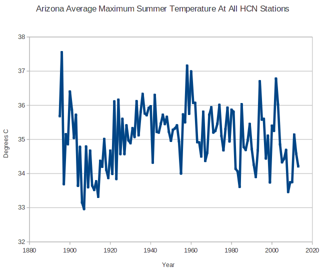
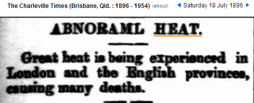
1896 – An Incredibly Hot Summer In Both Hemispheres
But a cording to current climate theory this isn’t possible — do you think the current theories just might be WRONG … lol
The year 1896 brought record heat to both hemispheres, with CO2 below 300 PPM. Interesting how climatologists pretend this didn’t happen, and in fact NASA has largely erased it from the temperature record.
The summer of 1896 was the hottest on record in Arizona
The heat covered the US, and caused “terrible mortality” in Chicago

People dropped dead from the heat in London
January, 1896 was by far the hottest month is Australian history.
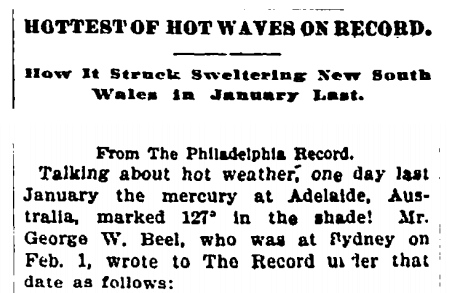

Some places reached 130 degrees.
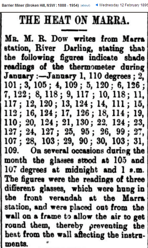
Parrots dropped dead out of trees.
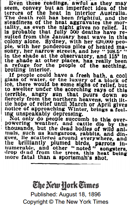
The heat killed millions of rabbits

Temperatures in Australia plummeted over the next 50 years, as CO2 began to rise.
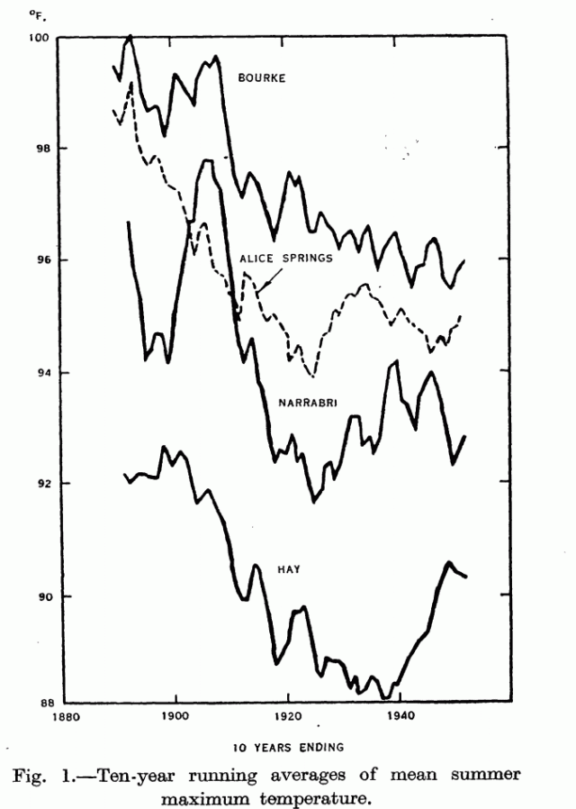
NASA Hacking Australia
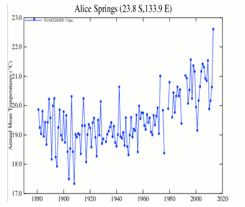
NASA-GISS does what NASA-GISS does best — play games with the data!
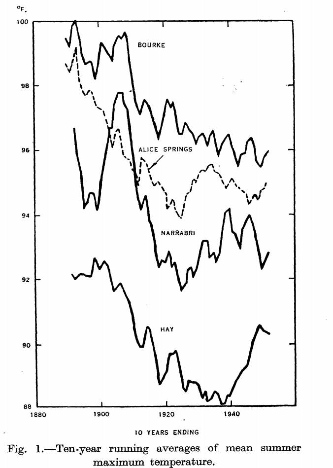
Jennifer Marohasy dug up a 1952 CSIRO paper, which shows sharp Australian cooling from the hot 1890s to the 1920s. I overlaid GISS average summer temperature 10 year ending mean for Alice Springs, on the equivalent CSIRO maximum temperature graph for Alice Springs.
The comparison isn’t perfect (average temperature vs. maximum) but it does show how NASA has dramatically cooled Australia’s pre-1930 past, and have in fact turned a 1910-1925 cooling trend into a warming trend.
Deacon_EL_ClimateChangeinAustralia_1952.pdf
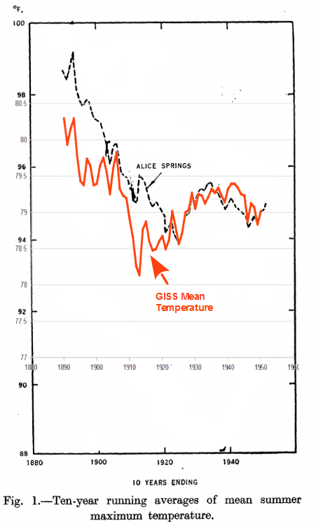
We know that the raw Alice Springs data was correct, because many other stations showed the same 1910-1925 cooling – which NASA has erased. Once again, NASA is destroying temperature records to suit a political agenda.
This is what NASA did to Alice Springs between GISS V2 and GISS V3