Sea Ice Extent – Day 167 – Antarctic 2nd Highest – Global 15th Highest For This Day


Just more proof that the planet is getting hotter and hotter!

sunshinehours1's avatarsunshine hours

2nd Highest Antarctic Sea Ice For This Day – 1.1 million above the 1981-2010 mean. – Above 2 standard deviation.

15th Highest Global Sea Ice For This Day – Above the 1981-2010 mean.

Arcticno longer a record low for the day. So far 45 days in 2015 have been record lows. 2006 has 79 record lows. 2012 has 127.

Global_Sea_Ice_Extent_Zoomed_2015_Day_167_1981-2010Antarctic_Sea_Ice_Extent_Zoomed_2015_Day_167_1981-2010Arctic_Sea_Ice_Extent_Zoomed_2015_Day_167_1981-2010

South / North

View original post

Analysis of Global Temperature Trends, May 2015 What’s really going on with the Climate?


The analysis and plots shown here are based on the following: first NASA-GISS temperature anomalies (converted to degrees Celsius so non-scientists will understand the plots) as shown in their table LOTI, second James E. Hansen’s Scenario B data, which is the very core of the IPCC Global Climate models (GCM’s) and which was based on a CO2 sensitivity value of 3.0O Celsius, lastly, a plot based on an alternative climate model designated ‘PCM’ and based on a sensitively value of .65O Celsius.

An explanation of the alternative model designated PCM is in order since many have interpreted this PCM model as a statistical least squares projection of some kind and nothing could be further from the truth. A decade ago when I started this work the first thing I did was look at geological temperature changes since it is well known that the climate is not a constant; I learned that in my undergrad geology and climatology courses in 1964. One quickly finds that there is a clear movement in global temperatures with a 1,000 some year cycle going back at least 3,000 to 4,000 years; probably because of the apsidal precession of about 21,000 years for a complete cycle. However about every 10,000 years the seasons are reversed making the winter colder and the summer warmer (northern hemisphere) 10,000 years from now. There are also 60 to 70 year cycles in the Pacific and the Atlantic oceans that are well documented. We also know that there are greenhouse gases such as Carbon Dioxide and the National Academy of Sciences (NAS) estimated that Carbon Dioxide had a doubling rate of 3.0O Celsius plus or minus 1.5O Celsius in 1979

The IPCC still uses the NAS 3.0O Celsius as the sensitivity value of Carbon Dioxide and a number in that range is required to make the IPCC GCM’s work. The problem with using this value is it leaves no room for other factors and hence the need of the infamous Hockey Stick plots of the IPCC from Mann, Bradley & Hughes in 1999. The PCM model is based on a much lower value for Carbon Dioxide consistent with current research which places the value between 0.65O and 1.5O Celsius per doubling of Carbon Dioxide. If the long and short movement in temperatures and a lower value for Carbon Dioxide are properly analyzed and combined a plot that matched historical and current (non manipulated) NASA temperature estimates very well can be constructed. This is not curve fitting.

The PCM model is such a construct and it is not based on statistical analyses of raw data. It is based on creating curves that match observations (which is real science) and those observations appear to be related to the movement of water in the world’s oceans. The movements of ocean currents is well documented in the literature all that was done here was properly combine the separate variables into one curve which had not been previously done. Since this combined curve is an excellent predictor of global temperatures unlike the IPCC GCM’s it appears to reflect reality a bit better than the convoluted IPCC GCM’s which after the past 19 years of no statistical warming have been shown to be in error.

Now, to smooth out highly erratic monthly variations a 12 month running average is used in all the plots. This information will be shown in four tables and updated each month as the new data comes in about the middle of the month. Since no model or simulation that cannot reasonably predict that which it was design to do is worth anything the information presented here definitively proves that NASA, NOAA and the IPCC just don’t have a clue.

000 2015-05 a

The first plot, UL is a plot of the NASA temperature anomaly converted to degrees Celsius and shown in red with a black trend line added. There has been a very clear reversal in the upward movement of global temperatures since about 2001 and neither the UN IPCC nor anyone else has an explanation for this 13 years later. Since CO2 has continued to increase at what could be argued an increasing rate this raises serious doubts about the logic programmed into all the IPCC global climate models.

The next plot UR, also in red, shows the IPCC estimates of what the Global temperature should be, based on Hansen’s Scenario B, with the NASA actual temperatures’ subtracted from them. Therefore this plot represents a deviation from what the Climate “believers” KNOW what the temperature should be; with a positive value indicating the IPCC values are higher than actual and a negative value indicating the IPCC values are lower than actual, as measured by NASA. A black trend line is added and we can clearly see that the deviation from expected is increasing at an increasing rate. This makes sense since the IPCC models project increased temperatures based primarily on the increasing level of CO2 in the earth’s atmosphere. Unfortunately, for them, the actual temperatures from NASA are trending down (even as they try to hide the down ward movement with data manipulation) since other factors are in play, therefore each year the gap between them widens. Since we have 13 years of observations’ showing this pattern it becomes hard to justify a continuing belief in the IPCC climate models, there is obviously something very wrong here.

The next plot LL shown in blue is based on the equations in the PCM climate model described in previous papers and posts here and since it is generated by “equations” a trend line is not needed. As can be seen the PCM, LL, and the NASA, UL, trend plots are very similar the reason being that in the PCM model there is a 68.2 year cycle that moves the trend line up and then down a total of .30O Celsius (currently negative .0070O Celsius per year); and we are now in the downward portion of that trend which will continue until around 2035. This short cycle is clearly observed in the raw NASA data in the LOTI table going back to 1868. Then there is a long trend, 1052.6 years with an up and down of 1.36O Celsius (currently plus .0029O Celsius per year) also observed in the NASA data. Lastly there is CO2 adding about .005O Celsius per year so they basically wash out which matches the current holding pattern we are experiencing. However within a few years the increasing downward trend of the short cycle will overpower the other two and we will see drop of about .002O Celsius per year and that will be increasing until till around 2025 or so. After about 2035 the short cycle will have bottomed and turn up and all three will be on the upswing again. These are all round numbers shown here as representative values.

The last plot LR in blue uses the same logic as used in the UR plot, here we use the PCM estimates of what the Global temperature should be with the NASA actual temperatures’ subtracted from them. A positive value indicates the PCM values are higher than actual and a negative value indicates the PCM values are lower than expected. A black trend line was added and it clearly shows that the PCM model is tracking the NASA actual values very closely. In, fact since 1970 the PCM model has rarely been off by more than +/- .1 degrees Celsius and has an average trend of almost zero error, while the IPCC models are erratic and are now approaching an error rate of +.5O above expected.

In summary, the IPCC models were designed before a true picture of the world’s climate was understood. During the 1980’s and 1990’s CO2 levels were going up and the world temperature was also going up so there appeared to be correlation and causation. The mistake that was made was looking at only a ~20 year period when the real variations in climate move in much longer cycles. Those other cycles can be observed in the NASA data but they were ignored for some reason. By ignoring those trends and focusing only on CO2 the models will be unable to correctly plot global temperatures until they are fixed.

Lastly the next Chart shows what a plot of the PCM model would look like from the year 1000 to the year 2200. The plot matches reasonably well with history and fits the current NASA-GISS table LOTI date very closely, despite homogenization. I understand that this model is not based on physics but it is also not curve fitting. It’s based on observed reoccurring patterns in the climate. These patterns can be modeled and when they are you get a plot that works better than any of the IPCC’s GCM’s. If the conditions that create these patterns do not change and CO2 continues to increase to 800 ppm or even 1000 ppm than this model will work into the foreseeable future. One hundred fifty years from now global temperatures will peak at around 15.5 to 15.7 degrees C and then will be on the downside of the long cycle for the next 500 years. The overall effect of CO2 reaching levels of 1000 ppm or even higher will be between 1.0 and 1.5 degrees C which is about the same as that of the long cycle.

Carbon Dioxide is not capable of doing what Hansen and Gore claim!

000 2015-05 b

The purpose of this post is to make people aware of the errors inherent in the IPCC models so that they can be corrected.

The Obama administration’s “Need” for a binding UN climate treaty with mandated CO2 reductions in Europe and America means there will be such a resolution presented at the COP12 conference in Paris in December. To support this NASA will be forced to show ever increasing global temperatures for the rest of 2015 that will make less and less sense based on observations and satellite data which will all be dismissed or ignored.

Sir Karl Raimund Popper (28 July 1902 – 17 September 1994) was an Austrian and British philosopher and a professor at the London School of Economics. He is considered one of the most influential philosophers of science of the 20th century, and he also wrote extensively on social and political philosophy. The following quotes of his apply to this subject.

If we are uncritical we shall always find what we want: we shall look for, and find, confirmations, and we shall look away from, and not see, whatever might be dangerous to our pet theories.

Whenever a theory appears to you as the only possible one, take this as a sign that you have neither understood the theory nor the problem which it was intended to solve.

… (S)cience is one of the very few human activities — perhaps the only one — in which errors are systematically criticized and fairly often, in time, corrected


May 2015 Global Surface (Land+Ocean) and Lower Troposphere Temperature Anomaly & Model-Data Difference Update


Figure-10 Tells it all the GCM’s continue to show a much larger increase in Temperature than NOAA and NASA can make with their software. There can only be two reasons — Number One is that there is a flaw in the GCM’s. Number Two is that all the global temperature data collection is wrong.

Bob Tisdale's avatarBob Tisdale - Climate Observations

This post provides an update of the data for the three primary suppliers of global land+ocean surface temperature data—GISS through May 2015 and HADCRUT4 and NCEI (formerly NCDC) through April 2015—and of the two suppliers of satellite-based lower troposphere temperature data (RSS and UAH) through May 2015.

View original post 2,960 more words

Twin peaks – twin lies


By Paul Driessen and Tom Tamarkin
web posted June 15, 2015

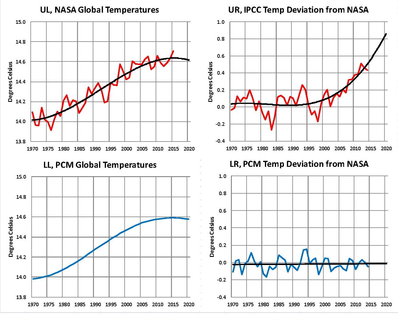
A recent NOAA article is just what Doctor Doom ordered. It claims the 18-year “hiatus” in rising planetary temperatures isn’t really happening. (The “pause” followed a 20-year modest temperature increase, which followed a prolonged cooling period.) The article states:

“Here we present an updated global surface temperature analysis that reveals that global trends are higher than reported by the IPCC, especially in recent decades, and that the central estimate for the rate of warming during the first 15 years of the 21st century is at least as great as the last half of the 20th century. These results do not support the notion of a ‘slowdown’ in the increase of global surface temperature.”

Published in Science magazine to ensure extensive news coverage before critics could expose its flaws, the report was indeed featured prominently in the national print, television, radio and electronic media.

It’s part of the twin peaks thesis: Peaking carbon dioxide levels will cause peaking temperatures, which will lead to catastrophic climate and weather. Unfortunately for alarmists, the chaos isn’t happening.

No category 3-5 hurricane has hit the United States for a record 9-1/2 years. Tornadoes, droughts, polar bears, polar ice, sea levels and wildfires are all in line with (or improvements on) historic patterns and trends. The Sahel is green again, thanks to that extra CO2.  And the newly invented disasters they want to attribute to fossil fuel-driven climate change – allergies, asthma, Islamic State and Boko Haram – don’t even pass the laugh test.

The NOAA report appears to have been another salvo in the White House’s attempt to regain the offensive, ahead of the Heartland Institute’s Tenth International Climate Conference. However, a growing number of prominent analysts have uncovered serious biases, errors and questions in the report.

Climatologists Pat Michaels, Dick Lindzen, and Chip Knappenberger point out that the NOAA team adjusted sea-surface temperature (SST) data from buoys upward by 0.12 degrees Celsius, to make them “homogenous” with lengthier records from engine intake systems in ships. However, engine intake data are “clearly contaminated by heat conduction” from the ships, and the data were never intended for scientific use – whereas the global buoy network was designed for environmental monitoring.

So why not adjust the ship data downward, to “homogenize” them with buoy data, and account for the contamination? Perhaps because, as Georgia Tech climatologist Judith Curry observed, this latest NOAA analysis “will be regarded as politically useful for the Obama administration.” However, it will not be “particularly useful” for improving our understanding of what is happening in Earth’s climate system.

Dr. Curry and the previously mentioned scientists also note that the buoy network has covered an increasingly wide area over the past couple decades, collecting high quality data. So again, why did NOAA resort to shipboard data? The ARGO buoys and satellite network (both omitted in this new analysis) do not show a warming trend – whereas the NOAA methodology injects a clear warming trend.

Canadian economist and statistical expert Ross McKitrick also analyzed the NOAA approach. He concluded that it wipes out the global warming hiatus that eight other studies have found. Its adjustments to SST records for 1998-2000 had an especially large effect, he says. Dr. McKitrick also recaps the problems scientists have with trying to create consistent temperature records from the multiple measurement methods employed over the centuries.

Theologian, ethicist and climate analyst Calvin Beisner provides an excellent summary of all these and other critiques of the deceptive NOAA paper.

It is also important to note that, in reality, NOAA is quibbling about hundredths of a degree – essentially the margin of error. On that basis it rejects multiple studies that found planetary warming has stopped.

Britain’s Global Warming Policy Forum succinctly concludes: “This is a highly speculative and slight paper that produces a statistically marginal result by cherry-picking time intervals, resulting in a global temperature graph that is at odds with those produced by the UK Met Office and NASA,” as well as by other exhaustive data monitoring reports over the past four decades.

The vitally important bottom line is simple.

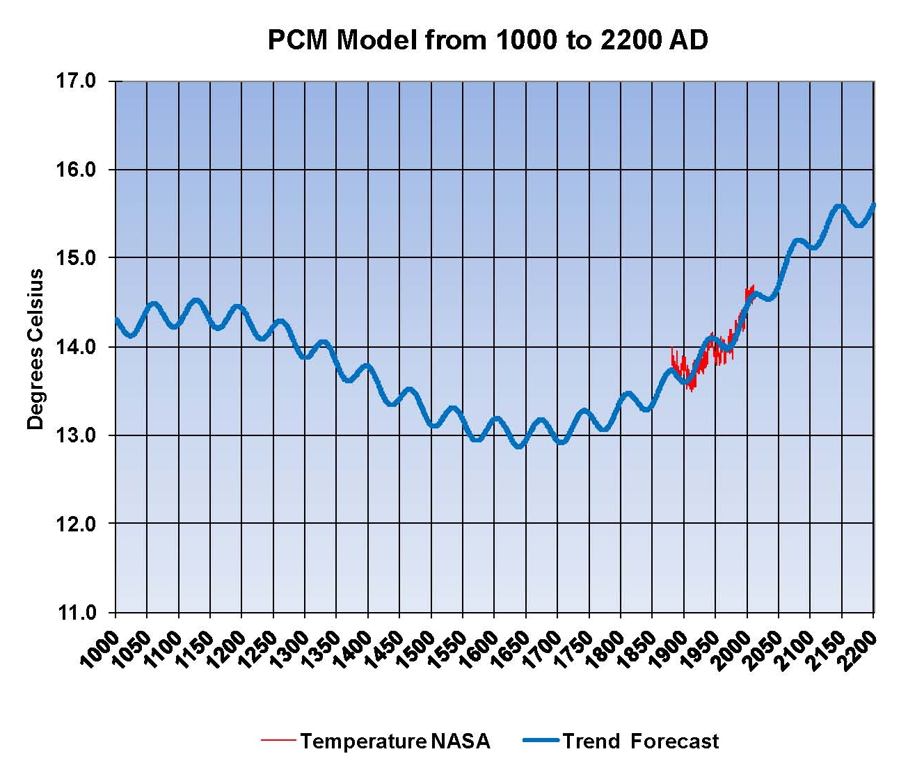
The central issue in this ongoing debate is not whether Planet Earth is warming. The issue is: How much is it warming? How much of the warming and other climate changes are due to mankind’s use of fossil fuels and emission of greenhouse gases – and how much are due to the same powerful natural forces that have driven climate and weather fluctuations throughout Earth and human history? And will any changes be short-term or long-term … and good, bad, neutral or catastrophic?

At this time, there is no scientific evidence – based on actual observations and measurements of temperatures and weather events – that humans are altering the climate to a significant or dangerous degree. Computer models, political statements and hypothetical cataclysms cannot and must not substitute for that absence of actual evidence, especially when the consequences would be so dire for so many. In fact, even the “record high” global average temperature of 2014 was concocted and a margin of error.

Simply put, the danger is not climate change – which will always be with us. The danger is energy restrictions imposed in the name of controlling Earth’s perpetually fickle climate.

Moreover, the IPCC’s top climate official says the UN’s unelected bureaucrats are undertaking “probably the most difficult task we have ever given ourselves, which is to intentionally transform the [global capitalist] economic development model.” Another IPCC director says, “Climate policy has almost nothing to do anymore with environmental protection. The next world climate summit is actually an economy summit, during which the distribution of the world’s resources will be negotiated.”

That summit could give government officials and environmental activists the power to eliminate fossil fuels, control businesses and entire economies, and tell families what living standards they will be permitted to enjoy – with no accountability for the damage that will result from their actions.

For developed nations, surrendering to the climate crisis industry would result in fossil fuel restrictions that kill jobs, reduce living standards, health, welfare and life spans – and put ideologically driven government bureaucrats in control of everything people make, grow, ship, eat and do.

For poor countries, implementing policies to protect energy-deprived masses from computer-generated manmade climate disasters decades from now would perpetuate poverty and diseases that kill them tomorrow. Denying people their basic rights to have affordable, reliable energy, rise up out of poverty, and enjoy modern technologies and living standards would be immoral – a crime against humanity.

Countries, communities, companies and citizens need to challenge and resist these immoral, harmful, tyrannical, lethal and racist EPA, IPCC, UN and EU decrees. Otherwise, the steady technological, economic, health and human progress of the past 150 years will come to a painful, grinding halt – sacrificed in the name of an illusory and fabricated climate crisis. ESR

Paul Driessen is senior policy analyst for the Committee For A Constructive Tomorrow (www.CFACT.org), author of Eco-Imperialism: Green power – Black death, and coauthor of Cracking Big Green: Saving the world from the Save-the-Earth money machine. Tom Tamarkin is founder and CEO of USCL Corporation and of the fusion energy advocacy groups http://www.fusion4freedom.us  and http://www.fuelRfuture.com. He is widely credited with inventing the utility industry smart meter and holds granted and pending patents in the field.

Medieval Warm Period confirmed via cave study of 3000 years of climatic variations


More confirmation that CO2 is not the primary driver for global temperature.

Global Warming Alarmists use Fear, to Extort Money. We need to say NO!


I know Will and he is world Case in his field! Anyone that would speak against him is de facto wrong

Will Happer, Physicist Princeton–with a chair position–says warmers are goofy mad


Last year I spend the weekend with Will, in Princeton, going over ‘Climate Change” with him. He was extremely helpful to me with showing me both the university and some of the theory involved there is no doubt he is a great man.

john1282's avatarJunkScience.com

I would say yes but it’s about the true believer pathology–they are committed to a sky is falling concept so they can commit to a “solution.”

View original post 67 more words

Despite attempts to erase it globally, “the pause” still exists in pristine US surface temperature data


this slight downward trend matches my model exactly and if i am right will continue for 15 more years before it turns up again.

Sea Ice Extent – Day 164 – Antarctic 2nd Highest – Global 15th Highest For This Day


Does the truth even matter today?

sunshinehours1's avatarsunshine hours

2nd Highest Antarctic Sea Ice For This Day – 1 million above the 1981-2010 mean. – Above 2 standard deviation.

15th Highest Global Sea Ice For This Day – Above the 1981-2010 mean.

Arcticno longer a record low for the day. So far 45 days in 2015 have been record lows. 2006 has 79 record lows. 2012 has 127.

Global_Sea_Ice_Extent_Zoomed_2015_Day_164_1981-2010Antarctic_Sea_Ice_Extent_Zoomed_2015_Day_164_1981-2010Arctic_Sea_Ice_Extent_Zoomed_2015_Day_164_1981-2010

South / North

View original post

Spectacular Collapse Of The Arctic Climate Scam Continues


After over 30 years of it being drummed into us the the planet was going to melt and kill all of us we have lost the battle the under 45 people most all of them think we are crazy for not believing what we are being told. very few under 45 people i know think Al Gore is wrong and they will not believe anything to the contrary even when you show them Charts like these. I am told that I made them up when i try! Like this insane trade deal (which will pass) COP21 will result in an agreement!

Tony Heller's avatarReal Climate Science

The Arctic was the last remaining hope of the climate criminals to maintain any credibility, and that story has completely collapsed.

As we approach mid-summer, southern Greenland is still covered with snow. This is a land where Vikings farmed 1,000 years ago.

ScreenHunter_9529 Jun. 14 00.49

Weather Webcams | Weather Underground

The melt season on Greenland is the slowest on record. Normally about 30% of Greenland is melting by now, but this year less than 10% is melting.

ScreenHunter_9526 Jun. 14 00.35Greenland Ice Sheet Surface Mass Budget: DMI

Greenland’s surface has gained more than half a trillion tons of snow and ice since September.

ScreenHunter_9527 Jun. 14 00.37

Near the midpoint of the melt season, Arctic sea ice is closely tracking 2006. That was the year with the highest summer minimum of the past decade.

ScreenHunter_9528 Jun. 14 00.41

Ocean and Ice Services | Danmarks Meteorologiske Institut

Arctic sea ice is the thickest it has been since 2006.

Bpiomas_plot_daily_heff.2sst (4)

Bpiomas_plot_daily_heff.2sst.png (2488×1960)

Ahead of the Paris conference…

View original post 34 more words