
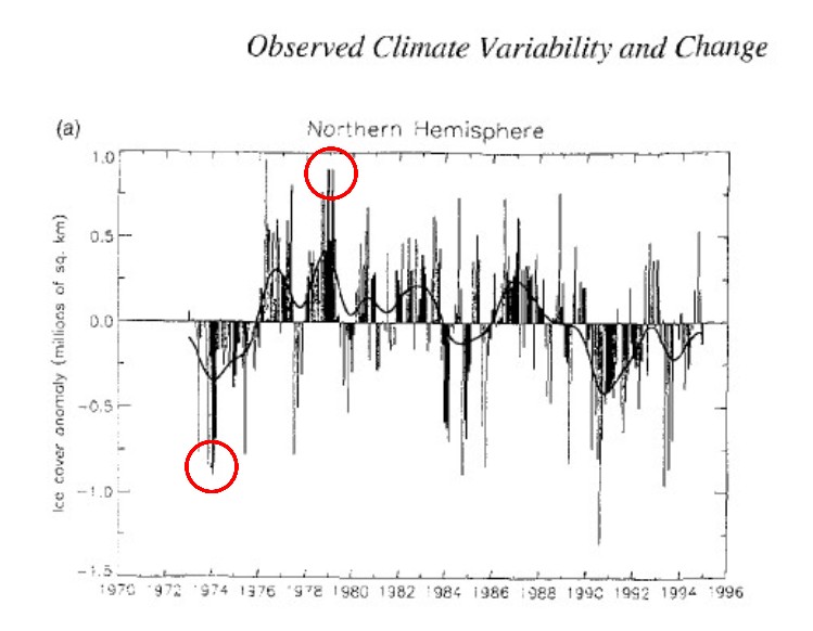
When looking at charts and graphs its always good to make sure the starting point is valid (has been cherry picked) for the purpose of the chart.
NSIDC begins their Arctic sea ice graphs in 1978-1979 – which creates the impression that Arctic sea ice is steadily declining.
Arctic Sea Ice News and Analysis | Sea ice data updated daily with one-day lag
They ignore satellite data prior to 1978, which shows that Arctic sea ice extent was two million km² lower in 1974. The graph below was in the 1995 IPCC report.
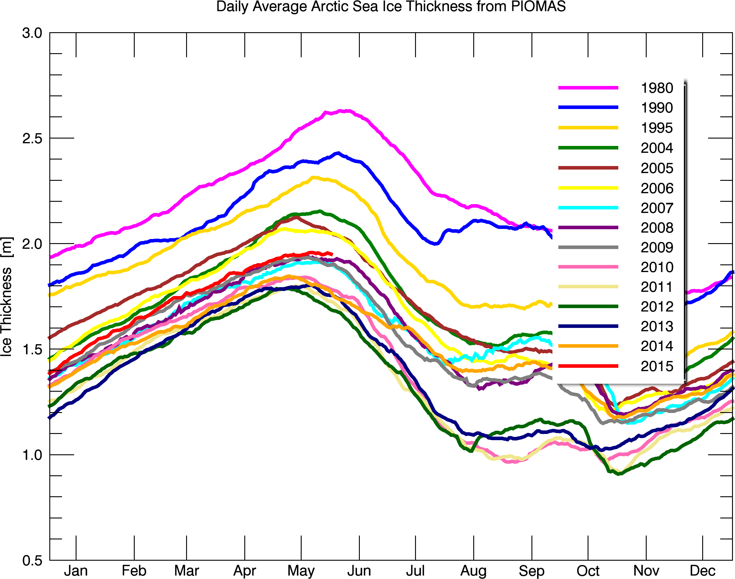
The Arctic is not melting down. It is currently the thickest since 2006, and thickness is about the same (2 meters) as it was 75 years ago.
Bpiomas_plot_daily_heff.2sst.png (2488×1960)
Papers Past — Auckland Star — 14 December 1940 — WARMER ARCTIC

