
The PCM Model
When my study of the subject of climate change started in 2005 the first thing I did was to find where the temperature data was and that was at NASA. They publish their estimate of the world’s average temperature each month in a table going back to January 1880. The table is Land Ocean Temperature Index (LOTI). The values in that table are in hundredths of a degree Celsius taken from a base temperature which is 14.0 degrees Celsius. They call this number an Anomaly and it is what everyone in this field uses.
For example if the value in table LOTI for say July 2006 was 58 then we would add .58 to 14.0 degrees Celsius and have a temperature of 14.58 C; if the value was -24 then we would add -.24 to 14.0 degrees Celsius and have a temperature of 13.76 degrees Celsius. Once I understood the system I keyed all the values back to 1880 in an Excel Spreadsheet and plotted them in a chart. The chart below is what I saw when I finished; there were obviously two downward trends and two upward trend in 2005. Later that changed but it got me thinking.
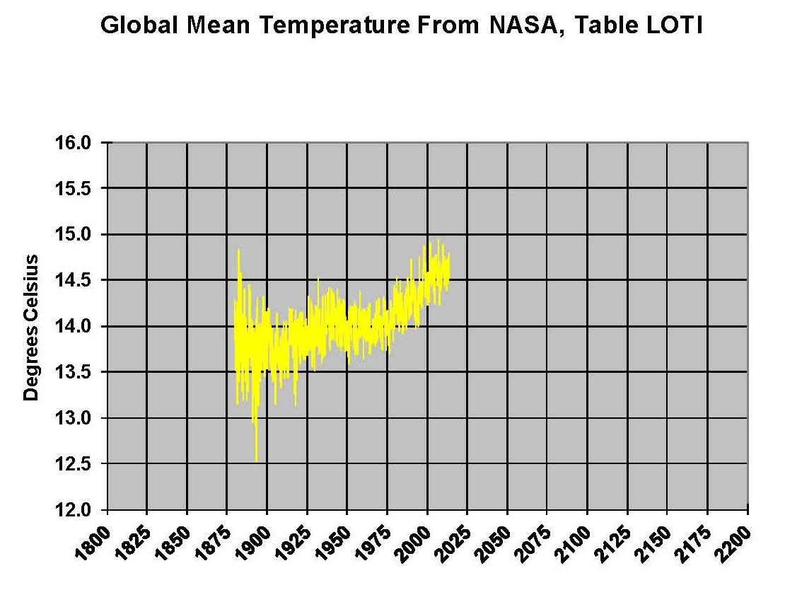
In addition to the two down and two up trends it seems that each was higher then the previous one and the last upward trend seem longer than the first one. So to my mind there were multiple variables in play here and I spent a lot of time trying to find what they were. That was not an easy task given that the Science was already settled and the reason that temperatures were going up was that “we” were putting Carbon Dioxide in the atmosphere in such great numbers that it was building up and creating a “greenhouse” effect that was going to destroy the planet, according to Al Gore. This process was called Anthropogenic Climate Change; Anthropogenic meaning caused by man. I knew I was going to have to add Carbon Dioxide into the picture so now was the time. NOAA published the level of Carbon Dioxide in the atmosphere in parts per million (ppm) back to 1958 so that was added to the spreadsheet
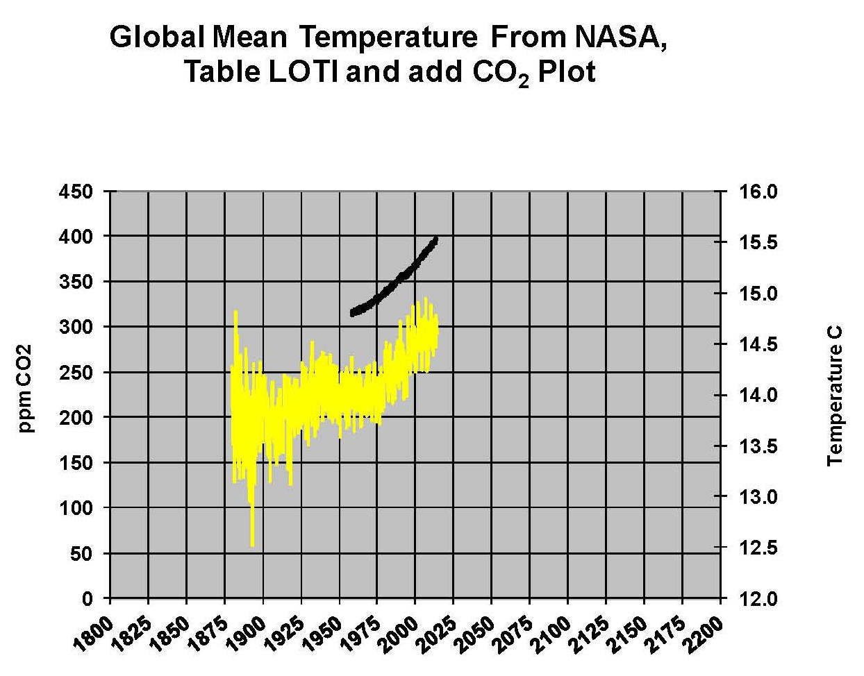
Unfortunately the Carbon Dioxide levels didn’t go back to 1880 so that a direct comparison couldn’t be made. However the curve was very smooth and consistent and since there was an accepted value of 280 ppm in 1800 it seemed to me that Carbon Dioxide was increasing at a rate with little variation while temperatures were moving up and down month to month. Therefore, there must be more going on than just Carbon Dioxide driving temperature changes. The following Chart shows what the Carbon Dioxide levels look like when added to the review.
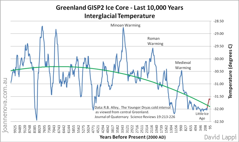
Skipping forward a couple of years to 2009 my research confirmed that there was more going on than Carbon Dioxide levels. For example we have a plot of temperatures from Greenland ice core samples where three warming periods and three cooling periods are shown. This was only one of many like studies. It can also be seen that there are about 1,000 years between peaks so could that be a climate cycle?
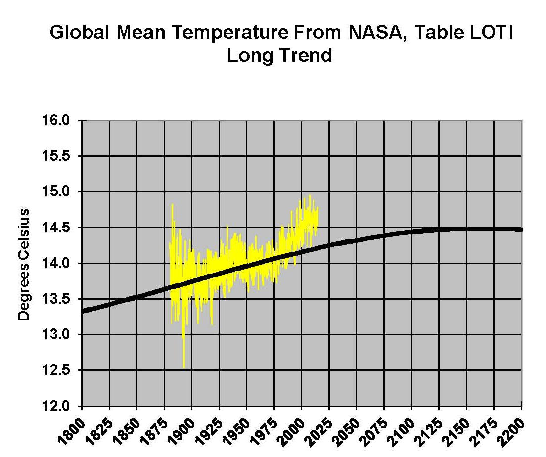
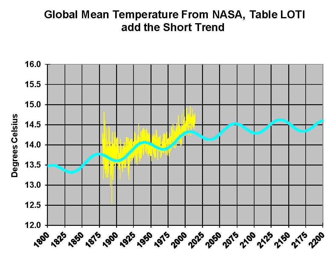
In previous posts here I described the equations that were developed and so I’ll skip that here other than to say that the long cycle ended up as 1052.63 years with an amplitude of 1.48 degrees Celsius. And the next chart shows that equation overlaid on the NASA temperature plot with the minimum set to 1650 which is considered the bottom of the little ice age. The plot seems to pick up the overall upward movement so we are on track to a valid model.
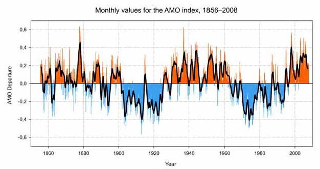
We still had short range fluctuations to identify and there were observed pattern to support another factor such as the Atlantic Multidecadal Oscillation Index (AMO index) shown below which looks very similar to the temperature plot of NASA with the ups and downs that were much shorter than the previous long trend. This cycle seemed to be around 60 years as can be seen in this plot from Wikipedia.
Again in previous posts here I described the equations there were developed and so I’ll skip that here other than to say that the short cycle ended up as 66.67 years with an amplitude of .3 degrees Celsius. And the next chart shows that equation added to the long cycle such that it matched the observed variations in the NASA temperature plot. The chart shows the long and short cycles which now seem to pick up most of the pattern so we are still on track to a valid model.
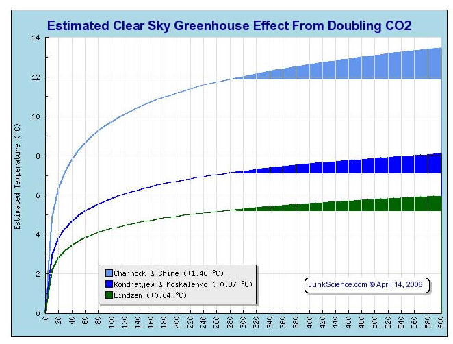
Although it’s clear that what we have is very close to the NASA data it’s not there yet, there must be another factor. The most likely is Carbon Dioxide despite what some try to say that it has no affect. More research showed that there was no certainty about what the actual effect of Carbon Dioxide was and this is discussed here in previous plots. If we assume that it was to the low side not the high side that the IPCC uses than maybe we had the final element for the model. Dr. Lindzen a well known Physicist now retired from MIT in 2013 believes that it’s toward the low side and I found this graph on Junksicience.com a great source of information despite its name showing the various values.
Using Dr. Lindzen’s value of .64 Degrees Celsius as shown in the previous chart allows one to develop an equation for the amount of temperature that various levels of carbon Dioxide will produce. Since this is a diminishing amount no matter what the value we needed an equation that accomplished that. We started at 280 ppm in 1800 and worked the numbers to 2009 (when this work was done) and where we can see, based on the above chart, that most of the effect of Carbon Dioxide as already been realized. There is very little more increase to get no matter how high the level of Carbon Diode gets. The equation for Carbon Dioxide is shown on a previous post so we’ll just add the plot to what we already have and that is shown in the next Graphic.
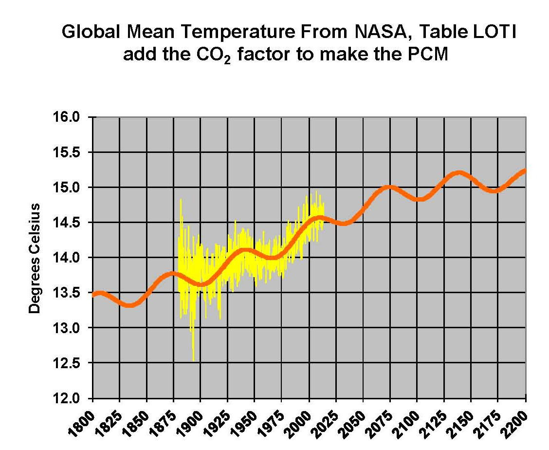
The PCM model is now complete as can be seen on the previous Graphic. There is no reason to not believe that this model is not a true representation of the planets current climate patterns. The proof to any theory is that the results match observations which we do have here. However, it would be foolish to believe that over long period of time, meaning tens of thousands of years, that this model would hold up as there are just way too many factors that have effects on the climate when we consider geological times.
However, right now “today” this model works and shows that the hysterics over climate change as being promoted by the government is false. We are in a cooling period and will be until sometime in the 2030’s — There is absolutely “no” justification for Green Energy projects that will significantly drive up the cost of energy and by so doing will therefore have very negative influences on the global economy that could even lead to wars.
We must get real and stop this false and misleading “snake oil” program of Al Gore and his cohorts before we go any further in this misguided direction.
