A quick review of several sources including Wikipedia that had estimated dates of 5 previously identified warm and cold periods going back almost 3,000 years was used to give these average dates for either the bottom or the peak temperature in that period.
The Sub Atlantic Cold Period 363 BC
The Roman Warm Period 365 AD
The Dark Age Cold Period 700 AD
The Medieval Warm Period 1192 AD
The Little Ice Age 1602 AD
The average peak to bottom for these observed Cycles is 491 years or 982 years for a complete cycle. So if we add 491 years to the last bottom which was in 1602 AD that would make the peak of the “current” warming trend 2149 AD. This has nothing to do with CO2 although CO2 will add some to the coming peak maybe even .5 degree Celsius.
Basically what this quick 30 minutes study showed is there is nothing to worry about except corrupt politicians.
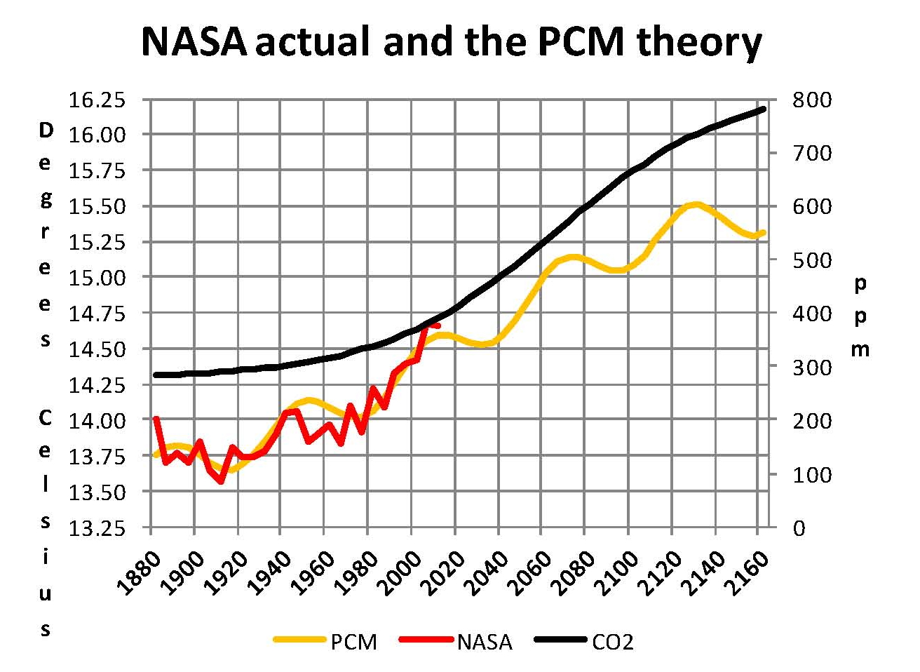
Based on this quick review and other information all previously shown on my blog a climate model can be constructed in a reasonable amount of time (Took me a couple of years since I was starting from scratch) Which is as follows. Chat One shows mathematically derived plots based on empirical observations of NASA–GISS data and other data such as was shown in the opening paragraph of this post. The cyan line is based on the war and cold cycles in the opening. The red line is based on El Nino, LA Nina and the Atlantic Multidecadal Oscillation (AMO). The black line is based on a mathematical analysis of NOAA CO2 growth rates projected into the future and reaching a level of 1,000 ppm by the end of the next century.
The blue line is the base since we knows what the temperature was in 1600 and we have a good idea what the level of CO2 was back then as well. Therefore from Chart One we can see that the blue pattern takes about 1,000 years to make a cycle and the total rang is 1.4 degrees Celsius. The red line has a cycle of 70 years with a range of .38 degrees Celsius. And CO2 from 1650 to the peak in about 2150 is about 1.0 degrees Celsius however keep in mind that half of the increase has already been used up since we are at 400 ppm now.
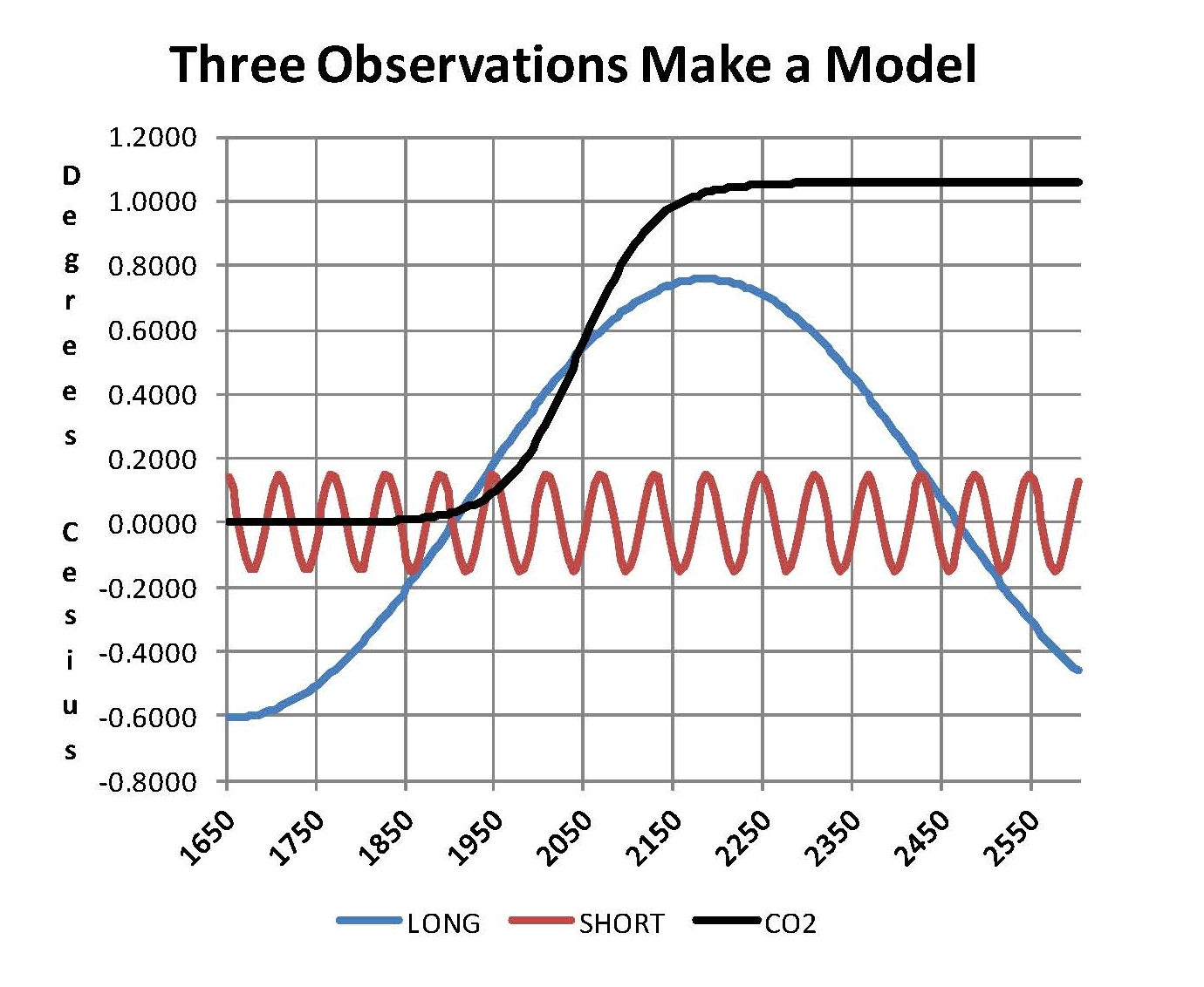
Chart Two is a composite made from adding all three of the items in Chart One together. Obviously after 2150 the blue line starts moving down and since it is the largest of the three it will drag down all the rest with it for another 500 years just as it has done for the past 3000 years. The yellow line is the sum of the three items in Chart one labeled PCM The red line are actual NASA-GISS temperatures for their Table LOTI. The red and yellow line match well indicating that there is validity in the assumption used here. Previous posts here have showed most of the detail for doing this including all the equations, for those that interested.