
The following chart was produced from information published monthly by NASA-GISS on their website in a table designated the land ocean temperature index, LOTI, which contains temperature deviations from a base of 14.0 degrees Celsius. These deviations are in hundredths of a degree Celsius and are called anomalies and NASA almost never uses actual temperatures in what they do. Personally I do not support this method since the base period, 1951 to 1980, is totally arbitrary and has no significance.
This chart was created after several years of observing strange movements in the values posted in the LOTI table. These changes result from NASA recalculating the entire data set each month when the new month was added to the chart. When I first realized this I thought it was just random movements that would cancel out; but that turned out to not be the case and the movements were observed to follow patterns. I have written about this many times over the past few years but these movements have become more and more out of touch with reality as NASA tries to make the global temperatures match the need of the Obama administration and the COP21 conference, to be held in Paris in November 2015 for “high” global temperatures to justify the world tax on carbon that will be proposed in the UN early 2016. There will be two more releases between now and when the conference starts, one for September and one for October which will be coming out just when the conference starts.
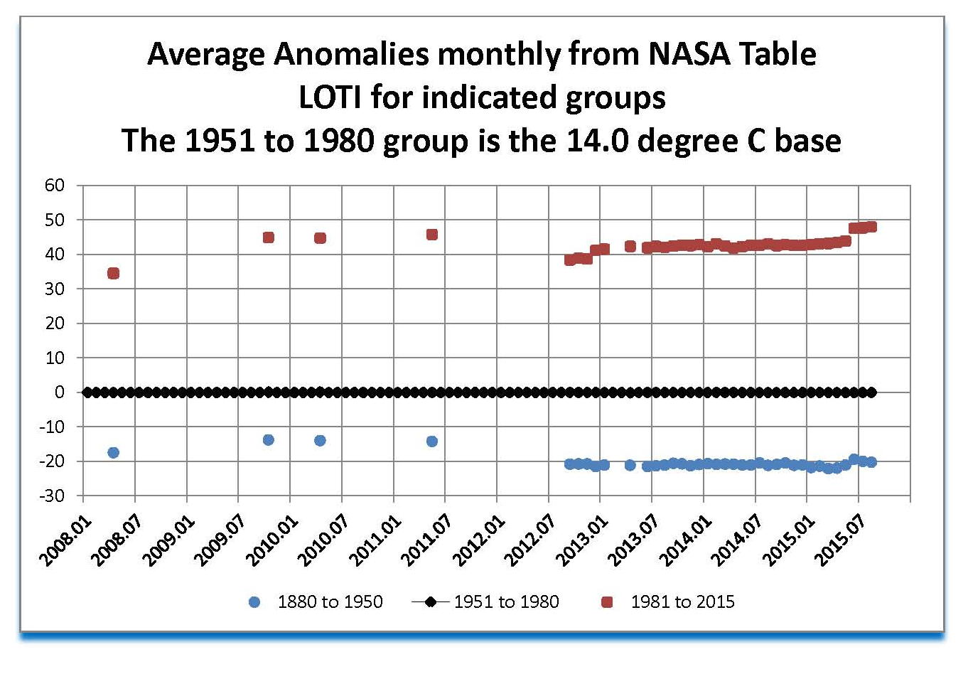
There are three categories shown in this chart: the first is the period 1880 to 1950 containing 840 monthly values and shown in blue circles, the second is the period 1951 to 1980 containing 360 monthly values shown in black diamonds, and the last is the period 1981 to the present containing 312 values as of August 2015 and shown in red squares. The plot shown in each case is the average anomaly for all the values in that category for the indicated month of publication. Unfortunately I did not save all the printouts of the LOTI tables as I assumed that they would be available online if needed. Sadly that is not true and so there are large gaps in the chart until late in 2012.
Since NASA has designated the period 1951 to 1980 as the 14.0 degree Celsius base it can by definition not change and NASA has done a good job of making the 30 year period work out to near zero, as can be seen in the black diamonds. However, if the individual months are looked at a slightly different look appears. Basally the earlier portion in the 50’s moves down and the newer portion in the 70’s move up such that the average stays zero. This is required to support the changes in the other two periods. It’s important to understand that this period MUST equal zero and since the values in this LOTI table are always changing the software has to be set to make this period come out to zero. When plots are made of the monthly NASA issues a teeter totter effect can be observed with the pivot point being 1951 to 1980.
Now the period 1880 to 1950 in blue is historical and so one would think is fixed; however NASA does not buy that the past cannot be changed. Ignoring the one 2008 value we look at the four 2009 and 2010 values and then look at the 2012 to 2014 values and we see a shift of about five hundredths of a degree down which is a major shift. Then in 2014 and 2015 the plot gets erratic as NASA starts to do serious manipulation of the data and temporarily loses control of the system. NASA must have been directed to make sure that 2015 was the hottest year ever and that required a lot of program changes to make that happen. Getting the right (political) outcome would not be an easy task and so it apparently it took the programmers a few months to get it right.
The current period 1981 to the present (August 2015) is the most important one, politically, and is shown here as the red squares. The red plots look “reasonable” though 2014 and then like the blue things start to get erratic. Keep in mind that each point on the chart represents an average of hundreds of values so a noticeable change cannot be from random movements. The red plots contain over 300 values so to see a jump in the plots as seen in 2015 especially in the last several monthly publications is very unlikely to be “natural” for it indicates that a large numbers of values have suddenly gone up not just a few in the current months.
This manipulation can also be seen in the blue plots after 2014 where it is even harder to change the average as there are 840 values here. I am sure that this manipulation will continue through the end of the year so that there can be a case made to justify a carbon tax on all the US Canada and the EU. This tax will be proposed by Obama and the catholic Pope and passed by the UN in early 2016. I would be very surprised if the red plot doesn’t reach 50 or greater by the end of the year.
These large upward changes to the global temperature are not supported by the satellites that also measure temperatures, so there is some discussion being proposed that there are errors in the satellites and/or in their calibration since they to do support the NASA ground data showing large increases. I would not be surprised if an error was found in the next few months that shows that the satellites data is not right.
Hopefully I am wrong in my assessment and I would love to be proved wrong. I will update this chart for the rest of the year so we can see what is going on with the data.
