
This paper shows that the values published in the NASA table LOTI cannot be supported when the sun’s energy is used as an input since the difference month to month in the table cannot be less or more than when the sun sends us. Changes in the planets albedo were also considered and even 30% changes in the albedo cannot explain the large amount of energy that must come in or go out if the NASA values are to be believed.
NASA publishes values representing the global surface temperature of the planet supposedly based on actual measurements processed in a complex algorithm they call homogenization. The resulting values are published each month in a table called the Land Ocean Temperature Index (LOTI) which runs from January 1880 to the current month, September 2015 in this case. The process they use is explained on their web site for those that are interested. However the values shown in their work seem to show very large temperature swings on a month to month basis and that did not seem reasonable to me, given this was Global temperatures. This prompted me to do a review of the process in June 2015 and that led to a previous draft paper which was modified to create this finished work.
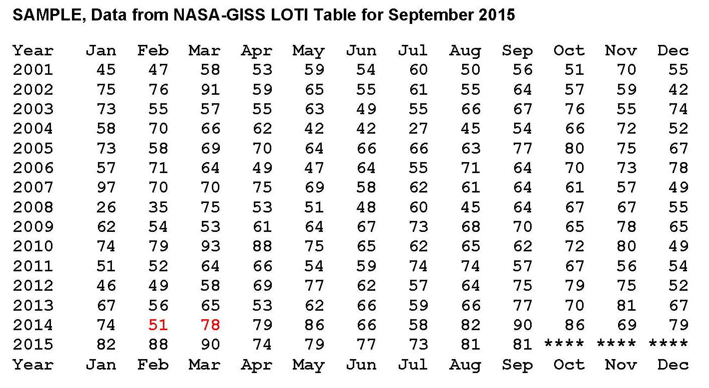
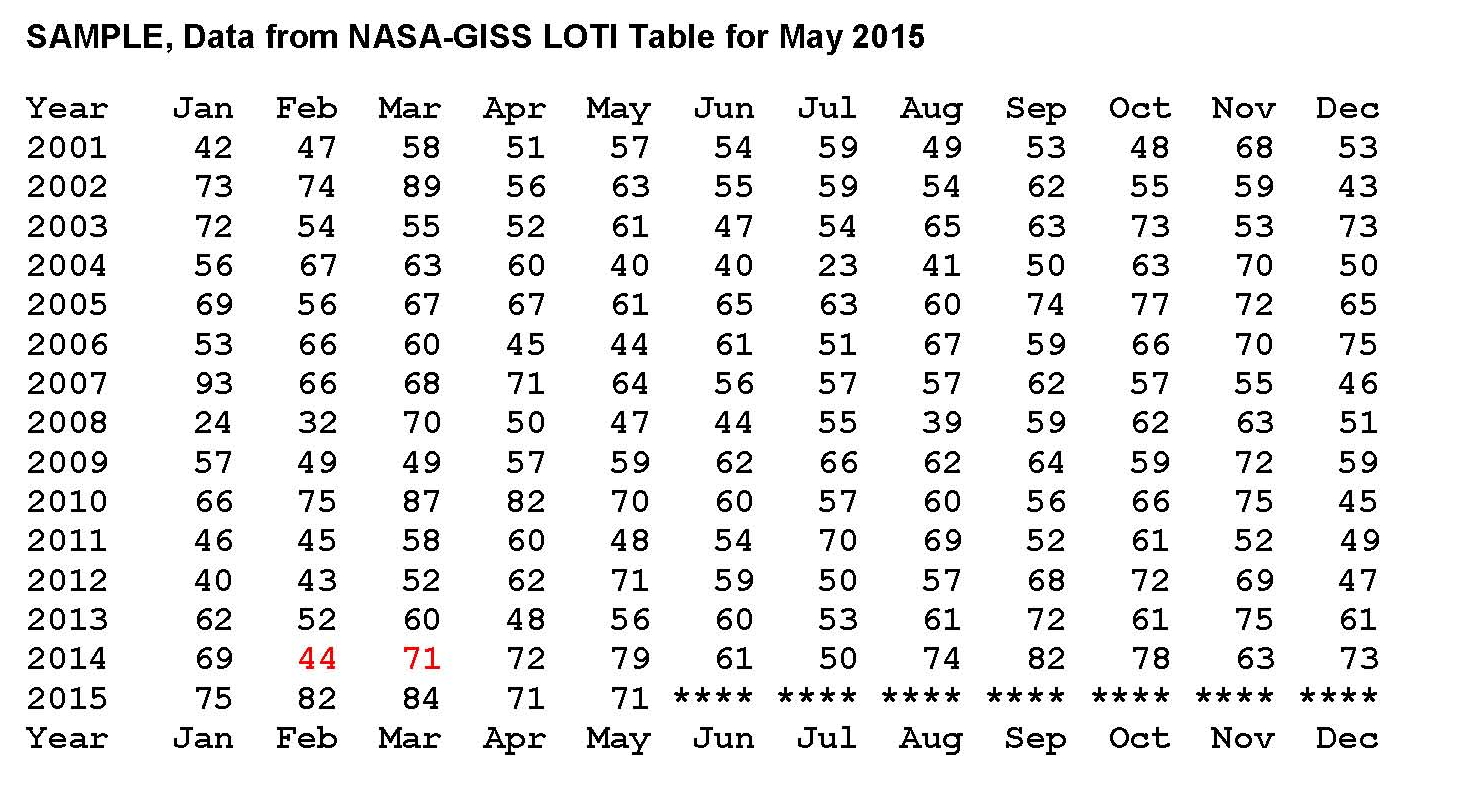
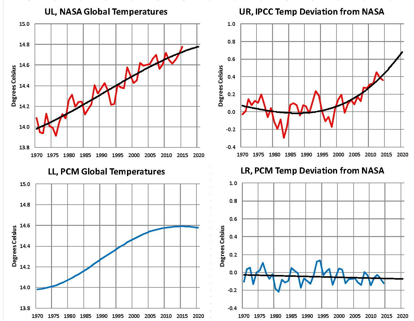
A small sample from NASA’s table is provided below running from January 2001 to September 2015. A good example of this large swing in values can be found in the value shown in February 2014 of 51 compared to March 2014 of 78 (both shown in red) a difference of 27 anomalies (a quarter of a degree), a NASA measure of temperatures in hundredths of a degree Celsius, represents a lot of energy on a global scale.
What we are going to do now is reverse engineer the NASA Temperature values in the full LOTI table and then calculate the energy flows required to make those changes. If the “required” energy flows are not reasonable, then the NASA temperatures are not reasonable. They must be in synchronization with energy inputs as energy can neither be created nor destroyed. The first step was to place all 1929 LOTI values in a spreadsheet and then turn the NASA anomalies (a deviation from a base of 14.0 degrees Celsius) back into temperatures by dividing by 100 then adding that value back to the base 14.0 degrees Celsius and lastly adding that result to 273.15 to convert to degrees Kelvin. Kelvin must be used to calculate total heat when working on these kinds of projects.
Next we needed to calculate the total heat value of the NASA temperatures and their changes and so from Wikipedia we find that the Earth’s dry atmosphere is 5.1352E+18 kg and the water in the atmosphere is 1.27E+16 kg for a total of 5.1479E+18 kg. From these values we can calculate that water is on average .247% of the atmosphere. We also find that on Wikipedia the specific heat of the Earth’s atmosphere is 1006 Joules per degree Kelvin (J/kg/K) without water and so we need to add 4.6 J/kg/K for water and 9.8 J/kg/K for latent heat to the 1006 J/kg/K giving us a total of 1020.4 J/kg/K for the earth’s atmosphere with .0247% water at standard air.
There is one last step since the NASA values are “surface” temperatures, we need an adjustment for altitude cooling if we are looking for the total energy in the atmosphere. To accomplish this we’ll subtract 28.5 degrees Celsius making the answer the theoretical temperature at 5 km above sea level which is about where 50% of the atmosphere is above 5 km and 50% below; so this makes for a reasonable estimate for calculating total energy. Using this logic we subtract the 28.5 degrees Celsius from the NASA LOTI values that we converted to degree Celsius, which are surface values which then gives a ballpark value to calculate the total heat in the atmosphere.
With the monthly NASA temperatures in a spreadsheet it was only a few hours work to set up the equations and plot a few charts. We calculated the heat value of each month’s anomaly for example for January 1880 the value was 1.3572E+24 Joules and for June 2015 the value was 1.36266E+24 Joules. Those values are a result of energy coming in from the sun minus what leaves the planet as infrared energy assuming no large change in the temperature of the land or oceans. To my knowledge these kinds of temperature changes (energy flows) have not been observed on the surface of the planet.
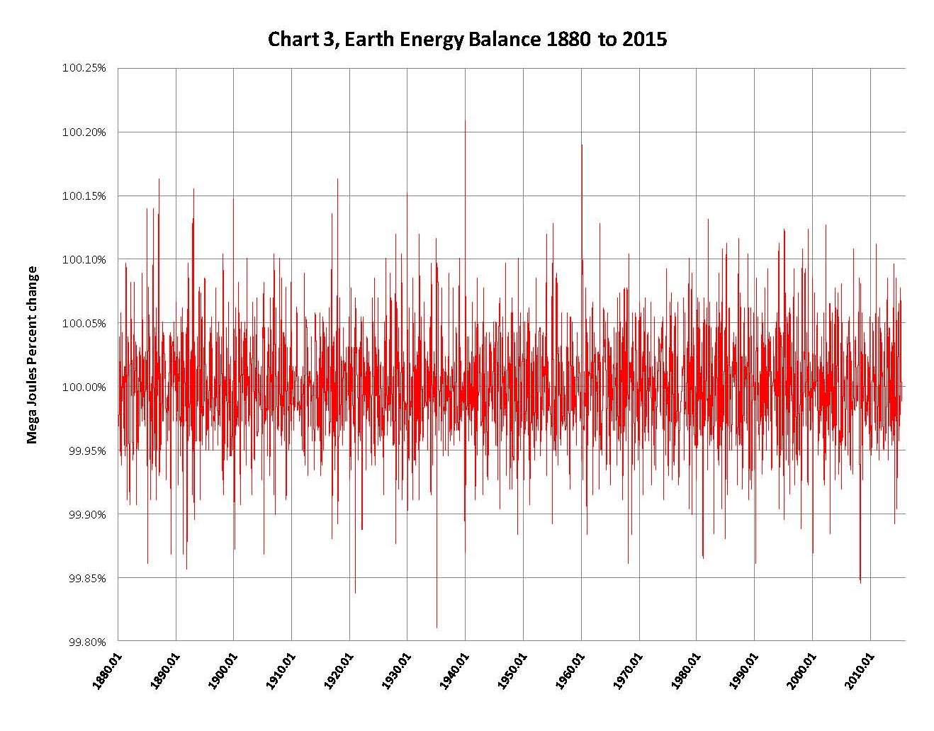
This review shows that the magnitude of the “required” energy flows is not reasonable indicating to me that the NASA temperatures is not reasonable as can be seen in Chart 1 on the next page. This shows two plots, the monthly change in the NASA anomalies in blue (required energy out) and the sun’s input in red (energy in). The sun’s input is adjusted for the orbital distance to the sun and the number of days in the month which is required to match the time periods shown in the NASA LOTI table. Since the sun is the energy input, the NASA temperatures minus the input must equal the input with the opposite sign, or negative. In other words, the sum of the two must be zero.
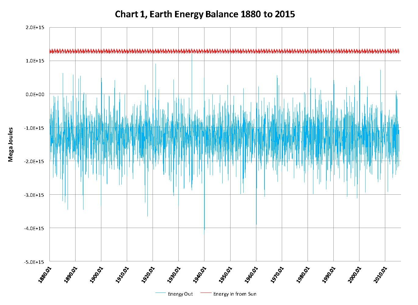
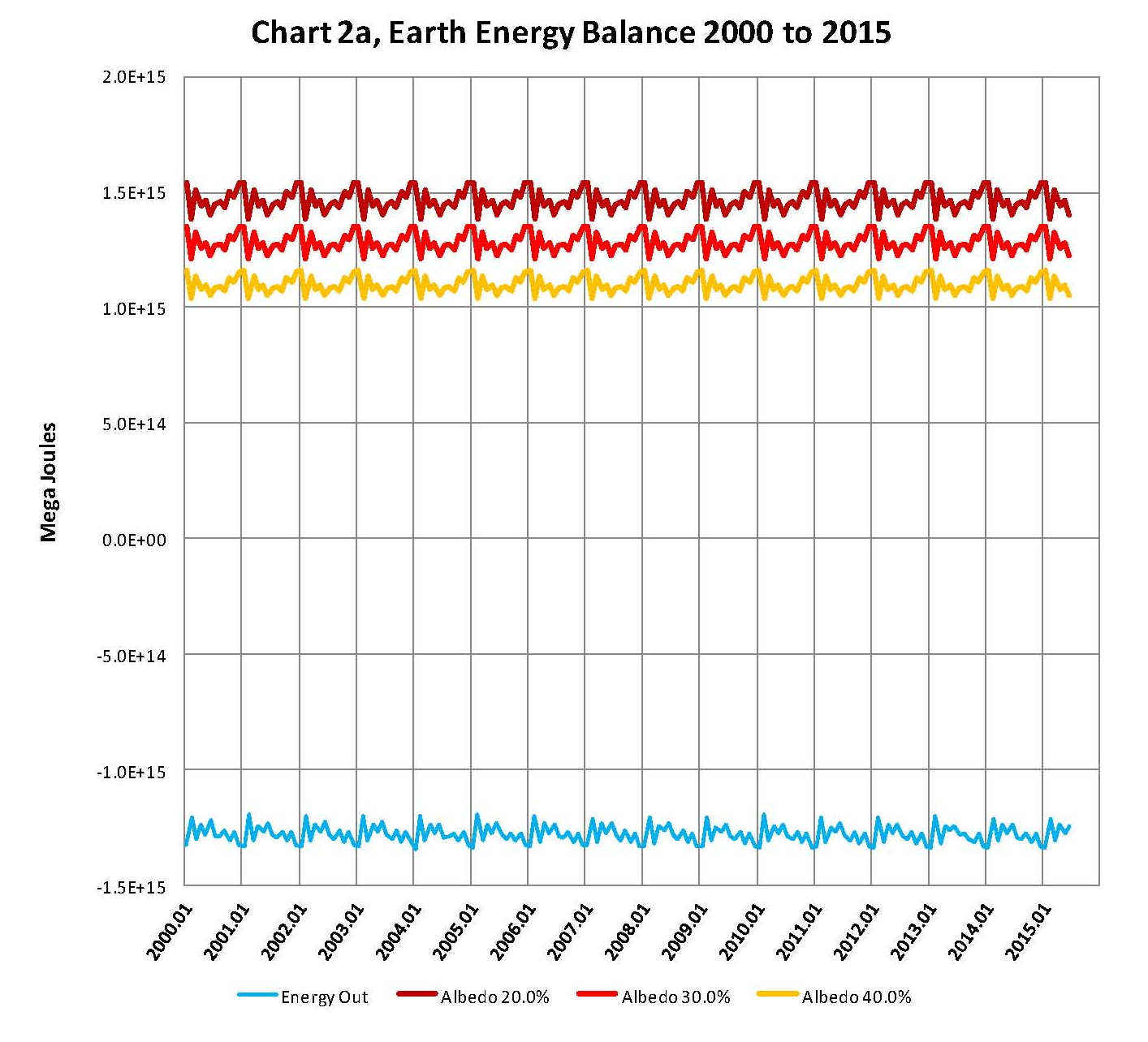
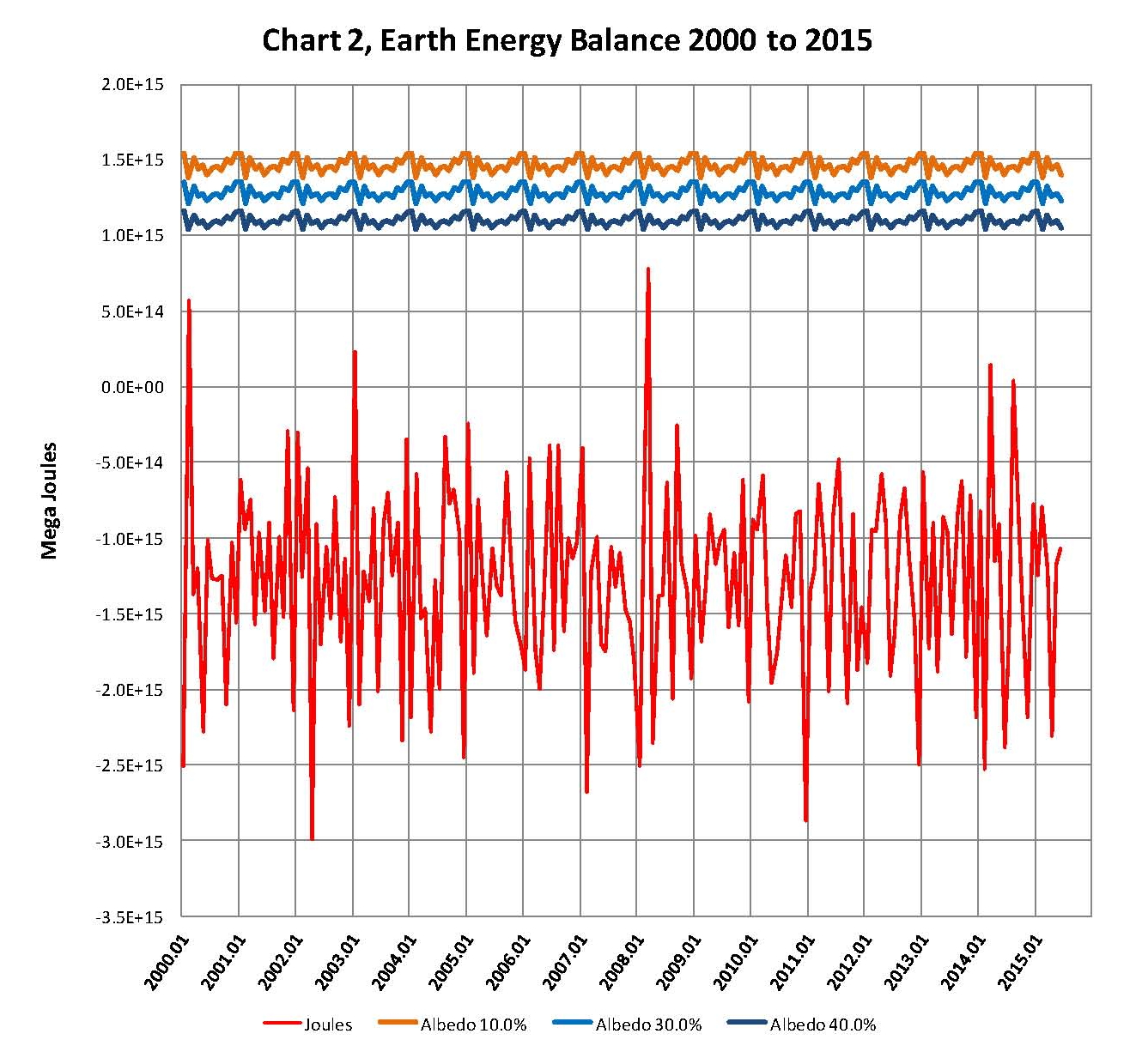
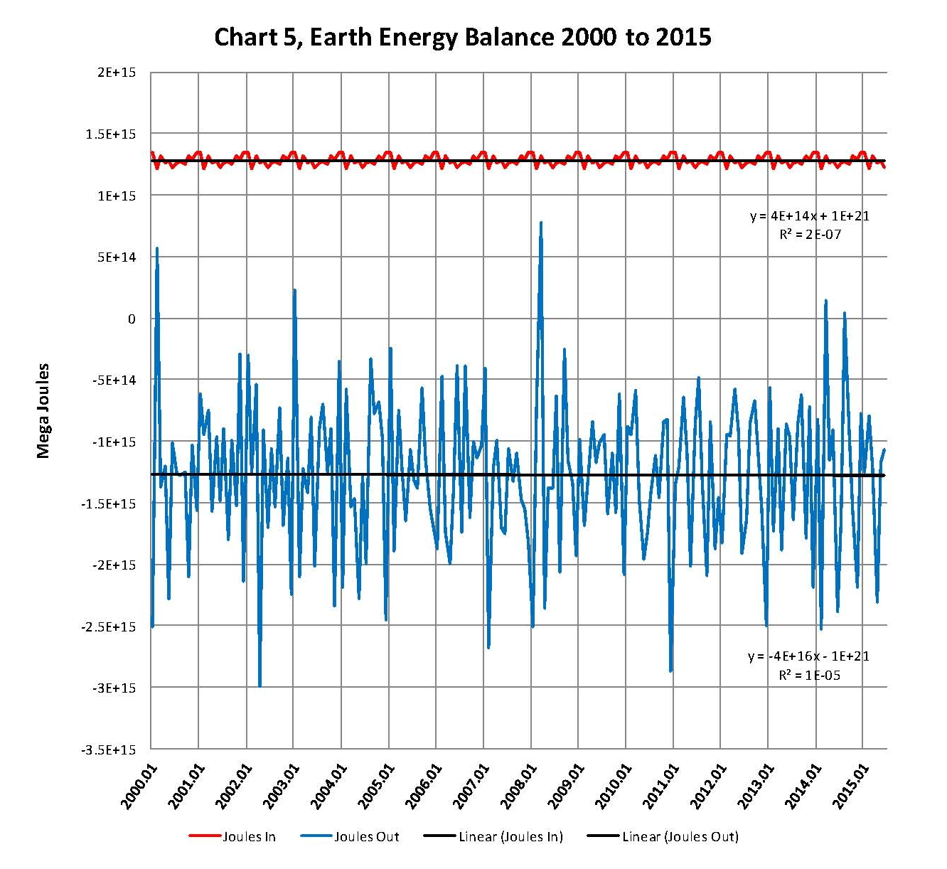
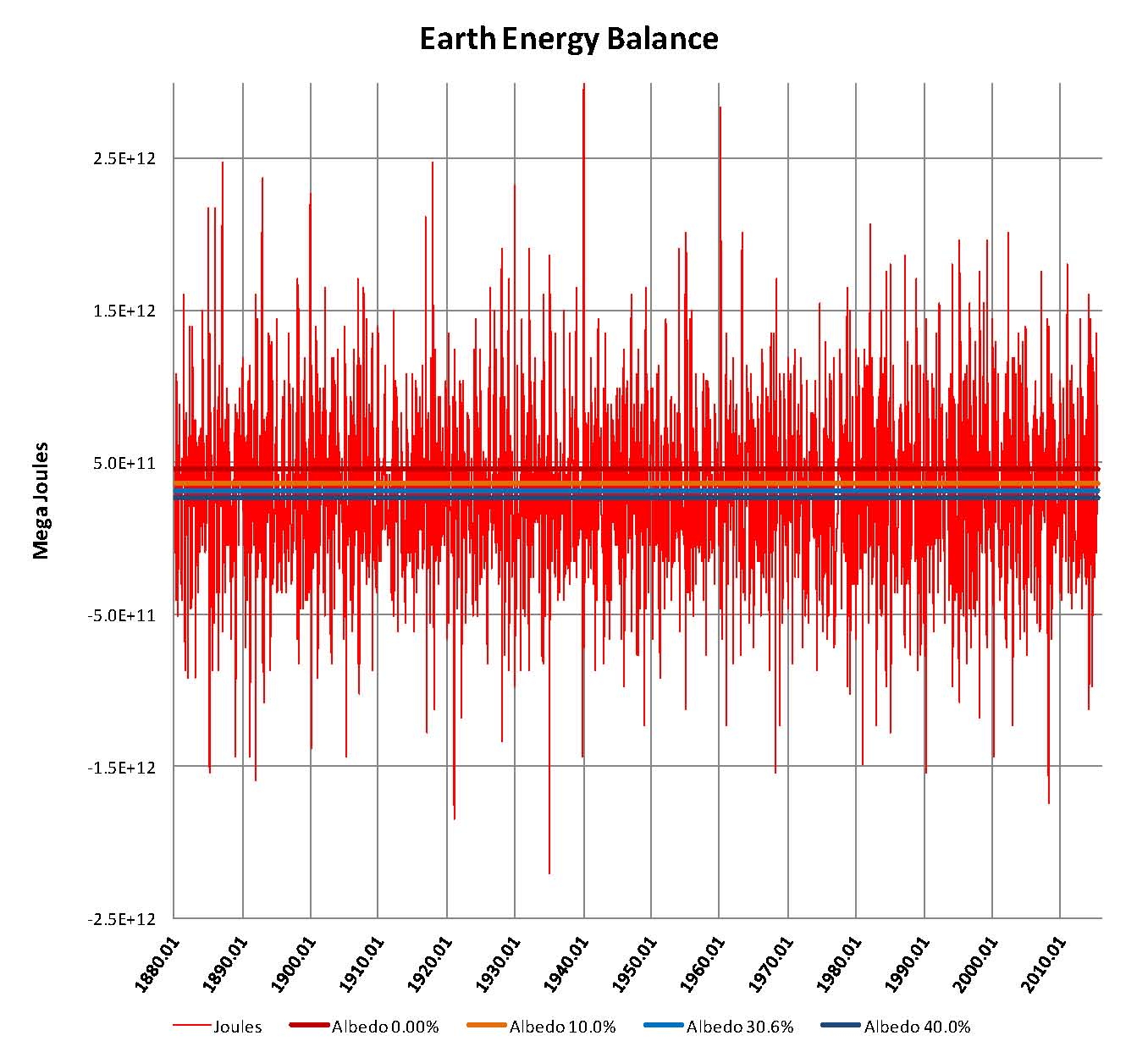
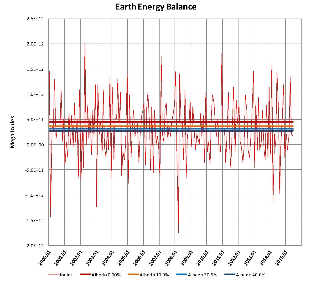
It’s clear when looking at Chart 1 that there have to be extremely large monthly energy flows involved here if the NASA numbers are actually valid. To put this in perspective three, lines were added to Chart 1, as shown in Chart 2. These lines are for the incoming solar radiation using 1414.44 Wm2 for solar radiation at aphelion (January) and 1322.97 Wm2 for solar radiation at perihelion (July) in the earth’s orbit using the following albedo percentages; 20.0% dark red plot, 30.0% (Actual) red plot and 40.0% a yellow plot. The red plot is also shown on Chart 1. We also changed the time frame from 1880 to the present to 2000 to the present so that more detail could be seen when making Chart 2.
The choppy lines in the dark red, red and yellow Sun radiation plots are a result of using monthly values and the months don’t always have the name number of days. The purpose of showing these three radiation plots from the sun is to show that large changes in the planets albedo cannot account for the large energy swings and so the large changes in the NASA data such as shown here just don’t happen. That means that even these large albedo changes cannot account for the large required movements in energy indicated by NASA’s numbers shown in their table LOTI, the actual smaller albedo changes we experience surely can’t.

The blue plot for the NASA temperatures is actually the “required” energy out flow to balance the suns energy inflow. Given the process that NASA uses to determine global temperatures it would be expect that there would be some variations, but surely not of the magnitude shown in this chart.
NOAA and NASA have spend a lot of time and resources developing complex systems with the intent to show how “current’ temperatures were being driven up by the level of greenhouse gasses in the atmosphere caused by the burning of fossil fuels. This was called anthropogenic climate change meaning climate change caused by man. These apparent upward global temperature changes in the 1980’s and 1990’s were assumed by politicians to be dangerous and the scientific community given the task of showing the dangers to the planet of increasing temperatures. Although there was some real scientific validity to the man made climate change movement a true cause and effect review of the concept was never made and money poured in to “prove’ the concept.
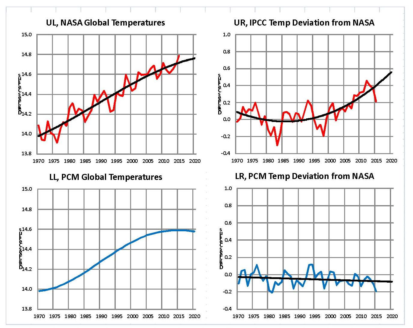
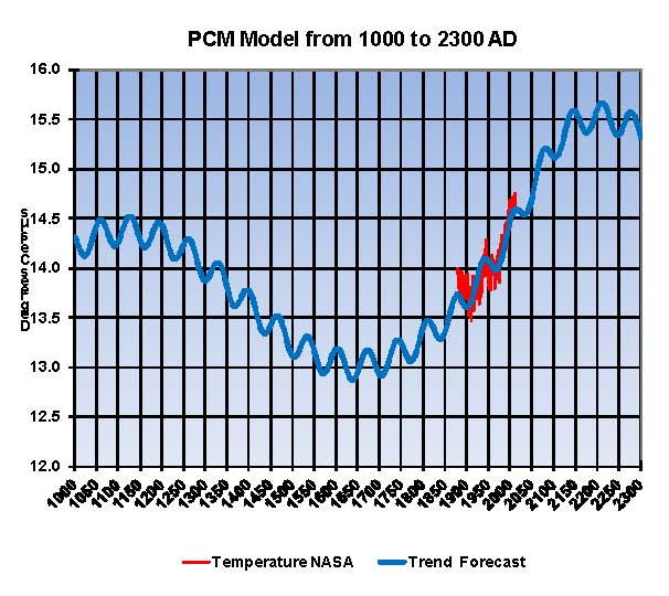
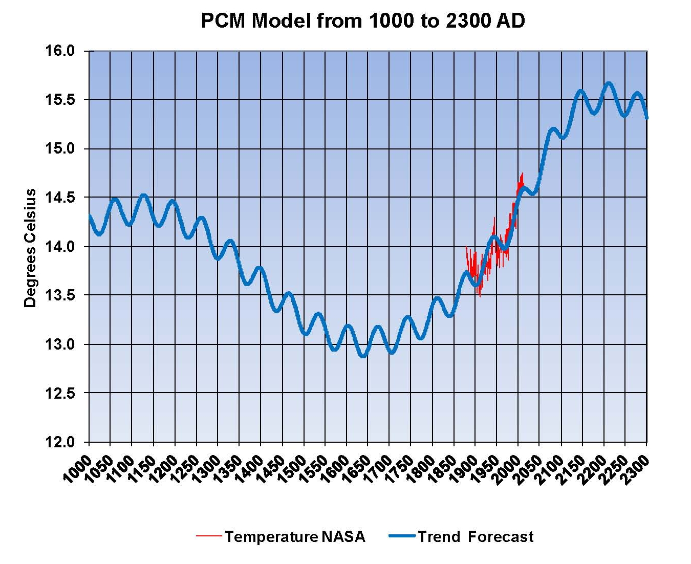
Had a true review of the apparent problem been done first it would have been obvious that there were other factors involved besides greenhouse gases the most obvious was the well documented thousand year cycle of warm and cold periods going back several thousand years. The most recent of these cycles ended around 1650 during the coldest part of what is called the Little Ice Age. Assuming the thousand year cycle is valid that means that the global temperature would be ascending for five hundred years peaking around 2150. Based on this principle of multiple reasons for the apparent climate change, a climate model was then developed in 2007 that fit the historic patterns that includes the increases in greenhouse gases. This model is called a pattern model and designated the PCM and shown next.

The next Chart 1a was developed exactly the same way as the NASA Chart 1 was except we used the temperatures generated by the PCM model as shown in the previous PCM chart instead of those developed by NASA in their computer system. We can clearly see in this Chart 1a that this PCM model generates a plot that very closely matches the suns input but is negative which it must be to keep the planet in thermal balance.

The next Chart 2a is based on the same principle as that shown for the NASA data in Chart 2 looking at 2000 to the present for more detail and we can see that the sun’s is exactly balanced by the energy leaving the planet as it must be when we use the PCM model to generate the temperatures. The model was developed in 2007 and this review used the values calculated by the PCM model.
Further from a total energy, heat, perspective the current increase in global temperatures of just over plus 1 degree Celsius from 1880 is less than 4 tenths of a percent change in the planets heat content. Even 2 degrees Celsius as predicted by the PCM model would be less than 6 tens of a percent change in the planets heat content so making claims of utter disaster for such small amounts of a heat increase is really stretching the point especially since the planet has reached temperatures beyond where we are now many times in the distant past; we are still just barely out of the last ice age after all.
The point to this analysis is to show that whatever the method used to analyze global temperatures, the in’s and out’s must balance. Clearly the NASA-GISS table LOTI data is not valid for the monthly temperature swings exceed what would be possible in the real world. Maybe if NASA would concentrate on developing real systems and models instead of doing the bidding of politicians their work might actually be valid.
This paper contains original research on the energy balance of the climate (weather) of the planet. A more sophisticated analysis could possibly be done showing what the effect of the1 to 2 degree Celsius increase in global temperatures that has accrued since the end of the little ice age in ~1650 would look like; maybe a 3D chart would work giving another dimension to work with. The energy balance would still be there but the in’s and out’s would have a pattern similar to what is shown in the chart of the PCM model and trending upward indicated that there is an increase in temperature
David J. Pristash, Independent Researcher
BBA, EMBA, Graduate GE management program
Captain US ARMY 18A (WIA Retired), Seven issued patents
Member Beta Gamma Sigma


