The sad thing is he gives all of us a bad name, who is going to believe a scientist or engineer ever again!
James Hansen will likely go down as the most laughable scientist in history

The sad thing is he gives all of us a bad name, who is going to believe a scientist or engineer ever again!
James Hansen will likely go down as the most laughable scientist in history
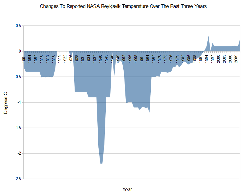
To compensate they play very loose with the past data; its much easier to change the past than the present.
There is nothing subtle about the institutional bias built into the global warming scam. They call the principals “climate change scientists.”
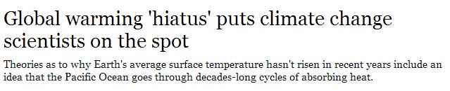
Global warming ‘hiatus’ puts climate change scientists on the spot – latimes.com
They call the organization the Intergovernmental Panel for Climate Change.
And they keep the temperature data at the Carbon Dioxide Information Analysis center
These institutions’ very existence is based on the presumption that the climate is changing due to CO2. The result of their “science“is a foregone conclusion. The sole purpose of the next IPCC report is damage control, forced by Gaia’s failure to cooperate with the scamsters.
Hey if you are a progressive and a “believer” than the truth matters not only the cause in important — most progressives are nothing more than Lemmings running for the cliff
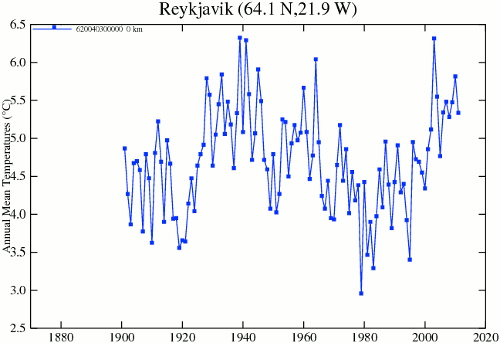
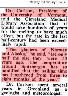
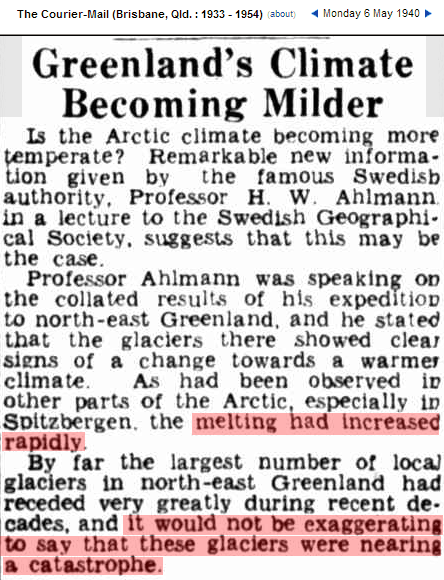
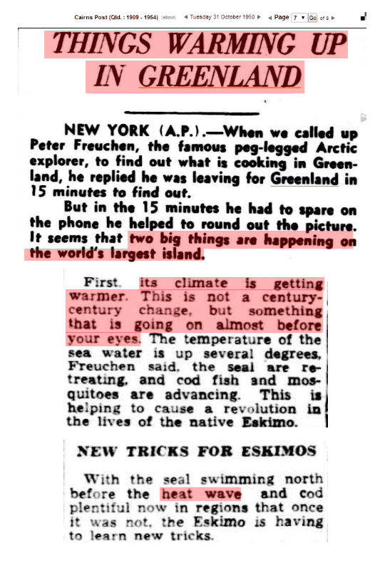
In 1950, everyone knew about the massive warming in the Arctic
18 Feb 1952 – Melting Icecaps Mystery
06 May 1940 – Greenland’s Climate Becoming Milder
Even NASA/NOAA knew about it until a few years ago, when they decided to erase it.
GHCN V3 : Data.GISS: GISS Surface Temperature Analysis
GHCN V2 : Data.GISS: GISS Surface Temperature Analysis
In order to get rid of the 1940’s blip, NASA/NOAA cooled temperatures by more than 2C

Yes you do repeat yourself … lol
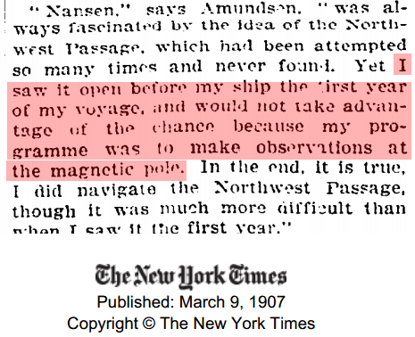
In 1904, the Northwest Passage was open – near the bottom of the hockey stick.

According to our impeccably honest friends at NOAA and NASA, this summer has been the hottest ever in the Northern Hemisphere – and the Northwest Passage is closed.
It all makes perfect sense if you are a climate expert, or have the IQ of a turnip. But I repeat myself.
What really going on with the Climate?
The analysis and plots shown here are based on the following: first NASA-GISS temperature anomalies (converted to degrees Celsius) as shown in their table LOTI, second James E. Hansen’s Scenario B data, which is the very core of the IPCC Global Climate models which was based on a CO2 sensitivity value of 3.0O Celsius, lastly, a plot based on an alternative climate model designated ‘PCM’ and based on a sensitively value of .65O Celsius. To smooth monthly variations a 12 month running average is used in all the plots. This information will be shown in four tables and updated each month as the new data comes in about the middle of the month. Since no model or simulation that cannot reasonably predict that which it was design to do is worth anything the information presented here definitively proves that NASA, NOAA and the IPCC just doesn’t have a clue.
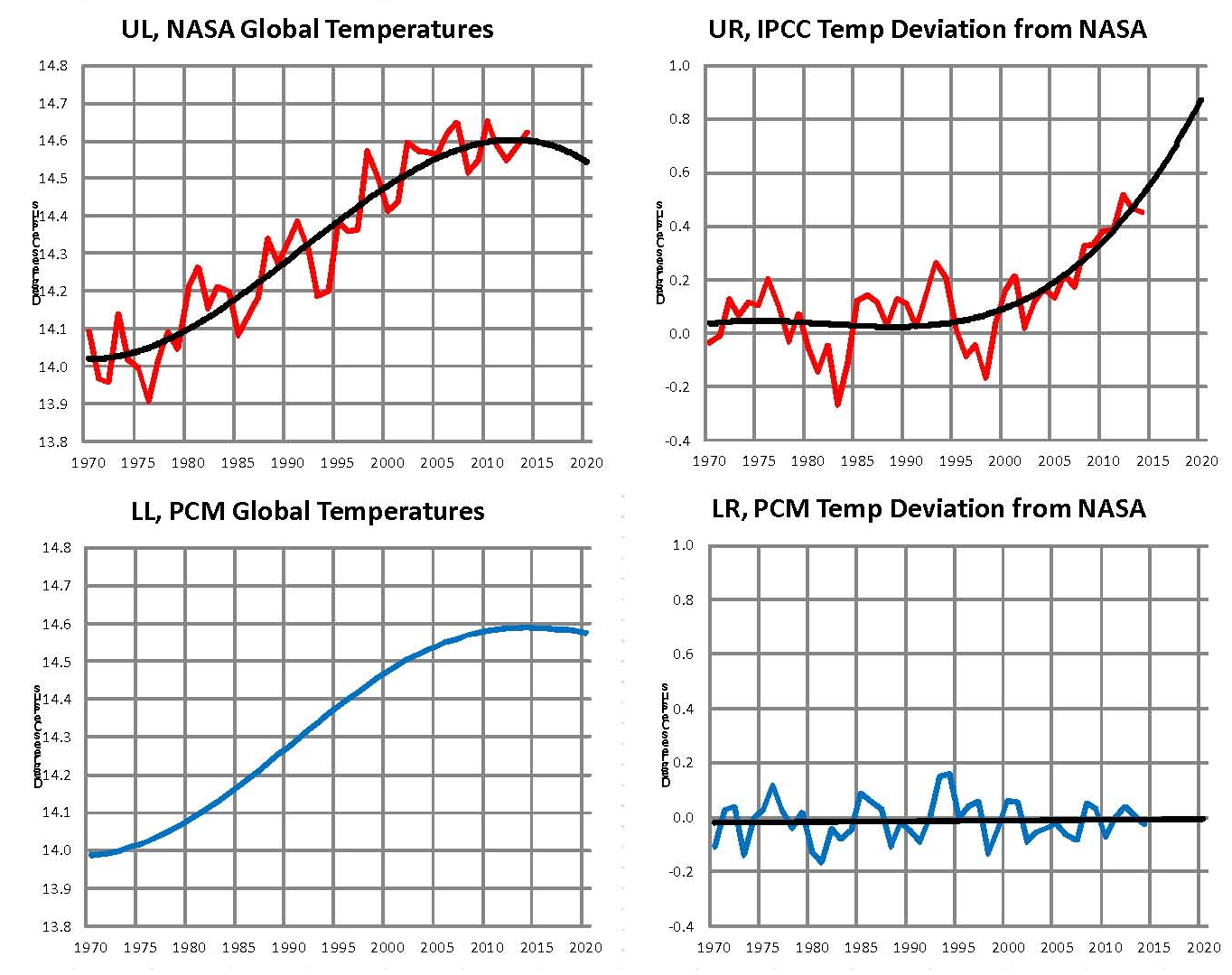
The first plot, UL is a plot of the NASA temperature anomaly converted to degrees Celsius and shown in red with a black trend line added. There has been a very clear reversal in the upward movement of global temperatures since about 2001 and neither the UN IPCC nor anyone else has an explanation for this. Since CO2 has continued to increase at what could be argued an increasing rate this raises serious doubts about the logic programmed into all the IPCC global climate models.
The next plot UR, also in red, shows the IPCC estimates of what the Global temperature should be, based on Hansen’s Scenario B, with the NASA actual temperatures’ subtracted from them. Therefore this plot represents a deviation from what the Climate “believers” KNOW what the temperature should be; with a positive value indicating the IPCC values are higher than actual and a negative value indicating the IPCC values are lower than actual. A black trend line is added and we can clearly see that the deviation from expected is increasing at an increasing rate. This makes sense since the IPCC models project increased temperatures based primarily on the increasing level of CO2 in the earth’s atmosphere. Unfortunately, for them, the actual temperatures from NASA are trending down (even as they try to hide the down ward movement with data manipulation) since other factors are in play, therefore each year the gap between them widens. Since we have 12 years of observations’ showing this pattern it becomes hard to justify a continuing belief in the IPCC climate models, there is obviously something very wrong here.
The next plot LL shown in blue is based on the equations in the PCM climate model described in previous papers and posts here and since it is generated by “equations” a trend line is not needed. As can be seen the PCM, LL, and the NASA, UL, trend plots are very similar the reason being that in the PCM model there is a 68.2 year cycle that moves the trend line up and then down a total of .30O Celsius (currently negative .0070O Celsius per year); and we are now in the downward portion of that trend which will continue until around 2035. This short cycle is clearly observed in the raw NASA data in the LOTI table going back to 1880. Then there is the a long trend, 1052.6 years with an up and down of 1.36O Celsius (currently plus .0029O Celsius per year) also observed in the NASA data. Lastly there is CO2 adding about .005O Celsius per year so they basically wash out which matches the current holding pattern we are in. However within a few years the increasing downward trend of the short cycle will overpower the other two and we will see drop of about .002O Celsius per year and that will be increasing until till around 2025 or so. After about 2035 the short cycle will turn up and all three will be on the upswing again. These are all round numbers shown here as representative values.
The last plot LR in blue uses the same logic as used in the UR plot, here we use the PCM estimates of what the Global temperature should be with the NASA actual temperatures’ subtracted from them. A positive value indicates the PCM values are higher than actual and a negative value indicates the PCM values are lower than expected. A black trend line was added and it clearly shows that the PCM model is tracking the NASA actual values very closely. In, fact since 1970 the PCM model has rarely been off by more than +/- .1 degrees Celsius and has an average trend of almost zero error, while the IPCC models are erratic and are now approaching an error rate of +.5O above expected.
The IPCC models were designed before a true picture of the world’s climate was understood. During the 1980’s and 1990’s CO2 levels were going up and the world temperature was also going up so there appeared to be correlation and causation. The mistake that was made was looking at only a 20 year period when the real variations in climate move in much longer cycles. Those other cycles can be observed in the NASA data but they were ignored for some reason. By ignoring those trends and focusing only on CO2 the models will be unable to correctly plot global temperatures until they are fixed.
The purpose of this post is to make people aware of the errors inherent in the IPCC models so that they can be corrected.
Sir Karl Raimund Popper (28 July 1902 – 17 September 1994) was an Austrian and British philosopher and a professor at the London School of Economics. He is considered one of the most influential philosophers of science of the 20th century, and he also wrote extensively on social and political philosophy. The following quotes of his apply to this subject.
If we are uncritical we shall always find what we want: we shall look for, and find, confirmations, and we shall look away from, and not see, whatever might be dangerous to our pet theories.
Whenever a theory appears to you as the only possible one, take this as a sign that you have neither understood the theory nor the problem which it was intended to solve.
… (S)cience is one of the very few human activities — perhaps the only one — in which errors are systematically criticized and fairly often, in time, corrected
The thing is that back then it wasn’t a consensus now that it is it’s more certain then ever we only have 2 more years till it happens … lol
SIGNIFIGANT RISE IN SEA LEVEL NOW SEEMS CERTAIN
By ERIK ECKHOLM
Published: February 18, 1986MANY scientists are so sure that the sea level will rise visibly in the coming decades that they are advising planners to adopt new strategies now. A predicted rise in sea level of one foot within the next 30 to 40 years willdrive much of the Atlantic and Gulf shoreline inward by a hundred feet and some of it by more than a thousand feet
SIGNIFIGANT RISE IN SEA LEVEL NOW SEEMS CERTAIN – NYTimes.com
Hey maybe we can sick the EPA on the DOE …
After what NOAA and NASA have done they should both be closed down there is no way to bring back there reputations now!
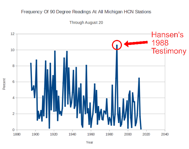
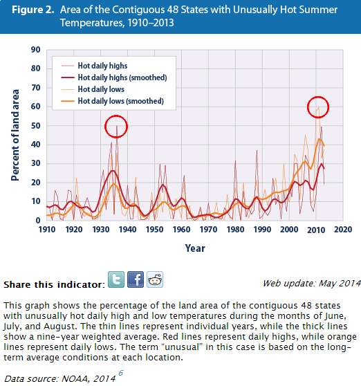
According to this EPA document, only 50% of the US was unusually hot in 1936, and 60% of the US was hot in 2012.
This document was derived from NOAA’s Climate Extremes Index (CEI.) It is trivial to demonstrate that the NOAA CEI is wrong.
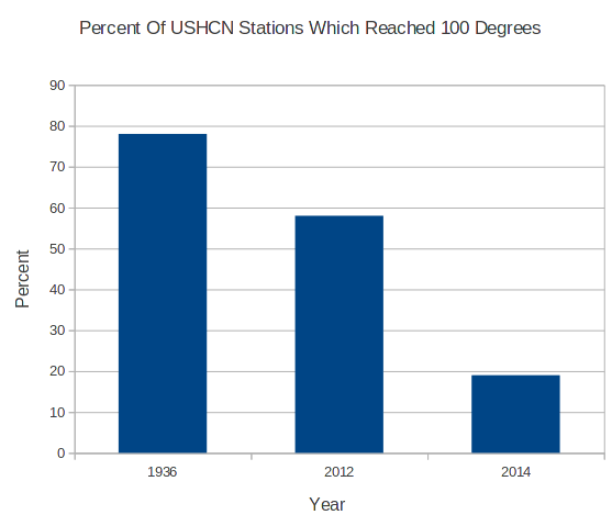
In 1936, 78% of USHCN stations recorded 100 degree temperatures, compared to 58% in 2012. Forty-four states had temperatures over 100 degrees in 1936. The CEI shows accurate numbers for 2012, but the 1936 numbers are massively understated. The average peak temperature of the 78% over 100 degrees in 1936 was an incredible 108 degrees.
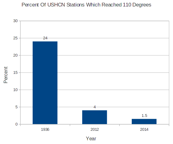
But it is worse than it seems – the 1936 temperatures were not just over 100 degrees, but they were way over 100 degrees. In 1936, 24% of the US reached 110 degrees – compared to only 4% in 2012.
During the…
View original post 3,793 more words
This is a serious problem and should be getting more attention!
Its amassing what one can do with a computer and the license to lie!
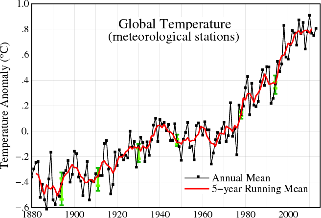
We are all familiar with this NASA graph, which forms the basis of the hockey stick. It shows about 1.2C warming from 1880 to 1998.
But their graphs didn’t always look like this. In 1999 they showed no net warming from 1878 to 1978, and a total of 0.5C warming from the 1870’s to 1998. NASA has more than doubled hockey stick warming since 1999. Clever of them to hide the warm pre-1880 temperatures, in their current graphs.
I have created this site to help people have fun in the kitchen. I write about enjoying life both in and out of my kitchen. Life is short! Make the most of it and enjoy!
De Oppresso Liber
A group of Americans united by our commitment to Freedom, Constitutional Governance, and Civic Duty.
Share the truth at whatever cost.
De Oppresso Liber
Uncensored updates on world events, economics, the environment and medicine
De Oppresso Liber
This is a library of News Events not reported by the Main Stream Media documenting & connecting the dots on How the Obama Marxist Liberal agenda is destroying America
Australia's Front Line | Since 2011
See what War is like and how it affects our Warriors
Nwo News, End Time, Deep State, World News, No Fake News
De Oppresso Liber
Politics | Talk | Opinion - Contact Info: stellasplace@wowway.com
Exposition and Encouragement
The Physician Wellness Movement and Illegitimate Authority: The Need for Revolt and Reconstruction
Real Estate Lending


