The IPCC climate models as discussed here have many issues most as a result of the method used to develop them e.g. showing that increased levels of Carbon Dioxide “would” increase the global temperatures to unacceptable levels. The models were started in earnest around 1988 when the IPCC was formed and much of this work was from James Hansen of NASA. In 1988 he presented to the US Congress his estimate of what the increasing levels of Carbon Dioxide from the burning of carbon based fuels would do to the world’s climate; these were presented as Scenario A (worst case), B (expected case) and C (unlikely low estimate). Scenario B was the focus and its projections were shown from 1958 (when the first Carbon Dioxide levels were published by NOAA) to 2020 in the form as described in section four; after the formation of the IPCC and the global Climate models were developed they added to Hansen’s work and that plot (shown in red in Figures 1 and 3) is what is used here. It appears to be a form of a log function (black plot with the equation for it shown superimposed over the red plot) with a primary focus on the level of Carbon Dioxide (values listed in the IPCC table “ar4 forcings” also a form of a log function) which is assumed to be the proximate cause of global temperature changes.
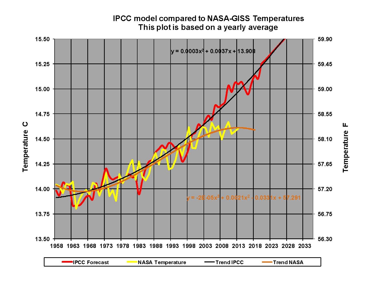
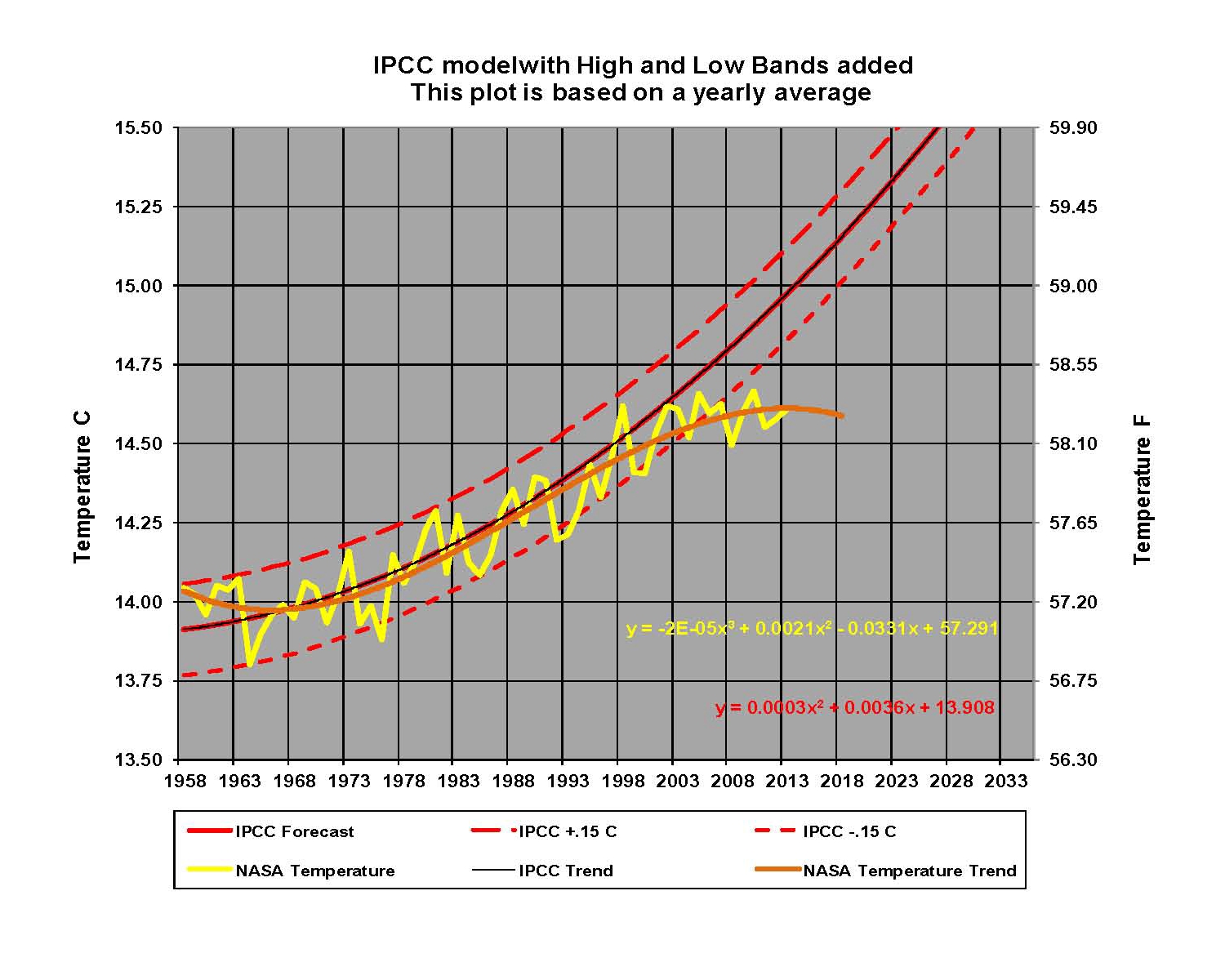
Although Carbon Dioxide did play a part, the real reason was that the long and short climate trends previously described in point seven were both moving up together; more on this in the next section. This can be seen in the IPCC estimated global temperatures shown in Figure 1 as the red plot when it is compared from 1958 to 2000 with the yellow NASA-GISS temperature plot (orange trend line added with equation) where the red IPCC plot moves in synchronization with the yellow NASA-GISS plot of estimated global temperature. However, after 2000 things began to change as the yellow NASA-GISS plot, and the orange trend began to move down while the red IPCC plot and trend continued to move up. Thirteen years have now passed and the IPCC still has no explanation for why global temperatures are trending down not up: so with no explanation we can say that the model is flawed and needs additional work before any estimates can be believed. This is clearly shown in Figure 2 where we added a high and low band of .15 degrees Celsius to the trend of the IPCC plot and they represent a deviation of +/- 1.0% from the mean. This shows where we can reasonably expect NASA-GISS temperatures to fall within; the IPCC has only 42 of 56 years between the high and the low bands for 75.0% inside the bands. The last time the NASA-GISS plot was inside the IPCC GCM bands was 2007 and the last time it was near the mean was 2002. There is no doubt that there is something seriously wrong here.