
An Analysis of Global Temperature Trends
The analysis and plots shown here are based on the following. One, NASA-GISS temperature anomalies as shown in the December 2013 Table LOTI converted to degrees Celsius. Two, is James Hansen’s Scenario B data, which is the base for the IPCC Global Climate models as described in the various posts here, also converted to degrees Celsius. Three, is a plot based on the PCM climate model, also shown in degrees Celsius. No changes or adjustments to the data were make other then conversion to degrees Celsius. This was done only to show the plots in values that are more common to those not trained in the sciences. This conversion makes no difference in what is shown. To smooth out monthly variation yearly averages are used in all the plots. Also we only go back to 1958 here as that is when NOAA begins to publish Carbon dioxide values.
There are four plots shown here in the post the first is in the upper left corner (UL), the next in the upper right corner (UR), the next in the lower left corner (LL) and the last one is in the lower right corner (LR). All data used to make these plots is as described in the first paragraph.
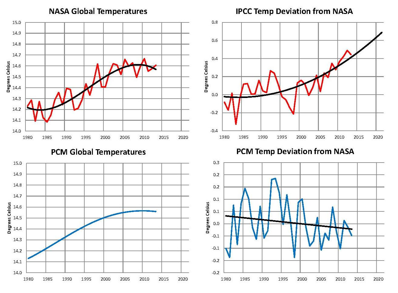
The first plot, UL is a plot of the NASA anomaly converted to degrees Celsius shown in red with a black trend line added. There has been a very clear reversal in the upward movement of global temperatures since about 2001 and the IPCC has no explanation for this. Since CO2 has continued to increase at what could be argued an increasing rate this raises serious doubts about the logic programmed into all the IPCC global climate models.
The next plot UR also in red, shows the IPCC estimates of what the Global temperature should be based on James Hansen’s Scenario B with the NASA actual temperatures’ subtracted from them. This plot then represents a deviation from expected temperatures. A positive value indicates the IPCC values are higher than actual and a negative value indicates the IPCC values are lower than expected. A black trend line has been added and we can clearly see that the deviation is increase at an increasing rate since 2001. This makes sense since the IPCC models project increased temperatures based on the increasing level of CO2 in the earth’s atmosphere. Unfortunately the actual temperatures from NASA are trending down so each year the gap between them widens. Since we have 12 years of observations’ showing this pattern it becomes hard to justify a continuing belief in the logical built into the climate models, there is obviously something very wrong.
The next plot LL shown in blue is based on the five equations in the PCM climate model described in detail in the posts here. Since it is a curve generated by equations a trend line is not needed as it is a smooth plot. Although in this plot the hook at the bottom of the trend line in plot UL does not show in the plot here, it would if we went back a few more years. However the more current data from 2001 on is almost identical with that of the NASA plot in UL from 2001 to the present. The reason being that in the PCM model there is a 66.67 year cycle that moves the trend line up .15 degrees Celsius and then down by the same amount; we are now in the downward portion of that trend which will continue until around 2035. This short cycle is clearly observed in the raw NASA data going back to 1880. Because there is also a long trend which is still moving up the short cycle is amplified going up and dampened going down.
The last plot LR also in blue uses the same logic as that used in the UR plot, here we use the PCM estimates of what the Global temperature should be with the NASA actual temperatures’ subtracted from them. This plot then also represents a deviation from expected. A positive value indicates the PCM values are higher than actual and a negative value indicates the PCM values are lower than expected. A black trend line was added and it clearly shows that the PCM model is tracking the NASA actual values very closely. There does appear to be a slight negative trend but since we are only just entering the down portion of the observed pattern it’s too early to see if the PCM model needs to be tweaked any.
In my opinion the IPCC models were designed before a true picture of the world’s climate was understood. During the 1980’s and 1990’s carbon dioxide levels were going up and the world temperature was also going up so there appeared to be correlation, and there obviously was as both were moving up. The mistake that was made was looking at only a 20 year period when the variations in climate move in much longer cycles. Those other cycles can be observed in the NASA data but they were ignored for some reason. By ignoring those trends and focusing only on carbon dioxide the models will be unable to correctly plot global temperatures until they are changed.
The purpose of these posts is to make people aware of the errors inherent in the IPCC models so that they can be corrected.
