
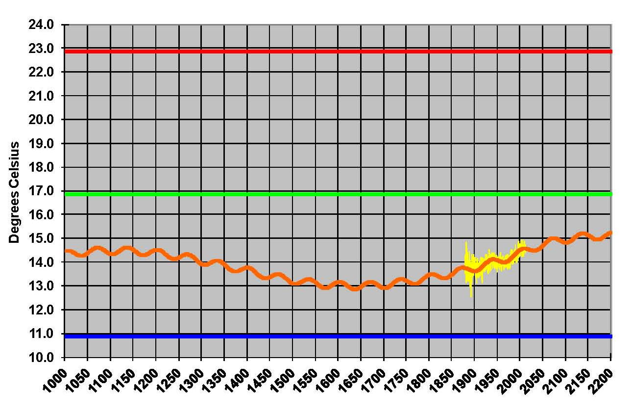
From 1000 AD to 3000 AD
If we take the model and project it back and then forward we can see the overall pattern and how it fits historically. Using the same basic format we have been showing with the high (red) low (blue) and average (green) temperature levels for reference we build the next two Graphics. Then we put in the NASSA-GISS data (yellow) but this time we’re using a plot from the full model which is monthly and has more variance but that also shows that the PCM plot is, over all, right on the NASA yellow plot; of course it was designed to fit so that’s no surprise.
In this first Graphic, shown from 1000 to 2200, the long and short cycle are very obvious and this pattern matches the temperature swings of both the “Little Ice age” and the “Medieval warming” that the IPCC tried to hide with their infamous hock stick graph.
The next Graphic, shown from 1800 to 3000, the long and short cycles are also very obvious but it can also be seen that the pattern has been shifted up about 1 degree Celsius which is from the higher concentration of carbon dioxide. Carbon dioxide is taken up to a level of 800 ppm but long before it gets there the effect is has, has been mitigated. In essence the atmosphere has become saturated and Carbon no longer plays a role in the climate process. The IPCC admits that the sensitivity of CO2 could be as low as .4 or as high as 4.0 degrees Celsius in their Fourth Assessment Report (AR4). They use 3.0 degrees Celsius in their models which is toward the high side but what they don’t tell you is that if they used a lower value like .64 degrees Celsius as Dr. Lindzen suggests that their models will not work. Meaning it will not give the huge increase in temperature that they promote. The definition of that value appears to be the one thing that makes or breaks the IPCC’s case; so it would seem to me that we would want to know whether its 3.0 or .64 degrees Celsius. No one at the iPCC is looking at it that I am aware of at this time.
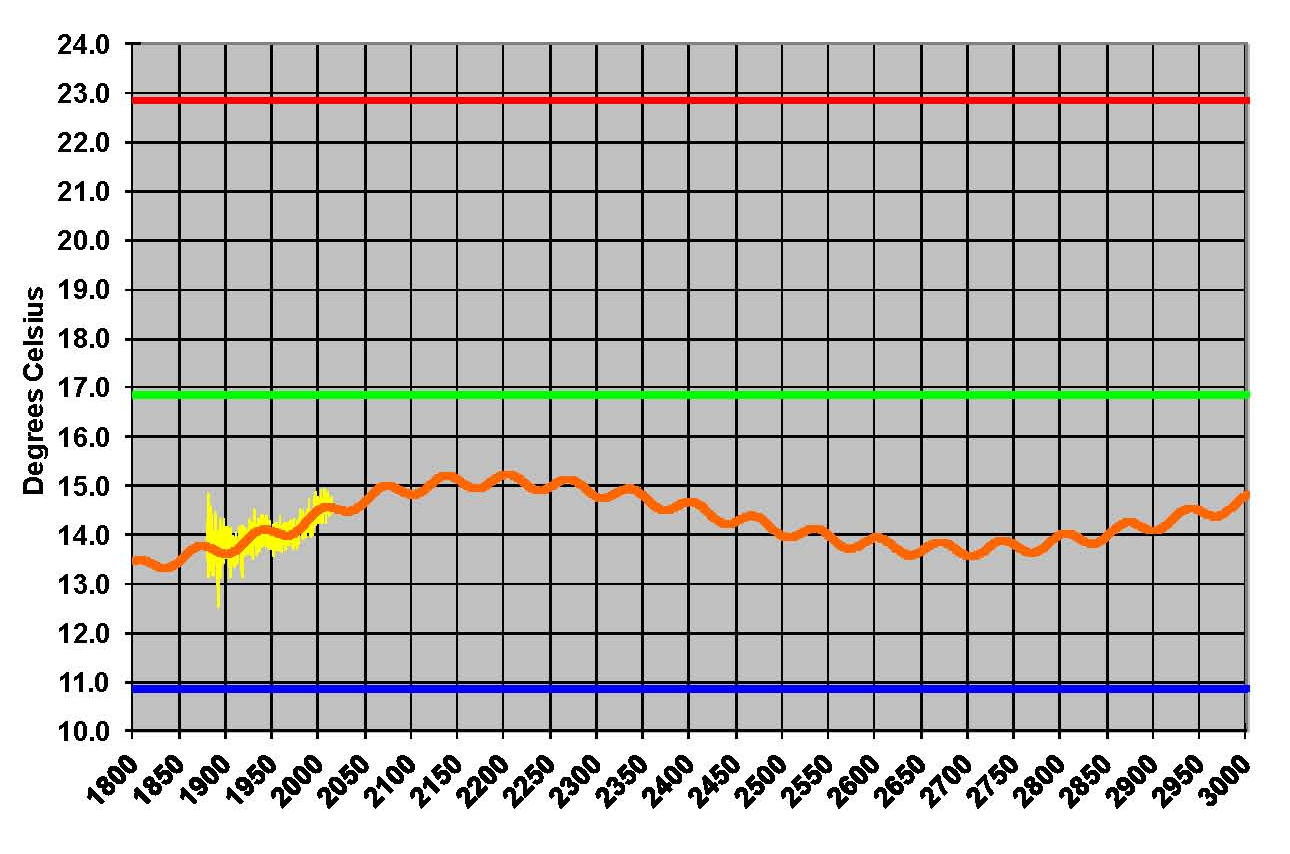
Since the IPCC models are so very wrong right at the begin of their projections as shown in previous posts the case that the .64 value is the more accurate value makes sense and that is the value that is used in the PCM model.
