Fact and Fantasy
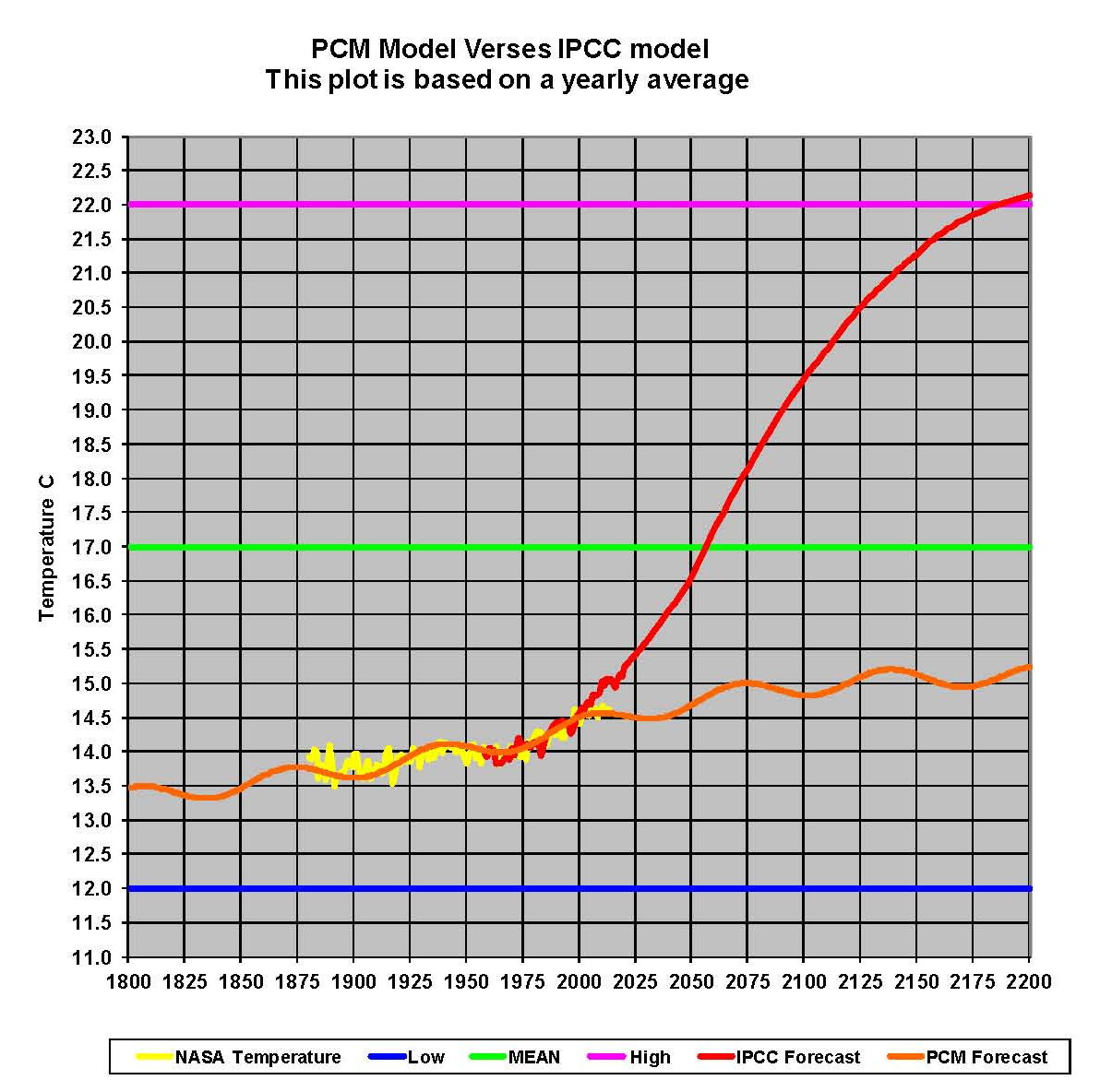
A Graphic is posted here after the text to show those with an open mind two possible futures. One based on reality and the other based on fantasy. But before we get to which is which we need to know what we are looking at. The following graphic contains some hard facts and two projections; the facts first. The Green line at 17.0 degrees Celsius is the geological mean temperature of the planet. The Blue line at 12.0 degrees Celsius is the geological mean low of the planet. The Magenta line at 22.0 degrees Celsius is the geological mean high for the planet. This gives us a prospective of where the earth’s temperatures have been.
The next item we show is the yellow plot which is found between 13.5 and 14.5 degrees Celsius between 1875 and 2015. This represents a plot of the December 2013 NASA-GISS Table LOTI values converted to Celsius. No adjustments were made to the data other than the units. Clearly there is a pattern to the data a sinusoidal pattern that is trending upward. The pattern isn’t as clear from 1880 to 1950 but then record keeping wasn’t as good as it is now; but the pattern is still there. This completes the facts which can be verified by simple searches on the web if one choices to do so. To the best of my knowledge these four plots are accurate and true.
The next step is to add two projections. The first will be the model that have been created and shown in the various posts here. Its called a Pattern Climate Model or PCM. It’s shown here as an orange plot starting at 13.5 degrees Celsius in 1800 and running across the chart end up at about 15.2 degrees Celsius in 2200. This plot like the NASA plot has a sinusoidal pattern to it as well as an upward trend. One can also observe that it fits very well over the Yellow NASA plot; that is because that is where the temperature pattern was found. As previously explained this pattern is derived from three factors, which are a long trend, a short trend and a factor for the level of carbon dioxide in the atmosphere. The equations for these three variables are explained in detail in previous posts here. Obviously by look this Orange plot fits very well over the yellow NASA temperature plot; which indicates that the logic for the math is sound.
Now we have the last item which is the view of James Hansen and the UN IPCC. There are two parts to this view, the first being Hansen’s Scenario B as present to the U.S. Congress in 1988 and which formed the core of the Climate models developed by the UN IPCC. This portion is the red plot starting at 14.0 degrees Celsius around 1955 and running to 15.0 degrees Celsius in 2020. From that point and moving to a bit over 22.0 degrees Celsius in 2200 is an average of the projections shown by the various IPCC climate models under various sets of assumptions. This is a huge increase in global temperatures and if true clearly would be a problem. However, since the models being used by the UN IPCC are so far off only a few years into their projections this forecast is just not believable.
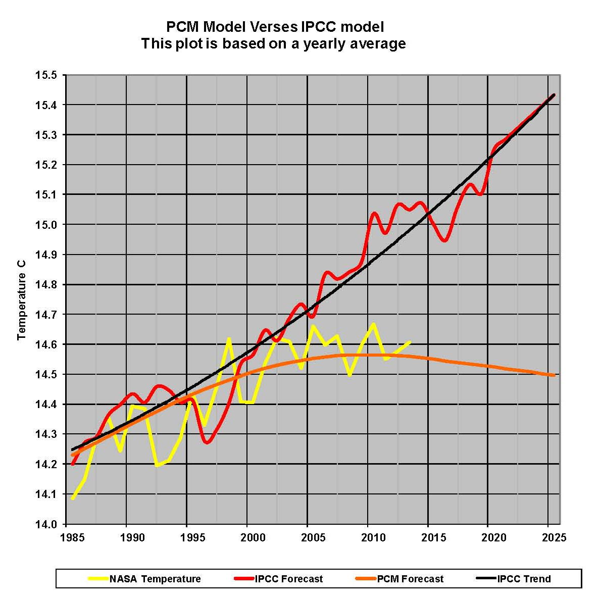
Let’s zoom in and look at the years 1985 to 2025 so we can see in more detail what happening between the variables; this is shown in the next graphic. The plots are the same as in the previous Graphic and so no identification is required. We did add a trend line in Black to the IPCC forecast to clarify the trend and the significant gap that is growing every year.
There is no way than anyone can look at these charts and believe that the IPCC climate models are correctly programmed.