IPCC Climate Models are Moving in the Wrong Driection


An Analysis of Global Temperature Trends

The analysis and plots shown here are based on the following. One, NASA-GISS temperature anomalies as shown in the December 2013 Table LOTI converted to degrees Celsius. Two, is James Hansen’s Scenario B data, which is the base for the IPCC Global Climate models as described in the various posts here, also converted to degrees Celsius. Three, is a plot based on the PCM climate model, also shown in degrees Celsius. No changes or adjustments to the data were make other then conversion to degrees Celsius. This was done only to show the plots in values that are more common to those not trained in the sciences. This conversion makes no difference in what is shown. To smooth out monthly variation yearly averages are used in all the plots. Also we only go back to 1958 here as that is when NOAA begins to publish Carbon dioxide values.

There are four plots shown here in the post the first is in the upper left corner (UL), the next in the upper right corner (UR), the next in the lower left corner (LL) and the last one is in the lower right corner (LR).  All data used to make these plots is as described in the first paragraph.

Four plots

The first plot, UL is a plot of the NASA anomaly converted to degrees Celsius shown in red with a black trend line added. There has been a very clear reversal in the upward movement of global temperatures since about 2001 and the IPCC has no explanation for this. Since CO2 has continued to increase at what could be argued an increasing rate this raises serious doubts about the logic programmed into all the IPCC global climate models.

The next plot UR also in red, shows the IPCC estimates of what the Global temperature should be based on James Hansen’s Scenario B with the NASA actual temperatures’ subtracted from them.  This plot then represents a deviation from expected temperatures. A positive value indicates the IPCC values are higher than actual and a negative value indicates the IPCC values are lower than expected.  A black trend line has been added and we can clearly see that the deviation is increase at an increasing rate since 2001. This makes sense since the IPCC models project increased temperatures based on the increasing level of CO2 in the earth’s atmosphere. Unfortunately the actual temperatures from NASA are trending down so each year the gap between them widens. Since we have 12 years of observations’ showing this pattern it becomes hard to justify a continuing belief in the logical built into the climate models, there is obviously something very wrong.

The next plot LL shown in blue is based on the five equations in the PCM climate model described in detail in the posts here.  Since it is a curve generated by equations a trend line is not needed as it is a smooth plot.  Although in this plot the hook at the bottom of the trend line in plot UL does not show in the plot here, it would if we went back a few more years. However the more current data from 2001 on is almost identical with that of the NASA plot in UL from 2001 to the present.  The reason being that in the PCM model there is a 66.67 year cycle that moves the trend line up .15 degrees Celsius and then down by the same amount; we are now in the downward portion of that trend which will continue until around 2035.  This short cycle is clearly observed in the raw NASA data going back to 1880. Because there is also a long trend which is still moving up the short cycle is amplified going up and dampened going down.

The last plot LR also in blue uses the same logic as that used in the UR plot, here we use the PCM estimates of what the Global temperature should be with the NASA actual temperatures’ subtracted from them.  This plot then also represents a deviation from expected. A positive value indicates the PCM values are higher than actual and a negative value indicates the PCM values are lower than expected. A black trend line was added and it clearly shows that the PCM model is tracking the NASA actual values very closely.  There does appear to be a slight negative trend but since we are only just entering the down portion of the observed pattern it’s too early to see if the PCM model needs to be tweaked any.

In my opinion the IPCC models were designed before a true picture of the world’s climate was understood. During the 1980’s and 1990’s carbon dioxide levels were going up and the world temperature was also going up so there appeared to be correlation, and there obviously was as both were moving up. The mistake that was made was looking at only a 20 year period when the variations in climate move in much longer cycles.  Those other cycles can be observed in the NASA data but they were ignored for some reason.  By ignoring those trends and focusing only on carbon dioxide the models will be unable to correctly plot global temperatures until they are changed.

The purpose of these posts is to make people aware of the errors inherent in the IPCC models so that they can be corrected. 

Summary of the Global Climate Pattern Model


THIS MODEL ACTUALLY WORKS

In the posts here in the Section on Climate Change that are labeled “Issues with the IPCC Models” I through IV we discussed the Pattern Climate Model (PCM) model of the world’s temperature which is based on identifying patterns and then finding equations that could generate a curve(s) that would match the observed data. The assumptions used for predicting temperatures are that there were two source curves for global temperature movement that were independent of each other but when added together with a reasonable factor for Carbon Dioxide effects gave observed results that matched NASA-GISS published values in their Table LOTI published monthly.

To use this PCM model we also needed a model for the Carbon Dioxide levels and that was modeled using the form of a Gaussian distribution after the seasonable variance was removed. The equation developed generated a plot that fit the NOAA-ERSL data very well and it transitioned smoothly back to the estimated 1650 value of ~270 ppm. This gives a base to work from that led to the following equations. But first we needed one more equation that of James Hansen’s Scenario B and a simple least squares method of his plots gives the following equation from 1958 to 2020, the period of his published work. X represents the number of years from 1958.

IPCC Temperature in Celsius GT = .0003*x^2 + .0037*x + 13.908 using this equation the Global temperature for 2013 should then be 15.02 C if the IPCC and Hansen are correct. The actual average for that year was 14.56 making the IPCC model over stating temperatures by .46 degrees C.

In the PCM model the base Temperature in 1650 (we use 1650 since that is the approximate low point in the little ice age) is set at TB = 13.215 C. The long cycle LC is 1,052.63 years with a 1.48 C swing. The short cycle SC is 66.67 years with a swing of .30 C. The forcing for CO2 CL is calculated from 272 ppm for 1650 and taken to 800 ppm level by 2250 by a plot that matches NOAA data where its available (1958 to the present). The model starts in January 1650 and moves by an increments of 1 per month (M) from the starting point to the end of the simulation. Each increment of one adds one row to the spreadsheet e.g. December 2013 would be M = (2014-1650)*12 = 4368

The NASA-GISS temperature December 2013 is 14.60 C
The PCM model projection for the same Month is 14.56 C

So the following is how we would use the PCM model. If we wanted to calculate the value that NASA-GISS will give for November 2014 that would represent an M value of 4379 and that is all that is needed to solve for the temperature. This method appears to work well from 1000 AD through 2000 AD; so the prediction for November 2014 is calculated as follows:

The Long Cycle LC = Sin (.00052359*M-1.57338795)*.74+.303784 = .791408 C
The Short Cycle SC = Sin (.00785385 *M-19.2419325)*.15+.195341 = .274718 C
CO2 will be CL = 550/(1+EXP(1+8.94+.002*M)+272 = 401.081 ppm
The Adder for CO2 will be TC = -4.227 + (.75*LN(CL))) = .268623 C
The Temperature for 2014-11 will be Temp = 13.215 + LC + SC + TC or 14.550 C
Based on the PCM model as shown in these 6 equations, including calculating the CO2 value we saw that there are 6 warming and cooling cycles in the base model planning horizon from 1800 to 2200. The following Table One contains values which are a twelve month average for each of the indicated years and represents the six climate cycles developed in the PCM model.

Table One
The first section of the Table shows a number of reference years; 1800 is the start of the forecast-ed temperature and CO2 used in the base model; 1880 starts the NASA-GISS temperature data; 1958 Starts the NOAA-CCGG CO2 data; 2013 was the last full year and is shown here for reference. 2204 contains the indicated peak of world temperature of 15.24 degrees C using this model. CO2 reaches 800 ppm at the end of the extended models planning horizon in 3000 AD and by then virtually all of the effect of CO2 has already been transferred into the planet’s atmosphere.

The second section of the table represents the six cycles shown in the 1800 through 2200 basic model with the pink band representing the top of the models temperature forecast and the cyan band representing the bottom of the models temperature forecast for that cycle. We can see that there is minimum deviation from either the actual compared to forecast CO2 or temperature so we have a good basis for the support of the models predictive capability.

The concern over global warming as observed during the 70’s 80’s and 90’s was not unreasonable since Carbon Dioxide, a known “greenhouse” gas (we use this term even though it is wrong as previously explained), levels were going up and global temperatures were also going up. The politicians that wanted to act got involved and created a solution before the apparent problem was even understood. The green energy, sustainability and save the planet slogans that were developed and even the greenhouse effect words were all designed to convince the citizens that things must be changed or there would be dire consequences. The IPCC climate models will eventually be fixed to work as they will eventually realize that something is not working the way they thought. Unfortunately the political damage has already been done as we poor hundreds billions of dollars into changing how we produce energy to fix a non-existent problem. The sooner we can get past this the less time, effort and resources will be wasted and we can use them for much better purposes.

Issues with the IPCC Methods, Part IV


As discussed, the PCM model of the world’s temperature is based on identifying patterns and then finding equations that could generate a curve(s) that would match the observed data.  This is neither non-linear least squares fitting nor is it Gauss-Newton curve fitting as there is just too much noise or variability to the temperature data especially with the method used by NASA to handle raw data and prior to ~1850 there is only proxy data.  The assumptions used here for predicting temperature are that there were two source curves that were independent of each other but when added together with a reasonable factor for Carbon Dioxide gave the observed results.  We also needed a model for the Carbon Dioxide level and that was modeled using the form of a Gaussian distribution after the seasonable variance was removed using a mean value.  Once that was accomplished an equation was developed that could generate a plot that fit the NOAA data very well and it would transition smoothly back to the 1650 value of ~270 ppm. This gives a base to work from that led to the following equations.

In the model the base Temperature in 1650 (we use 1650 since that is the approximate low point in the little ice age) is set at TB = 13.215 C.  The long cycle LC is 1,052.63 years with a 1.48 C swing. The short cycle SC is 66.67 years with a swing of .30 C.   The forcing for CO2 CL is calculated from 272 ppm for 1650 and taken to 800 ppm level by 2250 by a plot that matches NOAA data where available. The model starts in January 1650 and moves by an increments of 1 per month (M) from the starting point to the end of the simulation. Each increment of one adds one row to the spreadsheet.  So the following equations are what we use for the following example. If we wanted to calculate the value that NASA-GISS will give for November 2014 that would represent an M value of 4379 and that is all that is needed to solve for the temperature. This method appears to work well from 1000 AD through 2000 AD; so the prediction for November 2014 is calculated as follows:

1. The Long Cycle value is

LC = Sin (.00052359*M-1.57338795)*.74+.303784 = .791408 C

2. The Short Cycle value is

SC + Sin (.00785385 *M-19.2419325)*.15+.195341 = .274718 C

3. The CO2 value is

CL = 550/(1+EXP(1+8.94+.002*M)+272 = 401.081 ppm

4. The Adder for CO2 is

TC = -4.227 + (.75*LN(CL))) = .268623 C

5. The Temp. for 2014-11 will be:

Temp = 13.215 + LC + SC + TC = 14.550 C

The NASA-GISS temperature for June, July, and August 2013 is 14.58 C

The PCM model projection for the same period is 14.56 C

The concern over global warming as observed during the 70’s 80’s and 90’s was not unreasonable since Carbon Dioxide, a known “greenhouse” gas (we use this term even though it is wrong as explained in point six), levels were going up and global temperatures were also going up.  The politicians that wanted to act got involved and created a solution before the apparent problem was even understood.  The green energy, sustainability and save the planet slogans that were developed and even the greenhouse effect words were all designed to convince the citizens that things must be changed or there would be dire consequences. The IPCC climate models will eventually be fixed to work as they will eventually realize that something is not working the way they thought.  Unfortunately the political damage has already been done as we poor hundreds billions of dollars into changing how we produce energy to fix a non-existent problem.  The sooner we can get past this the less time, effort and resources will be wasted and we can use them for much better purposes.

Issues with the IPCC Methods, Part III


In Part I  the basics for a different kind of climate model which we call the Pattern Climate Model (PCM) were discussed and in this section we will present a method where the real reasons for global temperature movements can be demonstrated in a very simple model.  The reason or logic for developing this model is that based on geological evidence the link between Carbon Dioxide and global temperature appeared weak at best, especially at elevated levels meaning over 400/500 ppm.  More currently over the past 2000 years or so there appeared to be patterns to the climate that had better relationships to orbital changes, Milankovitch Cycles, and variations in the suns output.  As discussed in the seventh point over the past several thousand years the Milankovitch Cycles appear to give a global warming and cooling cycle of some 1,052 years with a swing in temperature of about 1.46 degrees Celsius.  This swing appears to match well with the timing of the Little Ice Age and the Medieval Warming as well as other warming and cooling cycles going back further than those two just mentioned. With a swing of almost 1.5 degrees Celsius this is has probably been the primary driver of global temperatures for the past 4000 years. Figure 3 follows.

IPCC-03However the Milankovitch Cycles cannot explain all of the variations as there are clearly many ups and downs observed with shorter times and less magnitude. The solar variation from internal variation in the fusion process in the suns interior appears to be the primary reason we have the short cycle of almost 67 years and with a swing of about .32 degrees Celsius.  Putting these two cycles together get’s us very close to observed NASA-GISS temperatures but there does seem to be more needed and we find that if we use a sensitivity value for Carbon Dioxide of .64 degrees Celsius and then add that value to the long and short trend that we end up with a very good match to the NASA-GISS temperature plots.  Because of the way the sensitivity value works in the models the actual temperature affect on the Climate is the highest when there is very little of it and it gets proportionately less the more there is. That may seem to be counter to logic but what happens is basically a “saturation” beyond which the affects of the Carbon Dioxide becomes almost zero.  If this were not true then during those periods where Carbon Dioxide was 10 or 20 times what it is now would have produced temperatures that would have killed off much of the life on the planet. Figure 3 shows the mathematical result of properly adding all these factors together and they are shown as the blue plot ladled the PCM. In addition just as was shown in Figure 1, an orange trend line for the yellow NASA-GISS temperatures is shown and both match the blue PCM plot very closely from 1960 to the present unlike that of the IPCC plot. Figure 4 follows

IPCC-04

There is a very clear difference between the blue PCM plot verses the IPCC red plot compared to the NASA-GISS temperature plot. Now that the short trend is moving down global temperatures have stopped increasing (this is why the orange trend plot has turned down) and will now move down between .08 and .16 degrees Celsius by 2035 and this assumes that Carbon Dioxide reaches 450 ppm by the end of 2035 which is in line with the IPCC “ar4 forcings.” This effect, the reversal of the past increasing trend is clearly shown in the current NASA-GISS data as shown in Figure 3 and 4 of actual NASA-GISS temperature data as of July 2013.

In Figure 4 we put some probability bands around the PCM model using the same values as used on the IPCC model a high (+.15 degree C) and a low (-.15 degree C) and they represent a deviation of +/- 1.0% from the mean. We can see that the PCM models bands contain most of the yellow NASS-GISS values from 1958 to 2013 with 51 of 56 points inside its bands for 91.1%. We also show the orange trend plot with its equation to the yellow NASA-GISS data which shows that their data plot is trending closer to the PCM plot than the IPCC plot and there have been no years outside the bands since 1998 which is 15 continuous years. If the NASA-GISS data plot continues following the current pattern for three more years then no more temperature plots can be expected to fall outside the dashed blue lines and the issue will be settled as it will get harder and harder for a temperature plot to fall into the red bands as that IPCC trend continues to more higher and higher.

For reference in Figure 1 all the values on the red plot to the left of 1988 are back calculated and all the values to the right of 1988 are forecasted values by the IPCC GCM system.  Then on Figure 3 we have the PCM system where all the values on the blue plot to the left of 2009 are back calculated and all the values to the right of 2009 are forecasted values by the equations in the PCM system.  Unlike NASA-GISS table LOTI temperature values the PCM Temperature values do not change as new temperatures are added to the data table. The model is what it is and lives or dies on the accuracy of its predictions.

The concern over global warming as observed during the 70’s 80’s and 90’s was not unreasonable since Carbon Dioxide, a known “greenhouse” gas (we use this term even though it is wrong as explained in point nine), levels were going up and global temperatures were also going up.  The politicians that wanted to act got involved and created a solution before the apparent problem was even understood.  The green energy, sustainability and save the planet slogans that were developed and even the greenhouse effect words were all designed to convince the citizens that things must be changed or there would be dire consequences. The IPCC climate models will eventually be fixed to work as they will eventually realize that something is not working the way they thought.  Unfortunately the political damage has already been done as we poor hundreds billions of dollars into changing how we produce energy to fix a non-existent problem.  The sooner we can get past this the less time, effort and resources will be wasted and we can use them for much better purposes.

Image

Issues with the IPCC Methods, Part II


The IPCC climate models as discussed here have many issues most as a result of the method used to develop them e.g. showing that increased levels of Carbon Dioxide “would” increase the global temperatures to unacceptable levels. The models were started in earnest around 1988 when the IPCC was formed and much of this work was from James Hansen of NASA.  In 1988 he presented to the US Congress his estimate of what the increasing levels of Carbon Dioxide from the burning of carbon based fuels would do to the world’s climate; these were presented as Scenario A (worst case), B (expected case) and C (unlikely low estimate). Scenario B was the focus and its projections were shown from 1958 (when the first Carbon Dioxide levels were published by NOAA) to 2020 in the form as described in section four; after the formation of the IPCC and the global Climate models were developed they added to Hansen’s work and that plot (shown in red in Figures 1 and 3) is what is used here. It appears to be a form of a log function (black plot with the equation for it shown superimposed over the red plot) with a primary focus on the level of Carbon Dioxide (values listed in the IPCC table “ar4 forcings” also a form of a log function) which is assumed to be the proximate cause of global temperature changes.

IPCC-01

Although Carbon Dioxide did play a part, the real reason was that the long and short climate trends previously described in point seven were both moving up together; more on this in the next section.  This can be seen in the IPCC estimated global temperatures shown in Figure 1 as the red plot when it is compared from 1958 to 2000 with the yellow NASA-GISS temperature plot (orange trend line added with equation) where the red IPCC plot moves in synchronization with the yellow NASA-GISS plot of estimated global temperature. However, after 2000 things began to change as the yellow NASA-GISS plot, and the orange trend began to move down while the red IPCC plot and trend continued to move up.  Thirteen years have now passed and the IPCC still has no explanation for why global temperatures are trending down not up: so with no explanation we can say that the model is flawed and needs additional work before any estimates can be believed. This is clearly shown in Figure 2 where we added a high and low band of .15 degrees Celsius to the trend of the IPCC plot and they represent a deviation of +/- 1.0% from the mean. This shows where we can reasonably expect NASA-GISS temperatures to fall within; the IPCC has only 42 of 56 years between the high and the low bands for 75.0% inside the bands. The last time the NASA-GISS plot was inside the IPCC GCM bands was 2007 and the last time it was near the mean was 2002. There is no doubt that there is something seriously wrong here.

IPCC-02

Issues with the IPCC Methods, Part I


The following post is intended to show, to those with some technical background, that the major issues that surround the belief that anthropogenic Carbon Dioxide (CO2) is the proximate cause of the recent thirty year increase in global temperatures are not settled; as claimed.  To accomplish this we will go through ten issues associated with what passes for the Anthropogenic Climate Change Theory, although they do not call it a theory, and their projections which they do not call forecasts. In essence what they are telling us is that their (IPCC) climate models might show what might happen, if we have considered all the variables correctly; in order words they aren’t sure.

These ten issues are not full discussions only short statements showing where there are problems areas; and they are not presented in any particular order or ranking.  Although there is a lot of technical jargon used here (the actual science is complicated) it has been simplified as much as possible which has also meant some liberties were taken with the use of some words. To the best of my knowledge none of these simplifications make any material change to the implications presented here.

One, Carbon in the form of Carbon Dioxide (CO2) has been declared to be a pollutant and thereby must be controlled under the guidelines of the 1963 Clean Air Act by the Environmental Protection Agency (EPA).  Further this was ruled to be a valid interpretation of the law by the U.S. Supreme Court in 2007 and therefore Carbon Dioxide is now a “legal” pollutant and “must” therefore be regulated; meaning reduced to the lowest possible value.  However, this logic flies in the face of reality as Carbon Dioxide is a “requirement” of the process that plants use to grow, known as photosynthesis.  The lower the level of Carbon Dioxide in the atmosphere the harder it is for the plants to grow; and, in fact, the optimum level of Carbon Dioxide in the atmosphere would probably be three to four times what it is now; and that level would also be more consistent with the earth’s geological records. Because of this misconception that Carbon Dioxide is a “pollutant” there is even talk of setting up some form of Geo-Engineering to remove the Carbon Dioxide from the atmosphere. This is literally insane for if they were able to get the Carbon Dioxide down to below 100 ppm they would kill off all the plants and trees on the planet. Just to get back to 300 ppm we would need to stop using all Carbon based fuel and process 290.1 Tt of air to get to 1,560.2 Gt of CO2 to pull out 406.9 Gt of Carbon.

Two, Geologically there is a poor link between Carbon Dioxide and global temperatures with periods of high Carbon Dioxide and low temperatures and periods of low Carbon Dioxide and high temperatures. It also appears that global temperature increases generally precede Carbon Dioxide level increases thereby seeming to show a reverse cause and effect from what we are being told.  In addition it also appears that whatever the link between Carbon Dioxide and temperature, it is relevant only at very low levels i.e. less than 300 ppm since Carbon Dioxide has been as high as 7,000 ppm, which is a range of values from low to high of 0ver 2,000%. Generally Carbon Dioxide has been more in the range of 1000 ppm and has only been at the current very low levels of under 400 ppm twice before once at 300 million years ago and once about 450 million years ago.  Even with that wide range of Carbon Dioxide values the global temperature has been relatively stable geologically ranging between a high of ~22 degrees Celsius and a low of ~12 degrees Celsius which is only a difference of 3.5% in heat value.  This shows that the thermal processes on the planet do not have any positive feedback associated with them as the current Climate Model’s seem to be implying or the temperature swings would be much greater. Lastly, we are currently at 14.6 degrees Celsius which is 3 degrees Celsius below the historic global mean temperature since we have probably still not completely recovered from the last ice age 11,500 years ago.

Three, The Intergovernmental Panel on Climate Change (IPCC) was established by the United Nations (UN) in 1988 to “show” what the higher global temperatures caused by the observed increasing levels of Carbon Dioxide would do to the planet physically and economically. It was “assumed” that global temperatures would go up in a direct relationship to the higher levels of Carbon Dioxide caused by the burning of fossil fuels (which are primarily Carbon) for the creation of energy.  The charter of the IPCC was not to find the “cause” of global warming but to show how Carbon Dioxide “was” changing the climate. Showing what will happen with higher global temperatures is not the same as “proving” that Carbon Dioxide will cause global temperatures to increase to levels that will cause major problems. The true relationship of Carbon Dioxide and global temperatures has never been established.

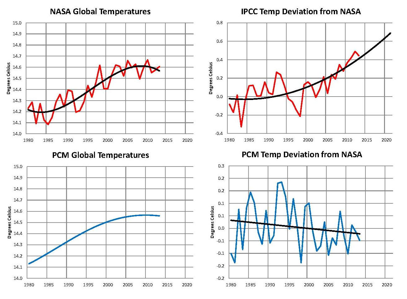
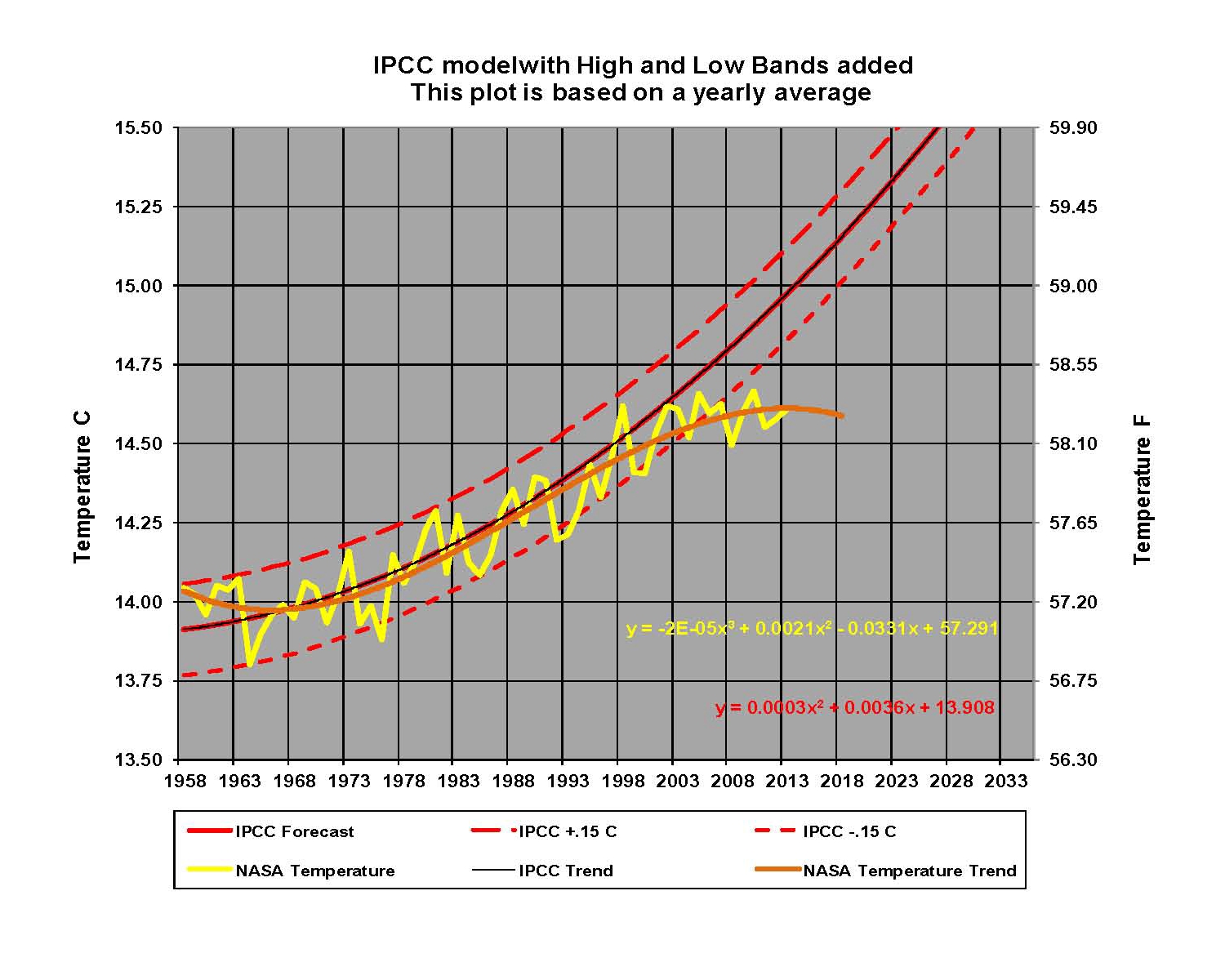
Four, Determining the global temperature is a daunting task and the science and engineering behind it has not been established in a transparent mode. The core issue is how to put all the individual temperature records together into one master value.  This process is accomplished with software today that determines an anomaly (a difference) from some base.  NASA-GISS (Godard Institute for Space Studies) publishes this number monthly in their LOTI table (LOTI is the Land Ocean Temperature Index which is a composite of all the NASA temperature reading they have collected each month adjusted into one number) as a hundredth of a degree Celsius plus or minus from the base temperature which is currently set as 14.0 degrees Celsius.  NASA-GISS publishes global anomalies back to January 1880; unfortunately because of the process that they use this means that every month all the numbers in the index change.  So with no fixed base how do we even know what the temperature change is, i.e. in October 2009 the LOTI which is a derived number determined by software which purports to be the global mean temperature) value for January 1880 was 28 and on July 2013 the LOTI value for January 1880 was -34. Converting to degrees Celsius and comparing to the current temperature, that is a change of only .32 degrees Celsius using the 2009 figure but it’s a change of .94 degrees Celsius using the 2013 figure, so which is it?  This process has not been subject to independent peer review and it must be if the process and the numbers are to be believed.  Also it makes no sense to keep changing all the numbers back to 1880 every month and some of the changes are not small as just shown. There is agreement that temperatures have gone up but that’s about the extent of the process.

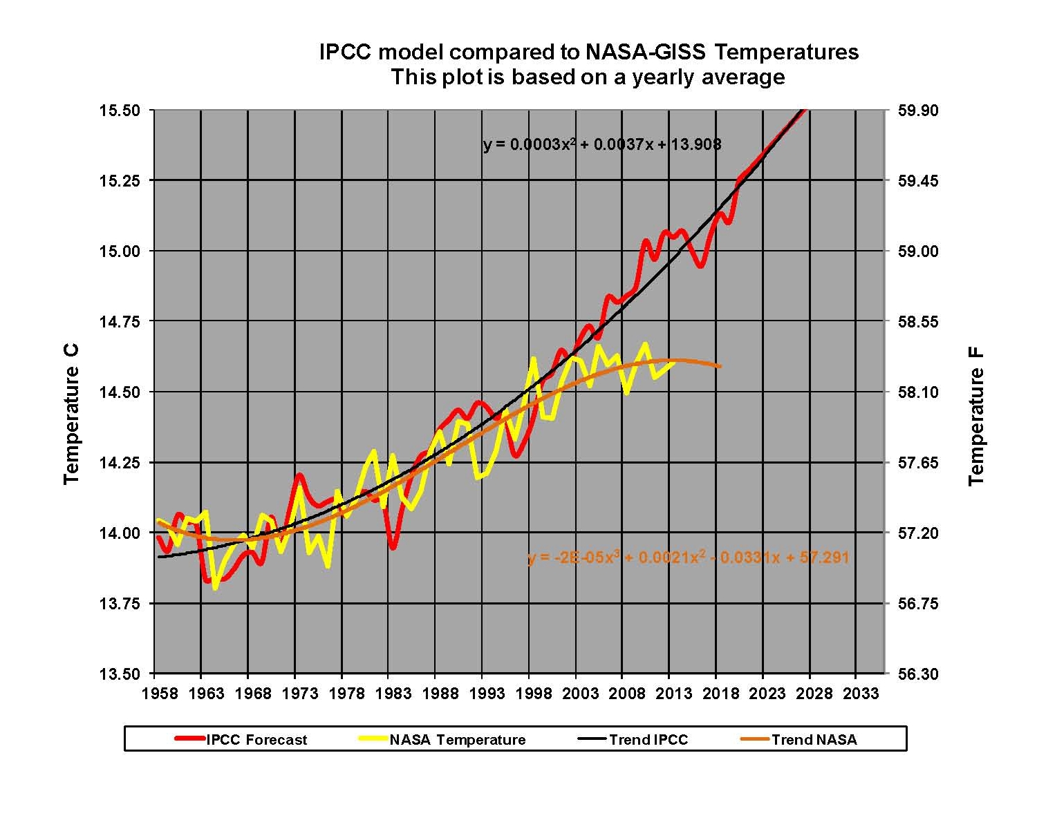
Five, In order to determine future global climate changes based on temperature changes Global Climate Models (GCM’s) of various kinds have been established by the IPCC. These are extremely complex constructs that to work must have equations to determine all the thermal flows of energy on the planet from the deepest ocean to the top of the earth’s atmosphere. There are two issues with this, one being we do not know all the processes and variables involved nor even what values to assign to many of them and two we do not have computers powerful enough to process the data at a resolution sufficient to determine global energy policy. The resolution is a major factor, since for these kinds of models to work the entire planet must be covered in a grid or mesh in all three dimensions, e.g. a box; the current state of the art means that these boxes are much larger than major cities and many of the key thermal flows are at much smaller sizes that cannot then be properly modeled. Then when the current GCM’s are run they never give the same result twice and so an average of a number of runs is used for each. In addition they change the population and economic circumstances such that it not even certain if they are projecting climate or economics for example in the current report, AR4, seven different economic scenarios are shown.  That range of outputs is way too broad to give any certainty to the output especially with the current downward global temperature trend which is not even possible, with the way the GCM models are currently programmed.

Six, A key number that is not known with sufficient certainty is the Radiative Forcing value of Carbon Dioxide which determines the Climate Sensitivity or the amount the global temperature will increase with a doubling of the level of Carbon Dioxide.  The IPCC uses 3.0 degrees Celsius in its models but they also admit in their Fourth Assessment Report (AR4) issued in 2007 that the range of values is from .4 to 4.5 degrees Celsius.   This wide range gives results ranging from no climate effect to global catastrophe and the use of 3.0 degrees Celsius puts the models into the range of catastrophe.  The apparent need for the value of 3.0 degrees Celsius is that is what was needed to make the models show a global temperature that matched that which was observed between about 1960 and 2000. The mistake in this was assuming that there were “no other significant factors” in play and that Carbon Dioxide was the primary cause if not the ultimate cause of the increase. It seems when properly used the Carbon Dioxide sensitivity value is closer to .64 degrees Celsius than the 3.0 degrees Celsius the IPCC uses.

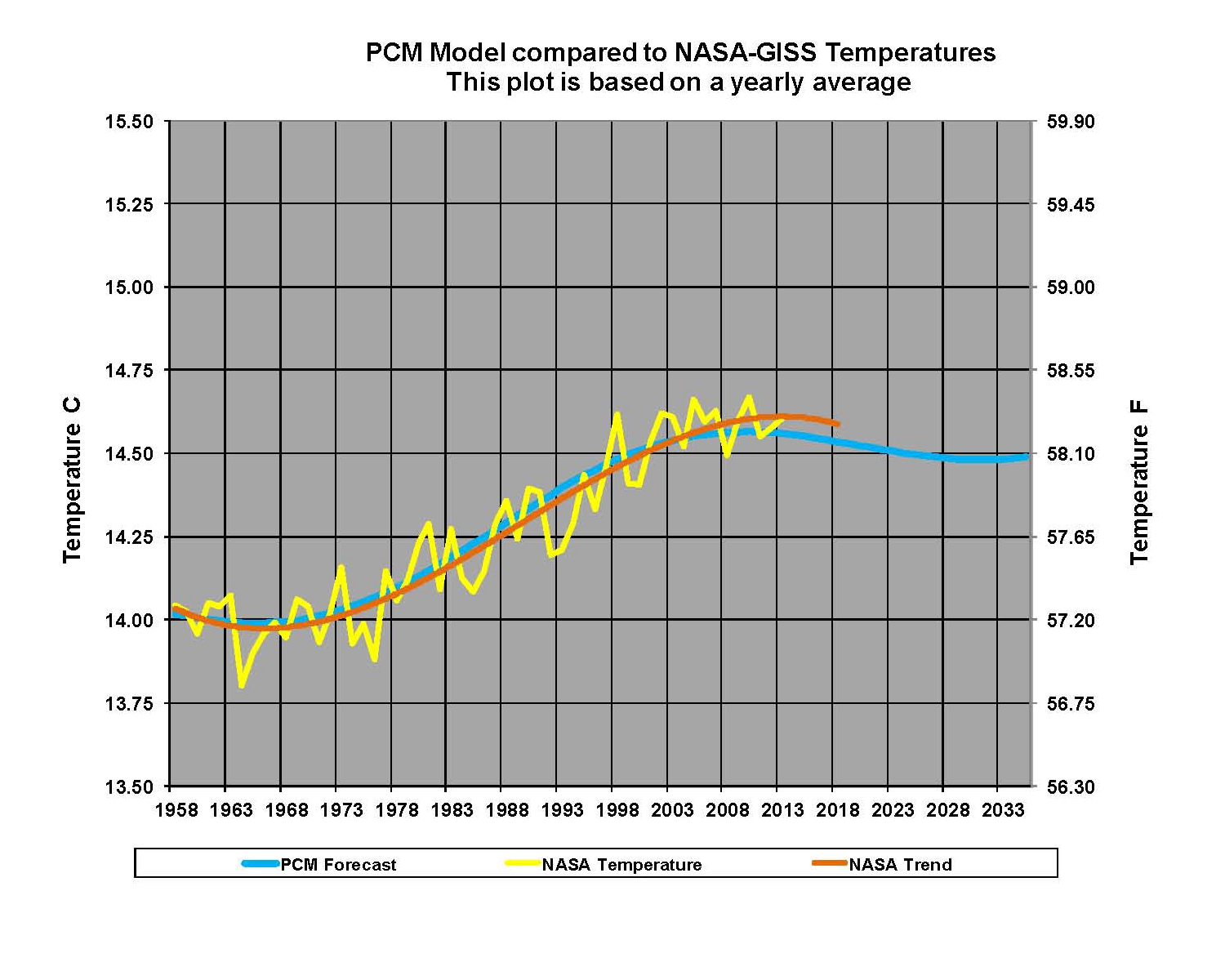
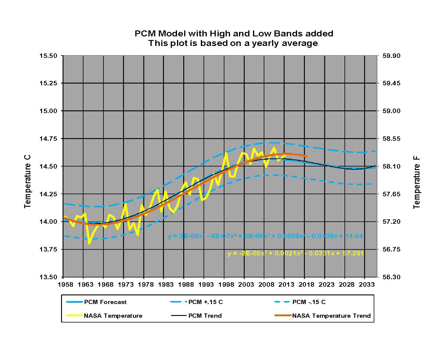
Seven, The IPCC has mostly ignored orbital and solar variations and that is what has forced them to use the high climate sensitivity values for Carbon Dioxide.  The orbital changes as first defined by Milutin Milankovic and now known as the Milankovitch Cycles have three components: Precession, Axial tilt and Eccentricity all of which are well documented.  Over the past several thousand years they appear to give a global warming and cooling cycle of some 1,052 years with a swing in temperature of about 1.46 degrees Celsius.  The solar variation from internal variation in the fusion process in the suns interior are the primary reason we have the short cycle of almost 67 years with a swing of about .32 degrees Celsius.  In both cases these numbers do relate to the primary cause of the observed temperature increases but they are mitigated by all the thermal sinks on Earth and so they do not exactly correlate year for year.  These two patterns are the bases for an alternative climate model called a PCM here.

Eight, Reliable thermometers were not invented until 1724 by Daniel Fahrenheit so there was no  way to know what the global temperature really was although other cruder devices were in use prior to then; however by around 1850 there were enough weather stations recording temperatures to begin trying to determine what the average global temperature was.  It must also be understood that before 1850 everything regarding temperature is proxy data which means that it is derived from things like the ratio of the isotopes of Oxygen 18 to Oxygen 16 in wood, stalagmites, ice and sediments; the size of tree rings and coral growth.  That is not to say that there is no relationship to temperature but since other things also contribute to the items being measured its difficult if not impossible to know the true cause and therefore the global temperature. More importantly there is no “one” global temperature, whatever the number is said to be it is strictly an artificial number derived by some process e.g. software today.   The reason this is an artificial number is that the earth is a spinning global with one side facing the sun (being heated) and the other deep space (cooling down); this creates three climate bands on each side of the equator. First is the equatorial band from the equator to 30 degree north or south which receives the bulk of the available heat from the sun. Next are the bands north and south from 30 to 60 degree, where the continental United States is, that receives about 1/3 less. Lastly we have the Polar Regions from 60 to 90 degrees north and south which receives almost no heat from the sun. Considering the planet as a whole, front and back; only 5.6% is directly under the sun at any one time with another 16.7% getting a reasonable amount of solar heat, all the rest is, in effect, cooling down. The complex planetary air flows that create our climate are a direct result of the heating patterns from these bands and the spinning globe. The energy from the sun is also significantly reduced by clouds levels, and the temperature on the surface depends whether it‘s land or water and what the elevation is.  This is a very complex process that is not yet completely understood at the local level, yet we are shown a stated value, the anomaly, which are actually degrees Celsius shown to the second decimal place.  This indicates a relatively high degree of precision but since the values change every month we have low accuracy.

Nine, there is no “greenhouse” effect and there are no “greenhouse” gases!  The processes going on in the earth’s athomosephere “are not” the same processes as that occurring in a greenhouse used to grow food.  The heat in the greenhouse is trapped in there by the physical barrier of the glass or plastic panels.   There are no physical barriers in the atmosphere and so the process is very different.  Sunlight reaches the earth and as it enters the atmosphere 30% of it is reflected back into space, mostly by the white clouds.  The remaining radiation warms the air the land and the water but by doing so the energy must also “eventually” leave the planet to maintain a thermal balance and does so as radiation in the infrared (IR) bands. Some of that outgoing Infrared is absorbed by the Carbon Dioxide and then reradiated and either shifted to water vapor or sent out into space. There is a lot more water than Carbon Dioxide and, in fact, water is the primary “greenhouse” gas if we have to use that term.  The water in the atmosphere acts as a thermal buffer and that raises the global temperature from a negative 18.5 degrees Celsius to 14.5 degrees Celsius which is a positive swing of 33 degrees Celsius, and of that 33 degrees Celsius about 15% is from the affect of Carbon Dioxide at present levels.  Now here is the important fact, using the more realistic Carbon Dioxide sensitivity values there is only about .5 to 1 degrees more of a temperature increase that can be realized by the level of Carbon Dioxide in the athomosephere no matter how high it goes.  The programming in the IPCC climate models apparently use some form of logarithmic function related to Carbon Dioxide which forces the model into a positive feedback mode which is just not supported by geological records. This is why the lower value makes more sense since the planet has never been as hot as the IPCC Carbon Dioxide higher sensitivity values would take it in the near future. This value is at the heart of the argument and so knowing what it really is, is probably the single most important element in the debate.

Ten, A model of any kind is only as good as its ability to accurately predict future events and the better the model the further into the future the model can accurately predict that which it is programmed to do. According to Wikipedia “Modeling and simulation (M&S) is getting information about how something will behave without actually testing it in real life.” … “M&S is a discipline on its own. Its many application domains often lead to the assumption that M&S is pure application. This is not the case and needs to be recognized by engineering management experts who want to use M&S. To ensure that the results of simulation are applicable to the real world, the engineering manager must understand the assumptions, conceptualizations, and implementation constraints of this emerging field.” Global climate models are simulations of what will happen under the assumptions and restraints built into the models. And since this debate is on Climate that changes very slowly it will take decades to see what the real movements are and whether the IPCC models are any good.  The issue at hand is Carbon Dioxide levels which began to move up in concert with global temperatures starting around 1965.  That pattern was constant up until only a few years ago and that gave the illusion that Carbon Dioxide was the proximate cause of the Change; but three decades is less than a blink of an eye with Climate.  With global temperatures now actually dropping not increasing there is building doubt about the ability of the IPCC climate models to accurately show what is happening in the real world even a few years into the future. What we are currently seeing in the falling global temperature levels, while the OPCC GCM’s say they must go up, is the very definition of a bad model/simulation. This is a fundamental flaw not just a projection being a little bit off track!