A Short History of Climate Change, Part I


Background

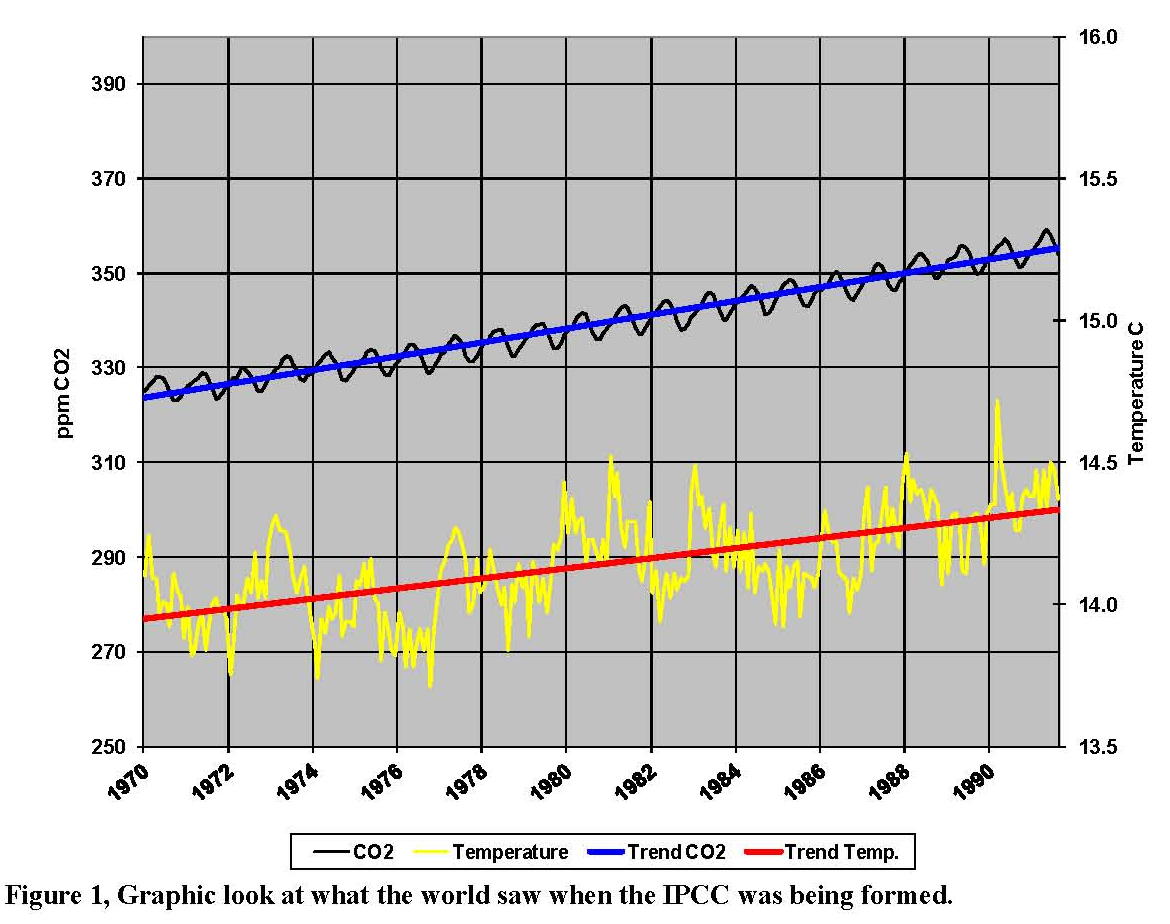
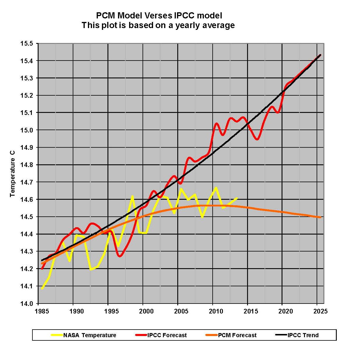
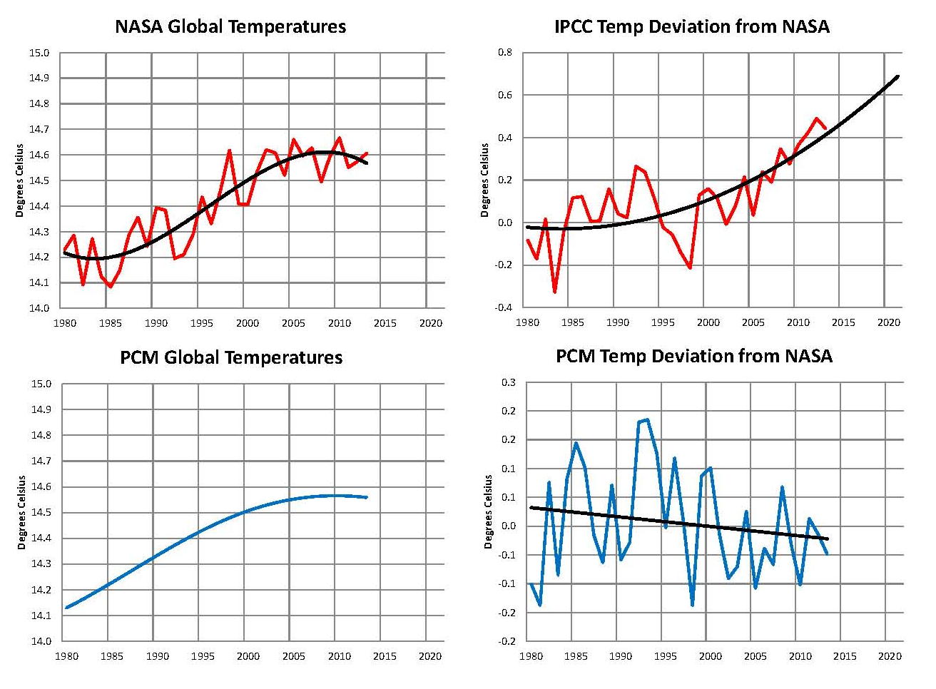
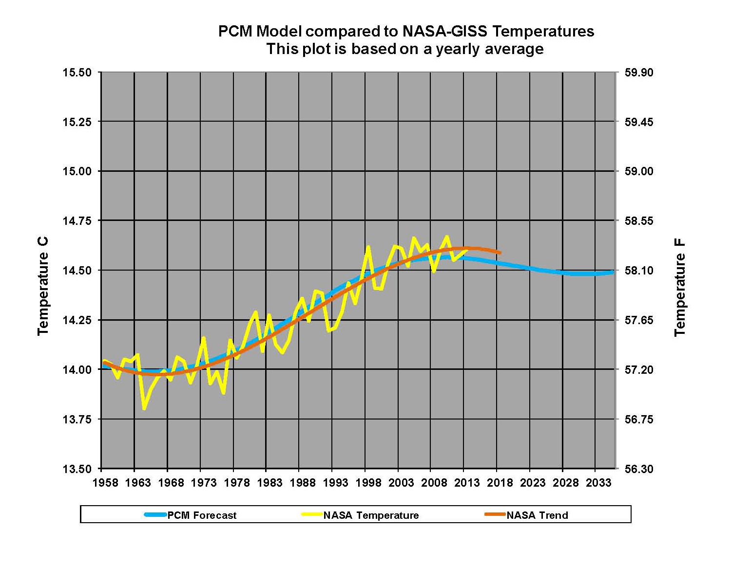
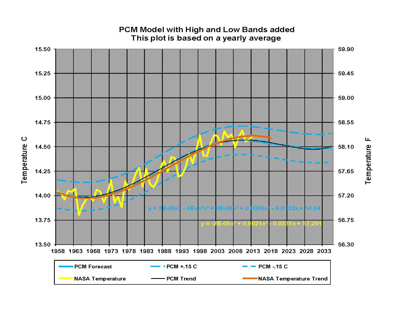
Over the past several decades a great deal of international effort has been undertaken to show that anthropogenic CO2 is causing climate change on the planet by raising the planet’s temperature.  Therefore the increased temperatures will change the world’s climate patterns which will result in the melting of the world’s glaciers, increased storms and probably loss of valuable crop lands by rising sea levels. The implied result on the world’s civilizations will be catastrophic and therefore there will be a significant loss of life from both the climate change and the probable wars that will be fought over dwindling resources. The Intergovernmental Panel on Climate Change (IPCC) has been given the primary task of showing how this will happen and this research is being done primarily by NASA and NOAA in the United States and the Met Office Hadley Center and Climate Research Unit in the United Kingdom. To show what is happening on a planetary scale very complex computer models have been constructed by some of the world’s best scientists and those models have shown that the temperature of the planet will hit unprecedented levels possibly as soon as 2050.  To prevent this from happening various international forums have been held such as Rio de Janiero in 1992 and Kyoto in 1997 where goals for a reduction in the CO2 emissions from the burning of fossil fuels primarily from petroleum, coal and natural gas were agreed to by the parties.  Efforts to date have been totally unsuccessful and CO2 levels have now about to go over 400 ppm and they are increasing by and increasing rate now at 2 ppm per year.

The Intergovernmental Panel on Climate Change (IPCC) was set up in 1988 by the United Nations (UN) at the request of some of its members. Its mission is to provide comprehensive scientific assessments of current scientific, technical and socio-economic information worldwide about the risk of climate change more specifically Anthropogenic Climate Change (which is by definition climate change caused by the action of humans). The concern was from the global increase in temperatures which were “presumed” to be from increasing levels of Carbon Dioxide (CO2) in the atmosphere as measured in parts per million (ppm) resulting from burning carbon based fuels; and this resulted in a self full filling prophecy. The IPCC does not do research and so the information they use comes predominantly from four sources the National Aeronautics and Space Administration Goddard Institute for Space Studies (NASA-GISS) and the National Oceanic & Atmospheric Administration Carbon Cycle Greenhouse Gas Group  (NOAA-CCGG) in the U.S. and the Met Office Hadley Centre (UKMO) and the Climate Research Unit University of East Anglia (CRU) in the United Kingdom (UK).  Others are involved as well but these four agencies at the direction of their governments are the primary drivers of this concept.

The concept of Anthropogenic Climate Change actually started in the late 19th century with the belief that lower levels of CO2 might be the cause of the past ice ages. During the 20th century that transitioned into the concept that too much CO2 might cause global overheating and that belief reached a peak in the 1970’s when the environmental movement started in earnest with the creation of the Environmental Protection Agency (EPA) in the U.S. as well as other like agencies and organizations in both the US, UK and what was to become the European Union EU. The environmentalists all had concerns over pollution and the resulting affect on both humans and the environment and this link to CO2 seemed like a simple way to promote their concerns.  These environmental movements, in themselves, were needed as concerns over pollution were very real back then. However virtually all the worlds energy is produced from carbon based fuels. Most of the real pollution from coal (e.g. sulfur, fly ash, mercury, soot) and from petroleum and gasoline (e.g. nitrogen oxides, carbon monoxide, sulfur dioxide, ozone and particulate matter) was all fixable through technology and they have been mostly eliminated in the United States. Unfortunately, Carbon Dioxide production from fossil fuels cannot be eliminated by any known cost effective means and so this aspect of the environmental movement was very misguided. It was assumed by many in the movement that alternative means of producing energy could be developed and they were called Clean Energy and the movement took on a life of its own.

The history of the concept of CO2 being a factor in the worlds temperature was based on the work of many scientists and the fact that CO2 was originally thought to be a significant greenhouse gas so reasonable attempts were made to calculate the warming effect of this gas on the planet.  There were a lot of concerns that a significant warming of the planet could result from the increasing usage of fossil (carbon based) fuels being used to generate ~400 Quadrillion watts (Quad) of usable energy for civilization in the 80’s. This is especially true because that number of Quads has already significantly increased and will, probably more than double by the middle of the 21st century as reported by the US Department of Energy (DOE) and the UN as the rest of the world increase’s their standard of living.

Continued in A Short History of Climate Change, Part II

A Short History of Climate Change, Part II


How it all started

During the 1970’s and 1980’s the temperature of the planet did seem to be going up, see Figure 1 from that period, and this led to a reinforcing belief that it was being caused by increasing levels of CO2 as both seemed to be rising together in lock step, in other words there was a correlation between the two variables.  This is what eventually led to the creation of the IPCC and the construction of the various Global Climate Models (GCM) [1] Hafemeister and Schwartz, which were designed to show how much the planet’s temperature was going up because of the increasing levels of CO2 in the atmosphere. Inherent in setting up the IPCC and the global climate models was the belief that there was both correlation and cause and effect between the world’s temperature and the level of CO2 in the atmosphere.  This was a very serious flaw which has led to much wasted effort and a lot of confusion in the world’s science and engineering communities, because instead of working on producing cheap energy which would improve the lives of everyone on the planet and which we would need in abundance, we are working very hard on reducing CO2 which either significantly increases the cost or reduces the supply of energy and is therefore very counterproductive.

History-1

Because of the importance of this Figure 1 some discussion is justified.  The trend lines between CO2 and temperature appear to be almost exactly the same.  This is, in part, because of the scales used in this chart.  However the scales used here are the basically the same as those used throughout this paper, although the portion (window) shown in any one Figure might be different.  In this Figure CO2 increases about 9.2% and temperature increases about 4.4% and different scales and units would, in fact, give different numbers. The salient point to the IPCC was that both CO2 and temperature were moving up simultaneously and that gave them the justification for what they were proposing in their Anthropogenic Climate Change Theory.

The IPCC in many cases indirectly acknowledges that they don’t really know what they are doing for example in the IPCC 2007 4th assessment on Climate Change their climatologists admit to having a “low” or “very low” understanding of 13 of the 15 factors that drive climate [2]. So in other words they only know what they are doing 2 out of 15 times or 13.3% of the time yet they want us to trust them and completely change the entire world’s energy production system at a cost of untold trillions of dollars because they just might have guessed correctly; that seems to be a bit much. Most of the science I know, albeit I’m of an older generation, requires over 90% certainty before it is accepted and that’s just the start of a proof of a theory. For example Albert Einstein’sTheory” of Special Relativity is not acceptance as a law of science it is still only a theory that appears to be correct.

The really amazing thing about what the IPCC and their cohorts are doing is that prior to their founding and the creation of a large amount of government research money there was little to no support for the theory that CO2 was causing planetary change and increasing the earth’s temperature; given that CO2 is only .0398% of the atmosphere even today that does seem to be a bit of a stretch.  For example the American Meteorological Society (AMS) had refuted the concept of CO2 as a greenhouse gas in 1951 in its Compendium of Meteorology [3], In which they stated that the idea that CO2 could alter the climate “was never widely accepted and was abandoned when it was found that all the long-wave radiation [that would be] absorbed by CO2 is [already] absorbed by water vapor.” There was also a hugely influential National Academy of Science  in their Charney Report from 1979 [4]. This 33-year-old U.S. government report details the role of carbon dioxide and how it might impact the climate. You will see that while CO2 is mentioned no less than 112 times, as you’d expect, but nowhere in this report will you find ANY mention of the greenhouse gas effect/theory.

One of the principle architects’ of the anthropogenic climate change theory was James Edward Hansen and according to Wikipedia he is “… an American adjunct professor in the Department of Earth and Environmental Sciences at Columbia University. Hansen is best known for his research in the field of climatology, his testimony on climate change to congressional committees in 1988 that helped raise broad awareness of global warming, and his advocacy of action to avoid dangerous climate change.”  From 1981 to 2013, he was the head of the NASA Goddard Institute for Space Studies in New York City, a part of the Goddard Space Flight Center in Greenbelt, Maryland. Hansen, while at NASA in a leadership role, was the primary driver for the US governments push for control of energy and therefore we must look at his work since it is, if not the primary driver certainly one of the main drivers of world policy on climate today.  Hansen retired from NASA-GISS in April of 2013 and has now become very active in the environmental movement.

From the NASA-GISS website, “In particular Hansen gave a presentation to the US congress in 1988 where he showed them what he thought would happen to Global climate if we did not stop putting Carbon Dioxide CO2 into the earth’s atmosphere. In the original 1988 paper, three different scenarios were used A, B, and C. They consisted of hypothesised future concentrations of the main greenhouse gases – CO2, CH4, CFCs etc. together with a few scattered volcanic eruptions. The details varied for each scenario, but the net effect of all the changes was that Scenario A assumed exponential growth in forcings, Scenario B was roughly a linear increase in forcings, and Scenario C was similar to B, but had close to constant forcings from 2000 onwards. Scenario B and C had an ‘El Chichon’ sized volcanic eruption in 1995. Essentially, a high, middle and low estimate were chosen to bracket the set of possibilities. Hansen specifically stated that he thought the middle scenario (B), shown below as Figure 2, the “most plausible”.

History-2

Figure 2 James E. Hansen’s three scenarios

Hansen as well as many others are true believers in the Anthropogenic climate change movement and they have, for the most part, made this into a religion and refuse to admit that there could be any other factors besides CO2 that drive Global climate. What has happened is that rather than look at climate and how it has “always” changed over time Hansen and the IPCC chose to ignore the fact that climate has never been a constant and tried to prove the CO2 “was” the cause of the current change.  A look at recent history going back to the last Ice Age shows how foolish that belief is, see Figure 3 below.

History-3

Figure 3, 11,000 years of Change

What should have been done was construct a null hypothesis argument to see if science could prove that the CO2 was not the cause instead of trying to make the models show that it was the cause.  Much of what was done in these models was to tweak the assumptions and the raw data to give the result that was desired and that has led to a wide disparity between the current observed downward movement of temperatures and the upward predictions of those temperatures by all the IPCC climate models. This increasing disparity is becoming a major issue with the IPCC (and their supporting agencies) and the other side of this argument. There are now an increasing number of scientists who are not in support of the way the climate work has been done.  We have attempted to show here that after wasting billions of dollars that —

CO2 is neither the proximate nor the ultimate cause of the world’s temperature going up.

Continued in A Short History of Climate Change, Part III

A Short History of Climate Change, Part III


Photosynthesis

From approximately 1970 to 2000 the earth had been warming and at the same times the CO2 levels in the earths’ atmosphere had been rising; both apparently in sync as shown in the previous Figure 1. There is probably a very high correlation to the increased level of CO2 in the atmosphere and the increased use of carbon-based fuels by advanced societies in particular the United States (US) the European Union (EU) and the Pacific Rim countries over the past century, [5] Olivier et al. We will concede that point of argument although there are other much larger sources and sinks for carbon on the planet. The issue is that the increase in the CO2 levels has been identified, by some, as a cause of great concern. Their belief is that more CO2 will cause the planet to heat up to unprecedented and disastrous levels [6] Editorial Nature! In essence a positive feed back situation that at some point creates a runway increase in temperature, see Figure 4 where the red oval is Hansen’s Scenario B. If true this is indeed very, very bad and needs to be addressed.

History-4

That concern has manifested itself in two counts one patently false and the other without observed verification.  The first and totally false statement is that high levels of CO2 in the atmosphere are very dangerous and must be regulated as we have been told by both the United States Supreme Court in Massachusetts v. EPA (2007) and the US EPA.  Since an average human probably creates almost a half a ton of CO2 per year just by breathing we are all now in violation of U.S. Supreme Court edicts [7] Fox News 2009.

In fact CO2 is a food that is “required” for photosynthesis to occur in plant life and higher levels of CO2 are better than lower levels and therefore the plants grow faster [8] DeGraaf et al and [9] Soon et al with higher levels of CO2.  Figure 5 below shows the basic equation for photosynthesis in plants, where carbon dioxide from the atmosphere and water from the ground are combined by the energy in sun light producing Sugar and Oxygen.

History-6

Figure 5, The Equation for Creating Sugar from Carbon Dioxide

When plants appeared and evolved on Earth, it is known for a fact that the carbon dioxide (CO2) concentration was much higher than it is now. Back then, the CO2 concentration was certainly well above 1000 parts per million (ppm) and even well over several thousand ppm early in the earth’s history. Today the average CO2 concentration in outdoors air on the planet is about 400 ppm. Thus, plants enjoy and are stimulated by breathing air with a higher CO2 concentration more like when they first developed. That’s why so many indoor gardeners enrich their garden with CO2 during photosynthesis to supply the plants with this essential building material. Through photosynthesis, the carbon in CO2 is extracted and takes part in the building of leaves, stems, flowers and fruits. Figure 6 shows how the equation shown in Figure 5 works in the plant.

History-7

Figure 6, What goes on in a plant leaf

Proper CO2 concentration from early growing to fructification allows for faster maturation and larger yield. Since outdoors air CO2 level varies in the 400-700 ppm range at any given time and most plants grow better in the 700-1500 ppm range, there is a gap to fill. CO2 concentration enrichment aims at filling the gap to raise the limit to plants growth rate.

The benefits of CO2 enrichment are to reduce the time from seedling to harvest, and generally accelerate growth and augment crop yield. Plants also better resist some pests like moulds. Rutgers University compared Romaine lettuce grown outdoors and in a climate controlled greenhouse with CO2 enrichment [10] Both A. J.  The results were clearly to the advantage of the indoor greenhouse grown lettuce. Romaine lettuce grown outdoors reached ready-to-market maturity in 62 days. In the greenhouse under a well controlled climate and CO2 enhancement, lettuce heads were ready-to-market in 48 days: a clear gain of 14 days to get to harvest. Also the greenhouse yield weighted 33 % more than field grown lettuce heads. Yield quality was more uniform and greenhouse heads were paid a higher price.

Additional support of increased growth for high levels of CO2 comes from the number of stomata cells in plants which control the intake of CO2 and the output of water.  When the stomata cell levels decrease as CO2 levels increase the plant grows faster a well known established fact [11] Cockburn et al. Since the ultimate source of all our food is plant life, restricting the growth of CO2 would seem to be a very bad thing to do.  At the heart of this part of the false anthropogenic global warming argument is what the optimum level of CO2 in the atmosphere is.  The current unstated assumption is that its ~280 ppm as existed some 300 years ago and that is what it “should” be …

There is no basis in fact or theory for this assumption; therefore any increase or decrease cannot be shown to be either good or bad ipso facto.

References

[1]    Hafemeister, David and Schwartz, Peter “A Tutorial in the Basic Physic of Climate Change,” Physics and Science Vol. 37 No. 3 July 2008

[2]    Solomon, Susan, et al, IPCC: Climate Change 2007: Working Group I: The Physical Science Basis; 2.9.1 Uncertainties in Radiative Forcing.

[3]    Brooks, C.E.P. (1951). “Geological and Historical Aspects of Climatic Change.” In Compendium of Meteorology, edited by Thomas F. Malone, pp. 1004-18 (at 1016). Boston: American Meteorological Association. 

[4]    Suomi, Verner E. et al, That National Academies “Carbon Dioxide and Climate: A Scientific Assessment” July 1979.

[5]    Olivier, Jos G. J., “Trends in Global CO2 Emissions 2012 Report,” PBL Netherlands Environmental Assessment Agency, July 2012 

[6]    Editorial “Time to act,” Nature 458, (April 30, 2009) 1077-1078

[7]    Fox News Friday August 26, 2009, “Don’t Exhale: EPA Expected to Declare Carbon Dioxide a Dangerous Pollutant”

[8]    de Graff, Marie-Anne et al, “Interactions between plant growth and soil nutrient cycling under elevated CO2: a meta-analysis”, Global Change Biology (2006) 12, 2077-2091,

[9]    Soon, Willie et al, “Environmental effects of increased atmospheric carbon dioxide”, Climate Research Vol. 13 149-164, 1999 October 26.

[10] Both, A. J. et al, Page 3 “Horticultural Engineering,” Volume 18 No. 5, October 2003

[11] Cockburn, William, “Relationships between Stomatal Behavior and Internal Carbon Dioxide Concentration in Crassulacean Acid Metabolism Plants,” Plant Physiol (1979) 63, 1029-1032

The PCM Looking Back and Looking Forward


From 1000 AD to 3000 AD

If we take the model and project it back and then forward we can see the overall pattern and how it fits historically.  Using the same basic format we have been showing with the high (red) low (blue) and average (green) temperature levels for reference we build the next two Graphics. Then we put in the NASSA-GISS data (yellow) but this time we’re using a plot from the full model which is monthly and has more variance but that also shows that the PCM plot is, over all, right on the NASA yellow plot; of course it was designed to fit so that’s no surprise.

In this first Graphic, shown from 1000 to 2200, the long and short cycle are very obvious and this pattern matches the temperature swings of both the “Little Ice age” and the “Medieval warming” that the IPCC tried to hide with their infamous hock stick graph.

PCM 1000 to 2200

The next Graphic, shown from 1800 to 3000, the long and short cycles are also very obvious but it can also be seen that the pattern has been shifted up about 1 degree Celsius which is from the higher concentration of carbon dioxide. Carbon dioxide is taken up to a level of 800 ppm but long before it gets there the effect is has, has been mitigated. In essence the atmosphere has become saturated and Carbon no longer plays a role in the climate process.  The IPCC admits that the sensitivity of CO2 could be as low as .4 or as high as 4.0 degrees Celsius in their Fourth Assessment Report (AR4). They use 3.0 degrees Celsius in their models which is toward the high side but what they don’t tell you is that if they used a lower value like .64 degrees Celsius as Dr. Lindzen suggests that their models will not work. Meaning it will not give the huge increase in temperature that they promote.  The definition of that value appears to be the one thing that makes or breaks the IPCC’s case; so it would seem to me that we would want to know whether its 3.0 or .64 degrees Celsius. No one at the iPCC is looking at it that I am aware of at this time.

PCM 1800 to 3000

Since the IPCC models are so very wrong right at the begin of their projections as shown in previous posts the case that the .64 value is the more accurate value makes sense and that is the value that is used in the PCM model.

Two Views of Our Future


Fact and Fantasy

A Graphic is posted here after the text to show those with an open mind two possible futures. One based on reality and the other based on fantasy.  But before we get to which is which we need to know what we are looking at.  The following graphic contains some hard facts and two projections; the facts first.  The Green line at 17.0 degrees Celsius is the geological mean temperature of the planet. The Blue line at 12.0 degrees Celsius is the geological mean low of the planet. The Magenta line at 22.0 degrees Celsius is the geological mean high for the planet. This gives us a prospective of where the earth’s temperatures have been.

The next item we show is the yellow plot which is found between 13.5 and 14.5 degrees Celsius between 1875 and 2015. This represents a plot of the December 2013 NASA-GISS Table LOTI values converted to Celsius. No adjustments were made to the data other than the units.  Clearly there is a pattern to the data a sinusoidal pattern that is trending upward. The pattern isn’t as clear from 1880 to 1950 but then record keeping wasn’t as good as it is now; but the pattern is still there. This completes the facts which can be verified by simple searches on the web if one choices to do so. To the best of my knowledge these four plots are accurate and true.

The next step is to add two projections. The first will be the model that have been created and shown in the various posts here. Its called a Pattern Climate Model or PCM. It’s shown here as an orange plot starting at 13.5 degrees Celsius in 1800 and running across the chart end up at about 15.2 degrees Celsius in 2200. This plot like the NASA plot has a sinusoidal pattern to it as well as an upward trend.  One can also observe that it fits very well over the Yellow NASA plot; that is because that is where the temperature pattern was found. As previously explained this pattern is derived from three factors, which are a long trend, a short trend and a factor for the level of carbon dioxide in the atmosphere. The equations for these three variables are explained in detail in previous posts here. Obviously by look this Orange plot fits very well over the yellow NASA temperature plot; which indicates that the logic for the math is sound.

Now we have the last item which is the view of James Hansen and the UN IPCC. There are two parts to this view, the first being Hansen’s Scenario B as present to the U.S. Congress in 1988 and which formed the core of the Climate models developed by the UN IPCC. This portion is the red plot starting at 14.0 degrees Celsius around 1955 and running to 15.0 degrees Celsius in 2020. From that point and moving to a bit over 22.0 degrees Celsius in 2200 is an average of the projections shown by the various IPCC climate models under various sets of assumptions. This is a huge increase in global temperatures and if true clearly would be a problem. However, since the models being used by the UN IPCC are so far off only a few years into their projections this forecast is just not believable.

Future 1

Let’s zoom in and look at the years 1985 to 2025 so we can see in more detail what happening between the variables; this is shown in the next graphic. The plots are the same as in the previous Graphic and so no identification is required. We did add a trend line in Black to the IPCC forecast to clarify the trend and the significant gap that is growing every year.

There is no way than anyone can look at these charts and believe that the IPCC climate models are correctly programmed.

Future 2

IPCC Climate Models are Moving in the Wrong Driection


An Analysis of Global Temperature Trends

The analysis and plots shown here are based on the following. One, NASA-GISS temperature anomalies as shown in the December 2013 Table LOTI converted to degrees Celsius. Two, is James Hansen’s Scenario B data, which is the base for the IPCC Global Climate models as described in the various posts here, also converted to degrees Celsius. Three, is a plot based on the PCM climate model, also shown in degrees Celsius. No changes or adjustments to the data were make other then conversion to degrees Celsius. This was done only to show the plots in values that are more common to those not trained in the sciences. This conversion makes no difference in what is shown. To smooth out monthly variation yearly averages are used in all the plots. Also we only go back to 1958 here as that is when NOAA begins to publish Carbon dioxide values.

There are four plots shown here in the post the first is in the upper left corner (UL), the next in the upper right corner (UR), the next in the lower left corner (LL) and the last one is in the lower right corner (LR).  All data used to make these plots is as described in the first paragraph.

Four plots

The first plot, UL is a plot of the NASA anomaly converted to degrees Celsius shown in red with a black trend line added. There has been a very clear reversal in the upward movement of global temperatures since about 2001 and the IPCC has no explanation for this. Since CO2 has continued to increase at what could be argued an increasing rate this raises serious doubts about the logic programmed into all the IPCC global climate models.

The next plot UR also in red, shows the IPCC estimates of what the Global temperature should be based on James Hansen’s Scenario B with the NASA actual temperatures’ subtracted from them.  This plot then represents a deviation from expected temperatures. A positive value indicates the IPCC values are higher than actual and a negative value indicates the IPCC values are lower than expected.  A black trend line has been added and we can clearly see that the deviation is increase at an increasing rate since 2001. This makes sense since the IPCC models project increased temperatures based on the increasing level of CO2 in the earth’s atmosphere. Unfortunately the actual temperatures from NASA are trending down so each year the gap between them widens. Since we have 12 years of observations’ showing this pattern it becomes hard to justify a continuing belief in the logical built into the climate models, there is obviously something very wrong.

The next plot LL shown in blue is based on the five equations in the PCM climate model described in detail in the posts here.  Since it is a curve generated by equations a trend line is not needed as it is a smooth plot.  Although in this plot the hook at the bottom of the trend line in plot UL does not show in the plot here, it would if we went back a few more years. However the more current data from 2001 on is almost identical with that of the NASA plot in UL from 2001 to the present.  The reason being that in the PCM model there is a 66.67 year cycle that moves the trend line up .15 degrees Celsius and then down by the same amount; we are now in the downward portion of that trend which will continue until around 2035.  This short cycle is clearly observed in the raw NASA data going back to 1880. Because there is also a long trend which is still moving up the short cycle is amplified going up and dampened going down.

The last plot LR also in blue uses the same logic as that used in the UR plot, here we use the PCM estimates of what the Global temperature should be with the NASA actual temperatures’ subtracted from them.  This plot then also represents a deviation from expected. A positive value indicates the PCM values are higher than actual and a negative value indicates the PCM values are lower than expected. A black trend line was added and it clearly shows that the PCM model is tracking the NASA actual values very closely.  There does appear to be a slight negative trend but since we are only just entering the down portion of the observed pattern it’s too early to see if the PCM model needs to be tweaked any.

In my opinion the IPCC models were designed before a true picture of the world’s climate was understood. During the 1980’s and 1990’s carbon dioxide levels were going up and the world temperature was also going up so there appeared to be correlation, and there obviously was as both were moving up. The mistake that was made was looking at only a 20 year period when the variations in climate move in much longer cycles.  Those other cycles can be observed in the NASA data but they were ignored for some reason.  By ignoring those trends and focusing only on carbon dioxide the models will be unable to correctly plot global temperatures until they are changed.

The purpose of these posts is to make people aware of the errors inherent in the IPCC models so that they can be corrected. 

Movie Review, Forbidden Planet


A movie with a real and significant message

This is a Classic movie that was entered into the Library of Congress’ National Film Registry in 2013, being deemed “culturally, historically, or aesthetically significant.” This film directed by Fed M. Wilcox from a screen play by Cyril Hume had many firsts and was a precursor to what was to come much later in this kind of film. The film stars Walter Pidgeon, Anne Francis, Leslie Nielsen and it featured Robby the Robot the first robot actor. Goggle Forbidden Planet and check out the Wikipedia write up. But that’s not why I am writing a review of a 58 year old movie. Back then I was very into science and engineering and I read every science fiction book I could get my hands on.  When I saw this movie I was impressed by both the special affects the plot and the hidden message which bears revisiting today for many reasons. As you may see after reading this review.

Set in the 23rd century, the United Planets Cruiser C57-D travels to the planet Altair IV, 16 light-years from Earth, sent to discover the fate of an expedition sent 20 years earlier. Soon after entering orbit, the cruiser receives a transmission from Dr. Edward Morbius played by Walter Pidgeon, the previous expedition’s master of languages and their meanings. He warns the starship to stay away, saying he cannot guarantee their safety; he also states further assistance is not necessary. The C57-D Commander John J. Adams, played by Leslie Nielsen ignores the warning and after receiving coordinates lands the starship.

After landing they are met by Robby the Robot, played by himself, who takes Adams, Lieutenant Jerry Farman played by Jack Kelly, and Lieutenant “Doc” Ostrow, played by Warren_Stevens to Morbius’s home. There, Morbius explains to them that an unknown “planetary force” killed nearly everyone and then vaporized their starship, Bellerophon, as the survivors desperately tried to lift off the planet. Only Morbius, his wife (who died of natural causes later), and their daughter Altaira, played by Anne Francis were somehow spared. Morbius fears that the C57-D and its crew will meet the same fate and they should immediately leave.

That night after posting sentries, equipment aboard the C57-D is sabotaged. Adams and Ostrow confront Morbius in the morning; where they learn he has been studying an extinct highly advanced native species, the Krell, a race that mysteriously all died about 200,000 years before, just as they were on the verge of achieving their crowning scientific triumph leaving no trace of their existence on the planet’s surface. Admitting to Adams he hadn’t been forthright Morbius shows Adams and Ostrow a secret Krell laboratory that he found, within it he shows them a device he calls a “plastic educator”, a device capable of measuring and enhancing intellectual capacity; he puts it on and uses it to display a three-dimensional, moving thought projection of Altaira.

Morbius tell them that the Bellerophon’s captain tried the machine and was instantly killed. Morbius also tried using this machine and he barely survived; later after recovering he discovered his intellect had been permanently doubled. His increased intelligence enabled him, along with information from a stored Krell library, to build Robby and the other “technological marvels” in his home. Morbius then takes them on a tour of a vast cube-shaped underground Krell machine complex, 20 miles (30 km) square, still functioning and powered by 9,200 super powerful thermonuclear reactors. Adams demands that the knowledge of the Krell be turned over to Earth supervision, but Morbius refuses, citing the significant danger that the Krell technology would pose to mankind if it were to fall into the wrong hands and misused.

While this is going on Altaira never have seen a man, other than her father, is becoming romantically attracted to the captain. Going back to the starship Adams orders a defensive force field fence set up around the starship for protection. Despite the precautions Chief Engineer Quinn is found dead the next morning. The next night, the C57-D’s crew is prepared they quickly discover that the creature is invisible as its roaring Lion like image becomes visible as it stands within the fence’s force field, further enhanced by the crew’s directed high-energy weapons fire. None of these precautions matter as the monoester kills several of the crew, including the ships navigator Jerry Farman. While the battle in the starship is going on back in the Krell lab, Morbius is startled awake by Altaira’s screaming; at that same instant, the large creature suddenly vanishes.

Returning to Morbius’s home Adams confronts him demanding an explanation, while, Ostrow sneaks away to use the Krell educator; where he is fatally injured. Before he dies Ostrow explains to Adams that the Krell Machine was built to materialize anything the Krell could imagine, projecting matter and energy anywhere on the planet. Then with his dying breath, he also tells Adams the Krell forgot one thing: “Monsters from the Id” and before he can say more he dies. Adams now understands what happened and asserts that Morbius’ subconscious mind, enhanced by the “plastic educator”, utilized the Great Krell Machine, recreating the Id monster that killed the original expedition when they tried to leave; Morbius steadfastly refuses to accept this conclusion.

By this time Altaira declares her love for Adams in defiance of her father’s wishes, and Robby detects the Id creature approaching the house. Morbius commands Robby to kill it, but Robby knowing it is a manifestation of his master develops a conflict with Morbius’ command since he his programmed to never harm a human and Robby shuts down. The ID creature power by all the thermonuclear reactors melts the indestructible metal doors of the Krell laboratory where Adams, Altaira, and Morbius have taken refuge. Morbius not accepts the truth: the creature is an extension of his own mind, “his evil self”.

He is fatally injured trying to stop the creature, which then disappears but before he dies Morbius directs Adams to activate a floor switch and warns them that all the Krell thermonuclear furnaces will now overload and destroy the planet; they must be 100 million miles away within 24 hours. Adams and Altaira along with Robby escape the lab and get back to the starship and leave later from deep space, with the C57-D safely on course back to Earth, they witness the destruction of Altair IV on the ship’s viewscreen.

The reason this movie is so significant is the message that to advanced a technology developed without understand of all the ramifications can destroy even the those that mean no harm. Maybe because if was so young at the time I was moved by that message and today as we move into genetic research where we will soon be able to modify are genes we had better make sure that we “really” know what we are doing or like the Krell we could destroy ourselves.

Issues with the IPCC Methods, Part IV


As discussed, the PCM model of the world’s temperature is based on identifying patterns and then finding equations that could generate a curve(s) that would match the observed data.  This is neither non-linear least squares fitting nor is it Gauss-Newton curve fitting as there is just too much noise or variability to the temperature data especially with the method used by NASA to handle raw data and prior to ~1850 there is only proxy data.  The assumptions used here for predicting temperature are that there were two source curves that were independent of each other but when added together with a reasonable factor for Carbon Dioxide gave the observed results.  We also needed a model for the Carbon Dioxide level and that was modeled using the form of a Gaussian distribution after the seasonable variance was removed using a mean value.  Once that was accomplished an equation was developed that could generate a plot that fit the NOAA data very well and it would transition smoothly back to the 1650 value of ~270 ppm. This gives a base to work from that led to the following equations.

In the model the base Temperature in 1650 (we use 1650 since that is the approximate low point in the little ice age) is set at TB = 13.215 C.  The long cycle LC is 1,052.63 years with a 1.48 C swing. The short cycle SC is 66.67 years with a swing of .30 C.   The forcing for CO2 CL is calculated from 272 ppm for 1650 and taken to 800 ppm level by 2250 by a plot that matches NOAA data where available. The model starts in January 1650 and moves by an increments of 1 per month (M) from the starting point to the end of the simulation. Each increment of one adds one row to the spreadsheet.  So the following equations are what we use for the following example. If we wanted to calculate the value that NASA-GISS will give for November 2014 that would represent an M value of 4379 and that is all that is needed to solve for the temperature. This method appears to work well from 1000 AD through 2000 AD; so the prediction for November 2014 is calculated as follows:

1. The Long Cycle value is

LC = Sin (.00052359*M-1.57338795)*.74+.303784 = .791408 C

2. The Short Cycle value is

SC + Sin (.00785385 *M-19.2419325)*.15+.195341 = .274718 C

3. The CO2 value is

CL = 550/(1+EXP(1+8.94+.002*M)+272 = 401.081 ppm

4. The Adder for CO2 is

TC = -4.227 + (.75*LN(CL))) = .268623 C

5. The Temp. for 2014-11 will be:

Temp = 13.215 + LC + SC + TC = 14.550 C

The NASA-GISS temperature for June, July, and August 2013 is 14.58 C

The PCM model projection for the same period is 14.56 C

The concern over global warming as observed during the 70’s 80’s and 90’s was not unreasonable since Carbon Dioxide, a known “greenhouse” gas (we use this term even though it is wrong as explained in point six), levels were going up and global temperatures were also going up.  The politicians that wanted to act got involved and created a solution before the apparent problem was even understood.  The green energy, sustainability and save the planet slogans that were developed and even the greenhouse effect words were all designed to convince the citizens that things must be changed or there would be dire consequences. The IPCC climate models will eventually be fixed to work as they will eventually realize that something is not working the way they thought.  Unfortunately the political damage has already been done as we poor hundreds billions of dollars into changing how we produce energy to fix a non-existent problem.  The sooner we can get past this the less time, effort and resources will be wasted and we can use them for much better purposes.

Issues with the IPCC Methods, Part III


In Part I  the basics for a different kind of climate model which we call the Pattern Climate Model (PCM) were discussed and in this section we will present a method where the real reasons for global temperature movements can be demonstrated in a very simple model.  The reason or logic for developing this model is that based on geological evidence the link between Carbon Dioxide and global temperature appeared weak at best, especially at elevated levels meaning over 400/500 ppm.  More currently over the past 2000 years or so there appeared to be patterns to the climate that had better relationships to orbital changes, Milankovitch Cycles, and variations in the suns output.  As discussed in the seventh point over the past several thousand years the Milankovitch Cycles appear to give a global warming and cooling cycle of some 1,052 years with a swing in temperature of about 1.46 degrees Celsius.  This swing appears to match well with the timing of the Little Ice Age and the Medieval Warming as well as other warming and cooling cycles going back further than those two just mentioned. With a swing of almost 1.5 degrees Celsius this is has probably been the primary driver of global temperatures for the past 4000 years. Figure 3 follows.

IPCC-03However the Milankovitch Cycles cannot explain all of the variations as there are clearly many ups and downs observed with shorter times and less magnitude. The solar variation from internal variation in the fusion process in the suns interior appears to be the primary reason we have the short cycle of almost 67 years and with a swing of about .32 degrees Celsius.  Putting these two cycles together get’s us very close to observed NASA-GISS temperatures but there does seem to be more needed and we find that if we use a sensitivity value for Carbon Dioxide of .64 degrees Celsius and then add that value to the long and short trend that we end up with a very good match to the NASA-GISS temperature plots.  Because of the way the sensitivity value works in the models the actual temperature affect on the Climate is the highest when there is very little of it and it gets proportionately less the more there is. That may seem to be counter to logic but what happens is basically a “saturation” beyond which the affects of the Carbon Dioxide becomes almost zero.  If this were not true then during those periods where Carbon Dioxide was 10 or 20 times what it is now would have produced temperatures that would have killed off much of the life on the planet. Figure 3 shows the mathematical result of properly adding all these factors together and they are shown as the blue plot ladled the PCM. In addition just as was shown in Figure 1, an orange trend line for the yellow NASA-GISS temperatures is shown and both match the blue PCM plot very closely from 1960 to the present unlike that of the IPCC plot. Figure 4 follows

IPCC-04

There is a very clear difference between the blue PCM plot verses the IPCC red plot compared to the NASA-GISS temperature plot. Now that the short trend is moving down global temperatures have stopped increasing (this is why the orange trend plot has turned down) and will now move down between .08 and .16 degrees Celsius by 2035 and this assumes that Carbon Dioxide reaches 450 ppm by the end of 2035 which is in line with the IPCC “ar4 forcings.” This effect, the reversal of the past increasing trend is clearly shown in the current NASA-GISS data as shown in Figure 3 and 4 of actual NASA-GISS temperature data as of July 2013.

In Figure 4 we put some probability bands around the PCM model using the same values as used on the IPCC model a high (+.15 degree C) and a low (-.15 degree C) and they represent a deviation of +/- 1.0% from the mean. We can see that the PCM models bands contain most of the yellow NASS-GISS values from 1958 to 2013 with 51 of 56 points inside its bands for 91.1%. We also show the orange trend plot with its equation to the yellow NASA-GISS data which shows that their data plot is trending closer to the PCM plot than the IPCC plot and there have been no years outside the bands since 1998 which is 15 continuous years. If the NASA-GISS data plot continues following the current pattern for three more years then no more temperature plots can be expected to fall outside the dashed blue lines and the issue will be settled as it will get harder and harder for a temperature plot to fall into the red bands as that IPCC trend continues to more higher and higher.

For reference in Figure 1 all the values on the red plot to the left of 1988 are back calculated and all the values to the right of 1988 are forecasted values by the IPCC GCM system.  Then on Figure 3 we have the PCM system where all the values on the blue plot to the left of 2009 are back calculated and all the values to the right of 2009 are forecasted values by the equations in the PCM system.  Unlike NASA-GISS table LOTI temperature values the PCM Temperature values do not change as new temperatures are added to the data table. The model is what it is and lives or dies on the accuracy of its predictions.

The concern over global warming as observed during the 70’s 80’s and 90’s was not unreasonable since Carbon Dioxide, a known “greenhouse” gas (we use this term even though it is wrong as explained in point nine), levels were going up and global temperatures were also going up.  The politicians that wanted to act got involved and created a solution before the apparent problem was even understood.  The green energy, sustainability and save the planet slogans that were developed and even the greenhouse effect words were all designed to convince the citizens that things must be changed or there would be dire consequences. The IPCC climate models will eventually be fixed to work as they will eventually realize that something is not working the way they thought.  Unfortunately the political damage has already been done as we poor hundreds billions of dollars into changing how we produce energy to fix a non-existent problem.  The sooner we can get past this the less time, effort and resources will be wasted and we can use them for much better purposes.

Image

Issues with the IPCC Methods, Part II


The IPCC climate models as discussed here have many issues most as a result of the method used to develop them e.g. showing that increased levels of Carbon Dioxide “would” increase the global temperatures to unacceptable levels. The models were started in earnest around 1988 when the IPCC was formed and much of this work was from James Hansen of NASA.  In 1988 he presented to the US Congress his estimate of what the increasing levels of Carbon Dioxide from the burning of carbon based fuels would do to the world’s climate; these were presented as Scenario A (worst case), B (expected case) and C (unlikely low estimate). Scenario B was the focus and its projections were shown from 1958 (when the first Carbon Dioxide levels were published by NOAA) to 2020 in the form as described in section four; after the formation of the IPCC and the global Climate models were developed they added to Hansen’s work and that plot (shown in red in Figures 1 and 3) is what is used here. It appears to be a form of a log function (black plot with the equation for it shown superimposed over the red plot) with a primary focus on the level of Carbon Dioxide (values listed in the IPCC table “ar4 forcings” also a form of a log function) which is assumed to be the proximate cause of global temperature changes.

IPCC-01

Although Carbon Dioxide did play a part, the real reason was that the long and short climate trends previously described in point seven were both moving up together; more on this in the next section.  This can be seen in the IPCC estimated global temperatures shown in Figure 1 as the red plot when it is compared from 1958 to 2000 with the yellow NASA-GISS temperature plot (orange trend line added with equation) where the red IPCC plot moves in synchronization with the yellow NASA-GISS plot of estimated global temperature. However, after 2000 things began to change as the yellow NASA-GISS plot, and the orange trend began to move down while the red IPCC plot and trend continued to move up.  Thirteen years have now passed and the IPCC still has no explanation for why global temperatures are trending down not up: so with no explanation we can say that the model is flawed and needs additional work before any estimates can be believed. This is clearly shown in Figure 2 where we added a high and low band of .15 degrees Celsius to the trend of the IPCC plot and they represent a deviation of +/- 1.0% from the mean. This shows where we can reasonably expect NASA-GISS temperatures to fall within; the IPCC has only 42 of 56 years between the high and the low bands for 75.0% inside the bands. The last time the NASA-GISS plot was inside the IPCC GCM bands was 2007 and the last time it was near the mean was 2002. There is no doubt that there is something seriously wrong here.

IPCC-02