Understanding Why They Wanted To Get Rid Of The Blip


We just need to keep reminding everyone!

Tony Heller's avatarReal Climate Science

Climategate scientists said they wanted to get rid of the 1940’s blip, and they did. They don’t want people to know what the climate was like in the past, because it wrecks their story and exposes their graphs as complete nonsense.

ScreenHunter_2440 Sep. 01 09.26

21 Jul 1932 – A Warmer World.

View original post

NOAA Data Tampering – Always Worse Than It Seems


Make the data fit the result that you want is what they do — the new science!

Tony Heller's avatarReal Climate Science

I changed my environment to use the identical set of 1,218 stations for GHCN HCN daily data, as are used for the  USHCN monthly data.

We are of course familiar with the hockey stick of data tampering being done between raw and final USHCN monthly data.

ScreenHunter_2426 Aug. 31 15.10

 But it is worse than it seems. Before they even to get to “raw monthly” data, they have already cooled the past by 0.1ºF relative to their raw daily data.

ScreenHunter_2427 Aug. 31 15.11

There seems to be no limit to the amount of cheating being done with the temperature record.

View original post

Climate Science Explained In One Simple Graph


Its amazing what you can do with data today! We could prove just about anything today even climate change I bet … lol

Tony Heller's avatarReal Climate Science

ScreenHunter_2417 Aug. 31 06.29 Climate is complicated, but climate science isn’t.

US winter temperatures plummeted from 1950 to 1979. Scientists reacted to this with the global cooling scare, as reported by Science News in 1975

ScreenHunter_2418 Aug. 31 06.31

NASA warned of a new ice age by the year 2020.

ScreenHunter_36-Feb.-07-00.051 (1)

http://pqasb.pqarchiver.com/

After 1979, temperatures got much warmer, so NASA’s James Hansen began the global warming scare.

ScreenHunter_2417 Aug. 31 06.29

But after the year 2000, temperatures began to plummet again. So NASA and NOAA responded with the  only sensible solution. They altered the data to eliminate the earlier warmth and the current cooling.

But the data tampering wasn’t enough to keep up with cooling temperatures – so a few years ago they renamed “global warming” as “climate change”

ScreenHunter_2417 Aug. 31 06.29

You might be tempted to think that the practice of climate science is a complete fraud, and if you did, you would be correct.

View original post

The Primary Driver Of Climate


Apparently we have forgotten a lot. We knew more a hundred years ago it would seem. I have been working on this aspect for almost a decade now and I agree this is more right than any of the believers at NOAA, NASA as well as the British counter parts and the IPCC.

Tony Heller's avatarReal Climate Science

ScreenHunter_174 Aug. 31 16.35

The Cause Of An Ice Age

It has been known for over 110 years that the primary driver of climate on Earth is variations in the planet’s orbit and rotation. Because the Earth’s orbit is elliptical, some seasons are longer than others. Depending on which way the planet’s axis is tilted at any given time, this can either mean either long summers, or long winters.

Precession of the Earth’s axis over time produces alternating cold and warm periods, and opposite in the opposite hemispheres.

ScreenHunter_173 Aug. 31 16.33

Long before climate science went completely brain dead under the stewardship of James Hansen, this was well understood, and was also understood to be the cause of the MWP – which the Climategate criminals  have since tried to erase.

ScreenHunter_175 Aug. 31 16.43ScreenHunter_176 Aug. 31 16.43

31 Jan 1903 – CLIMATE AND HISTORY.

View original post

Analysis of Global Temperature Trends, July 2014


What really going on with the Climate?

The analysis and plots shown here are based on the following: first NASA-GISS temperature anomalies (converted to degrees Celsius) as shown in their table LOTI, second James E. Hansen’s Scenario B data, which is the very core of the IPCC Global Climate models which was based on a CO2 sensitivity value of 3.0O Celsius, lastly, a plot based on an alternative climate model designated ‘PCM’ and based on a sensitively value of .65O Celsius. To smooth monthly variations a 12 month running average is used in all the plots. This information will be shown in four tables and updated each month as the new data comes in about the middle of the month. Since no model or simulation that cannot reasonably predict that which it was design to do is worth anything the information presented here definitively proves that NASA, NOAA and the IPCC just doesn’t have a clue.

2014-07 Temperature Data

The first plot, UL is a plot of the NASA temperature anomaly converted to degrees Celsius and shown in red with a black trend line added. There has been a very clear reversal in the upward movement of global temperatures since about 2001 and neither the UN IPCC nor anyone else has an explanation for this. Since CO2 has continued to increase at what could be argued an increasing rate this raises serious doubts about the logic programmed into all the IPCC global climate models.

The next plot UR, also in red, shows the IPCC estimates of what the Global temperature should be, based on Hansen’s Scenario B, with the NASA actual temperatures’ subtracted from them. Therefore this plot represents a deviation from what the Climate “believers” KNOW what the temperature should be; with a positive value indicating the IPCC values are higher than actual and a negative value indicating the IPCC values are lower than actual. A black trend line is added and we can clearly see that the deviation from expected is increasing at an increasing rate. This makes sense since the IPCC models project increased temperatures based primarily on the increasing level of CO2 in the earth’s atmosphere. Unfortunately, for them, the actual temperatures from NASA are trending down (even as they try to hide the down ward movement with data manipulation) since other factors are in play, therefore each year the gap between them widens. Since we have 12 years of observations’ showing this pattern it becomes hard to justify a continuing belief in the IPCC climate models, there is obviously something very wrong here.

The next plot LL shown in blue is based on the equations in the PCM climate model described in previous papers and posts here and since it is generated by “equations” a trend line is not needed. As can be seen the PCM, LL, and the NASA, UL, trend plots are very similar the reason being that in the PCM model there is a 68.2 year cycle that moves the trend line up and then down a total of .30O Celsius (currently negative .0070O Celsius per year); and we are now in the downward portion of that trend which will continue until around 2035. This short cycle is clearly observed in the raw NASA data in the LOTI table going back to 1880. Then there is the a long trend, 1052.6 years with an up and down of 1.36O Celsius (currently plus .0029O Celsius per year) also observed in the NASA data. Lastly there is CO2 adding about .005O Celsius per year so they basically wash out which matches the current holding pattern we are in. However within a few years the increasing downward trend of the short cycle will overpower the other two and we will see drop of about .002O Celsius per year and that will be increasing until till around 2025 or so. After about 2035 the short cycle will turn up and all three will be on the upswing again. These are all round numbers shown here as representative values.

The last plot LR in blue uses the same logic as used in the UR plot, here we use the PCM estimates of what the Global temperature should be with the NASA actual temperatures’ subtracted from them. A positive value indicates the PCM values are higher than actual and a negative value indicates the PCM values are lower than expected. A black trend line was added and it clearly shows that the PCM model is tracking the NASA actual values very closely. In, fact since 1970 the PCM model has rarely been off by more than +/- .1 degrees Celsius and has an average trend of almost zero error, while the IPCC models are erratic and are now approaching an error rate of +.5O above expected.

The IPCC models were designed before a true picture of the world’s climate was understood. During the 1980’s and 1990’s CO2 levels were going up and the world temperature was also going up so there appeared to be correlation and causation. The mistake that was made was looking at only a 20 year period when the real variations in climate move in much longer cycles. Those other cycles can be observed in the NASA data but they were ignored for some reason. By ignoring those trends and focusing only on CO2 the models will be unable to correctly plot global temperatures until they are fixed.

The purpose of this post is to make people aware of the errors inherent in the IPCC models so that they can be corrected.

Sir Karl Raimund Popper (28 July 1902 – 17 September 1994) was an Austrian and British philosopher and a professor at the London School of Economics. He is considered one of the most influential philosophers of science of the 20th century, and he also wrote extensively on social and political philosophy. The following quotes of his apply to this subject.

If we are uncritical we shall always find what we want: we shall look for, and find, confirmations, and we shall look away from, and not see, whatever might be dangerous to our pet theories.

Whenever a theory appears to you as the only possible one, take this as a sign that you have neither understood the theory nor the problem which it was intended to solve.
… (S)cience is one of the very few human activities — perhaps the only one — in which errors are systematically criticized and fairly often, in time, corrected

IMF Energy Carbon Tax


The only thing they are interested in it the TAX getting their hands on the trillions of dollars this would bring in would make of of them very very rick even if the only “skimmed” .1% and you know they would try for more!

Analysis of Global Temperature Trends, June 2014


What really going on with the Climate?

The analysis and plots shown here are based on the following: first NASA-GISS temperature anomalies (converted to degrees Celsius) as shown in their table LOTI, second James E. Hansen’s Scenario B data, which is the very core of the IPCC Global Climate models which was based on a CO2 sensitivity value of 3.0O Celsius, lastly, a plot based on an alternative climate model designated ‘PCM’ and based on a sensitively value of .65O Celsius. To smooth monthly variations a 12 month running average is used in all the plots. This information will be shown in four tables and updated each month as the new data comes in about the middle of the month. Since no model or simulation that cannot reasonably predict that which it was design to do is worth anything the information presented here definitively proves that the IPCC just doesn’t have a clue.

IPCC-08

The first plot, UL is a plot of the NASA temperature anomaly converted to degrees Celsius shown in red with a black trend line added. There has been a very clear reversal in the upward movement of global temperatures since about 2001 and neither the UN IPCC nor anyone else has an explanation for this. Since CO2 has continued to increase at what could be argued an increasing rate this raises serious doubts about the logic programmed into all the IPCC global climate models.

The next plot UR, also in red, shows the IPCC estimates of what the Global temperature should be, based on Hansen’s Scenario B, with the NASA actual temperatures’ subtracted from them. Therefore this plot represents a deviation from what the Climate “believers” KNOW what the temperature should be; with a positive value indicating the IPCC values are higher than actual and a negative value indicating the IPCC values are lower than actual. A black trend line is added and we can clearly see that the deviation from expected is increasing at an increasing rate. This makes sense since the IPCC models project increased temperatures based primarily on the increasing level of CO2 in the earth’s atmosphere. Unfortunately, for them, the actual temperatures from NASA are trending down (even as they try to hide the down ward movement with data manipulation) since other factors are in play, therefore each year the gap between them widens. Since we have 12 years of observations’ showing this pattern it becomes hard to justify a continuing belief in the IPCC climate models, there is obviously something very wrong.

The next plot LL shown in blue is based on the equations in the PCM climate model described in previous papers and posts here and since it is generated by “equations” a trend line is not needed. As can be seen the PCM, LL, and the NASA, UL, trend plots are very similar the reason being that in the PCM model there is a 68.2 year cycle that moves the trend line up and then down a total of .30O Celsius (currently negative .0070O Celsius per year); and we are now in the downward portion of that trend which will continue until around 2035. This short cycle is clearly observed in the raw NASA data in the LOTI table going back to 1880. Then there is the a long trend, 1052.6 years with an up and down of 1.36O Celsius (currently plus .0029O Celsius per year) also observed in the NASA data. Lastly there is CO2 adding about .005O Celsius per year so they messily wash out which matches the current holding pattern we are in. However with a few years the increasing downward trend of the short cycle will overpower the other tow and we will see drop of about .002O Celsius per year and that will be increasing until till around 2025. After about 2035 the short cycle will turn up and all three will be on the upswing again. These are all round numbers shown here are representative values.

The last plot LR in blue uses the same logic as used in the UR plot, here we use the PCM estimates of what the Global temperature should be with the NASA actual temperatures’ subtracted from them. A positive value indicates the PCM values are higher than actual and a negative value indicates the PCM values are lower than expected. A black trend line was added and it clearly shows that the PCM model is tracking the NASA actual values very closely. In, fact since 1970 the PCM model has rarely been off by more than +/- .1 degrees Celsius and has an average trend of almost zero error, while the IPCC models are erratic and are now approaching an error rate of +.5O above expected.

The IPCC models were designed before a true picture of the world’s climate was understood. During the 1980’s and 1990’s CO2 levels were going up and the world temperature was also going up so there appeared to be correlation and causation. The mistake that was made was looking at only a 20 year period when the real variations in climate move in much longer cycles. Those other cycles can be observed in the NASA data but they were ignored for some reason. By ignoring those trends and focusing only on CO2 the models will be unable to correctly plot global temperatures until they are fixed.

The purpose of this post is to make people aware of the errors inherent in the IPCC models so that they can be corrected.

Sir Karl Raimund Popper (28 July 1902 – 17 September 1994) was an Austrian and British philosopher and a professor at the London School of Economics. He is considered one of the most influential philosophers of science of the 20th century, and he also wrote extensively on social and political philosophy. The following quotes of his apply to this subject.
If we are uncritical we shall always find what we want: we shall look for, and find, confirmations, and we shall look away from, and not see, whatever might be dangerous to our pet theories.
Whenever a theory appears to you as the only possible one, take this as a sign that you have neither understood the theory nor the problem which it was intended to solve.
… (S)cience is one of the very few human activities — perhaps the only one — in which errors are systematically criticized and fairly often, in time, corrected

Wind Power Barely Registers In June


This is the core problem with Wind and also Solar; as any competent engineer will tell you that it is basically impossible to go much above the 10% level of Wind or Solar for Grid level power. Using very optimistic values of 30% up time means you need three times the generating capacity if you even hope to get to a output equivalency of other forms. Hot backup is also required so the entire system makes no sense at any level.

The Blackbody Temperature of the Planet Earth


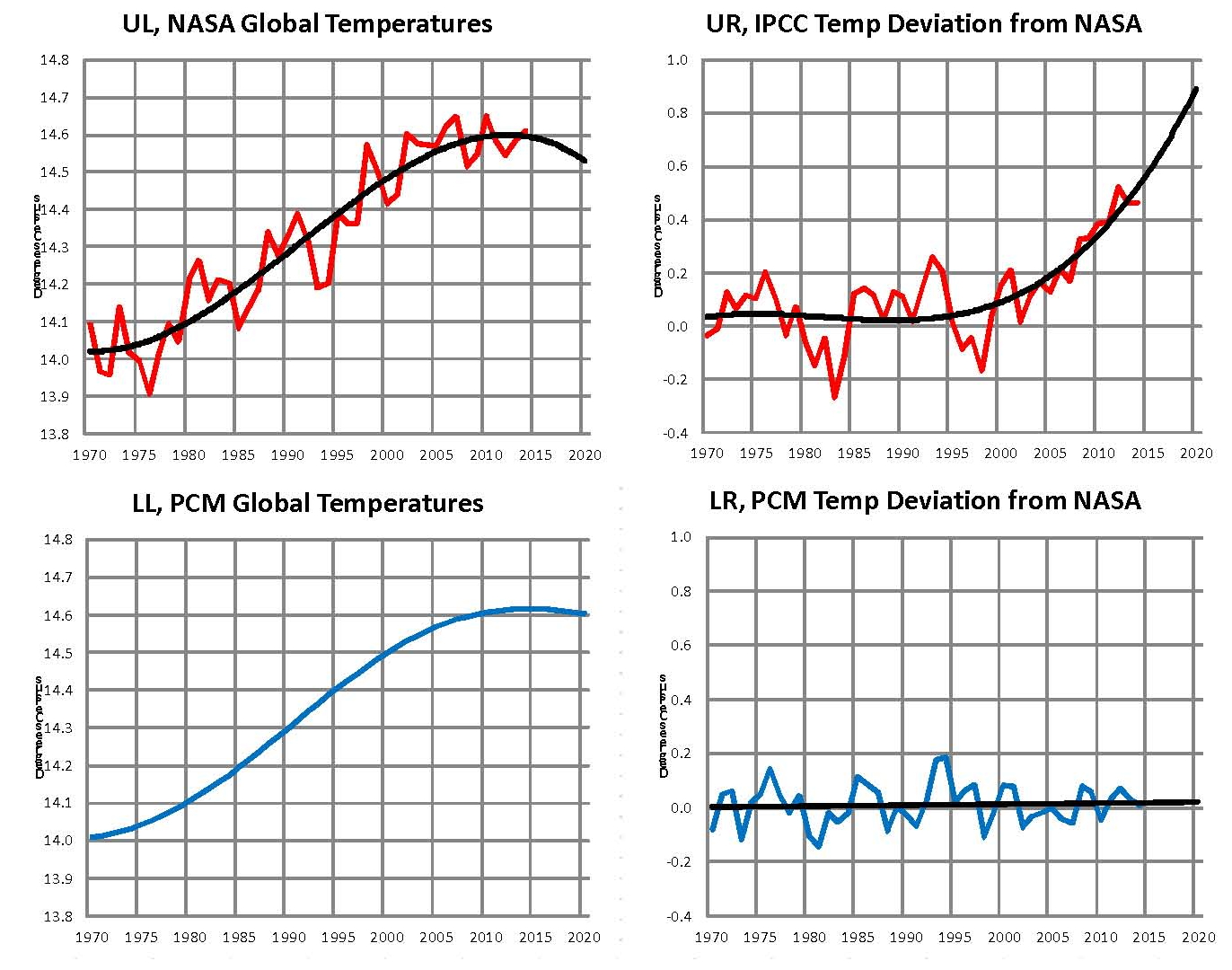
This is a key step in the Climate Debate

Determining the ‘exact’ Blackbody temperature of the planet is the first step in determining what the “greenhouse’ effect is; for without that value all else is either speculation or based on an unreliable value. This leads us to a quandary since the plant is a global spinning around a titled axis and with an elliptical orbit around the sun Figure 1 which is the source of virtually all the energy that heats the planet. Clearly with these facts there cannot be one temperature for the planet and so an average can be very misleading and lead to false conclusions.

Traditional calculations of the planets black body temperature ignore the variables which then lead one to assume a steady state situation verses the real dynamic situation that drives climate. To justify this assumption a general statement that the variances are too small to have any meaningful effect are promoted. I some cases with fewer variables this might be true but in this case I think not.

These are the main Variables:

1. The sun has a cycle of about eleven years and that gives a small variation in the suns output of about 1%
2. The planet has an elliptical Orbit that varies by 3.34% or 4,999,849 miles
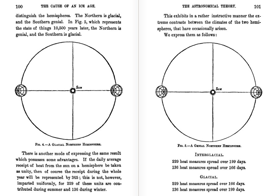
3. The axial tilt of the planet is 23.4 degrees which causes winter and summer to alternate between Aphelion and Perihelion about every 10,000 years
4. The planet is a sphere so only one side faces the sun at any given moment
5. The sun’s energy reaches the planet on a line drawn from the center of the sun to the center of the planet which only intersects the equator twice a year
6. The energy from the sun is concentrated around this line
7. The planet is a sphere so the suns radiation drops off in all directions from this line by a Cosine factor to zero at the edge 90 degrees from the center line
8. The spin and tilt of the planet means that the center line moves up 23.4 degrees and down 23.4 degrees during the course of one orbit
9. That movement means the distribution of energy also moves
10. The distribution of land and ocean are not uniform on the planet
11. The albedo of the planet is a variable not a constant
12. Energy from the core adds a small amount of energy
13. Tidal forces from the sun and the moon also add some energy
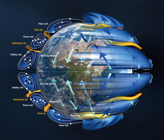
14. Energy is carried North and South from the hot spot centered on the line by the atmosphere and the ocean
15. The Coriolis Effect along with tidal forces drive thermal transfer north and south at an angle and these are then main contributors to the climate

FIGURE 01
Figure 1, the Earth’s orbit

FIGURE 02
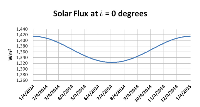
Figure 2, orbital changes in solar flux

There are three sources of energy that determine the climate on the earth: the radiation from the sun which is said to be 1366 Wm2 The actual value based on the orbital range is from 1414.4 Wm2 in January to 1323.0 Wm2 in July Figure 2 and there is also an eleven year sun spot cycle with a range of 1.37 Wm2. The hot core of the planet adds ~0.087 W/m2 and the gravitational effects of the moon and the sun (tides) adds another ~.00738 Wm2. Of these three the sun’s radiation is by far the most important but considering all three the range during an eleven year solar cycle is from a high of ~1415.3 Wm2 to a low of ~1322.4 Wm2 so a more accurate mean would be 1368.34 Wm2.

The energy emitted by the planet must equal the energy absorbed by the planet and we can calculate this using the Stefan-Boltzmann Law. Which is the energy flux emitted by a blackbody is related to the fourth power of the body’s absolute temperature. The tidal and core temperatures are added after the albedo adjustment.

E = σT4
σ = 5.67×10⁻⁸ Wm2 K sec
A = 30.6% (the planets albedo, this is not a constant)

σTbb4 x (4πRe2) = S πRe2 x (1-A)
σTbb4 = S/4 * (1-A)
σTbb4 = 1368.24/4 Wm2 * (1-A)
σTbb4 = 342.16 Wm2 * (1-A)
σTbb4 = 254.36 Wm2

Earth’s Blackbody temperature                      Earth’s surface temperature

Tbb = 252.23O K (-20.92O C) low                  Ts = ~287.75O K (14.6 O C) today
Tbb = 254.36O K (-18.79O C) mean
Tbb = 256.54O K (-16.51O C) high

The difference between the Blackbody and the current temperatures is what we call the ‘greenhouse’ effect that averages 33.36O Celsius (C), today, although the range is from 35.52O C to 31.11O C from variations in the 11 year solar cycle. Despite this variation in incoming solar flux the planet’s temperatures is very stable. Other factors are also important in doing climate work such as the solar energy is concentrated between about +/- 30 degrees of the equator maybe a bit more. And the heat from the core and probably the tides is concentrated where the crust is the thinnest under the oceans and this concentration of energy core heat and tides) combined with Coriolis forces is probably what drives the ocean currents. In my opinion these other important factors are not being considered properly in the climate models.

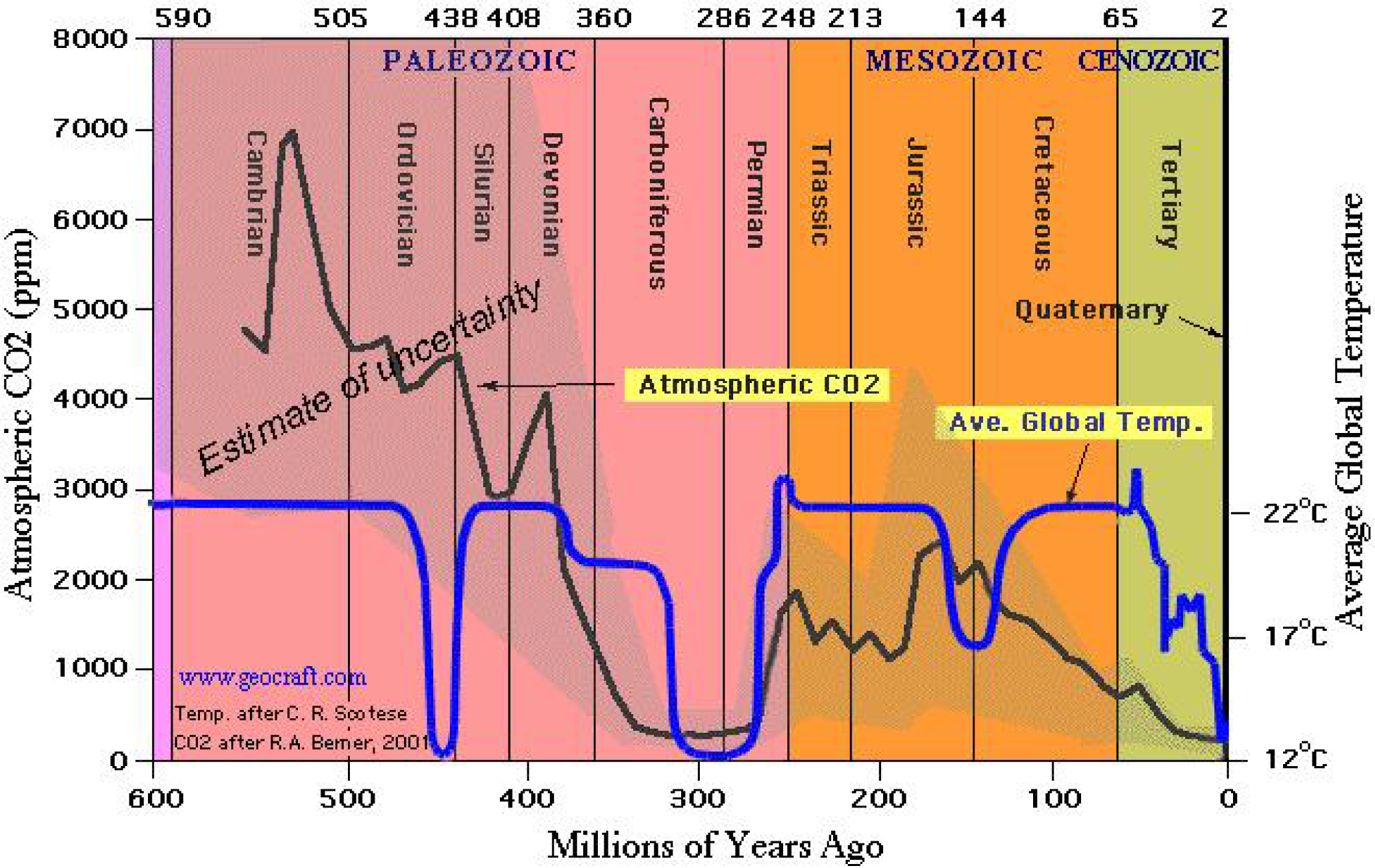
We also know from geological studies Figure 3 that the planets temperature has been relatively stable over the past 600 million years with a mean of about 17O C or 290O Kelvin (K) and with a range of plus or minus 5O K or C based on the information in Figure 3. During the past 250 million years CO2 concentrations have ranged from a low of ~280 ppm (a historic low)in 1800 to the present low of 400 ppm to a high of over 2,000 ppm probably averaging around 1,500 ppm. There was only one other period in the past 600 million years with CO2 this low. Going back further CO2 was estimated to be as high is 7000 ppm, but we will ignore that for now.

This means that whatever the processes are that relate to determining the thermal balance of the planet they must work within this range to be valid. Although Figure 3 shows a range of 10O C it would be prudent to spend resources to determine these values with as great accuracy as possible. We’ll assume a mean of 16O C with a range from 10O to 22O C as being more reasonable. Also we are now in one of only three cold periods which are very rare in the past 600 million years and if we count that partial dip 150 million years ago that means that there is probably a 150 million year cycle there; maybe one of those first determined my Milutin Milankovic.

FIGURE 03
Figure 3, Geological temperatures and Carbon Dioxide

Additional discussion as to the so called “greenhouse” effect must start with the important correction that this process is not a true greenhouse effect, since it is not the same process that occurs in a greenhouse used to grow food. The actual process that occurs is based on the structure of the atoms involved and how they interact with the various frequencies of visible and infrared radiation that are in play on the planet. However at this point in time there is no way to correct for the misuse of the words so we are stuck with it and all the complications that therefore arise in trying to properly discuss the issue with lay people and even some with technical knowledge.

The greenhouse effect occurs within the earth’s atmosphere and the main constitutes of wet air, by volume ppmv (parts per million by volume) are listed in the following table. Water vapor is 0.25% over the full atmosphere but locally it can be 0.001% to 5% depending on local conditions. Water and CO2 are mostly near the surface not in the upper atmosphere so the bulk of the greenhouse effect must be close to the surface.

                                   Gas Volume Percentage
Nitrogen (N2)                                 780,840 ppmv   78.8842%
Oxygen (O2)                                   209,460 ppmv   20.8924%
Argon (Ar)                                          9,340 ppmv    0.9316%
Water vapor (H2O)                             2,500 ppmv     0.2494%
Carbon dioxide (CO2)                            400 ppmv     0.0399%
Neon (Ne)                                          18.18 ppmv     0.001813%
Helium (He)                                         5.24 ppmv     0.000523%
Methane (CH4)                                    1.79 ppmv      0.000179%

There are only two of these gases that are relevant to determining how that 33O C (today) happens. That is not to say the others do not contribute but that at the present concentrations of Water H2O and Carbon Dioxide CO2 they are the main determinants. And since we know the range of temperatures that have existed geologically then we have set the range which these to gases must interact in, meaning that any set of equations or models or theories that predict values outside this range must be suspect based on geological evidence.

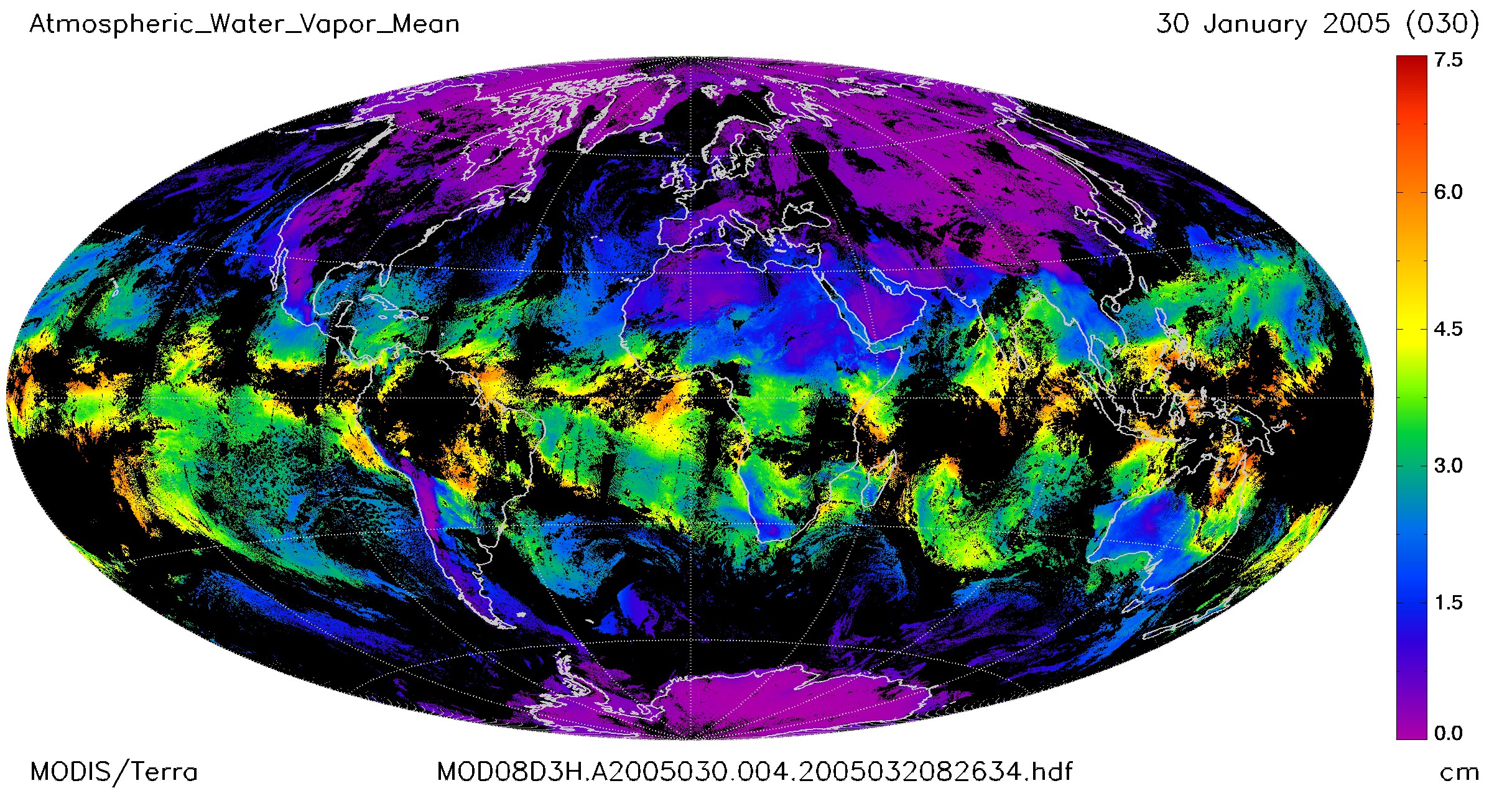
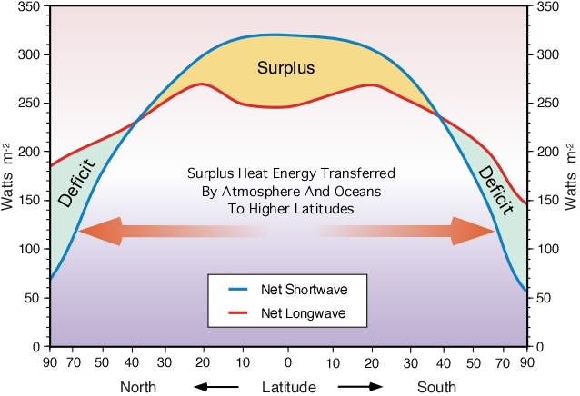
Also it must be kept in mind that the solar flux falls on a spot centered on a line drawn from the center of the earth to the center of the sun and because of the 23.5O axial tilt of the planet this “Hot” spot moves up and down as the planet moves though its orbit. Because of the shape of the planet the intensity falls off quickly as we move north and south and east and west according to a cosine factor so the heat energy is mostly over oceans near the equator where the atmosphere is the densest.

The first image below Figure 4 shows a recent distribution of water across the planet and it is clearly concentrated over the oceans close to the equator and that results in the heat imbalance and therefore movement north and south as shown in the second image Figure 5.

FIGURE 04
Figure 4, water vapor concentrated near the equator

FIGURE 05
Figure 5, basic heat flows from the equator north and south

The next two images show how that energy is moved by the water Figure 6 and the atmosphere north and south from the equator Figure 7.

FIGURE 06
Figure 6, Ocean currents

FIGURE 07
Figure 7, Atmospheric heat flows

In summary we now know that the Blackbody temperature of the planet is a variable.

Tbbl   = 252.23O K (-20.92O C) low at Aphelion
Tbbm = 254.36O K (-18.79O C) and the yearly mean
Tbbh  = 256.54O K (-16.51O C) high at Perihelion

Therefore the ‘greenhouse effect must also be a variable.

Ts = ~287.75O K (14.6O C) today

Ghl =   Tbbl + Ts    = 35.52O C
Ghm = Tbbm + Ts = 32.39O C
Ghh =  Tbbh + Ts   = 31.11O C

The range in temperature just from orbital changes is therefore 4.41 O C which is significantly more than the warming that the IPCC claims has happened. These are hard numbers based on the solar flux which is known and the orbital parameters of the Earth that are also known. The large variances come from the Stefan-Boltzmann Law; which is the energy flux emitted by a Blackbody is related to the fourth power of the body’s absolute temperature. The fourth power in the equation magnifies the small variation in solar flux significantly.

Kentucky Group Wants To Tax Breathing


I knew this was coming — these people are mentally defective.

Tony Heller's avatarReal Climate Science

A national tax on anything that produces carbon emissions — gasoline, airplanes and coal-burning power plants — is the goal of the new Kentucky chapter of Citizens’ Climate Lobby, an international nonprofit group seeking to curb global warming.

Carbon tax sought to curb global warming

Humans exhale a terrifying 40,000 PPM CO2 – enough to raise current atmospheric CO2 levels by 100X. In order to rescue mankind from global warming, breathing must be stopped through taxation or whatever other means is necessary.

View original post