Going …. Going …. Gone


I agree 100% with this as it goes along with my work on the manipulation that NASA does with the temperature data. But the irony to this is no matter how much they play with the numbers they can’t get the temperatures up to where the climate models say they MUST BE …

Tony Heller's avatarReal Climate Science

Thirty-nine percent of USHCN data is now fabricated, meaning that there is now 39% more monthly temperature data reported than measured, compared to less than 5% in 1990.

ScreenHunter_605 Jun. 22 04.40

The fabricated data is warming 7°F/century faster than the measured data since 1990, when the data started disappearing.

ScreenHunter_607 Jun. 22 05.03

In fact, the measured TOBS adjusted data shows no warming since 1990. All US warming since 1990 is due to data fabrication.

ScreenHunter_609 Jun. 22 05.11

I am considered a heretic for excluding imaginary temperature data from my analysis, and simply averaging the thermometer data. It is now considered unacceptable by the orthodoxy to use actual measured data.

View original post

Analysis of Global Temperature Trends, May 2014


What really going on with the Climate?

The analysis and plots shown here are based on the following: first NASA-GISS temperature anomalies (converted to degrees Celsius) as shown in their table LOTI, second James E. Hansen’s Scenario B data, which is the very core of the IPCC Global Climate models which was based on a CO2 sensitivity value of 3.0O Celsius, lastly, a plot based on an alternative climate model designated ‘PCM’ and based on a sensitively value of .65O Celsius. To smooth monthly variations a 12 month running average is used in all the plots. This information will be shown in four tables and updated each month as the new data comes in.

2014-May
The first plot, UL is a plot of the NASA temperature anomaly converted to degrees Celsius shown in red with a black trend line added. There has been a very clear reversal in the upward movement of global temperatures since about 2001 and neither the UN IPCC nor anyone else has an explanation for this. Since CO2 has continued to increase at what could be argued an increasing rate this raises serious doubts about the logic programmed into all the IPCC global climate models.

The next plot UR, also in red, shows the IPCC estimates of what the Global temperature should be, based on Hansen’s Scenario B, with the NASA actual temperatures’ subtracted from them. Therefore this plot represents a deviation from what the Climate “believers” KNOW what the temperature should be; with a positive value indicating the IPCC values are higher than actual and a negative value indicating the IPCC values are lower than actual. A black trend line is added and we can clearly see that the deviation from expected is increasing at an increasing rate. This makes sense since the IPCC models project increased temperatures based primarily on the increasing level of CO2 in the earth’s atmosphere. Unfortunately, for them, the actual temperatures from NASA are trending down (even as they try to hide the down ward movement with data manipulation) since other factors are in play, therefore each year the gap between them widens. Since we have 12 years of observations’ showing this pattern it becomes hard to justify a continuing belief in the IPCC climate models, there is obviously something very wrong.

The next plot LL shown in blue is based on the equations in the PCM climate model described in previous papers and posts here and since it is generated by “equations” a trend line is not needed. As can be seen the PCM, LL, and the NASA, UL, trend plots are very similar the reason being that in the PCM model there is a 68.2 year cycle that moves the trend line up and then down a total of .30O Celsius (currently negative .0070O Celsius per year); and we are now in the downward portion of that trend which will continue until around 2035. This short cycle is clearly observed in the raw NASA data in the LOTI table going back to 1880. Then there is the a long trend, 1052.6 years with an up and down of 1.36O Celsius (currently plus .0029O Celsius per year) also observed in the NASA data. Lastly there is CO2 adding about .005O Celsius per year so they messily wash out which matches the current holding pattern we are in. However with a few years the increasing downward trend of the short cycle will overpower the other tow and we will see drop of about .002O Celsius per year and that will be increasing until till around 2025. After about 2035 the short cycle will turn up and all three will be on the upswing again. These are all round numbers shown here are representative values.

The last plot LR in blue uses the same logic as used in the UR plot, here we use the PCM estimates of what the Global temperature should be with the NASA actual temperatures’ subtracted from them. A positive value indicates the PCM values are higher than actual and a negative value indicates the PCM values are lower than expected. A black trend line was added and it clearly shows that the PCM model is tracking the NASA actual values very closely. In, fact since 1970 the PCM model has rarely been off by more than +/- .1 degrees Celsius and has an average trend of almost zero error, while the IPCC models are erratic and are now approaching an error rate of +.5O above expected.

The IPCC models were designed before a true picture of the world’s climate was understood. During the 1980’s and 1990’s CO2levels were going up and the world temperature was also going up so there appeared to be correlation and causation. The mistake that was made was looking at only a 20 year period when the real variations in climate move in much longer cycles. Those other cycles can be observed in the NASA data but they were ignored for some reason. By ignoring those trends and focusing only on CO2 the models will be unable to correctly plot global temperatures until they are fixed.

The purpose of this post is to make people aware of the errors inherent in the IPCC models so that they can be corrected.

Sir Karl Raimund Popper (28 July 1902 – 17 September 1994) was an Austrian and British philosopher and a professor at the London School of Economics. He is considered one of the most influential philosophers of science of the 20th century, and he also wrote extensively on social and political philosophy. The following quotes of his apply to this subject.

If we are uncritical we shall always find what we want: we shall look for, and find, confirmations, and we shall look away from, and not see, whatever might be dangerous to our pet theories.

Whenever a theory appears to you as the only possible one, take this as a sign that you have neither understood the theory nor the problem which it was intended to solve.

… (S)cience is one of the very few human activities — perhaps the only one — in which errors are systematically criticized and fairly often, in time, corrected


Problems with the NASA Temperature Data


Homogenization or Manipulation?

What does NASA do when it attempts to determine the World’s temperature that it publishes each month in various reports such as the Land Ocean Temperature Index, or LOTI? This table of anomalies (changes from a base of 14.0O Celsius) is published back to January 1880 and the latest version includes temperatures though April 2014, or 1,600 values. Each month when the new table is created using the process called “homogenization” NASA “recalculates” all the temperatures all the way back to January 1880.

After several years of studying the NASA values for work I was doing, sometime in late 2012 or early 2013, as I remember it, a major change was noticed in the 2012 values from those in earlier periods. The changes were observed because of the way I was entering the data for each month’s anomaly in a spreadsheet column for analysis which put each month’s value next to the previous months one. What was observed was that the temperatures from 1900 to 1940, and other periods were significantly and systematically changed to support the myth that Carbon Dioxide emissions were dramatically changing the climate of the planet.

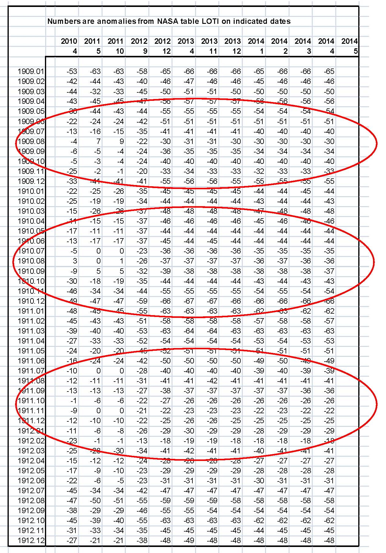
Table 1 is a listing of NASA anomalies that is provided as proof of the data manipulation that goes on with the NASA homogenization process. I picked four years as a sample 1909, 1910, 1911 and 1912 and they are shown on the Y axis of Table 1 and you can see in the Table that there was a major shift in the numbers between the LOTI issue dates October 2011 and September 2012 (Report download dates on the X axis) which matches what is shown later in Figure 1. There are three red ovals placed around some of the major shifts in this sample of what occurred from the period 1900 through 1940 to emphasize the issue; although all that data has been shifted to much colder temperatures.

WUWT 01

Table 1 Listing of anomalies

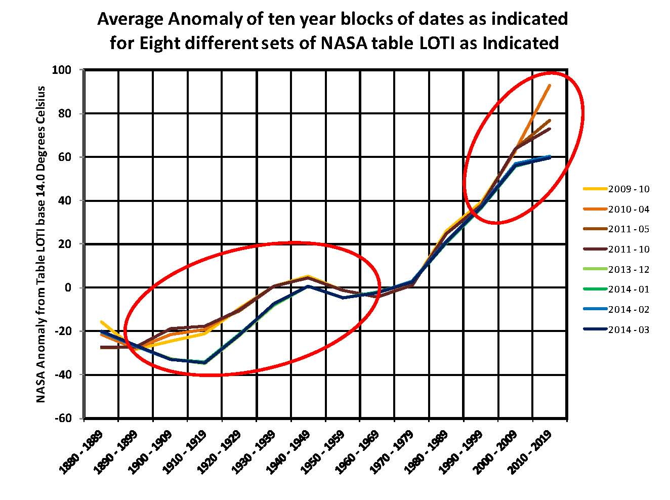
We show what NASA did in Figure 1 which contains 8 anomaly plots broken into two sets, one set of four from 2011 and earlier (brown and orange) and the other set of four from 2012 and later (blue and green). There is a major difference between the two sets of plots which should not be there; red ovals on the chart. My take on why this happened cannot be proved but it would make sense with the management in place at NASA when the change was made between November 2009 and October 2011.

To those reviewing the data, at NASA, it would have been obvious by 2005 that temperatures had stopped moving up and that was not possible according to the logic used in the anthropogenic climate change belief. The IPCC and their cohorts had stated many times that the science was settled and the debate was over. But they were showing in their homogenization process very high temperatures by 2010 (in support of what was supposed to be happening) which was getting hard to justify. The yellow and orange plots were reaching an anomaly of 100 or 1.0O Celsius over the 14.0O Celsius base. So they decided to change the program and we have the results in Figure 1.

The process that NASA uses to determine the anomaly results in variability and so to remove that we first looked at blocks of ten years which would then contain 120 values for each month and an average for that set was determined. From 2009 to the present the average was determined using the actually number of values available for each of the monthly tables since some tables ended prior to the present. That gave us 14 points to plot from 1880 through 2014 for each of the eight reviewed months. Figure 1 has the ten year time blocks on the X axis and the value of the anomaly on the Y axis. The anomalies are in hundredths of a degree so the total range is 1.6O Celsius.

As can be seen the values of the anomalies from the first set dropped significantly from 1900 to 1940 and again from 2000 to the present and it was not a gradual change but first one way and then the other way, indicating a programming change.

WUWT 02Figure 1, NASA manipulation

If we look at the periods in the brown – orange set from 1920 to the present time the movement up appears to be about 100 (-20 to +80) or 1.0 degree Celsius. But I think that they knew that the “current” numbers they were showing were not real. So somewhere in NASA a decision was make to reprogram the homogenization program and what they did was lower the 1920 period and the present period about the same amount to give about the same upward movement in temperature as previously existed prior to the change. On their charts the shift would almost not be seen.

The result is that the new set, blue – green shows an upward movement of about 95 (-35 to +60) which matches the older set range but ends up at a much lower value that is closer to what the real temperature is even though they don’t like that. The difference between the sets is close to -.25 degrees Celsius which is not inconsequential. Whether this was intentional or not the change is there and is major and that puts into question the process used by NASA to determine the global temperature.

This process must be reviewed in detail so we can be sure of the accuracy of what is being published.

The next step was to look at each data set independently, and what should have been observed on a plot would be a more or less horizontal line across the Chart for each time block for the average value of the NASA anomaly for that period. Instead what was observed Figure 2 were major shifts mostly down, colder, in a large number of the time blocks all occurring during 2012; meaning that a programming change must have been made that shifted around entire blocks of temperature anomalies, this has to be intentional and not random.

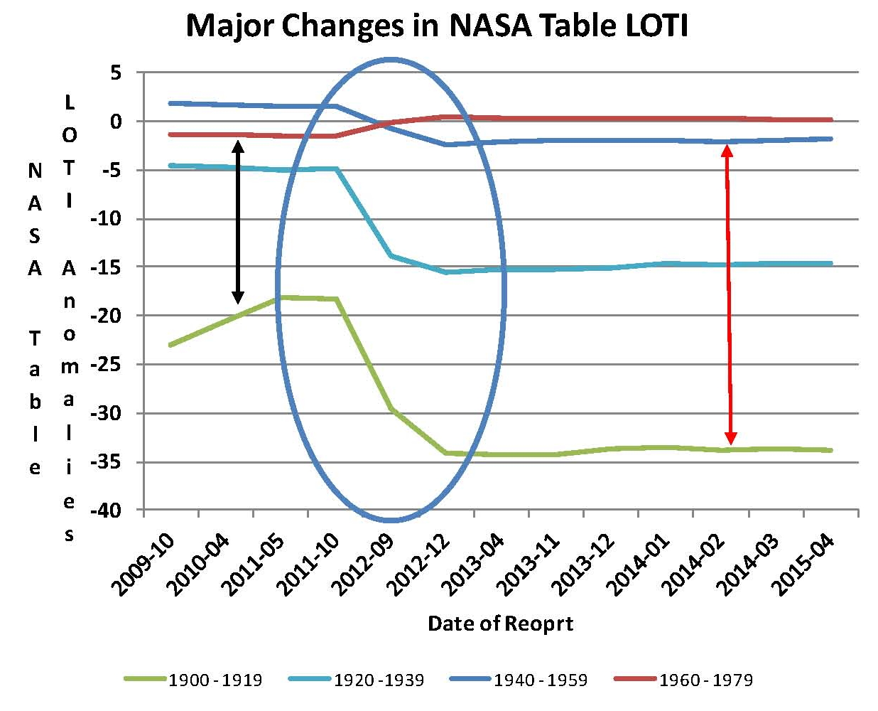
Rather than show all the plots new ones were created to show where the major changes were and they are plotted here Figure 2 as 1900 to 1919, 1920 to 1939, 1940 to 1959 and 1960 to 1979 this time each plot containing 240 values for each of the 13 NASA LOTI reports so were are looking at 20 year blocks which should definitely take out any random variations. Virtually all the 13 original time blocks showed this kind of shift, some up and some down in values, but since many overlapped it was hard to track the individual plots and this simplified version shows the core of what was done with the temperatures without the distraction of too many plots. Without data manipulation each plot should end up as a straight line on the Chart.

WUWT 03Figure 2, NASA homogenization

It’s obvious that there has been a major shift in the values shown in NASA table LOTI during these four 20 year periods totaling 80 years. What appears to have been done is to make the 1900 to 1919 period .15 degree C colder; make the 1920 to 1939 period .1 degree C colder; make the 1940 to 1959 period about .05 degree C colder and then make the 1960 to 1979 period about .025 degree C warmer. By doing this they made the 1960 to 1979 period warmer than the earlier 1940 to 1959 period such that the “look” of the data fit the narrative of the alarmist message being promoted by Hansen (who was still employed by NASA during this time) and Gore of dangerous anthropogenic global warming. The data after the 2012 change shows a very clear ~.35 degree C progressive warming, red arrow, from 1900 to 1979 compared to less than ~.2 degrees C prior to 2012, black arrow, and it also gets rid of the 1940 to 1959 warm period which doesn’t match the overall message being promoted.

It’s hard to image how this change could come about without conscious effort being applied to make this the end result; it’s just too convenient to be by chance.

Problems with the NASA Temperature Data


Homogenized Anomalies

NASA makes an attempt at determining the World’s temperature each month and publishes the result around the middle of each month in various reports one of which is called the Land Ocean Temperature Index, or LOTI. This table of values is published back to January 1880 and the lasted version includes temperatures though April 2014, or 1,600 values. However, rather than publish an actual temperature they first establish a base of 14.0 degrees Celsius and then using a complex algorithm determine a value higher or lower than the 14.0 degrees Celsius base in hundredths of a degree which they call an anomaly, i.e. 13.5 degrees Celsius would be -50 and 14.5 would be +50. Each month when the new table is created using this process called “homogenization” NASA recalculates all the temperatures all the way back to January 1880.

After several years of studying the published values, sometime in early 2013 as I remember it, a major change was noticed in the 2012 published values from those in earlier periods. Previous to this minor changes of a few hundredths of a degree were commonly observed in the LOTI data but they just appeared to be random or rounding changes, which would be normal in a process like NASA uses, so they were ignored. The reason is that a few pluses and a few minuses would mostly cancel out and could be ignored as having no real affect. What was observed was something much different and so an in depth analysis was made of the entire set of 13 available tables and then by entering all the data for 8 of them plus 5 new ones into a spreadsheet which created a table with now over 22,000 values, which could be reviewed.

To simplify the analysis the data for the 13 reports was looked at in ten year blocks e.g. January 1880 to December 1889 which would be 120 values and an average determined; this would eliminate any random or rounding changes. This was done for the period January 1880 through December 2009 creating a Table of 169 values which were placed into an Excel Chart. What should have been observed would be a more or less horizontal line across the Chart for each time block for the average value of the NASA anomaly for that period. Instead what was observed were major shifts mostly down meaning colder in a large number of the ten year time blocks all occurring during 2012; meaning that a programming change must have been made that shifted around entire blocks of temperature anomalies. This has to be intentional and not random.

Rather than show all 13 plots four new ones were created to show where the major change was and they are plotted here as 1900 to 1919, 1920 to 1939, 1940 to 1959 and 1960 to 1979 each plot containing 240 values for each of the 13 NASA LOTI reports. Virtually all the 13 original time blocks showed this kind of shift, some up and some down in values, but since many overlapped it was hard to track the individual plots and this simplified version shows the core of what was done with the temperatures without the distraction of too many plots.

NASA PROBLEMS

It’s obvious that there has been a major shift in the values shown in NASA table LOTI during these four 20 year periods totaling 80 years; shown in the area contained in the blue oval with the question mark. What appears to have been done is to make the 1900 to 1919 period .15 degrees colder; make the 1920 to 1939 period .1 degree colder; make the 1940 to 1959 period about .05 degrees colder and them make the 1960 to 1979 period about .025 degrees warmer. While doing this they made the 1960 to 1979 period warmer than the earlier 1940 to 1959 period such that the look of the data fit the narrative of the alarmist message being promoted by Hansen and Gore of dangerous anthropogenic global warming which was the original message being promoted at the time. The data after the 2012 change shows a very clear ~.35 degree progressive warming, red arrow, from 1900 to 1979 compared to less than ~.2 degrees prior to 2012, black arrow, and it also gets rid of the 1940 to 1959 warm period which doesn’t match the overall message being promoted.

It’s hard to image how this change could come about without conscious effort being applied to make this the end result; it’s just too convenient to be by chance.

Sir Karl Raimund Popper (28 July 1902 – 17 September 1994) was an Austrian and British philosopher and a professor at the London School of Economics. He is considered one of the most influential philosophers of science of the 20th century, and he also wrote extensively on social and political philosophy. The following quotes of his apply to this subject.

If we are uncritical we shall always find what we want: we shall look for, and find, confirmations, and we shall look away from, and not see, whatever might be dangerous to our pet theories.

Whenever a theory appears to you as the only possible one, take this as a sign that you have neither understood the theory nor the problem which it was intended to solve.

… (S)cience is one of the very few human activities — perhaps the only one — in which errors are systematically criticized and fairly often, in time, corrected

Analysis of Global Temperature Trends, April 2014


What really going on with the Climate?

The analysis and plots shown here are based on the following: first NASA-GISS temperature anomalies (converted to degrees Celsius) as shown in their table LOTI, second James Hansen’s Scenario B data, which is the very core of the IPCC Global Climate models which was based on a CO2 sensitivity value of 3.0 degrees Celsius, lastly, a plot based on an alternative climate model designated the ‘PCM’ climate model based on a sensitively value of .65 degrees Celsius. To smooth out large monthly variations a 12 month running average is used in all the plots. This information will be shown in four tables and updated each month as the new data comes in.

2014-April

The first plot, UL is a plot of the NASA temperature anomaly converted to degrees Celsius shown in red with a black trend line added. There has been a very clear reversal in the upward movement of global temperatures since about 2001 and neither the UN IPCC nor anyone else has an explanation for this. Since CO2 has continued to increase at what could be argued an increasing rate this raises serious doubts about the logic programmed into all the IPCC global climate models.

The next plot UR, also in red, shows the IPCC estimates of what the Global temperature should be, based on Hansen’s Scenario B, with the NASA actual temperatures’ subtracted from them. Therefore this plot represents a deviation from what the Climate “believers” think the temperature should be; with a positive value indicating the IPCC values are higher than actual and a negative value indicating the IPCC values are lower than actual. A black trend line is added and we can clearly see that the deviation from expected is increasing at an increasing rate. This makes sense since the IPCC models project increased temperatures based primarily on the increasing level of CO2 in the earth’s atmosphere. Unfortunately, for them, the actual temperatures from NASA are trending down since other factors are in play, therefore each year the gap between them widens. Since we have 12 years of observations’ showing this pattern it becomes hard to justify a continuing belief in the IPCC climate models, there is obviously something very wrong.

The next plot LL shown in blue is based on the equations in the PCM climate model described in previous papers and posts here and since it is generated by “equations” a trend line is not needed. As can be seen the PCM, LL, and the NASA, UL, trend plots are very similar the reason being that in the PCM model there is a 68.2 year cycle that moves the trend line up and then down a total of .30 degrees Celsius (.0044 degrees Celsius per year); and we are now in the downward portion of that trend which will continue until around 2035. This short cycle is clearly observed in the raw NASA data in the LOTI table going back to 1880. Because there is also a long trend, 1052.6 years with an up and down of 1.36 degrees Celsius (.0013 degrees Celsius per year) also observed in the NASA data; there is a net cooling of .0031 degrees Celsius per year going up right now. After about 2035 it will reverse and be a net increase of .0057 degrees Celsius. These are all round numbers as both curves are sine curves.

The last plot LR in blue uses the same logic as used in the UR plot, here we use the PCM estimates of what the Global temperature should be with the NASA actual temperatures’ subtracted from them. A positive value indicates the PCM values are higher than actual and a negative value indicates the PCM values are lower than expected. A black trend line was added and it clearly shows that the PCM model is tracking the NASA actual values very closely. In, fact since 1970 the PCM model has rarely been off by more than +/- .1 degrees Celsius and has an average trend of almost zero error, while the IPCC models are erratic and are now approaching an error rate of +.5 degrees above expected.

The IPCC models were designed before a true picture of the world’s climate was understood. During the 1980’s and 1990’s CO2 levels were going up and the world temperature was also going up so there appeared to be correlation and causation. The mistake that was made was looking at only a 20 year period when the real variations in climate move in much longer cycles. Those other cycles can be observed in the NASA data but they were ignored for some reason. By ignoring those trends and focusing only on CO2 the models will be unable to correctly plot global temperatures until they are fixed.

The purpose of this post is to make people aware of the errors inherent in the IPCC models so that they can be corrected.

Sir Karl Raimund Popper (28 July 1902 – 17 September 1994) was an Austrian and British philosopher and a professor at the London School of Economics. He is considered one of the most influential philosophers of science of the 20th century, and he also wrote extensively on social and political philosophy. The following quotes of his apply to this subject.

If we are uncritical we shall always find what we want: we shall look for, and find, confirmations, and we shall look away from, and not see, whatever might be dangerous to our pet theories.

Whenever a theory appears to you as the only possible one, take this as a sign that you have neither understood the theory nor the problem which it was intended to solve.

… (S)cience is one of the very few human activities — perhaps the only one — in which errors are systematically criticized and fairly often, in time, corrected

Water the Main Greenhouse Gas


Water the climate stabilizer

This post is an “opinion piece” although I believe it is based on sound principles and the conclusion is probably not all that far off from what we actually have with the planets climate.

What so many people forget when they are discussing the subject of Climate Change or Anthropogenic Climate Change is that the primary greenhouse gas in the atmosphere is Water, just plain old H2O at .25% or 2,500 ppm. The Carbon Dioxide CO2 that so many are extremely worried about is only a minor player at only .04% or 400 ppm. The how that these two interact in our atmosphere along with incoming solar radiation and outgoing infrared (IR) is what keeps the atmosphere of the planet 33 degrees Celsius warmer than it would be without these two gases. In other words the planet would be an ice ball and probably devoid of life without them.

When studying climate in relationship to Water and the various other trace gases such as CO2, Ozone, and Methane one finds that there are only a few bands (frequencies) of visible (incoming) or Infra red radiation (outgoing) where the trace gases could affect water which is the repository of the heat making up that 33 degrees Celsius of warming.   Ozone absorbs ultra violet which is very important to us but does not interact with the water or the Carbon Dioxide in the atmosphere so it can be dismissed for considerations involving changes in global temperature. Methane at present levels is only 1.8 ppm and so even though it could be a factor at higher levels it can also be dismissed; and so for all practical purposes that only leaves Water and Carbon Dioxide to consider for changes in the climate with the variations of these gases in the atmosphere.

When we look at charts showing the radiation transmitted by the atmosphere or absorbed by it. It would seem that the ratio of absorption of energy by Carbon Dioxide to Water is about 1 to 6 or in other words 16.7% CO2 and 83.3% H2O. Since we know that there is energy in the H2O in the atmosphere from absorbing visible and Infra red energy and that can be determined to be 33 degrees Celsius that distribution logic tells us that 5.5 degrees Celsius is related to CO2 and 27.5 degrees is related to H2O.   Based on these numbers we can generate sensitivity plots. Those plots make sense from observations of the atmosphere when all things are considered in proper context.

We’ll look at CO2 first and we find that from many peer reviewed papers the sensitivity values for CO2 have been moving down from the original National Academy of Sciences (NAS) 1979 Charney report of 3.0 degrees Celsius being the most likely to now most being less than 2.0 degrees Celsius. There are even a few studies below 1.0 degrees Celsius such as .68 degrees Celsius Harde and .64 degrees Celsius Lindzen. If we pick .65 and plot the resultant curve we find that 400 ppm intersects the CO2 plot at 5.5 degrees warming which just happens to be the same value that we got looking at the radiation absorption and transmission Charts. In my work I came up with .65 degrees Celsius as well because it was the value that made my model work; so obviously I have no problem with this value.

The following Chart shows the relationship that we just described.

Climate-Change-Analysis-01

With the Carbon Diode subject now settled (here) that leaves water to be studied and this is a little more complex. Everyone agrees that water is the primary greenhouse gas because of the large amount of heat that it can hold, from Wikipedia we have the following three statements:

Waters heat capacity is the highest of all common liquids and most solids and it prevents extreme changes in the planets temperature i.e. it is a great heat moderator.

Waters latent heat of fusion is also the highest of all common solids and liquids its thermostatic heat regulating effect is due to the release of heat when freezing and the absorption on melting.

Waters latent heat of vaporization is the highest of all common substances so it is immensely important in the transfer of heat in and between the ocean and the atmosphere which makes it a driving force in climate and weather.

We know following the logic used here that 5.5 degrees Celsius was the amount of increase in the atmosphere from Carbon Dioxide and so if we subtract that from 33 degrees Celsius we get a remainder of 27.5 degrees Celsius. That must then be the amount contributed by the water itself to the process and we can make another chart showing the contribution due to water. To make the chart we have water at 2500 ppm and we know the amount of increase in temperature must be 27.5 degrees Celsius so what sensitivity value will produce that curve? The following plot shows that if the sensitivity value of water is approximately 2.45 than we get the required value as shown in the following Chart.

Climate-Change-Analysis-02

This process makes sense since if the numbers were reversed and we made Carbon Dioxide have a sensitivity of 3.0 degrees Celsius (as the IPCC claims it is) than the warming from CO2 would be 27.9 and there would be no room for the water as there would only be 7.1 degrees available for the water.  These numbers are almost the same as what was developed here but reversed between the CO2 and Water so it has to be one way or the other. However, since we know the absorption bands of the CO2 and Water and we know the distribution on energy coming in and gong out we also know that this is not possible.

Therefore this paper must be a close approximation of the actual situation in the atmosphere and the IPCC value that they use of 3.0 degrees Celsius must therefore be wrong.

What is NASA doing with the Anomalies


NASA Data

NASA uses a process they call “homogenization” to calculate the values that they call global temperature anomalies and they publish those numbers in their Land Ocean Temperature Index (LOTI) each month. These values which are hundredth of a degree Celsius are deviations from a base they set as 14.0 degrees Celsius, which then becomes zero on their charts. This base represents, according to them, the global temperature average from 1951 to 1980 and you can see that the plots in the chart here for those years are very close to zero on the y axis.

The chart below contains 8 plots broken into two sets, one set of four 2011 and earlier (brown and orange) and the other set of four 2012 and later (blue and green). This chart was constructed after observing major shifts in the numbers sometime in early in 2012. Clearly there is a major difference between the two sets of plots which should just not be there; red ovals on the chart.

FIGURE-49a

NASA publishes the LOTI table each month and it contains anomalies by month from January 1880 to the present month and that represents 1599 values as of March 2014. Because the values were placed in a column in a spreadsheet for analysis beginning in 2006 at some point the shift in numbers became noticeable and a review was made in 2012. Unfortunately most of the old tables were not saved and so the older set 2009-10 though 2011-10 is not complete containing only 4 out of 24 issued monthly tables. However when placed side by side and seeing how the larger set (not all shown) of more recent values were reasonably stable there is no reason to think that the missing months were any different than the sample available. Previous version of these observation were plotted but were not easy to interpret and so a new method was derived in April 2014 and that is what is shown here.

The process that NASA uses to determine the anomaly results in variability in the data table and so to remove that we looked at blocks of ten years which would then contain 120 values for each month in that set and an average was determined. From 2009 to the present the average was determined by using the actually number of values available for each of the monthly tables. That gave us 14 points to plot from 1880 through 2009 for each of the eight monthly NASA releases being reviewed. The Chart has the ten year time blocks on the X axis and the value of the anomaly on the Y axis. The anomalies are in hundredths of a degree so the total range in degrees Celsius on the chart is 1.6 degrees Celsius.

The values of the anomalies from the first set dropped significantly from 1900 to 1940 and again from 2000 to the present and it was not a gradual change but first one way and then the other way, indicating a programming change.

My take on what happened cannot be proved but it would make some sense with the management in place at NASA when the change was made sometime between November 2009 and October 2011. To those reviewing the data, at NASA, it would have been obvious by say 2005 that temperatures had stopped moving up and that was not possible according to the logic used in the anthropogenic climate change belief. The IPCC and their cohorts had stated many times that the science was settled and the debate was over.

If we look at the periods in the brown – orange set that are around 1920 to the present time the movement up appears to be about 100 (-20 to +80) or 1.0 degree Celsius; however the published values were not reflecting what people were seeing in the real world even though they were what should have been seen according to the IPCC reports. So somewhere a decision was make to reprogram the program that did the homogenization and what they did was lower the 1920 period and the present period about the same amount but set to give about the same upward movement in temperature as previously existed prior to the change. In other words they can say there was no change in the increase in global temperature “so what difference does it make.”

The result is that other set, blue – green shows an upward movement of about 95 (-35 to +60) which matches the older set but ends up at a much lower value that is closer to what the real temperature is even though they don’t like that. The difference between the sets is close to .25 degrees Celsius which is not inconsequential.

Whether this was the reason or not the change is major and that puts into question the process used by NASA to determine the global temperature. This process must be reviewed in detail so we can be sure of what is being published.

Analysis of Global Temperature Trends, March 2014


What really going on with the Climate?

The analysis and plots shown here are based on the following: first NASA-GISS temperature anomalies (converted to degrees Celsius) as shown in their table LOTI, second James Hansen’s Scenario B data, which is the very core of the IPCC Global Climate models which was based on a CO2 sensitivity value of 3.0 degrees Celsius, lastly, a plot based on an alternative climate model designated the ‘PCM’ climate model based on a sensitively value of .65 degrees Celsius. To smooth out large monthly variations a 12 month running average is used in all the plots. This information will be shown in four tables and updated each month as the new data comes in.

2014-March

The first plot, UL is a plot of the NASA temperature anomaly converted to degrees Celsius shown in red with a black trend line added. There has been a very clear reversal in the upward movement of global temperatures since about 2001 and neither the UN IPCC nor anyone else has an explanation for this. Since CO2 has continued to increase at what could be argued an increasing rate this raises serious doubts about the logic programmed into all the IPCC global climate models.

The next plot UR, also in red, shows the IPCC estimates of what the Global temperature should be, based on Hansen’s Scenario B, with the NASA actual temperatures’ subtracted from them. Therefore this plot represents a deviation from what the Climate “believers” think the temperature should be; with a positive value indicating the IPCC values are higher than actual and a negative value indicating the IPCC values are lower than actual. A black trend line is added and we can clearly see that the deviation from expected is increasing at an increasing rate. This makes sense since the IPCC models project increased temperatures based primarily on the increasing level of CO2 in the earth’s atmosphere. Unfortunately, for them, the actual temperatures from NASA are trending down since other factors are in play, therefore each year the gap between them widens. Since we have 12 years of observations’ showing this pattern it becomes hard to justify a continuing belief in the climate models, there is obviously something very wrong.

The next plot LL shown in blue is based on the equations in the PCM climate model described in previous papers and posts here and since it is generated by “equations” a trend line is not needed. As can be seen the PCM, LL, and the NASA, UL, trend plots are very similar the reason being that in the PCM model there is a 68.2 year cycle that moves the trend line up and then down a total of .30 degrees Celsius (.0044 degrees Celsius per year); and we are now in the downward portion of that trend which will continue until around 2035. This short cycle is clearly observed in the raw NASA data in the LOTI table going back to 1880. Because there is also a long trend, 1052.6 years with an up and down of 1.36 degrees Celsius (.0013 degrees Celsius per year) also observed in the NASA data; there is a net cooling of .0031 degrees Celsius per year going up right now. After about 2035 it will reverse and be a net increase of .0057 degrees Celsius. These are all round numbers as both curves are sine curves.

The last plot LR in blue uses the same logic as used in the UR plot, here we use the PCM estimates of what the Global temperature should be with the NASA actual temperatures’ subtracted from them. A positive value indicates the PCM values are higher than actual and a negative value indicates the PCM values are lower than expected. A black trend line was added and it clearly shows that the PCM model is tracking the NASA actual values very closely. In, fact since 1970 the PCM model has rarely been off by more than +/- .1 degrees Celsius and has an average trend of almost zero error, while the IPCC models are erratic and are now approaching an error rate of +.5 degrees above expected.

The IPCC models were designed before a true picture of the world’s climate was understood. During the 1980’s and 1990’s CO2 levels were going up and the world temperature was also going up so there appeared to be correlation and causation. The mistake that was made was looking at only a 20 year period when the real variations in climate move in much longer cycles. Those other cycles can be observed in the NASA data but they were ignored for some reason. By ignoring those trends and focusing only on CO2 the models will be unable to correctly plot global temperatures until they are fixed.

The purpose of this post is to make people aware of the errors inherent in the IPCC models so that they can be corrected.

Sir Karl Raimund Popper (28 July 1902 – 17 September 1994) was an Austrian and British philosopher and a professor at the London School of Economics. He is considered one of the most influential philosophers of science of the 20th century, and he also wrote extensively on social and political philosophy. The following quotes of his apply to this subject.

If we are uncritical we shall always find what we want: we shall look for, and find, confirmations, and we shall look away from, and not see, whatever might be dangerous to our pet theories.

Whenever a theory appears to you as the only possible one, take this as a sign that you have neither understood the theory nor the problem which it was intended to solve.

… (S)cience is one of the very few human activities — perhaps the only one — in which errors are systematically criticized and fairly often, in time, corrected

Proof that the IPCC is Wrong


New paper showing CO2 sensitive being .68 degrees C

Last week Professor William Happer from Princeton sent me a newly issued paper describing a new method of calculating the climate sensitivity value of Carbon Dioxide; I finished reading it last night and found it very insightful.

The paper Advanced Two-Layer Climate Model for the Assessment of Global Warming by CO2 was written by Hermann Harde from the Helmut-Schmidt-University in Hamburg, Germany and it was published on March 14, 2014. As the title suggests Harde shows how he developed a method of analyzing the interaction of the Earth Atmosphere system (EASy) to determine the real sensitivity value of Carbon Dioxide (CO2). Since the accuracy of this value is critical to determining what effect CO2 will have on the global climate the results of this paper should put the last nail in the coffin containing the corpse of the theory called Anthropogenic Climate change.

The IPCC in all their assessments uses a climate sensitivity value of 3.0 degrees Celsius for a doubling of CO2. According to Wiki this value came from the 1979 National Academy of Science Report Carbon Dioxide and Climate: A Scientific Assessment Report of an Ad Hoc Study Group on Carbon Dioxide and Climate; Jule Charney chaired the study group and the report has since been referred to as the Charney Report. Also according to Wiki they took James Hansen’s high estimate of 4.0 C and added .5 degrees C to it and then took Syukuro Manabe’s low estimate of 2.0 C and subtracted .5 from it and then average the two which then gives us 1.5 Low 3.0 expected and 4.5 high which is what the IPCC is still using today as shown in AR5 thirty five years later. Much if not all of this theoretical work was done in the mid 1970’s which makes it 40 years old now; so the question is, is it still valid.

Since 1979 there have been a lot of studies made on this issue the graphic below shows some of the 29 most recent studies. The most current are on the left and the oldest on the right and each one shows the low the expected and the high value that each archer believed to be the correct value for CO2 sensitivity. The range in these studies is from about .2 degree C to 10.0 degree C with an estimated average of around 1.9 degrees C. However since they are listed by date we can see that the older values are higher than the newer values as shown by the cyan trend line that was added to the expected value for each.

In my work on this subject it was my belief that the lower values were the real ones and I had been using values around 1.0 degree C until the 2011 paper by Richard Lindzen and Yong-Sang Choi showed that a value of .64 degrees C was the right one. Since then as shown in the graphic the published papers continue to drop the sensitivity value lower with none of them sowing 3.0 degrees C as the right one. Yet the IPCC clings to this value for they know if it is lower than 3.0 degrees C that their climate models are wrong and the Anthropogenic Climate change belief is not valid.

IPCC REPORT 1

The next Graphic shows a range of Carbon Dioxide sensitivity values ranging from Harde’s .68 degrees Celsius to the IPCC’s 3.0 degrees Celsius. The red box on the red line for the 3.0 C plot is centered on where we are now at 400 ppm CO2. From that point a black arrow points to the right and anything above that is an increase in global temperature for the CO2 value on the X axis. That shows large increases in temperature in the near future and is what all the alarm is currently about.

The cyan box on the cyan line for the .68 C plot is also centered on where we are now at 400 ppm CO2. From that point a black arrow points to the right and anything above that is an increase in global temperature for the CO2 value on the X axis. That shows that there will be almost no increases in temperature in the near future and this matches to what the current NASA monthly published world temperatures are; and NASA temperatures are moving down now not up giving further proof that the IPCC theory is wrong.

IPCC REPORT 2

The Harde paper goes a long way to settling this issue as it is well written and well documented. In my opinion the climate issue is now settled but its settled on the truth now not the past lies. Unfortunately, the politicians and the media will not accept this they have too much time and money invested in the false theory, so the battle is not ended — but the momentum is now on our side and we will prevail.

Analysis of Global Temperature Trends, February 2014


What really going on with the Climate?

The analysis and plots shown here are based on the following: first NASA-GISS temperature anomalies (converted to degrees Celsius) as shown in their table LOTI, second James Hansen’s Scenario B data, which is the very core of the IPCC Global Climate models which was based on a CO2 sensitivity value of 3.0 degrees Celsius, lastly, a plot based on an alternative climate model designated the ‘PCM’ climate model based on a sensitively value of .67 degrees Celsius. To smooth out large monthly variations a 12 month running average is used in all the plots.  This information will be shown in four tables and updated each month as the new data comes in. Between last month and this month some new information was made available to me and so I spent some time tweaking my model which ended up improving the accuracy a few points. This change did not apply to the IPCC model.

STATUS 2014-02

The first plot, UL is a plot of the NASA temperature anomaly converted to degrees Celsius shown in red with a black trend line added. There has been a very clear reversal in the upward movement of global temperatures since about 2001 and the IPCC has no explanation for this. Since CO2 has continued to increase at what could be argued an increasing rate this raises serious doubts about the logic programmed into all the IPCC global climate models.

The next plot UR, also in red, shows the IPCC estimates of what the Global temperature should be, based on Hansen’s Scenario B, with the NASA actual temperatures’ subtracted from them.  Therefore this plot represents a deviation from what the Climate “believers” think the temperature should be; with a positive value indicating the IPCC values are higher than actual and a negative value indicating the IPCC values are lower than actual.  A black trend line is added and we can clearly see that the deviation is increasing at an increasing rate. This makes sense since the IPCC models project increased temperatures based primarily on the increasing level of CO2 in the earth’s atmosphere. Unfortunately, for them, the actual temperatures from NASA are trending down since other factors are in play, therefore each year the gap between them widens. Since we have 12 years of observations’ showing this pattern it becomes hard to justify a continuing belief in the climate models, there is obviously something very wrong.

The next plot LL shown in blue is based on the equations in the PCM climate model described in previous papers and posts here and since it is generated by “equations” a trend line is not needed.  As can be seen the PCM, LL, and the NASA, UL, trend plots are very similar the reason being that in the PCM model there is a 68.2 year cycle that moves the trend line up and then down a total of .30 degrees Celsius (.0044 degrees Celsius per year); and we are now in the downward portion of that trend which will continue until around 2035.  This short cycle is clearly observed in the raw NASA data in the LOTI table going back to 1880. Because there is also a long trend, 1052.6 years with an up and down of 1.36 degrees Celsius (.0013 degrees Celsius per year) also observed in the NASA data; there is a net cooling of .0031 degrees Celsius per year going up right now. After about 2035 it will reverse and be a net increase of .0057 degrees Celsius. These are all round numbers as both curves are sine curves.

The last plot LR in blue uses the same logic as used in the UR plot, here we use the PCM estimates of what the Global temperature should be with the NASA actual temperatures’ subtracted from them.  A positive value indicates the PCM values are higher than actual and a negative value indicates the PCM values are lower than expected. A black trend line was added and it clearly shows that the PCM model is tracking the NASA actual values very closely.  In, fact since 1970 the PCM model has rarely been off by more than +/- .1 degrees Celsius and has a trend of almost zero error, while the IPCC models are erratic and are now approaching an error rate of +.5 degrees high.

The IPCC models were designed before a true picture of the world’s climate was understood. During the 1980’s and 1990’s CO2 levels were going up and the world temperature was also going up so there appeared to be correlation and causation. The mistake that was made was looking at only a 20 year period when the real variations in climate move in much longer cycles.  Those other cycles can be observed in the NASA data but they were ignored for some reason.  By ignoring those trends and focusing only on CO2 the models will be unable to correctly plot global temperatures until they are fixed.

The purpose of this post is to make people aware of the errors inherent in the IPCC models so that they can be corrected. 

Sir Karl Raimund Popper (28 July 1902 – 17 September 1994) was an Austrian and British philosopher and a professor at the London School of Economics. He is considered one of the most influential philosophers of science of the 20th century, and he also wrote extensively on social and political philosophy. The following quotes of his apply to this subject.

If we are uncritical we shall always find what we want: we shall look for, and find, confirmations, and we shall look away from, and not see, whatever might be dangerous to our pet theories.

Whenever a theory appears to you as the only possible one, take this as a sign that you have neither understood the theory nor the problem which it was intended to solve.

… (S)cience is one of the very few human activities — perhaps the only one — in which errors are systematically criticized and fairly often, in time, corrected