
The war has now begun, Trump verses the entire globalist world; including the RNC the DNC the IMF the UN the EU and China. Trump will win they don’t have a chance!
Tag Archives: Sea level rise
CNN/ORC National Poll – Marco Rubio and Ted Cruz Suffer Stunning Drops, Trump and Carson Gain…
I would love to see Trump win Texas after the nasty campaign that Cruz has run. In any case Trump will do a lot better now that everyone in the world is against him … GO TRUMP
Analysis of Global Temperature Trends, January, 2016 What’s really going on with the Climate?
The analysis and plots shown here are based on the following: first NASA-GISS temperature anomalies (converted to degrees Celsius so non-scientists will understand the plots) as shown in their table LOTI, second James E. Hansen’s Scenario B data, which is the very core of the IPCC Global Climate models (GCM’s) and which was based on a CO2 sensitivity value of 3.0O Celsius, lastly, a plot based on an alternative climate model designated ‘PCM’ based on a sensitively value of 0.65O Celsius.
Note: I am making a revision to my model based on some new information that will make my climate model more accurate; even with the NASA/NOAA data manipulation which is in full force now. I expect to have this work completed by the next post for January 2016 data. This change has been completed and this paper uses the new a revised model. This change was to link the developed patterns to multiples of Pi which did in fact make an improvement and reduced errors from NASA observations.
An explanation of the alternative model designated, PCM, is in order since many have interpreted this PCM model as a statistical least squares projection of some kind. Nothing could be further from the truth. A decade ago when I started this work the first thing I did was look at geological temperature changes since it is well known that the climate is not a constant; I learned that in my undergrad geology and climatology courses in 1964.
The following observations give a starting point to any serious study. First, there is a clear movement in global temperatures with a 1,000 some year cycle going back at least 3,000 to 4,000 years; probably because of the apsidal precession of about 21,000 years for a complete cycle. However about every 10,000 years the seasons are reversed making the winter colder and the summer warmer in the northern hemisphere. 10,000 years from now the seasons will be reversed. Secondly, there are also 60 to 70 year cycles in the Pacific and the Atlantic oceans that are well documented. Lastly we also know that there are greenhouse gases such as carbon dioxide. The National Academy of Sciences (NAS) estimated that carbon dioxide had a doubling rate of 3.0O Celsius plus or minus 1.5O Celsius in 1979.
The core problem with the current climate change theory is that the IPCC still uses the NAS 3.0O Celsius as the sensitivity value of carbon dioxide and a number in that range is required to make the IPCC GCM’s work. The problem with using this value is it leaves no room for other factors and hence the need of the infamous hockey stick plots of the IPCC from Mann, Bradley & Hughes in 1999. The PCM model is based on a much lower value for carbon dioxide consistent with current research that places the value between 0.65O and 1.5O Celsius per doubling of carbon dioxide. If the long and short movement in temperatures and a lower value for carbon dioxide are properly analyzed and combined a plot that matched historical and current (non manipulated) NASA temperature estimates very well can be constructed. This is not curve fitting.
The PCM model is such a construct and it is not based on statistical analyses of raw data. It is based on creating curves that match observations (which is real science) and those observations appear to be related to the movement of water in the world’s oceans. The movements of ocean currents are well documented in the literature. All that was done here was properly combine the separate variables into one curve which had not been previously done, to my knowledge. Since this combined curve is an excellent predictor of global temperatures unlike the IPCC GCM’s, it appears to reflect reality a bit better than the convoluted IPCC GCM’s, which after the past 19 years of no statistical warming have been shown to be in error.
Now, to smooth out highly erratic monthly variations a 12 month running average is used in all the plots. This information will be shown in four tables and updated each month as the new data comes in about the middle of the month. Since no model or simulation that cannot reasonably predict that which it was design to do is worth anything the information presented here definitively proves that NASA, NOAA and the IPCC just don’t have a clue.
Note, starting in late 20014 and continuing to the present NASA has made major changes to the way they calculate the values used in their table LOTI. These changes have significantly increased the apparent global temperatures (political reasons) and these changes are not supported by satellite data; so they are probably not real. For example in the report issued in April 2010 the following temperatures were reported March 2002 102, January 2007 108. The January 2016 report shows March 2002 90, January 2007 95 and January 2016 as 111 but was it and will it say there? This paper uses the questionable NASA data since it is all that is available at this time. Prior to this “change” the PCM plot showed almost no error for NASA data as can be seen in the plots posted here last year.

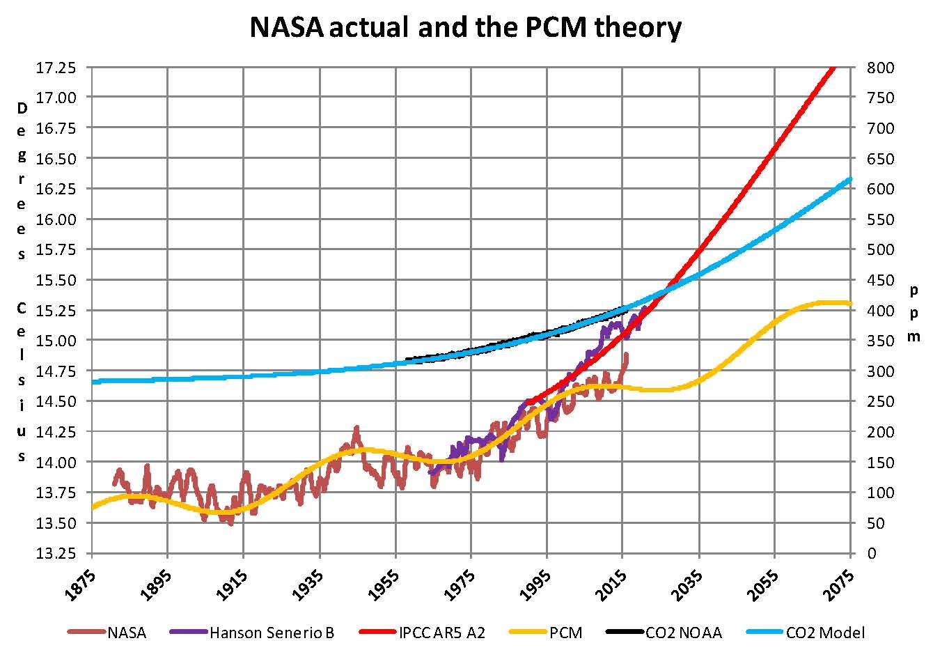
The first plot, UL is a plot of the NASA temperature anomaly converted to degrees Celsius and shown in red with a black trend line added. There has been a very clear reversal in the upward movement of global temperatures since about 2001 and neither the UN IPCC nor anyone else has an explanation for this 13 years later. Since CO2 has continued to increase at what could be argued an increasing rate, this raises serious doubts about the logic programmed into all the IPCC global climate models.
The next plot UR, also in red, shows the IPCC estimates of what the Global temperature should be, based on Hansen’s Scenario B, with the NASA actual temperatures’ subtracted from them. Therefore this plot represents a deviation from what the Climate “believers” KNOW what the temperature should be; with a positive value indicating the IPCC values are higher than actual and a negative value indicating the IPCC values are lower than actual, as measured by NASA. A black trend line is added and we can clearly see that the deviation from expected is increasing at an increasing rate. This makes sense since the IPCC models project increased temperatures based primarily on the increasing level of CO2 in the earth’s atmosphere. Unfortunately, for them, the actual temperatures from NASA are trending down (even as they try to hide the down ward movement with data manipulation) since other factors are in play, therefore each year the gap between them widens. Since we have 13 years of observations’ showing this pattern it becomes hard to justify a continuing belief in the IPCC climate models, there is obviously something very wrong here.
The next plot LL shown in blue is based on the equations in the PCM climate model described in previous papers and posts here and since it is generated by “equations” a trend line is not needed. As can be seen the PCM, LL, there is a 69.1 year cycle that moves the trend line up and then down a total of 0.29O Celsius and we are now in the downward portion of that trend (-.01491O C per year) which will continue until around 2035. This short cycle is clearly observed in the raw NASA data in the LOTI table going back to 1868. Then there is a long trend, 1036.7 years with an up and down of 1.65O Celsius (.00396O C per year) also observed in the NASA data. Lastly, there is CO2 adding about .007O Celsius per year so they basically wash out at -.0039 O C per year, which matches the current holding pattern we are experiencing. After about 2035 the short cycle will have bottomed and turn up and all three will be on the upswing again. These are all round numbers shown here as representative values.
The last plot LR in blue uses the same logic as used in the UR plot, here we use the PCM estimates of what the Global temperature should be with the NASA actual temperatures’ subtracted from them. A positive value indicates the PCM values are higher than actual and a negative value indicates the PCM values are lower than expected. A black trend line was added and it clearly shows that the PCM model is tracking the NASA actual values very closely. In, fact since 1970 the PCM model has rarely been off by more than +/- 0.1 degrees Celsius until the last few months where the manipulation showed up and has an average trend of almost zero error, while the IPCC models are erratic and are were approaching an error rate of over +0.4O C above expected until the last few months.
Note: Since I first started posting this monthly analysis a year and a half ago NOAA and NASA were directed make the global temperatures fit the political narrative that the planet was over heating and something drastic need to be done right now. The problem was as shown in this analysis the “real” world temperatures were not at the level that the IPCC GCM’s said they should be. Major adjustments to the data have been made that give the illusion that temperatures are going up even though they are not. However, as this analysis shows even with the manipulation that has destroyed all credibility from NOAA and NASA they cannot get the global temperatures even close to what their false theory claims they should be.
The next Chart shows the PCM model and all the various government plots related to climate change from 1875 through 275. Clearly within the next dozen years we will know one way or the other which kind of climate model works. One based on observations and the other based on questionable science. There is no disrespect meant against the real climate scientists that have been marginalized this disrespect is meant for the political scientists who are the worst kind as they work for money not for the truth.
In summary, the IPCC models were designed before a true picture of the world’s climate was understood. During the 1980’s and 1990’s CO2 levels were going up and the world temperature was also going up so there appeared to be correlation and causation. The mistake that was made was looking at only a ~20 year period when the real variations in climate move in much longer cycles. Those other cycles can be observed in the NASA data but they were ignored for some reason. By ignoring those trends and focusing only on CO2 the models will be unable to correctly plot global temperatures until they are fixed.
Lastly, the next chart shows what a plot of the PCM model, in yellow, would look like from the year 1400 to the year 2900. The plot matches reasonably well with history and fits the current NASA-GISS table LOTI data, in red, very closely, despite homogenization. I understand that this model is not based on physics but it is also not curve fitting. It’s based on observed reoccurring patterns in the climate. These patterns can be modeled and when they are, you get a plot that works better than any of the IPCC’s GCM’s. If the conditions that create these patterns do not change and CO2 continues to increase to 800 ppm or even 1000 ppm than this model will work into the foreseeable future. 150 years from now global temperatures will peak at around 15.75 to 16.00 degrees C and then will be on the downside of the long cycle for the next 500 years. The overall effect of CO2 reaching levels of 1000 ppm or even higher will be about 1.5 degrees C which is about the same as that of the long cycle. The Green plot shows the pattern with no change in CO2 from the pre-industrial era of ~280 ppm.
Carbon Dioxide is not capable of doing what Hansen and Gore claim!

The purpose of this post is to make people aware of the errors inherent in the IPCC models so that they can be corrected.
The Obama administration’s “need” for a binding UN climate treaty with mandated CO2 reductions in Europe and America was achieved as predicted at the COP12 conference in Paris in December 2015. To support this endeavor NASA will be forced to show ever increasing global temperatures that will make less and less sense based on observations and satellite data which will all be dismissed or ignored. Within a few years the manipulation will be obvious even to those without knowledge in the subject.
Sir Karl Raimund Popper (28 July 1902 – 17 September 1994) was an Austrian and British philosopher and a professor at the London School of Economics. He is considered one of the most influential philosophers for science of the 20th century, and he also wrote extensively on social and political philosophy. The following quotes of his apply to this subject.
If we are uncritical we shall always find what we want: we shall look for, and find, confirmations, and we shall look away from, and not see, whatever might be dangerous to our pet theories.
Whenever a theory appears to you as the only possible one, take this as a sign that you have neither understood the theory nor the problem which it was intended to solve.
… (S)cience is one of the very few human activities — perhaps the only one — in which errors are systematically criticized and fairly often, in time, corrected.
How NASA manipulates the numbers to give the result that they want
NASA-GISS publishes a table Land Ocean Temperature Index (LOTI) of temperature values around the middle of each month that gives their estimate of the global temperature in anomalies. This table shows the current month and it goes back, by month, all the way to January 1880 which represented 1,626 values with the January 2016 report. Anomalies are calculated by taking the estimated temperature say 15.2 degrees Celsius and subtracting 14.0 degrees Celsius from it leaving 1.2 degrees Celsius which is then multiplied by 100 giving us an anomaly of 102; it’s their system not mine. The 14 degrees Celsius was calculated back in the 1980 as the average temperature for the period from 1951 through 1980 or 30 years. Why that period I don’t know as it has no scientific significance. My guess is it was the period that the people working on this project like James E. Hanson grew up in, but whether that is true or not using those years as a base for anything makes no sense. This paragraph is required so anyone looking at the Chart that follows will be able to understand what the numbers mean.
When I started this climate research 10 years ago it was the result of work I was doing in the field of electric vehicles and I needed to find the amount of fossil fuels that were available to determine if electric vehicles were viable. Also prior work I had done at General Electric had indicated that there were many problems with actually trying to switch to electric cars from petroleum based. Progress has been made but there are still many issues that prevent a total conversion to electric. However this subject dragged me into the changing climate issue which at the time I had no reason to believe what NASA and James E. Hansen were saying was not true. That assumption proved to be very wrong after only a few months of studying the issue and that started me on seeing what the real reasons for the changing climate we had was.
My research during 2005 through 2007 was in collecting information on the subject and it soon became obvious that there was something wrong; the IPCC hockey stick graph and geological temperature records were at odds and one or the other was wrong. The key was the sensitivity value of Carbon Dioxide CO2 which tells us how much of an effect CO2 has on temperatures. The science is far from settled on this key value and from 1979 to the present the published papers have lowered the estimate of that key number from 3.0 degrees Celsius to closer to 1.0 degrees Celsius per doubling of CO2. The higher value is required to make the man made part of the changing climate real but the lower value appears to be the correct one; which then seems to show that there are other factors effecting climate than CO2 and this became obvious 12 years ago when the increase in Global temperature appeared to slow down or even stop; and this was called the ‘pause’. And this pause was supported by satellite data so it was hard to hide
However, politics came into play as many uneducated policy makers were tricked into supporting the claim that CO2 increases were going to be the world’s biggest problem ever. This belief had much support from various political factions that provided money and ground troops to get the message out. So, now today, with so much political capital invested in the concept facts could not be allowed to stand in the way and so NOAA and NASA were directed to adjust the global temperatures to support the movement and that culminated with the Paris climate treaty signed in December 2015 at COP21. The following Chart shows how this was done by changing all the values in the NASA LOTI table and an explanation follows the chart.

This Chart was made from 14 different NASA LOTI tables as downloaded from the NASA-GISS web site over the past 8 years and listed by date on the x axis. Each LOTI report has a temperature value for each month from the date of the report going back to January 1880 and since these values are recalculated every month in software there are variations in those values and so to remove the random changes blocks of values were averaged i.e. the first one in green January 1880 through December 1899 is 20 years containing 240 values. Then that block was plotted for each of the 14 different reports up to the base period. This block is very erratic moving first down and then up so there must be something in the software that causes that based on what they programmed in to all the other periods. I left it in here only to show the strange movements in the published temperatures provided by NASA. The next block is from January 1951 to December 1980, 30 year period, is the base period that NASA which was described in the first paragraph of this short paper. In the above chart it shows as a solid black line at the 0 point on the chart. Starting in 1940 we move to 10 year blocks of 120 values to see greater resolution. The most current block 2010 to 2019 shows the most manipulation.
Now what stands out in this chart are two things the first is that the plots for the blocks of years move up and down which means that the temperatures for that block of years is moving which doesn’t seem reasonable as they are in the past so how is that possible. Further, random fluctuations would be averaged out when considering 120 or 240 values. In general as shown in the straight red trend line above the black base line which moves up and the blue straight trend line below the black base line which moves down we can see that the past gets colder while the present gets warmer; both after they are first published. Each point on the chart is for the same time period and the same number of values with the exception of the most current block labeled at 2010-2019 which is currently at 60 values since we are only half way through that period. This last period is the most interesting since we can see a very large increase in the values in the first few months of 2015, black oval.
The second point is not so obvious and this that the base period black plot of 30 years from 1951 through 1980 is very stable and does not move. With what happens to all the other periods moving all over the place that is not possible unless it is not allowed to move. This is one of the reasons why that period should not have been picked as the base, however now that they did they are forced to make those 360 values, when averaged, equal zero or their system falls apart. A base period cannot fall in the middle of the measurements you are analyzing when you don’t have hard values to measure against.
Since the past can’t change except in Orwell’s 1984 the current movement of temperatures that support the myth of manmade climate change can only be by manipulation of the NOAA and NASA data sets. What this administration is currently doing is no different than what The Catholics did to Galileo in 1633 when he was sentenced to house arrest after a long battle proposing that the earth moved around the sun not vice versa. Today any work questioning that man is causing the temperature of the planet to rise to unheard of levels is ridiculed and banned and some have even proposed prison to utter that thought.
Since it is now 100% certain that NOAA and NASA are changing data to support a political view those organization are now nothing more than propaganda organs of the political class and have become high priests of a cult which has nothing to do with true science.
Bill Whittle on Donald Trump!
Hey guys, it’s time to ‘remember we are not enemies, but friends.’ This Afterburner needs to be heard by every Republican, so share it out!
We are entering a cool period of weather which will last until the mid 2030’s
Snow in Hong Kong? No Possible Way. Or Maybe?

Some people have asked why did I bother to follow weather? I became a partner in a firm called Strategic Weather to do long-term forecasting, which today is Planalytics which is geared to forecasting weather for business. The database on weather was put together and formed one of the largest in the country. Weather has played a key role in migrations and the rise and fall of nations. I have warned that we are entering a period which is summed up best as – the Age of Whatever Can Go Wrong – Will Go Wrong.
From a weather perspective, our long-term models at PEI project that we are heading into a mini ice age – not global warming, and it has nothing to do with emissions. This is a natural cycle whereby the energy output of the sun collapses. This week, temperatures plummeted in Hong Kong. They were even talking about snow, which I am not sure anyone has ever seen in my lifetime. This is the Maunder Minimum & the Coming Mini Ice Age. It is blistering cold right now in New Jersey. We have to comprehend that this is like a crash of the stock market from a 1929 high. It will be rapid and by no means gradual. By the time we look back at this in a few years, we will be willing to pay taxes for global warming to heat things up again.
Donald Trump Full “unabridged/extended” Interview on Face The Nation (video)…
Trump does well in interviews and this one seems reasonable unlike others.
Is climate change real and if so is humankind responsible?
The Earth gets all its energy from the sun in a somewhat complicated process of absorption and radiation with delays between the incoming and outgoing energy that creates a livable temperature on the planet’s surface. Geological records, going back hundreds of millions of years, have shown that the planet’s average surface temperature has ranged from a low of ~12.0OC to a high of ~22.0OC and the planet is to the low side today at just under 15.0OC. Obviously the mechanism that regulates the planets temperature is self correcting and does not get into a runaway hot or cold scenario. Since we know these facts to be true, we therefore have an inherently stable system.
The next fact to be considered, is that 10,000 years ago we were just about ready to come out of the last “Ice Age” with deep glaciers covering most of the land masses in the northern hemisphere. Obviously humankind had nothing to do with the existence and removal of that ice and so again we have proof that the climate is a variable and never gets totally out of line. But it should be kept in mind that we still have not got back to what would be an average geological global temperature of ~17.0OC so panic at the current slightly less than 15.0OC is somewhat irrational.
Now looking back two or three thousand years where we have recorded history and physical evidence we find that there have been well documented alternating cold and warm periods; The sub-Atlantic cold period, The Roman warm period, The dark age cold period, The Medieval warm period, The little ice age and the current Modern warm period. These cycles are real and consistently repeat themselves in a ~500 year up or down cycle making for a ~1000 year over all cycle. That movement in global climate is therefore the base for our modern climate and must be used in any climate model that will work.
Global temperatures are published each month by NASA-GISS (NASA) in their Land Ocean Temperature Index (LOTI) which goes back to January 1880 and runs by month to the current date and is where we get temperatures to work with. In that data, one can observe both the ~1000 year cycle and also a shorter ~70 year cycle which were used to create a climate model based on those two cycles back in ‘07. However once that model, which I called the PCM (Pattern Climate Model), was completed it was found that there was another factor to consider which was the effect of increased levels of CO2. The addition of CO2 with a lower sensitivity values than that used by the IPCC, 0.65OC verses 3.0OC, gave excellent predictive values and was used very successful until 2014 since this model predicted the current “pause” and further showed it will last until the mid 2030s.
Two things happened in late ’14 and early ’15 the first being that NASA decided to start seriously tampering with the climate data to make sure that the December 2015 COP21 conference in Paris had data that showed the planet had never been this hot before. The anomaly value published in November 2015 for their LOTI table for October 2015 was 104 which is the equivalent to 15.04OC; and sure enough in “that” report October 2015 was the hottest ever recorded by NASA. Unfortunately in previous versions of that report many other months had values higher than 104; so NASA had to make them colder in the November 2015 report. Data tampering was nothing new to NASA but what was done this time was so blatant that just about everyone in the field could see it. This data tampering created a situation where the climate model I developed was now showing an error or deviation that had not previously been observed, although it was not a major deviation and the PCM model was still more accurate than any of the IPCC GCM’s.
The other thing that occurred was that I became aware of the use of Pi (3.1416) in finding patterns. During November I decided to see if Pi could be used to improve my model. What I found was very interesting and it did make the climate model better. A base to work from was needed and so I picked the 22 year solar magnetic cycle. Thus 22 times Pi is 69.115 years and that becomes the short cycle and the long cycle becomes 15 times the short cycle or 1036.726 years which made it 330 times Pi. These values were not much different than what I had come up with in ’07 but they did make an improvement in the model being able to match the NASA values even better after changing all the formulas that I used to reflect this change. Also Pi to the power of e is 22.46. With the equations set only three things were required which were a starting date, 1650 in this case, and a starting temperature, 13.4OC, and lastly amplitude for each cycle. Based on observations 1.65OC was used for the long cycle and 0.29OC was used for the short cycle. These values are reasonably consistent with observation.
After making this change there was no change required in the CO2 model which is a logistics curve and matches the NOAA plot almost exactly which then allows projecting CO2 in to the future. Then after making all the adjustment based on Pi I found that I had to raise the CO2 sensitivity value up from what I was using 0.65OC to get the plot to match NASA data. I’m not sure this increase is justified as the NASA data is artificially high and so the 0.75OC value that I used may also be too high. However the 0.75OC is close to the expected lower values in current published papers and so even if the NASA values are eventually corrected and lowered, as they must be, a new lower value such as 0.75OC will still work since the sensitivity effect at that level is relatively low.
The following chart shows the results of using the 22 year solar magnetic cycle and Pi as the determining factor for the observed climate patterns. This chart is made from the average value of temperature and CO2 for each year, instead of using the monthly values which are very irregular in the NASA temperature tables. You can see the large upward movement in the 2015 temperature which is not justified as the satellite data clearly shows a lower value, however you can also see that the yellow plot from my model is very, very close to a mean of the NASA values. The sad thing is that this model might be even better if we had the real values to work with not the manipulated ones that NASA gives us. I have also added a red trace showing the IPCC AR5 A2 global temperature projection.
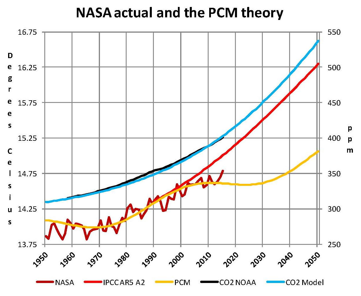
One other technical criticism of NASA is they use the period of 1950 to 1980 (30 years) to make their base for calculating anomalies, for some unknown reason. They determined that the mean temperature for that period was 14.0OC and they measure deviations from that in hundredths of a degree such that 15.04OC ends up as an anomaly of 104. This makes for interesting gyrations since they are always changing the values in their LOTI table and when they do so those values that end up in 1950 to 1980 period have to equal 14.0OC to make their system work, black oval in chart. It would have been much better to pick a value that had meaning such as 17.0OC which is the historic mean temperature of the planet. If they had done this then I would bet that the values around 1950 would be somewhat higher and closer to the yellow PCM plot. The next chart shows a closer view of the current period. In this Chart you can see the close relationship of CO2 and the IPCC AR5 A2 plot, this close of correlation leaves no room for other factors and since the IPCC has ruled out any natural reasons for climate change this makes sense. However if that assumption is wrong than the climate models are also wrong and that is why NASA manipulated the temperature values prior to COP21. The PCM model indicates that there will be no more warming until into the 2030’s
The next chart shows a complete 1036.7 year cycle. What we have is 1.65OC from the long cycle, 0.29OC from the short cycle and about 1.4OC from CO2, but actually I think the effect from CO2 will be less since the current NASA numbers are inflated and that forces us into a higher level in the model. Personally I think that the total will be close to a half a degree less than shown here but even if not we are still well below the geological average of 17.0OC so there is nothing to worry about. Both CO2 and global temperatures have been significantly higher than present levels which are actually closer to historic lows than to historic highs. Also if CO2 does get do over 1000 ppm plants will grow faster and therefore farming will have higher yields.
I also added a green plot labeled PCM WOC (without carbon) to this chart showing what the existing pattern of the long and short cycles would be if there was no increase in CO2 from the base of 290 ppm so we have something to reference the effect of CO2 which is only ~1.4OC. Today’s current temperatures would be about .5OC lower with a constant level of CO2 than they are with CO2 going from 290 ppm to 400 ppm. The next big global temperature increase will be from 2035 to 2070 and that will probably be a full degree so if we are not prepared that will cause utter panic since that will be more than what we had from 1975 to 2005. The Chart on the next page shows these items.
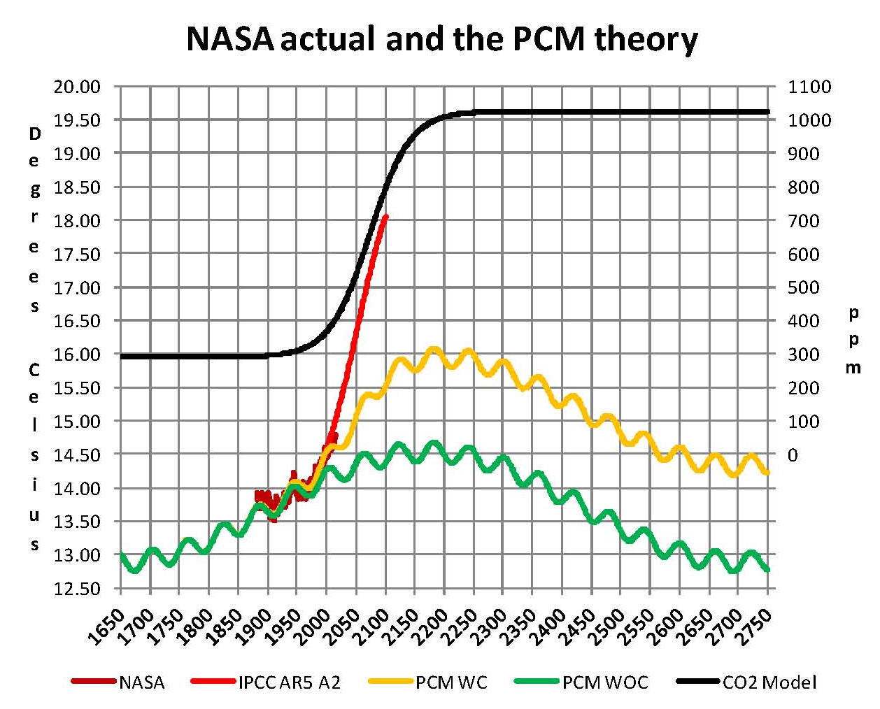
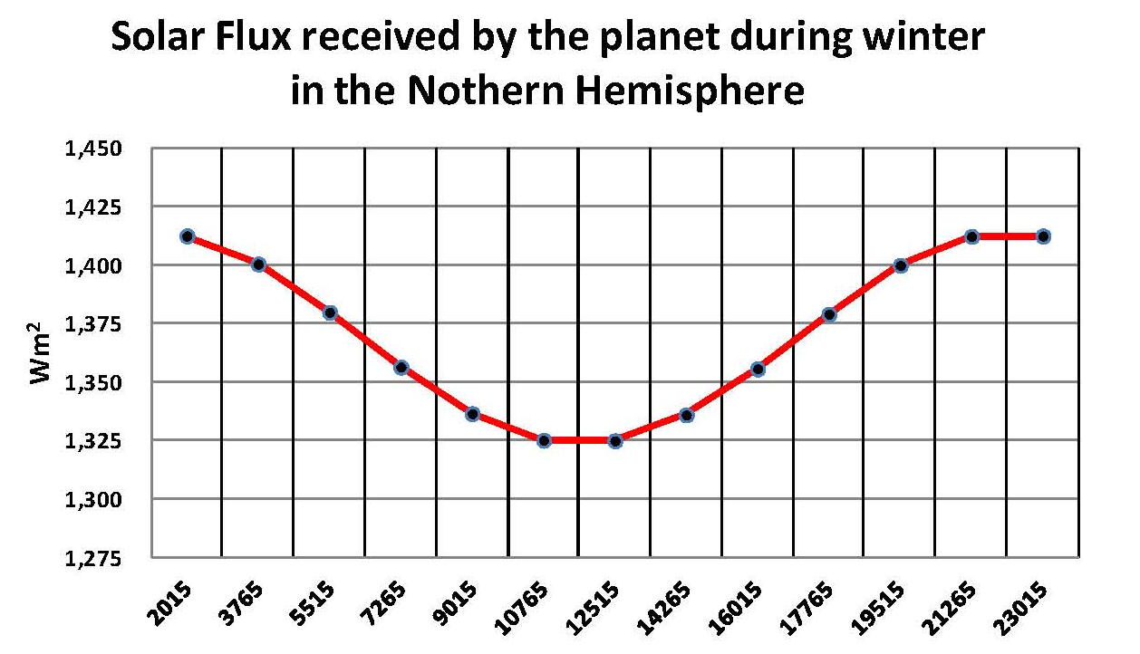
This climate model has been rightly criticized as curve fitting and I cannot claim it is not; however it does work so it must be based on real processes at play on the planet. My best guess is there are two things going on the main one is the apsidal precession of the earth’s orbit which reverses the aphelion and perihelion to the seasons every ~10,000 years. Since the bulk of the land is in the northern hemisphere and the southern is mostly water this makes a big difference since the summers will get hotter and the winters will get colder in the northern hemisphere when the earth’s axis is pointing toward the sun at perihelion which it will be in 10,000 years. A plot of the changes in solar flux is shown on the next page. know this is not 1,000 years but I just have a feeling that it is related. The thermohaline ocean circulation is a 1,000 cycle and probably related to the precession but this alone cannot explain the global temperatures and so it has been dismissed.
The other cycle the short 70 year cycle which is, in my opinion, related to the 22 year solar magnetic cycle which probably has an effect of particles entering the earth’s atmosphere and that changes the cloud layers which changes the planets albedo. There is more support for this theory but by itself it cannot account for the observed changes in global temperatures and so it has also been dismissed.
After writing this paper I became aware of a paper published by the National Academy of Sciences (PNAS) November 7, 2000 by Charles A Perry and Kenneth J Hsu. The paper was about a relationship between 2^N and solar output i.e. the solar magnetic cycle of ~22 years. So 2^6 power is 64 and 2^10 is 1024 which is not far off from using PI * 22 or Pi * 330, and in fact substituting those values in my model made little difference in the output. And since the NOAA and NASA published temperatures have been compromised there is no way to know which system is better at matching current temperature, which is very sad of science.
When the long and short cycles are removed we are left with only CO2 and that forces us to use the NAS 3.0OC +/- 1.5OC for each doubling of CO2; which worked when the long and short cycle were both in ascendance but 3.0OC +/- 1.5OC does not work now that they are not. As long as we ignore the geological cycles we will never be able to build a GCM that works.
Are NASA-GISS Published Global Temperatures Valid?
This paper shows that the values published in the NASA table LOTI cannot be supported when the sun’s energy is used as an input since the difference month to month in the table cannot be less or more than when the sun sends us. Changes in the planets albedo were also considered and even 30% changes in the albedo cannot explain the large amount of energy that must come in or go out if the NASA values are to be believed.
NASA publishes values representing the global surface temperature of the planet supposedly based on actual measurements processed in a complex algorithm they call homogenization. The resulting values are published each month in a table called the Land Ocean Temperature Index (LOTI) which runs from January 1880 to November 2015 in this case. The process they use is explained on their web site for those that are interested. However the values shown in their work seem to show very large temperature swings on a month to month basis and that did not seem reasonable to me, given this was Global temperatures. This prompted me to do a review of the process in June 2015 and that led to a previous draft paper which was modified to create this finished work.
A small sample from NASA’s table is provided below running from January 2001 to September 2015. A good example of this large swing in values can be found in the value shown in February 2014 of 50 compared to March 2014 of 77 (both shown in red) a difference of 27 anomalies (a quarter of a degree), a NASA measure of temperatures in hundredths of a degree Celsius, represents a lot of energy on a global scale.

What we are going to do now is reverse engineer the NASA Temperature values in the full LOTI table and then calculate the energy flows required to make those changes. If the “required” energy flows are not reasonable, then the NASA temperatures are not reasonable. They must be in synchronization with energy inputs as energy can neither be created nor destroyed. The first step was to place all 1929 LOTI values in a spreadsheet and then turn the NASA anomalies (a deviation from a base of 14.0 degrees Celsius) back into temperatures by dividing by 100 then adding that value back to the base 14.0OC and lastly adding that result to 273.15 to convert to degrees Kelvin. Kelvin must be used to calculate total heat when working on these kinds of projects.
Next we needed to calculate the total heat value of the NASA temperatures and their changes and so from Wikipedia we find that the Earth’s dry atmosphere is 5.1352E+18 kg and the water in the atmosphere is 1.27E+16 kg for a total of 5.1479E+18 kg. From these values we can calculate that water is on average .247% of the atmosphere. We also find that on Wikipedia the specific heat of the Earth’s atmosphere is 1006 Joules per degree Kelvin (J/kg/K) without water and so we need to add 4.6 J/kg/K for water and 9.8 J/kg/K for latent heat to the 1006 J/kg/K giving us a total of 1020.4 J/kg/K for the earth’s atmosphere with .0247% water at standard air.
There is one last step since the NASA values are “surface” temperatures, we need an adjustment for altitude cooling if we are looking for the total energy in the atmosphere. To accomplish this we’ll subtract 28.5OC making the answer the theoretical temperature at 5 km above sea level which is about where 50% of the atmosphere is above 5 km and 50% below; so this makes for a reasonable estimate for calculating total energy. Using this logic we subtract the 28.5OC from the NASA LOTI values that we converted to degrees Celsius, which are surface values which then gives a ballpark value to calculate the total heat in the atmosphere.
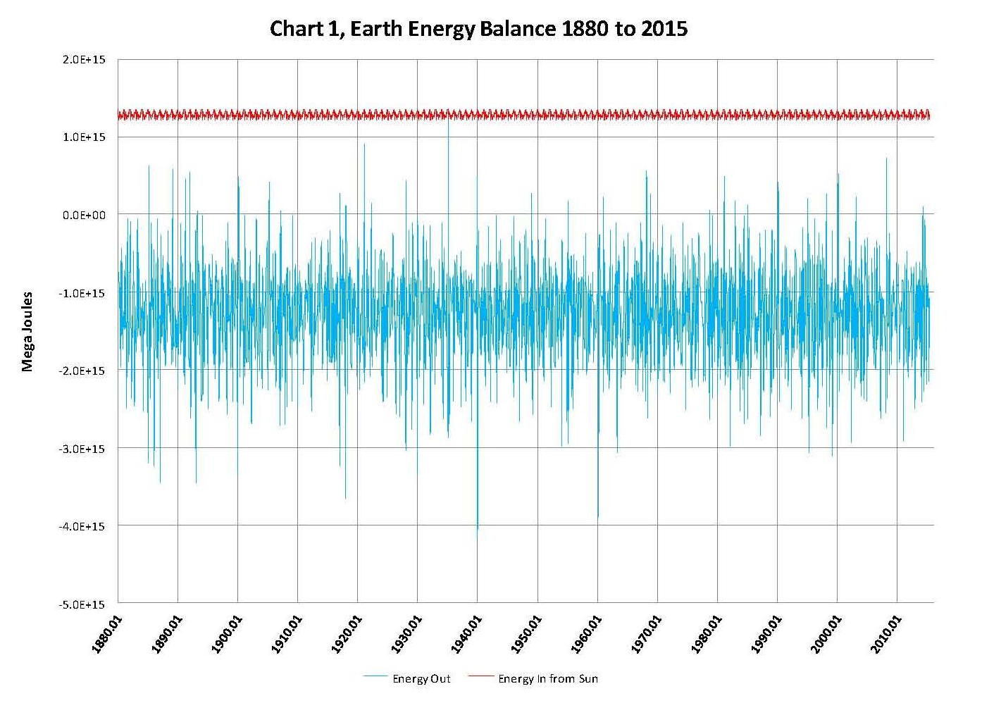
With the monthly NASA temperatures in a spreadsheet it was only a few hours work to set up the equations and plot a few charts. We calculated the heat value of each month’s anomaly for example for January 1880 the value was 1.3572E+24 Joules and for June 2015 the value was 1.36266E+24 Joules. Those values are a result of energy coming in from the sun minus what leaves the planet as infrared energy assuming no large change in the temperature of the land or oceans. To my knowledge these kinds of temperature changes (energy flows) have not been observed on the surface of the planet.
This review shows that the magnitude of the “required” energy flows is not reasonable indicating to me that the NASA temperatures is not reasonable as can be seen in Chart 1 on the next page. This shows two plots, the monthly change in the NASA anomalies in blue (required energy out) and the sun’s input in red (energy in). The sun’s input is adjusted for the orbital distance to the sun and the number of days in the month which is required to match the time periods shown in the NASA LOTI table. Since the sun is the energy input, the NASA temperatures minus the input must equal the input with the opposite sign, or negative. In other words, the sum of the two must be zero.
It’s clear when looking at Chart 1 that there have to be extremely large monthly energy flows involved here if the NASA numbers are actually valid. To put this in perspective three, lines were added to Chart 1, as shown in Chart 2. These lines are for the incoming solar radiation using 1414.44 Wm2 for solar radiation at aphelion (January) and 1322.97 Wm2 for solar radiation at perihelion (July) in the earth’s orbit using the following albedo percentages; 20.0% dark red plot, 30.0% (Actual) red plot and 40.0% a yellow plot. The red plot is also shown on Chart 1. We also changed the time frame from 1880 to the present to 2000 to the present so that more detail could be seen when making Chart 2.
The choppy lines in the dark red, red and yellow Sun radiation plots are a result of using monthly values and the months don’t always have the name number of days. The purpose of showing these three radiation plots from the sun is to show that large changes in the planets albedo cannot account for the large energy swings and so the large changes in the NASA data such as shown here just don’t happen. That means that even these large albedo changes cannot account for the large required movements in energy indicated by NASA’s numbers shown in their table LOTI, the actual smaller albedo changes we experience surely can’t.
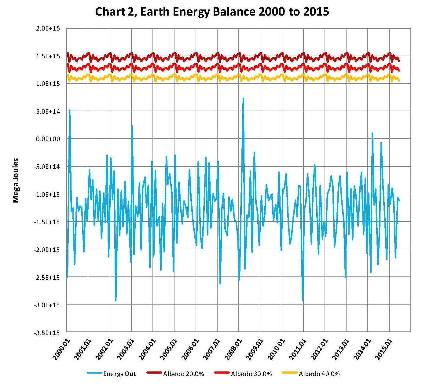
The blue plot for the NASA temperatures is actually the “required” energy out flow to balance the suns energy inflow. Given the process that NASA uses to determine global temperatures it would be expect that there would be some variations, but surely not of the magnitude shown in this chart.
NOAA and NASA have spend a lot of time and resources developing complex systems with the intent to show how “current’ temperatures were being driven up by the level of greenhouse gasses in the atmosphere caused by the burning of fossil fuels. This was called anthropogenic climate change meaning climate change caused by man. These apparent upward global temperature changes in the 1980’s and 1990’s were assumed by politicians to be dangerous and the scientific community given the task of showing the dangers to the planet of increasing temperatures. Although there was some real scientific validity to the man made climate change movement a true cause and effect review of the concept was never made and money poured in to “prove’ the political concept.
Had a true review of the apparent problem been done first it would have been obvious that there were other factors involved besides greenhouse gases the most obvious was the well documented thousand year cycle of warm and cold periods going back several thousand years. The most recent of these cycles ended around 1650 during the coldest part of what is called the Little Ice Age. Assuming the thousand year cycle is valid that means that the global temperature would be ascending for five hundred years peaking around 2150. Based on this principle of multiple reasons for the apparent climate change, a climate model was then developed that fit the historic patterns that include the increases in greenhouse gases. This model is called a pattern model and designated the PCM and shown next.
The next Chart 1a was developed exactly the same way as the NASA Chart 1 was except we used the temperatures generated by the PCM model as shown in the previous PCM chart instead of those developed by NASA in their computer system. We can clearly see in this Chart 1a that this PCM model generates a plot that very closely matches the suns input but is negative which it must be to keep the planet in thermal balance.
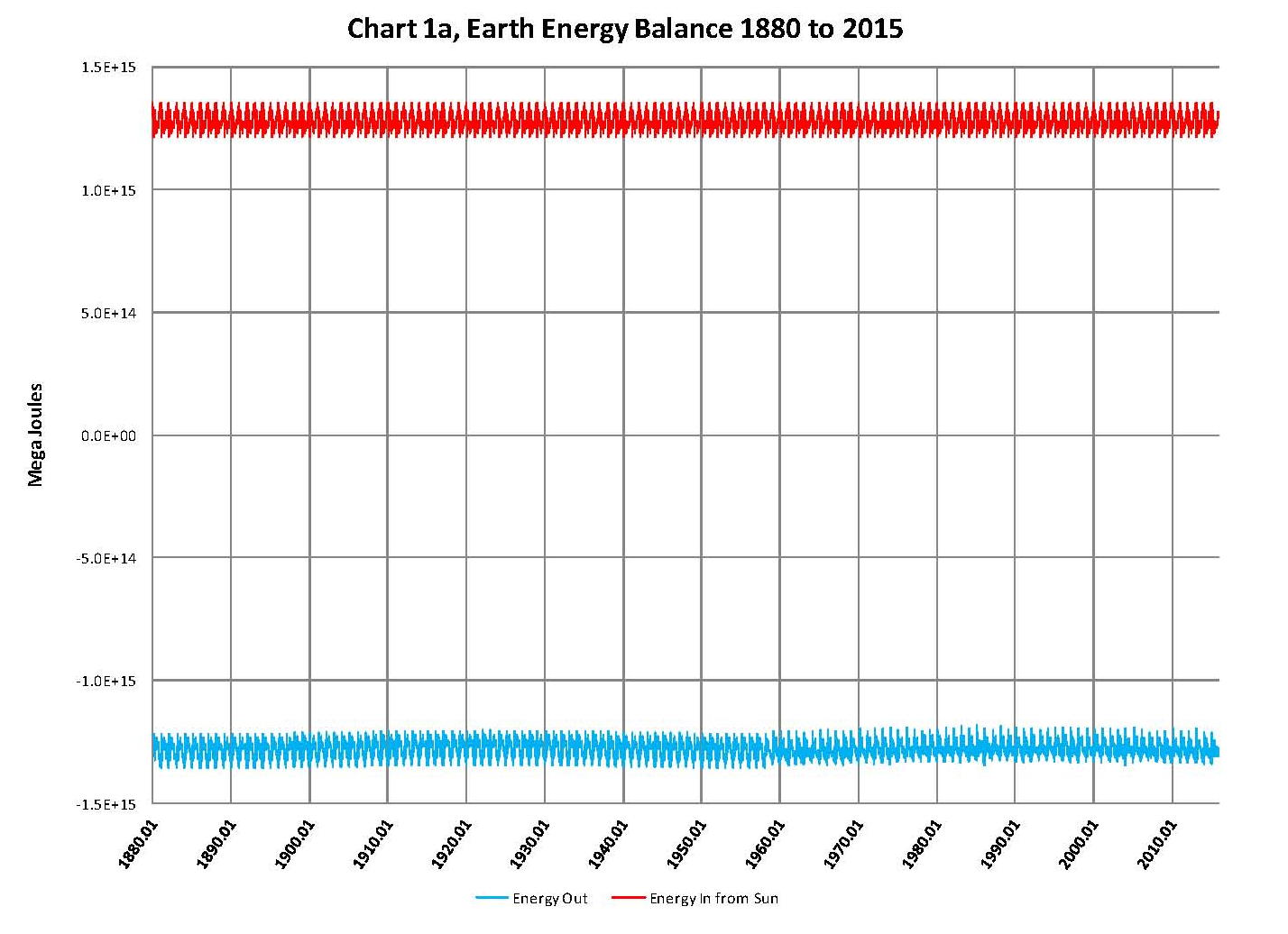
The next Chart 2a is based on the same principle as that shown for the NASA data in Chart 2 looking at 2000 to the present for more detail and we can see that the sun’s is exactly balanced by the energy leaving the planet as it must be when we use the PCM model to generate the temperatures. The model was developed in 2007 and this review used the values calculated by the PCM model.
Further from a total energy, heat, perspective the current increase in global temperatures of just over plus 1 degree Celsius from 1880 is less than 4 tenths of a percent change in the planets heat content. Even 2 degrees Celsius as predicted by the PCM model would be less than 6 tens of a percent change in the planets heat content so making claims of utter disaster for such small amounts of a heat increase is really stretching the point especially since the planet has reached temperatures beyond where we are now many times in the distant past; we are still just barely out of the last ice age after all.

The point to this analysis is to show that whatever the method used to analyze global temperatures, the in’s and out’s must balance. Clearly the NASA-GISS table LOTI data is not valid for the monthly temperature swings exceed what would be possible in the real world. Maybe if NASA would concentrate on developing real systems and models instead of doing the bidding of politicians their work might actually be valid.
This paper contains original research on the energy balance of the climate (weather) of the planet. A more sophisticated analysis could possibly be done showing what the effect of the1 to 2 degree Celsius increase in global temperatures that has accrued since the end of the little ice age in ~1650 would look like; maybe a 3D chart would work giving another dimension to work with. The energy balance would still be there but the in’s and out’s would have a pattern similar to what is shown in the chart of the PCM model and trending upward indicated that there is an increase in temperature
Analysis of Global Temperature Trends, November, 2015 What’s really going on with the Climate?
The analysis and plots shown here are based on the following: first NASA-GISS temperature anomalies (converted to degrees Celsius so non-scientists will understand the plots) as shown in their table LOTI, second James E. Hansen’s Scenario B data, which is the very core of the IPCC Global Climate models (GCM’s) and which was based on a CO2 sensitivity value of 3.0O Celsius, lastly, a plot based on an alternative climate model designated ‘PCM’ and based on a sensitively value of 0.65O Celsius.
An explanation of the alternative model designated, PCM, is in order since many have interpreted this PCM model as a statistical least squares projection of some kind. Nothing could be further from the truth. A decade ago when I started this work the first thing I did was look at geological temperature changes since it is well known that the climate is not a constant; I learned that in my undergrad geology and climatology courses in 1964.
The following observations give a starting point to any serious study. First, there is a clear movement in global temperatures with a 1,000 some year cycle going back at least 3,000 to 4,000 years; probably because of the apsidal precession of about 21,000 years for a complete cycle. However about every 10,000 years the seasons are reversed making the winter colder and the summer warmer in the northern hemisphere. 10,000 years from now the seasons will be reversed. Secondly, there are also 60 to 70 year cycles in the Pacific and the Atlantic oceans that are well documented. Lastly we also know that there are greenhouse gases such as carbon dioxide. The National Academy of Sciences (NAS) estimated that carbon dioxide had a doubling rate of 3.0O Celsius plus or minus 1.5O Celsius in 1979.
The core problem with the current climate change theory is that the IPCC still uses the NAS 3.0O Celsius as the sensitivity value of carbon dioxide and a number in that range is required to make the IPCC GCM’s work. The problem with using this value is it leaves no room for other factors and hence the need of the infamous hockey stick plots of the IPCC from Mann, Bradley & Hughes in 1999. The PCM model is based on a much lower value for carbon dioxide consistent with current research. This places the value between 0.65O and 1.5O Celsius per doubling of carbon dioxide. If the long and short movement in temperatures and a lower value for carbon dioxide are properly analyzed and combined a plot that matched historical and current (non manipulated) NASA temperature estimates very well can be constructed. This is not curve fitting.
The PCM model is such a construct and it is not based on statistical analyses of raw data. It is based on creating curves that match observations (which is real science) and those observations appear to be related to the movement of water in the world’s oceans. The movements of ocean currents are well documented in the literature. All that was done here was properly combine the separate variables into one curve which had not been previously done, to my knowledge. Since this combined curve is an excellent predictor of global temperatures unlike the IPCC GCM’s, it appears to reflect reality a bit better than the convoluted IPCC GCM’s, which after the past 19 years of no statistical warming have been shown to be in error.
Now, to smooth out highly erratic monthly variations a 12 month running average is used in all the plots. This information will be shown in four tables and updated each month as the new data comes in about the middle of the month. Since no model or simulation that cannot reasonably predict that which it was design to do is worth anything the information presented here definitively proves that NASA, NOAA and the IPCC just don’t have a clue.
Note, starting in late 20014 and continuing to the present NASA has made major changes to the way they calculate the values used in their table LOTI. These changes have significantly increased the apparent global temperatures (political reasons) and these changes are not supported by satellite data; so they are probably not real. For example in the report issued in April 2010 the following temperatures were reported March 2002 102, January 2007 108 and March 2010 106. The current report October 2015 shows March 2002 91, January 2007 97 and March 2010 92 and October 2015 as 104; which makes October 2015 the hotest ever . This paper uses the questionable NASA data since it is all that is available at this time. Prior to this “change” the PCM plot showed almost no error for NASA data as can be seen in the plots posted here last year.

The first plot, UL is a plot of the NASA temperature anomaly converted to degrees Celsius and shown in red with a black trend line added. There has been a very clear reversal in the upward movement of global temperatures since about 2001 and neither the UN IPCC nor anyone else has an explanation for this 13 years later. Since CO2 has continued to increase at what could be argued an increasing rate, this raises serious doubts about the logic programmed into all the IPCC global climate models.
The next plot UR, also in red, shows the IPCC estimates of what the Global temperature should be, based on Hansen’s Scenario B, with the NASA actual temperatures’ subtracted from them. Therefore this plot represents a deviation from what the Climate “believers” KNOW what the temperature should be; with a positive value indicating the IPCC values are higher than actual and a negative value indicating the IPCC values are lower than actual, as measured by NASA. A black trend line is added and we can clearly see that the deviation from expected is increasing at an increasing rate. This makes sense since the IPCC models project increased temperatures based primarily on the increasing level of CO2 in the earth’s atmosphere. Unfortunately, for them, the actual temperatures from NASA are trending down (even as they try to hide the down ward movement with data manipulation) since other factors are in play, therefore each year the gap between them widens. Since we have 13 years of observations’ showing this pattern it becomes hard to justify a continuing belief in the IPCC climate models, there is obviously something very wrong here.
The next plot LL shown in blue is based on the equations in the PCM climate model described in previous papers and posts here and since it is generated by “equations” a trend line is not needed. As can be seen the PCM, LL, and the NASA, UL, trend plots are very similar the reason being that in the PCM model, there is a 68.2 year cycle that moves the trend line up and then down a total of 0.30O Celsius (currently negative .0070O Celsius per year); and we are now in the downward portion of that trend which will continue until around 2035. This short cycle is clearly observed in the raw NASA data in the LOTI table going back to 1868. Then there is a long trend, 1052.6 years with an up and down of 1.36O Celsius (currently plus .0029O Celsius per year) also observed in the NASA data. Lastly, there is CO2 adding about .005O Celsius per year so they basically wash out, which matches the current holding pattern we are experiencing. However within a few years the increasing downward trend of the short cycle will overpower the other two and we will see drop of about .002O Celsius per year and that will be increasing until till around 2025 or so. After about 2035 the short cycle will have bottomed and turn up and all three will be on the upswing again. These are all round numbers shown here as representative values.
The last plot LR in blue uses the same logic as used in the UR plot, here we use the PCM estimates of what the Global temperature should be with the NASA actual temperatures’ subtracted from them. A positive value indicates the PCM values are higher than actual and a negative value indicates the PCM values are lower than expected. A black trend line was added and it clearly shows that the PCM model is tracking the NASA actual values very closely. In, fact since 1970 the PCM model has rarely been off by more than +/- 0.1 degrees Celsius and has an average trend of almost zero error, while the IPCC models are erratic and are now approaching an error rate of +0.5O above expected.
Note: Since I first started posting this monthly analysis a year and a half ago NOAA and NASA were directed make the global temperatures fit the political narrative that the planet was over heating and something drastic need to be done right now. The problem was as shown in this analysis the “real” world temperatures were not at the level that the IPCC GCM’s said they should be. Major adjustments to the data have been made that give the illusion that temperatures are going up even though they are not. However, as this analysis shows even with the manipulation that has destroyed all credibility from NOAA and NASA they cannot get the global temperatures even close to what their false theory claims they should be.
In summary, the IPCC models were designed before a true picture of the world’s climate was understood. During the 1980’s and 1990’s CO2 levels were going up and the world temperature was also going up so there appeared to be correlation and causation. The mistake that was made was looking at only a ~20 year period when the real variations in climate move in much longer cycles. Those other cycles can be observed in the NASA data but they were ignored for some reason. By ignoring those trends and focusing only on CO2 the models will be unable to correctly plot global temperatures until they are fixed.
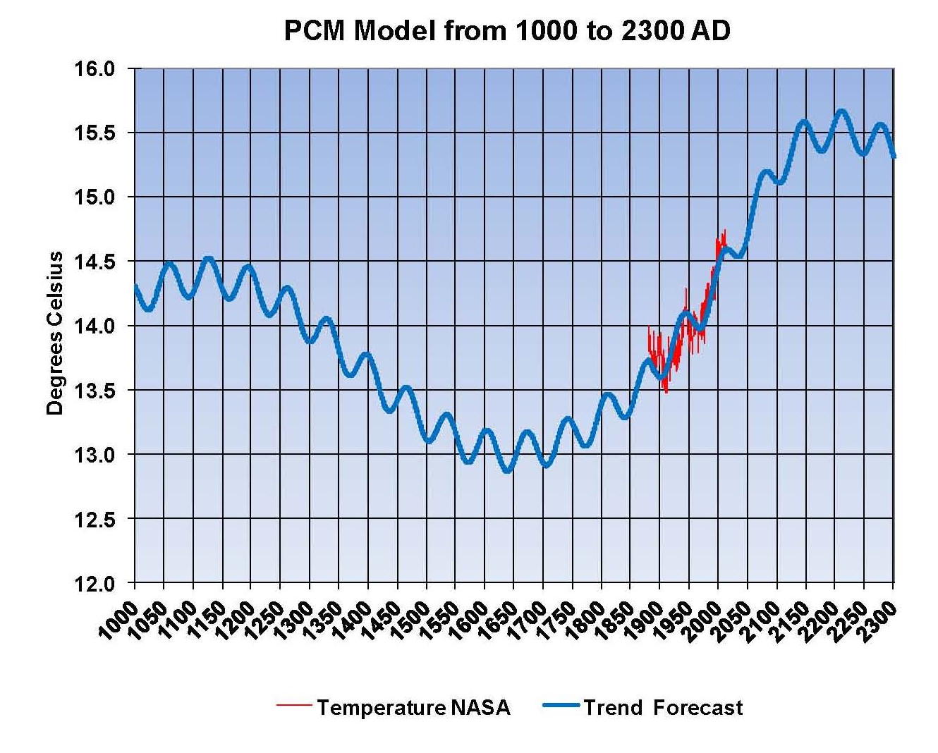
Lastly, the next chart shows what a plot of the PCM model would look like from the year 1000 to the year 2300. The plot matches reasonably well with history and fits the current NASA-GISS table LOTI date very closely, despite homogenization. I understand that this model is not based on physics but it is also not curve fitting. It’s based on observed reoccurring patterns in the climate. These patterns can be modeled and when they are, you get a plot that works better than any of the IPCC’s GCM’s. If the conditions that create these patterns do not change and CO2 continues to increase to 800 ppm or even 1000 ppm than this model will work into the foreseeable future. 150 years from now global temperatures will peak at around 15.5 to 15.7 degrees C and then will be on the downside of the long cycle for the next 500 years. The overall effect of CO2 reaching levels of 1000 ppm or even higher will be between 1.0 and 1.5 degrees C which is about the same as that of the long cycle.
Carbon Dioxide is not capable of doing what Hansen and Gore claim!

The purpose of this post is to make people aware of the errors inherent in the IPCC models so that they can be corrected.
The Obama administration’s “need” for a binding UN climate treaty with mandated CO2 reductions in Europe and America means there will be such a resolution presented at the COP12 conference in Paris in December. To support this NASA will be forced to show ever increasing global temperatures for the rest of 2015 that will make less and less sense based on observations and satellite data which will all be dismissed or ignored.
Sir Karl Raimund Popper (28 July 1902 – 17 September 1994) was an Austrian and British philosopher and a professor at the London School of Economics. He is considered one of the most influential philosophers for science of the 20th century, and he also wrote extensively on social and political philosophy. The following quotes of his apply to this subject.
If we are uncritical we shall always find what we want: we shall look for, and find, confirmations, and we shall look away from, and not see, whatever might be dangerous to our pet theories.
Whenever a theory appears to you as the only possible one, take this as a sign that you have neither understood the theory nor the problem which it was intended to solve.
… (S)cience is one of the very few human activities — perhaps the only one — in which errors are systematically criticized and fairly often, in time, corrected.
