Analysis of Global Temperature Trends, January, 2017, what’s really going on with the Climate?


The analysis and plots shown here are based on the following two data series. First NASA-GISS estimates of a global temperature shown as an anomaly (converted to degrees Celsius) as shown in their table Land Ocean Temperature Index (LOTI) and shown in the following Chart as the red plot labeled NASA. This plot is shown as a twelve month moving average to minimize the large monthly swings and better show trends; the scale for the temperatures is on the left. Second NOAA-ESRL Carbon Dioxide (CO2) values in Parts Per Million (PPM) which are shown in the following Chart as a black plot labeled NOAA. This plot is shown exactly as the data from NOAA is presented and there is no need for a moving average the scale for CO2 is shown on the right.

NASA published data as stated in the first paragraph is shown as an anomaly, but what is a temperature anomaly?  An anomaly is a deviation from some base value normally an average that is fixed. There were two problems with the system that NASA picked which were number one there is no “actual” global temperature and two since climate is a variable there cannot be a real base to measure from. NASA known for its science and engineering expertise back in the day thought it could get around these issues and created a system to do so. First they developed a computer model which took readings from all over the planet and made significant adjustments to them called homogenization and came up with the estimated global temperature. Second they picked the period 1950 to 1980 (30 years) and averaged the values and came up with 14.00 degrees Celsius and make that their base.  Then they took the calculated temperature and subtracted the base from it which gave them the anomaly. The problem is that both the base and the anomaly are arbitrary.

nasa-2017-01-p1

Now that we have a base to work with we are going to add to the previous Chart three things. The first is a trend line of the growth in CO2 since that is the entire basis for climate change according to the government through NASA and NOAA. That plot is superimposed over the black plot of the actual NOAA CO2 values as the cyan line labeled as the CO2 Model and one can see there is a very good fit to the actual NOAA values so there should be no dispute about its validity.  This plot allows us to make projections as to future global temperatures according to the level of CO2. The second added item is James E. Hansen’s Scenario B data, which is the very core of the IPCC Global Climate models (GCM’s) and which was based on a CO2 sensitivity value of 3.0O Celsius per doubling of CO2. This plot is shown here in lavender and is part of a presentation that Hansen showed to congress in 1988 when the UN was about to set up the International Panel on Climate Change (IPCC) and this plot is labeled as Hansen Scenario B which Hansen stated was the most likely to happen based on his theories’.  The third item is the current plot of the most likely temperature of the planet based on the growth of CO2 published by the IPCC. This plot is shown in Red and is labeled as IPCC AR5 A2 as that is the table where the data was found. This plot is a GCM computer projection of the planets temperature based to the complex relationships developed on the levels of CO2 by the IPCC through NASS and NOAA.

It can be seen in this Chart that the lavender plot and the Hansen plot are very close from 1965 to around 2000 after that, from 2000 to 2014, there is a very large and growing deviation reaching close to .5 degrees Celsius in 2014, which is not an insubstantial number.  Also of note is that there doesn’t seem to be a good correlation between the growth in CO2 and the increase in the planets temperature. The CO2 is going up in a log function and the Temperature was going down in a log function until recently where it reversed and is now going up in a log function. That major change in direction that occurred between 2013 and 2014 is the subject of this paper.

nasa-2017-01-p2

The next Chart is developed from the raw data from NASS and NOAA as shown in the first Chart.  This plot was made first by adding ten years blocks of temperature and CO2 as indicated in the Chart and diving by 120 to give an average for each.  Then the average Temperature was divided by the average CO2 to give degrees of temperature increase per PPM of CO2. After that was plotted it appeared that there were two different curves the first was from block 1965-1974 through block 2004-2014 shown as Black Dots and the second was from block 1995-2004 through block 2005-2016 shown as Black Dashes. When trend lines were added they were both almost perfect fits to the raw data and so you cannot see the data points very well on the Chart.  These blocks were picked to represent the entire period of time where we had both NASA temperature data and NOAA Co2 levels.

On the following Chart are two sets of color coded information. The first is Cyan plot and the Cyan box with the equation in it along with the R2 value 0f 1.0 are for the first series from block 1965-1974 through block 2004-2014. The other is the Red plot and the Red box with the equation in it along with the R2 value of 1.0 which are for the first series from block 1965-1974 through block 2004-2016. We can speculate on how this change has happened but it cannot be said that the plot change is not real; however additions data over the next few years will be required to actually prove that something has changed.

In summary the Cyan data set indicates a diminishing effect of CO2 on global temperature for about 54 years and the Red data set represents an increasing effect of CO2 on global temperature for the past 2 years. Since both data sets have an R2 value of 1.00 the trend lines cannot be in question.

nasa-2017-01-p3

Before we get into a possible explanation to the drastic change from the Cyan data to the Red data that occurred in 20014 we need to consider other factors than CO2 on Climate change.  The fault that occurred in the work that was done in the 1980’s was in assuming that there was an optimum or constant global temperature and therefore any change that was being observed was from the increasing amount of CO2 in the atmosphere.  There may have been correlation but it was never proved that there was causation (high R2 value) between CO2 and global temperatures. With that assumption, which limited options, we moved from true science into the realm of political science.  True science has an open mind and finds relationships that work in matching observations with predictions.  Political science changes history and/or facts to match the desires of the politicians. Since the politicians control the money political science is what we get; which means that what we get may not be technically correct.

A decade ago when I started looking at “climate” change the first thing I did was look at geological temperature changes since it is well known that the climate is not a constant; I learned that 52 years ago in my undergrad geology and climatology courses in 1964. The next paragraph explains currently observed patterns in climate related to this subject.

Ignoring the last Ice Age which ended some 11,000 years ago when a good portion of the Northern hemisphere was under miles of ice the following observations give a starting point to any serious study on the subject. First, there is a clear up and down movement in global temperatures with a 1,000 some year cycle going back at least 3,000 to 4,000 years; probably because of the apsidal precession of the earth’s orbit of about 20,000 years for a complete cycle. However about every 10,000 years the seasons are reversed making the winter colder and the summer warmer in the northern hemisphere. 10,000 years from now the seasons will be reversed. Secondly, there are also 60 to 70 year cycles in the Pacific and the Atlantic oceans that are well documented. These are known as the Atlantic MultiDecadal Oscillations (AMO) in the Atlantic and as La Nina and El Nino in the Pacific. Thirdly, we also know that there are greenhouse gases such as carbon dioxide that can affect global temperatures. Lastly the National Academy of Sciences (NAS) estimated that carbon dioxide had a doubling rate of 3.0O Celsius plus or minus 1.5O Celsius in 1979 when there were only two studies available and one for sure and maybe both were not per reviewed.

The result of looking objectively at the three possible sources of global temperature changes was a series of equations based on these observations that when added together produced a sinusoidal curve that seemed to follow NASA published temperatures very closely.  Since this curve was based on observed temperature patterns it was called a Pattern Climate Model (PCM) which has been described in previous papers and posts on my blog and since it is generated by “equations” many assume it is some form of least squares curve fitting, which it is not. It does seem to be related to ocean currents.

As can be seen in the following Chart the PCM there is a 69.1 year cycle that moves the trend line up and then down a total of 0.29O Celsius and we are now in the downward portion of that trend (-.01491O C per year) which will continue until around ~2035.  This short cycle is clearly observed in the raw NASA data in the LOTI table going back to 1880. Then there is a long trend, 1036.7 years with an up and down of 1.65O Celsius (.00396O C per year) also observed in the NASA data. Lastly, there is CO2 adding about .0079O Celsius per year so currently they all basically wash out at -.0039O C per year, which matches the current holding pattern we are experiencing. After about 2035 the short cycle will have bottomed and turn up and all three will be on the upswing again.  Note: the values shown here are only representative as the actual model uses many more places than what are shown here.

When using the 12 month running average for global temperatures up until 2014 the PCM model was within +/- .01 degrees of what NASA was publishing in their LOTI table since the early 1960’s as shown in the next Chart. Further the back projection of the PCM plot matched historical records and global temperatures going back past the time of Christ. It should also be consider that geologically CO2 levels have reached levels many times that of the current 400 ppm without destroying the planet so the current hysteria over the current small numbers can only be explained by political science not real science.

nasa-2017-01-p5

The nest step in this analysis is to put all of the known data and projections into one Chart which will contain: NASA’s table LOTI global temperature estimates, NOAA’s actual CO2 values, the CO2 model projections, the PCM model global temperature plot, Hansen’s Scenario B 1988 global temperature plot, and lastly the IPCC AR5 A2 global temperature plot. With that done we can look at the results and try to make some sense of what is going on with the various arms of the federal government that are promoting that carbon based fuels be eliminated since they are responsible for the global temperature level  going up.  As previously started when the government pours money into the sciences the sciences respond with technical papers the support the governments views, this is what I call political science verses real science as was done prior to the 1980’s; money talks and BS walks as everyone on the street knows.  This Chart views a good overview of the current situation showing all the facts and all the projections.

This Chart contains no manipulation of the data and the only change that was made was to convert the NASA anomalies back to degrees Celsius to make it more readable to lay people.  This is only a change in units and has no bearing on the look.  A subject not broached here is that of the NASA homogenization process itself and the base period from 1950 to 1980. The portion in the black circle contains the NASA base period of 14.00 degrees Celsius and the reason it’s brought up here is that the Homogenization process causes the global temperatures to move around since the entire data base all the way back to 1880 is recalculated each month.  But since the base has to stay at 14.00 degrees Celsius the program must be set to not allow changes in that period of time. I’m sure the programmers have fun with that. Prior work here has shown how this creates a teeter totter effect with the data plots, some of which have recently been significant.

nasa-2017-01-p6

The next Chart will be a look at the period from 2010 to 2020 so we can see the detail of the past few years where a change in CO2 of only a few ppm has caused a major change in the global temperature way beyond anything previously shown in any published NASA data. There are two black ovals on the Chart one at the top of the Chart which is a black oval around the CO2 levels for 2012, 2013, 2014, 2015 and part of 2016 and it’s very obvious that there has been very little change, maybe 7 ppm or about 1.9%. Then at the bottom of the Chart is another black oval around the NASA global temperature levels for 2012, 2013, 2014, 2015 and part of 2016 and its very obvious that there has been a very large change, almost .45 degrees Celsius or about 3.1%. There has never been such a large increase in temperature from such a small increase in CO2.

By contrast the previous comparable period of the last part of 2010 through 2013 shows about the same increase for CO2 at 1.1% but no increase for global temperature but actually small decrease. Worse it appears that this current strange upward trend will continue as the values shown here are based on a 12 month moving average and the current values being published by NASA have been very high for the past 7 months and therefore I would expect the NASA plot to be well over 15.00 Celsius within a few months and certainly before the end of 2016. After COP21 the need for Fake Warming was no longer needed and so we are seeing a downward trend developing. With the new administration we may see the end of data manipulation from NOAA and NASA and a return to real science political science.

nasa-2017-01-p7

In summary, the IPCC models were designed before a true picture of the world’s climate was understood. During the 1980’s and 1990’s CO2 levels were going up and the world temperature was also going up so there appeared to be correlation and causation. The mistake that was made was looking at only a ~20 year period when the real variations in climate all move in much longer cycles of decades and centuries.  Those other cycles can be observed in the NASA data but they were ignored for some reason.  By ignoring those trends and focusing only on CO2 the models will be unable to correctly plot global temperatures until they are fixed.

Lastly, the next chart shows what a plot of the PCM model, in yellow, would look like from the year 1400 to the year 2900. This plot matches reasonably well with recorded history and fits the current NASA-GISS table LOTI data, in red, very closely, despite homogenization.  I understand that this model is not based on physics but it is also not true curve fitting. It’s based on observed reoccurring patterns in the climate. These patterns can be modeled and when they are, you get a plot that works better than any of the IPCC’s GCM’s. If the conditions that create these patterns do not change and CO2 continues to increase to 800 ppm or even 1000 ppm than this model will work well into the foreseeable future.  150 years from now global temperatures will peak at around 15.750 to 16.000 C and then will be on the downside of the long cycle for the next ~500 years.

The overall effect of CO2 reaching levels of 1000 ppm or even higher will be about 1.50 C which is about the same as that of the long cycle.  The Green plot on the Chart shows the observed pattern with no change in CO2 from the pre-industrial era of ~280 ppm. CO2 cannot affect global temperatures more than 1.500 C +/- no matter what the ppm level of CO2is. The reason being that the CO2 sensitivity value is not 3.00 per doubling of CO2 but under 1.00 C per doubling of CO2 as shown in more current scientific work.

nasa-2017-01-p8

The purpose of this post is to make people aware of the errors inherent in the IPCC models so that they can be corrected. 

The Obama administration’s “need” for a binding UN climate treaty with mandated CO2 reductions in Europe and America was achieved as predicted at the COP12 conference in Paris in December 2015. To support this endeavor NASA was forced to show ever increasing global temperatures that will make less and less sense based on observations and satellite data which will all be dismissed or ignored.  Within a few years the manipulation will be obvious even to those without knowledge in the subject, but by then it will be to late the damage to the reputation of science will have been done.


Sir Karl Raimund Popper (28 July 1902 – 17 September 1994) was an Austrian and British philosopher and a professor at the London School of Economics. He is considered one of the most influential philosophers for science of the 20th century, and he also wrote extensively on social and political philosophy. The following quotes of his apply to this subject.

If we are uncritical we shall always find what we want: we shall look for, and find, confirmations, and we shall look away from, and not see, whatever might be dangerous to our pet theories.

Whenever a theory appears to you as the only possible one, take this as a sign that you have neither understood the theory nor the problem which it was intended to solve.

… (S)cience is one of the very few human activities — perhaps the only one — in which errors are systematically criticized and fairly often, in time, corrected.


More Evidence Against Global Warming Surfaces


Gore-Hot Air
While the Democrats are doing everything to block any alteration to the regulation and the tax scheme supported by Global Warming theories, the refreshing rise of Donald Trump in this arena is allowing free speech to be heard for the first time in more than a decade since Al Gore started this nonsense. This idea that man is the sole cause of climate change and CO2 is the devil, has been so seriously wrong. The Global Warming crowd has been attempting to silence any other research whatsoever.

I have sought to explain that the Sun is a thermal dynamic system, meaning it beats like your heart to a cycle of about 300 years. Even NASA has come out and had to admit: “[In] recent years, researchers have considered the possibility that the sun plays a role in global warming. After all, the sun is the main source of heat for our planet,” It is amazing for I attended a lecture by scientists from Harvard nearly 30 years ago where the finding of a study into the ice core samples from the North Pole were provided. When I studied the data, I was stunned. It aligned with the 309.6-year cycle of the Economic Confidence Model.

the-SUNThe data contributed to my understand about the rise and fall of civilizations. The climate change turning back toward a cold period caused (1) famine with a decline in food production, and (2) migration.
Researchers from the University of Wisconsin–Madison and Northwestern University have just published the results of a study which seems to confirm the “chaotic Solar System” model. This theory has long been postulated that the orbit of planets are also not perfect and constant, but are “chaotic” insofar as the planets do interact with their gravity fields and as such, the orbits do change. Much as the moon causes the ocean to move creating high and low tide with its gravitational field, the interaction between planets themselves have had a similar impact on the climate of the earth over the centuries. This has been the type of research the Global Warming crowd have acted like fascists attempting to outlaw all research that disputes their claims.

Colorado Climate Change

The study examined 90-million-year-old layers of sedimentary rock in Colorado. They searched for fluctuations in the levels of minerals that illustrated various climate patterns. This study the researchers claim is conclusive proof of unstable planetary orbits:

“Other studies have suggested the presence of chaos based on geologic data. But this is the first unambiguous evidence, made possible by the availability of high-quality, radioisotopic dates and the strong astronomical signal preserved in the rocks.”

We have a dynamic universe and the arrogant assumption that humans can actually alter the climate is just not supported by the evidence. Sure we can throw our trash out on the street and not bath and that will help create disease within the human community. However, that will not change summer into winter. The entire data series used by the Global Warming crowd is only from the mid 1800s and that is like looking at the Dow for the past 10 days and concluding it only goes up.

flat-earth

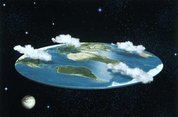
Bruno Giordano burned at the stake Armstrong EconomicsFreedom of Speech is essential in all fields, especially science. We need a fresh and open investigation otherwise we are just ignorant and assume the Earth is flat because heaven is up and hell is down so there can be nothing round. Nothing in this universe is constant – we live in a dynamic environment. It is time to stop the nonsense and explore the real universe. That is how we learn. The argument that the Earth had to be flat was the lack of understanding of gravity and they burned Bruno alive at the stake for saying simply that the sun was the center of our solar system – not the earth. The Global Warming fascists are at it again and have sought to prosecute anyone who disagrees with them.

Inconvenient Facts About Global Warming | Alex Epstein and Stefan Molyneux


The 97% Consensus? Global Warming Unmasked!


Trump scrapping NASA climate research division in crackdown on ‘politicized science’ 


Finally some sanity

oldbrew's avatarTallbloke's Talkshop

nasalogo
It looks more like ‘winding down’ at this stage, but ‘scrapping’ eventually. Not unexpected, if it goes ahead as suggested.
H/T Europe Breaking News

Donald Trump is poised to eliminate all climate change research conducted by Nasa as part of a crackdown on “politicized science”, his senior adviser on issues relating to the space agency has said.

Nasa’s Earth science division is set to be stripped of funding in favor of exploration of deep space, with the president-elect having set a goal during the campaign to explore the entire solar system by the end of the century. This would mean the elimination of Nasa’s world-renowned research into temperature, ice, clouds and other climate phenomena.

View original post 163 more words

Is Europe the new Destination for the North Pole?


Lettuce Frozen

I explained that the poles of the Earth move. On the Sun, they flip every 11 years and that is part of the Sunspot phenomenon. The poles are by mo means constant. They migrate routinely. However, about the time that Global Warming appears to have peaked, the poles also shifted direction in 2000. The North Pole mysteriously changed direction and began moving eastwards of the Greenwich meridian but at a shocking near twice its previous speed.

For most of the 1900s, the physical North Pole was moving westwards around 10 cm each year towards Canada’s Hudson Bay. Then all of a sudden, in 2000, it changed direction moving 75 degrees eastwards and began moving east at a rate of around 17 cm annually. Nobody has ever witnessed such a change. This is completely unprecedented!

The North Pole was previously in Hudson Bay about 54,000 until 48,000 years ago at 60 N and 83 W. Perhaps it is like lightening and just never strikes twice in the same spot. Now it is instead moving toward the British Isles according to NASA. Magnetic poles are defined in different ways but are commonly understood as positions on the Earth’s surface where the geomagnetic field is vertical. These north and south positions, called dip poles, do not need to be opposite of each other. In 1831, James Clark Ross located the north dip pole position in northern Canada. Natural Resources Canada (NRCan) tracked the North Magnetic Pole, which is slowly drifting across the Canadian Arctic, by periodically carrying out magnetic surveys to reestablish the Pole’s location from 1948 to 1994. An international collaboration, led by a French fundraising association, Poly-Arctique, and involving NRCan, Institut de Physique du Globe de Paris and Bureau de Recherche Geologique et Miniere, added two locations of the North Magnetic Pole in 2001 and 2007. The most recent survey determined that the Pole is moving approximately north-northwest at 55 km per year.

Netherlands Canals Freeze

This rapid movement is striking. But the directional change is even more alarming for Europe. The summer in Europe barely saw many real scorching hot days but the winters are getting colder. In 2012, even the waterways in Venice were icing over. Germany relies upon its canal system to move goods and agriculture. In 2012, the canals froze. The canals in the Netherlands were not freezing during the winter during the global warming period. That changed in 2009. Hamburg was frozen to the bone in 2010.

1709 Deep Freeze

Europe is rapidly turning colder much faster than expected. The real deep freeze for Europe came about 300 years ago and is known as the Deep Freeze of 1709. In the first few months of 1709 remained in a deep freeze for months. People were ice-skating on the canals of Venice. People could cross the Baltic Sea on horseback because it was completely frozen! You could not ring a church bell because it would shatter it was that cold. The length of the deep freeze has always been a mystery.

global warming

However, go to a museum that shows the changes in clothing. This illustration may be funny, to a large extent, it is true. Things were a lot colder 300 years ago and we are headed back in that direction.

The Southern region like Australia will see it get warmer in summer as Europe gets cooler in the winter. Things are changing much more rapidly ever since the North Pole reversed and changed direction moving at 55 km per year back in 2000.

NOAA Continues to Try to Justify Its Criminal Activity


Global Warming -5

The NOAA is now claiming that independent studies confirm they are right and that global warming is real. The claim only reveals once again how dishonest the NOAA is really acting. This new compilation of temperature records they say is etched into ice cores, old corals, and lake sediment layers, all reveals a pattern of global warming from 1880 to 1995. They are criminally misleading everyone for there is no dispute that there is a 300 year cycle to the energy output of the sun and the last low was in the 1700s so we have been moving into a natural warming cycle that has now peaked.

The NOAA says this finding, reported by a team of researchers from NOAA’s National Climatic Data Center, the University of South Carolina, the University of Colorado, and the University of Bern in Switzerland, resolves some of the uncertainty associated with thermometer records.

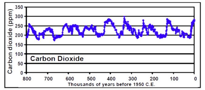
global-warming-cyclical800000 carbon800,000-year Ice-Core Records of Atmospheric Carbon Dioxide (CO2)

Nobody disputes this fact, The problem has been the NOAA claiming it is CO2 created by humans that is to blame ignoring the long historical record of climate change. What they are doing is no different than looking at the Dow Jones Industrial Index starting at 1932 and concluding that the market always moves higher and no depressions exist. 1880-1995 is not even one cycle of the sun. The data going back 800,000 years shows there is a cycle even to CO2 long before humans built cities.

global-cooling

The NOAA continues to hone in just on the modern period and refuses to test the analysis long-term. They continue to mislead people that our greatest danger is that we are headed into a mini-ice age and that means food shortages, which are beginning to see hit Europe this very year. They seem to be deliberately trying to mislead the public to thin the herd.

Migrating Poles


Pole

COMMENT: Your stance on the global climate is absolutely correct. Global temperatures remain in a serious downtrend since the Minoan peak. As the Greenland ice cores show, today’s climate is COLDER than 90% of the past 10,000 years! The warming zealots are screaming about CO2, which has risen sharply in the last 150 years (well above the long-term trend of the last several million years). But the temperatures are near the bottom of the range of the last 10,000 years! The assumption has been that CO2 causes warming, but if that were true, the data would back it up, and it does not at all. From the Vostok ice core, we know that we remain (very fortunately) in an inter-glacial period, which began about 11,000 years ago, and that the previous inter-glacial ended about 100,000 years ago (that inter-glacial was much warmer than our’s – remains of hippopotamus from that time period have been found in Britain!). We are likely much closer to the end of the current inter-glacial than to it’s beginning, and when it finally runs out of steam the climate in which we have lived will not be seen again for about 100,000 years (and sea level will be 300 feet lower).

JD

REPLY: Generally, most people do not even know that the North Pole moves. If you have ever studied geology, rocks are magnetized to where the North Pole lies when they are formed. We know for a fact that the North Pole has shifted several times in the last 120,000 years. We know that 120,000 years ago the North Pole was in the territory of Yukon in Canada at 63 N and 135 W; then it went to the Greenland Sea at 72 N and 10 E about 84,000 years ago, moved from 54,000 until 48,000 years ago and settle in the middle of Hudson Bay at 60 N and 83 W; it rested there for 30,000 years, then wandered once again from about 18,000 to about 12,000 years ago when it came to its present location. However, there are actually four poles, which most people are never taught in school.

Keep in mind that about 100,000 years ago, homo sapiens arrived in the Middle East and about 50,000 years ago, they arrived in central Asia. Human progress has been to a large extent made possible by the inter-glacial period. Evidence from geomagnetism and continental drift, have failed to explain the ice ages and climatic changes such like the sudden melting of the ice sheets or the violent and rapid extinctions.

Recently F. Barbierio (1999) addressed the pole shift hypothesis by arguing that the Earth’s poles could be rapidly shifted due to the impact of objects from space as small as about a third of a mile diameter asteroid. Former NASA engineer Maurice Chatelain (1988) argued that during the Hudson Bay period (48,000 to 18,000 years ago) the equator was in fact 30 degrees further south in South America. It most likely passed through central Chile and Argentina. Antarctica was most likely free of all ice.

We tend to assume that the way the world is today means it always was that way. Human recorded history is only about 6,000 years. Humanity is nothing within the scale of things regarding geology. So we do not comprehend how fast the Earth can change and we seem to be so arrogant to think we possess even the power to alter the climate if we choose to. The powers that be have been distorting pollution with climate change misleading people for political gain. I lived in London back in 1985. The stench from buses burning diesel fuel was terrible. It would make your eyes water at times. That’s been cleaned up. We all want clean air and water. But do not distort that into climate change when we better be concerned about everything turning much colder. When it turns colder, migration is unleashed and starvation thins the herd. Civilization declines. Right now it is moving toward London and Europe is turning very cold.

Has the Extinction Cycle Also Turned Against Us?


Marine Extinctions

QUESTION: Martin,
I have a question that is well outside your usual realm of discourse, so please bear with me as I explain.
I have just returned from visiting my friend, who is a senior cetacean biologist at one of the large west coast universities. While there, he described an amazing situation to me that has alarmed me greatly. He said that research at his university has conclusively identified the complete or almost complete collapse of several dozen food chains within the Pacific Ocean, all within the last 36 months or so. Further, in “unauthorized” exchanges with the relevant departments in other coast universities, he learned that the numbers involved may well be more like hundreds of chain collapses in the same timeframe as opposed to dozens. Finally, in talking with authoritative figures in Vancouver, they apparently believe that the figure is likely closer to 1000. My friend also explained that equally alarming is the fact that all these research departments are finding within the genres of sea life they have physically examined within the same timeframe “huge numbers of general body mutations, as well as skin disorders” which all cannot yet be accounted for in terms of causation.
As bad as all of this sounds, here is the real rub. Regarding these findings about food chain collapses, mutations, and injuries, my friend’s university has instituted a policy that forbids them from publishing their findings, from discussing their findings (on this subject) publicly or in private with other researchers outside their own campus, or finally from taking “unauthorized” radiation readings as part of their research. The penalties for violating these new rules are severe: loss of tenure, civil lawsuits for violation of contract, and potentially employment termination. He showed me a memo on the subject from her own university, so there is no doubt about that in my mind. For the part about colleagues at other universities encountering the same things, I have nothing but my his word but that is good enough for me.

I have never viewed myself as an alarmist or a conspiracist, and I know that he is neither of those things; he is someone who has always been dedicated to the scientific method and to facts. However, despite the preposterous look of this thing I must say that I feel something is badly wrong here. In doing some quick research on all of this, I have indeed found quite a number of articles from mainline sources talking about massive food chain collapses in the Pacific, but not quite on the scale my friend’s colleagues have suggested, and nowhere is any of this said to be possibly connected to radiation from Japan.
Martin, I have read your writings for some five years now, and at least as far as the subjects I believe I am qualified to render judgment on, I have never known you to be wrong about anything. This is much more than I can say about any press outlets or pundits. As a result, I feel compelled to put the question on this matter to you. Do you have any information derived from correlated computer data, or from your personal contacts that can shed any meaningful light on the situation described?
As always, please know that all your work and public disclosures are a boon to us all, and are deeply appreciated.

RT

ANSWER: I have been keenly aware of this crisis and have been running studies on it to test where this impacts the timeline. The greatest Marine extinction is known as the Permian–Triassic period. Evidence exists for environmental change around boundary suggests that there was an 8 °C (14 °F) rise in temperature, and an increase in CO2 levels by 2000 ppm. This is also one major factor that demonstrates the Global Warming people are not only dishonest since the CO2  concentration just before the industrial revolution was 280 ppm compared to present is 400 ppm. We are talking here about serious volcanic activity to have pushed the CO2 levels to 2000 for that extinction. However, there is also evidence of increased ultraviolet radiation reaching the earth, causing the mutation of plant spores at that time.

There are some who believe the mutations and dead was set in motion by the nuclear disaster in Japan. The data I have run demonstrates that we are headed toward another spike in the extinction cycle. This is entirely normal cyclical activity. We have entered 26 million years from the last historic low. This is when we should see a large spike. I am certainly willing to input data into our systems to see what emerges if anyone has more detailed near-term data that can possibly be extrapolated to see if there are cycles within cycles. If we could hone this series down to target at least decades, that would be great. So far, we have been able to make crude projections that may place the worst of this between 2032 and 2072.

Obviously, man may be aggravating the cycle increasing the amplitude, but there is no evidence that this cycle is set in motion by humankind. This appears to be a natural cycle at this point. The sardine biomass, which is the primary prey for so many marine species, has also collapsed to its lowest level in six decades. There are normal ocean regions that are naturally low in oxygen. However, these regions have been growing exponentially. They have expanded both horizontally and vertically. This has now incorporated rather extensive portions of the eastern Pacific, almost all of the Bay of Bengal, and an area of the Atlantic off West Africa as broad as the USA. These low oxygen areas have expanded by more than 1.7 million square miles in the past 50 years.

We may be dealing with Murphy’s Law – whatever can go wrong, is going wrong.

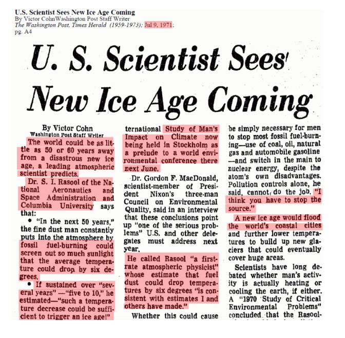
Scientists First Predicted Ice Age – Not Global Warming in 1971


Washington Post - Ice Age

http://pqasb.pqarchiver.com/


Back in 1971, the theory that burning fossil fuels would create an ice age, not global warming. The Washington Post reported on July 9, 1971, that Dr. S. I. Rasool of NASA and Columbia University said that the fine dust from fossil fuel use would block out so much sunlight that the Earth’s “average temperature could drop by six degrees.” Rasool went on to argue that “such a temperature increase could be sufficient to trigger an ice age!”

1816 Year Without a SummerScientists with time figured out that this would not happen on any permanent basis. After all, when a volcano erupts, it hurls up ash which does block the sun. The major event of Mount Tambora  eruption  in 1816 threw into the air so much ash that it snowed during the summer in New York City. It became known as 18-hundred-and-froze-to-death. This account from history tells the story that 1816 was a year when the sunlight could not penetrate the natural pollution from Tambora. As a result of a volcanic eruption at Mount Tambora in Indonesia, weather patterns were disrupted worldwide for months, allowing for excessive rain, frost, and snowfall through much of the Northeastern U.S. and Europe in the summer of 1816. The global cooling altered the natural weather and it resulted in a serious food shortage that set off a mass migration from New England to the Midwest within the USA as people were trying to find the sun like me moving to Florida.
The theory that burning fossil fuels would also throw up pollutants from burning coal and other fuels thereby reflecting solar energy back into space, was not plausible since it would settle down just as it does in a volcano. Then on May 18, 1980 ,when Mount St Helens erupted triggering the largest avalanche in history, it released destructive magma and suffocating ashes, proving itself that it is a volcano is more devastating that burning fossil fuels. Mount St Helens is part of the Pacific Ring of Fire and it is now respected that should there be a plate shift, the volcano eruptions could be devastating beyond the local region.

On that fateful day in 1980, approximately 80,000-feet of ash plume ascended to the sky. Simultaneously, very hot pyroclastic flows wiped out every living thing on its path at 50 to 80 miles per hour. More than 7,000 animals died and 57 humans. For the next nine hours, it seemed houses and buildings to bridges and highways, were burned and buried in deep lava mixed with snow. Then came the 1991 eruption of Pinatubo which produced about “5 cubic kilometers of dacitic magma and may be the second largest volcanic eruption of the century. Eruption columns reached 40 kilometers in altitude” creating a giant umbrella cloud. What was more shocking, the pollution it produced took only 3 weeks to engulf the world and indeed produced cooling – not warming.

CO2 Cycle

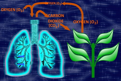
Scientists were worried that such man-made aerosols would block out so much sunlight that global temperatures would drop — just like how volcanoes can cause some atmospheric cooling. This theory all proved to be false. Where volcanos produce mostly SO2, they needed a new villain and that became CO2. But CO2 was something every grade school child learns about. Indeed, the very first time we learn about carbon dioxide was in grade school. We breathe in oxygen and breathe out carbon dioxide. Any eight-year-old can rattle off this fact. So how did they manage to take CO2, which is vital to the system, and turn this into the villain?

When the global warming crowd has been pointing at reducing our carbon emissions from the burning of fossil fuels, what they are really talking about behind the curtain is reducing population since we are a major exported of CO2. They are not telling everyone their real goal so they do not want to talk about how they are not taking into account the other half of the carbon cycle. As you also learned in grade school, plants are the opposite to animals in this respect. Through the process of photosynthesis, plants take in carbon dioxide and release oxygen, in a chemical equation opposite to humans. Plants also perform some form of respiration, since they too need to eat as well, but it is outweighed by the photosynthesis. The carbon they collect from the CO2 in the air forms their tissues composing roots, stems, leaves, and fruit. This enters our food chain as they are eaten by animals, including us, which are eaten by yet other animals, including us. Therefore, as humans, we are part of this food chain. All the carbon in our body comes either directly or indirectly from plants, which took it out of the air only recently.

The natural way to offset CO2 would be to grow more trees and plants. They way global warming has become a religion, one would think the goal would be to eliminate all CO2. To accomplish that, we need to start thinning the herd. So the fear of global cooling was converted to global warming and the environmental agenda behind the curtain is to eliminate someone’s grandchild.