QUESTION: Mr. Armstrong; I too must agree that somehow we should put your computer in charge. You get the timing right on everything that includes disease and even weather. You have proven beyond a shadow of a doubt that everything is connected. We have trade wars brewing and civil unrest with the prospect that war will come but in the Middle East, not Korea as you stated in a recent interview. Will these Global Warming people be the same a politicians and refuse to admit that they are ever wrong?
HN
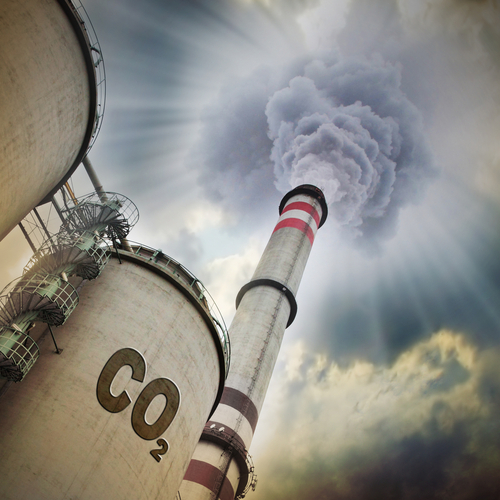
ANSWER: Unfortunately, the Global Warming people were handed $1 billion for their pretend research. They will NEVER admit that they have manipulated the data to justify their pretend science. If they came out and admitted the truth, assuming they would never be charged criminally for fraud as they should be, their funding would be cut off. Once you pay these people mountains of cash, there is no way they will reveal that there is no Global Warming. So the cold now they also attribute to Global Warming that they changed the words to Climate Change, and attribute “volatility” to the human activity itself. It is amazing. We cannot carry out Keynesian-Marxist manipulation of the economy, but we can manipulate the entire climate of the planet.
A lot of people will die because of these pompous money-grubbers who will prove to be the real Harbingers of Death.
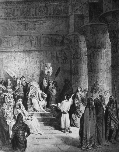
At least when Joseph interpreted the Pharaoh’s dream, he listened, and save countless lives. Today, these false prophets will ensure we are not prepared for the cold and a lot of people will die from disease and starvation. That trend alone has also contributed to creating war. On top of that, there are people who simply refuse to listen. They will not move and soon as interest rates rise, they will be unable to sell their homes and then will be trapped.
The analysis and plots shown here are based on the following two data series. First NASA-GISS estimates of a global temperature shown as an anomaly (converted to degrees Celsius) as shown in their table Land Ocean Temperature Index (LOTI) and shown in Chart 1 as the red plot labeled NASA the scale for the temperatures is on the left. The NASA LOTI temperatures are shown as a 12 month moving average because of the large monthly variation. Second NOAA-ESRL Carbon Dioxide (CO2) values in Parts Per Million (PPM) which are shown in Chart 1 as a black plot labeled NOAA the scale for CO2 is shown on the right.
NASA published data as stated in the first paragraph is shown as an anomaly, but what is a temperature anomaly? An anomaly is a deviation from some base value normally an average that is fixed. There were two problems with the system that NASA picked which were number one there is no “actual” global temperature and two since climate is a variable there cannot be a real base to measure from. NASA known for its science and engineering expertise back in the day thought it could get around these issues and created a system to do so. First they developed a computer model which took readings from all over the planet and made required adjustments to them which they called homogenization and came up with the estimated global temperature. Second they picked the period 1950 to 1980 (30 years) and averaged the values found in that period and came up with 14.00 degrees Celsius and make that their base. Then they took the calculated monthly temperature and subtracted the base from it which gave them the anomaly. The problem is that both are arbitrary.
Now that we have a base to work with we are going to add to Chart 1 three things. The first is a trend line of the growth in CO2 since that is according to the government through NASA and NOAA the entire basis for climate change. That plot is superimposed over the black plot of the actual NOAA CO2 values as the cyan line labeled as the CO2 Model and one can see there is a very good fit to the actual NOAA values so there should be no dispute about its validity, and it’s historically accurate. This plot allows us to make projections to future global temperatures according to the projected level of CO2 . The second added item is James E. Hansen’s 1988 Scenario B data, which is the very core of the IPCC Global Climate models (GCM’s) and which was based on a CO2 sensitivity value of 3.0O Celsius per doubling of CO2. This plot is shown here in lavender and is part of a presentation that Hansen showed to congress in 1988 when the UN was about to set up the International Panel on Climate Change (IPCC) and this plot is labeled as Hansen Scenario B which Hansen stated was the most likely to happen based on his 1979 climate theories’. The third item is the current plot of the most likely temperature of the planet based on the growth of CO2 published by the IPCC. This plot is shown in Red and is labeled as IPCC AR5 A2 as that is the table where the data was found. This plot is a GCM computer projection of the planets temperature based on the complex relationships developed on the levels of CO2 by the IPCC primarily though NASS and NOAA.
It can be seen in Chart 2 that the lavender plot and the Hansen plot are very close from 1965 to around 2000 after that, from 2000 to 2014, there is a very large and deviation reaching close to .5 degrees Celsius in 2015, which is not an insubstantial number. Also of note is that there doesn’t seem to be a good correlation between the growth in CO2 and the increase in the planets temperature. The CO2 is going up in a log function and the Temperature was going down until 2015 and then there was a mysterious spike up. That unexplained change in temperature direction appeared to have occurred between 2013 and 2014 and is the subject of this monthly paper.
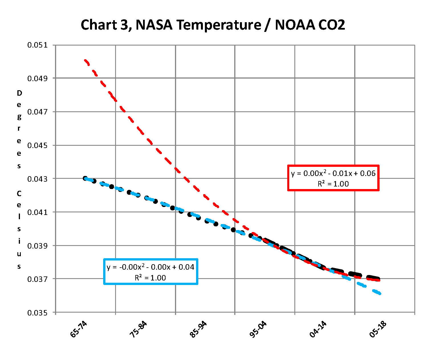
Next we have Chart 3 which is developed from the raw data from NASS and NOAA as shown in Chart 1. This plot was made first by adding ten years blocks of temperature and CO2 as indicated in the Chart 1 and diving by 120 to give an average for each. Then the average Temperature was divided by the average CO2 to give degrees of temperature increase per PPM of CO2. After that was plotted it appeared that there were two different curves. The first was from block 1965-1974 through block 2004-2014 shown as Black Dots and the second was from block 1995-2004 through block 2005-2017 shown as Black Dashes. When trend lines were added they were both almost perfect fits to the raw data and so you cannot see the data points very well on Chart 2. These blocks were picked to represent the entire period of time where we had both NASA temperature data and NOAA CO2 levels.
On Chart 3 there are two sets of color coded information. The first is Cyan plot and the Cyan box with the equation in it along with the R2 value of 1.0 are for the first series from block 1965-1974 through block 2004-2014. The other is the Red plot and the Red box with the equation in it along with the R2 value of 1.0 which are for the first series from block 1965-1974 through block 2004-2017. We can speculate on how this change happened but it can’t be said that the plot change is not real; however additional data will be required to actually prove that something has changed.
In summary the Cyan data set indicates a diminishing effect of CO2 on global temperature for about 54 years and the Red data set represents an increasing effect of CO2 on global temperature for the past 3 years. Since both data sets have an R2 value of 1.00 the trend lines cannot be in question.
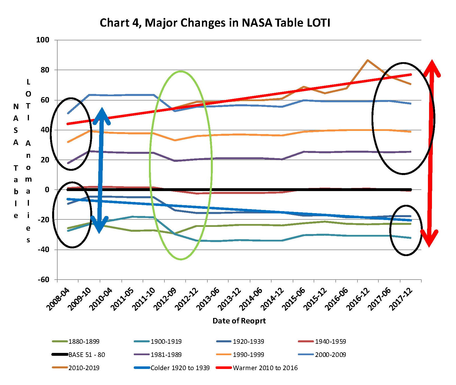
Continuing the analysis of what happened to the NASA data in table LOTI from Chart 3, the following Chart 4 was constructed from the same NASA data. It’s very sad to say but it seems to prove without much doubt that the global temperatures have been manipulated by NASA probably at the request of the federal government such that a case could be made for supporting the COP21 Paris climate conference in December 2015 by showing that the earth was much hotter than it actually was. The dates on the x axis are the date of the NASA LOTI download file. The plots for specific date groupings are set such that one can see what that date range did in each separate NASA download. The proof is shown in Chart 4 below and a discussion will follow below Chart 4 on how Chart 4 was constructed.
At the bottom of Chart 4 is a blue trend line of NASA LOTI temperatures prior to 1950 and starting in2012 the values started going down, getting colder. At the same time the NASA LOTI temperatures from 2012 to the present went up as shown in the red line. There was no change in the base period, black line. This cannot happen with random variables they will cancel each other out; this could only be caused by specific program changes in the process that NASA and NOAA use, in other words it is intentional. So there can be no other reason but an attempt to support the adoption of the Climate accord agreement by the administration, and they were successful as it was agreed to in Paris at COP21.
How this table was constructed is important so a discussion is needed. As stated in the opening paragraph of this paper NASA publishes a table of the estimated global temperature each month as anomalies from a base of 14 degrees Celsius. This table starts with January 1880 and runs to the current date. The new table typical comes out mid-month with the values for the previous month and for December 2017 there were 1,656 values. The process that is used to create this Table is very complex and is called homogenization. What that means is that the entire table is recreated each month and what that also means is that the temperature value for any given month is a variable.
When I realized the extent of that in 2012 I started to save the printouts of the NASA LOTI tables and I went back and found a few of them from when I started this project in 2007. When I started this project what I did is type in all the values from the NASA table into a spreadsheet each month which was a daunting task and I was very happy when NASA started to publish a csv file along with the text of the LOTI data. Then all I had to do is create a routine in excel that would turn the table format into a column format. There are now 65 months in the spreadsheet, when I started this method in 2012 there were maybe only a dozen. The values are residing in the spreadsheet as columns going from left to right so that the individual months are lined up side by side. This makes comparison of months very easy. One note is required here, when I started this model in 07 and for several years thereafter all I was doing is adding the current NASA LOTI current months number to the existing file, a single column, and it never occurred to me that the prior numbers were changing. The past was fixed, so I thought. This was also the way I was entering the NOAA CO2 data which doesn’t change over time.
The original goal was to see if the changes were just random or rounding errors. If that was so then they would wash out over time especially if I grouped the monthly data into blocks. I’ve used both 10 year (120 values) and 20 year (240 values) blocks which would be enough to maintain a fixed number if it was random or rounding. What I found was something quite different after I had a dozen or so columns in the spreadsheet, it appeared that NASA was making the past colder and the present warmer. And the purpose of the previous two Charts 3 and 4 is to show the result. Chart 4 is a bit complex but I have not found a better way to show what happened.
From 1880 to 1960 I used four 20 year blocks. Then I needed the base so there is a 30 year block from 1950 to 1980 and lastly four 10 year blocks from 1980 to the present. The last block is not yet complete as it will run to December 2019. Because the 30 year base block is fixed at 14.0 degrees Celsius there wasn’t much point in charting those individual yearly values even though there was some minor movement in those numbers. That raises an interesting issue for how can the base numbers not change and all the other numbers from 1880 to 2017 can change each month? A note, for each data set of years the plot on Chart 4 should be a straight line from left to right; very minor fluctuation would be OK. For example the plot for 1930 to 1949 (hidden behind the black plot) is what would be normally expected. This is the only plot that doesn’t show major manipulation.
In the four data sets in the 1880 to 1940 blocks in Chart 4 all have moved down probably about a .25 degree Celsius which is not insignificant. So the bottom line is that NASA made all the values from 1880 to 1940 colder by an average of a quarter of a degree Celsius. So that alone accounts for a high percentage of the supposed global warming that NASA shows. From 1980 to 2009 the data change appears to add another .1 degrees Celsius making the apparent differential between data from early 00’s to the present about .35 degrees greater than it was before 2009. That is not random that is a major change and clearly shows manipulation. I would probably never had caught this is if I hadn’t put the values in column format. Looking at all the data from 2008 to 2014 we find that around 2008 NASA showed that the planet had warmed about .75 degrees, Blue double arrow, from the 19th century. Then in 2014, four years later NASA showed that the planet had warmed about .95 degrees Red double arrow from the 19th century. However it gets a worse after that.
The change started in 2012, Green Oval, and Global temperature jumped almost a quarter of a degree by December 2015 just as the COP21 conference was in session. The temperatures kept going up with an eventual increase in global temperature of about 1.2 degrees Celsius in late 2016. At that point with the pressure off NASA appears to be erasing what they did as the global temperatures have now started back down. I’m not sure how many know of this blatant manipulation but it is serious. This is not science.
Now we need to consider other factors than CO2 on Climate change. The fault that occurred in the work that was done in the 1980’s was in assuming that there was an optimum or constant global temperature and therefore any change that was being observed was from the increasing amount of CO2 in the atmosphere. There may have been correlation but it was never proved that there was causation (high R2 value) between CO2 and global temperatures; Chart 3 clearly shows there is not. With that assumption, which limited options, we moved from true science into the realm of political science. True science has an open mind and finds relationships that work in matching observations with predictions. Political science changes history and/or facts to match the desires of the politicians. Since the politicians control the money political science is what we get; which means that what we get may not be technically correct.
A decade ago when I started looking at “climate” change the first thing I did was look at geological temperature changes since it is well known that the climate is not a constant; I learned that 53 years ago in my undergrad geology and climatology courses in 1964. The next paragraph explains currently observed patterns in climate related to this subject and is historical accurate.
Ignoring the last Ice Age which ended some 11,000 years ago when a good portion of the Northern hemisphere was under miles of ice the following observations give a starting point to any serious study on the subject of climate. First, there is a clear up and down movement in global temperatures with a 1,000 some year cycle going back at least 3,000 to 4,000 years; probably because of the apsidal precession of the earth’s orbit of about 20,000 years for a complete cycle. However about every 10,000 years the seasons are reversed making the winter colder and the summer warmer in the northern hemisphere. 10,000 years from now the seasons will be reversed again. Secondly, there are also 60 to 70 year cycles in the Pacific and the Atlantic oceans that are well documented. These are known as the Atlantic Multi Decadal Oscillations (AMO) in the Atlantic and as La Nina and El Nino in the Pacific. Thirdly, we also know that there are greenhouse gases such as carbon dioxide that can affect global temperatures. Lastly the National Academy of Sciences (NAS) estimated that carbon dioxide had a doubling rate of 3.0O Celsius plus or minus 1.5O Celsius in 1979 when there were only two studies available and one for sure and maybe both were not peer reviewed.
The result of looking objectively at the three possible sources of global temperature changes was a series of equations based on these observations that when added together produced a sinusoidal curve that seemed to follow NASA published temperatures very closely when first developed in 2007, and modified a few years later when it was found the short and long cycles were related to multiples of Pi. Since this curve was based on observed temperature patterns it was called a Pattern Climate Model (PCM) which has been described in previous papers and posts on my blog and since it is generated by “equations” many assume it is some form of least squares curve fitting, which it is not. It does seem to be related to ocean currents where the bulk of the planet’s surface heat is stored.
Chart 5 shows the PCM a composite of two cycles and CO2. There is a long trend, 1036.7 years with an up and down of 1.65O Celsius (.00396O C per year) we in the up portion of that trend. Then there is a 69.1 year cycle that moves the trend line up and then down a total of 0.29O Celsius and we are now in the downward portion of that trend (-.01491O C per year), which will continue until around ~2035. Lastly, there is CO2 currently adding about .0079O Celsius per year so together they all basically wash out at -.0039O C per year, which matches the current holding pattern we were experiencing until 2014. After about 2035 the short cycle will have bottomed and turn up and all three will be on the upswing again duplicating what was observed in the 1980’s. Note: the values shown here are only representative from what is in the model.
When using a 12 month running average for global temperatures up until 2014 the PCM model was within +/- .01 degrees of what NASA was publishing in their LOTI table since the early 1960’s as shown in Chart 5. Further the back projection of the PCM plot matched historical records and global temperatures going back past the time of Christ. It should also be considered that geologically CO2 levels have reached levels many times that of the current 400 ppm without destroying the planet so the current hysteria over the current very small numbers can only be explained by political science not real science.
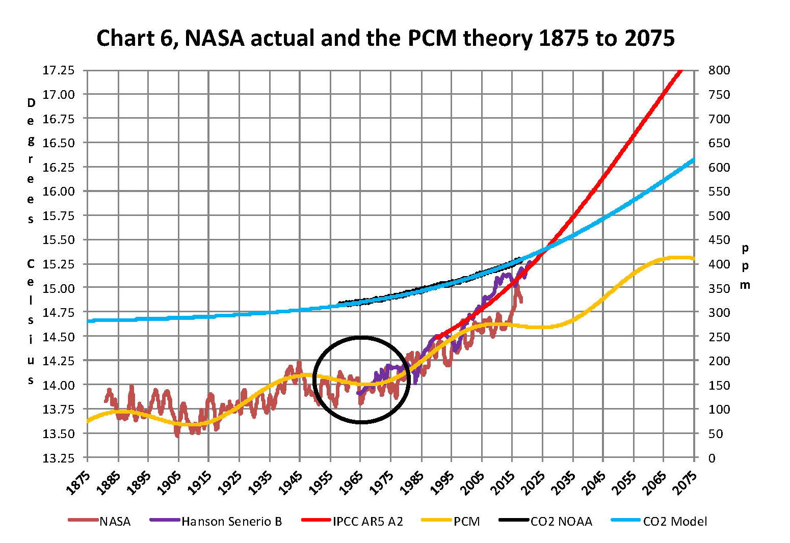
The nest step in this analysis is to put all of the known data and projections into Chart 6 which contains: NASA’s temperatures plot, NOAA’s CO2 plot, the CO2 model plot, the PCM model plot, Hansen’s Scenario B plot, and lastly the IPCC AR5 A2 global temperature plot. With that done we can look at the results and try to make some sense of what is going on with the various arms of the federal government that are promoting that we tax carbon based fuels to eliminate them since they are responsible for the global temperature level going up. As previously stated when the government pours money into the sciences the sciences respond with technical papers the support the governments views, this is what I call political science verses real science as was done prior to the 1980’s; money talks and BS walks as everyone on the street knows.
Chart 6 shows a good overview and contains no data manipulation and the only change that was made was to convert the NASA anomalies back to degrees Celsius to make it more readable to lay people. This is only a change in units and has no bearing on the look. We also need to understand the NASA homogenization process and its relationship to the 30 year base period. The portion in the black circle contains the NASA base period of 14.00 degrees Celsius and the reason it’s brought up here is that the Homogenization process causes the global temperatures to move around since the entire data base all the way back to 1880 is recalculated each month. But since the base has to stay at 14.00 degrees Celsius the program must be set to not allow changes in that period of time. I’m sure the programmers have fun with that. Prior work here has shown how this creates a teeter totter effect with the data plots, some of which have recently been significant.
Next Chart 7 looks at the period from 2010 to 2020 so we can see where a change in CO2 of only a few ppm has caused a major change in the global temperature way beyond anything previously shown in any published NASA data. There are two black ovals on Chart 7 one at the top of Chart 7 which is a black oval around the CO2 levels from 2012 to 2016 and part of 2017 and it’s very obvious that there has been very little change, maybe 7 ppm or about 1.9%. Then at the bottom of Chart 7 is another black oval around the NASA global temperature levels for the same period and its very obvious that there has been a large change, almost .50 degrees Celsius or about 3.1%. There has never been such a large increase in temperature from such a small increase in CO2. By contrast the previous comparable period of the last part of 2010 through 2013 shows about the same increase for CO2 at 1.1% but no increase for global temperature but actually small decrease.
Clarification is needed here as the plot seems to show the jump in temperature in 2016 not 2015; this is a result of the large jump in temperature shown by NASA. Since we are using a 12 month moving average and the increase occurred in only a few months it actually shifted the curve into 2016. The raw data for December 2015 showed the temperature at 15.12 degrees Celsius compared to December 2014 where it was 14.78 degrees Celsius. The actual peak was in February 2016 at 15.35 degrees Celsius. With the global temperature over 15.0 Celsius at COP21 the climate accord was approved and the manipulation was a success. After COP21 the need for Fake Warming was no longer needed and so we are now seeing a downward trend developing.
In summary, the IPCC models were designed before a true picture of the world’s climate was understood. During the 1980’s and 1990’s CO2 levels were going up and the world temperature was also going up so there appeared to be correlation and causation. The mistake that was made was looking at only a ~20 year period when the real variations in climate all move in much longer cycles of decades and centuries. Those other cycles can be observed in the NASA data but they were ignored for some reason. By ignoring those actual geological trends and focusing only on CO2 the Global Climate Models will be unable to correctly plot global temperatures until they are fixed. Also the temperature data from 1850 to 1880 was dropped for some reason as it showed a lower temperature that supported the PCM cycle shown in this paper.
In summary we have Chart 8 which shows why CO2 is not increasing the temperature of the planet by any meaningful amount. The problem, intentional or not, goes back to physics and how we show information. It’s critical that when we talk to nonscientists that information is properly displayed. And nowhere is this more important than when we are discussing temperature. When we talk about weather and local temperatures its going be in Celsius (C) in the EU or degrees Fahrenheit (F) in America e.g. for the base temperature that NASA uses it’s 14.00 C or 57.20 F; but these are both relative measures and do not tell us how much heat (thermal energy) is there. To know that we must use Kelvin (K) and that would be 287.150 K and all three of those numbers 14.00 C, 57.20 F, and 287.150 K are exactly the same temperature, just using a different base. But if the current temperature is 15.00 C that is a 7.1% increase in C, a 3.1% increase in F and a .35% increase in K; so which one is real? The answer is .35% because Kelvin is the only one that measures the total energy!
To show this graphically Chart 8 was constructed by plotting CO2 as a percentage increase from when it was first measured in 1958 the Black plot, the scale is on the left and it shows CO2 going up about 28.5% by February of 2018. That is a large change as anyone would agree. Now how about temperature, well when we look at the percentage change in temperature using the proper units Kelvin we find that the changes in global temperature are almost unmeasurable. The red plot, also starting in 1958, shows that the thermal energy in the earth’s atmosphere has varied by less than +/- .17%; while CO2 has increased by 28.3% which is over 80 times that of increase in temperature. So is there really a problem here?
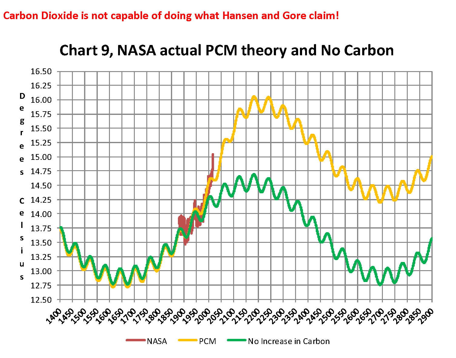
Lastly, Chart 9 shows what a plot of the PCM model, in yellow, would look like from the year 1400 to the year 2900. This plot matches reasonably well with recorded history and fits the current NASA-GISS table LOTI data, in red, very closely, despite homogenization. I do understand that this PCM model is not based on physics but it is also not some statistical curve fitting. It’s based on observed reoccurring patterns in the climate. These patterns can be modeled and when they are, you get a plot that works better than any of the IPCC’s GCM’s. If the real conditions that create these patterns do not change and CO2 continues to increase to 800 ppm or even 1000 ppm then this model will work well into the foreseeable future. 150 years from now global temperatures will peak at around 15.750 to 16.000 C and then will be on the downside of the long cycle for the next ~500 years.
The overall effect of CO2 reaching levels of 1000 ppm or even higher will be about 1.50 C which is about the same as that of the long cycle. The Green plot on Chart 9 shows the observed pattern with no change in CO2 from the pre-industrial era of ~280 ppm. CO2 cannot affect global temperatures more than 1.500 C +/- no matter what the ppm level of CO2 is. The reason being that the CO2 sensitivity value is not 3.00 per doubling of CO2 but less than 1.00 C per doubling of CO2 as shown in more current scientific work and it’s a logistics curve not a log curve.
The purpose of this post is to make people aware of the errors inherent in the IPCC models so that they can be corrected.
The Obama administration’s “need” for a binding UN climate treaty with mandated CO2 reductions in Europe and America was achieved as predicted at the COP12 conference in Paris in December 2015. To support this endeavor NASA was forced to show ever increasing global temperatures that will make less and less sense based on observations and satellite data which will all be dismissed or ignored. Within a few years the manipulation will be obvious even to those without knowledge in the subject, but by then it will be to late the damage to the reputation of science will have been done.
In closing keep this in mind. The current panic generated by the government using political science is that the current global temperature of around 15.0O Celsius is an increase of 7.14% from the 1960’s when the global temperature was 14.0O Celsius; and that does seem like a lot. However those views would be in error as the actual increase in thermal energy, as measured by temperature, would be only .35% because we must use Kelvin not Celsius when working with heat energy. When we use kelvin the temperature goes from 287.15O K to 288.15O K which is only .35% not 7.14% about 1/20 of what is implied by the IPCC. What the IPCC shows is not technically wrong as much as it is extremely misleading to anyone without a very strong science background.
Sir Karl Raimund Popper (28 July 1902 – 17 September 1994) was an Austrian and British philosopher and a professor at the London School of Economics. He is considered one of the most influential philosophers for science of the 20th century, and he also wrote extensively on social and political philosophy. The following quotes of his apply to this subject.
If we are uncritical we shall always find what we want: we shall look for, and find, confirmations, and we shall look away from, and not see, whatever might be dangerous to our pet theories.
Whenever a theory appears to you as the only possible one, take this as a sign that you have neither understood the theory nor the problem which it was intended to solve.
… (S)cience is one of the very few human activities — perhaps the only one — in which errors are systematically criticized and fairly often, in time, corrected.
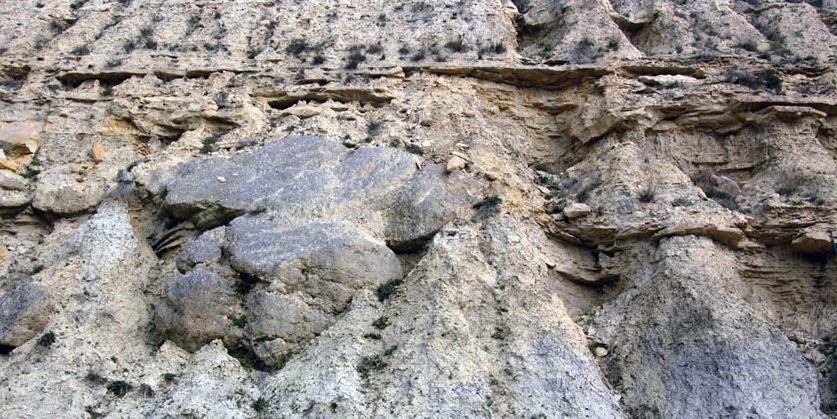
QUESTION: Enjoyed your article on The Persian Gulf and climate change. In a related topic we did a field trip once to the South of Spain and saw whole cliff faces of gypsum at Sorbas near Almaria. This very thick layer of gypsum is evidence that the Mediterranean Sea had once totally dried up. One explanation is that the Salinity Crisis in the Messinian was caused by tectonic plates shifting the Straits of Gibraltar closed, turning the Sea into an evaporite basin, leaving behind thick deposits of salt. Of course, this allowed migration of animals from Africa to Europe.
It is postulated that this could happen again in the future with the Mediterranean drying up in less than 1000 years. Any comment on this? Thanks a lot!
JW
ANSWER: Yes, that is something we have tried to work out a cyclical model. Most people are unfamiliar with the Messinian Event, and in its latest stage as the Lago Mare event. These were geological events during which the Mediterranean Sea went into a cycle of partly or nearly complete desiccation throughout the latter part of the Messinian age. This appears to have taken place between 5 and 6 million years ago which ended with a breach of that point at the Strait of Gibraltar resulted in a major flood where suddenly the Atlantic reclaimed the Mediterranean basin.
The Mediterranean is much saltier than the North Atlantic because it is virtually isolated by the Strait of Gibraltar. It has a very high rate of evaporation. When the Strait of Gibraltar closes again at some point in the future, the Mediterranean would mostly evaporate in about a thousand years or less. This would theoretically result in the rise of the Atlantic and Pacific oceans. Keep in mind that there is the ongoing northward movement of the African continent which could eventually drastically reduce the size of any future Mediterranean to just a lake.
The Mediterranean maintains its level depth simply because of the current inflow of Atlantic water. When that was shut off sometime between around 6 million years ago, this most likely allowed for the migration of people and animals from Africa northward into Europe.
We were investigating this event cyclically to see if it tied into the flipping of the poles, and that research was published in the Mayan Report. There was clearly a cyclically connection but it is impossible to say which causes which.
COMMENT: Hi Marty,
Climate Change: a great analysis as always.
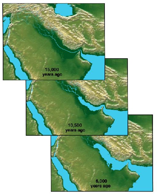
One point, if I may, is that no one really talks about the Persian Gulf, a shallow body of water, which most likely was dry land during the last Ice Age. Who knows what lies beneath, yet there is very little talk about exploring this area.
LL
REPLY: Oh you are very correct. The Persian Gulf is about 35 miles wide (56 km) at its narrowest, in the Strait of Hormuz. The Gulf is very shallow, with a maximum depth of 90 meters (295 feet) and an average depth of 50 meters (164 feet). The Persian Gulf was fertile dry land before the flood, which obviously contains very old cultures which may be older than anything known on dry land today. We do know that the Gulf has receded from where it once stood in ancient times following the flooding.
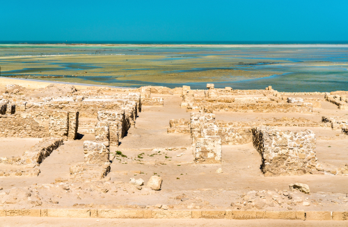
There is the legend of Dilmun (Telmun) that comes from Sumerian writings. This was an ancient Semitic-speaking city that is mentioned from the 3rd millennium BC onwards. Based on the records that have survived, Dilmun was located in the Persian Gulf. It was on a trade route between Mesopotamia and the Indus Valley Civilization. Dilmun was a major trading center which controlled the Persian Gulf trading routes. Dilmun was mentioned by the Mesopotamians as a trade partner and the major source of copper.
Ancient ruins at Bahrain Fort. A UNESCO World Heritage Site in the Middle East
There are two official letters from Dilmun dated about 1370 BC that were recovered from Nippur, during the Kassite dynasty of Babylon. There was some administrative relationship between Dilmun and Babylon at that time. There is also an early inscription that mentions Dilmun and speaks of the tribute that they brought to Ur-Nanshe, the first king of the first dynasty of Lagash, which was an ancient city located northwest of the junction of the Euphrates and Tigris rivers. Lagash (modern Al-Hiba) was one of the oldest cities of the Ancient Near East. The surviving inscriptions say: “The ships of Dilmun from foreign lands, brought him (Ur-Nanshe) wood as a tribute.” Kassite dynasty conquered and controlled Babylon between 1531 BC and until c. 1155 BC. After their collapse, the only mention of Dilmun comes from Assyrian inscriptions dated around 1150 BC which proclaimed the Assyrian king to be king of Dilmun as well.
Dilmun was a civilization that was quite an old civilization, yet because it appears to have been submerged in the Persian Gulf, it is much less famous than the four cradles of the civilization of the Old World, i.e. Mesopotamia, Ancient Egypt, the Indus Valley Civilization, and the Yellow River Civilization.
In literature, Dilmun occupies an important place in the mythology of Mesopotamia since it is in the second half of the Epic of Gilgamesh. Additionally, Dilmun is also mentioned in the myth of Enki and Ninhursag / Ninhursaja. In this story, Dilmun is presented as a sort of earthly paradise.
The flooding of the Persian Gulf has also been argued to be the origin of the story of Noah which follows the account of a flood in Gilgamesh
COMMENT: When Government turns on its own citizens.
Good day, Martin;
This climate change movement here in Ontario, Canada has gone too far. Construction of windmills in a small farming area has contaminated 16 residential water wells with that destroyed the pumps and piping that feed water to farms rendering property values to almost nothing.
Driving piles into the shale bedrock beneath the sandy soil for the foundation of windmills has disturbed the water sources. The Ministry of the environment has denied the water has been contaminated therefore avoiding an easy fix to install new systems that can easily purify the water. Instead, they will spend upwards of $50 to $100 million in legal battles to sway scientific study and avoid admittance of stupidity.
It’s like a farmer’s Flint Michigan for Canada. The ministry of environment has come out and claimed there is nothing wrong with the water. The citizens formed a group called “Water Wells First” and have been sidelined and lied to. Anyone with any sense could have figured out that if wind and solar electricity production costs are 30 to 80 cents per kilowatt-hour and sold to the public for 12 cents, the difference will be paid by the tax-payer anyway to the tune of hundreds of $millions over 20 years.
Government is contaminated when they protect their own failures and fail to protect the basic property rights of the people.
Thank you;
RH
REPLY: Governments are the worst evil in human society. Whenever they make a mistake, they will NEVER admit it. This is standard procedure in absolutely every department and it is universal infecting all governments worldwide. This is the political nature behind the curtain. Take the Refugee Crisis in Europe. Instead of admitting a mistake, they threaten all governments to take in a portion to lessen their own exposure. As they say, doctors bury their mistakes, but government imprisons theirs and then buries them after years of torture.
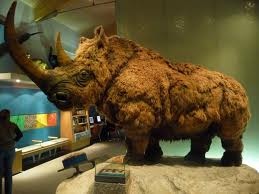
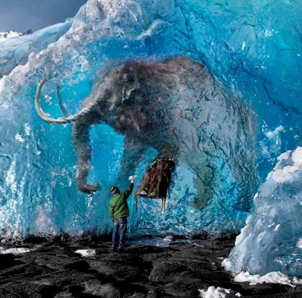
Indeed, science was turned on its head after a discovery in 1772 near Vilui, Siberia, of an intact frozen woolly rhinoceros, which was followed by the more famous discovery of a frozen mammoth in 1787. You may be shocked, but these discoveries of frozen animals with grass still in their stomachs set in motion these two schools of thought since the evidence implied you could be eating lunch and suddenly find yourself frozen, only to be discovered by posterity.
The discovery of the woolly rhinoceros in 1772, and then frozen mammoths, sparked the imagination that things were not linear after all. These major discoveries truly contributed to the “Age of Enlightenment” where there was a burst of knowledge erupting in every field of inquisition. Such finds of frozen mammoths in Siberia continue to this day. This has challenged theories on both sides of this debate to explain such catastrophic events. These frozen animals in Siberia suggest strange events are possible even in climates that are not that dissimilar from the casts of dead victims who were buried alive after the volcanic eruption of 79 AD at Pompeii in ancient Roman Italy. Animals can be grazing and then suddenly freeze abruptly. That climate change was long before man invented the combustion engine.
Even the field of geology began to create great debates that perhaps the earth simply burst into a catastrophic convulsion and indeed the planet was cyclical — not linear. This view of sequential destructive upheavals at irregular intervals or cycles emerged during the 1700s. This school of thought was perhaps best expressed by a forgotten contributor to the knowledge of mankind, George Hoggart Toulmin in his rare 1785 book, “The Eternity of the World“:
” ••• convulsions and revolutions violent beyond our experience or conception, yet unequal to the destruction of the globe, or the whole of the human species, have both existed and will again exist ••• [terminating] ••• an astonishing succession of ages.”
Id./p3, 110
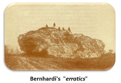
In 1832, Professor A. Bernhardi argued that the North Polar ice cap had extended into the plains of Germany. To support this theory, he pointed to the existence of huge boulders that have become known as “erratics,” which he suggested were pushed by the advancing ice. This was a shocking theory for it was certainly a nonlinear view of natural history. Bernhardi was thinking out of the box. However, in natural science people listen and review theories unlike in social science where theories are ignored if they challenge what people want to believe. In 1834, Johann von Charpentier (1786-1855) argued that there were deep grooves cut into the Alpine rock concluding, as did Karl Schimper, that they were caused by an advancing Ice Age.
This body of knowledge has been completely ignored by the global warming/climate change religious cult. They know nothing about nature or cycles and they are completely ignorant of history or even that it was the discovery of these ancient creatures who froze with food in their mouths. They cannot explain these events nor the vast amount of knowledge written by people who actually did research instead of trying to cloak an agenda in pretend science.
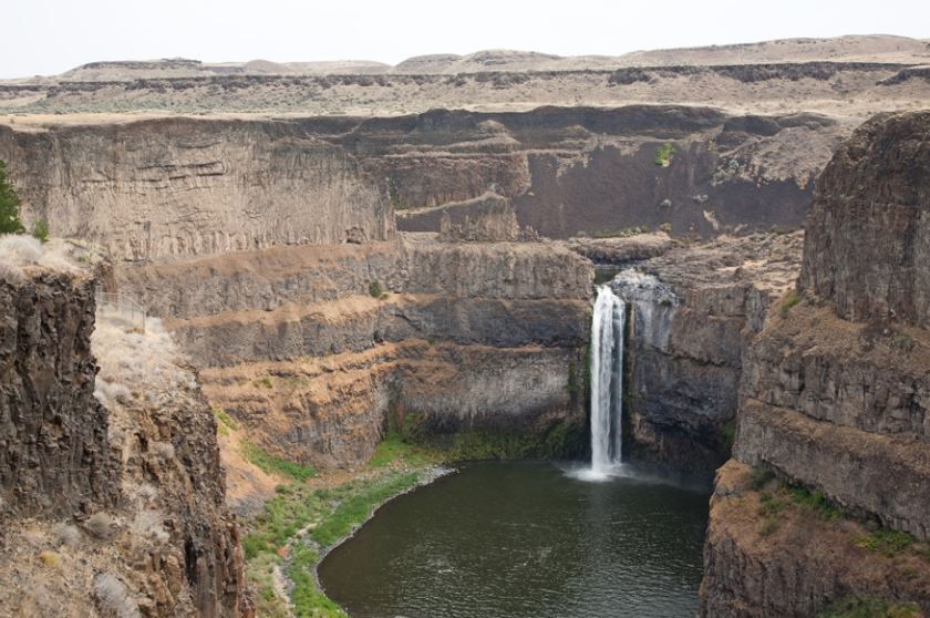
Glaciologists have their own word, jökulhlaup (from Icelandic), to describe the spectacular outbursts when water builds up behind a glacier and then breaks loose. An example was the 1922 jökulhlaup in Iceland. Some seven cubic kilometers of water, melted by a volcano under a glacier, had rushed out in a few days. Still grander, almost unimaginably grand, were floods that had swept across Washington state toward the end of the last ice age when a vast lake dammed behind a glacier broke loose. Catastrophic geologic events are not generally part of the uniformitarian geologist’s thinking. Rather, the normal view tends to be linear including events that are local or regional in size. One example of a regional event would be the 15,000 square miles of the Channeled Scablands in eastern Washington. Initially, this spectacular erosion was thought to be the product of slow gradual processes. In 1923, J. Harlen Bretz presented a paper to the Geological Society of America suggesting the Scablands were eroded catastrophically. During the 1940s, after decades of arguing, geologists admitted that high ridges in the Scablands were the equivalent of the little ripples one sees in mud on a streambed, magnified ten thousand times. Finally, by the 1950s, glaciologists were accustomed to thinking about catastrophic regional floods. The Scablands are now accepted to have been catastrophically eroded by the “Spokane Flood.” This Spokane flood was the result of the breaching of an ice dam which had created glacial Lake Missoula. Now the United States Geological Survey estimates the flood released 500 cubic miles of water, which drained in as little as 48 hours. That rush of water gouged out millions of tons of solid rock.
When Mount St. Helens erupted in 1980, this too produced a catastrophic process whereby two hundred million cubic yards of material was deposited by volcanic flows at the base of the mountain in just a matter of hours. Then, less than two years later, there was another minor eruption, but this resulted in creating a mudflow, which carved channels through the recently deposited material. These channels, which are 1/40th the size of the Grand Canyon, exposed flat contacts between the catastrophically deposited layers. This is what we see between the layers exposed in the walls of the Grand Canyon. What is clear, is that these events were relatively minor compared to a global flood. For example, the eruption of Mount St. Helens contained only 0.27 cubic miles of material compared to other eruptions, which have been as much as 950 cubic miles. That is over 2,000 times the size of Mount St. Helens!
With respect to the Grand Canyon, the specific geologic processes and timing of the formation of the Grand Canyon have always sparked lively debates by geologists. The general scientific consensus, updated at a 2010 conference, maintains that the Colorado River carved the Grand Canyon beginning 5 million to 6 million years ago. This general thinking is still linear and by no means catastrophic. The Grand Canyon is believed to have been gradually eroded. However, there is an example cyclical behavior in nature which demonstrates that water can very rapidly erode even solid rock. An exampled of this took place in the Grand Canyon region back on June 28th, 1983. There emerges an overflow of Lake Powell which required the use of the Glen Canyon Dam’s 40-foot diameter spillway tunnels for the first time. As the volume of water increased, the entire dam started to vibrate and large boulders spewed from one of the spillways. The spillway was immediately shut down and an inspection revealed catastrophic erosion had cut through the three-foot-thick reinforced concrete walls and eroded a hole 40 feet wide, 32 feet deep, and 150 feet long in the sandstone beneath the dam.
Some have speculated that the end of the Ice Age resulted in a flood of water which had been contained by the ice. Like that of the Scablands, it is possible that a sudden catastrophic release of water originally carved the Grand Canyon. It is clear that both the formation of the Scablands and the evidence of how Mount St Helens unfolded, may be support for the catastrophic formation of events rather than nice, slow, and linear.
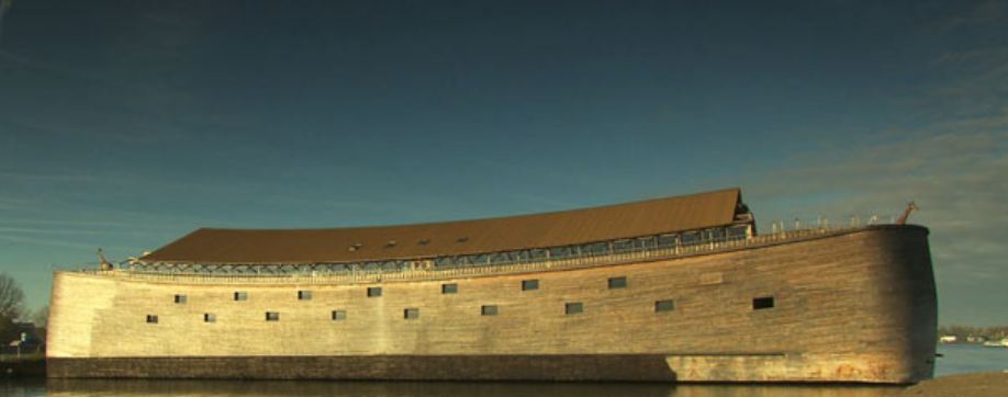
Then there is the Biblical Account of the Great Flood and Noah. Noah is also considered to be a Prophet of Islam. Darren Aronofsky’s film Noah was based on the biblical story of Genesis. Some Christians were angry because the film strayed from biblical Scripture. The Muslim-majority countries banned the film Noah from screening in theaters because Noah was a prophet of God in the Koran. They considered it to be blasphemous to make a film about a prophet. Many countries banned the film entirely.
The story of Noah predates the Bible. There exists the legend of the Great Flood rooted in the ancient civilizations of Mesopotamia. The Sumerian Epic of Gilgamesh dates back nearly 5,000 years which is believed to be perhaps the oldest written tale on Earth. Here too, we find an account of the great sage Utnapishtim, who is warned of an imminent flood to be unleashed by wrathful gods. He builds a vast circular-shaped boat, reinforced with tar and pitch, and carries his relatives, grains along with animals. After enduring days of storms, Utnapishtim, like Noah in Genesis, releases a bird in search of dry land.
Archaeologists generally agree that there was a historical deluge between 5,000 and 7,000 years ago which hit lands ranging from the Black Sea to what many call the cradle of civilization, which was the floodplain between the Tigris and Euphrates rivers. The translation of ancient cuneiform tablets in the 19th century confirmed the Mesopotamian Great Flood myth as an antecedent of the Noah story in the Bible.
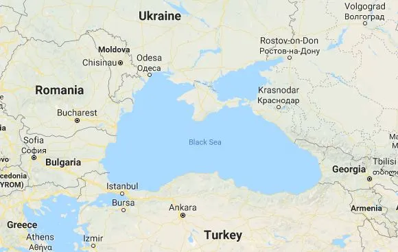
The problem that existed was the question of just how “great” was the Great Flood? Was it regional or worldwide? The stories of the Great Flood in Western Culture clearly date back before the Bible. The region implicated has long been considered to be the Black Sea. It has been suggested that the water broke through the land by Istanbul and flooded a fertile valley on the other side much as we just looked at in the Scablands. Robert Ballard, one of the world’s best-known underwater archaeologists, who found the Titanic, set out to test that theory to search for an underwater civilization. He discovered that some four hundred feet below the surface, there was an ancient shoreline, proving that there was a catastrophic event did happen in the Black Sea. By carbon dating shells found along the underwater shoreline, Ballard dated this catastrophic event to around 5,000 BC. This may match the around the time when Noah’s flood could have occurred.
Given the fact that for the entire Earth to be submerged for 40 days and 40 nights is impossible for that much water to simply vanish, we are probably looking at a Great Flood that at the very least was regional. However, there are tales of the Great Flood which spring from many other sources. Various ancient cultures have their own legends of a Great Flood and salvation. According to Vedic lore, a fish tells the mythic Indian king Manu of a Great Flood that will wipe out humanity. In turn, Manu also builds a ship to withstand the epic rains and is later led to a mountaintop by the same fish. We also find an Aztec story that tells of a devout couple hiding in the hollow of a vast tree with two ears of corn as divine storms drown the wicked of the land. Creation myths from Egypt to Scandinavia also involve tidal floods of all sorts of substances purging and remaking the earth. The fact that we have Great Flood stories from India is not really a surprise since there was contact between the Middle East and India throughout recorded history. However, the Aztec story lacks the ship, but it still contains punishing the wicked and here there was certainly no direct contact, although there is evidence of cocaine use in Egypt implying there was some trade route probably through island hopping in the Pacific to the shores of India and off to Egypt. Obviously, we cannot rule out that this story of the Great Flood even made it to South America.
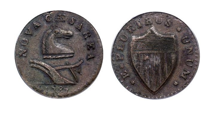
Then again, there is the story of Atlantis – the island that sunk beath the sea. The Atlantic Ocean covers approximately one-fifth of Earth’s surface and second in size only to the Pacific Ocean. The ocean’s name, derived from Greek mythology, means the “Sea of Atlas.” The origin of names is often very interesting clues as well. For example. New Jersey is the English Translation of Nova Caesarea which appeared even on the colonial coins of the 18th century. Hence, the state of New Jersey is named after the Island of Jersey which in turn was named in the honor of Julius Caesar. So we actually have an American state named after the man who changed the world on par with Alexander the Great, for whom Alexandria of Virginia is named after with the location of the famous cemetery for veterans, where John F. Kennedy is buried.
So here the Atlantic Ocean is named after the story of Atlanis. The original story of Atlantis comes to us from two Socratic dialogues called Timaeus and Critias, both written about 360 BC by the Greek philosopher Plato. According to the dialogues, Socrates asked three men to meet him: Timaeus of Locri, Hermocrates of Syracuse, and Critias of Athens. Socrates asked the men to tell him stories about how ancient Athens interacted with other states. Critias was the first to tell the story. Critias explained how his grandfather had met with the Athenian lawgiver Solon, who had been to Egypt where priests told the Egyptian story about Atlantis. According to the Egyptians, Solon was told that there was a mighty power based on an island in the Atlantic Ocean. This empire was called Atlantis and it ruled over several other islands and parts of the continents of Africa and Europe.
Atlantis was arranged in concentric rings of alternating water and land. The soil was rich and the engineers were technically advanced. The architecture was said to be extravagant with baths, harbor installations, and barracks. The central plain outside the city was constructed with canals and an elaborate irrigation system. Atlantis was ruled by kings but also had a civil administration. Its military was well organized. Their religious rituals were similar to that of Athens with bull-baiting, sacrifice, and prayer.
Plato told us about the metals found in Atlantis, namely gold, silver, copper, tin and the mysterious Orichalcum. Plato said that the city walls were plated with Orichalcum (Brass). This was a rare alloy metal which was found both in Crete as well as in the Andes, in South America. An ancient shipwreck was discovered off the coast of Sicily in 2015 which contained 39 ingots of Orichalcum. Many claimed this proved the story of Atlantis. Orichalcum was believed to have been a gold/copper alloy that was cheaper than gold, but twice the value of copper. Of course, Orichalcum was really a copper-tin or copper-zinc brass. We find in Virgil’s Aeneid, the breastplate of Turnus is described as “stiff with gold and white orichalc”. The monetary reform of Augustus in 23BC reintroduced bronze coinage which has vanished after 84BC. Here we see the introduction of Orichalcum for the Roman sesterius and the dupondius. The Roman as was struck in near pure copper. Therefore, about 300 years after Plato, we do see Orichalcum being introduced as part of the monetary system of Rome. It is clear that Orichalcum was rare at the time Plato wrote this. Consequently, this is similar to the stories of America that there was so much gold, they paved the streets in it.
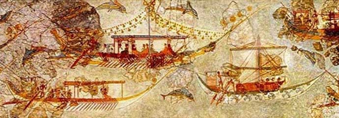
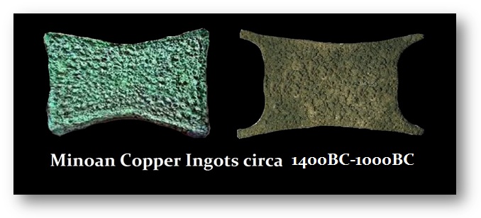
As the story is told, Atlantis was located in the Atlantic Ocean. There have been bronze-age anchors discovered at the Gates of Hercules (Straights of Gibralter) and many people proclaimed this proved Atlantis was real. However, what these proponents fail to take into account is the Minoans. The Minoans were perhaps the first International Economy. They traded far and wide even with Britain seeking tin. Their civilization was of the Bronze Age rising civilization that arose on the island of Crete and flourished from approximately the 27th century BC to the 15th century BC. Their trading range and colonization extended to Spain, Egypt, Israel (Canaan), Syria (Levantine), Greece, Rhodes, and of course to Turkey (Anatolia). Many other cultures referred to them as the people from the islands in the middle of the sea. However, the Minoans had no mineral deposits. They lacked gold as well as silver or even the ability to produce large mining of copper. What has survived are examples of copper ingots that served as MONEY in trade. Keep in mind that gold at this point was rare, too rare to truly serve as MONEY. It is found largely as jewelry in tombs of royal dignitaries.
The Bronze Age emerged at different times globally appearing in Greece and China around 3,000BC but it came late to Britain reaching there about 1900BC. It is known that copper emerged as a valuable tool in Anatolia (Turkey) as early as 6,500BC, where it began to replace stone in the creation of tools. It was the development of casting copper that also appears to aid the urbanization of man in Mesopotamia. By 3,000BC, copper is in wide use throughout the Middle East and starts to move up into Europe. Copper in its pure stage appears first, and tin is eventually added creating actual bronze where a bronze sword would break a copper sword. It was this addition of tin that really propelled the transition of copper to bronze and the tin was coming from England where vast deposits existed at Cornwall. We know that the Minoans traveled into the Atlantic for trade. Anchors are not conclusive evidence of Atlantis.
As the legend unfolds, Atlantis waged an unprovoked imperialistic war on the remainder of Asia and Europe. When Atlantis attacked, Athens showed its excellence as the leader of the Greeks, the much smaller city-state the only power to stand against Atlantis. Alone, Athens triumphed over the invading Atlantean forces, defeating the enemy, preventing the free from being enslaved, and freeing those who had been enslaved. This part may certainly be embellished. However, following this battle, there were violent earthquakes and floods, and Atlantis sank into the sea, and all the Athenian warriors were swallowed up by the earth. This appears to be almost certainly a fiction based on some ancient political realities. Still, the explosive disappearance of an island some have argued is a reference to the eruption of Minoan Santorini. The story does closely correlate with Plato’s notions of The Republic examining the deteriorating cycle of life in a state.
There have been theories that Atlantis was the Azores, and still, others argue it was actually South America. That would explain to some extent the cocaine mummies in Egypt. Yet despite all these theories, usually, when there is an ancient story, despite embellishment, there is often a grain of truth. In this case, Atlantis may not have completely submerged, but it could have partially submerged from an earthquake at least where the people lived. Survivors could have made to either the Americas or to Africa/Europe. What is clear, is that a sudden event could have sent a tsunamiinto the Mediterranean which then broken the land mass at Istanbul and flooded the valley below transforming this region into the Black Sea.
We also have evidence which has surfaced that the Earth was struck by a comet around 12,800 years ago. Scientific American has published that sediments from six sites across North America—Murray Springs, Ariz.; Bull Creek, Okla.; Gainey, Mich.; Topper, S.C.; Lake Hind, Manitoba; and Chobot, Alberta, have yielded tiny diamonds, which only occur in sediment exposed to extreme temperatures and pressures. The evidence surfacing implies that the Earth moved into an Ice Age killing off large mammals and setting the course for Global Cooling for the next 1300 years. This may indeed explain that catastrophic freezing of Wooly Mammoths in Siberia. Such an event could have also been responsible for the legend of Atlantis where the survivors migrated taking their stories with them.
There is also evidence surfacing from stone carvings at one of the oldest sites recorded located in Turkey. Using a computer programme to show where the constellations would have appeared above Turkey thousands of years ago, researchers were able to pinpoint the comet strike to 10,950BC, the exact time the Younger Dryas, which was was a return to glacial conditions and Global Cooling which temporarily reversed the gradual climatic warming after the Last Glacial Maximum that began to recede around 20,000 BC, utilizing ice core data from Greenland.
Now, there is a very big asteroid which passed by the Earth on September 16th, 2013. What is most disturbing is the fact that its cycle is 19 years so it will return in 2032. Astronomers have not been able to swear it will not hit the Earth on the next pass in 2032. It was discovered by Ukrainian astronomers with just 10 days to go. The 2013 pass was only a distance of 4.2 million miles (6.7 million kilometers). If anything alters its orbit, then it will get closer and closer. It just so happens to line up on a cyclical basis that suggests we should begin to look at how to deflect asteroids and soon.
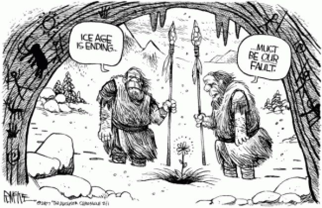
The British Government forecasters have today issued the first red snow warning for five years as the UK braces for potentially the worst blizzards since 1962. Britain has seen as much snow as the Bizzard of 1962 and of course, they are blaming Global Warming. If it gets hot it is caused by man. When it gets gold, it’s our fault too. To the Global Warming crowd, God just simply does not exist. We are to blame for all things natural or unnatural. We have to respect that the historical record demonstrates that things can freeze very fast.
I have been warning that the greatest danger we face is Global COOLING – not warming, and this is entirely a natural cycle. The heavy snow in Britain does more than keep people in their homes. It also prevents the delivery of food as supermarkets have nothing to sell. It is the cold that fosters disease and leads to pandemics. We will be praying for some heat by 2032. Be wise to stockpile extra food just in case.
I previously warned that the North Pole, which does move, was headed straight to Europe. The poles do MIGRATE and have NEVER been fixed. 2016 was the coldest year Britain has seen in 58 years. Even last winter, Europe was seriously frozen. Looks like 2018 is beating that record. There have been DEEP FREEZE events during 1700s. Britain is moving into an Ice Age and the sooner we respect that, the better off we will be.
The energy output of the Sum is declining toward a Solar Minimum which is the Fastest Decline in almost 10,000 Years. This is highly unusual and it is hard to forecast specific regions. Nevertheless, with the North Pole migrating toward Europe and the energy out of the Sun dropping faster than previously recorded, the end result is hard to predict insofar as how cold is cold.
Our computer correlates everything from economics, climate, to disease and politics. The colder the climate gets, the worse the diseases. We forecast that the winter of 2017/2018 was going to be very cold. This is why we also forecast that this would be the worst season for the Flu. The colder it gets, the greater the danger of a PANDEMIC for the season 2018/2019
Back in 1967, the International Global Atmospheric Research Program was established, mainly to gather data for better short-range weather prediction, but included climate. The following year, this was the beginning of biased studies which suggested that a possibility of a collapse of the Antarctic ice sheets would raise sea levels catastrophically. They put forth the idea that a big enough rise in global temperatures would eventually melt the world’s glaciers. They then pointed to a retreat of mountain glaciers since the 19th century claiming this was very apparent in many regions. This trend, they argued with linear logic, would release enough water to raise the sea level a bit. They argued that starting during the 1960s, several glacier experts warned that part of the Antarctic ice sheet seemed unstable. If the huge mass slid into the ocean, which did not happen, the sea-level rise would wreak great harm, perhaps within the next century or two. They completely failed to point out that there had historically been cycles in climate and even the poles were not at the same location but have flipped and moved about the Earth.
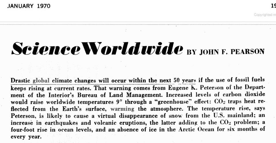
We find one of the early articles that predicted the average temperature would be 9 degrees hotter by now appeared in 1970. The publication was Popular Mechanics back in January 1970. The analysis was very seriously flawed as always because they take whatever trend is in motion and project it out without end. They completely fail to comprehend that there is any cycle within anything. This is the greatest trap in forecasting. The entire Global Warming trend has been created with this very dangerous and stupid method of linear forecasting.
All of these forecasts are indistinguishable from looking at the Dow Jones Industrials and observing it has risen 5% per year since 2009 and therefore, it will never correct once again and it will continue to advance by 5% every year into the endless future. This type of analysis simply does not qualify as any valid method of analysis by taking whatever trend is in motion and forecasting it will never end. That analysis was set in motion following 1967.
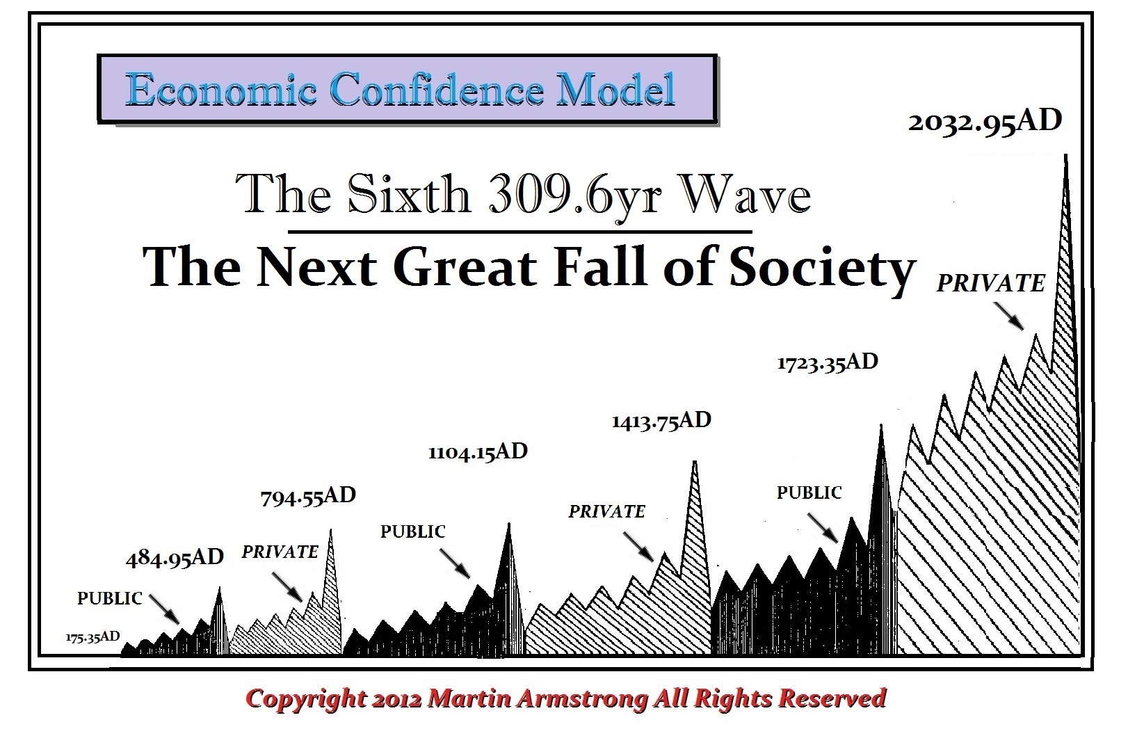
We have run our models on this movement of blaming humans for climate change. Unfortunately, this crazy analysis will not reach its peak until 2032. Governments will continue to embrace it as an excuse to raise taxes. So it looks like as government needs money, they do not care about the environment. They will use this climate change as the excuse to impose new types of taxes as if lining their pockets with other people’s money will save the planet – it is only to save their power.
I recently found this article about an ancient Indian burial ground found off the coast of Venice, Florida. It’s 7,000 years old.
This is another piece of evidence suggesting that rising ocean waters are not a modern phenomenon and a cyclical event like you suggested.
Have a nice day,
R
Dallas
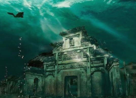
ANSWER: Oh yes. There are the Seven Wonders of the Undersea World. One of the more spectacular sunken cities is that in China, the ancient city, which is hidden 130 feet underwater. This is popularly known as the Lion City, which was once Shi Cheng – the center of politics and economics in the eastern province of Zhejiang.
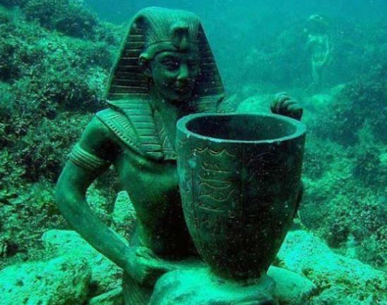
There is the ancient city of Alexandria in Egypt which is also under water. Then there are the ancient roadways underwater off the coast of Bermuda. There are numerous examples of sunken cities.
There is the ancient Etruscan city of Spina, which also sunk. There are many Italians with the name of Spina which refer to their original origin. Spina was an Etruscan port city, established by the end of the 6th century BC. It was a lost city until 1922 when it was discovered when drainage schemes in the delta of the Po River were carried out. This is the same lagoon that eventually became the location of Venice. Spina was a major international trade center whose main trading partner was Athens. For almost two thousand years the city laid forgotten under the mud of the Po lagoon. The excavations have thus brought to light an impressive wetland settlement, with regular Greek-style urban planning, including rectangular blocks and houses, entirely realized with timber and logs much as we see in Venice itself. Obviously, the technology dates back much further than most suspected. The ancient city of Spina was known for its trade, but it sank below the water and its location became lost. Today, they blame the sinking of Venice on Global Warming without ever mentioning that the previous city had sunk as well without Global Warming caused by humans.
The Etruscans lost power with the revolution in Rome and the beginning of the Roman Republic in 509BC which rejected the Etruscan kings. Then soon afterward, the Etruscan naval supremacy also collapsed when the ships of the ambitious Hieron I of Syracuse inflicted a devastating loss on their fleet off Cumae in 474 BC. This was the final blow to the Etruscan cities of Campania. The name Spina is found in Sicily, for it is clear that most inhabitants of Spina appear to have migrated to Sicily following their defeat by Hieron I.
I have created this site to help people have fun in the kitchen. I write about enjoying life both in and out of my kitchen. Life is short! Make the most of it and enjoy!
This is a library of News Events not reported by the Main Stream Media documenting & connecting the dots on How the Obama Marxist Liberal agenda is destroying America

 ANSWER: Unfortunately, the Global Warming people were handed $1 billion for their pretend research. They will NEVER admit that they have manipulated the data to justify their pretend science. If they came out and admitted the truth, assuming they would never be charged criminally for fraud as they should be, their funding would be cut off. Once you pay these people mountains of cash, there is no way they will reveal that there is no Global Warming. So the cold now they also attribute to Global Warming that they changed the words to Climate Change, and attribute “volatility” to the human activity itself. It is amazing. We cannot carry out Keynesian-Marxist manipulation of the economy, but we can manipulate the entire climate of the planet.
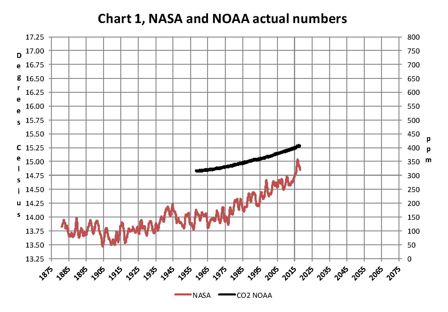


 Indeed, science was turned on its head after a discovery in 1772 near Vilui, Siberia, of an intact frozen woolly rhinoceros, which was followed by the more famous discovery of a frozen mammoth in 1787. You may be shocked, but these discoveries of frozen animals with grass still in their stomachs set in motion these two schools of thought since the evidence implied you could be eating lunch and suddenly find yourself frozen, only to be discovered by posterity.

 I have been warning that the greatest danger we face is Global COOLING – not warming, and this is entirely a natural cycle. The heavy snow in Britain does more than keep people in their homes. It also prevents the delivery of food as