Are NASA Global Temperatures Valid!


Something has been bothering me about the method that NASA-GISS (NASA) determines global temperatures and I don’t mean the more and more obvious data manipulation which we all know is there. NASA publishes values representing the global surface temperature of the planet supposedly based on actual measurements processed in a complex algorithm. The process is explained on their web site for those that are interested. The problem I saw in their data was the magnitude of swings in their numbers on a month to month basis; at a local level yes, of course, but on a global level the changes would have to be very gradual because of the extremely large numbers involved in the energy content of the Earth’s atmosphere and further there are natural atmospheric and oceanic energy flows that stabilize the planets temperature.

What we are going to do here is reverse engineering we’ll start with the NASA temperature and then calculate the energy flows required to make those changes. If the “Required” energy flows are not reasonable then the NASA temperatures are not reasonable. They must be in synchronization with each other as energy can neither be created nor destroyed.

So to start I decided to try and calculate the heat value of the NASA temperatures and their changes and so from Wikipedia we find that the dry atmosphere is 5.1352E+18 kg and the water is 1.27E+16 kg for a total of 5.1479E+18 kg. From these values we can calculate that water is on average .247% of the atmosphere. We also find that 1006 Joules per degree Kelvin (J/kg/K) is the specific heat value of the Earth’s atmosphere without water and so we need to add 4.6 J/kg/K for water and 9.8 J/kg/K for latent heat to the 1006 J/kg/K making a total of 1020.4 J/kg/K for the earth’s atmosphere with .0247% water at standard air.

The next step was to take the most current (at the time this was written) NASA global temperatures values from their Land Ocean Temperature Index (LOTI) which runs from January 1880 to June 2015 and place all 1925 values in a spreadsheet. To calculate the heat value of the atmosphere we need to turn the NASA anomalies (a deviation from a base of 14.0 degrees Celsius) into temperatures by dividing by 100 and then adding that value to the base 14.0 degrees Celsius and lastly add that result to 273.15 to convert to degrees Kelvin.

With that completed we need one last step since the NASA values are “surface” temperatures, we need an adjustment for altitude cooling if we are looking for the total energy in the atmosphere. To accomplish this we’ll subtract 28.5 degrees Celsius making the answer the theoretical temperature at 5 km above sea level which is about where 50% of the atmosphere is above 5 km and 50% below; so this makes for a reasonable estimate for calculating total energy. Actually it’s probably a low estimate because of the constant atmospheric temperature above 11km and most of the water is in the lower half.

With all the monthly NASA temperatures in a column it was only a few hours work to set up the equations and plot a few charts. We calculated the heat value of each month’s anomaly for example for January 1880 the value was 1.3572E+24 Joules and for June 2015 the value was 1.36266E+24 Joules. Those values are a result of energy coming in from the sun minus what leaves the planet as infrared energy assuming no large change in the temperature of the land or oceans. To my knowledge these kinds of temperature changes (energy flows) have not been observed on the surface of the planet.

Chart 1 shows two plots the monthly change in the NASA anomalies in red and the sun’s input in blue. The sun’s input is adjusted for the orbital distance to the sun and the number of days in the month. There are 1625 values in the LOTI table so because of the large number of values the Chart line width was set to zero to make it readable and the scale set to mega joules.

000 CHART ONE

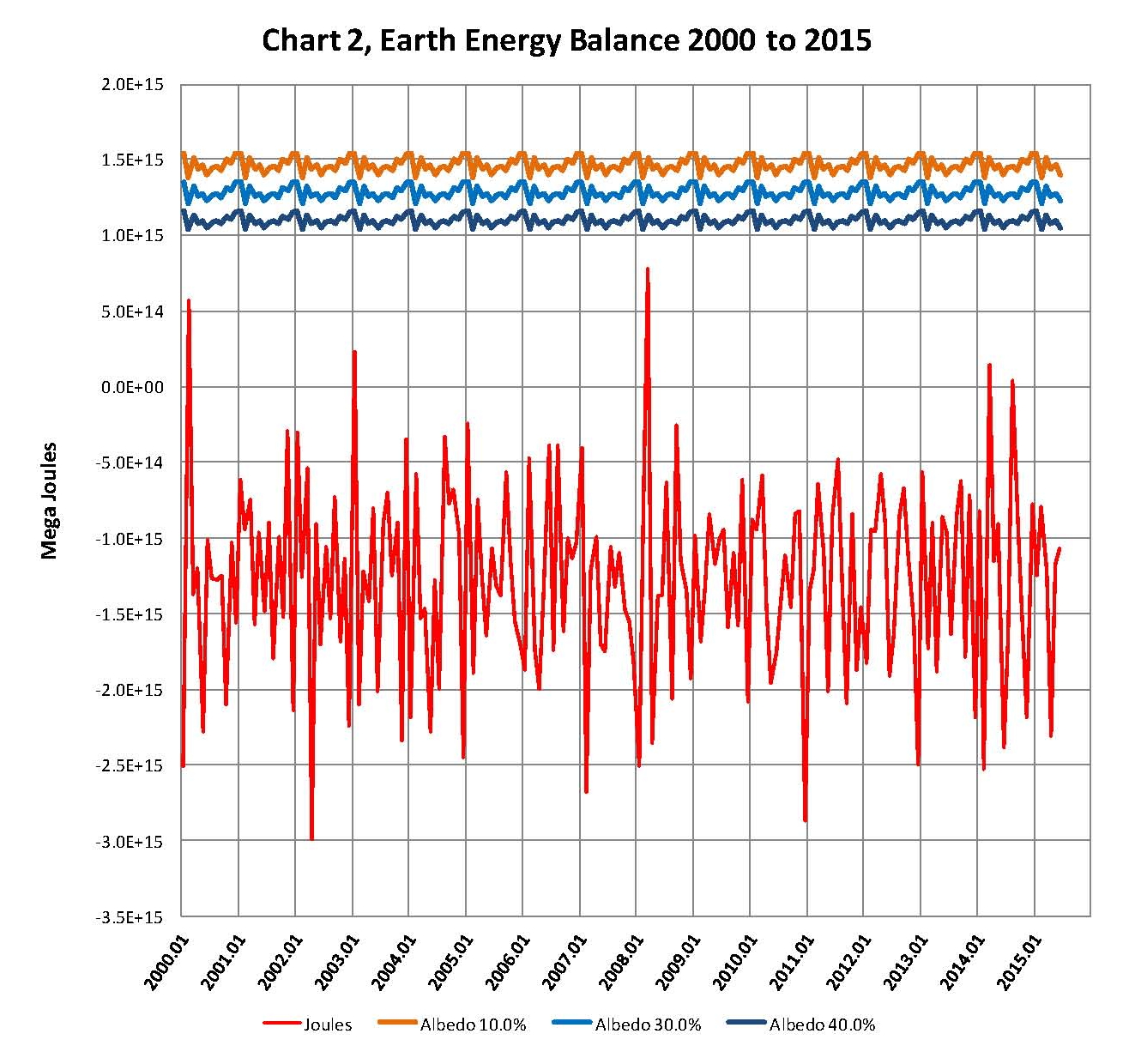
It’s clear when looking at Chart 1 that there have to be extremely large monthly energy flows involved here if the NASA numbers are actually valid. To put this in perspective three lines were added to Chart 1 but also running only from 2000 to the present so that more detail could be seen making Chart 2. These lines are for the incoming solar using 1414.44 Wm2 for solar radiation at aphelion (January) and 1322.97 Wm2 for solar radiation at perihelion (July) in the earth’s orbit using the following albedo percentages 20.0% orange plot, 30.0% (Actual) blue plot and 40.0% dark blue plot. The blue plot is also shown on Chart 1.

These values were based on the cross sectional area of the planet adjusted by dividing by 4 which compensates for the spherical earth so the energy is spread over a larger large than the cross sectional area. Obviously the Wm2 had to be converted to Joules and we used 84600 seconds per day for the conversion since we were looking monthly changes. The large number of values on Chart 1 makes the variance hard to see; but on Chart 2 you can see the annual swings. The choppy lines in the Sun radiation plots are a result of using monthly values and the months don’t always have the name number of days. The purpose of the sun’s radiation plots is to show that small changes it the planets albedo cannot account for the large energy swings.

000 CHART TWO

The next Chart 3 is made using the same data as that used in Charts 1 and 2 but this time we calculate a percentage change in heat month to month instead of Joules. It appears that there is a consistent monthly variance of +/- .05% which may seem small but that represents about +/- 6.25E+13 Mega Joules of energy moving around on a monthly basis, so where does that energy come from or go to?

000 CHART THREE

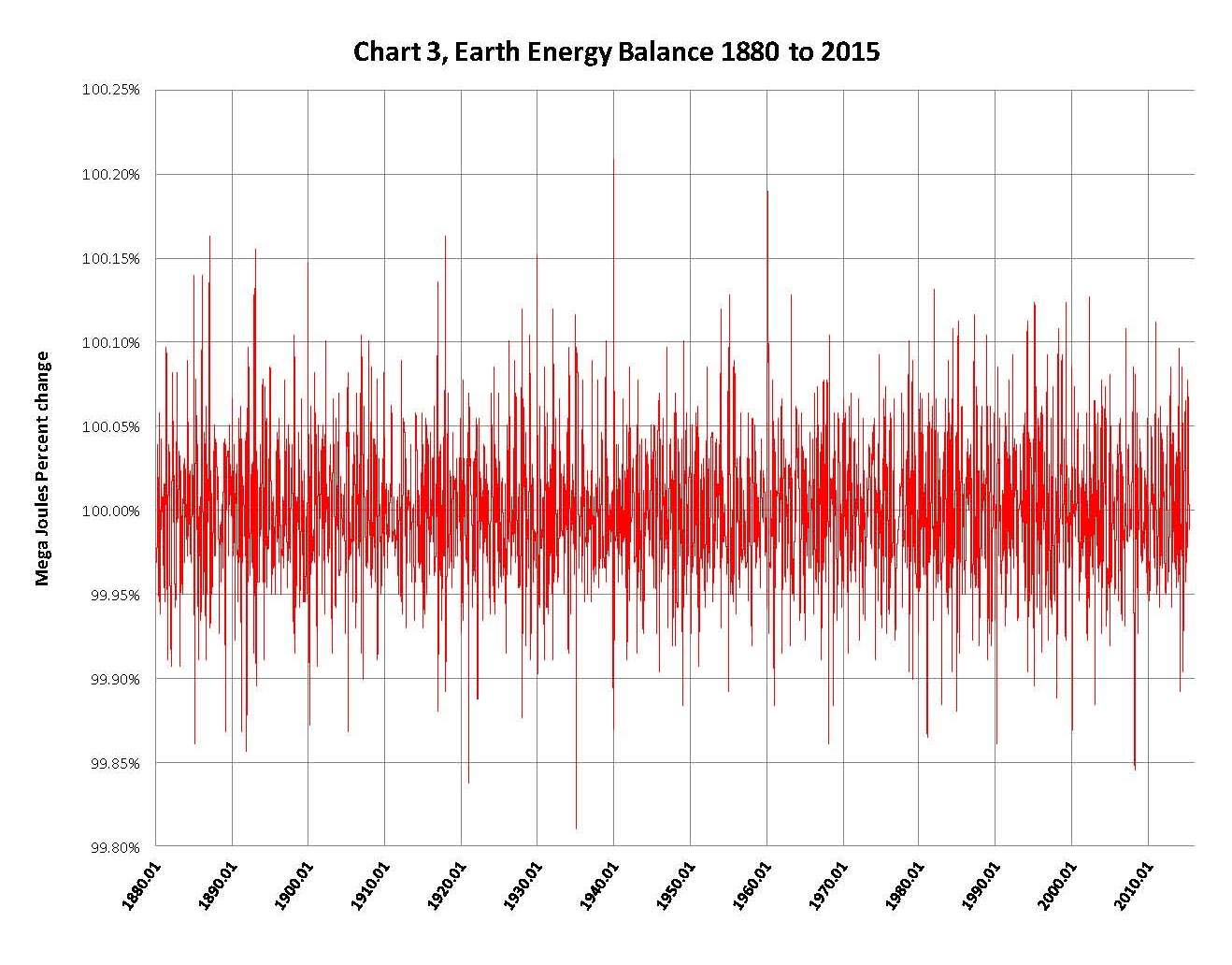
Chart 4, is the same as Chart 3 except again we look at 2000 to the present just as we did with Chart 2. We can see that there are energy swings month to month of well over 1.5E+14 Joules which just don’t seem reasonable. Some of these swings go over .1% month to month which on a global scale is a very large number, more on this later in the paper.

000 CHART FOUR

In the next Chat 5 we look at the two items that make up the different of the monthly changes. Like Chart 2 and 4 we are looking at 2000 to the present so we can see the movements in greater detail. The red line represents the energy in from the sun and the blue line represents the energy out or in to make the NASA number for the current month work as listed. Trend lines were added to both along with their equations and R2 values. The trend line shows the mean value which shows the swings in temperature movements are more or less the opposite of the energy coming in from the sun. In my opinion this blue plot should look more like the red plot.

Also, for all practical purposes the energy in and out flows would have to be in and out of the planets oceans; would that not be noticeable?

000 CHART FIVE

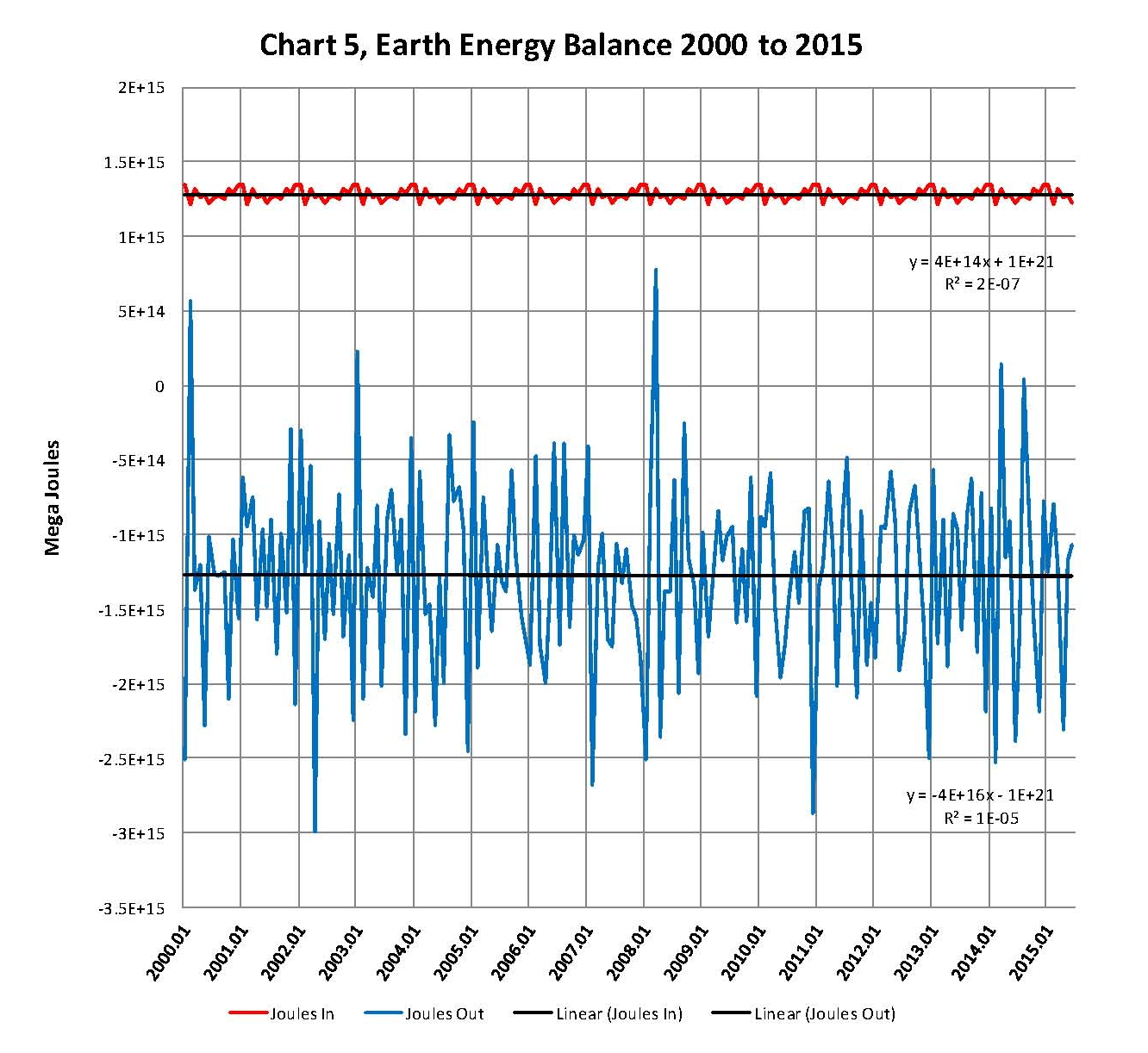
Chart 6, the next Chat is based on the blue plot shown in Chart 5. We can see in Chart 5 that there is a lot of energy moving in and out of someplace? But since this value is so high we need to get a handle on it and so we can equate it to the energy released by an atomic bomb. The most common size today is about one mega ton, which is about 50 time the size of the larger atomic bomb, Fat Man, dropped on Nagasaki from a Boeing B-29 super fortress named Bockscar .

Dividing the values in Chart 5 by 4.18E+12 Joules per a one mega ton atomic bomb we can create a chart representing One Mega Ton Atomic bombs, so the energy movements are equivalent to between 10 and 800 one mega ton bombs going off every day of the year.

000 CHART SIX

We can see that the monthly NASA-GISS energy flows far and away exceed any possible variation in the planets albedo or, in my opinion from the oceans, and so the values in the NASA-GISS table LOTI cannot be correct.

I would appreciate feedback on this analysis as there are serious implications to the integrity of the NOAA and NASA published data!

THE ONE REASON DONALD TRUMP WAS THE CLEAR WINNER OF THE FIRST GOP DEBATE


THE GOP and FOX tried to take Trump out on Thursday — they failed and will continue to fail as they are no match for Trump.

Mark Levin Knows The Ruse When He Hears It Too…


The Fox moderators were there to promote themselves and make certain candidates look bad with false information. They were especially interested in make Trump look bad., so it would seem that Fox has now joined the ranks of CNN MSNBC ABC AND CBS.

Donald Trump Says ‘We Need To Keep Illegals Out’


Trump is 100% and what I can’t understand is why we would even want illegals in our country.? We have an emigration system that allows them to come in legally!

They Are… They Aren’t… Weeeeell Maybe…


I was an Infantry Captain in the army with service from 1965 to 1969 and one of the first duties of a “real” officer like Lt. Cmdr. Timothy White is to protect his troops while conducting his mission to the best of his abilities. In return his NCO’s and his troopers will follow his lead since they know he has their six. The pentagon is all about politics and promotions and they don’t give a rat’s ass about the troops any longer. I would resign my commission before I would ever even consider bringing charges against a true leader like Lt. Cmdr. Timothy White. Today’s military if it doesn’t change its ways will soon not be able to maintain a fighting force of the caliber that existed 10 years ago. Its being run from the pentagon by what we called Garrett Troopers (GOOGLE IT) back in the day.

deacon303's avatarWhiskey Tango Foxtrot

Multiple sources have reported that the United States Navy has not ruled out the possibility of bringing criminal charges against one of the victims of the Chattanooga, Tennessee shooting that left five U.S. servicemen dead.

According to former U.S. senator and Marine Infantry officer Jim Webb, Lt. Cmdr. Timothy White may face serious federal charges because he returned fire at Mohammed Abdulazeez with his personal firearm, which he was not authorized to have on his person while performing his duties at a Naval Reserve station.

“Navy charging LCDR Tim White w/ a crime for trying to defend our sailors & Marines in #Chattanooga? He deserves a medal, not an indictment,” Webb posted on his Twitter account.

Former Congressman and retired U.S. Army Col. Allen West also confirmed the potential trouble White is facing.

“Ladies and gents, resulting from the text message I received yesterday, I can confirm that the United…

View original post 158 more words

Why I Support Donald Trump – Part 2


The reasons presented here are exactly the one that mean the GOP is dead. The GOP has merged with the progressive left such that there is little to no difference between them. We know this to be true so the ONLY solution is a new party. Can a third party win? Of course it can where do you think the GOP cam from 161 years ago.

Why I Support Donald Trump’s Campaign – And It’s Probably Not What You Think…


I support Trump as well for these reasons and many more.

ALERT: Netanyahu Issues Terrifying Warning… An Attack On America IS Coming


As more or less everyone knows Obama is either a fool or an idiot not that the difference means anything.

THIS MAP SHOWS HOW OBSESSED AMERICA IS WITH DONALD TRUMP


Trump and to a lessor degree Ted Cruz are the only two that are talking about the real issues that face us, so this should be no surprise.

Legal and Academic Equality Nonsense


Re-Post from CNS News
By Walter E. Williams | August 4, 2015 | 5:44 AM EDT

A particular act or policy might not have a discriminatory intent, but that doesn’t let you off the hook. If it has a disproportionately negative impact on so-called protected classes, it is said to have a disparate impact and risks being prohibited by law. The uninformed assumption made by judges, lawyers and academics is that but for the fact of racial and sex discrimination, we all would be distributed across occupations, educational backgrounds and other socio-economic characteristics according to our percentages in the population.

Such a vision is absolute nonsense. There is no evidence, anywhere, at any time, that but for the fact of discrimination, there would be proportional representation among various socio-economic characteristics. Let’s look at some disproportionalities, with an eye toward discovering the causes and then deciding what to do about them.

If one were to list the world’s top 30 violinists of the 20th century, at least 25 of them would be of Jewish ancestry. Another disparity is that despite the fact that Jews are less than 3 percent of the U.S. population and a mere 0.2 percent of the world’s population, during the 20th century, Jews were 35 percent of American and 22 percent of the world’s Nobel Prize winners. Are Jews taking violin excellence and Nobel Prizes that belong to other ethnicities? If America’s diversity worshippers see underrepresentation as probative of racial discrimination, what do they propose be done about overrepresentation?

Overrepresentation may be seen as denial of opportunity. For example, blacks are 13 percent of our population but about 80 percent of professional basketball players and 65 percent of professional football players and among the highest-paid players in both sports. By stark contrast, blacks are only 2 percent of the NHL’s professional ice hockey players. Basketball, football and ice hockey represent gross racial disparities and as such come nowhere close to “looking like America.”

Do these statistics mean that the owners of multibillion-dollar basketball and football operations are nice guys and ice hockey owners are racists? By the way, just because blacks are 65 percent of professional football players, let’s not lull ourselves into complacency. When’s the last time you saw a black NFL kicker or punter?

There are even geographical disparities. Not a single player in the NHL’s history can boast of having been born and raised in Hawaii, Louisiana or Mississippi. Geographical disparities are not only limited to ice hockey. The population statistics for North and South Dakota, Iowa, Maine, Montana and Vermont show that not even 1 percent of their population is black. In states such as Georgia, Alabama and Mississippi, blacks are overrepresented. When such racial disparities were found in schooling, the remedy was busing. I’ll tell you one thing; I’m not moving to Montana. It’s too cold.

Geographical disparities don’t only apply to the U.S. Historically, none of the world’s greatest seamen has been born and raised in a Himalayan nation, such as Nepal and Bhutan, or a sub-Saharan nation of Africa. They mostly have been from Scandinavia, other parts of Europe, East Asia or the South Pacific.

Being a man, I find another disproportionality particularly disturbing. According to a recent study conducted by Bond University in Australia, sharks are nine times likelier to attack and kill men than they are women. Such a disproportionality leads to only one conclusion: Sharks are sexist. Another disturbing sex disparity is that despite the fact that men are 50 percent of the population and so are women, men are struck by lightning six times as often as women. Of those killed by lightning, 82 percent are men. I wonder what whoever is in charge of lightning has against men.

Differences are seen by many as signs of inequality. Nobel laureate Milton Friedman put it best: “A society that puts equality before freedom will get neither. A society that puts freedom before equality will get a high degree of both.” Equality in conjunction with the general rules of law is the only kind of equality conducive to liberty that can be secured without destroying liberty.