Published on Nov 15, 2018
Bill Whittle gets triggered by the New York Congressperson-elect Alexandria Ocasio-Cortez’s remarks at a climate change sit-in protest outside Rep. Nancy Pelosi’s office. Stephen Green and Scott Ott join in the Fisking!

Published on Nov 15, 2018
Published on Nov 15, 2018

COMMENT: Mr. Armstrong; I came across this guy Richard Lindzen and it struck me he was asking people the same question about the Second Law of Thermodynamics. He concluded that very few people who appear to be scientists or educated can even answer the question but still profound to be experts on Global Warming. It is impossible to argue for Global Warming if you cannot even describe what is the Second Law of Thermodynamics.
Thank you for opening our minds.
HW
REPLY: Yes you are absolutely correct. I assume you are referring to a comment I have made at WEC events about a major public corporation directed its Chief Financial Officer to meet with me after he lost probably 10% of the company’s funds on currency. I met with the CFO and of course, it was hostile at first. He had to acknowledge our track record but he rebutted that every single forecast for 20 years could have been coincidence or luck. When I saw it was really going nowhere but I sensed he was not a smart-ass of stupid, I asked him what was his background. He hesitated and lowered his voice to reply he went to school and had a degree in nuclear physics. I said great – “Let’s now look at the markets from the perspective of the Second Law of Thermodynamics!”
It may have taken him all of 15 seconds for his mouth to drop and out came the words – OMG, there has to be a cycle! I said absolutely!
This is the entire problem with the Global Warming crowd. They have bogus data only back to the second half of the 1800s and they have ZERO comprehension of the dynamics of the system. Then you have people like Al Gore preaching on a subject in which he has never even taken a course in school yet knows everything there is to know. Welcome to the new world order where these people have determined the best way to save the planet is to eliminate humans. They are working hard on trying to figure out how to accomplish that without standing trial for genocide. Just in case they do not understand what that word means the definition = the deliberate killing of a large group of people. In their case, anyone in the industrialized world.
QUESTION: Do you think that a pole shift will be devastating to society?
SK
ANSWER: No. I think many turn such events into a looming existential threat destined to destroy us. That is probably up there with the Yellowstone Supervolcano. These treasured theories of our impending doom seem to lurk in a myth that some event will kill us all. I am not exactly sure why people tend always to want to create such doom like the Year 2000 computer bug that was going to destroy all technology. There is no evidence that the entire world would be destroyed by such a pole shift. It may be unpleasant for some and suddenly nice for others. But a pole shift is a natural event and may disrupt communications and air travel, but we will adjust.
The same thing when I am warning about Global Cooling. These are events that have taken place throughout recorded history. It was such an event that led to a massive migration south back to North Africa known as the Sea Peoples. This brought about the collapse of the Bronze Age with very few societies, empires or city-states surviving. It was Global Cooling that resulted in the Black Death. When temperatures decline, crops fail and famine rises and with that combination diseases increase. The childish notion that Global Warming will result in the ice melting and sea levels rising is really absurd. It really is when the Arctic Ocean has been free of ice that the water can evaporate and return as snowfall which then builds the glaciers.
Climate has had a very major impact on the history of civilization. We have expanded during warm periods and contracted during gold periods.
We have been schooled over the past 40 years that Carbon Dioxide (CO2) is rising to levels never seen before on this planet and as a result the world’s average temperature is rising to levels that will, if nothing else, destroy large areas of the planet. The latest UN predictions indicate a major Catastrophe will happen by 2040 unless we do something drastic right now. This destruction will be from two factors; one, ocean levels raising and flooding all worlds coastal areas forcing the world population to higher ground; and two, even if those moves are accomplished the increased temperatures will bring massive storms that will ravage the areas not flooded. The only solution to prevent this from happening is, stop using carbon based fuels; petroleum, natural gas, and coal which, all, generate large amount of water and carbon dioxide and replacing them with wind or solar energy.
These dire projections are based on the belief that CO2 is the “primary” driver of global temperature changes; i.e. more CO2 in the atmosphere is very bad. This view is severally distorted and more likely entirely false. One can argue the reasons for these lies but it really doesn’t matter whether they are innocent or malicious in their construct; either way promoting something that is tearing up the worlds civilizations by misallocation of resources is very misguided.
Basic facts:
The first thing that needs to be done when developing a theory is to identify and define the issue or problem. The issue was that after WW II there was a large buildup of industry required to rebuild the devastated planet and that rapid uncontrolled growth created real environmental problems. Much good resulted from the original environmental emphasis such as the creation of the Environmental Protection Agency, EPA, however, others in the 90’s saw a way to gain power and wealth by exaggerating aspects of the movement. During the 80’s and the 90’s global temperatures were going up so these people saw a way to increase the size and scope of government to their advantage with a carbon tax. They picked increased levels of CO2 in the atmosphere as the strawman argument and funneled large amounts of research money into universities to study how bad the increases were.
Unfortunately, federal grant money is “directed” money so it was given to find out how bad the issue was, not to find out if it was even bad or even real. Therein was the problem as this is a very complex math and physics study in a subject that had not been previously studied in detail such that 30 years later the key variables and relationship are still not known with specify. The mistake that was made in the attempt to quantify the apparent increase in global temperatures was that increased CO2 in the planet’s atmosphere was that CO2 was the ONLY REASON the global temperatures were increasing. Unfortunately this assumption was not true as there had been several warm and cold periods in history going back thousands of years. The previous little ice age in the seventeenth century was one of these and the warming we now have, about 10 Celsius, is partly from the northern hemisphere still coming out from that cold period.
Next we’ll review some important information on temperatures and how it’s measured. We need to understand the details before we can draw conclusions. The problem, intentional or not, goes back to physics and how we show information. It’s critical that when we talk to nonscientists that information is properly displayed. And nowhere is this more important than when we are discussing global temperature in relationship to anthropogenic climate change.
When we talk about climate (long term changes; centuries) or weather (short term changes; decades) local temperatures are going be in Celsius (C) in the EU and science, or degrees Fahrenheit (F) in America. The base temperature for the earth that NASA established is 14.00 C or 57.20 F; but these are both relative measures and do not tell us how much heat (thermal energy) is there. To know that we must use Kelvin (K) or Rankin (R) and that would be 287.150 K and 516.870 R all four of those numbers 14.00 C, 287.150 K 57.20 F, and 516.870 R are exactly the same temperature, just using a different base. But if the current temperature went from 14.00 C, to 14.860 C that is a 6.14% increase in C, an increase of 2.71% in F and an increase of .30% in K and R; so which one is real? The answer is .30% because Kelvin and Rankin are the only ones that measure the total increase in energy! Table One shows these relationships that we just discussed.
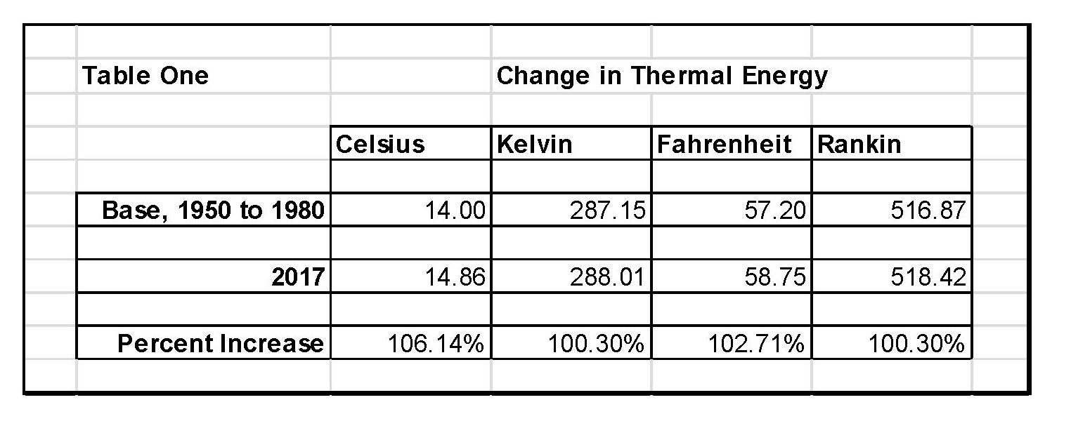
The next step is to plot Carbon Diode (CO2) from NOAA-ESRL and the estimated global temperature as published by NASS-GISS each month. As can be seen in Table One It doesn’t really matter whether we would use Kelvin and Rankin since the increase in thermal energy is exactly the same either way; but we’ll use Kelvin as that is the accepted norm in the scientific community for determining the amount thermal energy in any object especially when looking at changes in temperature or measuring the thermal energy in any object. There are other less known temperature scales that have specific purposes but they don’t really apply here in this subject.
The important thing is how much has the temperature actually gone up since we started to measure CO2 in the atmosphere? To show this graphically Chart 8 was constructed by plotting CO2 as a percent increase from when it was first measured in 1958, the Black plot, the scale is on the left and it shows CO2 going up about 30.0% from 1958 to May of 2018. That is a very large change as anyone would have to agree. Now how about temperature, well when we look at the percentage change in temperature from 1958, using Kelvin, we find that the changes in global temperature are almost un-measurable. The scale on the right side had to be expanded 5 times (the range is 20 % on the left and 4% on the right) to be able to see the plot in the same chart in any detail. The red plot, starting in 1958, shows that the thermal energy in the earth’s atmosphere increased by .30%; while CO2 has increased by 30.0% which is 100 times that of the increase in temperature. So is there really a meaningful link between them that would give as a major problem?

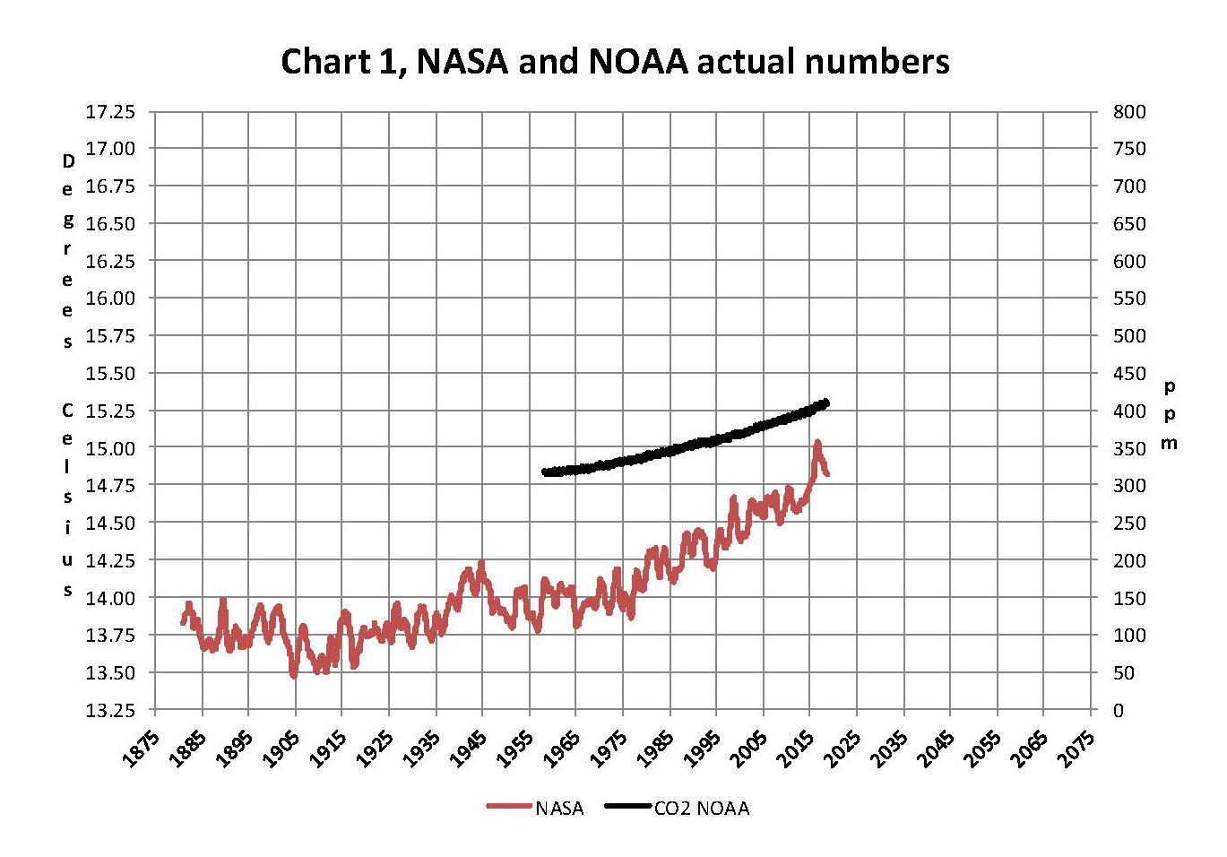
Chart 8 and all the rest of what is shown here in this paper are based on the following two data series. First NASA-GISS estimates of a global temperature shown as an anomaly (converted to degrees Celsius) as shown in their table Land Ocean Temperature Index (LOTI) and shown in Chart 1 as the red plot labeled NASA the scale for the temperatures is on the left. The NASA LOTI temperatures are shown as a 12 month moving average because of the very large monthly variations. Second NOAA-ESRL CO2 values in Parts per Million (PPM) which are shown in Chart 1 as a black plot labeled NOAA the scale for CO2 is shown on the right no change is required to the NOAA data set it is ready to use as is.
NASA published data is shown as an anomaly, but what is a temperature anomaly? An anomaly is a deviation from some base value normally an average that is fixed. There were two problems with the system that NASA picked which were number one there is no “actual” global temperature and two since climate is a variable and always has been so there cannot be a real base to measure from. NASA known for its science and engineering expertise back in the day thought it could get around these issues and created a system to do so. First they developed a computer model which took the readings from all over the planet and made adjustments to them in software which they called homogenization and came up with the estimated global temperature. Second they picked the period 1950 to 1980 (30 years) and averaged the values found in that period and came up with 14.00 degrees Celsius and make that their base. Lastly they took the calculated monthly temperature and subtracted the base from it which gave them the anomaly and multiplied the result by 100.
The problem is that both are arbitrary. Why pick 1950 to 1980 as the base period? Is there something special about that time frame? And as to a global temperature there is no such thing for many reasons like the earth faces the sun so one side is cool and onside it warm. Higher latitudes are cooler than the equator and higher elevations are cooler than lower. And finally there are many areas where there are no measurements taken. Therefore there is no one temperature only an artificial artifact solely dependent on the soundness of the software used to create that one temperature!
Chart 1 below is 100% accurate and based only on NASA and NOAA data as published.
Now that we have a base to work with we are going to add to Chart 1 three things. The first is a trend line of the growth in CO2 since that is according to the government through NASA and NOAA the entire basis for climate change. That plot is superimposed over the black plot of the actual NOAA CO2 values as the cyan line labeled as the CO2 model and one can see there is a very good fit to the actual NOAA values so there should be no dispute about its validity, and it’s historically accurate. This plot allows us to make projections to future global temperatures according to the projected level of CO2The second added item is James E. Hansen’s 1988 Scenario B data, which is the very core of the IPCC Global Climate models (GCM’s) and which was based on a CO2 sensitivity value of 3.0O Celsius per doubling of CO2. This plot is shown here in lavender and is from a presentation that Hansen showed congress in 1988 to help support the UN in setting up the International Panel on Climate Change (IPCC). This plot is labeled as Hansen Scenario B which Hansen stated was the most likely to happen based on his 1979 climate theories’. The third item is the current plot of the most likely temperature of the planet based on the growth of CO2 published by the IPCC. This plot is shown in Red and is labeled as IPCC AR5 A2 as that is the table where the data was found. This plot is a GCM computer projection of the planets temperature based on the complex relationships developed by the IPCC primarily though NASA and NOAA.

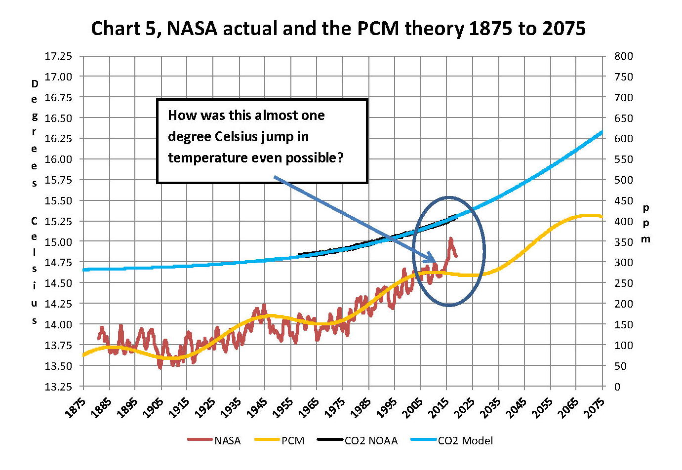
It can be seen in Chart 2 that the lavender plot and the Hansen plot are very close from 1965 to around 2000. However there isn’t a good correlation between the growth in CO2 and the increase in the planets temperature, as shown in Chart 8. The CO2 is going up in a log function and the temperature was going up until 2000 then it plateaued from 2000 until 2014 where there was a mysterious spike up of .5 degrees Celsius just in time for COP21 in Paris. Then after CP21 was over the unexplained change in temperature started to come back down. The climate doesn’t make changes like what the NSA/NOAA data shows that would be weather if it even was real.
Chart 7 looks at the period from 2010 to 2020 so we can see where a change in CO2 of only a few ppm has caused a major change in the global temperature way beyond anything previously shown in any published NASA data. There are three ovals on Chart 7 one at the top of Chart 7 which is a black oval around the CO2 levels from 2010 to 2018 and it’s very obvious that there has been very little change, maybe 3 ppm a year Then at the bottom of Chart 7 is dark red oval around the NASA global temperature levels from 2013 to 2018 and its very obvious that there has been a sudden large change, almost .50 degrees Celsius in 3 years. There has never been such a large increase in temperature from such a small increase in CO2. By contrast the previous comparable period of the last part of 2010 through 2013 Blue oval shows about the same increase per year for CO2 but global temperature decreased.
An explanation is needed here as the NASA temperature plot in Chart 7 seems to show the jump in temperature in 2016 not 2015; this is a result of the very large jump in temperature shown by NASA. Since we are using a 12 month moving average and the increase occurred in only a few months it actually shifted the curve into 2016. The raw data for December 2012 was at a low of 14.44 degrees Celsius but by February 2016 the temperature was at a record high of 15.35 degrees Celsius a .91 degree Celsius increase, Red arrow. With the global temperature over 15.0 Celsius at COP21 in December 2015 at the Paris COP21 conference the climate accord was approved and the manipulation was a success. After COP21 the Fake Warming was no longer needed so we are now seeing a downward trend developing. The current temperature for June 2018 is 14.88 degrees Celsius.

In summary, the IPCC models were designed before a true picture of the world’s climate was understood. During the 1980’s and 1990’s CO2 levels were going up and the world temperature was also going up so there appeared to be correlation and causation. The mistake that was made was looking at only a ~20 year period when the real variations in climate move in much longer cycles of centuries which can be observed in the NASA data but they were ignored for some reason. By ignoring those actual geological trends and focusing only on CO2 the Global Climate Models will be unable to correctly plot global temperatures until they are fixed. Also the temperature data from 1850 to 1880 was dropped for some reason as it showed a lower temperature than would be expected. The lower temperatures’ in that period would have shown a shorter cycle they didn’t want shown.
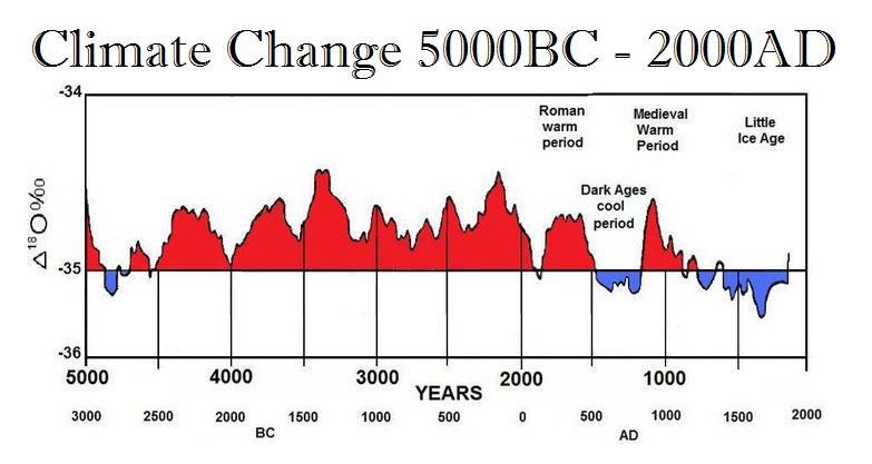
A decade ago when I started looking at “climate” change the first thing I did was look at geological temperature changes since it is well known that the climate is not a constant; I learned that 53 years ago in my undergrad geology and climatology courses in 1964. The next paragraph explains currently observed patterns in climate related to this subject and is historical accurate.
Ignoring the last Ice Age which ended some 11,000 years ago when a good portion of the Northern hemisphere was under miles of ice the following observations give a starting point to any serious study on the subject of climate. First, there is a clear movement up and down in global temperatures with a 1,000 some year cycle going back at least 3,000 to 4,000 years; probably because of the apsidal precession of the earth’s orbit of about 20,000 years for a complete cycle. About every 10,000 years the seasons are reversed making the winter colder and the summer warmer in the northern hemisphere. 10,000 years from now the seasons will be reversed again. Secondly, there are also 60 to 70 year cycles in the Pacific and the Atlantic oceans that are well documented. These are known as the Atlantic Multi Decadal Oscillations (AMO) in the Atlantic and as La Nina and El Nino in the Pacific. Thirdly, we also know that there are greenhouse gases such as carbon dioxide that can affect global temperatures. Lastly the National Academy of Sciences (NAS) estimated that carbon dioxide had a doubling rate of 3.0O Celsius plus or minus 1.5O Celsius in 1979 when there were only two studies available and one for sure and maybe both were not peer reviewed.
The result of looking objectively at the three possible sources of global temperature changes was a series of equations based on these observations that when added together produced a sinusoidal curve that seemed to follow NASA published temperatures very closely when first developed in 2007, and modified a few years later when it was found the short and long cycles were related to multiples of Pi. Since this curve was based on observed temperature patterns it was called a Pattern Climate Model (PCM) which has been described in previous papers and posts on my blog and since it is generated by “equations” many assume it is some form of least squares curve fitting, which it is not. It does seem to be related to ocean currents where the bulk of the planet’s surface heat is stored and cloud formation.
Chart 5 shows the PCM a composite of two cycles and CO2. There is a long trend, 1036.7 years with an up and down of 1.65O Celsius (.00396O C per year) we in the up portion of that trend. Then there is a 69.1 year cycle that moves the trend line up and then down a total of 0.29O Celsius and we are now in the downward portion of that trend (-.01491O C per year), which will continue until around ~2035. Lastly, there is CO2 currently adding about .0079O Celsius per year so together they all basically wash out at -.0039O C per year, which matches the current holding pattern we were experiencing until 2014. After about 2035 the short cycle will have bottomed and turn up and all three will be on the upswing again duplicating what was observed in the 1980’s. Note: the values shown here are only representative from what is in the model.
When using a 12 month running average for global temperatures up until 2014 the PCM model was within +/- .01 degrees of what NASA was publishing in their LOTI table since the early 1960’s as shown in Chart 5. Further the back projection of the PCM plot matched historical records and global temperatures going back past the time of Christ. It should also be considered that geologically CO2 levels have reached levels many times that of the current 400 ppm without destroying the planet so the current hysteria over the current very small numbers can only be explained by political science not real science.
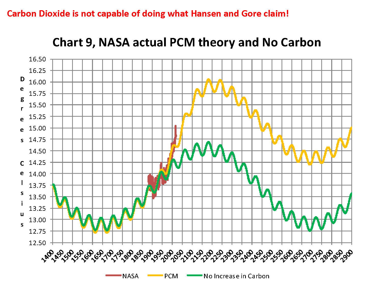
Lastly, Chart 9 shows what a plot of the PCM model, in yellow, would look like from the year 1400 to the year 2900. This plot matches reasonably well with recorded history and fits the current NASA-GISS table LOTI data, in red, very closely, despite homogenization. I do understand that this PCM model is not based on physics but it is also not some statistical curve fitting. It’s based on two observed reoccurring patterns in the climate and a factor for CO2. These patterns can be modeled and when they are, you get a plot that works better than any of the IPCC’s GCM’s. If the real conditions that create these patterns do not change and CO2 continues to increase to 800 ppm or even 1000 ppm then this model will work well into the foreseeable future. 150 years from now global temperatures will peak at around 15.750 to 16.000 C and then they will be on the downside of the long cycle for the next ~500 years.
The overall effect of CO2 reaching levels of 1000 ppm or even higher will be about 1.50 C which is about the same as that of the long cycle. The Green plot on Chart 9 shows the observed pattern with no change in CO2 from the pre-industrial era of ~280 ppm. CO2 cannot affect global temperatures more than 1.500 C +/- no matter what the ppm level of CO2 is. The reason being that the CO2 sensitivity value is not 3.00 per doubling of CO2 but less than 1.00 C per doubling of CO2 as shown in more current scientific work and it’s a logistics curve not a log curve.
The purpose of this post is to make people aware of the errors inherent in the IPCC models so that they can be corrected.
The Obama administration’s “need” for a binding UN climate treaty with mandated CO2 reductions in Europe and America was achieved as predicted at the COP12 conference in Paris in December 2015. To support this endeavor NASA was forced to show ever increasing global temperatures that will make less and less sense based on observations and satellite data which will all be dismissed or ignored. Within a few years the manipulation will be obvious even to those without knowledge in the subject, but by then it will be to late the damage to the reputation of science will have been done. Fortunately President Trump pulled us out of the bad agreement.
In closing keep this in mind. The current panic generated by the government using political science is that the current global temperature of around 15.0O Celsius is an increase of 7.14% from the 1960’s when the global temperature was 14.0O Celsius; and that does seem like a lot. However those views would be in error as the actual increase in thermal energy, as measured by temperature, would be only .35% because we must use Kelvin not Celsius when working with heat energy. When we use kelvin the temperature goes from 287.15O K to 288.15O K which is only .35% not 7.14% about 1/20 of what is implied by the IPCC. What the IPCC shows is not technically wrong as much as it is extremely misleading to anyone without a science background.
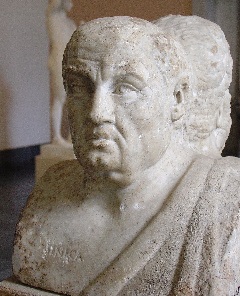
Sir Karl Raimund Popper (28 July 1902 – 17 September 1994) was an Austrian and British philosopher and a professor at the London School of Economics. He is considered one of the most influential philosophers for science of the 20th century, and he also wrote extensively on social and political philosophy. The following quotes of his apply to this subject.
If we are uncritical we shall always find what we want: we shall look for, and find, confirmations, and we shall look away from, and not see, whatever might be dangerous to our pet theories.
Whenever a theory appears to you as the only possible one, take this as a sign that you have neither understood the theory nor the problem which it was intended to solve.
… (S)cience is one of the very few human activities — perhaps the only one — in which errors are systematically criticized and fairly often, in time, corrected.
QUESTION: Mr. Armstrong; You mentioned that the environment was the primary cause of the Greek Dark age between the Heroic and Hellenistic periods. Can you elaborate on that at all?
Thank you. They do not seem to connect the dots as you say in school
MG
ANSWER: What is most interesting is the fact that they do not connect the dots which are so glaring for that period of time. The Bronze Age Collapse was a Dark-Age in the Near East, Asia Minor, Aegean region, North Africa, Caucasus, Balkans and the Eastern Mediterranean. This encapsulated the transition from the Late Bronze Age to the Early Iron Age, which was violent, sudden, and a major setback for civilization as a whole. We seem to focus on the fall of Rome, but not the catastrophic collapse of the Bronze Age.
The political economy of city-states that dominated the Aegean region and Anatolia region (Modern Turkey), simply disintegrated much like Rome whereby people abandoned cities and formed small isolated village during the Greek Dark Age. This takes place about 51.6 years following the cultural collapse of the Mycenaean kingdoms, of the Kassite dynasty of Babylonia, of the Hittite Empire in Anatolia and the Levant, and of the Egyptian Empire. We also see the political-economic destruction of Ugarit and the Amorite states in the Levant. Over in the Luwian states of western Asia Minor, we also see a collapse in civilization. There was also a period of tremendous political-economic chaos in Canaan (Israel). This wholesale collapse of all of these city-states resulted in the collapse of trade routes as we saw with the collapse of Rome. This also manifests in the reduction of literacy in much of the known world.
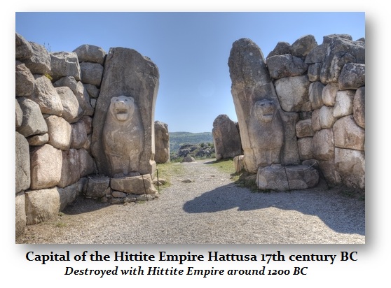
Hattusa became the capital of the Hittite Empire in the 17th century BC. The city was destroyed, together with the Hittite state itself, around 1200 BC, as part of the Bronze Age collapse. The site was subsequently abandoned. Modern estimates put the population of the city between 40,000 and 50,000 at it’s the peak. The dwelling houses which were built with timber and mud bricks have vanished from the site, leaving only the ruins of the stone built temples and palaces. The lost city was rediscovered at the beginning of the 20th century in central Turkey by a German archeological team. One of the most important discoveries at the site has been clay tablets, consisting of legal codes, procedures, and literature of the ancient Near East.
In the first phase of this fascinating period, we witness the complete violent destruction, and abandonment of cities such as Hattusa, Mycenae, and Ugarit. This all takes place within just one 51.6 year wave of the Economic Confidence Model at the end of the 13th century and the beginning of the 12th century BC. Civilization seems to collapse on a grand wholesale basis with almost every significant city in the eastern Mediterranean world is then destroyed, many of which were never again to ever be occupied again.
Assyria and Elam appear to survive the Bronze Age Collapse and then even Elam is nearly completely destroyed by Nebuchadnezzar I who revived Babylonian Empire briefly before he in turn suffered a series of defeats by the Assyrians. After the death of their leader, Ashur-bel-kala in 1056 BC, then we see Assyria began an economic decline for about 112 years. – but by the end of the 12th century BC as it really fell back to just a city-state but it did survive the Bronze Age Collapse just greatly reduced by around 1000BC.
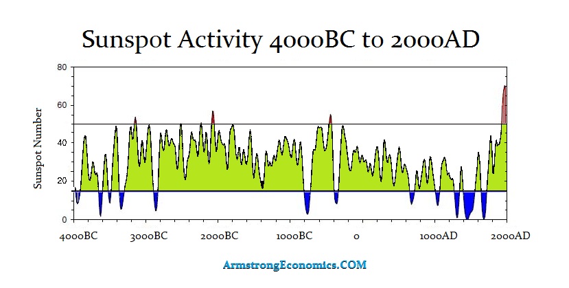
By the end of the ensuing Dark Age that engulfed the entire region, the former Hittite Empire appears to be broken apart in separatist movements and what eventually emerges is independent city-states in Cilicia and the Levant (Syria). This period seems to be great migrations as people began to move south due to climate change. Bu the mid-10th century BC, we see Aramaeans moving into the Levant and the Philistines then settle in southern Canaan where the Canaanite-speaking Semites. From 935 BC after the worst of the collapse in sunspot activity, Assyria began to reorganize and once more expand outwards reestablishing the Neo-Assyrian Empire (911-605 BC), which the Egyptians even feared. Phrygians, Cimmerians, and Lydians arrived in Asia Minor, who were Greek in origin. The Colchians (Georgians) also emerge at this time. The various people of this region appear to reform civilization with the warming becoming the Iranian peoples such as the Persians, Medes, Parthians, and Sargatians. These groups all appear in Ancient Iran soon after the Sunspot low. In the Aegean, this is the reappearance of the Classical Greece Era.
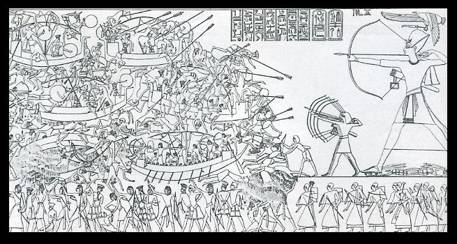
This is the period of the Great Migration South as I call it. They are known as the Sea People who invaded Northern Africa which corresponds to the colder climate up north. The Sea Peoples remain unidentified and have remained a source of much speculation. In the archaeological record, the Philistines first appear in the early 12th century BC with the Bronze Age Collapse. Their arrival is signaled by artifacts that belong to what is clearly an extraordinarily different culture from other local populations at the time. Their pottery closely parallels to the ancient Greek world. They also use Aegean rather than a Semitic script. They also eat pork as well as the occasional dog. Several passages in the Hebrew Bible describe the interlopers as coming from the “Land of Caphtor,” or modern-day Crete. Keep in mind that Crete fell to Mycenae who also conquered Troy after Thera erupted and destroyed much of the Minoan economy. I believe the Sea People were of Mycenae in origin.
There is a lack of contemporary historical explanation documenting this period. However, correlating it with the weather, it appears that we are dealing with a Climate Change where the Earth entered into a very cold period and crops failed forcing a migration south.
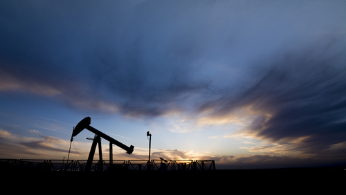
The price of Western Canadian Select (WCS) crude dropped more than US$55 per barrel BELOW North American benchmark of West Texas Crude. The widening discount is evidence the commodity is illustrating how the environmentalists are really destroying the Canada economy. They are causing taxes to rise as social programs continue on an unsound footing and in the meantime, they are undermining the economy in Alberta. The Federal Court of Appeal ruled in August that the National Energy Board (NEB) review of the Trans Mountain pipeline expansion was too flawed for the federal government to base its decision on. The prevention of pipeline construction means that the oil has to be taken out by an inefficient method.
The prices being paid for Western Canadian oilsands bitumen have fallen so far that many producers are losing money on every barrel sold into the spot market. The Western Canada Select price is for a blend of heavy, sticky bitumen and light oil needed to dilute it so it can flow in a pipeline. The price of WCS fell under $20 per barrel. They insist that everyone has to pay a Global Warming Tax in Canada and then they want to shut down the use of any oil whatsoever. Meanwhile, universities in Canada teaching engineering have seen a collapse in those even interested in obtaining a degree in energy. They are really creating a crisis for the younger generations on the other side of 2020.
An independent audit of the key temperature dataset that is being used by climate models has exposed more than 70 problems with the data which render it “unfit for global studies.” Problems include zero degree temperatures in the Caribbean, 82 degree C temperatures in Colombia and ship-based recordings taken 100km inland. The audit has concluded that the studies are deliberately exaggerating temperatures to support a theory of global warming utilizing global averages that are far less certain than what is being forecast.
 The audit has revealed that “that climate models have been tuned to match incorrect data, which would render incorrect their predictions of future temperatures and estimates of the human influence of temperatures.” Furthermore, the Paris Climate Agreement adopted 1850-1899 averages as “indicative” of pre-industrial temperatures is “fatally flawed.” The entire Paris Climate Agreement has an agenda to eliminate effectively the advancement of society and attempt to reset the clock to the pre-Industrial Revolution. This entire theory that before the Industrial Revolution, our planet’s atmosphere was somehow pristine and uncontaminated by human-made pollutants has been also proven to be completely bogus. Bubbles trapped in Greenland’s ice has revealed that we began emitting greenhouse gases at least 2,000 years ago. The Romans even constructed the first aqueduct was built in 312 BC because there was a serious problem with water pollution. Seneca (c 4BC-65AD), the adviser to Nero, wrote in 61AD: “No sooner had I left behind the oppressive atmosphere of the city [Rome] and that reek of smoking cookers which pour out, along with clouds of ashes, all the poisonous fumes they’ve accumulated in their interiors whenever they’re started up, than I noticed the change in my condition.”
This new audit argues even the most simple basic quality checks had not been done on the HadCRUT4 data which is managed by the UK Met Office Hadley Centre and the Climate Research Unit at the University of East Anglia. The audit exposed that estimates were made of the uncertainties arising from thermometer accuracy, homogenization, sampling grid boxes with a finite number of measurements available, large-scale biases such as urbanization and estimation of regional averages with non-complete global measurement coverage.
The audit has exposed the dishonesty in this entire scheme and it appears to be directed at the goal of reducing the population. Anomalies it has identified include at St Kitts in the Caribbean, the average temperature for December 1981 was zero degrees, normally it’s 26C. For three months in 1978, one place in Colombia reported an 82 degrees Celsius average – hotter than the hottest day on Earth. Then in Romania, one September the average temperature was reported as minus 46°C, which has never happened. The data showed that supposedly ships would report ocean temperatures from places up to 100km inland. The paper also points out that the most serious flaws identified was the shortage of data. For the first two years, from 1850 onwards, the only land-based reporting station in the Southern Hemisphere was in Indonesia. Then there were ship observations at the time but Australian records had not started until 1855 in Melbourne, behind Auckland which started in 1853. This data appears to have been just made up.
According to the HadCRUT4 calculation of coverage, it was almost 1950 before there was data from even half of the Southern Hemisphere was available. Yet they claim global warming has taken hold for 100 years prior. Then the Paris Climate Agreement takes the HadCRUT4 average from 1850 to 1899 as an “indicative” temperature or pre-Industrial Revolution. There is absolutely no possible way the data set being used to support all this Global Warming is even valid for any forecast.
I have created this site to help people have fun in the kitchen. I write about enjoying life both in and out of my kitchen. Life is short! Make the most of it and enjoy!
De Oppresso Liber
A group of Americans united by our commitment to Freedom, Constitutional Governance, and Civic Duty.
Share the truth at whatever cost.
De Oppresso Liber
Uncensored updates on world events, economics, the environment and medicine
De Oppresso Liber
This is a library of News Events not reported by the Main Stream Media documenting & connecting the dots on How the Obama Marxist Liberal agenda is destroying America
Australia's Front Line | Since 2011
See what War is like and how it affects our Warriors
Nwo News, End Time, Deep State, World News, No Fake News
De Oppresso Liber
Politics | Talk | Opinion - Contact Info: stellasplace@wowway.com
Exposition and Encouragement
The Physician Wellness Movement and Illegitimate Authority: The Need for Revolt and Reconstruction
Real Estate Lending
