The Hunger Stones Have Appeared


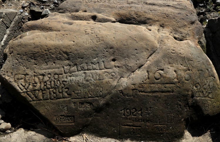
While the Global Warming fanatics are out in force saying “see” the heat in Europe is caused by humans driving their cars around, they continue to ignore history. The extreme heat in Europe this year is part of a cycle. The swings from extreme heat to extreme cold are also not unheard of. Another piece of historical evidence they ignore is known as the Hungry Stones. Pictured here is a Hungry Stone from 1616 which has been exposed by the low level of water in the Elbe River. This is at Decin, in the Czech Republic. Throughout the centuries, there have been these cycles of extreme heat followed by extreme cold. Such events have been recorded when drought has resulted in the low level of water in the Elbe river.

This year’s drought in Europe has exposed once again the Hunger Stones that have been used for centuries to commemorate historic droughts which warn of their consequences when you see these stones again. The Hunger Stones are visible in the Elbe River once again. This is a major river which begins in the Czech Republic and flows through Germany. There are more than a dozen Hunger Stones that serve as records of previous droughts establishing that the extreme heat and drought of this year is by no means unique to history.

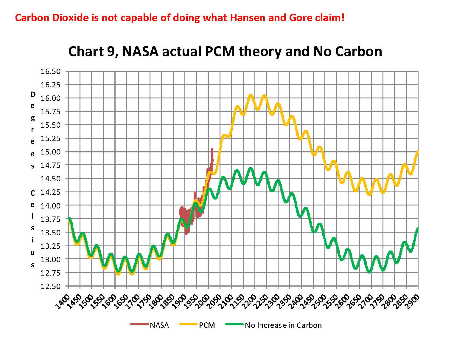
The various Hunger Stones record droughts that resulted in famine and soaring prices for food. The droughts that have been recorded on the stones date to 1417, 1616, 1707, 1746, 1790, 1800, 1811, 1830, 1842, 1868, 1892, and 1893, which covers a period of 476 years. This produces an average of 39.6 years. Just applying that average would bring you to 2012. However, we have to look closer. Note that two years 1892 and 1893 are back-to-back. This does not reflect two separate droughts, but the peak in intensity. Instead of there being TWO separate droughts, it is the same even just extended. That means there were really 11 events within this 476-year span of history and low and behold this alters the average to 43.27 years. This actually conforms to our Economic Confidence Model frequency of 8.6 years /2 = 4.3.

In fact, additional evidence that is being ignored by the Global Warming crowd who seem intent upon leading society to its doom by ignoring the past entirely. Extensive research has also been done on tree-rings in north-central Europe. This study has discovered that there has been a pattern of “megadroughts” in the 15th through 19th centuries. They classified 1893 as the “Great Drought of 1893” where rainfall decline between 30 to 90% throughout various regions in Europe. They also found that the Irish famine of 1740–1741 was the result of a cooling period they pointed out resulted in unusually low winter and spring temperatures in 1740 that produced in crop failures and a massive subsequent famine. They point out that there were five major “megadrought” that took place in 1540, 1590, 1616, 1718, and 1719. Once again, we see back-to-back events in 1718 and 1719 which in our analysis reflect a build up in intensity rather than two separate events. Reducing this to 4 evens once again gives us an average of 44.75 years which is very close to the Pi frequency. If we plot this serious out, we arrive at 2020.

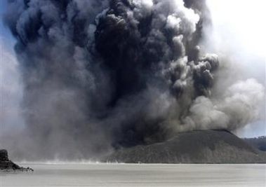
It appears that instead of a back-to-back event in 2019, this cand become the worst period of intensity and produce three years of drought into 2020. The greater the number of volcanos erupting can also produce an increase in intensity for this period. What we must be concerned about is volcanic activity appearing in the West Indies, which includes Soufriere on St. Vincent. It is the stratovolcano type event that can change the weather. These are volcanoes that are known as a composite volcano, which is a conical volcano built up by many layers (strata) of hardened lava, tephra, pumice, and ash. When they erupt, this sends a tremendous amount of material into the atmosphere which reduces sunlight and cools the temperatures.

When we ran the drought data through our models, not only did it correlate with the ECM, it also coordinated with the first historical eruption of the volcano which took place during 1718 and a subsequent eruption 1812. Now, look at the drought records of megadroughts – 1718/1719. When we ran the model, out comes the year 1816 which s known as the Year Without a Summer. The climate turned extremely cold and it was snowing in July in New York City. This resulted in major food shortages across the Northern Hemisphere. Note that the second eruption was 1812.

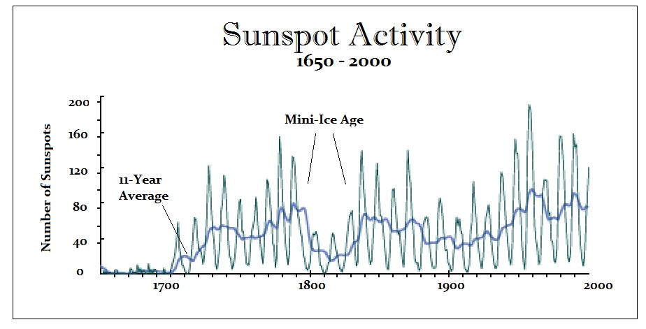
When we correlated this entire period, what emerged was a dramatic increase in volcanic activity which also correlated with the decline in the energy output of the sun. Our model warned that volcanic activity would rise beginning here in 2018 correlated with a decline in the energy output of the sun which should have begun in 2015.  Note that the Hunger Stones also mark the year 1811. While this is one year prior to the eruption in the West Indies in 1812, there is what has been called the 1808/1809 Mystery Volcanic Eruption which seems to have set in motion a Mini Ice Age during the early 1800s. This was a monumental volcanic eruption in the VEI 6 range which appears to have taken place in late 1808. This event preceded the 1815 eruption of Mount Tambora (VEI 7) which produced the Year Without a Summer in 1816.

There was the period climatologists called the Little Ice Age they believed took place starting around 1650. This was the result of primarily the decline in the energy output of the sun reflected in the drastic decline in sunspot activity. What we are looking at here is a drastic correction in market-terminology which took place during the early 1800s. A study of Greenland and Antarctic ice cores in the 1990s revealed evidence that pointed to a massive volcanic eruption that had occurred in early 1809. The problem that everyone face was there were not human records of such an event. This meant that it must have been in a region where humans did not record the event. Additional research revealed from tree-ring data that there was also a major eruption in 1808. Now two independent sources were pointing to a mystery eruption – but where?

The mystery was simply that such a catastrophic eruption of that magnitude should have been noticed by someone. They began to scour the records around the world hoping that someone somewhere recorded the event. Finally, in 2014 a Ph.D. student Alvaro Guevara-Murua and Dr. Caroline Williams of the University of Bristol discovered an account of atmospheric events consistent with such an event by Colombian scientist Francisco José de Caldas who recorded a massive transparent cloud that obstructed the sunlight at Bogotá, Columbia in early 1809. The further investigation revealed that the cloud was first been observed by him on December 11th, 1808. De Caldas reported conditions consistent with a volcanic cloud that altered the weather turning it unusually cold, with even bitter frosts in Columbia.

Further investigations to the south in Peru produced another observation by a physician named Hipólito Unanue of Lima. Combining these two observations led to the conclusion that the window of the eruption was sometime within 14 days of December 4th, 1808. The only area in the tropics to the west of Colombia and Peru with possible volcanoes was also located in the South Western Pacific Ocean between Indonesia and Tonga. At the time, there was hardly any reporting coming from this region lacking European settlements. The Rabaul area has had such major VEI 6+ eruptions but records only date back to the mid-1800s.

However, this one catastrophic VEI6+ eruption is NOT the only volcano that erupted. This is why we have warned that the cyclical period for volcano eruptions turned upo with 2018. In 1808 there were major additional eruptions in Urzelina, the Azores during May (1st to 4th), as well as the Taal Volcano, in the Philippines during March that year.  There was also the Chilean Putana volcano which had a major eruption during of 1808-1810 (records are not precise) This period is then followed by the truly massive 1815 eruption of Mount Tambora in the Dutch East Indies. This one is attributed with creating the Year without a Summer because it was the largest eruption in at least 1,300 years that has been recorded. This event was followed by the 1814 eruption of Mayon in the Philippines, which appears to have contributed to the weather changes of cooling creating an accumulative event.

Our models have pinpointed yet another such period that perhaps sent human civilization into the Dark Ages. There was a similar period with volcanos and extreme weather events of 535–536. Researchers from Los Alamos Laboratory published a thesis (LA-UR 004608) in this study these researchers developed a model recreating a volcanic eruption of such proportion that it staggers the human mind. This eruption is known as the Proto-Krakatau eruption. It occurred in the year 536 AD in the present day country of Indonesia. This predecessor or the 18 15 AD eruption of Krakatau of the same name and place was many times greater. The evidence these scientists present is that this resulting blast of this super volcano with its caldera (magma chamber) collapsing beneath it formed the Strait of Sunda between the islands of Sumatra and Java. Before this explosive eruption, these two islands were one land mass. The bathymetry data indicates this caldera is about 40 to 60 km in diameter. Michael the Syrian: “The Sun became dark and its darkness has lasted eighteen months. Each day it shone for about four hours, and still, this light was only a feeble shadow the fruits did not ripen, and the wine tasted like sour grapes.”

This appears to be the eruption of the volcano Krakatoa is located on Rakata, in the Pacific between Java and Sumatra, Indonesia. We know the name from the major eruption on August 26th, 1883 which was one of the most catastrophic ever witnessed in recorded in modern history. Previously, we knew of a more moderate eruption that took place back in 1680. Contemporary historians recorded events. Procopius wrote in 536AD: “during this year a most dread portent took place. For the sun gave forth its light without brightness … and it seemed exceedingly like the sun in eclipse, for the beams it shed were not clear.” John the Lydian, or John Lydus, was a 6th-century Byzantine administrator and a historian who wrote also in 536AD: “The sun became dim … for nearly the whole year … so that the fruits were killed at an unseasonable time.”

In Mesopotamia, a source quoted by Michael the Syrian (ca. 1166-1 199 AD) and Bar-Hebraeus 1246-1286 records that: “In the year 848 of the Greeks [536 A.D.]. the Sun was dark and its darkness lasted for eighteen months, each day it shone for about 4 hours, and still, this light was only a feeble shadow,. , the fruits did not ripen and wine tasted like sour grapes”

Flavius Magnus Aurelius Cassiodorus Senator (c. 485 – c. 585),  was a Roman statesman and a historian. He wrote of this period: “The sun … seems to have lost its wonted light, and appears of a bluish color. We marvel to see no shadows of our bodies at noon, to feel the mighty vigor of the sun’s heat wasted into feebleness, and the phenomena which accompany an eclipse prolonged through almost a whole year. We have had … a summer without heat … the crops have been chilled by north winds … the rain is denied …”

The ice core samples clearly show actually two very large sulfate peaks that occur with volcanos. The first took place during 537AD and the second follows in 541—542AD. Therefore, once again we may be dealing with multiple volcanic eruptions. Both peaks are approximately the same size. It is the first event that has been recorded as the catastrophe. Contemporary historians mention above have provided contemporary accounts of this dramatic decrease in the Sun’s brightness during 536 and 537 AD. We have yet another contemporary account of a historian from Constantinople (Hamilton and Brooks, 1899, p. 267), believed to be Zacharius of Mytilene, who describes: ‘”In the year 14 [536 AD], the Sun began to be darkened by day and the Moon by night… from the 24th of March in this year until the 24th of June in the following year 15.” Because the dimming was less severe and shorter in duration, it is generally assumed that the atmosphere was filled with fine volcanic ash or dust from this event. (Rigby et al., 2004; Larsen et al., 2008), There is no question that SO2 emissions from volcanos produce a cooling trend in weather. However, it has also been shown that there is a time lag between 6 and 18 months that will vary depending upon how far up the ash is thrust into the atmosphere. Thus, there can be a delayed effect from when the eruption actually takes place.

Yet there is still another theory that strangely comes into play this October/November. The argument is that we pass through a particularly dense section of the Taurid Meteor path around every 2500 years and this has contributed to legends and climate change. Every year there are as South Taurid Meteor shower which will peak overnight on Oct. 9-10 for the Southern Hemisphere and then in the Northern Hemisphere, the North Taurid Meteor shower peaks Nov. 11-12. This has provided the foundation for love stories and wishing upon a shooting star. However, there have been intense Meteor storms that led to legends of dragons fighting in the sky breathing fireballs at each other. Chinese historical records from 540AD describe: “Dragons fought in the pond of the K’uho, They went westward … in the places they passed, all trees were broken.” Ice core sample also contain extraterrestrial dust from this period as well. It is argued that a larger meteor struck the Earth about this time and this is what is described as dragons fighting in the sky.

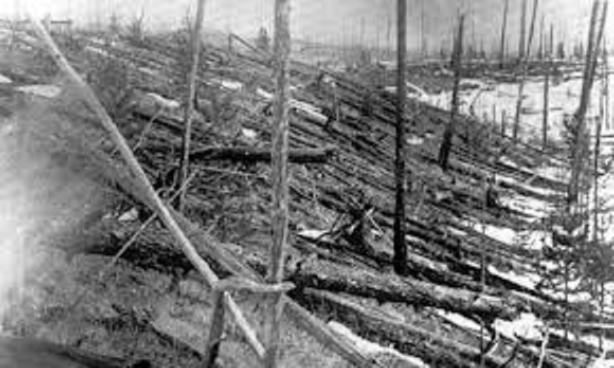
The one major know meteor even is that of Tunguska which was a large explosion that occurred in Russia, on the morning of June 30th, 1908. The explosion flattened 770 square miles (2,000 square kilometers) of the forest. The explosion is classified as an impact event, even though no impact crater has been found. The meteor is believed to have exploded above ground and thereby disintegrated at an altitude of 3 to 6 miles before it actually struck the ground.  This is the largest impact event on Earth in recorded history, not geological history.

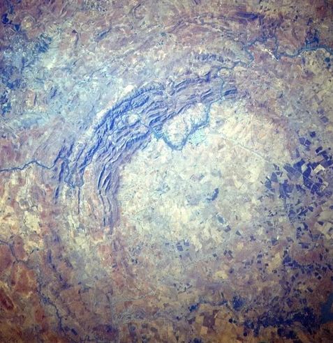
Meteorite impacts are by far perhaps among the most destructive forces in the solar system. It is believed that such events have resulted in mass extinctions. However, there are others who suggest that they may have also delivered the seeds of life soon after Earth was born. The oldest impact crater on Earth is also the largest and it is located in South Africa. It is known as the Vredefort Crater for it was originally 185 miles in diameter which struck some 2.02 billion years ago (pictured here). There is another major impact known as the  Chicxulub crater located in the Yucatan peninsula of Mexico which is 93 miles in diameter that some argue may have wiped out the dinosaurs with a blast that was equal to the estimated energy of 10 billion Hiroshima A-bombs which took place about 66 million years ago.

Global Temperatures Changes July, 2018, Man Made or Not?


We have been schooled over the past 40 years that Carbon Dioxide (CO2) is rising to levels never seen before on this planet and as a result the world’s average temperature is rising to levels that will, if nothing else, destroy large areas of the planet. The latest UN predictions indicate a major Catastrophe will happen by 2040 unless we do something drastic right now. This destruction will be from two factors; one, ocean levels raising and flooding all worlds coastal areas forcing the world population to higher ground; and two, even if those moves are accomplished the increased temperatures will bring massive storms that will ravage the areas not flooded. The only solution to prevent this from happening is, stop using carbon based fuels; petroleum, natural gas, and coal which, all, generate large amount of water and carbon dioxide and replacing them with wind or solar energy.

These dire projections are based on the belief that CO2 is the “primary” driver of global temperature changes; i.e. more CO2 in the atmosphere is very bad. This view is severally distorted and more likely entirely false.  One can argue the reasons for these lies but it really doesn’t matter whether they are innocent or malicious in their construct; either way promoting something that is tearing up the worlds civilizations by misallocation of resources is very misguided.

Basic facts:

  • The planets global temperature is directly related to the energy arriving here from our sun
  • That energy manifests itself in a form which we call temperature
  • Temperature is a measure of the amount of heat (energy) that an object holds
  • The planets temperature is directly related to the amount of water in the atmosphere
  • Without water in the atmosphere the earth would be 330 Celsius colder and frozen solid
  • Carbon Dioxide (CO2) is a requirement for life to exist on this planet
  • More Carbon Dioxide (CO2) is better as planets grow faster, less Carbon Dioxide (CO2) is bad
  • Carbon Dioxide (CO2) only indirectly affects temperature probably less than 5% that of water
  • Climate is a measure of the average of all the factors that produce a stable environment
  • Weather is a measure of local factors that may make large changes in daily or seasonal conditions
  • The planets temperature in geological times ranged from170 Celsius +/- 60 Celsius
  • 12,000 or so years ago the last ice age ended for no reason we can determine


The first thing that needs to be done when developing a theory is to identify and define the issue or problem. The issue was that after WW II there was a large buildup of industry required to rebuild the devastated planet and that rapid uncontrolled growth created real environmental problems. Much good resulted from the original environmental emphasis such as the creation of the Environmental Protection Agency, EPA, however, others in the 90’s saw a way to gain power and wealth by exaggerating aspects of the movement. During the 80’s and the 90’s global temperatures were going up so these people saw a way to increase the size and scope of government to their advantage with a carbon tax.  They picked increased levels of CO2 in the atmosphere as the strawman argument and funneled large amounts of research money into universities to study how bad the increases were.

Unfortunately, federal grant money is “directed” money so it was given to find out how bad the issue was, not to find out if it was even bad or even real. Therein was the problem as this is a very complex math and physics study in a subject that had not been previously studied in detail such that 30 years later the key variables and relationship are still not known with specify. The mistake that was made in the attempt to quantify the apparent increase in global temperatures was that increased CO2 in the planet’s atmosphere was that CO2 was the ONLY REASON the global temperatures were increasing.  Unfortunately this assumption was not true as there had been several warm and cold periods in history going back thousands of years. The previous little ice age in the seventeenth century was one of these and the warming we now have, about 10 Celsius, is partly from the northern hemisphere still coming out from that cold period.

Next we’ll review some important information on temperatures and how it’s measured. We need to understand the details before we can draw conclusions. The problem, intentional or not, goes back to physics and how we show information. It’s critical that when we talk to nonscientists that information is properly displayed. And nowhere is this more important than when we are discussing global temperature in relationship to anthropogenic climate change.

When we talk about climate (long term changes; centuries) or weather (short term changes; decades) local temperatures are going be in Celsius (C) in the EU and science, or degrees Fahrenheit (F) in America. The base temperature for the earth that NASA established is 14.00 C or 57.20 F; but these are both relative measures and do not tell us how much heat (thermal energy) is there. To know that we must use Kelvin (K) or Rankin (R) and that would be 287.150 K and 516.870 R all four of those numbers 14.00 C, 287.150 K 57.20 F, and 516.870 R are exactly the same temperature, just using a different base. But if the current temperature went from 14.00 C, to 14.860 C that is a 6.14% increase in C, an increase of 2.71% in F and an increase of .30% in K and R; so which one is real? The answer is .30% because Kelvin and Rankin are the only ones that measure the total increase in energy! Table One shows these relationships that we just discussed.

The next step is to plot Carbon Diode (CO2) from NOAA-ESRL and the estimated global temperature as published by NASS-GISS each month.  As can be seen in Table One It doesn’t really matter whether we would use Kelvin and Rankin since the increase in thermal energy is exactly the same either way; but we’ll use Kelvin as that is the accepted norm in the scientific community for determining the amount thermal energy in any object especially when looking at changes in temperature or measuring the thermal energy in any object.  There are other less known temperature scales that have specific purposes but they don’t really apply here in this subject.

The important thing is how much has the temperature actually gone up since we started to measure CO2 in the atmosphere? To show this graphically Chart 8 was constructed by plotting CO2 as a percent increase from when it was first measured in 1958, the Black plot, the scale is on the left and it shows CO2 going up about 30.0% from 1958 to May of 2018. That is a very large change as anyone would have to agree.  Now how about temperature, well when we look at the percentage change in temperature from 1958, using Kelvin, we find that the changes in global temperature are almost un-measurable. The scale on the right side had to be expanded 5 times (the range is 20 % on the left and 4% on the right) to be able to see the plot in the same chart in any detail. The red plot, starting in 1958, shows that the thermal energy in the earth’s atmosphere increased by .30%; while CO2 has increased by 30.0% which is 100 times that of the increase in temperature. So is there really a meaningful link between them that would give as a major problem?

Chart 8 and all the rest of what is shown here in this paper are based on the following two data series. First NASA-GISS estimates of a global temperature shown as an anomaly (converted to degrees Celsius) as shown in their table Land Ocean Temperature Index (LOTI) and shown in Chart 1 as the red plot labeled NASA the scale for the temperatures is on the left. The NASA LOTI temperatures are shown as a 12 month moving average because of the very large monthly variations. Second NOAA-ESRL CO2 values in Parts per Million (PPM) which are shown in Chart 1 as a black plot labeled NOAA the scale for CO2 is shown on the right no change is required to the NOAA data set it is ready to use as is.

NASA published data is shown as an anomaly, but what is a temperature anomaly?  An anomaly is a deviation from some base value normally an average that is fixed. There were two problems with the system that NASA picked which were number one there is no “actual” global temperature and two since climate is a variable and always has been so there cannot be a real base to measure from. NASA known for its science and engineering expertise back in the day thought it could get around these issues and created a system to do so. First they developed a computer model which took the readings from all over the planet and made adjustments to them in software which they called homogenization and came up with the estimated global temperature. Second they picked the period 1950 to 1980 (30 years) and averaged the values found in that period and came up with 14.00 degrees Celsius and make that their base.  Lastly they took the calculated monthly temperature and subtracted the base from it which gave them the anomaly and multiplied the result by 100.

The problem is that both are arbitrary. Why pick 1950 to 1980 as the base period? Is there something special about that time frame? And as to a global temperature there is no such thing for many reasons like the earth faces the sun so one side is cool and onside it warm. Higher latitudes are cooler than the equator and higher elevations are cooler than lower. And finally there are many areas where there are no measurements taken. Therefore there is no one temperature only an artificial artifact solely dependent on the soundness of the software used to create that one temperature!

Chart 1 below is 100% accurate and based only on NASA and NOAA data as published.

Now that we have a base to work with we are going to add to Chart 1 three things. The first is a trend line of the growth in CO2 since that is according to the government through NASA and NOAA the entire basis for climate change. That plot is superimposed over the black plot of the actual NOAA CO2 values as the cyan line labeled as the CO2 model and one can see there is a very good fit to the actual NOAA values so there should be no dispute about its validity, and it’s historically accurate.  This plot allows us to make projections to future global temperatures according to the projected level of CO2The second added item is James E. Hansen’s 1988 Scenario B data, which is the very core of the IPCC Global Climate models (GCM’s) and which was based on a CO2 sensitivity value of 3.0O Celsius per doubling of CO2. This plot is shown here in lavender and is from a presentation that Hansen showed congress in 1988 to help support the UN in setting up the International Panel on Climate Change (IPCC). This plot is labeled as Hansen Scenario B which Hansen stated was the most likely to happen based on his 1979 climate theories’.  The third item is the current plot of the most likely temperature of the planet based on the growth of CO2 published by the IPCC. This plot is shown in Red and is labeled as IPCC AR5 A2 as that is the table where the data was found. This plot is a GCM computer projection of the planets temperature based on the complex relationships developed by the IPCC primarily though NASA and NOAA.


It can be seen in Chart 2 that the lavender plot and the Hansen plot are very close from 1965 to around 2000. However there isn’t a good correlation between the growth in CO2 and the increase in the planets temperature, as shown in Chart 8. The CO2 is going up in a log function and the temperature was going up until 2000 then it plateaued from 2000 until 2014 where there was a mysterious spike up of .5 degrees Celsius just in time for COP21 in Paris. Then after CP21 was over the unexplained change in temperature started to come back down. The climate doesn’t make changes like what the NSA/NOAA data shows that would be weather if it even was real.

Chart 7 looks at the period from 2010 to 2020 so we can see where a change in CO2 of only a few ppm has caused a major change in the global temperature way beyond anything previously shown in any published NASA data. There are three ovals on Chart 7 one at the top of Chart 7 which is a black oval around the CO2 levels from 2010 to 2018 and it’s very obvious that there has been very little change, maybe 3 ppm a year Then at the bottom of Chart 7 is dark red oval around the NASA global temperature levels from 2013 to 2018 and its very obvious that there has been a sudden large change, almost .50 degrees Celsius in 3 years. There has never been such a large increase in temperature from such a small increase in CO2. By contrast the previous comparable period of the last part of 2010 through 2013 Blue oval shows about the same increase per year for CO2 but global temperature decreased.

An explanation is needed here as the NASA temperature plot in Chart 7 seems to show the jump in temperature in 2016 not 2015; this is a result of the very large jump in temperature shown by NASA. Since we are using a 12 month moving average and the increase occurred in only a few months it actually shifted the curve into 2016. The raw data for December 2012 was at a low of 14.44 degrees Celsius but by February 2016 the temperature was at a record high of 15.35 degrees Celsius a .91 degree Celsius increase, Red arrow. With the global temperature over 15.0 Celsius at COP21 in December 2015 at the Paris COP21 conference the climate accord was approved and the manipulation was a success. After COP21 the Fake Warming was no longer needed so we are now seeing a downward trend developing. The current temperature for June 2018 is 14.88 degrees Celsius.

In summary, the IPCC models were designed before a true picture of the world’s climate was understood. During the 1980’s and 1990’s CO2 levels were going up and the world temperature was also going up so there appeared to be correlation and causation. The mistake that was made was looking at only a ~20 year period when the real variations in climate  move in much longer cycles of centuries which can be observed in the NASA data but they were ignored for some reason.  By ignoring those actual geological trends and focusing only on CO2 the Global Climate Models will be unable to correctly plot global temperatures until they are fixed. Also the temperature data from 1850 to 1880 was dropped for some reason as it showed a lower temperature than would be expected. The lower temperatures’ in that period would have shown a shorter cycle they didn’t want shown.

A decade ago when I started looking at “climate” change the first thing I did was look at geological temperature changes since it is well known that the climate is not a constant; I learned that 53 years ago in my undergrad geology and climatology courses in 1964. The next paragraph explains currently observed patterns in climate related to this subject and is historical accurate.

Ignoring the last Ice Age which ended some 11,000 years ago when a good portion of the Northern hemisphere was under miles of ice the following observations give a starting point to any serious study on the subject of climate. First, there is a clear movement up and down in global temperatures with a 1,000 some year cycle going back at least 3,000 to 4,000 years; probably because of the apsidal precession of the earth’s orbit of about 20,000 years for a complete cycle. About every 10,000 years the seasons are reversed making the winter colder and the summer warmer in the northern hemisphere. 10,000 years from now the seasons will be reversed again. Secondly, there are also 60 to 70 year cycles in the Pacific and the Atlantic oceans that are well documented. These are known as the Atlantic Multi Decadal Oscillations (AMO) in the Atlantic and as La Nina and El Nino in the Pacific. Thirdly, we also know that there are greenhouse gases such as carbon dioxide that can affect global temperatures. Lastly the National Academy of Sciences (NAS) estimated that carbon dioxide had a doubling rate of 3.0O Celsius plus or minus 1.5O Celsius in 1979 when there were only two studies available and one for sure and maybe both were not peer reviewed.

The result of looking objectively at the three possible sources of global temperature changes was a series of equations based on these observations that when added together produced a sinusoidal curve that seemed to follow NASA published temperatures very closely when first developed in 2007, and modified a few years later when it was found the short and long cycles were related to multiples of Pi.  Since this curve was based on observed temperature patterns it was called a Pattern Climate Model (PCM) which has been described in previous papers and posts on my blog and since it is generated by “equations” many assume it is some form of least squares curve fitting, which it is not. It does seem to be related to ocean currents where the bulk of the planet’s surface heat is stored and cloud formation.

Chart 5 shows the PCM a composite of two cycles and CO2. There is a long trend, 1036.7 years with an up and down of 1.65O Celsius (.00396O C per year) we in the up portion of that trend. Then  there is a 69.1 year cycle that moves the trend line up and then down a total of 0.29O Celsius and we are now in the downward portion of that trend (-.01491O C per year), which will continue until around ~2035. Lastly, there is CO2 currently adding about .0079O Celsius per year so together they all basically wash out at -.0039O C per year, which matches the current holding pattern we were experiencing until 2014. After about 2035 the short cycle will have bottomed and turn up and all three will be on the upswing again duplicating what was observed in the 1980’s.  Note: the values shown here are only representative from what is in the model.

When using a 12 month running average for global temperatures up until 2014 the PCM model was within +/- .01 degrees of what NASA was publishing in their LOTI table since the early 1960’s as shown in Chart 5. Further the back projection of the PCM plot matched historical records and global temperatures going back past the time of Christ. It should also be considered that geologically CO2 levels have reached levels many times that of the current 400 ppm without destroying the planet so the current hysteria over the current very small numbers can only be explained by political science not real science.

Lastly, Chart 9 shows what a plot of the PCM model, in yellow, would look like from the year 1400 to the year 2900. This plot matches reasonably well with recorded history and fits the current NASA-GISS table LOTI data, in red, very closely, despite homogenization.  I do understand that this PCM model is not based on physics but it is also not some statistical curve fitting. It’s based on two observed reoccurring patterns in the climate and a factor for CO2. These patterns can be modeled and when they are, you get a plot that works better than any of the IPCC’s GCM’s. If the real conditions that create these patterns do not change and CO2 continues to increase to 800 ppm or even 1000 ppm then this model will work well into the foreseeable future.  150 years from now global temperatures will peak at around 15.750 to 16.000 C and then they will be on the downside of the long cycle for the next ~500 years.

The overall effect of CO2 reaching levels of 1000 ppm or even higher will be about 1.50 C which is about the same as that of the long cycle.  The Green plot on Chart 9 shows the observed pattern with no change in CO2 from the pre-industrial era of ~280 ppm. CO2 cannot affect global temperatures more than 1.500 C +/- no matter what the ppm level of CO2 is. The reason being that the CO2 sensitivity value is not 3.00 per doubling of CO2 but less than 1.00 C per doubling of CO2 as shown in more current scientific work and it’s a logistics curve not a log curve.

The purpose of this post is to make people aware of the errors inherent in the IPCC models so that they can be corrected. 

The Obama administration’s “need” for a binding UN climate treaty with mandated CO2 reductions in Europe and America was achieved as predicted at the COP12 conference in Paris in December 2015. To support this endeavor NASA was forced to show ever increasing global temperatures that will make less and less sense based on observations and satellite data which will all be dismissed or ignored.  Within a few years the manipulation will be obvious even to those without knowledge in the subject, but by then it will be to late the damage to the reputation of science will have been done. Fortunately President Trump pulled us out of the bad agreement.

In closing keep this in mind. The current panic generated by the government using political science is that the current global temperature of around 15.0O Celsius is an increase of 7.14% from the 1960’s when the global temperature was 14.0O Celsius; and that does seem like a lot. However those views would be in error as the actual increase in thermal energy, as measured by temperature, would be only .35% because we must use Kelvin not Celsius when working with heat energy. When we use kelvin the temperature goes from 287.15O K to 288.15O K which is only .35% not 7.14% about 1/20 of what is implied by the IPCC. What the IPCC shows is not technically wrong as much as it is extremely misleading to anyone without a science background.

Sir Karl Raimund Popper (28 July 1902 – 17 September 1994) was an Austrian and British philosopher and a professor at the London School of Economics. He is considered one of the most influential philosophers for science of the 20th century, and he also wrote extensively on social and political philosophy. The following quotes of his apply to this subject.

If we are uncritical we shall always find what we want: we shall look for, and find, confirmations, and we shall look away from, and not see, whatever might be dangerous to our pet theories.

Whenever a theory appears to you as the only possible one, take this as a sign that you have neither understood the theory nor the problem which it was intended to solve.

… (S)cience is one of the very few human activities — perhaps the only one — in which errors are systematically criticized and fairly often, in time, corrected.

Back to School in California….


Things have become a little more challenging for kids this year….

Global Warming / Climate Change Hoax – Dr. Roy Spencer


Published on Jul 10, 2014

The climate change hoax, is real. Global Warming in terms of the government and IPCC’s agenda is fake. The IPCC is made up of 72 people… The NIPCC who dissent from the IPCC, 32,000 scientists and climate change analysts oppose the political agenda created for the purpose of expanding regulations and power of the government, subsequently increasing taxes at every direction, to expand government further, around the world. Why? It’s simple…. Karl Marx, 1848, when he created the concept of progressivism,,, “to transfer wealth and power to the state”…….. sums that up. NIPCC (Non Government International Panel on Climate Change http://www.nipccreport.org Video Credit, Heartland Foundation, via 9th International Conference on Climate Change http://www.heartland.org

Electric Cars or Else – Says Brussels by 2020


From 2020, European carmakers MUST  comply with stricter EU regulations. On average, only 95 grams of CO2 emissions per kilometer drove are permitted per car produced. If the output is higher than that, there will be drastic fines due. The leader seems to be BMW. I bought an I8 myself which is a hybrid so it has also a gas engine in the rear but electric in the front. You really can’t beat electric for speed off the line. It will really pin you back in the seat. I must say, being a sports car advocate, it is one of the best cars I have ever owned and a love it. (I do not own BMW stock).

Nevertheless, German companies are finding these requirements are unreasonable to meet 95 grams of CO2 emissions. That means the consumption of fuel must be around four liters per 100 kilometers. That is a very major objective imposed by this theory of Global Warming. The market for electric cars is really confined to Europe for regulation purposes, but the number one market is China where electricity prices are the lowest.

There are no combustion cars that comply with the European standard. German carmakers to produce sedans, but they cannot avoid building cars that consume more than four liters of fuel on average and therefore they cannot meet these higher CO2 emissions standards of 95 grams per kilometer.

Clearly, European car manufacturers have no choice but to produce electric cars. The fine per car that does not meet the standard will be around 13,o00 to 11,000 euros. Every German car maker will face hundreds of millions of euros in fines. The problem that the government has completely FAILED to take into consideration is the availability of electricity to fuel cars. Many are starting to look at the problem that even assuming cars can be plugged in, the demand for electricity may exceed the capacity to produce it.

The installation of an electric power station at every parking lot will be expensive, to begin with. However, if every car is plugged into the power grid, then the concern becomes will we simply shift the CO2 emissions from cars to power plants? The only way to avoid that is to create more nuclear power plants, and then we have many environmentalists objecting to that solution.

Of course, the world can go back to bicycles. Amsterdam has so many people commuting on bikes, it is astonishing. There are parking garages at the train station where people leave their bikes overnight and commute home by train. Here is a picture of a parking lot for bikes in Amsterdam. You will never see this anywhere else. Of course, back in the 1980s to early 1990s, there were still more bikes on the road in Beijing than there were cars. That has now changed dramatically as well.

Bikes are certainly a solution, but it has its limitations for age and disabilities. Then there is weather as well, which conspires against the commuter using bikes

California tackles THE BIG ISSUES


Published on Aug 5, 2018

The electrical grid is inadequate. The roads are third-world. Public sector unions have bankrupted what was once the richest state in the nation. Thank God Cali has got its priorities straight

Is SO2 the Real Threat – not CO2?


It has snowed in Alberta, Canada on August 1st in the dead of summer. Such strange events like this have not been common. Europe is burning from heat when buildings do not even have air conditioning because they never needed it. The concern that we are headed into a volcanic weather event really needs our attention. Volcanos emit C02, but they are a major source of something far worse – SO2. We have all heard of the London Fog. However, in 1952, some 4,000 people in Britain died from breathing in the fog.

The London Fog of 1952 resulted from burning coal excessively because it was a bitterly cold winter. This produced sulfur dioxide in the lower atmosphere, which may have reached 7 times normal levels. This became the perfect storm. The air was stagnant and there no real wind. This combined with high humidity to create a very dense fog. Once the sulfur dioxide was trapped by the fog combining with the high humidity of water vapor, this deadly combination produced sulfuric acid, which many call today acid rain. Despite all the claims of CO2, it is really SO2 that can become lethal.

We have learned about SO2 and have been reducing human emissions since the London Fog of 1952. Despite the constant focus of cars and CO2, it is Power plants and motor vehicles that burn sulfur-containing fuels, especially diesel, that create SO2. It is the Sulfur dioxide that can react in the atmosphere to form fine particles of acrid rain that pose the largest health risks to the atmosphere. CO2 does not have the same effect. This is what the major movement has been for clean air – reducing SO2.

Volcanos emit a lot of Sulfur dioxide (SO2) which smells like rotten eggs. Humans also contribute by burning coal and other fossil fuels which are the largest source of sulfur dioxide from human activities. However, volcanoes and forest fires are THE major natural contributors. What is important to understand is that sulfur dioxide is a pollutant that does impact the climate. Once SO2 is in the atmosphere, it can easily form sulfate ions. These are negatively charged particles made of up of sulfur and oxygen atoms. Since they are negatively charged, sulfate ions combine with water vapor in the atmosphere and then form small droplets of sulfuric acid (H2SO4). You may hear of this as acid rain. CO2 does not act in this manner.

When a volcano erupts. we then see huge amounts of sulfur dioxide are released into the stratosphere which will then convert to sulfates. There is a qualification needed here because sulfates formed at lower altitudes are removed from the atmosphere in just a few weeks through settling and precipitation. However, the SO2 emission from volcanos reach the upper bounds of the atmosphere and create aerosols that are mainly tiny droplets of sulfuric acid that then stay in the atmosphere for about two years. These SO2 droplets reflect incoming solar radiation back into space yet absorb both incoming solar radiation and outgoing infrared radiation. The net result, is simply that SO2 reduces the amount of energy reaching the lower atmosphere and Earth’s surface. Hence, we get global cooling of the lower atmosphere and Earth’s surface.

Consequently, it is the volcanic eruptions are of considerable impact on global climate and are a proven fact rather than theory as is the case with CO2. Following the eruption of Mount Pinatubo in 1991, a cooling trend lasted through 1993. This was attributed to the sulfuric acid aerosols that persisted in the stratosphere. Historically, there was a global cooling which followed the 1883 eruption of Krakatoa. The worst such event was the “Year without a summer” which followed the eruption of Tambora in 1815.

The other school of thought has been where many scientists believe that the continuous emission of sulfates would counter any greenhouse gas theory of CO2. As volcanos tend to erupt when the energy output of the sun declines as has been taking place since 2015, we are experiencing uneven concentrations of sulfates around the world. This may be a major issue if turning places that are normally warm to cold and cold to warm. The problem with SO2 is that it remains in the atmosphere much longer and hence the continued trend of erupting volcanos can seriously alter the climate for even more than a decade ahead.

42,000-year-old worms revived from Siberian permafrost


Well, it looks like you can’t just freeze politicians and end their reign of terror. It turns out, they might still be thawed out 42,000 years later beginning again. The latest biology news was reported in Germany in grenzwissenschaft-aktuell.de. A 42,000-year-old soil sample from Siberian permafrost contained nematodes. It was thawed and the soil contained worms which were brought back to life. This amazing event set the biology record for the period of time over which higher organisms can survive in cryogenic sleep. They reported that the worms began to move within a few weeks at 20 degrees Celsius in the Moscow laboratories and began to eat food.

There are two species of worm that have been discovered. Panagrolaimus nematodes have been revived which date back 32,000 years and were located at about 3.0 meters down. The Plectus worms were discovered at an age of 42,000 years only 3.5 meters deep. Therefore, those who thought Global Cooling might freeze politicians suddenly as took place in Siberia had better reconsider their dreams. They just might wake up on the next cycle and begin the chaos all over again

Is the Climate Change Preparation for the Pole Shift?


A reader sent this is where ice storms are happening daily this summer in Calgary, Canada. In Bavaria, where I am currently, it is the hottest in 200 years. The temperature is in the 90s (32c) and hotels, restaurants do not have air conditioning because it never gets hot here. Then in Ukraine, which it is typically in the 90s for the summer, they are experiencing the coldest summer with temperatures in the 70s.

In Greenland, birds migrate there for the summer to create offspring. This year, summer never came. Indeed, crops are failing around the world from either too much heat or too much cold. It appears that where it is normally hot, the climate is becoming cold. Where it is cold, it is becoming hot.

Many scientists are starting to wonder what is going on. It certainly is not Global Warming since that theory implies consistency. Some are wondering if this is a prelude to the climate is shifting thanks to a possible pole shift. The problem, nobody knows what this means. The last time the poles flipped was 720,000 years ago. We have no model to clearly define the end result. Will we suddenly be frozen with a spoon in our mouth at breakfast? Perhaps we are entering more than just a major Sixth Wave in the ECM. Maybe the weather is also conspiring to shift the financial capital from the West to the East.

Still, the other school of thought is pointing to volcano’s. It’s abundantly clear that there is also such a thing as volcanic weather, which historically can be highly dangerous. These astonishing changes historically also remind us that volcanic events have long affected weather systems and have even transformed the Earth’s climate dramatically. They have changed weather also by prolonged gaseous effusions. In recent times they’ve occasionally canceled out summers or triggered droughts. The major eruption of Tambora created the year without a summer where it snowed in New York City in July. Volcano-ism has disrupted the atmosphere altering our climate. For brief moments, the realization that lava flows can drive machinations in the sky makes such meteorological manifestations seem very close to magic. Heat rises and lava is about as hot as it gets. Many fear that the increase in volcanic activity is disrupting the climate that needs to be studied closely but is being ignored because you cannot tax nature.

Another Volcano Erupts in the Pacific


We have another volcano erupting in the Pacific and this time the entire island of  Vanuatu island is being completely evacuated for a second time as its volcano erupts again. The Manaro Voui volcano began spewing ash in recent days, prompting officials to order thousands of residents on tiny Ambae island to leave immediately. All crops appear to have been destroyed by the ash.

The volcano began rumbling in September last year, which led to the island’s first full evacuation. This time, officials in the South Pacific nation have made the evacuation  compulsory where all residents are being moved to neighboring islands.

The more volcanoes that keep erupting the greater the chance of increasing the cooling trend