Canada is on the cusp of instituting a national carbon tax. Against push-back from normal Canadians in Ontario who are against the insufferable proposal, Liberal Minister of Environment Catherine McKenna explains how it will work. WATCH:


Canada is on the cusp of instituting a national carbon tax. Against push-back from normal Canadians in Ontario who are against the insufferable proposal, Liberal Minister of Environment Catherine McKenna explains how it will work. WATCH:
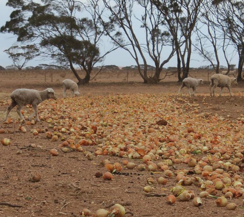
Farmers in South Australia have been forced to feed sheep with onions that were rejected for commercial sale due to a shortage of feed. Besides the energy output of the sun declining, we also have the changes in the earth’s wobble to contend with. The Northern Hemisphere’s last ice age ended about 20,000 years ago, and most evidence had indicated that the ice age in the Southern Hemisphere ended about 2,000 years later.
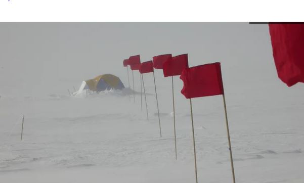
There have been new findings come from a detailed examination of an ice core sample taken from the West Antarctic Ice Sheet Divide for the first time. Previously, the ice cores were taken from the East where the ice is thickest. This new area of the ice is more than 2 miles deep and covers 68,000 years. They have only completed about half so far in the analysis. One meter of ice covers one year, but at greater depths, the annual layers are compressed to centimeters. Evidence of greater warming periods was revealed in layers associated with 18,000 to 22,000 years ago. This is known as the “deglaciation” period and corresponds to the last big climate change. Obviously, that is well before civilization. This real science reveals how our climate system actually functions and it is cyclical in accordance with the laws of physics. Changes in Earth’s orbit changes on the scale of thousands of years. Nevertheless, as the Earth changes its tilt, some regions that were cold become warm and others that were warm become cold. This tends to be a more consistent process that is emerging.
West Antarctica is separated from East Antarctica by a major mountain range. East Antarctica has a substantially higher elevation and tends to be much colder, though there is recent evidence that it too is warming rather rapidly. There is clear warming in Western Antarctica in the past decades. The new data obtained from the ice cores confirm that Western Antarctica’s climate is more strongly influenced by regional conditions in the Southern Ocean than East Antarctica has been. The warming in Western Antarctica 20,000 years ago is not explained by a change in the sun’s intensity. What appears to impact the poles more so has been the wobble of the Earth. It is the wobble which changes how the sun’s energy is distributed over the planet. As the Earth tilts, it not merely warms the ice sheet, but also warms the Southern Ocean that surrounds Antarctica.
Currently, the axial tilt is in the middle of its range. The third and final of the Milankovitch Cycles is Earth’s precession. Precession is the Earth’s slow wobble as it spins on an axis. Nonetheless, the axial tilt, the second of the three Milankovitch Cycles, is the inclination of the Earth’s axis in relation to its plane of orbit around the Sun. Therefore, the oscillations in the degree of Earth’s axial tilt occur on a periodicity of 41,000 years. The tilt does not sound like much moving from 21.5 to 24.5 degrees. However, at this time the Earth’s axial tilt is about 23.5 degrees. As a result, this provides us with our seasons. Interestingly enough, since there are periodic variations of this angle, the severity of the Earth’s seasons changes dramatically. When we have less of an axial tilt, then the Sun’s solar radiation is more evenly distributed between winter and summer. However, less tilt also increases the difference in radiation receipts between the equatorial and polar regions.
The Earth appears to react significantly to a very small degree shift of axial tilt. This will promote the growth of ice sheets. There is a response due to a warmer winter, in which warmer air would be able to hold more moisture, and thus produce a greater amount of snowfall building up the glaciers. Additionally, summer temperatures would be cooler which in turn results in less melting of the winter’s accumulation.
Therefore, we do not have a single source that we can attribute to climate change. It appears to emerge as a combination of the energy output of the sun, the wobble of the earth, and the sudden rise in volcanic activity. The problem gets really back when all three converge
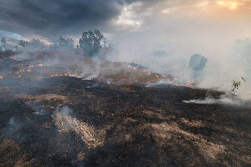
It is time to begin to really investigate Climate Change for what our computer is forecasting is like a dramatic rise in volatility or a Panic Cycle to be more accurate. What does that mean? We are going to experience extremes on both sides. You will see record temperature in the summer of 100+ F and in the winter, bitterly cold freezing. The admixture of these types of trend plays hell with crops. We are looking at severe droughts. In Australia, we are looking at drought conditions that match the ‘Federation drought‘ which took place during the late 1880s and early 1890s. This also contributed to the rise in socialism. There was a major drought in the outback areas of New South Wales, Queensland, Victoria and South Australia killed many animals. There was a major loss of vegetative cover that led to erosion and a dust bowl. Many native edible plant species vanished with devastating consequences. Between 1895 and 1903 there was a major drought that impacted most of the country. They came to name it the ‘Federation drought‘ which lasted interestingly 8.6 years.
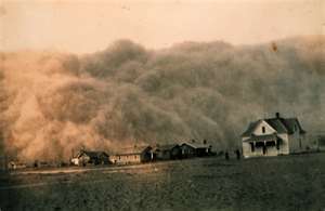 The American Dust Bowl also became known as “the Dirty Thirties” which began in 1930. Regular rainfall did not return to the region until the end of 1939, which finally brought the Dust Bowl years to a close. The severe drought hit the Midwest and Southern Great Plains during 1930. This resulted in major dust storms that began the following year in 1931 coinciding with the Sovereign Debt Crisis. By 1934, an estimated 35 million acres of formerly cultivated land had been rendered completely useless for farming. Another 125 million acres was rapidly losing its topsoil. Once again, we have a period of 8.6 years.
Again, the next drought which began in late 1949 continued into late 1957 to early 1958 covering once more a duration of 8.6 years. This was also a severe drought in the United States. It did begin during the late 1940s in the Southwestern United States, which expanded into New Mexico and Texas during 1950 and 1951. The drought hit very hard in the Central Plains, Midwest and certain of the Rocky Mountain States, particularly between the years 1953 and 1957. During 1956, it spread to parts of central Nebraska. From 1950 to 1957, Texas experienced the most severe drought in recorded history. By the time the drought ended, 244 of Texas’s 254 counties had been declared federal disaster areas. California was also hit very hard with some natural lakes drying up completely in 1953. It was Southern California that has been hit hard very hard by the drought during 1958-1959. There was also a widespread dust storm as was the case during the Dust Bowl which impacted the Plains with winds of up to 100 mph (161 km) that reached some 3 feet in depth (a meter).
From a cyclical perspective, the drought cycle has turned up in 2017. We do not expect this to peak until 2025
We have been schooled over the past 40 years that Carbon Dioxide (CO2) is rising to levels never seen before on this planet and as a result the world’s average temperature is rising to levels that will, if nothing else, destroy large areas of the planet. The latest UN predictions indicate a major Catastrophe will happen by 2040 unless we do something drastic right now. This destruction will be from two factors; one, ocean levels raising and flooding all worlds coastal areas forcing the world population to higher ground; and two, even if those moves are accomplished the increased temperatures will bring massive storms that will ravage the areas not flooded. The only solution to prevent this from happening is, stop using carbon based fuels; petroleum, natural gas, and coal which, all, generate large amount of water and carbon dioxide and replacing them with wind or solar energy.
These dire projections are based on the belief that CO2 is the “primary” driver of global temperature changes; i.e. more CO2 in the atmosphere is very bad. This view is severally distorted and more likely entirely false. One can argue the reasons for these lies but it really doesn’t matter whether they are innocent or malicious in their construct; either way promoting something that is tearing up the worlds civilizations by miss allocation of resources is very misguided.
Basic facts:
The first thing that needs to be done when developing a theory is to identify and define the issue or problem. The issue was that after WW II there was a large buildup of industry required to rebuild the devastated planet and that rapid uncontrolled growth created real environmental problems. Much good resulted from the original environmental emphasis such as the creation of the Environmental Protection Agency, EPA, however, others in the 90’s saw a way to gain power and wealth by exaggerating aspects of the movement. During the 80’s and the 90’s global temperatures were going up so these people saw a way to increase the size and scope of government to their advantage with a carbon tax. They picked increased levels of CO2 in the atmosphere as the strawman argument and funneled large amounts of research money into universities to study how bad the increases were.
Unfortunately, federal grant money is “directed” money so it was given to find out how bad the issue was, not to find out if it was even bad or even real. Therein was the problem as this is a very complex math and physics study in a subject that had not been previously studied in detail such that 30 years later the key variables and relationship are still not known with specify. The mistake that was made in the attempt to quantify the apparent increase in global temperatures was that increased CO2 in the planet’s atmosphere was that CO2 was the ONLY REASON the global temperatures were increasing. Unfortunately this assumption was not true as there had been several warm and cold periods in history going back thousands of years. The previous little ice age in the seventeenth century was one of these and the warming we now have, about 10 Celsius, is partly from the northern hemisphere still coming out from that cold period.
Next we’ll review some important information on temperatures and how it’s measured. We need to understand the details before we can draw conclusions. The problem, intentional or not, goes back to physics and how we show information. It’s critical that when we talk to nonscientists that information is properly displayed. And nowhere is this more important than when we are discussing global temperature in relationship to anthropogenic climate change.
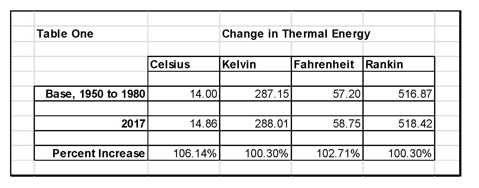
When we talk about climate (long term changes; centuries) or weather (short term changes; decades) local temperatures are going be in Celsius (C) in the EU and science, or degrees Fahrenheit (F) in America. The base temperature for the earth that NASA established is 14.00 C or 57.20 F; but these are both relative measures and do not tell us how much heat (thermal energy) is there. To know that we must use Kelvin (K) or Rankin (R) and that would be 287.150 K and 516.870 R all four of those numbers 14.00 C, 287.150 K 57.20 F, and 516.870 R are exactly the same temperature, just using a different base. But if the current temperature went from 14.00 C, to 14.860 C that is a 6.14% increase in C, an increase of 2.71% in F and an increase of .30% in K and R; so which one is real? The answer is .30% because Kelvin and Rankin are the only ones that measure the total increase in energy! Table One shows these relationships that we just discussed.
The next step is to plot Carbon Diode (CO2) from NOAA-ESRL and the estimated global temperature as published by NASS-GISS each month. As can be seen in Table One It doesn’t really matter whether we would use Kelvin and Rankin since the increase in thermal energy is exactly the same either way; but we’ll use Kelvin as that is the accepted norm in the scientific community for determining the amount thermal energy in any object especially when looking at changes in temperature or measuring the thermal energy in any object. There are other less known temperature scales that have specific purposes but they don’t really apply here in this subject.
The important thing is how much has the temperature actually gone up since we started to measure CO2 in the atmosphere? To show this graphically Chart 8 was constructed by plotting CO2 as a percent increase from when it was first measured in 1958, the Black plot, the scale is on the left and it shows CO2 going up about 30.0% from 1958 to May of 2018. That is a very large change as anyone would have to agree. Now how about temperature, well when we look at the percentage change in temperature from 1958, using Kelvin, we find that the changes in global temperature are almost un-measurable. The scale on the right side had to be expanded 5 times (the range is 20 % on the left and 4% on the right) to be able to see the plot in the same chart in any detail. The red plot, starting in 1958, shows that the thermal energy in the earth’s atmosphere increased by .30%; while CO2 has increased by 30.0% which is 100 times that of the increase in temperature. So is there really a meaningful link between them that would give as a major problem?

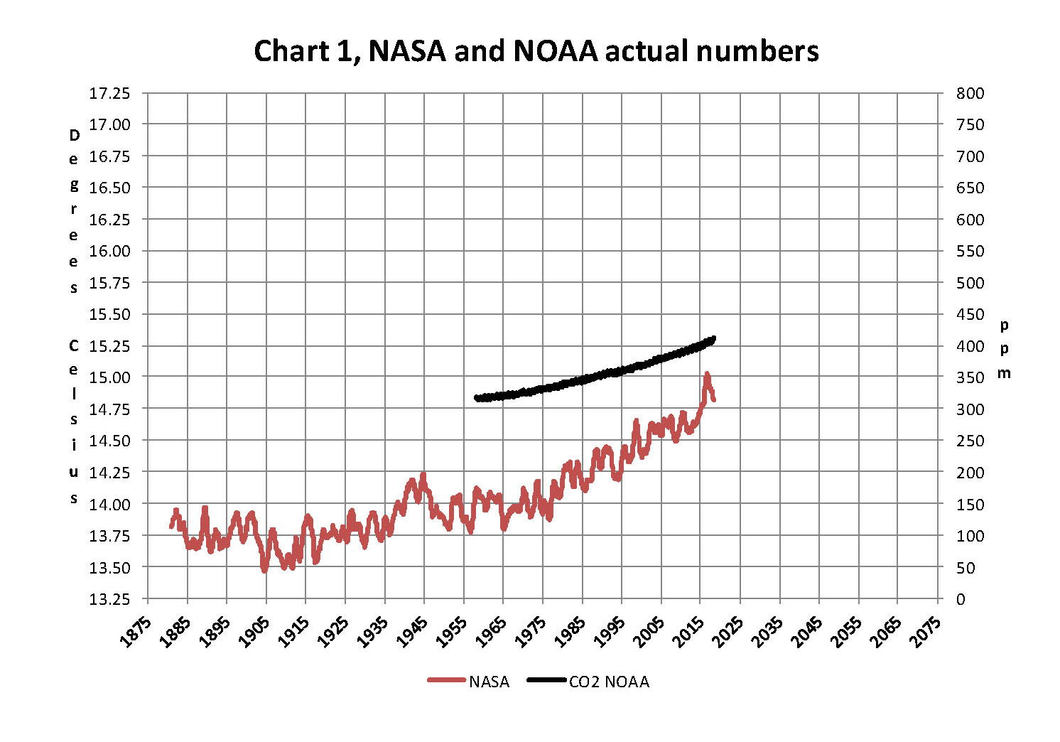
Chart 8 and all the rest of what is shown here in this paper are based on the following two data series. First NASA-GISS estimates of a global temperature shown as an anomaly (converted to degrees Celsius) as shown in their table Land Ocean Temperature Index (LOTI) and shown in Chart 1 as the red plot labeled NASA the scale for the temperatures is on the left. The NASA LOTI temperatures are shown as a 12 month moving average because of the very large monthly variations. Second NOAA-ESRL CO2 values in Parts per Million (PPM) which are shown in Chart 1 as a black plot labeled NOAA the scale for CO2 is shown on the right no change is required to the NOAA data set it is ready to use as is.
NASA published data is shown as an anomaly, but what is a temperature anomaly? An anomaly is a deviation from some base value normally an average that is fixed. There were two problems with the system that NASA picked which were number one there is no “actual” global temperature and two since climate is a variable and always has been so there cannot be a real base to measure from. NASA known for its science and engineering expertise back in the day thought it could get around these issues and created a system to do so. First they developed a computer model which took the readings from all over the planet and made adjustments to them in software which they called homogenization and came up with the estimated global temperature. Second they picked the period 1950 to 1980 (30 years) and averaged the values found in that period and came up with 14.00 degrees Celsius and make that their base. Lastly they took the calculated monthly temperature and subtracted the base from it which gave them the anomaly and multiplied the result by 100.
The problem is that both are arbitrary. Why pick 1950 to 1980 as the base period? Is there something special about that time frame? And as to a global temperature there is no such thing for many reasons like the earth faces the sun so one side is cool and onside it warm. Higher latitudes are cooler than the equator and higher elevations are cooler than lower. And finally there are many areas where there are no measurements taken. Therefore there is no one temperature only an artificial artifact solely dependent on the soundness of the software used to create that one temperature!
Chart 1 below is 100% accurate and based only on NASA and NOAA data as published.
Now that we have a base to work with we are going to add to Chart 1 three things. The first is a trend line of the growth in CO2 since that is according to the government through NASA and NOAA the entire basis for climate change. That plot is superimposed over the black plot of the actual NOAA CO2 values as the cyan line labeled as the CO2 model and one can see there is a very good fit to the actual NOAA values so there should be no dispute about its validity, and it’s historically accurate. This plot allows us to make projections to future global temperatures according to the projected level of CO2The second added item is James E. Hansen’s 1988 Scenario B data, which is the very core of the IPCC Global Climate models (GCM’s) and which was based on a CO2 sensitivity value of 3.0O Celsius per doubling of CO2. This plot is shown here in lavender and is from a presentation that Hansen showed congress in 1988 to help support the UN in setting up the International Panel on Climate Change (IPCC). This plot is labeled as Hansen Scenario B which Hansen stated was the most likely to happen based on his 1979 climate theories’. The third item is the current plot of the most likely temperature of the planet based on the growth of CO2 published by the IPCC. This plot is shown in Red and is labeled as IPCC AR5 A2 as that is the table where the data was found. This plot is a GCM computer projection of the planets temperature based on the complex relationships developed by the IPCC primarily though NASA and NOAA.

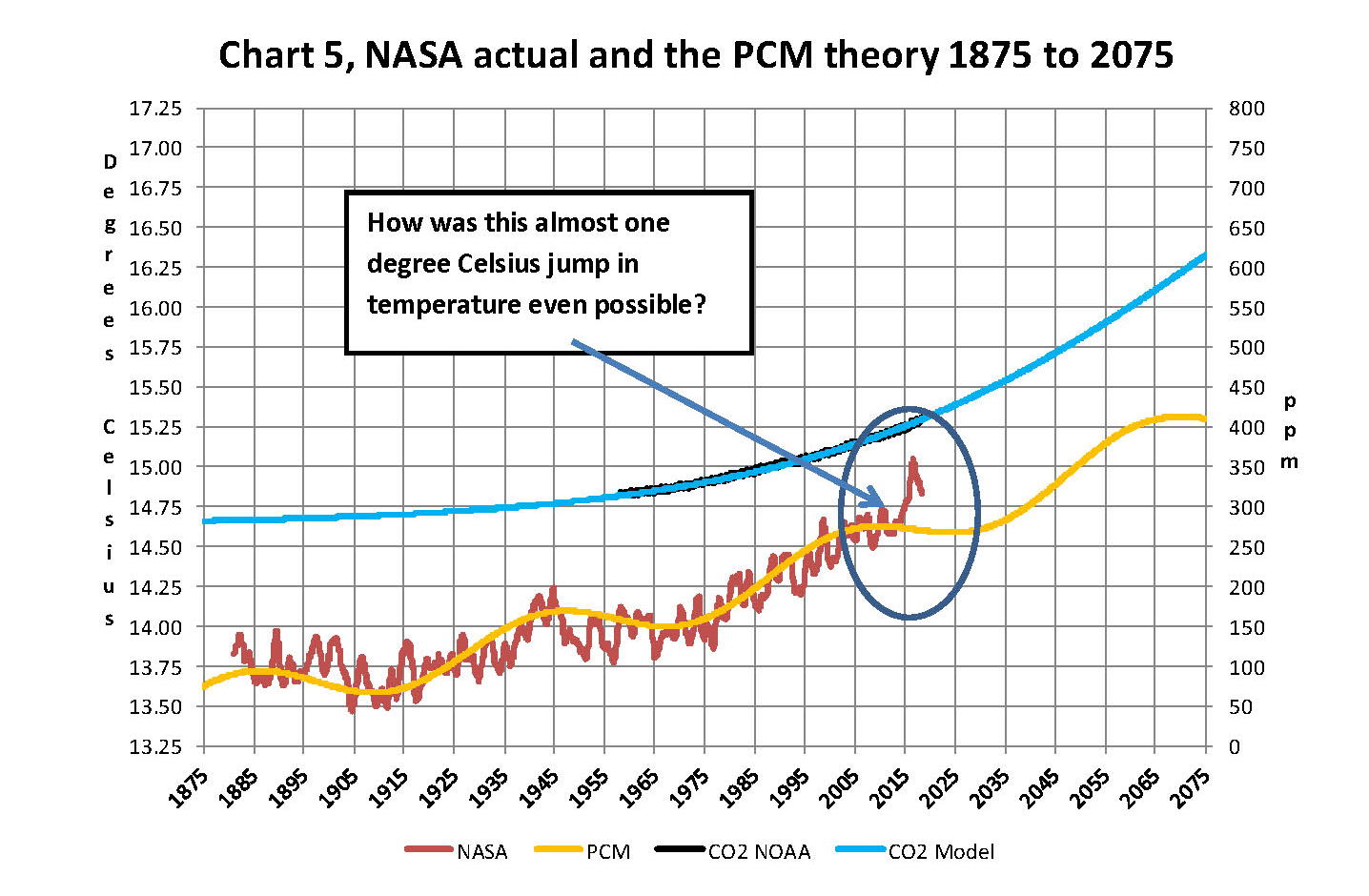
It can be seen in Chart 2 that the lavender plot and the Hansen plot are very close from 1965 to around 2000. However there isn’t a good correlation between the growth in CO2 and the increase in the planets temperature, as shown in Chart 8. The CO2 is going up in a log function and the temperature was going up until 2000 then it plateaued from 2000 until 2014 where there was a mysterious spike up of .5 degrees Celsius just in time for COP21 in Paris. Then after CP21 was over the unexplained change in temperature started to come back down. The climate doesn’t make changes like what the NSA/NOAA data shows that would be weather if it even was real.
Chart 7 looks at the period from 2010 to 2020 so we can see where a change in CO2 of only a few ppm has caused a major change in the global temperature way beyond anything previously shown in any published NASA data. There are three ovals on Chart 7 one at the top of Chart 7 which is a black oval around the CO2 levels from 2010 to 2018 and it’s very obvious that there has been very little change, maybe 3 ppm a year Then at the bottom of Chart 7 is dark red oval around the NASA global temperature levels from 2013 to 2018 and its very obvious that there has been a sudden large change, almost .50 degrees Celsius in 3 years. There has never been such a large increase in temperature from such a small increase in CO2. By contrast the previous comparable period of the last part of 2010 through 2013 Blue oval shows about the same increase per year for CO2 but global temperature decreased.
An explanation is needed here as the NASA temperature plot in Chart 7 seems to show the jump in temperature in 2016 not 2015; this is a result of the very large jump in temperature shown by NASA. Since we are using a 12 month moving average and the increase occurred in only a few months it actually shifted the curve into 2016. The raw data for December 2012 was at a low of 14.44 degrees Celsius but by February 2016 the temperature was at a record high of 15.35 degrees Celsius a .91 degree Celsius increase, Red arrow. With the global temperature over 15.0 Celsius at COP21 in December 2015 at the Paris COP21 conference the climate accord was approved and the manipulation was a success. After COP21 the Fake Warming was no longer needed so we are now seeing a downward trend developing. The current temperature for June 2018 is 14.88 degrees Celsius.

In summary, the IPCC models were designed before a true picture of the world’s climate was understood. During the 1980’s and 1990’s CO2 levels were going up and the world temperature was also going up so there appeared to be correlation and causation. The mistake that was made was looking at only a ~20 year period when the real variations in climate move in much longer cycles of centuries which can be observed in the NASA data but they were ignored for some reason. By ignoring those actual geological trends and focusing only on CO2 the Global Climate Models will be unable to correctly plot global temperatures until they are fixed. Also the temperature data from 1850 to 1880 was dropped for some reason as it showed a lower temperature than would be expected. The lower temperatures’ in that period would have shown a shorter cycle they didn’t want shown.
A decade ago when I started looking at “climate” change the first thing I did was look at geological temperature changes since it is well known that the climate is not a constant; I learned that 53 years ago in my undergrad geology and climatology courses in 1964. The next paragraph explains currently observed patterns in climate related to this subject and is historical accurate.
Ignoring the last Ice Age which ended some 11,000 years ago when a good portion of the Northern hemisphere was under miles of ice the following observations give a starting point to any serious study on the subject of climate. First, there is a clear movement up and down in global temperatures with a 1,000 some year cycle going back at least 3,000 to 4,000 years; probably because of the apsidal precession of the earth’s orbit of about 20,000 years for a complete cycle. About every 10,000 years the seasons are reversed making the winter colder and the summer warmer in the northern hemisphere. 10,000 years from now the seasons will be reversed again. Secondly, there are also 60 to 70 year cycles in the Pacific and the Atlantic oceans that are well documented. These are known as the Atlantic Multi Decadal Oscillations (AMO) in the Atlantic and as La Nina and El Nino in the Pacific. Thirdly, we also know that there are greenhouse gases such as carbon dioxide that can affect global temperatures. Lastly the National Academy of Sciences (NAS) estimated that carbon dioxide had a doubling rate of 3.0O Celsius plus or minus 1.5O Celsius in 1979 when there were only two studies available and one for sure and maybe both were not peer reviewed.
The result of looking objectively at the three possible sources of global temperature changes was a series of equations based on these observations that when added together produced a sinusoidal curve that seemed to follow NASA published temperatures very closely when first developed in 2007, and modified a few years later when it was found the short and long cycles were related to multiples of Pi. Since this curve was based on observed temperature patterns it was called a Pattern Climate Model (PCM) which has been described in previous papers and posts on my blog and since it is generated by “equations” many assume it is some form of least squares curve fitting, which it is not. It does seem to be related to ocean currents where the bulk of the planet’s surface heat is stored and cloud formation.
Chart 5 shows the PCM a composite of two cycles and CO2. There is a long trend, 1036.7 years with an up and down of 1.65O Celsius (.00396O C per year) we in the up portion of that trend. Then there is a 69.1 year cycle that moves the trend line up and then down a total of 0.29O Celsius and we are now in the downward portion of that trend (-.01491O C per year), which will continue until around ~2035. Lastly, there is CO2 currently adding about .0079O Celsius per year so together they all basically wash out at -.0039O C per year, which matches the current holding pattern we were experiencing until 2014. After about 2035 the short cycle will have bottomed and turn up and all three will be on the upswing again duplicating what was observed in the 1980’s. Note: the values shown here are only representative from what is in the model.
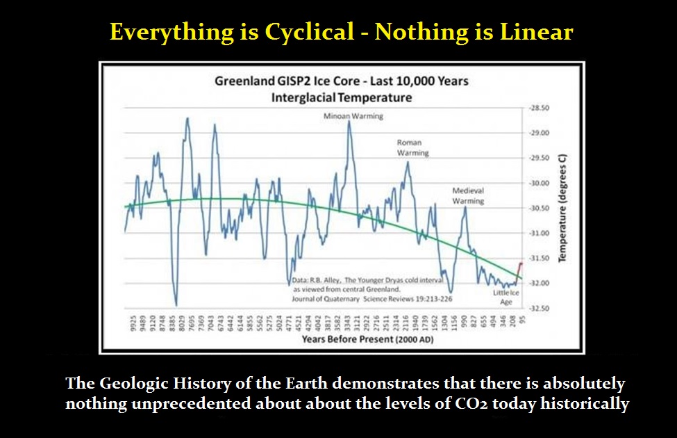
When using a 12 month running average for global temperatures up until 2014 the PCM model was within +/- .01 degrees of what NASA was publishing in their LOTI table since the early 1960’s as shown in Chart 5. Further the back projection of the PCM plot matched historical records and global temperatures going back past the time of Christ. It should also be considered that geologically CO2 levels have reached levels many times that of the current 400 ppm without destroying the planet so the current hysteria over the current very small numbers can only be explained by political science not real science.
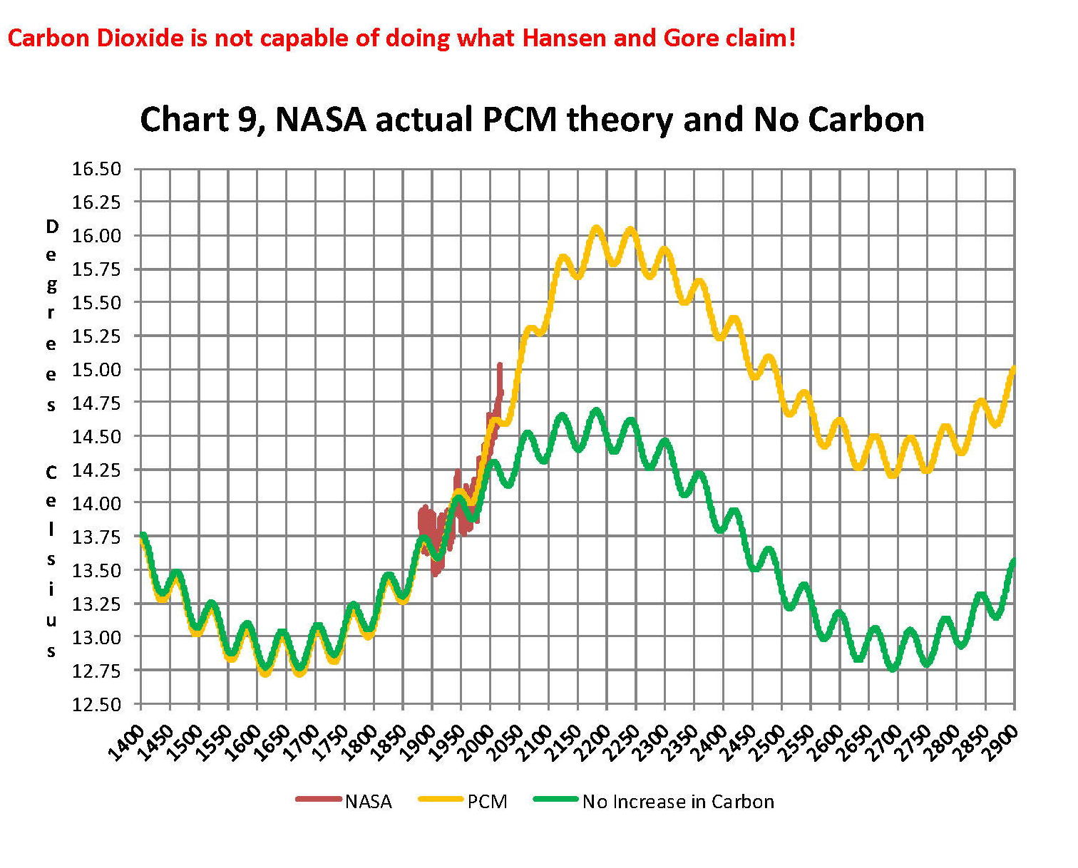
Lastly, Chart 9 shows what a plot of the PCM model, in yellow, would look like from the year 1400 to the year 2900. This plot matches reasonably well with recorded history and fits the current NASA-GISS table LOTI data, in red, very closely, despite homogenization. I do understand that this PCM model is not based on physics but it is also not some statistical curve fitting. It’s based on two observed reoccurring patterns in the climate and a factor for CO2. These patterns can be modeled and when they are, you get a plot that works better than any of the IPCC’s GCM’s. If the real conditions that create these patterns do not change and CO2 continues to increase to 800 ppm or even 1000 ppm then this model will work well into the foreseeable future. 150 years from now global temperatures will peak at around 15.750 to 16.000 C and then they will be on the downside of the long cycle for the next ~500 years.
The overall effect of CO2 reaching levels of 1000 ppm or even higher will be about 1.50 C which is about the same as that of the long cycle. The Green plot on Chart 9 shows the observed pattern with no change in CO2 from the pre-industrial era of ~280 ppm. CO2 cannot affect global temperatures more than 1.500 C +/- no matter what the ppm level of CO2 is. The reason being that the CO2 sensitivity value is not 3.00 per doubling of CO2 but less than 1.00 C per doubling of CO2 as shown in more current scientific work and it’s a logistics curve not a log curve.
The purpose of this post is to make people aware of the errors inherent in the IPCC models so that they can be corrected.
The Obama administration’s “need” for a binding UN climate treaty with mandated CO2 reductions in Europe and America was achieved as predicted at the COP12 conference in Paris in December 2015. To support this endeavor NASA was forced to show ever increasing global temperatures that will make less and less sense based on observations and satellite data which will all be dismissed or ignored. Within a few years the manipulation will be obvious even to those without knowledge in the subject, but by then it will be to late the damage to the reputation of science will have been done. Fortunately President Trump pulled us out of the bad agreement.
In closing keep this in mind. The current panic generated by the government using political science is that the current global temperature of around 15.0O Celsius is an increase of 7.14% from the 1960’s when the global temperature was 14.0O Celsius; and that does seem like a lot. However those views would be in error as the actual increase in thermal energy, as measured by temperature, would be only .35% because we must use Kelvin not Celsius when working with heat energy. When we use kelvin the temperature goes from 287.15O K to 288.15O K which is only .35% not 7.14% about 1/20 of what is implied by the IPCC. What the IPCC shows is not technically wrong as much as it is extremely misleading to anyone without a science background.
Sir Karl Raimund Popper (28 July 1902 – 17 September 1994) was an Austrian and British philosopher and a professor at the London School of Economics. He is considered one of the most influential philosophers for science of the 20th century, and he also wrote extensively on social and political philosophy. The following quotes of his apply to this subject.
If we are uncritical we shall always find what we want: we shall look for, and find, confirmations, and we shall look away from, and not see, whatever might be dangerous to our pet theories.
Whenever a theory appears to you as the only possible one, take this as a sign that you have neither understood the theory nor the problem which it was intended to solve.
… (S)cience is one of the very few human activities — perhaps the only one — in which errors are systematically criticized and fairly often, in time, corrected.
QUESTION: You said while the energy output of the sun declines, at the same time the summers can get hotter. It seems strange but my daughter lives near you in Florida and it is hotter here in New York. Is the weather just getting crazy?
ANSWER: This summer we should see sweltering heat build across parts the northern United States and over western and central Europe throughout the summer months. The temperatures will be hotter in the Northern regions which definitely seems crazy. It is more comfortable in the South than in the North. These regions will simply see high temperatures past 90 F (32 C) up to 100 F (38 C ) on numerous occasions from June through August from probably Toronto to the Carolinas in the USA and in Europe from Frankfurt down to Milan/Rome.and Berlin, Germany.
There seems to be a pattern historically of dry summers and cold winters for Europe while in the Eastern US there will generally be flooding. This can contribute to producing dangerous conditions for not just people, the young and elderly, but to further the cycle of drowning crops in the US to droughts in Europe. This historically also tends to create the cycle of famine. The entire process is plagued by higher volatility with the swings to both extremes. This builds in cyclical force much as a bull market in a volatility period.
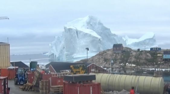
Meanwhile, the largest iceberg to ever threaten the shoreline in Greenland has appeared. An 11-million-ton iceberg, 300 feet tall, is now hovering over the town of Innaarsuit in Greenland. The massive iceberg floats dangerously close to shore coming within just 500 to 600 feet offshore last weekend. This is all part of perhaps the shift in climate that is brewing.
COMMENT: Mr. Armstrong; there are just people who refuse to believe that global warming is wrong. When there are cold spells like that here in Australia, they argue there are equally a number of warm spots. They are leading us down the tubes. They will not yield and even consider that they are wrong and if so, what is the consequence of such a mistake.
PG
 ANSWER: Yes, when something is against Global Warming that rebuts saying cold spots are not science. Some of these cold snaps have been very strange indeed. Yet when it is warm, suddenly it is science. It even got warm in Siberia. There are placed that are normally a dessert that has suddenly burst with life. They refuse to consider the historical evidence that there have even been ice ages which implies that had to have also been warming periods way before the Industrial Age. The completely ignore the science of how ice ages are even created which takes place WHEN the ice at the North Pole melts and that allows water to evaporate and return as snow. They portray that when the ice melts, the oceans will rise and New York and Miami will be under water. They spin that as science which is just sophistry. In essence, they refuse to believe in the cyclical nature of everything. I suppose they also assume they will live forever since their denial of cycles must mean they too will never die.
The Poles flip. Ask anyone in geology and they will tell you that rocks are magnetized in the direction of the North Pole when they are formed from an erupting volcano. We are watching a number of volcanos erupting not just in the Pacific, but also in Siberia. We know that the North Pole has been all over the place and it is moving more rapidly today than ever before in recent years when we have tracked it. The last time it flipped was over 700,000 years ago so we do not have recorded history to understand what actually happens. The poles flip about every 11 years on the Sun. But nobody lives there so they can’s tell us what to expect.
 I have written about the suddenly frozen animal in Siberia. Effectively, there have been two schools of thought – (1) Chaotic and (2) Linear Progression. We do NOT want to believe you can just wake up one day and freeze to death at the kitchen table. Hence, we do not WANT to believe in abrupt change even being possible. This is also why you will find that people prefer to believe in gradual global warming and will immediately call pointing out any cold spell is not science – only global warming is science. They PREFER to believe that humans can alter the entire cyclical nature of the earth just as they prefer to believe in Keynesianism and government will smooth out the business cycle and make life perfect for you just in case you live forever.
Julius Caesar said it best. People just will believe what they WANT to believe. The people who call Global Warming science and everything else is not-science, there is no point in trying to argue. It is like investments. There has to be someone who buys the high when it is time to sell. You cannot change the mind of those who believe in Global Warming because it is their religion. Al Gore will die frozen and be blaming the cold on CO2. This is a question of the cyclical nature of the universe and stops trying to blame someone for there just may be something bigger to take notice of.
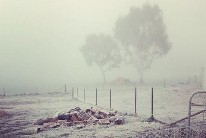
The winter Downunder has already been the coldest in 26 years. Temperatures plummeted on the East Coast at Marangaroo to a low of -11.1C. It is amazing that the amount of money on the table to justify global warming which is all about raising taxes for carbon emissions is placing us at a greater risk for it is distracting everyone from the real threat – global cooling. Meanwhile, ski fans are rejoicing calling it an Epic Winter in New Zealand.
Meanwhile, between volcanoes erupting in the Pacific, extreme cold in the southern hemisphere, we also have Typhoon Prapiroon which has devasted Japan, which is more prepared for earthquakes than typhoons. Most people do not know in the West why they even call pilots during World War II a Kamikaze pilot. The word “Kamikaze” really means “Divine Wind” and it was the attempt by the Mongold to invaded Japan TWICE when a typhoon destroyed their fleets. It was then said that Japan was protected by the “Divine Wind” and that is why the pilots were named Kamikaze. Right now, the typhoons are hitting Japan killing at what may be more than 200 people while forcing millions to evacuate. This has been the WORST disaster from a typhoon is 36 years.
Meanwhile, there has been ZERO evidence put forth that atmospheric CO2 levels actually will warm anything. In fact, it has been pointed out that the analysis that has been used for the entire theory of Global Warming makes no sense whatsoever. The basis for this entire theory claims that somehow nature treats human CO2 emissions differently than it treats nature’s CO2 emissions. Besides that, CO2 levels have been historically much higher in the past long before humans began the Industrial Revolution.
The coldest place on earth many believe is Washington DC who really could care less about the country of the people. That certainly is one definition of cold, but the other is in Mother Nature. Scientists have determined that it is Antarctic where temperatures can get down to a -100 degrees Celsius. Now that pretty cold. Let’s just pray the pole down flip in the middle of the night we we do not win the lottery and get that distinction.
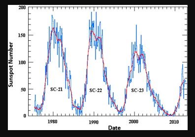
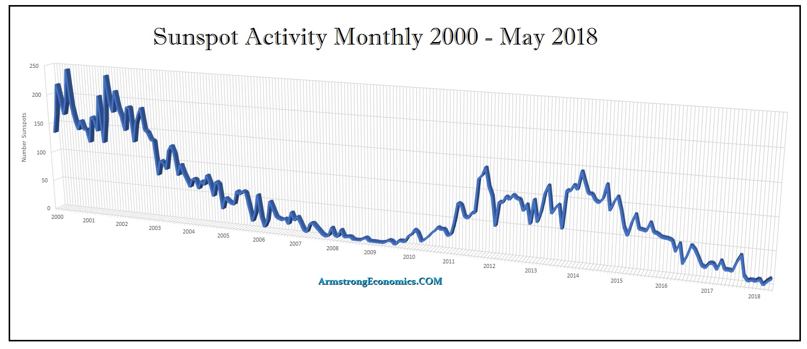
The deep minimum of Solar Cycle 23 and its potential impact on climate change has been interesting. In addition, a source region of the solar winds at solar activity minimum, especially in the Solar Cycle 23, the deepest during the last 500 years, has been studied. Solar activities have had a notable effect on palaeoclimatic changes. Contemporary solar activity is so weak and hence expected to cause global cooling. The Solar Cycle 23 began during April 1996 and had its peak in early 2000/2001. The decline phase thereafter extended from 2002 until December 2009. That was the longest decline phase of any of the previous 23 solar cycles. The overall length of solar cycle 23 extended for a period of 13.5 years from April 1996. As shown on this chart, notice that each cycle has been declining in intensity. Solar Cycle 23 was sharply weaker and what has come in Solar Cycle 24 is even weaker still.
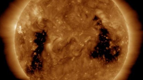
This solar cycle minimum seems to have unusual properties that appear to be related to weak solar polar magnetic fields. The immediate Solar Cycle 24 began during 2009. It was a late starter given the extension of Solar Cycle 23 which interesting was a Pi Cycle extension of 3.14 years. This is true looking at the previous cycles of the 20th and 19th centuries warning that something is indeed unfolding here that is unusual. There are small polar coronal holes appearing which add to the complexity of coronal morphology. Coronal holes are most prevalent and stable at the solar north and south poles, however, these polar holes can grow and expand to lower solar latitudes. It is also possible for coronal holes to develop in isolation from the polar holes, or for an extension of a polar hole to split off and become an isolated structure.
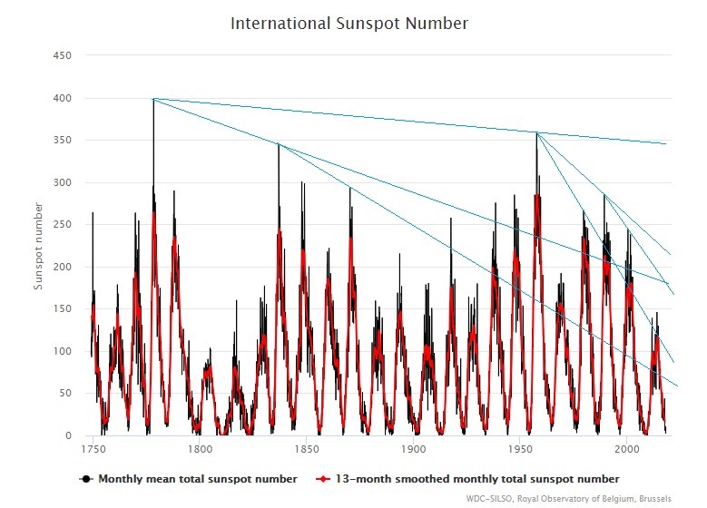
We must pay attention to the fact that this magnetic configuration at the Sun is incredibly different from the one observed during the previous two solar minima periods. Magnetic activity during the years 2006–2009 has been very weak with sunspot numbers reaching the lowest values in about 100 years. This long and extended minimum is characterized by weak polar magnetic fields. We can see that we have been in an extended decline since the 18th century. This rather disturbing when we run correlations with this on the economic trends.
Earth’s atmosphere varies opposite to the solar activity since the cosmic ray particles are deflected by the Sun’s magnetic field to a greater or lesser degree. With increased solar activity (and stronger magnetic fields), the cosmic ray intensity decreases, and with it the amount of cloud coverage, resulting in a rise of temperatures on Earth. Conversely, a reduction in solar activity produces lower temperatures.
Current Solar Cycle 24 has been declining much faster than expected. There is some concern that Solar Cycle 24 might possibly extend as well for the weather has been getting excessively colder in the northern regions. The peak in the cycle arrived during April 2014 reaching an average sunspot number of 82. While the peak value was within the expected range of error for the general forecasts, the maximum occurred significantly lower than the forecasts.
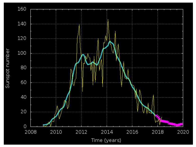
This is the current forecast for Solar Cycle 24. We can see the pink project is the forecast of the industry and it coincides very well with our Economic Confidence Model. I have stated before that I attended a presentation of the data collected from the ice core samples. It revealed a 300-year major cycle in the energy output of the sun. It matched the Economic Confidence Model I constructed from entirely different source data including the monetary history of human activity. I was stunned, for it demonstrated to me that the rise and fall of empires, nations, and city-states was also in part instigated by climate change. When it turns cold, this is when civilization contracts. The bottom of this immediate ECM is January 2020. The forecast for Solar Cycle 24 will bottom around that same time period.
We are running our models on all the data to come up with our own forecast for Solar Cycle 25, which will take us into the end of this 51.6-year Wave in 2032 and the culmination of the 309.6-year cycle in the ECM. As you can see, Solar Cycle 24 is significantly lower than the Solar Cycle 23. You can see why I moved to Florida. Preliminary findings show that each wave is progressively getting weaker and that may be in line with what we expect in commodity prices as well as what is to come after 2032.
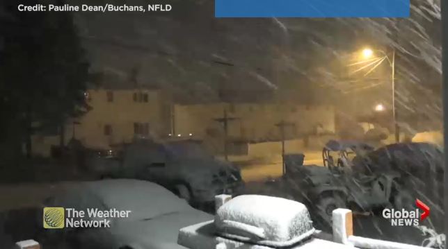
It is still snowing across the border in Newfoundland, Canada in June. In Wisconsin, there was so much snow during April, it is still there in huge piles in June. Believe it or not, snowfall has still been reported this week in EIGHT states. This is California, Nevada, Washington, Oregon, Montana, Wyoming, New Hampshire (Mount Washington), and at Mullen Pass, Idaho. This is alarmingly curious. Granted, our computer was forecasting this would be a colder winter than the previous. But this is getting insane. I had to run over to Brussels for meetings in May and I encountered snow in Chicago trying to catch a connecting flight. Even the old Farmers Almanac forecast for 2017–2018 showed generally colder temperatures than last winter for the U.S. and Canada. They too are cyclical based. We have not yet crossed that line of alarming cold weather just yet.
Unfortunately, our computer is forecasting that the winter of 2018-2019 will be much colder than 2017-2018, but it will still not be dramatically colder on a dangerous scale just yet. A large part of the northern United States will experience colder temperatures again so buy some long underwear and keep an emergency supply on-hand. Regrettably, even the South and West should expect to feel cooler than normal weather and that means Florida and the Southeast will also feel a bit chilly with milder-than-average temperatures once again.
We are certainly headed into climate change. Sadly, even if we leave our cars running in the driveway all night, we will not reverse this trend of Global Cooling. We better start looking at reality for the next cycle will be a rise in Agricultural prices due to weather cycles.
I have created this site to help people have fun in the kitchen. I write about enjoying life both in and out of my kitchen. Life is short! Make the most of it and enjoy!
De Oppresso Liber
A group of Americans united by our commitment to Freedom, Constitutional Governance, and Civic Duty.
Share the truth at whatever cost.
De Oppresso Liber
Uncensored updates on world events, economics, the environment and medicine
De Oppresso Liber
This is a library of News Events not reported by the Main Stream Media documenting & connecting the dots on How the Obama Marxist Liberal agenda is destroying America
Australia's Front Line | Since 2011
See what War is like and how it affects our Warriors
Nwo News, End Time, Deep State, World News, No Fake News
De Oppresso Liber
Politics | Talk | Opinion - Contact Info: stellasplace@wowway.com
Exposition and Encouragement
The Physician Wellness Movement and Illegitimate Authority: The Need for Revolt and Reconstruction
Real Estate Lending
