This is a Technical Study of the Relationships in Solar Flux, Water vapor and all the other Gasses in the Atmosphere, Using the September, 2024 NASA & NOAA Data


Rate This

The attached report on Global Weather for September 2024 Data has charts showing the relationship between CO2 growth and Temperature increases going up since we started to accurately measure CO2 in the atmosphere in 1958. These Charts were created by showing CO2 as a percent increase from when it was first measured in 1958, the Black plot, the scale is on the left and it shows COgoing up by about ~34.0% from 1958 to September 2024. That is a very large change as anyone would have to agree. 

Now how about temperature, well when we look at the percentage change in temperature also from 1958, using Kelvin (which does measure the actual change in heat), we find that the changes in global temperature (heat) is about ~.3% and may reach .5% by 2028. To even be able to see this minuscule change we had to reduce the scale of the Temperature Axis by a factor of ten.
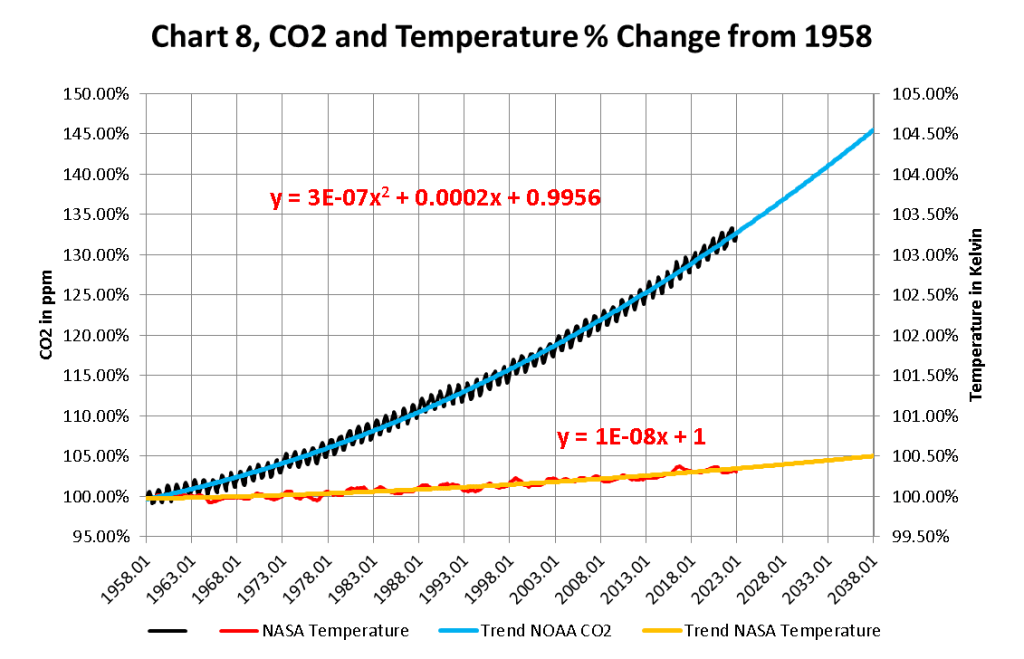
This Chart 8 uses unaltered values from NOAA and NASA properly displayed ,and the Blue and Yellow projections are created by Microsoft Excel not me.

The NOAA and NASA numbers tell us the story of the Very Small Changes in the temperature of the planets Atmosphere As Carbon Dioxide goes up geometrically.

BLACKBODY TEMPERATURE 2024-09Download

Share this:

This is a Technical Study of the Relationships in Solar Flux, Water vapor and all the other Gasses in the Atmosphere, Using the February, 2025 NASA & NOAA Data


The attached report on Global Weather for February 2025 Data has charts showing the relationship between CO2 growth and Temperature increases going up since we started to accurately measure CO2 in the atmosphere in 1958. These Charts were created by showing CO2 as a percent increase from when it was first measured in 1958, the Black plot, the scale is on the left and it shows CO2 going up by about ~34.0% from 1958 to January 2024. That is a very large change as anyone would have to agree. 

Now how about temperature, well when we look at the percentage change in temperature also from 1958, using Kelvin (which does measure the actual change in heat), we find that the changes in global temperature (heat) is about ~.3% and may reach .5% by 2028. To even be able to see this minuscule change we had to reduce the scale of the Temperature Axis by a factor of ten.

This Chart 8 uses unaltered values from NOAA and NASA properly displayed ,and the Blue and Yellow projections are created by Microsoft Excel not me.

The NOAA and NASA numbers tell us the story of the Very Small Changes in the temperature of the planets Atmosphere As Carbon Dioxide goes up geometrically.

This is a Technical Study of the Relationships in Solar Flux, Water vapor and all the other Gasses in the Atmosphere, Using the January, 2025 NASA & NOAA Data


The attached report on Global Weather for January 2024 Data has charts showing the relationship between CO2 growth and Temperature increases going up since we started to accurately measure CO2 in the atmosphere in 1958. These Charts were created by showing CO2 as a percent increase from when it was first measured in 1958, the Black plot, the scale is on the left and it shows CO2 going up by about ~34.0% from 1958 to January 2024. That is a very large change as anyone would have to agree. 

Now how about temperature, well when we look at the percentage change in temperature also from 1958, using Kelvin (which does measure the actual change in heat), we find that the changes in global temperature (heat) is about ~.3% and may reach .5% by 2028. To even be able to see this minuscule change we had to reduce the scale of the Temperature Axis by a factor of ten.

This Chart 8 uses unaltered values from NOAA and NASA properly displayed ,and the Blue and Yellow projections are created by Microsoft Excel not me.

The NOAA and NASA numbers tell us the story of the Very Small Changes in the temperature of the planets Atmosphere As Carbon Dioxide goes up geometrically.

This is a Technical Study of the Relationships in Solar Flux, Water vapor and all the other Gasses in the Atmosphere, Using the December, 2024 NASA & NOAA Data


The attached report on Global Weather for December 2024 Data has charts showing the relationship between CO2 growth and Temperature increases going up since we started to accurately measure CO2 in the atmosphere in 1958. These Charts were created by showing CO2 as a percent increase from when it was first measured in 1958, the Black plot, the scale is on the left and it shows CO2 going up by about ~34.0% from 1958 to December 2024. That is a very large change as anyone would have to agree. 

Now how about temperature, well when we look at the percentage change in temperature also from 1958, using Kelvin (which does measure the actual change in heat), we find that the changes in global temperature (heat) is about ~.3% and may reach .5% by 2028. To even be able to see this minuscule change we had to reduce the scale of the Temperature Axis by a factor of ten.

This Chart 8 uses unaltered values from NOAA and NASA properly displayed ,and the Blue and Yellow projections are created by Microsoft Excel not me.

The NOAA and NASA numbers tell us the story of the Very Small Changes in the temperature of the planets Atmosphere As Carbon Dioxide goes up geometrically.

This is a Technical Study of the Relationships in Solar Flux, Water vapor and all the other Gasses in the Atmosphere, Using the September, 2024 NASA & NOAA Data


The attached report on Global Weather for September 2024 Data has charts showing the relationship between CO2 growth and Temperature increases going up since we started to accurately measure CO2 in the atmosphere in 1958. These Charts were created by showing CO2 as a percent increase from when it was first measured in 1958, the Black plot, the scale is on the left and it shows CO2 going up by about ~34.0% from 1958 to October 2024. That is a very large change as anyone would have to agree. 

Now how about temperature, well when we look at the percentage change in temperature also from 1958, using Kelvin (which does measure the actual change in heat), we find that the changes in global temperature (heat) is about ~.3% and may reach .5% by 2028. To even be able to see this minuscule change we had to reduce the scale of the Temperature Axis by a factor of ten.

This Chart 8 uses unaltered values from NOAA and NASA properly displayed ,and the Blue and Yellow projections are created by Microsoft Excel not me.

The NOAA and NASA numbers tell us the story of the Very Small Changes in the temperature of the planets Atmosphere As Carbon Dioxide goes up geometrically.

Is an Ice Age Coming?


Posted Oct 30, 2024 By Martin Armstrong 

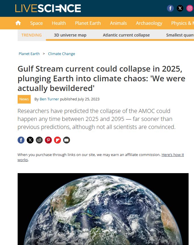
2025 Gulf Stream Collapse

QUESTION: Does your model still predict that we will turn colder in the winters ahead? Live Science seems to be confirming what you forecast, maybe five years ago, for the post-2024 period.

FL

Game of Throne Global Warming is Coming

ANSWER: While the Climate Zealots have been touting Global Warming, the opposite is unfolding. Our earth models have been warning that we are NOT in this Global Warming nonsense. We should have stockpiled food like Joseph told the Pharaoh. There is also a polar vortex forming that warns of Extreme Winters ahead. This, too, is a powerful winter force.

White Walker Close Up

Ads the warned in Game of Thrones, Winter is Coming – not Global Warming. A Polar Vortex also involves the Jet Stream moving south. That typically protects us from extreme cold. But moving south warns us that we can experience extreme cold periods. I will update that research after the WEC. I just have my hands full right now.

Climate Change Explained


Patrick Moore is the only one that hass developed a true scientic explination of what is going on with the worlds climate. And burning fosile fuels is actually keeping the planet alive. We came very close to destroing all live on the planet for the lack of CO2 about 275 years ago when we were on the edge of to little CO2 for plants to live. CO2 was 180 PPM back then. And we saved the world by burning coal and oil and natural gas which started to increace the amount of CO2.

The optimum level for CO2 is probably three times where we are now.

Watch this video to the end.

This is a Technical Study of the Relationships in Solar Flux, Water vapor and all the other Gasses in the Atmosphere, Using the September, 2024 NASA & NOAA Data


The attached report on Global Weather for September 2024 Data has charts showing the relationship between CO2 growth and Temperature increases going up since we started to accurately measure CO2 in the atmosphere in 1958. These Charts were created by showing CO2 as a percent increase from when it was first measured in 1958, the Black plot, the scale is on the left and it shows CO2 going up by about ~34.0% from 1958 to September 2024. That is a very large change as anyone would have to agree. 

Now how about temperature, well when we look at the percentage change in temperature also from 1958, using Kelvin (which does measure the actual change in heat), we find that the changes in global temperature (heat) is about ~.3% and may reach .5% by 2028. To even be able to see this minuscule change we had to reduce the scale of the Temperature Axis by a factor of ten.

This Chart 8 uses unaltered values from NOAA and NASA properly displayed ,and the Blue and Yellow projections are created by Microsoft Excel not me.

The NOAA and NASA numbers tell us the story of the Very Small Changes in the temperature of the planets Atmosphere As Carbon Dioxide goes up geometrically.

This is a Technical Study of the Relationships in Solar Flux, Water vapor and all the other Gasses in the Atmosphere, Using the July, 2024 NASA & NOAA Data


The attached report on Global Weather for Aug 2024 Data has charts showing the relationship between CO2 growth and Temperature increases going up since we started to accurately measure CO2 in the atmosphere in 1958. These Charts were created by showing CO2 as a percent increase from when it was first measured in 1958, the Black plot, the scale is on the left and it shows CO2 going up by about ~34.0% from 1958 to July 2024. That is a very large change as anyone would have to agree. 

Now how about temperature, well when we look at the percentage change in temperature also from 1958, using Kelvin (which does measure the actual change in heat), we find that the changes in global temperature (heat) is about ~.3% and may reach .5% by 2028. To even be able to see this minuscule change we had to reduce the scale of the Temperature Axis by a factor of ten.

This Chart 8 uses unaltered values from NOAA and NASA properly displayed ,and the Blue and Yellow projections are created by Microsoft Excel not me.

The NOAA and NASA numbers tell us the story of the Very Small Changes in the temperature of the planets Atmosphere As Carbon Dioxide goes up geometrically.

Climate Stupidity and How It Began


It began in California. “…California Assembly speaker Willie Brown formed our nation’s first clean-air district in the Los Angeles basin, the South Coast Air Quality Management District (SCAQMD)…”

https://www.americanthinker.com/articles/2024/05/climate_stupidity.html