
Armstrong Economics Blog/Nature
Re-Posted Jul 8, 2019 by Martin Armstrong
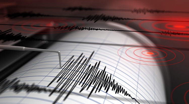
QUESTION: You warning that earthquakes were due in California with solar minimum seem to be right on target. Why won’t they just look at your correlations since this is not some opinion you pull out of thin air?
FB
ANSWER: A quake hit last Thursday on the 4th of July which was the largest earthquake to strike Southern California in nearly 20 years with a magnitude 6.4 temblor centered in Ridgecrest, California. Then the aftershock was even bigger. A 7.1 earthquake rocked Southern California last Friday night unleashing multiple fires. They called a state of emergency is declared in Ridgecrest and San Bernardino County. You can watch the energy wave set off by the earthquake on July 4th ripple through the entire United States.
Lost in the headline of the California quake was the fact that there was a 6.2 magnitude earthquake recorded off the coast of northern Vancouver Island on Wednesday night – July 3rd. There was also a 4.7 earthquake just south of Cohoe, Alaska also on July 3rd. Therefore up and down the West Coast of the USA/Canada, there was correlated earthquake activity which seems to be linked.
European Power Grid in Serious Trouble
Armstrong Economics Blog/Energy
Re-Posted Jul 5, 2019 by Martin Armstrong
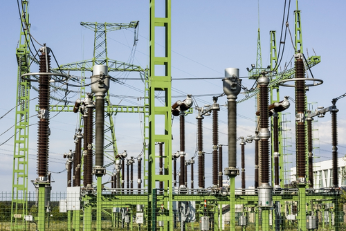
The German power grid crashed on three separate days during June which was so critical, it required neighboring countries to come to its rescue to prevent a total blackout. The entire European power grid has been exposed as a risk. The cause of the insufficient power supply is not yet fully understood. The issue in question is the EU demand for the reduction in CO2 and the push toward electric cars. The power grid of Europe will not be able to cope with such a mass convergence. The shortages in June are a warning that the Global Warming agenda being pushed in Europe really needs to a reconsidered
Why Renewable’s can’t save the planet | Michael Shellenberger | TEDxDanubia
Published on Jan 4, 2019
Princeton’s William Happer rebuts myth of carbon pollution
Published on Apr 18, 2018
Over 37,000 Head of Cattle Die from Global Warming in Montana?
Armstrong Economics Blog/Climate
Re-Posted Jul 2, 2019 by Martin Armstrong

COMMENT: Marty, the winter of 2018 has been the coldest ever. We lost so many heads of cattle here in Montana, I have never seen it this bad in my lifetime. These people preaching global warming belog in prison.
JH
REPLY: The federal Livestock Indemnity Program paid out $11.1 million for the loss of 37,352 cattle in Montana in 2018. Ranchers and the Farm Service Agency (FSA) say there were more weather-related cattle deaths that did not qualify for compensation. These people will send the European economy down even further wiping out economy growth by eliminating the combustion engine. The damage they are causing around the world is really insane.
European Car Manufacturers Heading into a Crisis?
Armstrong Economics Blog/Climate
Re-Posted Jul 2, 2019 by Martin Armstrong

The Global Warming conspiracy is going to seriously harm the European economy. The political intolerance for the combustion engine has German engine suppliers in a crisis. It appears that there is certainly no more money being invested in any technology to do with the combustion engine. That also means that the unemployment in that industry will rise to the worst levels witnessed during the Great Depression. Normally, you have a transition from one technology to another which always leaves people behind who cannot adapt. However, this particular transition is not being carried out by the free market or the natural trend of evolution in technology. This time, the transition is being compelled by government and the end result is not likely to be very beneficial to the European economy.
Additionally, German car manufacturers will have no choice but to move production of combustion engines offshore for other markets. The prospect of being able to manufacture combustion engine cars in Europe for export will diminish greatly. Back in 2010, Ferrari S.p.A. was looking to idle production and eliminate 9% of its work force after sister brand Maserati reduced orders for engines. While Maserati sells an average of 3,000-3,500 vehicles annually in North America, all Maseratis are built in Italy.
Beyond 2021, the EU is finalizing plans that, once agreed later this year, would cut automaker CO2 targets by 15 percent from the 2021 averages by 2025 onward and to 37.5 percent after 2030 That means the average CO2 emissions of less than 60g/km on an NEDC basis (almost 110 miles per gallon), or 66g/km under WLTP. The costs of adding the required tech will not be cost-effective in smaller cars. That means prices on the preferred smaller smart cars in Europe could rise by an additional 10% due to regulation.
Debunking the Climate Consensus
Published on Jul 6, 2018
Climate Change Narrative is Driven by Agenda of Political Control—Myron Ebell
Premiered Jun 21, 2019
Digital Exclusive: Dr. Patrick Moore TEARS APART The Green New Deal | Huckabee
A Technical Study in the Relationships of Solar Flux, Water, Carbon Dioxide and Global Temperatures, May 2019 Data
From the attached report on climate change for May 2019 Data we have the two charts showing how much the global temperature has actually gone up since we started to measure CO2 in the atmosphere? To show this graphically Chart 8 was constructed by plotting CO2 as a percent increase from when it was first measured in 1958, the Black plot, the scale is on the left and it shows CO2 going up a bit over 30.0% from 1958 to May of 2019. That is a very large change as anyone would have to agree. Now how about temperature, well when we look at the percentage change in temperature from 1958, using Kelvin (which does measure the change in heat), we find that the changes in global temperature (heat) are almost un-measurable. The scale on the right side had to be expanded 10 times (the range is 40 % on the left and 4% on the right) to be able to see the plot in the same chart in any detail. The red plot, starting in 1958, shows that the thermal energy in the earth’s atmosphere increased by .30%; while CO2 has increased by 30.0% which is 100 times that of the increase in temperature. So is there really a meaningful link between them that would give as a major problem? The numbers tell us no there isn’t.
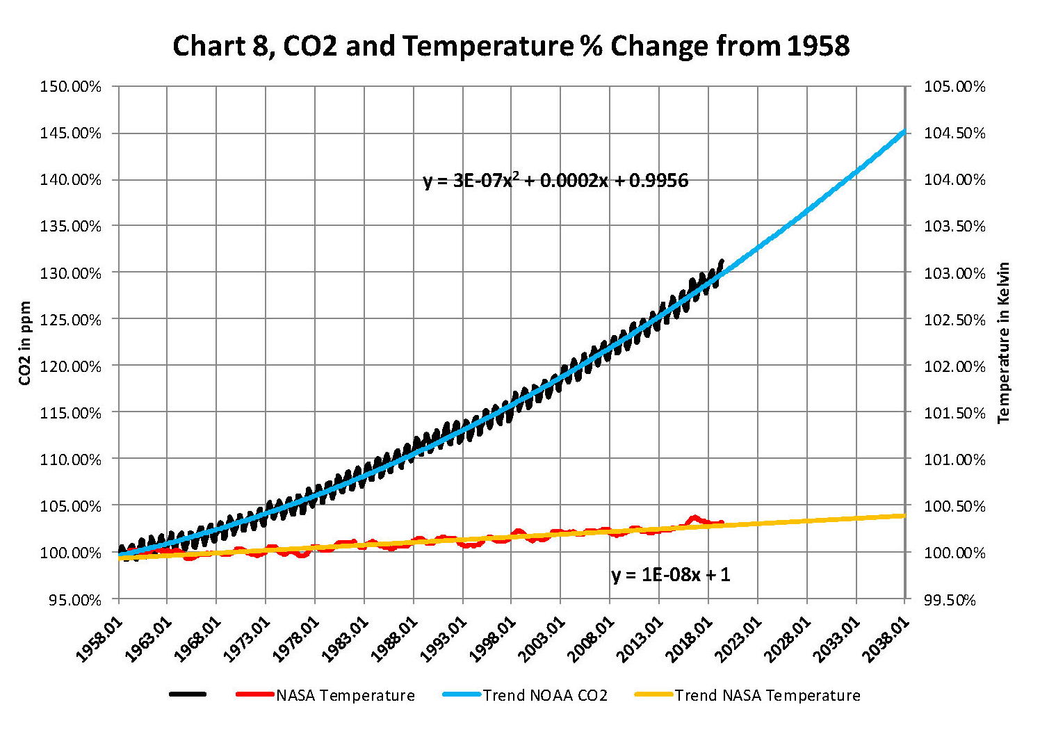
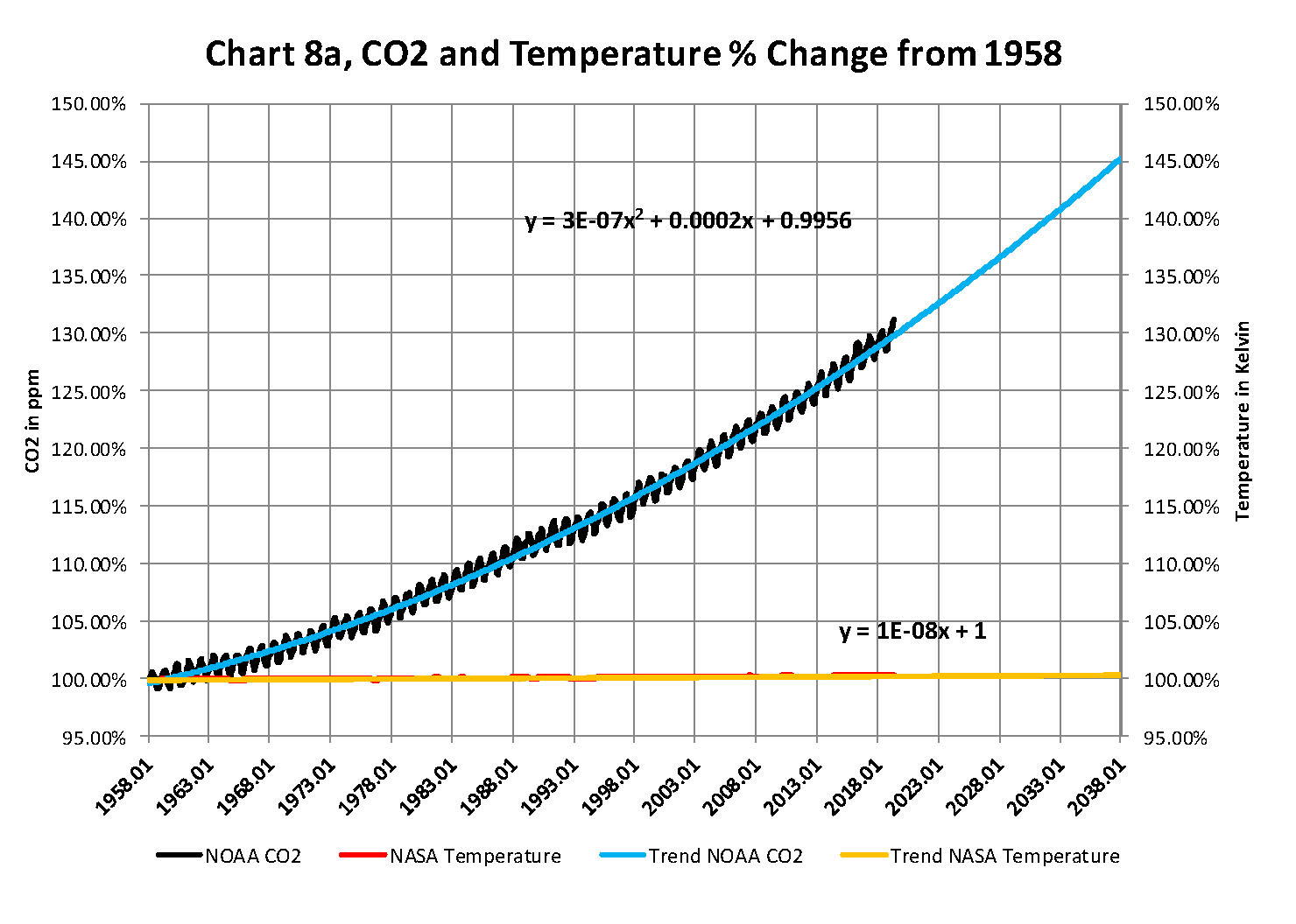
The next chart is Chart 8a which is the same as Chart 8 except for the scales which are the same for both CO2 and Temperature. As you see the increase in energy, heat, is not visually observably in this chart hence the need for the previous chart 8 to show the minuscule increase in thermal energy shown by NASA in relationship to the change in CO2. Based to these trends, determined by excel not me, in 2028 CO2 will be 428 ppm and temperatures will be 15.0o Celsius and in 2038 CO2 will be 458 ppm and temperatures will be 15.6O Celsius. This is what the data shows no matter what the reasons are, so I have no idea how the IPCC gets to predict that the world will end in ten or even twenty years.
The full 37 page report explains how these charts were developed and why using NASA and NOAA data are used with out change to prove that The New Green Deal is not required and any attempt to compliment that plan will be a world wide disaster.
