The timing is not certain but the ride will be very bumpy!


The Sling Shot Move – How Long Would it Last?

ECM-2015-20

QUESTION: 

Hi Martin…can you explain more what you meant but what you said below?
Does this mean a long correction that will last thru out this year or longer? or will it just be thru march ..then bottom and head back up thru 2017..? Confused here…what is the …extension mean exactly? Is that an uptrend in the market until and beyond 2017?

If it cracks…how long will it crack downwards?
Thank you

Our Panic Cycles began to turn up this week moving into next week. If we penetrate last year’s low of 15370, then we may see a drop to retest the major support area in the 12875-13100 area. We should break the market FIRST and this appears to be setting up for the extension beyond 2017. A monthly closing below 16013 will signal that the market should crack and then we will be set up for a really wild rise.

1987 Sling Shot

2007 Sling Shot

ANSWER: No, this is a Sling Shot move more akin to 1987 if we achieve it. A crash would be rather quick in the form of a Waterfall Move. Therefore, we are unlikely to see a prolonged decline. It would tend to be short, sweet, and to the point. Everyone would tend to bailout and then that would be the fuel to send it back up for they would not believe the result. Keep in mind this is NOT YET CONFIRMED. We need to elect a Monthly Bearish Reversal at the 16000 area to signal a move to the next zone in the 12900-13100 area on the extreme.

The movement in the DOW and the rest is as predicted and the year is still not looking good.


Dow Array Still on Track

DJFOR-M 7-6-2015

QUESTION: Marty; At the conference you stated that 2016 should be the major turning point in deflation. Do you still see this concluding for the first quarter?

Thanks

HG

ANSWER: The monthly array in the Dow published here back in July appears to be working on target. November was the reaction high where the Dow reached 1721043 intraday. It picked the May high for 2015 correctly and we still have the first quarter as the main target to pay attention. Not much has changed. Socrates warned that is we closed lower at year-end 2015 then we would see a correction.

We may yet get that Sling-Shot Move where you take out last year’s low and then swing to new highs. The only difference that seems to be shaping up is that instead of a conclusion for 2017, we may be looking at an extension into 2020 and the general public becomes aware of the crisis in government.

We have to pay close attention now to the Weekly and Monthly Bearish Reversals. It is the monthly which will signal if we are going to get a Sling-Shot and extend this entire mess beyond 2017.

The numbers are the numbers and the arrays are the arrays. My personal opinion does not really matter for it is always the computer which does a far better job than I could do on a personal level.

So it begins …


Contribution from Norway — War & Money

War-Money

COMMENT: 

Good morning, Martin.

Yesterday I bought an old booklet printed for 10 NoK at the Armed Forces Museum: “Laws, resolutions and prescripts due to circumstances of war”, by the Justice Department, printed in Kristiania (now Oslo) in 1917. I thought I there would find the outline of a recipe for what may come here this time around. Here are the highlights (in addition to an ever growing list of goods that are temporarily forbidden to export):

3. August 1914: Telegram from the Finance dept, ordering all major banks to execute the bank-plan restricting withdrawals from accounts, and immediately order all banks to stop any withdrawal not in accordance with the plan.

4. August 1914: Maximum prices to be imposed on certain goods

4. August 1914: Payment of expireing government paper will be postponed one month, ordinary interest rate applies. For paper without interest rates, 5% p.a. will be paid during the posponment period.

5. August 1914: Bank of Norway is temporarily not obliged to exchange its notes with gold.

15. August 1914: Since there was no bank run, the bank-plan is relaxed, but banks shall only allow withdrawals to companies to pay salaries etc. Private persons are allowed to withdraw what the bank think they will need for one week at the time. Under no circumstances must the banking restrictions come in the way of companies/private persons paying taxes to state/munis.

18. August 1914: Gold and silver in any form is for the time being prohibited to export from Norway.

18. September 1914: International private telegrams are to be in Norwegian, Swedish, Danish, German, English, French or Russian, and be written in a clear way that gives meaning to the operators. If not, the telegrams will not be forwarded and no notification given. International phonecalls are to be in Norwegian, Swedish or Danish. Non- compliance leads to termination of the conversation.

20. August 2015: Increased taxes on income generated due to the war business cycle: 5% on first 5000 NoK increased income (based on tax declaration 1914) assumed to be due to the war. 15% on 20 000 NoK and above.

15. April 1916: Bank of Norway is temporarily no longer obliged to exchange into notes gold handed in, nor is the State Mint obliged to mint coins from gold handed in.

Happy New Year Martin, and all fellow readers of this blog.

00:00
01:37


REPLY: War and money has always been a politically sanctioned marriage. Trying to force the federalization of Europe to end war is like advocating that had Hitler or Napoleon conquered all of Europe, then they would have ended European wars. The EU in Brussels is trying to conquer Europe and they are using politicians to betray their own people. This has always been the goal. The euro was indeed the federalization of Europe through the back door, as Margaret Thatcher said.

2015.75: The Start of Sovereign Debt Crisis

ECM2015-2020

We warned that 2015.75 was the turning point to the start of BIG BANG. As we now have entered the down wave on the Economic Confidence Model, things will begin to heat up. Here in 2016, I have warned that our crisis has been created by the total mismanagement of government by politicians. This year will mark the beginning of the problem where governments

I have warned that our current crisis in 2016 has been created by the total mismanagement of government by politicians. This year will mark the beginning of the problem of governments NEVER paying off debt. Instead, they roll it and add to it year after year. Well, 2016 will mark an outrageous roll as the equivalent of nearly half of the USA’s national debt has to be refunded. Major economies need to raise about $7.1 trillion U.S. dollars to refinance debt. Germany alone has around €203 billion euros of new debt that it has to sell, which is a considerable challenge in view of the fragile global economy. Welcome to BIG BANG.

A recovery from the open but still down!


Market Talk — January 4, 2016

Market-Talk

What a start to the New Year! Talk around the street voiced a few reasons for today’s stock market declines from geopolitical tensions between Saudi Arabia and Iran to additional dealing costs associated to playing the markets. Discussions are apparently underway across the globe to address market orders, the way in which orders are placed, the magnitude of such orders and the frequency. This, of course, will increase the volatility of prices (as market-makers withdraw) whilst at the same time lead exchanges to increasing margin requirement’s.

Chinese equities lost all bids with two exchange forced closes earlier today. The initial 5% forced the first close only to be closed the second time after the Index fell 7% – this time for the remainder of the day. The Nikkei opened the year over 1% lower and continued the selling throughout the rest of the day to close down 3% at 18,450. The futures have continued that decline and are currently trading around 18,150.

Europe opened weakly and remained so for the balance of the day. DAX closed -4.3%, FTSE -2.4%, and CAC -2.5%. In the U.S., we saw initial weakness across the board but all recovered in the final 30 minutes of trading.

The DOW, S&P, and NASDAQ all recovered to close at their days highs. All markets closed lower but a huge improvement in the final twenty minutes from their lows. DOW -2.1%; S&P -1.5%, and NASDAQ -2.1%.

Both gold and the bond markets saw the flight to quality bid with gold jumping $15 while bonds rallied 4BP across the curve. The spread between U.S./Germany closed around 166bp with U.S. 10s yielding 2.235 whilst German 10s closed 0.57%. This year, we should also follow the peripheral European bond market, so for point of fact we shall include 10yr Italy also; so tonight the BTP closed at 1.55%.

The U.S. dollar saw the bulk of the in-flow with the DXY (USD Index) closing up 0.25% at 98.95. The Turkish Lira was one of the EM currencies that suffered (amidst the market turmoil) closing down on the day almost 1.6% against the USD. GBP and Euro also lost ground but only a marginal 0.25%. A couple of other currencies to mention would be the BRL that lost 2% and the Polish Zloty that lost 1.2%.

The Markets will be unstable through first quarter!


Dow & the Immediate Outlook

DJIND-W TECH 1-4-2016

QUESTION: Marty, at the WEC you said the Dow would go down in the first quarter. How far do you see this going this time?

ANSWER: We elected a monthly Bearish Reversal at year end and closed lower than 2014. The main support starts really down at 15850 level followed by 15370. We can see even technically the Stochastics are showing a correction is forming and we lost the upward momentum. A monthly closing beneath that level will confirm a deeper correction. Many people expect the stock market to decline with higher interest rates domestically and others see that an uptick in US rates will be the kiss of death to Emerging Markets which will be bad for the world economy as a whole. Keep in mind that these are likely to put a bullish spin yet of the dollar fueling the deflationary spiral for now. I have stated that this is critical to understand the future.

We have initial support forming at the 16886 level and a weekly closing below that will confirm a continued decline. Our Daily models warn of important support starting at 16930.

DJIND-W FOR 1-4-2016

Volatility should rise doing into next week and we have a slew of Directional Changes in a row on the Weekly level warning of a very choppy market ahead into early February.

The Black hole of Sovereign Debt!


Our Nemesis – Sovereign Debt Crisis

Nemesis-Justice

Nemesis & Justice in Pursuit

QUESTION: Mr. Armstrong, I wanted to thank you for the conference in Berlin. It was my first time attending. I cannot wait for the DVD. You gave so much information, I think I will have to watch the DVD several times. I can see the debt crisis here in Europe and I can see the move to get cash into dollars. Has debt always been the great destroyer of civilization?

ANSWER: The Sovereign Debt Crisis is our Nemesis; the inescapable agent of someone’s or something’s downfall. Before governments borrowed, they debased their currency. This was the same result for the German Hyperinflation that is so seriously misunderstood. Because of the 1918 Communist Revolution in Germany and their default on all outstanding debt of the previous government, the new Revolutionary Government could not borrow. Hence , all they had was the printing press. That is SIGNIFICANTLY different from today. As long as “confidence” prevails and they can sell debt, there can be no hyperinflation for that is not caused by simply printing more money this year than next. That is a simpleton’s view of more complex issue.

Black-HoleWe are not anywhere close to hyperinflation. We are trapped within a Sovereign Debt Crisis where the world governments continue to issue debt which is bought by insane people, and then they try to service that debt by raising taxes. This shrinks the private sector as government acts like a black hole sucking in all the energy and light within the economy destroying civilization and risking a Dark Age.

Claudius AY Pax-Nemesis

This time there will be no peaceful hand-over of power, so I would not count on the Pax-Nemesis prevailing. After the assassination of Caligula on January 24, 41AD, the Praetorian Guards needed an emperor to retain their jobs and took Claudius to the Praetorian camp and put him under their protection. The depiction of the goddess Pax-Nemesis, representing subdued vengeance or the amnesty in prosecuting those who had participated in the assassination of his nephew.The Senate quickly met and began debating a change of government, yet it quickly devolved into an argument over which of them would be the new Princeps. When the Senate heard of the Praetorians’ claim, they demanded that Claudius be delivered to them for approval. Perhaps King Herod of Israel, a boyhood friend may have counseled Claudius, but whatever the source of the counsel be it Herod or the guards, Claudius rightly refused sensing the danger.

Eventually the Senate was forced to give in and accepted Claudius as the new Emperor and in return he pardoned nearly all the assassins. Thus, this coin was issued depicting “Pax” meaning peace and Nemesis; the inescapable agent of someone’s or something’s downfall.

So unfortunately, the only possible way forward to escape our fate of a Dark Age is to employ the SOLUTION we have set forth to deal with the debt. This is our only hope of achieving Pax-Nemesis.

DEFLATION comes as governments try to collect more and more taxes. This shrinks the economy and makes it vulnerable it collapses. INFLATION comes when CONFIDENCE is lost in government. Then money declines in value and assets rise. It is always a confidence game.


The Real Reason Inflation Unfolds

Confidence-wide

QUESTION: Dear Mr Armstrong,

Thank you EVER SO MUCH for everything that you do even for ordinary folks like me who are not traders but just want to have a good grasp of where to put their money. I have already learnt a great deal by merely following your blog throughout the last two years, and I’m eagerly anticipating the investor level of Socrates. Merely from looking at how it’s supposed to work on your website is mind-blowing! Thanks for the incredible work that must go into this amazing project.

Concerning the pressure exerted by banks on Romanian politicians I find it really intriguing that these days banks usually (at least, here in Germany) may put stipulations in their mortgage contracts giving them the right, under certain circumstances, to re-evaluate the value of your property, if this has increased in terms of your currency, and to adjust your mortgage accordingly. Interestingly, they weren’t allowed to put in such stipulations before the Euro was introduced. Clearly, the banks want to have it both ways, so I agree with you when you say: “The bankers want no risk and will screw the people every time. This law is fair as the banks sold mortgages without guidance.”

What still confuses me sometimes is that assets may rise even in a deflation, but I suppose that’s due to an asset inflation then which is to do with the political climate calling for a flight to assets, correct?

Yours sincerely,
TN (Germany)

ANSWER: Correct. The banks did not believe in the euro. Even the German Central Bank was against the euro. They could not speak out back then so there were people inside who were feeding us all the inside info to get it out. We published a lot back then and the commission even attended our conference in London in 1997. This was, in part, the primary reason for that hidden clause which never got much press. Trying to cope with pricing cross currency has always been a huge problem for corporations as well as banks. Not every mortgage has such a clause. However, if a country were to exit the euro, the mortgages would most likely be revalued by political dictate rather than a free market.

We can still experience “asset inflation” during a deflationary move for one of two reasons. First are commodities that can rise due to a sudden shortage in supply, such as in an agricultural produce when a crop is destroyed for some reason. Second, asset prices can rise during a deflationary wave because taxes are rising and banks become untrustworthy. Then money seeks merely to park. It is not a speculative boom whereby people are expecting to make money on a rise. This is the typical capital flight to quality where assets replace government bonds.

declsilv-ma-waterfall

3-Hoard

The typical assumption is that Rome went through hyperinflation during the 3rd century simply because the coinage was debased. Yet, hoards of the debased coinage are common during this period. We rarely see hoards of the debased mixed with the old silver coinage. The hoard we purchased covered the period of 250 AD up to 285 AD. We bought this hoard for study because it was perhaps the widest span of time of any hoard. Most seem to be 270-285 AD period. This demonstrates that they hoarded even the debased coinage. Therefore, it was beyond merely debasement. This was the massive invasions of barbarians at the gates.

Aurelian-Wall-1R

If you travel to Rome, you will see its walls are largely intact in many areas. They were constructed by the Emperor Aurelian (270-275 AD). Banks could not be trusted and there was a question of whether government could even defend its people. It was not merely the debasement. The debasement became necessary because of massive hoarding which created deflation. The inflationary wave came AFTER the contraction bottomed. This is when we see the wage and price controls of Diocletian (284-305 AD) issued in 301 AD. This curiously was 51.6 years after Trajan Decius (249-251 AD) came to power. Decius was the first Roman Emperor to be killed in battle by the Goths. This was the start of the decline in CONFIDENCE of Roman society when they realized they were vulnerable for the first time.

Confidence-2

The deflation comes as governments try to collect more and more taxes. This shrinks the economy and makes it vulnerable long-term until it collapses. The inflation comes when CONFIDENCE is lost in government. Then money declines in value and assets rise. It is always a confidence game.

Donald Trump Full “unabridged/extended” Interview on Face The Nation (video)…


Trump does well in interviews and this one seems reasonable unlike others.

Is climate change real and if so is humankind responsible?


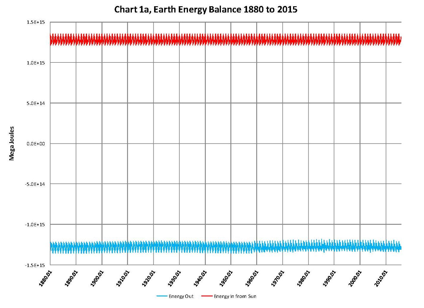
The Earth gets all its energy from the sun in a somewhat complicated process of absorption and radiation with delays between the incoming and outgoing energy that creates a livable temperature on the planet’s surface. Geological records, going back hundreds of millions of years, have shown that the planet’s average surface temperature has ranged from a low of ~12.0OC to a high of ~22.0OC and the planet is to the low side today at just under 15.0OC. Obviously the mechanism that regulates the planets temperature is self correcting and does not get into a runaway hot or cold scenario. Since we know these facts to be true, we therefore have an inherently stable system.

The next fact to be considered, is that 10,000 years ago we were just about ready to come out of the last “Ice Age” with deep glaciers covering most of the land masses in the northern hemisphere. Obviously humankind had nothing to do with the existence and removal of that ice and so again we have proof that the climate is a variable and never gets totally out of line. But it should be kept in mind that we still have not got back to what would be an average geological global temperature of ~17.0OC so panic at the current slightly less than 15.0OC is somewhat irrational.

Now looking back two or three thousand years where we have recorded history and physical evidence we find that there have been well documented alternating cold and warm periods; The sub-Atlantic cold period, The Roman warm period, The dark age cold period, The Medieval warm period, The little ice age and the current Modern warm period. These cycles are real and consistently repeat themselves in a ~500 year up or down cycle making for a ~1000 year over all cycle. That movement in global climate is therefore the base for our modern climate and must be used in any climate model that will work.

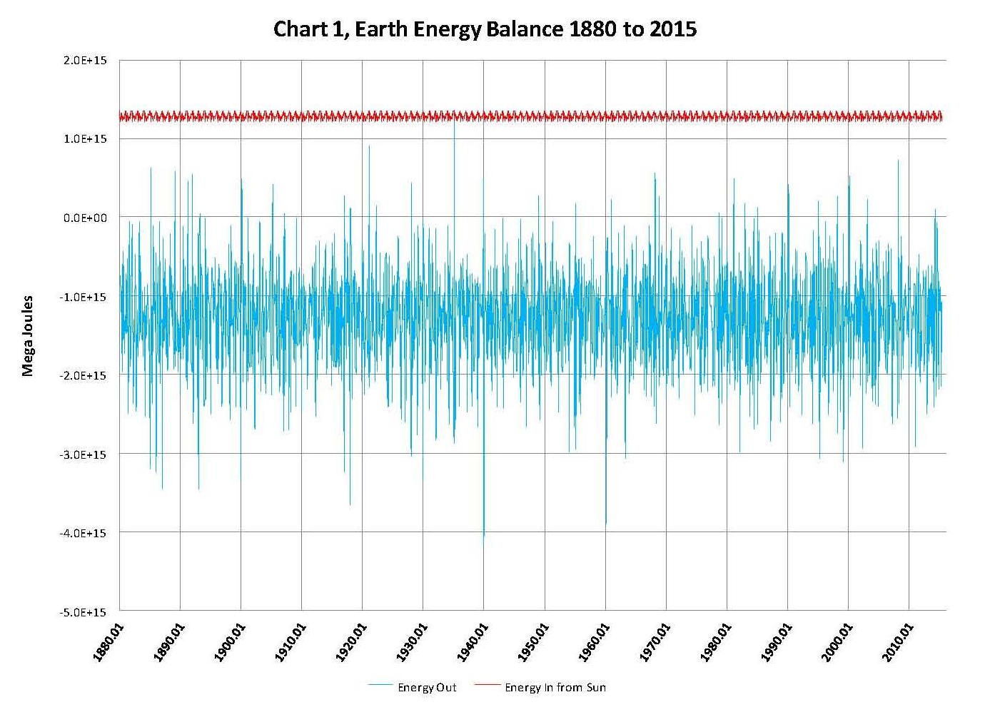
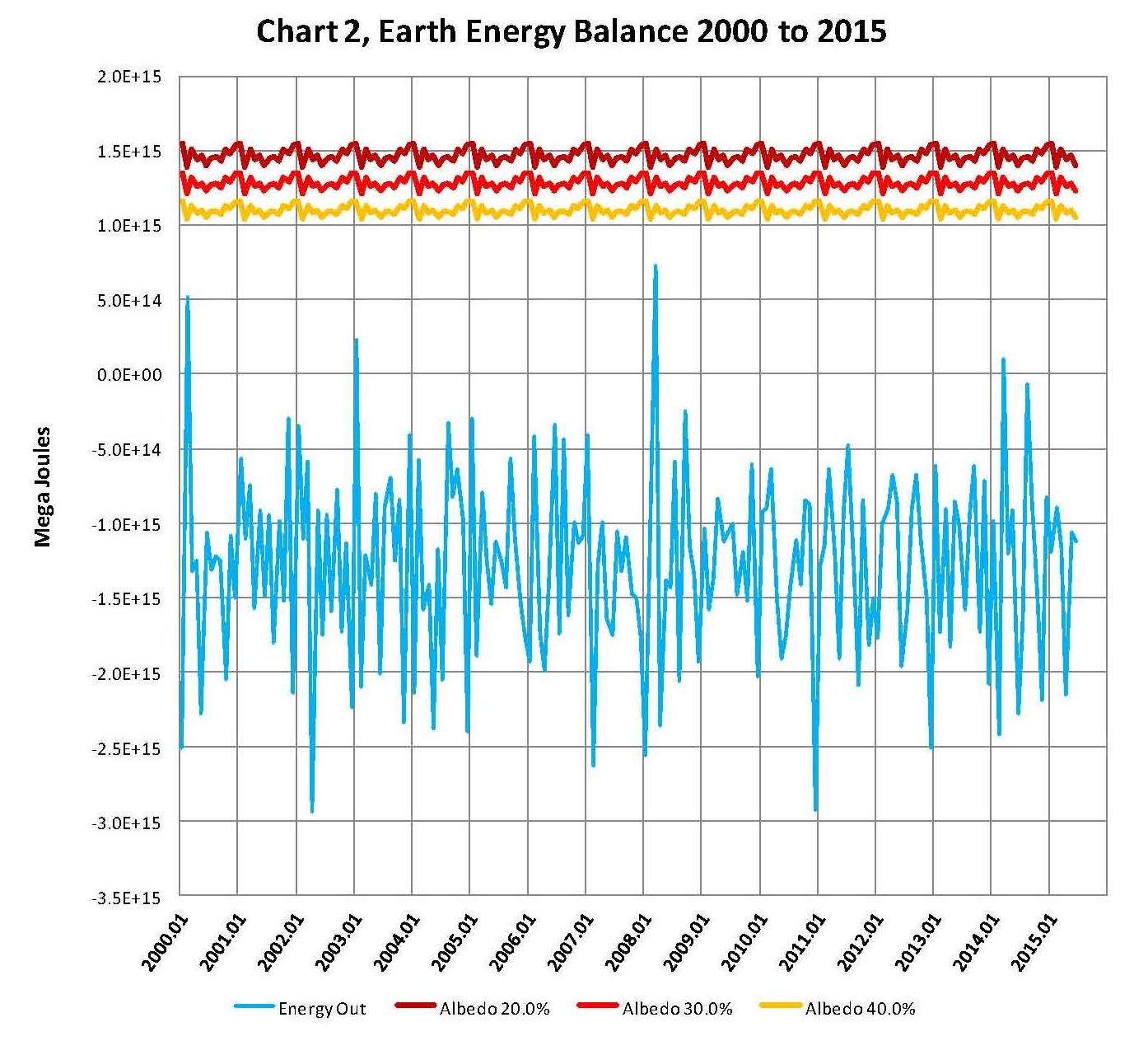
Global temperatures are published each month by NASA-GISS (NASA) in their Land Ocean Temperature Index (LOTI) which goes back to January 1880 and runs by month to the current date and is where we get temperatures to work with. In that data, one can observe both the ~1000 year cycle and also a shorter ~70 year cycle which were used to create a climate model based on those two cycles back in ‘07. However once that model, which I called the PCM (Pattern Climate Model), was completed it was found that there was another factor to consider which was the effect of increased levels of CO2. The addition of CO2 with a lower sensitivity values than that used by the IPCC, 0.65OC verses 3.0OC, gave excellent predictive values and was used very successful until 2014 since this model predicted the current “pause” and further showed it will last until the mid 2030s.

Two things happened in late ’14 and early ’15 the first being that NASA decided to start seriously tampering with the climate data to make sure that the December 2015 COP21 conference in Paris had data that showed the planet had never been this hot before. The anomaly value published in November 2015 for their LOTI table for October 2015 was 104 which is the equivalent to 15.04OC; and sure enough in “that” report October 2015 was the hottest ever recorded by NASA. Unfortunately in previous versions of that report many other months had values higher than 104; so NASA had to make them colder in the November 2015 report. Data tampering was nothing new to NASA but what was done this time was so blatant that just about everyone in the field could see it. This data tampering created a situation where the climate model I developed was now showing an error or deviation that had not previously been observed, although it was not a major deviation and the PCM model was still more accurate than any of the IPCC GCM’s.

The other thing that occurred was that I became aware of the use of Pi (3.1416) in finding patterns. During November I decided to see if Pi could be used to improve my model. What I found was very interesting and it did make the climate model better. A base to work from was needed and so I picked the 22 year solar magnetic cycle. Thus 22 times Pi is 69.115 years and that becomes the short cycle and the long cycle becomes 15 times the short cycle or 1036.726 years which made it 330 times Pi. These values were not much different than what I had come up with in ’07 but they did make an improvement in the model being able to match the NASA values even better after changing all the formulas that I used to reflect this change. Also Pi to the power of e is 22.46. With the equations set only three things were required which were a starting date, 1650 in this case, and a starting temperature, 13.4OC, and lastly amplitude for each cycle. Based on observations 1.65OC was used for the long cycle and 0.29OC was used for the short cycle. These values are reasonably consistent with observation.

After making this change there was no change required in the CO2 model which is a logistics curve and matches the NOAA plot almost exactly which then allows projecting CO2 in to the future. Then after making all the adjustment based on Pi I found that I had to raise the CO2 sensitivity value up from what I was using 0.65OC to get the plot to match NASA data. I’m not sure this increase is justified as the NASA data is artificially high and so the 0.75OC value that I used may also be too high. However the 0.75OC is close to the expected lower values in current published papers and so even if the NASA values are eventually corrected and lowered, as they must be, a new lower value such as 0.75OC will still work since the sensitivity effect at that level is relatively low.

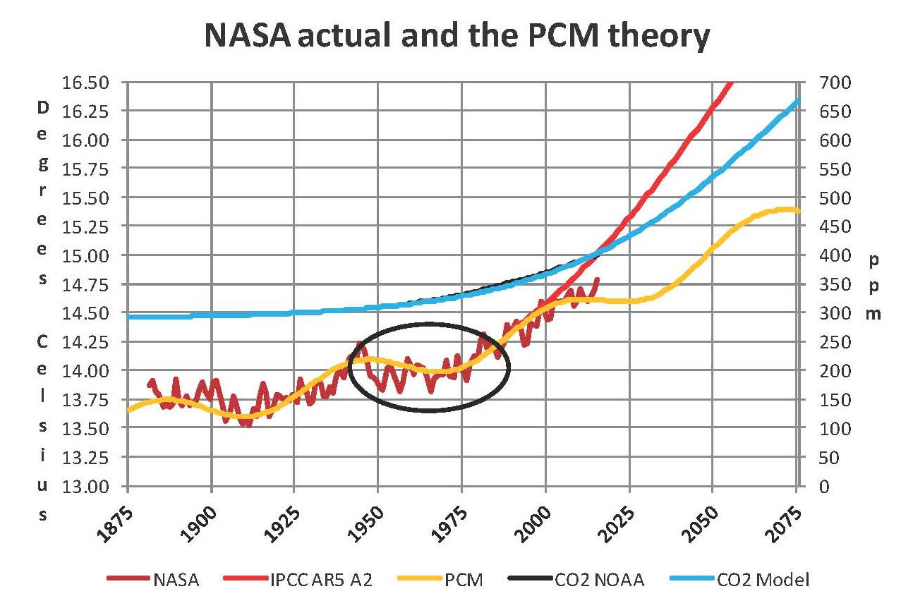
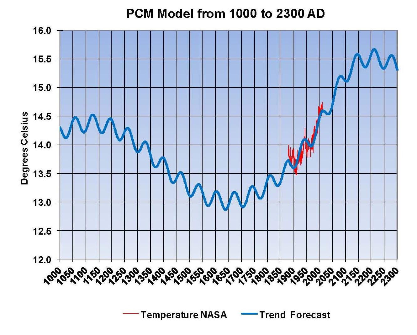
The following chart shows the results of using the 22 year solar magnetic cycle and Pi as the determining factor for the observed climate patterns. This chart is made from the average value of temperature and CO2 for each year, instead of using the monthly values which are very irregular in the NASA temperature tables. You can see the large upward movement in the 2015 temperature which is not justified as the satellite data clearly shows a lower value, however you can also see that the yellow plot from my model is very, very close to a mean of the NASA values. The sad thing is that this model might be even better if we had the real values to work with not the manipulated ones that NASA gives us. I have also added a red trace showing the IPCC AR5 A2 global temperature projection.

CHANGE 01

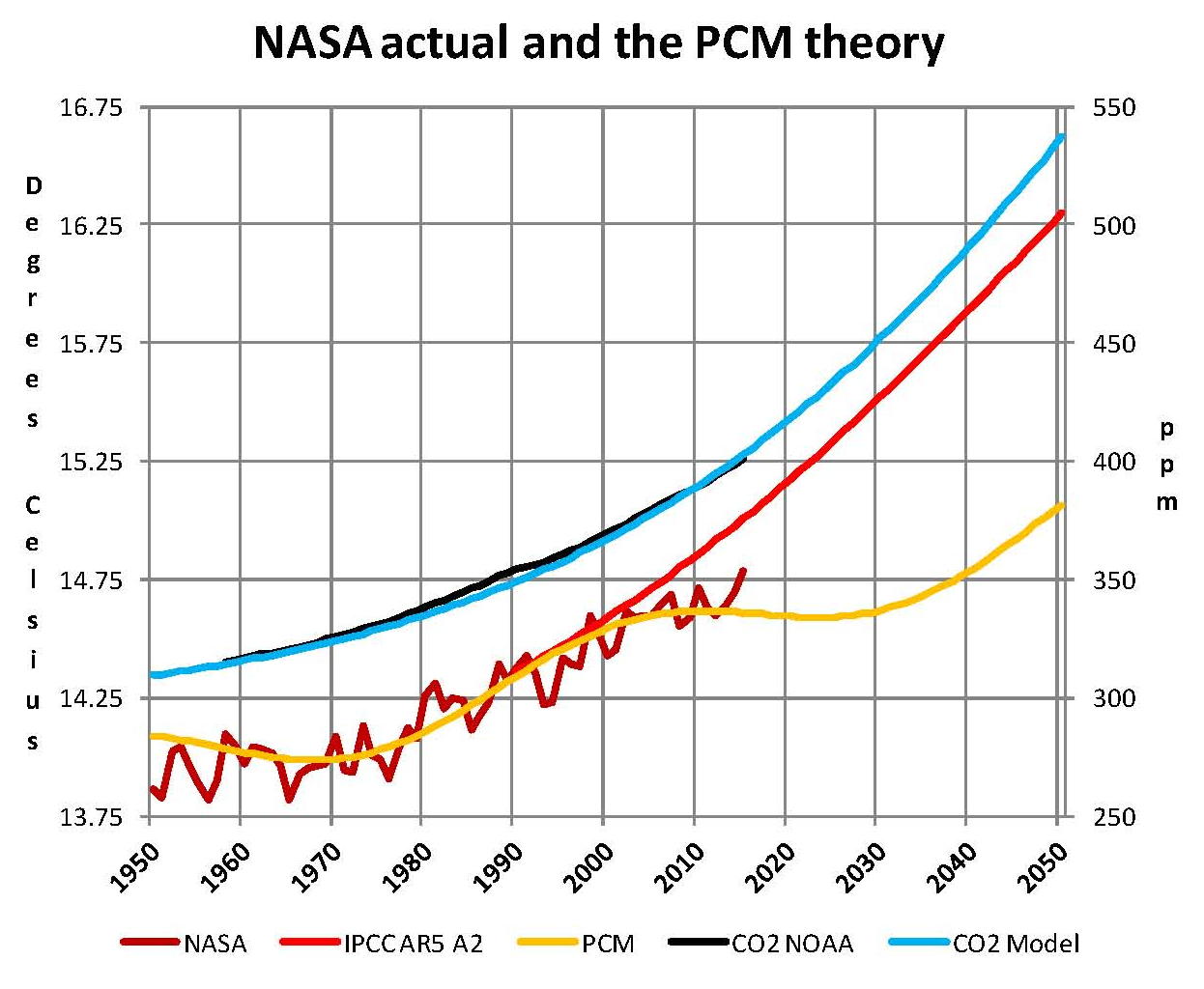
One other technical criticism of NASA is they use the period of 1950 to 1980 (30 years) to make their base for calculating anomalies, for some unknown reason. They determined that the mean temperature for that period was 14.0OC and they measure deviations from that in hundredths of a degree such that 15.04OC ends up as an anomaly of 104. This makes for interesting gyrations since they are always changing the values in their LOTI table and when they do so those values that end up in 1950 to 1980 period have to equal 14.0OC to make their system work, black oval in chart. It would have been much better to pick a value that had meaning such as 17.0OC which is the historic mean temperature of the planet. If they had done this then I would bet that the values around 1950 would be somewhat higher and closer to the yellow PCM plot. The next chart shows a closer view of the current period. In this Chart you can see the close relationship of CO2 and the IPCC AR5 A2 plot, this close of correlation leaves no room for other factors and since the IPCC has ruled out any natural reasons for climate change this makes sense. However if that assumption is wrong than the climate models are also wrong and that is why NASA manipulated the temperature values prior to COP21. The PCM model indicates that there will be no more warming until into the 2030’s

CHANGE 02

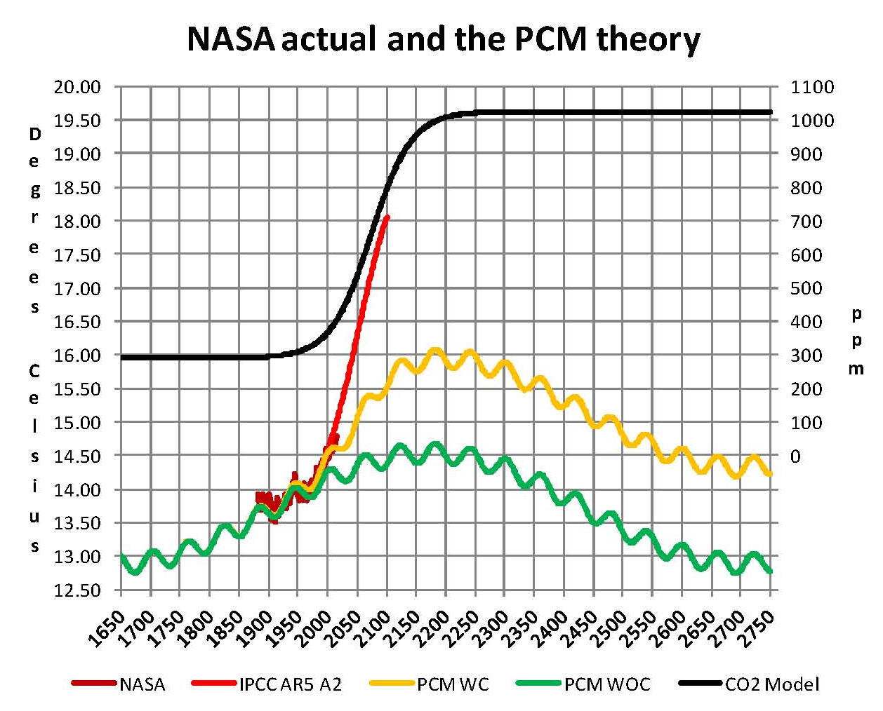
The next chart shows a complete 1036.7 year cycle. What we have is 1.65OC from the long cycle, 0.29OC from the short cycle and about 1.4OC from CO2, but actually I think the effect from CO2 will be less since the current NASA numbers are inflated and that forces us into a higher level in the model. Personally I think that the total will be close to a half a degree less than shown here but even if not we are still well below the geological average of 17.0OC so there is nothing to worry about. Both CO2 and global temperatures have been significantly higher than present levels which are actually closer to historic lows than to historic highs. Also if CO2 does get do over 1000 ppm plants will grow faster and therefore farming will have higher yields.

I also added a green plot labeled PCM WOC (without carbon) to this chart showing what the existing pattern of the long and short cycles would be if there was no increase in CO2 from the base of 290 ppm so we have something to reference the effect of CO2 which is only ~1.4OC. Today’s current temperatures would be about .5OC lower with a constant level of CO2 than they are with CO2 going from 290 ppm to 400 ppm. The next big global temperature increase will be from 2035 to 2070 and that will probably be a full degree so if we are not prepared that will cause utter panic since that will be more than what we had from 1975 to 2005. The Chart on the next page shows these items.

CHANGE 03

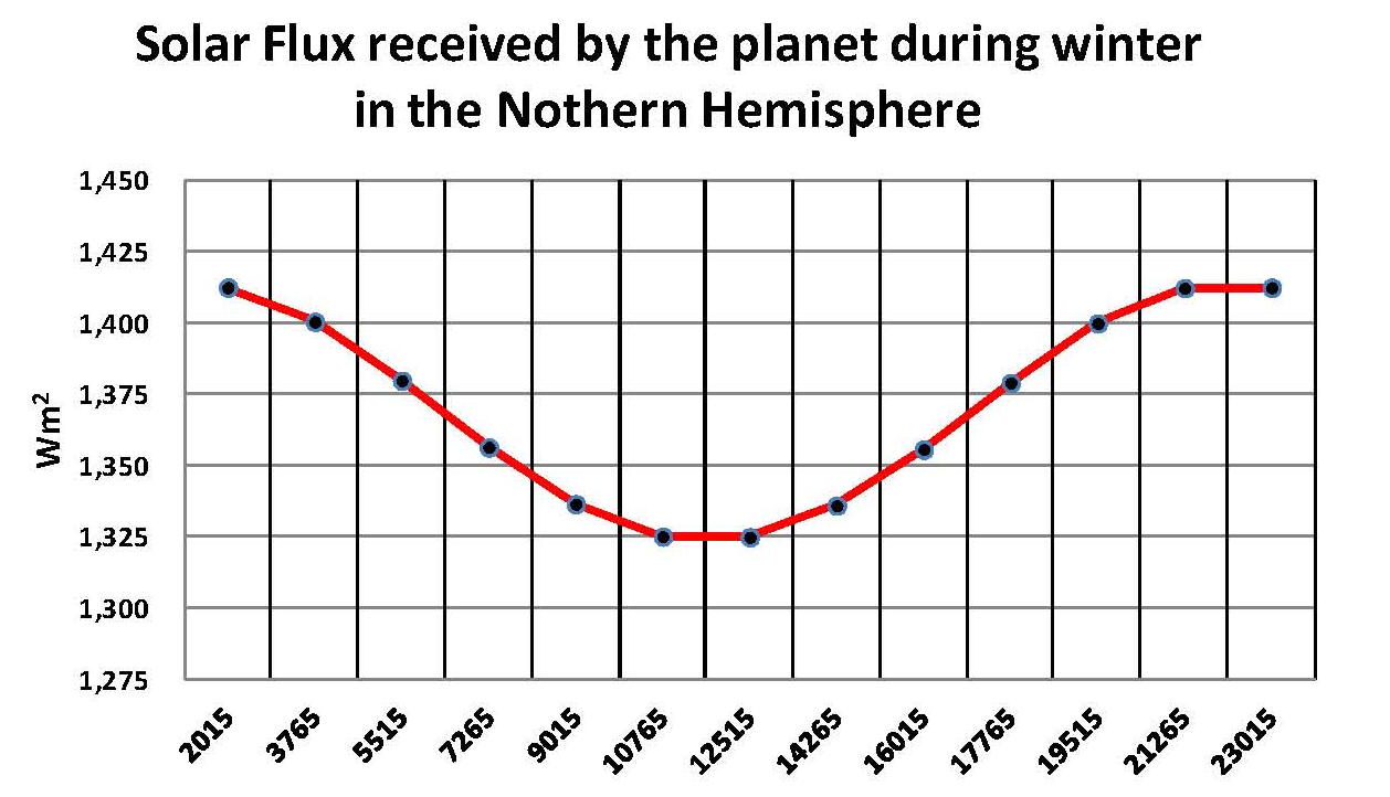
This climate model has been rightly criticized as curve fitting and I cannot claim it is not; however it does work so it must be based on real processes at play on the planet. My best guess is there are two things going on the main one is the apsidal precession of the earth’s orbit which reverses the aphelion and perihelion to the seasons every ~10,000 years. Since the bulk of the land is in the northern hemisphere and the southern is mostly water this makes a big difference since the summers will get hotter and the winters will get colder in the northern hemisphere when the earth’s axis is pointing toward the sun at perihelion which it will be in 10,000 years. A plot of the changes in solar flux is shown on the next page. know this is not 1,000 years but I just have a feeling that it is related. The thermohaline ocean circulation is a 1,000 cycle and probably related to the precession but this alone cannot explain the global temperatures and so it has been dismissed.

The other cycle the short 70 year cycle which is, in my opinion, related to the 22 year solar magnetic cycle which probably has an effect of particles entering the earth’s atmosphere and that changes the cloud layers which changes the planets albedo. There is more support for this theory but by itself it cannot account for the observed changes in global temperatures and so it has also been dismissed.

CHANGE 04

After writing this paper I became aware of a paper published by the National Academy of Sciences (PNAS) November 7, 2000 by Charles A Perry and Kenneth J Hsu. The paper was about a relationship between 2^N and solar output i.e. the solar magnetic cycle of ~22 years. So 2^6 power is 64 and 2^10 is 1024 which is not far off from using PI * 22 or Pi * 330, and in fact substituting those values in my model made little difference in the output. And since the NOAA and NASA published temperatures have been compromised there is no way to know which system is better at matching current temperature, which is very sad of science.

When the long and short cycles are removed we are left with only CO2 and that forces us to use the NAS 3.0OC +/- 1.5OC for each doubling of CO2; which worked when the long and short cycle were both in ascendance but 3.0OC +/- 1.5OC does not work now that they are not. As long as we ignore the geological cycles we will never be able to build a GCM that works.

Are NASA-GISS Published Global Temperatures Valid?


This paper shows that the values published in the NASA table LOTI cannot be supported when the sun’s energy is used as an input since the difference month to month in the table cannot be less or more than when the sun sends us. Changes in the planets albedo were also considered and even 30% changes in the albedo cannot explain the large amount of energy that must come in or go out if the NASA values are to be believed.

NASA publishes values representing the global surface temperature of the planet supposedly based on actual measurements processed in a complex algorithm they call homogenization. The resulting values are published each month in a table called the Land Ocean Temperature Index (LOTI) which runs from January 1880 to November 2015 in this case. The process they use is explained on their web site for those that are interested. However the values shown in their work seem to show very large temperature swings on a month to month basis and that did not seem reasonable to me, given this was Global temperatures. This prompted me to do a review of the process in June 2015 and that led to a previous draft paper which was modified to create this finished work.

A small sample from NASA’s table is provided below running from January 2001 to September 2015. A good example of this large swing in values can be found in the value shown in February 2014 of 50 compared to March 2014 of 77 (both shown in red) a difference of 27 anomalies (a quarter of a degree), a NASA measure of temperatures in hundredths of a degree Celsius, represents a lot of energy on a global scale.

NASS-GISS 01

What we are going to do now is reverse engineer the NASA Temperature values in the full LOTI table and then calculate the energy flows required to make those changes. If the “required” energy flows are not reasonable, then the NASA temperatures are not reasonable. They must be in synchronization with energy inputs as energy can neither be created nor destroyed. The first step was to place all 1929 LOTI values in a spreadsheet and then turn the NASA anomalies (a deviation from a base of 14.0 degrees Celsius) back into temperatures by dividing by 100 then adding that value back to the base 14.0OC and lastly adding that result to 273.15 to convert to degrees Kelvin. Kelvin must be used to calculate total heat when working on these kinds of projects.

Next we needed to calculate the total heat value of the NASA temperatures and their changes and so from Wikipedia we find that the Earth’s dry atmosphere is 5.1352E+18 kg and the water in the atmosphere is 1.27E+16 kg for a total of 5.1479E+18 kg. From these values we can calculate that water is on average .247% of the atmosphere. We also find that on Wikipedia the specific heat of the Earth’s atmosphere is 1006 Joules per degree Kelvin (J/kg/K) without water and so we need to add 4.6 J/kg/K for water and 9.8 J/kg/K for latent heat to the 1006 J/kg/K giving us a total of 1020.4 J/kg/K for the earth’s atmosphere with .0247% water at standard air.

There is one last step since the NASA values are “surface” temperatures, we need an adjustment for altitude cooling if we are looking for the total energy in the atmosphere. To accomplish this we’ll subtract 28.5OC making the answer the theoretical temperature at 5 km above sea level which is about where 50% of the atmosphere is above 5 km and 50% below; so this makes for a reasonable estimate for calculating total energy. Using this logic we subtract the 28.5OC from the NASA LOTI values that we converted to degrees Celsius, which are surface values which then gives a ballpark value to calculate the total heat in the atmosphere.

With the monthly NASA temperatures in a spreadsheet it was only a few hours work to set up the equations and plot a few charts. We calculated the heat value of each month’s anomaly for example for January 1880 the value was 1.3572E+24 Joules and for June 2015 the value was 1.36266E+24 Joules. Those values are a result of energy coming in from the sun minus what leaves the planet as infrared energy assuming no large change in the temperature of the land or oceans. To my knowledge these kinds of temperature changes (energy flows) have not been observed on the surface of the planet.

This review shows that the magnitude of the “required” energy flows is not reasonable indicating to me that the NASA temperatures is not reasonable as can be seen in Chart 1 on the next page. This shows two plots, the monthly change in the NASA anomalies in blue (required energy out) and the sun’s input in red (energy in). The sun’s input is adjusted for the orbital distance to the sun and the number of days in the month which is required to match the time periods shown in the NASA LOTI table. Since the sun is the energy input, the NASA temperatures minus the input must equal the input with the opposite sign, or negative. In other words, the sum of the two must be zero.

NASS-GISS 02

It’s clear when looking at Chart 1 that there have to be extremely large monthly energy flows involved here if the NASA numbers are actually valid. To put this in perspective three, lines were added to Chart 1, as shown in Chart 2. These lines are for the incoming solar radiation using 1414.44 Wm2 for solar radiation at aphelion (January) and 1322.97 Wm2 for solar radiation at perihelion (July) in the earth’s orbit using the following albedo percentages; 20.0% dark red plot, 30.0% (Actual) red plot and 40.0% a yellow plot. The red plot is also shown on Chart 1. We also changed the time frame from 1880 to the present to 2000 to the present so that more detail could be seen when making Chart 2.

The choppy lines in the dark red, red and yellow Sun radiation plots are a result of using monthly values and the months don’t always have the name number of days. The purpose of showing these three radiation plots from the sun is to show that large changes in the planets albedo cannot account for the large energy swings and so the large changes in the NASA data such as shown here just don’t happen. That means that even these large albedo changes cannot account for the large required movements in energy indicated by NASA’s numbers shown in their table LOTI, the actual smaller albedo changes we experience surely can’t.

NASS-GISS 03

The blue plot for the NASA temperatures is actually the “required” energy out flow to balance the suns energy inflow. Given the process that NASA uses to determine global temperatures it would be expect that there would be some variations, but surely not of the magnitude shown in this chart.

NOAA and NASA have spend a lot of time and resources developing complex systems with the intent to show how “current’ temperatures were being driven up by the level of greenhouse gasses in the atmosphere caused by the burning of fossil fuels. This was called anthropogenic climate change meaning climate change caused by man. These apparent upward global temperature changes in the 1980’s and 1990’s were assumed by politicians to be dangerous and the scientific community given the task of showing the dangers to the planet of increasing temperatures. Although there was some real scientific validity to the man made climate change movement a true cause and effect review of the concept was never made and money poured in to “prove’ the political concept.

Had a true review of the apparent problem been done first it would have been obvious that there were other factors involved besides greenhouse gases the most obvious was the well documented thousand year cycle of warm and cold periods going back several thousand years. The most recent of these cycles ended around 1650 during the coldest part of what is called the Little Ice Age. Assuming the thousand year cycle is valid that means that the global temperature would be ascending for five hundred years peaking around 2150. Based on this principle of multiple reasons for the apparent climate change, a climate model was then developed that fit the historic patterns that include the increases in greenhouse gases. This model is called a pattern model and designated the PCM and shown next.

NASS-GISS 04

The next Chart 1a was developed exactly the same way as the NASA Chart 1 was except we used the temperatures generated by the PCM model as shown in the previous PCM chart instead of those developed by NASA in their computer system. We can clearly see in this Chart 1a that this PCM model generates a plot that very closely matches the suns input but is negative which it must be to keep the planet in thermal balance.

NASS-GISS 05

The next Chart 2a is based on the same principle as that shown for the NASA data in Chart 2 looking at 2000 to the present for more detail and we can see that the sun’s is exactly balanced by the energy leaving the planet as it must be when we use the PCM model to generate the temperatures. The model was developed in 2007 and this review used the values calculated by the PCM model.

Further from a total energy, heat, perspective the current increase in global temperatures of just over plus 1 degree Celsius from 1880 is less than 4 tenths of a percent change in the planets heat content. Even 2 degrees Celsius as predicted by the PCM model would be less than 6 tens of a percent change in the planets heat content so making claims of utter disaster for such small amounts of a heat increase is really stretching the point especially since the planet has reached temperatures beyond where we are now many times in the distant past; we are still just barely out of the last ice age after all.

NASS-GISS 06

The point to this analysis is to show that whatever the method used to analyze global temperatures, the in’s and out’s must balance. Clearly the NASA-GISS table LOTI data is not valid for the monthly temperature swings exceed what would be possible in the real world. Maybe if NASA would concentrate on developing real systems and models instead of doing the bidding of politicians their work might actually be valid.

This paper contains original research on the energy balance of the climate (weather) of the planet. A more sophisticated analysis could possibly be done showing what the effect of the1 to 2 degree Celsius increase in global temperatures that has accrued since the end of the little ice age in ~1650 would look like; maybe a 3D chart would work giving another dimension to work with. The energy balance would still be there but the in’s and out’s would have a pattern similar to what is shown in the chart of the PCM model and trending upward indicated that there is an increase in temperature