All of this anti-Russian warmongering that the West needs desperately to create a war to hide the total collapse of our Marxist-based Socialist Economy where politicians only know how to run by promising free programs for everything.
Blowing up the gas pipeline from Russia to Germany to economically undermine Russia has undermined the German economy as well – the heart of Europe. Pollution levels in the country have indeed at times reached those of the worst polluting countries.
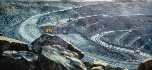
The energy shortages that have been deliberately created have resulted in surging power prices. Germany has been compelled to turn to cut down trees for wood and to boost coal use. All of this has taken place while they are supposed to be committed to fighting climate change and the Greens object to any nuclear power.
To keep the factories operating and just the lights on, Germany is now burning coal at the fastest pace in at least six years. Europe’s largest economy is in serious danger of an economic crisis despite the EU’s drive to phase out all fossil fuel.
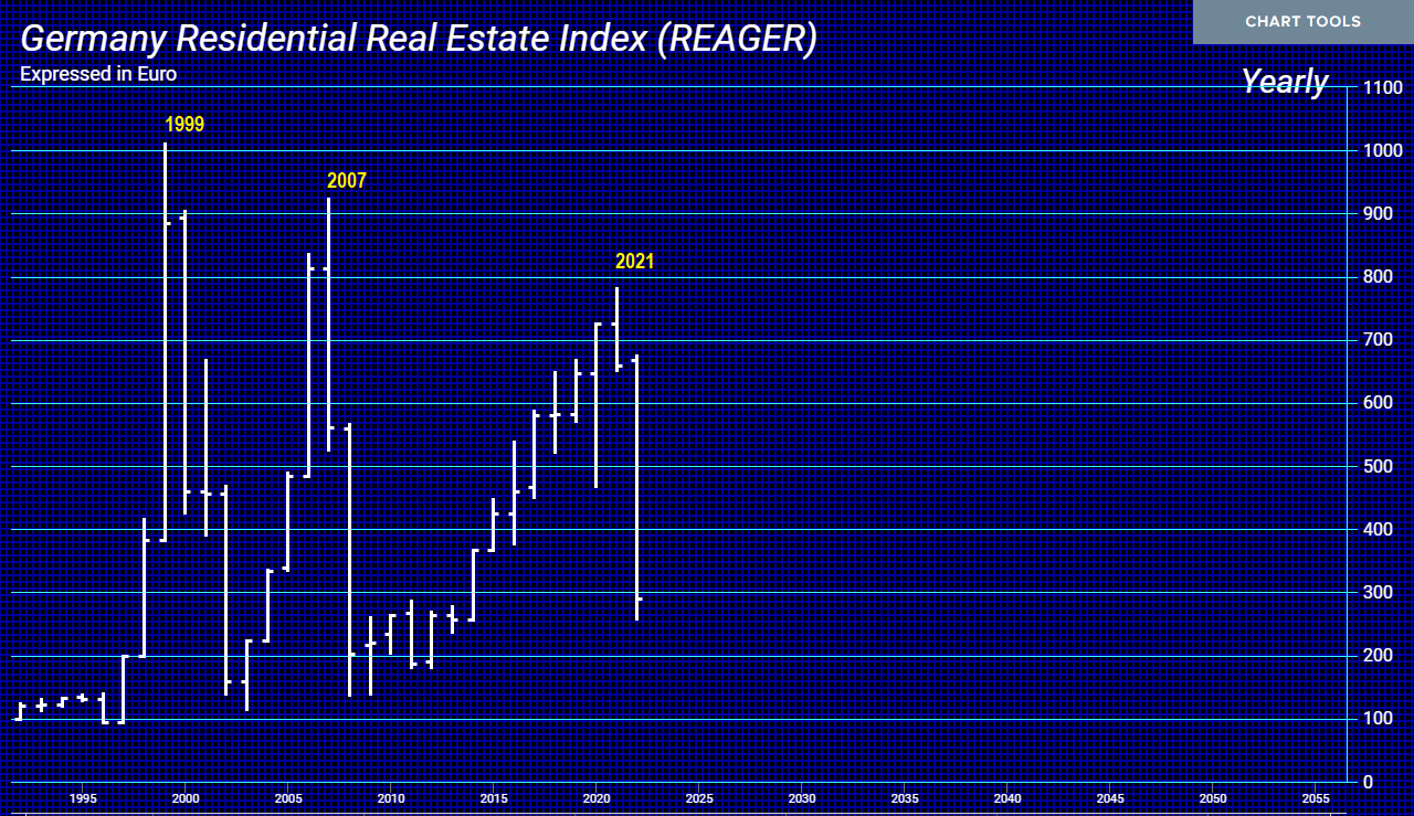
Many have asked why our computer has been so bearish on the Euro. Just look at German Real Estate. The high was in 1999 in both nominal and real terms. Then look at 2007. That was the real estate boom in the USA with the Mortage-Backed disaster. It never exceeded 1999 high. Now, look at the 2021 high. Once again, we see a lower high. Here we are 23 years from the 1999 high and still making corrections. Add to all of this the deliberate energy crisis and the rising costs just to stay warm are very serious.
Germany is the heart of the EU. Without a solid economic performance from Germany, the Euro is doomed.
When this hit upper midwest I was in middle school in San Diego. I was in the library every morning before school following this, Voyager and Viking.
I watched another rendition of this video on youtube and it cut out the portion where the chief scientist at Lamont-Doherty (Columbia) stated ice-age conditions can return inside of 10-20 years time at any time (or something like that).
Regards
RD, San Marcos Ca
REPLY: With Ice Ages, we find a similar pattern of cyclical pattern formations as we do in markets. About 2.6 million years ago, that is when the Earth entered the Pleistocene period. This was marked by an interesting cyclical pattern whereby there were these deep ice ages that came at regular 43,000-year intervals. Then about 1 million years ago, the Earth entered what is known as the Mid-Pleistocene transition period. It was here where these ice age cycles suddenly expanded from 43,000-year intervals to nearly 100,000-year cycles. The last one was about 11,000 years ago. This is not referring to the Mini-Ice Age of the 1600s.
What we do know is that there were tiny changes in Earth’s orbit. These events are known as Milankovitch cycles. They are believed to have driven the planet in and out of these ice ages. However, it is also now assumed that these Milankovitch cycles have not correlated to the sudden jump in nearly doubling the Ice Age cycle length.
Preliminary data from Antarctic Ice Core saw a transition from glacial to interglacial conditions about 430,000 years ago which is known as (Termination V). This transition into the present interglacial period needs to be looked at from intensity using our Energy Models. Scientists look at the magnitude of change in temperatures and greenhouse gases. What seems to be overlooked is the cycle of these warming periods. The interglacial stage following Termination V was quite long running the course of about 28,000 years compared to the 12,000 years period so far in the present interglacial period.
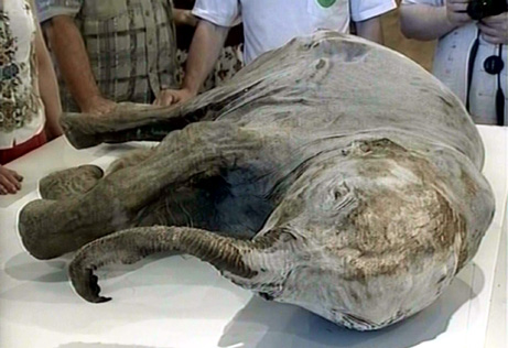
What this is warning is that an Ice Age is not entirely out of the question post-2032. I am awaiting access to the data from the 2.7 million-year core and then run it through Socrates to see if we are indeed going to see a 12,000-year interval or a doubling effect. What does appear to be likely, which explains the frozen animals in Siberia, is that we can see an Ice Age hit within less than 10 years.
What is absolutely astonishing, is that this entire global warming propaganda that they then changed it to climate change because it was not just getting warmer – but colder. The entire premise is that the climate is changing all because of the Industrial Revolution and they REFUSE to address the fact that there are natural cycles to weather since the Earth was born.
I had to go to New Jersey for the Holiday. OMG – it was 10 degrees. It reminded me why I moved to Florida to get closer to real Global Warming. There us a cycle to absolutely everything. Only a complete idiot would argue against that.
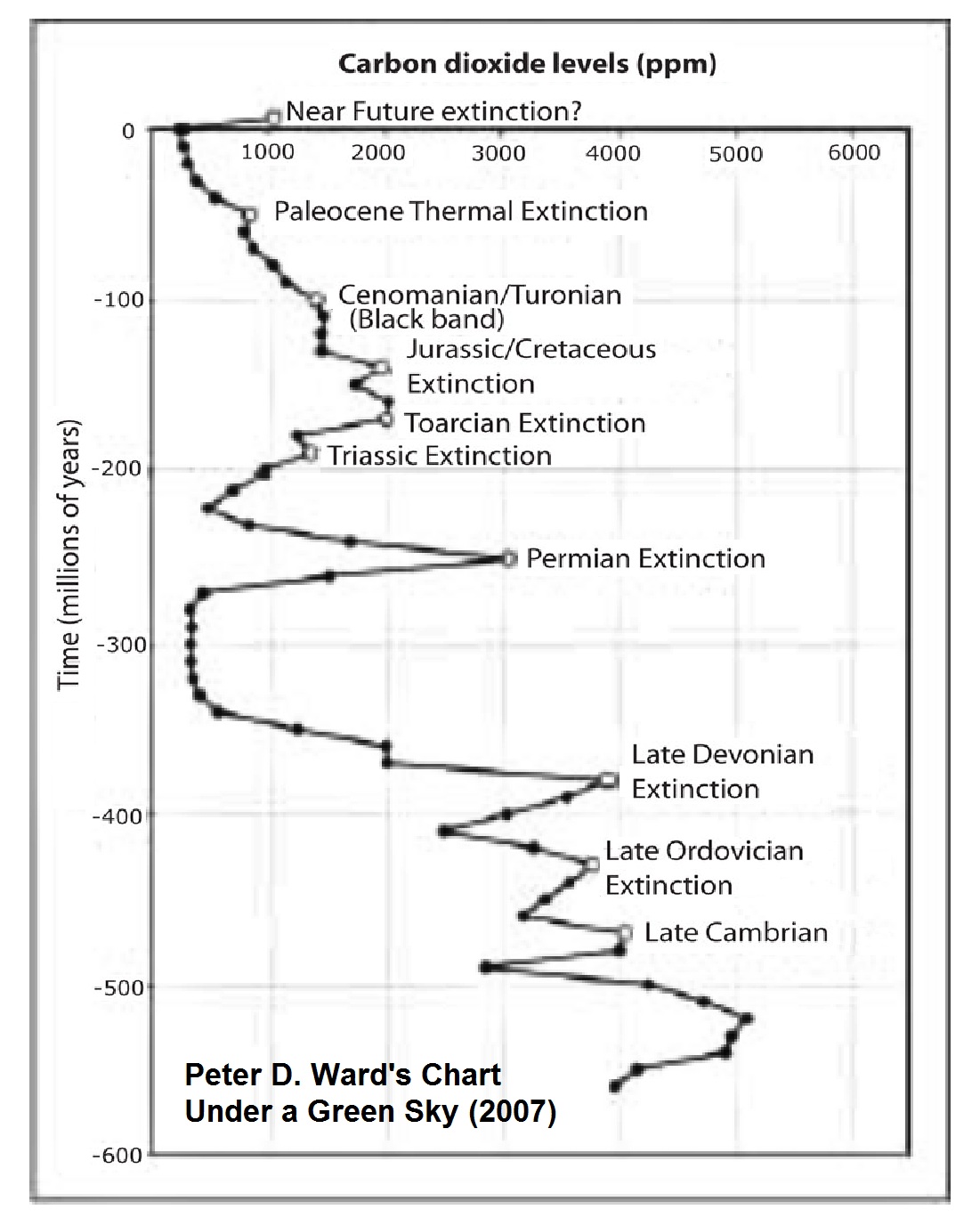
During the 1970s, scientists were all predicting a new ice age. That was the popular view. Then there was a totally theoretical proposition laid out in the book Under a Green Sky that has become the bible for the total destruction of our modern society and just maybe they know that and are looking to deprive energy to reduce the population.
If we take the graph from the paleontologist Peter D. Ward’s book, “Under a Green Sky” published in 2007, this is what has inspired this whole climate debate and there is no evidence that it was CO2 that created an extinction of hundreds of millions of years ago. This has been a theoretical model that appears to be as reliable as the one funded by Bill Gates to justify locking down the entire world economy for a man-made virus – COVID19.
I find it really hypocritical that they want to imprison Trump, but not people pushing to reduce the world population and mandating a vaccine that FAILED to prevent the virus and more people who died of COVID who were vaccinated than not.
When the head of Pfizer seems to be way too close to heads of state and he has ABSOLUTE IMMUNITY that not even the International Criminal Court wants to charge Putin but not Pfizer, is just another example of the political cesspool we live in today.
The rise and fall of civilizations have been tied to climate. They ignore history and refuse to comprehend that there are simply cycles to everything. When Rome was the dominant power, there was pollution and CO2 which was created by burning wood. The first clean air act was put into law in 535 AD. These people act like we will all become extinct unless we reduce CO2 to zero. They have no science to back them up, just a book that put the theory about CO2 creating one of the extinctions without any evidence — just an assumption.
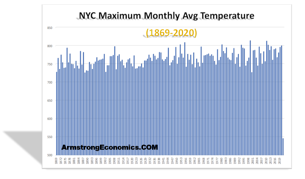
There is ABSOLUTELY no statistical evidence whatsoever that there has been any Global Warming. Here are the monthly maximum temperatures for New York City since 1869.
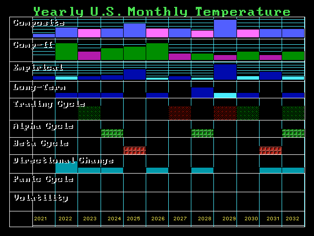
Here is the Computer cyclical forecast for 12 years. This year 2022 was a Double Directional Change and it was on target. The big targets for the climate crisis will be 2025 followed by 2029 – and it will not be warming.
The real question remains unanswered. Are these people claiming Climate Change to deliberately reduce the population?
In response to reviewers’ comments on a paper John Christy and I submitted regarding the impact of El Nino and La Nina on climate sensitivity estimates, I decided to change the focus enough to require a total re-write of the paper.
The paper now addresses the question: If we take all of the various surface and sub-surface temperature datasets and their differing estimates of warming over the last 50 years, what does it imply for climate sensitivity?
The trouble with estimating climate sensitivity from observational data is that, even if the temperature observations were globally complete and error-free, you still have to know pretty accurately what the “forcing” was that caused the temperature change.
(Yes, I know some of you don’t like the forcing-feedback paradigm of climate change. Feel free to ignore this post if it bothers you.)
As a reminder, all temperature change in an object or system is due to an imbalance between rates of energy gained and energy lost, and the global warming hypothesis begins with the assumption that the climate system is naturally in a state of energy balance. Yes, I know (and agree) that this assumption cannot be demonstrated to be strictly true, as events like the Medieval Warm Period and Little Ice Age can attest.
But for the purpose of demonstration, let’s assume it’s true in today’s climate system, and that the only thing causing recent warming is anthropogenic greenhouse gas emission (mainly CO2). Does the current rate of warming suggest (as we are told) that a global warming disaster is upon us? I think this is an important question to address, separate from the question of whether some of the recent warming is natural (which would make AGW even less of a problem).
Lewis and Curry (most recently in 2018) addressed the ECS question in a similar manner by comparing temperatures and radiative forcing estimates between the late 1800s and early 2000s, and got answers somewhere in the range of 1.5 to 1.8 deg. C of eventual warming from a doubling of the pre-industrial CO2 concentration (2XCO2). These estimates are considerably lower than what the IPCC claims from (mostly) climate model projections.
Our approach is somewhat different from Lewis & Curry. First, we use only data from the most recent 50 years (1970-2021), which is the period of most rapid growth in CO2-caused forcing, the period of most rapid temperature rise, and about as far back as one can go and talk with any confidence about ocean heat content (a very important variable in climate sensitivity estimates).
Secondly, our model is time-dependent, with monthly time resolution, allowing us to examine (for instance) the recent acceleration in deep ocean temperature (ocean heat content) rise.
In contrast to Lewis & Curry and differencing two time periods’ averages separated by 100+ years, our approach is to use a time-dependent model of vertical energy flows, which I have blogged on before. It is run at monthly time resolution, so allows examination of such issues as the recent acceleration of the increase in oceanic heat content (OHC).
In response to reviewers comments, I extended the domain from non-ice covered (60N-60S) oceans to global coverage (including land), as well as borehole-based estimates of deep-land warming trends (I believe a first for this kind of work). The model remains a 1D model of temperature departures from assumed energy equilibrium, within three layers, shown schematically in Fig. 1.
One thing I learned along the way is that, even though borehole temperatures suggest warming extending to almost 200 m depth (the cause of which seems to extent back several centuries), modern Earth System Models (ESMs) have embedded land models that extend to only 10 m depth or so.
Another thing I learned (in the course of responding to reviewers comments) is that the assumed history of radiative forcing has a pretty large effect on diagnosed climate sensitivity. I have been using the RCP6 radiative forcing scenario from the previous (AR5) IPCC report, but in response to reviewers’ suggestions I am now emphasizing the SSP245 scenario from the most recent (AR6) report.
I run all of the model simulations with either one or the other radiative forcing dataset, initialized in 1765 (a common starting point for ESMs). All results below are from the most recent (SSP245) effective radiative forcing scenario preferred by the IPCC (which, it turns out, actually produces lower ECS estimates).
The Model Experiments
In addition to the assumption that the radiative forcing scenarios are a relatively accurate representation of what has been causing climate change since 1765, there is also the assumption that our temperature datasets are sufficiently accurate to compute ECS values.
So, taking those on faith, let’s forge ahead…
I ran the model with thousands of combinations of heat transfer coefficients between model layers and the net feedback parameter (which determines ECS) to get 1970-2021 temperature trends within certain ranges.
For land surface temperature trends I used 5 “different” land datasets: CRUTem5 (+0.277 C/decade), GISS 250 km (+0.306 C/decade), NCDC v3.2.1 (+0.298 C/decade), GHCN/CAMS (+0.348 C/decade), and Berkeley 1 deg. (+0.280 C/decade).
For global average sea surface temperature I used HadCRUT5 (+0.153 C/decade), Cowtan & Way (HadCRUT4, +0.148 C/decade), and Berkeley 1 deg. (+0.162 C/decade).
For the deep ocean, I used Cheng et al. 0-2000m global average ocean temperature (+0.0269 C/decade), and Cheng’s estimate of the 2000-3688m deep-deep-ocean warming, which amounts to a (very uncertain) +0.01 total warming over the last 40 years. The model must produce the surface trends within the range represented by those datasets, and produce 0-2000 m trends within +/-20% of the Cheng deep-ocean dataset trends.
Since deep-ocean heat storage is such an important constraint on ECS, in Fig. 3 I show the 1D model run that best fits the 0-2000m temperature trend of +0.0269 C/decade over the period 1970-2021.
Finally, the storage of heat in the land surface is usually ignored in such efforts. As mentioned above, climate models have embedded land surface models that extend to only 10 m depth. Yet, borehole temperature profiles have been analyzed that suggest warming up to 200 m in depth (Fig. 4).
This great depth, in turn, suggests that there has been a multi-century warming trend occurring, even in the early 20th Century, which the IPCC ignores and which suggests a natural source for long-term climate change. Any natural source of warming, if ignored, leads to inflated estimates of ECS and of the importance of increasing CO2 in climate change projections.
I used the black curve (bottom panel of Fig. 4) to estimate that the near-surface layer is warming 2.5 times faster than the 0-100 m layer, and 25 times faster than the 100-200 m layer. In my 1D model simulations, I required this amount of deep-land heat storage (analogous to the deep-ocean heat storage computations, but requiring weaker heat transfer coefficients for land and different volumetric heat capacities).
The distributions of diagnosed ECS values I get over land and ocean are shown in Fig. 5.
The final, global average ECS from the central estimates in Fig. 5 is 2.09 deg. C. Again, this is somewhat higher than the 1.5 to 1.8 deg. C obtained by Lewis & Curry, but part of this is due to larger estimates of ocean and land heat storage used here, and I would suspect that our use of only the most recent 50 years of data has some impact as well.
Conclusions
I’ve used a 1D time-dependent model of temperature departures from assumed energy equilibrium to address the question: Given the various estimates of surface and sub-surface warming over the last 50 years, what do they suggest for the sensitivity of the climate system to a doubling of atmospheric CO2?
Using the most recent estimates of effective radiative forcing from Annex III in the latest IPCC report (AR6), the observational data suggest lower climate sensitivities (ECS) than promoted by the IPCC with a central estimate of +2.09 deg C. for the global average. This is at the bottom end of the latest IPCC (AR6) likely range of 2.0 to 4.5 deg. C.
I believe this is still likely an upper bound for ECS, for the following reasons.
Borehole temperatures suggest there has been a long-term warming trend, at least up into the early 20th Century. Ignoring this (whatever its cause) will lead to inflated estimates of ECS.
I still believe that some portion of the land temperature datasets has been contaminated by long-term increases in Urban Heat Island effects, which are indistinguishable from climatic warming in homogenization schemes.
Urban Night Lighting Observations Demonstrate The Land Surface Temperature Dataset is ‘not fit for purpose’
Foreword by Anthony:
This excellent study demonstrates what I have been saying for years – the land surface temperature dataset has been compromised by a variety of localized biases, such as the heat sink effect I describe in my July 2022 report: Corrupted Climate Stations where I demonstrate that 96% of stations used to measure climate have been producing corrupted data. Climate science has the wrongheaded opinion that they can “adjust” for all of these problems. Alan Longhurst is correct when he says: “…theinstrumental record is not fit for purpose.”
One wonders how long climate scientists can go on deluding themselves about this useless and highly warm-biased data. – Anthony
The pattern of warming of surface air temperature recorded by the instrumental data is accepted almost without question by the science community as being the consequence of the progressive and global contamination of the atmosphere by CO2. But if they were properly inquisitive, it would not take them long see what was wrong with that over-simplification: the evidence is perfectly clear, and simple enough for any person of good will to understand.
In 2006 NASA Goddard published two plots showing that the USA data[1] did not follow the same warming trend as the rest of the world. Rural data numerically dominate the USA archive, while urban data massively dominate almost everywhere else. Observations began very early in the USA – being introduced by Jefferson in 1776 – and that emphasis had already then been placed on providing assistance to farmers.
They are consistent with the ‘global warming‘ that so worries us today being an urban affair, caused not by global CO2 pollution of the global atmosphere but by the heat of combustion of petroleum we burn in our vehicles, our homes and where we work – all of which is additive to the radiative consequences of our buildings and impermeable cement and asphalt surfaces. However, towns and cities in fact occupy only a very small fraction of the land surface of our planet, about 0.53% (or 1.25%, if their densely populated suburbs are included) according to a recent computation done with rule-based mapping. But it is in this very small fraction of land surfaces that most of the data in the CRUTEM or GISTEMP archives have been recorded.
Consequently, very few surface air temperature observations have been made in the small villages which, with their farms and grazing lands, are scattered in the otherwise uninhabited grassland. forest, mountain, desert and tundra. Nor is it widely understood that our presence there has been associated with progressive change since the introduction of steel and steam to plough the grasslands and to cut forests for timber.[2]
A measure of the brightness or intensity of night lighting, the BI index, was derived by NASA from the work of Mark Imhoff, who calibrated and ranked night lights in seven stable classes – one rural, two peri-urban and four urban.[3] The BI indes for airport of Toulouse is at 59 and the central district of Cairo is at 167. Care must be take with apparent anomalies similar to that of Millau which is an active little town of 20,000 people but it has a BI = 0, as does Gourdon which has only 4000. This is because the MeteoFrance instruments at Millau have been placed on a bare hilltop on the far side of a deep, unbuilt valley adjacent to the town and so they record only the conditions of the surrounding countryside.
It is not only in major cities that the effects of urbanisation can be detected; this effect can also be detected in data from some very small places that would otherwise be considered rural as at Lerwick, a port in the Orkney Islands with a population of <7000. Here, the GHCN-M data from KNMI show a warming of about 0.9oC over the period 1978-2018, while during the same period the day/night temperature difference increased by 0.3oC. Retention of heat at night is characteristic of urban warming.
But Gourdon, a compact little rural village not far from my home in western France has a BI of only 7 for a population of only 3900. It is situated in farmland that was abandoned 150 years ago when the vines died, and it is now given over to sheep, goats and scrub vegetation. Little hamlets in this region are now often dark at night and their road signs may warn you that you are entering a ´Starlit village´.
Despite its deep isolation, there is a manned Meteofrance data station in Gourdon which over a 60-year period has recorded a very gradual and small summer warming since mid-20th century, associated with perfectly stable winter conditions.
Since buildings and human activity have undoubtedly changed at Gourdon in this long period, perhaps especially by the growth of rural tourism, this effect was probably predictable. The same is seen in data from other small places such as Lerwick, a port in the Orkney Islands with a population about twice that of Gourdon. Here, GHCN-M data from KNMI show a warming of about 0.9oC over the period 1978-2018 while during the same period the day/night temperature difference increased by 0.3oC.
The BI values for night lighting are in no way influenced by fact that the thermometric data with which each is associated have later been merged with data from another station to achieve regional homogeneity. Consequently, it is appropriate to associate them with night-light data in the hope of isolating the effects of local combustion of hydrocarbons in towns and cities, from what we must attribute to solar variation. The consequences of homogenisation on the surface air temperature data is avoided here by the use of GHCN-M data from the KNMI site – which are as close to the original observations, adjusted only for on-site problems, as is now possible to get.
The urban warming phenomenon has been observed and understood for almost two hundred years. Meteorologist Luke Howard (quoted by H.H. Lamb) wrote in 1833 concerning his studies of temperature at the Royal Society building in central London and also at Tottenham and Plaistow, then some distance beyond the town:
‘But the temperature of the city is not to be considered as that of the climate; it partakes too much of an artificial warmth, induced by its structure, by a crowded population, and the consumption of great quantities of fuel in fires: as will appear by what follows….we find London always warmer than the country, the average excess of its temperature being 1.579°F….a considerable portion of heated air is continually poured into the common mass from the chimnies; to which we have to add the heat diffused in all directions, from founderies, breweries, steam engines, and other manufacturing and culinary fire..’ [4]
To Luke Howard’s list must now be added the consequences of the combustion of hydrocarbon fuels in vehicles, mass transport systems, power plants and industrial enterprises located within the urban perimeter, cement/asphalt surfaces and their relative contributions day and night.[5]
The energy budget of the agglomeration of Toulouse in southern France is probably typical of such places: anthropogenic heat release is of order 100 Wm2 in winter and 25 W m-2 in summer in the city core, and somewhat less in the residential suburbs. Observations of resulting evolution of surface air temperatures in central Toulouse are compatible with the anticipated effect of the inventory of all heat sources seasonally. Below the urban canopy layer, a budget for heat production and loss through advection into surrounding rural areas has been computed and it is found that this loss is important under some wind conditions. In this and many other urbanisations, there is also an important seasonality of heat release by passing road traffic that forms a major component of the heating budget, since national highway systems commonly pass close to major centres of population.[6]
Larger cities, larger effects: in the core of the city of Tokyo during the 1990s the seasonal heat flux range was 400-1600 W.m-2 and the entire Tokyo coastal plain appears to be contaminated by urban heat generated within the city, especially in summer when warming may extend to 1 km altitude, much higher than the simple nocturnal heat island over large cities.[7] The long-term evolution of urban climates is well illustrated in Europe where, in the second half of the 20th century when their natural association with regional climate was abruptly replaced by a simple warming trend that took them almost 2oC above the base-line of the previous 250 years.
Although, globally, the energy from urban heat is equivalent to only a very small fraction of heat transported in the atmosphere, models suggest that it may be capable of disrupting natural circulation patterns sufficiently to induce distant as well as local effects on the global surface air temperature pattern. Significant release of this heat into the lower atmosphere is concentrated in three relatively small mid-latitude regions – eastern North America, western Europe and eastern Asia – but the inclusion of this regional injection of heat (as a steady input at 86 model points where it exceeds 0.4W m2) has been tested in the NCAR Community Atmospheric model CAM3.
Comparison of the control and perturbation runs showed significant regional effects from the release of heat from these three regions at 86 grid points where observations of fossil fuel use suggest that it exceeds 0.4 Wm-2. In winter at high northern latitudes, very significant temperature changes are induced: according to the authors, ‘there is strong warming up to 1oK in Russia and northern Asia…. the north-eastern US and southern Canada have significant warming, up to 0.8 K in the Canadian Prairies’.
The suggestion that the global surface air temperature data – on which the hypothesis of anthropogenic climate warming hangs – are heavily contaminated by other heat sources is not novel. The map below shows the locations of 173 stations used by MacKittrick and Michaels for a statistical analysis of the contamination of the global temperature archives by urban heat., using which they rejected the null hypothesis that the spatial pattern of temperature trends is independent of socio-economic effects which was, and still is, the position taken by the IPCC – for which MacKittrick was then a reviewer.[8]
In the present context, this study seemed worth repeating, so a file of 31 clusters of BI indices was gathered from the ‘Get Neighbours’ lists that are shown when accessing GISTEMP data. These clusters comprise 1200 data files representing 776 towns or cities and 424 rural places – of which 355 are totally dark at night. They therefore represent a wide range of individual station histories – many longer than 100 years – and are sufficient for the task. Just 53 of the 540 rural sites listed are in Western Europe, the remainder being located in the vast, night-dark expanses of Asia – where the data based on the arctic island of Novaya Zemyla includes only three with significant night lights, of which one is the city of Murmansk.
The cluster centred southeast of Lake Baikal includes two cities (329,000 and 212,000 inhabitants having BIs of only 28 and 13) together with 39 small places – of which 28 are totally dark at night – while that immediately to the west of Baikal includes 19 such places. But not all bright locations have large populations, because intensive industrial farms – solar panel energised – can dominate regional night lighting as it does at in some Gulf States: an experimental farm alone here generates a BI of 122, while the 3012 people who live at Shiwaik generate a BI of 181.
The map below indicates the central locations of 30 clusters in relation to the distribution of native vegetation type. [9]
These data may be used to investigate the supposed warming of Europe and Asia that so worries the public. In far eastern Russia and neighbouring territories 8 clusters are listed which include 296 place-names lacking any night-lighting at all, together with just five small towns having night-light indices of only 1. In such places, it is the natural cycle of climate conditions – modified locally by progressive anthropogenic change in ground cover – that dominates the global pattern of air temperature, and in rural regions there is a rather simple relationship between population size and BI.
Towns and villages occupy only a very small fraction of the continental land surface of our planet, currently about 0.53% – or 1.25% if their densely-populated suburbs are included – according to a recent study using rule-based mapping. Although it is peripheral to the present discussion, it must be emphasised that conditions in the sparsely-inhabited rural or natural regions are not static at secular scale – everywhere, including in Asia, grasslands and prairies have been grazed or ploughed, and forests clear-cut and replaced with secondary growth.
Consequently, the distribution of population is highly aggregated and associated – as it must be – with regional economic development. This is illustrated in the images below which show that in western Europe access to the sea is critical, as it is in Japan, while in night-dark Ukraine and Russia it is the zones of temperate broadleaf forest and temperate steppe in which settlement and urban development has been most active.[10] The arctic tundra belt is very sparsely populated but does includes a few industrialised cities, of which Archangelsk is the largest.
Although, globally, the energy from heat of combustion is equivalent to only a very small fraction of the energy transported in the atmosphere, models suggest that it may be capable of disrupting natural circulation patterns sufficiently to induce distant as well as local effects on the global SAT pattern derived from observations. Significant release of this heat into the lower atmosphere is concentrated in three relatively small mid-latitude regions – eastern North America, western Europe and eastern Asia – but the inclusion of this regional injection of heat (as a steady input at 86 model points where it exceeds 0.4W m2) in the NCAR Community Atmospheric model CAM3 has important but distant regional effects, especially in winter.
Comparisons of control and perturbation runs show significant regional effects from the release of heat from these three regions at 86 grid points at which observations of fossil fuel use suggest that it exceeds 0.4 Wm-2: specifically, in winter at high northern latitudes, very significant temperature changes are induced: according to the authors, ‘there is strong warming up to 1oK in Russia and northern Asia…. the north-eastern US and southern Canada have significant warming, up to 0.8 K in the Canadian Prairies’. Especially in northern North America, where the instrumental record is excellent, this effect is readily observed night lighting is highly aggregated and associated – as it must be – with regional economic development. This is illustrated in the image above which shows that in western Europe access to the sea is critical, as it is in Japan, while in night-dark Ukraine and Russia it is the zones of temperate broadleaf forest and temperate steppe in which settlement and urban development has been most active.[11]
In eastern Asia, 8 clusters include 268 places that are dark at night, together with just 47 having some night-lighting, mostly of intensity <20. They include only one city (BI = 153). In such regions, it is the multi-decadal cycle of solar brilliance that dominates the evolution of air temperature, modified by local effects of change in vegetation and ground cover.
But it is really a misuse of the term ‘rural’ to apply it to the small inhabited places scattered across northern Asia, for this implies some similarity with landscapes such as surrounds Gourdon, devoted now or in the past to farming and herding. But small villages in asiatic Russia have nothing to do with rurality: their houses and streets have simply been set down in natural terrain – in the wildlands, if you will – that is subsequently ignored; there are no crops, gardens or greenhouses, and the activities of the population are not clear. The wide unpaved streets bear very few motor vehicles – and there is no street lighting. Many are described as administrative centres and some have a small dirt runway for light aircraft, while a few seem not to be connected to the rest of the world by dirt roads even seasonally,
Here are two small places in northern Siberia with very different seasonal temperature regimes, of which one is clearly well on its way to urbanisation. Each lies between 65-70oN on the banks of the river Lena.
Zhigansk is a long-settled little town founded in 1632 by Cossacks sent to pacify and tax the region; it is now an administrative centre housing 3500 people., laid out beside the river on a rectangular grid. Until the Lena freezes, it has no road access to the outside in winter.
Kjusjur, just south of the mouth of the Lena in a subarctic environment, was founded in 1924 as the administrative centre for this region, and has a population of 1345; routine meteorological data began to be collected in 1924 and continues today. About 100 small houses and one larger building are set on unpaved streets beside the stony bank of te river; it has neither runway nor river landing place, but rough tracks leave the settlement to north and south which must be impassable much of the year.[12]
Two motor vehicles can be seen in Kjusjur and a few small boats are pulled up on the beach, while there are about ten motor vehicles in Zhigansk and neither place has any street lighting. Zhigansk has a dirt airstrip with a radar installation that perhaps also houses the meteorological station. Each has a temperature regime appropriate to its situation, and although it was what I was looking for, I am surprised by the strength of the response to urbanisation at Zhigansk. I was also expecting that each would respond – at least in very general terms – to solar forcing, and so it does: the cooling of the 1940s and 50s which caused us so much concern in those years about a coming glaciation is clear.
A compilation of arctic data and proxies took 64oN as the limit of the Arctic region, within which 59 stations were used to analyse the pattern of regional co-variability for SAT anomalies based on PCA techniques.[13] This demonstrated quasi-periodicity of 50-80 years in ice cover in the Svalbard region: at least eight previous periods of relatively low ice cover can be identified back to about 1200.
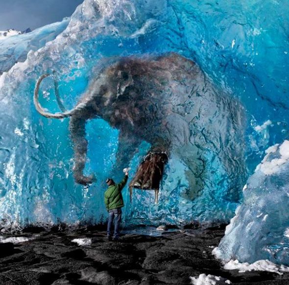
Hindcasting climate states is not easy: a recent synthesis of tree-ring data from the Yamal peninsula rashly states that in Siberia the ‘industrial era warming is unprecedented…. elevated summer temperatures above those…for the past seven millennia‘. However, documents and observations show that this is one generalisation too far. In summer 1846, as recorded by H.H. Lamb, warming across the arctic extended from Archangel to eastern Siberia, where the captain of a Russian survey ship noted that the River Lena was hard to locate in a vast, flooded landscape and could be followed only by the ‘rushing of the stream’ which ‘rolled trees, moss and large masses of peat’ against his ship, that secured from the flood ‘an elephant’s head’.
The temperature reconstruction below is from annual growth of larches on the Yamal peninisula at the mouth of the Ob.[14] It testifies that the early decades of the 19th century did indeed include a period of very cold conditions on the arctic coast, while supporting the reality of periods of warmth likely to caused melting of the permafrost of tundra regions.
In any case, irruptions of warm Atlantic water into the eastern Arctic – including the present one – are well recorded in the archives of whaling, sealing and the cod fisheries. The present period of a warm Arctic climate is not novel and there is an abundant record from the cod fisheries in the Barents Sea and beyond, not to speak of the documentation concerning the intermittence of open seas from the sealers and whalers in northern waters.
The surface air temperature data are dominated by observations made in towns and cities so that the secular evolution of the climate is determined not by the gaseous composition of the atmosphere, nor by solar radiation: instead, it is dominated by the consequences of our ever-increasing combustion of fossil hydrocarbons in motor cars, public transit and home heating systems, as well as in the industrial plants and factories where most of us must work. To this must be added the daily accumulation of solar heat in the stonework or cement of our buildings facing each other along narrow passages.
One conclusion is unavoidable from this simple exploration of the surface air temperature archive: as used today by the IPCC and the climate change science community the instrumental record is not fit for purpose: it is contaminated by data obtained from that tiny fraction of Earth’s surface where most of us spend our brief span of years indoors.
Footnotes
[1]Hansen, NASA press release and J. Geophys. Res. 106, D20, 23947-23963.
[2]Ellis, E.C. et al. (2010) Glob. Ecol. Biogeog. 19, 589-606
[3] R.A. Ruedy (pers. comm)- see GISS notice dated Aug 28, 1998, at the Sources website
Dr John Christy, distinguished Professor of Atmospheric Science and Director of the Earth System Science Center at the University of Alabama in Huntsville, has been a compelling voice on the other side of the climate change debate for decades. Christy, a self-proclaimed “climate nerd”, developed an unwavering desire to understand weather and climate at the tender age of 10, and remains as devoted to understanding the climate system to this day. By using data sets built from scratch, Christy, with other scientists including NASA scientist Roy Spencer, have been testing the theories generated by climate models to see how well they hold up to reality. Their findings? On average, the latest models for the deep layer of the atmosphere are warming about twice too fast, presenting a deeply flawed and unrealistic representation of the actual climate. In this long-form interview, Christy – who receives no funding from the fossil fuel industry – provides data-substantiated clarity on a host of issues, further refuting the climate crisis narrative.
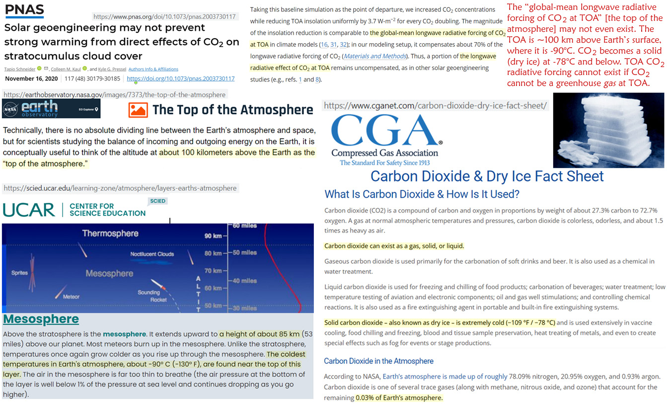
The longstanding claim is CO2 (greenhouse gas) top-of-atmosphere (TOA) forcing drives climate change. But it is too cold at the TOA for CO2 (or any greenhouse gas) to exist.
TOA greenhouse gas forcing is a fundamental tenet of the CO2-drives-climate-change belief system. And yet the “global-mean longwave radiative forcing of CO2 at TOA” (Schneider et al., 2020) may not even exist.
It is easily recognized that water vapor (greenhouse gas) forcing cannot occur above a certain temperature threshold because water freezes out the farther away from the surface’s warmth H2O goes.
According to NASA, the TOA is recognized as approximately 100 km above the surface. The temperature near that atmospheric height is about -90°C.
Posted originally on the conservative tree house on December 22, 2022 | Sundance
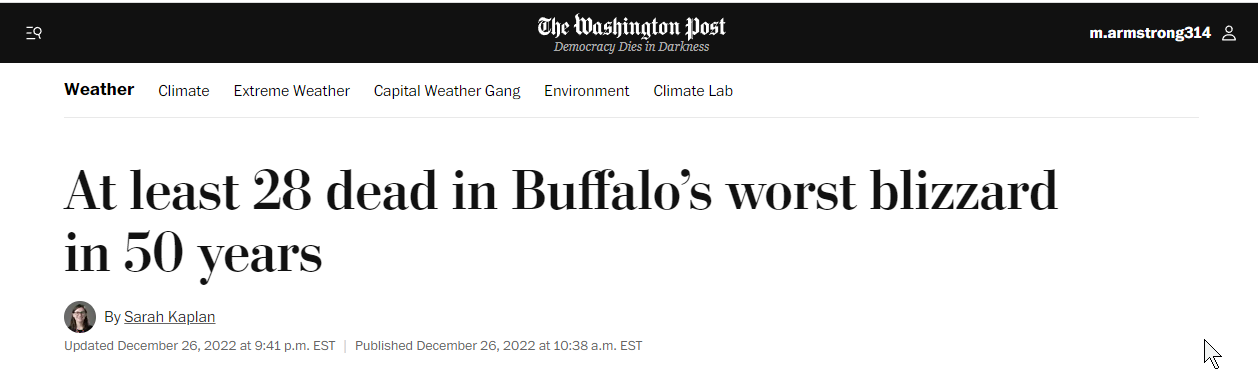
Extreme winter weather, such as subzero temperatures, wind chills and heavy snow, is impacting much of the U.S. this Christmas holiday weekend and is expected to heavily impact travel. Major parts of the U.S. electricity grid are very vulnerable, particularly as a result of Biden energy policy, steering investment away from coal, oil and natural gas.
Places across the northern Rockies, northern Plains and upper Midwest are experiencing temperature drops by tens of degrees in minutes. The extremely cold airmass is expected to hit at least 24 other states along the Gulf Coast and in the eastern U.S. The National Weather Service has a Detailed Warning HERE.
The potential for severe consequences as an outcome of this winter storm has the political minders of Joe Biden worried.
.
(Via NWS) – A major and anomalous storm system is forecast to produce a multitude of weather hazards through early this weekend, as heavy snowfall, strong winds, and dangerously cold temperatures span from the northern Great Basin through the Plains, Upper Midwest, Great Lakes, and the northern/central Appalachians.
At the forefront of the impressive weather pattern is a dangerous and record-breaking cold air mass in the wake of a strong arctic cold front diving southward across the southern Plains today and eastward into the Ohio/Tennessee Valleys by tonight.
Behind the front, temperatures across the central High Plains have already plummeted 50 degrees F in just a few hours, with widespread subzero readings extending throughout much of the central/northern Plains and northern Rockies/Great Basin.
These temperatures combined with sustained winds of 20 to 30 mph and higher wind gusts of up to 60 mph will continue to lead to wind chills as low as minus 40 degrees across a large swath of the Intermountain West and northern/central Plains, with more localized areas of minus 50 to minus 70 possible through the end of the week. (read more)
I am reminded of Fort Wainwright, Alaska, in January of 1989, when a cold airmass settled on the state for weeks. It was so cold (-50°, -70° or worse) that airplanes could not achieve lift. McGrath went from +29° to -42° during a work shift. During a single work shift everyone’s truck tires were flat and frozen. LOL… Crazy stuff.
Joe Biden – “I’m going to, shortly, be briefed by — by both FEMA and the National Weather Service, and we’re going to start that briefing. And — but in the meantime, please take this storm extremely seriously. And I don’t know whether your bosses will let you, but if you all have travel plans, leave now. Not — not a joke. I’m tell- — sending my staff — my staff, if they have plans to leave on — tomorrow — late tonight or tomorrow, I’m telling them to leave now. They can talk to me on the phone. It’s not life and death. But it will be if they don’t — if they don’t get out, they may not get out. So, any rate, thank you all for coming in, and I’m going to do the briefing now. Thank you.” (link)
The polar air will bring “extreme and prolonged freezing conditions for southern Mississippi and southeast Louisiana,” the National Weather Service (NWS) said in a special weather statement Sunday.
“We’re looking at much-below normal temperatures, potentially record-low temperatures leading up to the Christmas holiday,” said NWS meteorologist Zack Taylor. (link)
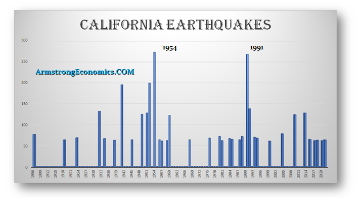
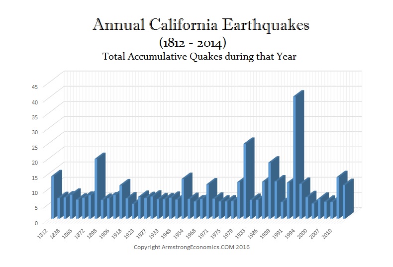
QUESTION: Marty, we had an earthquake here in Northern California today that seems to be following your forecast building into 2028. Can you update your earthquake chart?
Thank you
Jeff
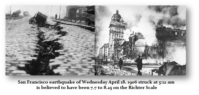
ANSWER: Here is the update. Socrates has already pulled that data down. Yes, the trend appears to be building into a serious cluster for 2028 which may exceed that of 1954. This chart is recording ONLY those quakes that are 6.0 or higher. There are numerous quakes in the 4 to 5 range. It was the 1906 Earthquake that set in motion the Panic of 1907 since the insurance companies were in NYC and the claims were in California. It was JP Morgan who stepped up to save the banks in NY and that became the model for how the Federal Reserve was created with 13 branches to manage the regional capital flows that resulted in the financial crisis in the aftermath of the 1906 San Francisco Earthquake which was a 7.7 on the Richter Scale.
This chart presents the total number of quakes regardless of the magnitude. Here we can see that 1992 was the year with the greatest number of quakes irrespective of magnitude. This is a different perspective entirely. The top chart is what I have called the cluster perspective where we only took into account 6.0 or higher. This illustrates that just like market activity, earthquakes build in intensity. They produce clusters of magnitude. The next serious period should still be 2028.
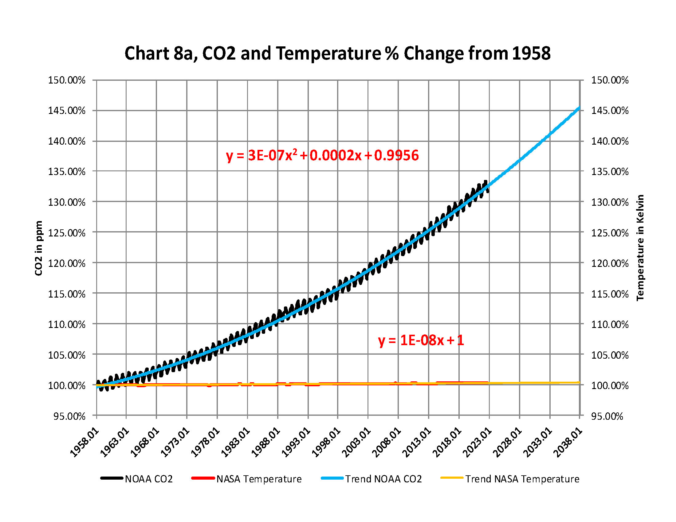
From the attached report on climate change for November 2022Data we have the two charts showing how much the global temperature has actually gone up since we started to measure CO2 in the atmosphere in 1958? To show this graphically Chart 8a was constructed by plotting CO2 as a percent increase from when it was first measured in 1958, the Black plot, the scale is on the left and it shows CO2 going up by about 32.4% from 1958 to November of 2022. That is a very large change as anyone would have to agree. Now how about temperature, well when we look at the percentage change in temperature also from 1958, using Kelvin (which does measure the change in heat), we find that the changes in global temperature (heat) is almost un-measurable at less than .4%.
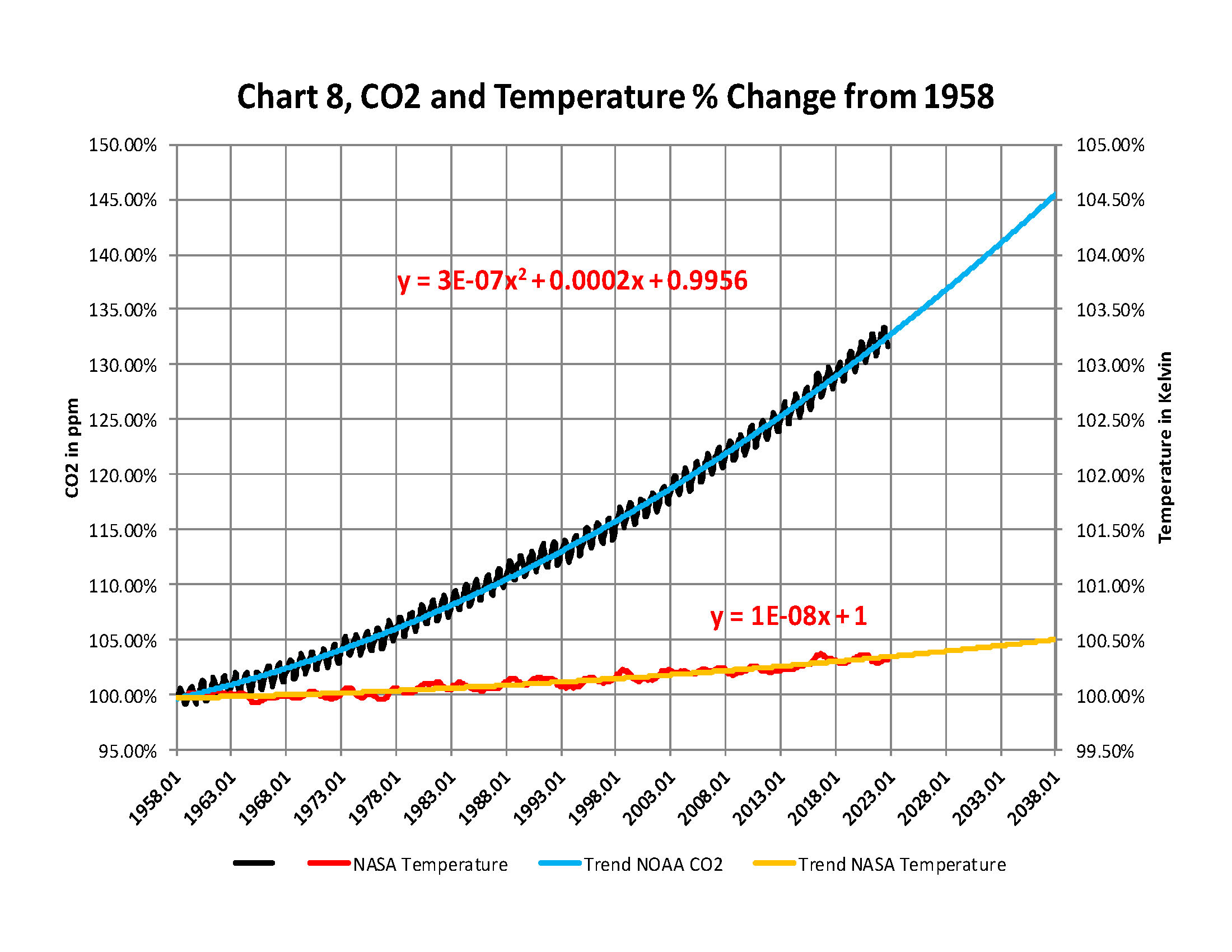
As you see the increase in energy, heat, is not visually observably in this chart hence the need for another Chart 8 to show the minuscule increase in thermal energy shown by NASA in relationship to the change in CO2 Shown in the next Chart using a different scale.
This is Chart 8 which is the same as Chart 8a except for the scales. The scale on the right side had to be expanded 10 times (the range is 50 % on the left and 5% on the right) to be able to see the plot in the same chart in any detail. The red plot, starting in 1958, shows that the thermal energy in the earth’s atmosphere increased by .40%; while CO2 has increased by 32.4% which is 80 times that of the increase in temperature. So is there really a meaningful link between them that would give as a major problem?
Based to these trends, determined by excel not me, in 2028 CO2 will be 428 ppm and temperatures will be a bit over 15.0o Celsius and in 2038 CO2 will be 458 ppm and temperatures will be 15.6O Celsius.
The NOAA and NASA numbers tell us the True story of the
Changes in the planets Atmosphere
The full 40 page report explains how these charts were developed .
I have created this site to help people have fun in the kitchen. I write about enjoying life both in and out of my kitchen. Life is short! Make the most of it and enjoy!
This is a library of News Events not reported by the Main Stream Media documenting & connecting the dots on How the Obama Marxist Liberal agenda is destroying America