
Will we see Hummingbird II now that the first try didn’t work? I would really like to see Trump win no matter what — could he do any worse than the last two time the R’s lost to someone that was destroying the country? The first time maybe they didn’t realize but the second time the R’s intentional stopped campaigning so they wouldn’t win.
Monthly Archives: September 2015
There is no end to the ways the Government can Confiscate your Wealth
Sovereign Debts: How Defaults May Unfold

In the Middle East, the banks are trying to convince the Gulf States to begin issuing debt even if there is no need to borrow, simply so they have a market to trade. Governments should never listen to bankers for this always becomes a conflict of interest with respect to national debts. The sooner government wakes up to the Sovereign Debt Crisis, the soon their particular country will be saved.
When you say we are entering a “Sovereign Debt Crisis”, people automatically assume that debt will just default. Governments NEVER like to admit a mistake, so an outright default may be limited to the emerging markets the further you move away from the core economies. What may also take place is the mandatory conversion of debt extending the maturity. You may buy 90-day paper and suddenly wake up to find that the government has converted 90-day paper into 10-year bonds. Always remember, they have the tanks and guns — never forget whom you are dealing with.
In Italy, the period 1919–1922 was one of very little progress on debt and deficit reduction. Despite a levy on wealth that was introduced to tax the rich, as always, the tax faced tremendous opposition as well as implementation difficulties. Consequently, Italian fiscal deficits remained high, and inflation increased along with the money supply rather significantly. The Italian government engaged in a mandatory debt conversion, known as “conversione forzosa” during 1926, which they would again impose during 1934. They forced debt holders to extend their debt by lengthening the maturity. This seriously impacted the full faith and trust in the Italian government. During the post-1926 years and then again after 1934, the mandatory conversione forzosa effectively was seen as a partial default by the government, which made it extremely difficult and costly to borrow on a short-term basis thereafter.
You must be careful in the post-2015.75 era. Owning even short-term government paper can result in a conversione forzosa, which is the usurpation of capital by sheer force. This is one form of default that people need to realize has also been a means of default. The City of Detroit suspended all debt payments between 1937 and 1963. Britain entered a moratorium in 1931 on its debt, resuming years later.
Consequently, defaults, suspensions, moratorium, and conversione forzosa are different types of defaults whereby you lose access to your capital. There are many different flavors of a Sovereign Debt Crisis.
CNN Debate Precursor – Night of The Long Knives – GOPe “Operation Hummingbird” – Discussion Thread….
There is no reason to doubt this Rove, Inc strategy is in play as sundance has corrected identified.
OAN/GRAVIS Post Debate Poll – Carly Fiorina Ties Donald Trump, Rubio Gains – Roves’ “Operation Hummingbird” A Resounding Success…
Good analysis and Accurate — Trump is no dummy so we we see by the next debate what his strategy to beat Rove Inc. I don’t think is has showed his hand yet I would guess a big surprise next time!
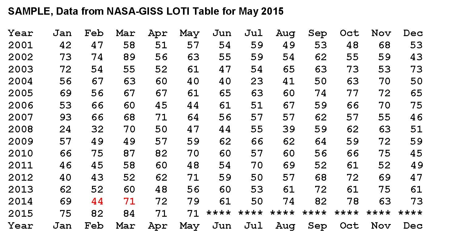
Are NASA-GISS Published Global Temperatures Valid?
NASA publishes values representing the global surface temperature of the planet supposedly based on actual measurements processed in a complex algorithm they call homogenization. The resulting values are published each month in a table called the Land Ocean Temperature Index (LOTI) which runs from January 1880 to the current month, May in this case. The process they use is explained on their web site for those that are interested. However the values shown in their work seem to show very large temperature swings on a month to month basis and that did not seem reasonable to me, given this was Global temperatures. This prompted me to do a review of the process in June 2015 and that led to a previous draft paper which was modified to create this finished work.
A small sample from NASA’s table is provided below running from January 2001 to May 2015. A good example of this large swing in values can be found in the value shown in February 2014 of 44 compared to March 2014 of 71 (both shown in red) a difference of 27 anomalies, a NASA measure of temperatures in hundredths of a degree Celsius, represents a lot of energy on a global scale.
What we are going to do now is reverse engineer the NASA Temperature values in the full LOTI table and then calculate the energy flows required to make those changes. If the “required” energy flows are not reasonable, then the NASA temperatures are not reasonable. They must be in synchronization with each other as energy can neither be created nor destroyed. The first step was to place all 1925 LOTI values in a spreadsheet and then turn the NASA anomalies (a deviation from a base of 14.0 degrees Celsius) back into temperatures by dividing by 100 then adding that value back to the base 14.0 degrees Celsius and lastly adding that result to 273.15 to convert to degrees Kelvin. Kelvin must be used to calculate total heat when working on these kinds of projects.
Next we needed to calculate the total heat value of the NASA temperatures and their changes and so from Wikipedia we find that the Earth’s dry atmosphere is 5.1352E+18 kg and the water in the atmosphere is 1.27E+16 kg for a total of 5.1479E+18 kg. From these values we can calculate that water is on average .247% of the atmosphere. We also find that on Wikipedia the specific heat of the Earth’s atmosphere is 1006 Joules per degree Kelvin (J/kg/K) without water and so we need to add 4.6 J/kg/K for water and 9.8 J/kg/K for latent heat to the 1006 J/kg/K giving us a total of 1020.4 J/kg/K for the earth’s atmosphere with .0247% water at standard air.
There is one last step since the NASA values are “surface” temperatures, we need an adjustment for altitude cooling if we are looking for the total energy in the atmosphere. To accomplish this we’ll subtract 28.5 degrees Celsius making the answer the theoretical temperature at 5 km above sea level which is about where 50% of the atmosphere is above 5 km and 50% below; so this makes for a reasonable estimate for calculating total energy. Using this logic we subtract the 28.5 degrees Celsius from the NASA LOTI values that we converted to degree Celsius, which are surface values which then gives a ballpark value to calculate the total heat in the atmosphere.
With the monthly NASA temperatures in a spreadsheet it was only a few hours work to set up the equations and plot a few charts. We calculated the heat value of each month’s anomaly for example for January 1880 the value was 1.3572E+24 Joules and for June 2015 the value was 1.36266E+24 Joules. Those values are a result of energy coming in from the sun minus what leaves the planet as infrared energy assuming no large change in the temperature of the land or oceans. To my knowledge these kinds of temperature changes (energy flows) have not been observed on the surface of the planet.
This review shows that the magnitude of the “required” energy flows is not reasonable indicating to me that the NASA temperatures is not reasonable as can be seen in Chart 1 on the next page. This shows two plots, the monthly change in the NASA anomalies in blue (required energy out) and the sun’s input in red (energy in). The sun’s input is adjusted for the orbital distance to the sun and the number of days in the month which is required to match the time periods shown in the NASA LOTI table. Since the sun is the energy input, the NASA temperatures minus the input must equal the input with the opposite sign, or negative. In other words, the sum of the two must be zero.
It’s clear when looking at Chart 1 that there have to be extremely large monthly energy flows involved here if the NASA numbers are actually valid. To put this in perspective three, lines were added to Chart 1, as shown in Chart 2. These lines are for the incoming solar radiation using 1414.44 Wm2 for solar radiation at aphelion (January) and 1322.97 Wm2 for solar radiation at perihelion (July) in the earth’s orbit using the following albedo percentages; 20.0% dark red plot, 30.0% (Actual) red plot and 40.0% a yellow plot. The red plot is also shown on Chart 1. We also changed the time frame from 1880 to the present to 2000 to the present so that more detail could be seen when making Chart 2.
The choppy lines in the dark red, red and yellow Sun radiation plots are a result of using monthly values and the months don’t always have the name number of days. The purpose of showing these three radiation plots from the sun is to show that large changes in the planets albedo cannot account for the large energy swings and so the large changes in the NASA data such as shown here just don’t happen. That means that even these large albedo changes cannot account for the large required movements in energy indicated by NASA’s numbers shown in their table LOTI, the actual smaller albedo changes we experience surely can’t.

The blue plot for the NASA temperatures is actually the “required” energy out flow to balance the suns energy inflow. Given the process that NASA uses to determine global temperatures it would be expect that there would be some variations, but surely not of the magnitude shown in this chart.
NOAA and NASA have spend a lot of time and resources developing complex systems with the intent to show how “current’ temperatures were being driven up by the level of greenhouse gasses in the atmosphere caused by the burning of fossil fuels. This was called anthropogenic climate change meaning climate change caused by man. These apparent upward global temperature changes in the 1980’s and 1990’s were assumed by politicians to be dangerous and the scientific community given the task of showing the dangers to the planet of increasing temperatures. Although there was some real scientific validity to the man made climate change movement a true cause and effect review of the concept was never made and money poured in to “prove’ the concept.
Had a true review of the apparent problem been done first it would have been obvious that there were other factors involved besides greenhouse gases the most obvious was the well documented thousand year cycle of warm and cold periods going back several thousand years. The most recent of these cycles ended around 1650 during the coldest part of what is called the Little Ice Age. Assuming the thousand year cycle is valid that means that the global temperature would be ascending for five hundred years peaking around 2150. Based on this principle of multiple reasons for the apparent climate change, a climate model was then developed that fit the historic patterns that includes the increases in greenhouse gases. This model is called a pattern model and designated the PCM and shown next.

The next Chart 1a was developed exactly the same way as the NASA Chart 1 was except we used the temperatures generated by the PCM model as shown in the previous PCM chart instead of those developed by NASA in their computer system. We can clearly see in this Chart 1a that this PCM model generates a plot that very closely matches the suns input but is negative which it must be to keep the planet in thermal balance.

The next Chart 2a is based on the same principle as that shown for the NASA data in Chart 2 looking at 2000 to the present for more detail and we can see that the sun’s is exactly balanced by the energy leaving the planet as it must be when we use the PCM model to generate the temperatures. The model was developed in 2007 and this review used the values calculated by the PCM model.

Further from a total energy, heat, perspective the current increase in global temperatures of just over plus 1 degree Celsius from 1880 is less than 4 tenths of a percent change in the planets heat content. Even 2 degrees Celsius as predicted by the PCM model would be less than 6 tens of a percent change in the planets heat content so making claims of utter disaster for such small amounts of a heat increase is really stretching the point especially since the planet has reached temperatures beyond where we are now many times in the distant past; we are still just barely out of the last ice age after all.
The point to this analysis is to show that whatever the method used to analyze global temperatures, the in’s and out’s must balance. Clearly the NASA-GISS table LOTI data is not valid for the monthly temperature swings exceed what would be possible in the real world. Maybe if NASA would concentrate on developing real systems and models instead of doing the bidding of politicians their work might actually be valid.
This paper contains original research on the energy balance of the climate (weather) of the planet. A more sophisticated analysis could possibly be done showing what the effect of the1 to 2 degree Celsius increase in global temperatures that has accrued since the end of the little ice age in ~1650 would look like; maybe a 3D chart would work giving another dimension to work with. The energy balance would still be there but the in’s and out’s would have a pattern similar to what is shown in the chart of the PCM model and trending upward indicated that there is an increase in temperature
Analysis of Global Temperature Trends, August, 2015 What’s really going on with the Climate?
The analysis and plots shown here are based on the following: first NASA-GISS temperature anomalies (converted to degrees Celsius so non-scientists will understand the plots) as shown in their table LOTI, second James E. Hansen’s Scenario B data, which is the very core of the IPCC Global Climate models (GCM’s) and which was based on a CO2 sensitivity value of 3.0O Celsius, lastly, a plot based on an alternative climate model designated ‘PCM’ and based on a sensitively value of 0.65O Celsius.
An explanation of the alternative model designated, PCM, is in order since many have interpreted this PCM model as a statistical least squares projection of some kind. Nothing could be further from the truth. A decade ago when I started this work the first thing I did was look at geological temperature changes since it is well known that the climate is not a constant; I learned that in my undergrad geology and climatology courses in 1964.
The following observations give a starting point to any serious study. First, there is a clear movement in global temperatures with a 1,000 some year cycle going back at least 3,000 to 4,000 years; probably because of the apsidal precession of about 21,000 years for a complete cycle. However about every 10,000 years the seasons are reversed making the winter colder and the summer warmer in the northern hemisphere. 10,000 years from now the seasons will be reversed. Secondly, there are also 60 to 70 year cycles in the Pacific and the Atlantic oceans that are well documented. Lastly we also know that there are greenhouse gases such as carbon dioxide. The National Academy of Sciences (NAS) estimated that carbon dioxide had a doubling rate of 3.0O Celsius plus or minus 1.5O Celsius in 1979.
The core problem with the current climate change theory is that the IPCC still uses the NAS 3.0O Celsius as the sensitivity value of carbon dioxide and a number in that range is required to make the IPCC GCM’s work. The problem with using this value is it leaves no room for other factors and hence the need of the infamous hockey stick plots of the IPCC from Mann, Bradley & Hughes in 1999. The PCM model is based on a much lower value for carbon dioxide consistent with current research. This places the value between 0.65O and 1.5O Celsius per doubling of carbon dioxide. If the long and short movement in temperatures and a lower value for carbon dioxide are properly analyzed and combined a plot that matched historical and current (non manipulated) NASA temperature estimates very well can be constructed. This is not curve fitting.
The PCM model is such a construct and it is not based on statistical analyses of raw data. It is based on creating curves that match observations (which is real science) and those observations appear to be related to the movement of water in the world’s oceans. The movements of ocean currents are well documented in the literature. All that was done here was properly combine the separate variables into one curve which had not been previously done, to my knowledge. Since this combined curve is an excellent predictor of global temperatures unlike the IPCC GCM’s, it appears to reflect reality a bit better than the convoluted IPCC GCM’s, which after the past 19 years of no statistical warming have been shown to be in error.
Now, to smooth out highly erratic monthly variations a 12 month running average is used in all the plots. This information will be shown in four tables and updated each month as the new data comes in about the middle of the month. Since no model or simulation that cannot reasonably predict that which it was design to do is worth anything the information presented here definitively proves that NASA, NOAA and the IPCC just don’t have a clue.
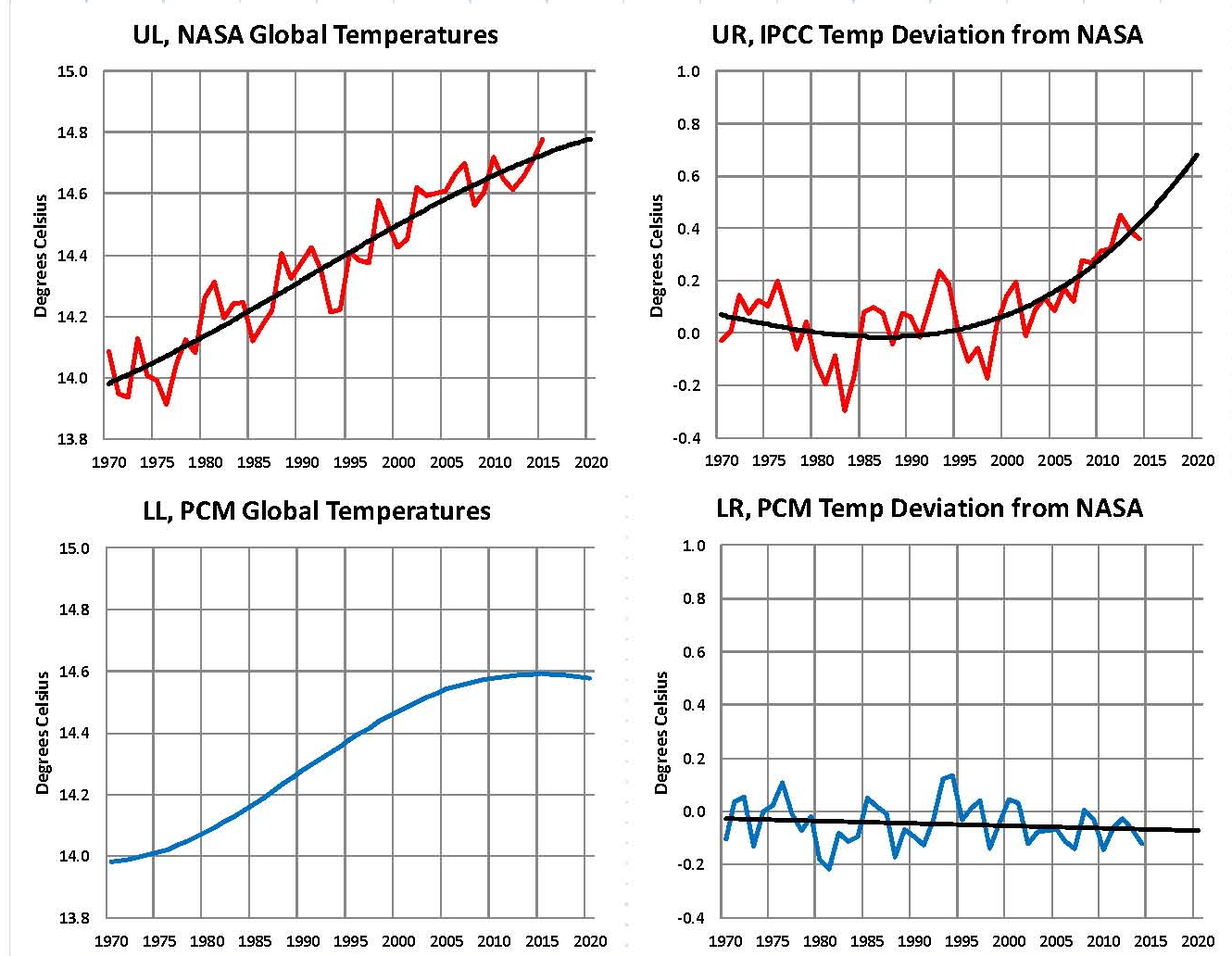
The first plot, UL is a plot of the NASA temperature anomaly converted to degrees Celsius and shown in red with a black trend line added. There has been a very clear reversal in the upward movement of global temperatures since about 2001 and neither the UN IPCC nor anyone else has an explanation for this 13 years later. Since CO2 has continued to increase at what could be argued an increasing rate, this raises serious doubts about the logic programmed into all the IPCC global climate models.
The next plot UR, also in red, shows the IPCC estimates of what the Global temperature should be, based on Hansen’s Scenario B, with the NASA actual temperatures’ subtracted from them. Therefore this plot represents a deviation from what the Climate “believers” KNOW what the temperature should be; with a positive value indicating the IPCC values are higher than actual and a negative value indicating the IPCC values are lower than actual, as measured by NASA. A black trend line is added and we can clearly see that the deviation from expected is increasing at an increasing rate. This makes sense since the IPCC models project increased temperatures based primarily on the increasing level of CO2 in the earth’s atmosphere. Unfortunately, for them, the actual temperatures from NASA are trending down (even as they try to hide the down ward movement with data manipulation) since other factors are in play, therefore each year the gap between them widens. Since we have 13 years of observations’ showing this pattern it becomes hard to justify a continuing belief in the IPCC climate models, there is obviously something very wrong here.
The next plot LL shown in blue is based on the equations in the PCM climate model described in previous papers and posts here and since it is generated by “equations” a trend line is not needed. As can be seen the PCM, LL, and the NASA, UL, trend plots are very similar the reason being that in the PCM model, there is a 68.2 year cycle that moves the trend line up and then down a total of 0.30O Celsius (currently negative .0070O Celsius per year); and we are now in the downward portion of that trend which will continue until around 2035. This short cycle is clearly observed in the raw NASA data in the LOTI table going back to 1868. Then there is a long trend, 1052.6 years with an up and down of 1.36O Celsius (currently plus .0029O Celsius per year) also observed in the NASA data. Lastly, there is CO2 adding about .005O Celsius per year so they basically wash out, which matches the current holding pattern we are experiencing. However within a few years the increasing downward trend of the short cycle will overpower the other two and we will see drop of about .002O Celsius per year and that will be increasing until till around 2025 or so. After about 2035 the short cycle will have bottomed and turn up and all three will be on the upswing again. These are all round numbers shown here as representative values.
The last plot LR in blue uses the same logic as used in the UR plot, here we use the PCM estimates of what the Global temperature should be with the NASA actual temperatures’ subtracted from them. A positive value indicates the PCM values are higher than actual and a negative value indicates the PCM values are lower than expected. A black trend line was added and it clearly shows that the PCM model is tracking the NASA actual values very closely. In, fact since 1970 the PCM model has rarely been off by more than +/- 0.1 degrees Celsius and has an average trend of almost zero error, while the IPCC models are erratic and are now approaching an error rate of +0.5O above expected.
Note: Since I first started posting this monthly analysis a year and a half ago NOAA and NASA were directed make the global temperatures fit the political narrative that the planet was over heating and something drastic need to be done right now. The problem was as shown in this analysis the “real” world temperatures were not at the level that the IPCC GCM’s said they should be. Major adjustments to the data have been made that give the illusion that temperatures are going up even though they are not. However, as this analysis shows even with the manipulation that has destroyed all credibility from NOAA and NASA they cannot get the global temperatures even close to what their false theory claims they should be.
In summary, the IPCC models were designed before a true picture of the world’s climate was understood. During the 1980’s and 1990’s CO2 levels were going up and the world temperature was also going up so there appeared to be correlation and causation. The mistake that was made was looking at only a ~20 year period when the real variations in climate move in much longer cycles. Those other cycles can be observed in the NASA data but they were ignored for some reason. By ignoring those trends and focusing only on CO2 the models will be unable to correctly plot global temperatures until they are fixed.
Lastly, the next chart shows what a plot of the PCM model would look like from the year 1000 to the year 2300. The plot matches reasonably well with history and fits the current NASA-GISS table LOTI date very closely, despite homogenization. I understand that this model is not based on physics but it is also not curve fitting. It’s based on observed reoccurring patterns in the climate. These patterns can be modeled and when they are, you get a plot that works better than any of the IPCC’s GCM’s. If the conditions that create these patterns do not change and CO2 continues to increase to 800 ppm or even 1000 ppm than this model will work into the foreseeable future. 150 years from now global temperatures will peak at around 15.5 to 15.7 degrees C and then will be on the downside of the long cycle for the next 500 years. The overall effect of CO2 reaching levels of 1000 ppm or even higher will be between 1.0 and 1.5 degrees C which is about the same as that of the long cycle.
Carbon Dioxide is not capable of doing what Hansen and Gore claim!
The purpose of this post is to make people aware of the errors inherent in the IPCC models so that they can be corrected.
The Obama administration’s “need” for a binding UN climate treaty with mandated CO2 reductions in Europe and America means there will be such a resolution presented at the COP12 conference in Paris in December. To support this NASA will be forced to show ever increasing global temperatures for the rest of 2015 that will make less and less sense based on observations and satellite data which will all be dismissed or ignored.
Sir Karl Raimund Popper (28 July 1902 – 17 September 1994) was an Austrian and British philosopher and a professor at the London School of Economics. He is considered one of the most influential philosophers for science of the 20th century, and he also wrote extensively on social and political philosophy. The following quotes of his apply to this subject.
If we are uncritical we shall always find what we want: we shall look for, and find, confirmations, and we shall look away from, and not see, whatever might be dangerous to our pet theories.
Whenever a theory appears to you as the only possible one, take this as a sign that you have neither understood the theory nor the problem which it was intended to solve.
… (S)cience is one of the very few human activities — perhaps the only one — in which errors are systematically criticized and fairly often, in time, corrected.
DO YOU BELIEVE IN “GOD?”
Do you Believe in God?

I was asked an interesting question if I believed in God. I think most people believe in some form of higher being and the exact form will differ around the world. Whatever the religion, there is a common theme – do unto others as you would have them do to you. From even back to Ancient Egypt, they believe in everyone would be accountable for their actions upon death. It is never what someone’s words may proclaim, the proof is only in their actions.
My response to this question was rather blunt. I do not believe those in power could possibly believe in any form of God for if they did, they would not try to play God, manipulate society and lie to us about absolutely every possible aspect of the economy and life. Socialism/Marxism outright violates the Ten Commandments for you are not supposed to covet their neighbors goods. Yet government ignores that command and they declare that freedom is bad and that they have the right to take for others who have more than they do. Yet they will prosecute someone who robs another on the street for taking goods or cash from them simply because they have it. Police kill citizens without being charged, It is alright to someone else if the government orders you to do so. Those in power ALWAYS exempt themselves form religion and law yet pretend they are just and righteous.
You DO NOT manipulate facts, lie to the people, and then pretend you believe in God. If you believe in God and any sense of a last judgment, you cannot then advocate manipulating, stealing, and then lying to the public.
Government always use religion to manipulate the masses. Even the USA threatened the Vatican to remove it from the SWIFT system like Iran unless they too reported to whom any wire came from or was going to. So religion to government has always been just a tool to manipulate the people. They cannot advocate nor actually believe in any God and then do what they do. You do not try to end democracy to retain power and then pretend you believe in any higher power.
One’s belief is demonstrated not by what they say, but by their actions.
What the News Isn’t Saying About Vaccine-Autism Studies
What the News Isn’t Saying About Vaccine-Autism Studies

A new study this week found no link between vaccines and autism. It instantly made headlines on TV news and popular media everywhere. Many billed it as the final word, “once again,” disproving the notion that vaccines could have anything to do with autism.
What you didn’t learn on the news was that the study was from a consulting firm that lists major vaccine makers among its clients: The Lewin Group.
That potential conflict of interest was not disclosed in the paper published in The New England Journal of Medicine; the study authors simply declare “The Lewin Group operates with editorial independence.”
(As an aside, according to OpenSecrets.org, The Lewin Group’s parent company, UnitedHealth Group, is a key government partner in Obamacare. Its subsidiary QSSI was given the contract to build the federal government’s HealthCare.gov website. One of its top executives and his family are top Obama donors.)
Conflicts of interest alone do not invalidate a study. But they serve as important context in the relentless effort by pharmaceutical interests and their government partners to discredit the many scientists and studies that have found possible vaccine-autism links.
Many Studies Suggest Possible Vaccine-Autism Links
When the popular press, bloggers and medical pundits uncritically promote a study like The Lewin Group’s, it must confound researchers like Lucija Tomljenovic, Catherine DeSoto, Robert Hitlan, Christopher Shaw, Helen Ratajczak, Boyd Haley, Carolyn Gallagher, Melody Goodman, M.I. Kawashti, O.R. Amin, N.G. Rowehy, T. Minami, Laura Hewitson, Brian Lopresti, Carol Stott, Scott Mason, Jaime Tomko, Bernard Rimland, Woody McGinnis, K. Shandley and D.W. Austin.
They are just a few of the many scientists whose peer-reviewed, published works have found possible links between vaccines and autism. But unlike The Lewin Group’s study, their research has not been endorsed and promoted by the government and, therefore, has not been widely reported in the media. In fact, news reports, blogs and “medical experts” routinely claim no such studies exist.
To be clear: no study to date conclusively proves or disproves a causal link between vaccines and autism and—despite the misreporting—none has claimed to do so. Each typically finds either (a) no association or (b) a possible association on a narrow vaccine-autism question. Taken as a whole, the research on both sides serves as a body of evidence.
The Astroturf Propaganda Campaign
It’s theoretically possible that all of the studies supporting a possible link between vaccines and autism are wrong. And, if the propagandists are to be believed, each of the researchers is an incompetent crank, quack, nut or fraud (and, of course, “anti-vaccine” for daring to dabble in research that attempts to solve the autism puzzle and leads to vaccine safety issues). The scientists and their research are “controversial,” simply because the propagandists declare them to be.
The disparaged scientists include well-published neurologists, pharmacists, epidemiologists, immunologists, PhD’s, chemists and microbiologists from places like Boston Children’s Hospital, Horizon Molecular Medicine at Georgia State University, University of British Columbia, City College of New York, Columbia University, Stony Brook University Medical Center, University of Northern Iowa, University of Michigan, University of Arkansas for Medical Sciences, Arkansas Children’s Hospital Research Institute, Al Azhar University of Cairo, Kinki University in Japan, the University of Pittsburgh School of Medicine, Swinburne University of Technology in Australia, Institute of Psychiatry and Neurology in Poland, Department of Child Health Care, Children’s Hospital of Fudan University in China, Utah State University and many more.
Their work is, at best, ignored by the media; at worst, viciously attacked by the predictable flock of self-appointed expert “science” bloggers who often title their blogs with the word “science” or “skeptics” to confer an air of legitimacy.
This astroturf movement, in my opinion, includes but is not limited to: LeftBrainRightBrain, ScienceBlogs, NeuroSkeptic, ScienceBasedMedicine, LizDitz, ScienceBasedMedicine, CrooksandLiars, RespectfulInsolence, HealthNewsReview, SkepticalRaptor, Skepticblog, Skeptics.com, Wired, BrianDeer, SethMnookin, Orac, Every Child by Two, the vaccine industry supported American Academy of Pediatrics, and the government/corporate funded American Council on Science and Health (once called “Voodoo Science, Twisted Consumerism” by the watchdog Center for Science in the Public Interest).
This circle operates with the moral support of the vaccine industry and its government partners, citing one another’s flawed critiques as supposed proof that each study has been “debunked,” though the studies continue to appear in peer-reviewed, published journals and in the government’s own National Institutes of Health library.
“Weak,” “too small,” “haphazard,” “not replicated,” “junk science,” “flawed,” “unrelated,” declare the propagandists, without exception. Just as attackers spent years challenging any study that linked tobacco to lung cancer.
They know that reporters who don’t do their homework will conduct an Internet search, run across the blogs with science-y sounding names, and uncritically accept their word as if it’s fact and prevailing thought.
CDC claims “no link” between vaccines and autism
A Small Sampling
Many of the studies have common themes regarding a subset of susceptible children with immunity issues who, when faced with various vaccine challenges, end up with brain damage described as autism.
“Permanent brain damage” is an acknowledged, rare side effect of vaccines; there’s no dispute in that arena. The question is whether the specific form of autism brain injury after vaccination is in any way related to vaccination.
So what are a few of these published studies supporting a possible link between vaccines and autism?
As far back as 1998, a serology study by the College of Pharmacy at University of Michigan supported the hypothesis that an autoimmune response from the live measles virus in MMR vaccine “may play a causal role in autism.” (Nothing to see here, say the critics, that study is old.)
In 2002, a Utah State University study found that “an inappropriate antibody response to MMR [vaccine], specifically the measles component thereof, might be related to pathogenesis of autism.” (“Flawed and non-replicable,” insist the propagandists.)
Also in 2002, the Autism Research Institute in San Diego looked at a combination of vaccine factors. Scientists found the mercury preservative thimerosal used in some vaccines (such as flu shots) could depress a baby’s immunity. That could make him susceptible to chronic measles infection of the gut when he gets MMR vaccine, which contains live measles virus. (The bloggers say it’s an old study, and that other studies contradict it.)
In 2006, a team of microbiologists in Cairo, Egypt concluded, “deficient immune response to measles, mumps and rubella vaccine antigens might be associated with autism, as a leading cause or a resulting event.”
A 2007 study found statistically significant evidence suggesting that boys who got the triple series Hepatitis B vaccine when it contained thimerosal were “more susceptible to developmental disability” than unvaccinated boys.
Similarly, a 5-year study of 79,000 children by the same institution found boys given Hepatitis B vaccine at birth had a three times increased risk for autism than boys vaccinated later or not at all. Nonwhite boys were at greatest risk. (“Weak study,” say the critics.)
A 2009 study in The Journal of Child Neurology found a major flaw in a widely-cited study that claimed no link between thimerosal in vaccines and autism. Their analysis found that “the original p value was in error and that a significant relation does exist between the blood levels of mercury and diagnosis of an autism spectrum disorder.”
The researchers noted, “Like the link between aspirin and heart attack, even a small effect can have major health implications. If there is any link between autism and mercury, it is absolutely crucial that the first reports of the question are not falsely stating that no link occurs.”
(Critics: the study is not to be believed.)FDA list of thimerosal-containing vaccines
A 2010 rat study by the Polish Academy of Sciences suggested “likely involvement” of thimerosal in vaccines (such as flu shots) “in neurodevelopmental disorders such as autism.” (The critics dismiss rat studies.)
In 2010, a pilot study in Acta Neurobiologiae Experimentalis found that infant monkeys given the 1990’s recommended pediatric vaccine regimen showed important brain changes warranting “additional research into the potential impact of an interaction between the MMR and thimerosal-containing vaccines on brain structure and function.”
A study from Japan’s Kinki University in 2010 supported “the possible biological plausibility for how low-dose exposure to mercury from thimerosal-containing vaccines may be associated with autism.”
A 2011 study from Australia’s Swinburne University supported the hypothesis that sensitivity to mercury, such as thimerosal in flu shots, may be a genetic risk factor for autism. (Critics call the study “strange” with “logical hurdles.”)
A Journal of Immunotoxicology review in 2011 by a former pharmaceutical company senior scientist concluded autism could result from more than one cause including encephalitis (brain damage) following vaccination. (Critics say she reviewed “debunked and fringe” science.)
In 2011, City University of New York correlated autism prevalence with increased childhood vaccine uptake. “Although mercury has been removed from many vaccines, other culprits may link vaccines to autism,” said the study’s lead author. (To critics, it’s “junk science.”)
A University of British Columbia study in 2011 that found “the correlation between Aluminum [an adjuvant] in vaccines and [autism] may be causal.” (More “junk science,” say the propagandists.)
A 2011 rat study out of Warsaw, Poland found thimerosal in vaccines given at a young age could contribute to neurodevelopmental disorders. (Proves nothing, say critics.)
A Chinese study in 2012 suggested that febrile seizures (an acknowledged side effect of some vaccines) and family history of neuropsychiatric disorders correlate with autistic regression.
A 2012 study from the Neurochemistry Research Marie Curie Chairs Program in Poland found that newborn exposure to vaccines with thimerosal (such as flu shots) might cause gluten-related brain injuries.
In 2013, neurosurgeons at the Methodist Neurological Institute found that children with mild mitochondrial defect may be highly susceptible to toxins like the vaccine preservative thimerosal found in vaccines such as flu shots. (“Too small” of a study, say the critics.)
Then, there’s a 2004 Columbia University study presented at the Institute of Medicine. It found that mice predisposed for genetic autoimmune disorder developed autistic-like behavior after receiving mercury-containing vaccines. (Critics say that’s not proof, and the work was not replicable.)
There’s Dr. William Thompson, the current CDC senior scientist who has come forward with an extraordinary statement to say that he and his agency have engaged in long term efforts to obscure a study’s significant link between vaccines and autism, heightened in African Americans boys. (The CDC says the data changes made were for legitimate reasons.)
There’s the current CDC immunization safety director who acknowledged to me that it’s possible vaccines may rarely trigger autism in children who are biologically or genetically susceptible to vaccine injury.
There’s the case of Hannah Poling, in which the government secretly admitted multiple vaccines given in one day triggered her brain injuries, including autism, then paid a multi-million dollar settlement, and had the case sealed from the prying public eyes under a confidentiality order.
There was the former head of the National Institutes of Health, Dr. Bernadine Healy, who stoked her peers’ ire by publicly stating that the vaccine-autism link was not a “myth” as so many tried to claim. She disclosed that her colleagues at the Institute of Medicine did not wish to investigate the possible link because they feared the impact it would have on the vaccination program.
There’s former CDC researcher Poul Thorsen, whose studies dispelled a vaccine autism link. He’s now a “most wanted fugitive” after being charged with 13 counts of wire fraud and nine counts of money laundering for allegedly using CDC grants of tax dollars to buy a house and cars for himself.
And there are the former scientists from Merck, maker of the MMR vaccine in question, who have turned into whistleblowers and accuse their company of committing vaccine fraud.
Read: CDC Vaccine Information Statements
The Spin
If you want to review research and evidence on the other side, a simple Internet search will easily turn up everything you want to know. Those studies always seem to get covered in the news. They somehow turn up first in Google search results, along with the reports and blogs disparaging all opposing science and news reporting.
You might run across a February article in the New York Times. It treated the vaccine autism theory as if it comes down to a disagreement between emotionally fragile parents of autistic children and real research: “faith” and “feeling” versus hard science.
“Some parents feel certain that vaccines can lead to autism,” stated the article, and “the vaccine-autism link has continued to be accepted on faith by some.”
You might run across this network news story that uses Dr. Paul Offit as an expert on vaccine safety. He’s introduced as “director of the Vaccine Education Center at the Children’s Hospital of Philadelphia” and he “denies a connection with vaccination and autism.”
Somehow, it goes unreported that Offit has made millions (he won’t disclose exactly how much) inventing a vaccine for Merck, which makes the MMR vaccine in question. Offit’s rotavirus vaccine has, itself, been the subject of safety concerns. And his employment at Children’s Hospital has been funded in part by $1.5 million given by Merck. In addition, he got caught giving false and disparaging information regarding a report I did exposing his financial ties to the pharmaceutical industry he so vigorously defends. His false statements were corrected by the publication that originally reported them. And Offit and his book publisher settled a libel accusation by a vaccine safety advocate who accused Offit of fabricating a disparaging conversation in his book: Autism’s False Prophets. Offit agreed to apologize, correct the book and make a donation to an autism charity.
But to the news: none of that matters. Offit is simply presented as an unbiased expert.
The supposedly best medical experts in the world who deny vaccines have anything to do with autism remain at an utter loss to explain this generation’s epidemic. To declare the science “settled” and the debate “over” is to defy the plain fact that many scientists worldwide are still sorting through it, and millions of people are still debating it.
The body of evidence on both sides is open to interpretation. People have every right to disbelieve the studies on one side. But it is disingenuous to pretend they do not exist.
Migration as Jihad
Migration is part of the doctrine of jihad. Migration is so important that the Islamic calendar is based upon the Hijra, Mohammed’s migration from Mecca to Medina. Why? Because it was migration that lead to the creation of jihad in Medina. And it was jihad that made Islam triumphant.
In the past Muslims tended to stay in Islamic countries. Today, the new politics is to migrate to Kafir lands and immerse themselves in local politics. This is the jihad of money, writing and speech. Their politics is to bring the Sharia to Kafir culture. An example is using Islamic money is to build departments in universities that will support Sharia and never criticize Islam.
