The EU is now past the point of No Return and will began to implode in March


ECM-Euro

QUESTION: Mr. Armstrong; The World Economic Conference was outstanding. Your theme that Europe was the focal point for the coming chaos has been proven valid with each passing day. You have mentioned this is the time that will begin the collapse in public confidence within the EU even surviving. I must ask. Do you believe if they call you in and followed everything you have said, is it just too late to save Europe?

Thank you so much

PB

ANSWER: Unfortunately, I know how to restructure Europe so it would function, but I do not believe that would even be sufficient at this stage in the game. We have probably reached the point of no return. All that is now left is the crash and burn. Only then will society reform. I simply believe we crossed that line last year. We began a new declining cycle in 2008 and that was the peak in the Euro as well. The start of the real decline in the Euro where mainstream capital begins to question when negative rates can really reverse or stimulate the economy unfolds after 2016.202. This comes into play March 13/14, 2016. This is not my personal opinion. This is just the modeling.

This seems to be so important we will try to put together a video on this matter.

Almost all Income Inequality is caused by Government Taxes!


Social Inequality

QUESTION:

Dear Martin Armstrong,

I appreciate very much your economic analysis and read your blog nearly daily although I disagree with some of your political statements.

In your last blog about Schengen you mention that “Everything is connected and nothing takes place in some isolated vacuum”.  Obvious.

According to me, and many others re-known economists like Joseph Stiglizt or Paul Krugman, one of the problems in the current world is the exponential increase of social inequality and  massive collection of wealth in few hands.

How is it possible that barely the 60 richest people can have the same wealth as half of the population (3.6 billion)? Is this acceptable? What would be the solution in your opinion? Because just free markets will reinforce not decrease the actual trend and you seem to be “socialist”-averse although some sort of redistribution of wealth should be done, I suppose, but how?.

Thanks for your great work

BR

ANSWER: This is a Marxist diversion. It focuses only on the “rich” and ignores the fact that government continues to expand and consume wealth. The “wealth” that everyone points to for the richest people is by no means a product of WAGES, rather it is created on paper valuations of investment. At the same time, that “wealth” dropped $1 trillion just in the January decline this year. It is NOT actual “money” in that sense. It is no different than your home being worth $500,000 one day and then $200,000 a month later.

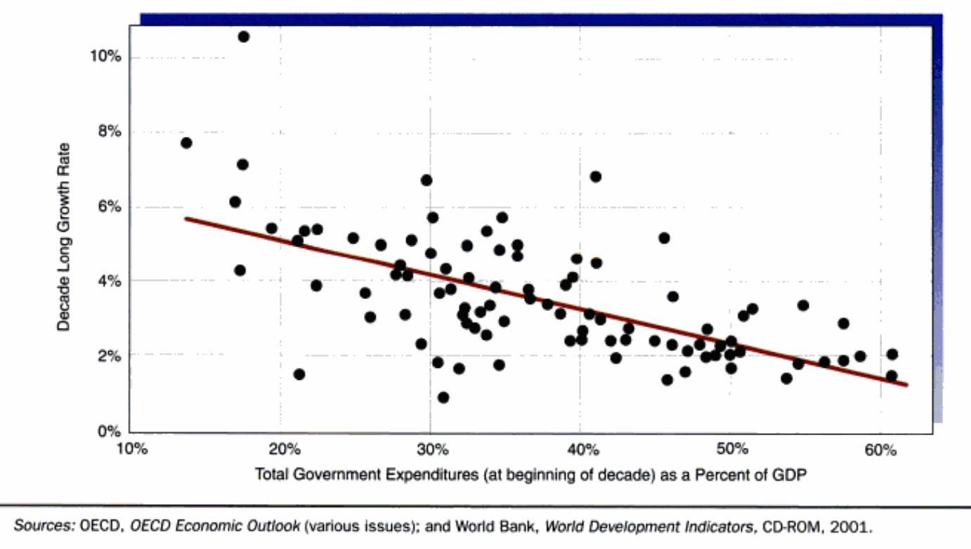
Total-Government-Expenditure-as-a-Percent-of-GDP-vs-Growth-Rate

“Social inequality” remains the headline grabber, yet the larger government becomes, the lower the economic growth. The OECD itself illustrates this. Higher taxes reduce economic growth, plain and simple. Then we have the average person who is robbed by about 50%+ between income taxes (federal and state), property taxes, fees, tools, and sales taxes. All of this goes to sustain government; it does NOT raise the living standard of the average person. Europe is even worse.

I tried to save Social Security on Capitol Hill. I argued to convert it to a wealth fund and allow it to invest exactly as the “rich” employ their money rather than stuffing it with depreciating government bonds. When I DONATED my time on Capitol Hill, the Dow was 1,000. That would now be 17 times more and amply enough to retired on. Social Security goes bust next year, and with interest rates manipulated lower you will get nothing.

Then the government charges payroll taxes on the average worker. Sure, they hand you a refund check at year-end. So they are borrowing from the average person and NOT paying them any interest. The government robs your ability to save and grow “rich” by stuffing your money in government bonds under Social Security.

Government creates “social inequality” by robbing the poor and middle classes while pretending to care. If we eliminated government federal income taxes, most people would take home at least 30% more.

Tax RobberyThe problem is NOT that the “rich” make money from investment; it is that the rest of society is DENIED the right to invest to get ahead because the government is bleeding everyone dry. Take all the money from the “rich” and we end up with communism, which will not improve your life in the least. So you do not stand a chance of surviving the future unless we start looking at the real culprit here. This is like a baseball game: the pitcher only focuses on the batter while those on base are stealing the next one unnoticed. We need to pay attention before there is no future for our posterity. Thank God I am not 18. I really do not want to live in a world run in this manner. This is not like Star Trek: “Scotty. Beam me up PLEASE!“

THE DONALD’S FIRST DAY IN OFFICE


President Donald Trump and Vice President Marco Rubio are sworn into office.

ONE. In a rare event on inauguration day, Congress convenes for an emergency meeting to repeal the illegal and unconstitutional Socialist healthcare farce known as Obamacare. The new Director of Health and Social Services Dr. Ben Carson announces that an independent group of healthcare management professionals is hired to handle healthcare services for poor and low income people. They are also assigned the duty of eliminating Medicare and Medicaid fraud. Government’s costs for public healthcare are reduced by 90%. Healthcare insurance premiums for working Americans are reduced by 50%. The move saves billions of taxpayer paid dollars. Healthcare service in the U.S improves 100%.

TWO. Newly appointed Department of Homeland Security Chief Ted Cruz announces the immediate deployment of troops to the U.S. Mexico border to control illegal immigration and the immediate deportation of illegals with criminal records or links to terrorist groups. New bio-encrypted Social Security IDs are required by every American citizen. Birthright is abolished. All immigration from countries that represent a threat to the safety of American citizens is terminated indefinitely. The move saves American taxpayers billions of dollars. Several prisons are closed.

THREE. Newly appointed Secretary of Business and Economic Development Carly Fiorina eliminates more than half of the Government agencies operating under the Obama administration saving taxpayers billions of dollars. Stocks rise 100%.

FOUR. Newly appointed Director of Government Finance Rand Paul announces the abolition of the IRS and displays a copy of the new Federal Tax Return form. It consists of one page. The instructions consist of two pages. The Federal Reserve is audited. The move saves American Taxpayers billions of dollars and increases tax revenue.

FIVE. Hillary Clinton is in prison, where she belongs. Her cell is directly across from Jesse Jackson and Al Sharpton who are serving time for “Hate Crimes”. She bitches at them constantly from behind the bars of her cell in what some call cruel and unusual punishment.

SIX. Bernie Sanders is in the nuthouse, where he belongs. His room is directly across from Nancy Pelosi, Debbie Wasserman Schultz, Chris Matthews and Al Franken. They meet for tea every day at 10 AM and discuss the success and benefits of Communism and Socialism throughout the world. They also wonder when the “Mothership” is going to pick them up and return them to their home planets,

SEVEN. Windows 12 is released. It is designed for humans, doesn’t try to satisfy the needs of every person on the planet, doesn’t require a degree in nuclear physics to operate and looks just like Windows 7 except it is easier to use.

EIGHT. Barack Obama flees the United States under cover of darkness and returns to his homeland of Kenya before his trial for treason begins. He deplanes on a remote jungle airstrip. It was reported that he was last seen wandering through the jungle singing “Hakuna Matata” with a chimp named Commie.

NINE. A committee is not established to determine what is causing global cooling. Billions of taxpayer dollars are saved.

TEN. Dead people are no longer allowed to vote in Chicago, a huge blow for the Democrat Party in the State of Illinois.

THE PERFECT DAY!


Trump’s Reading of the Snake is Going Viral in Europe


The Snake is in with us right now be prepared!

Can Trump save the US?


POLITICS

Some people have asked if I am a Republican or Democrat/ Labour or Tory. Both political sides are wrong. They pander to their core constituents using the social issues to get everyone wound-up, but when it comes to economics; well there is no real difference. Neither side will reform or downsize government. Their solution will be as Christine Lagarde’s: grab more and more until it works for them.

1844 Phila Nativism Riot Againt Irish

1833MissBond

I have been asked if I really think Trump will be the man to save us. No. I do not believe anyone can do that at this late point in history. Trump’s reading of Al Wilson’s song “The Snake” is typical and part of the cycle. The state sovereign debt crisis of the mid-19th century was set in motion by Andrew Jackson’s war on the Bank of the United States because they funded his opponents. Jackson then destroyed the central bank, which set off the Age of Broken Banknotes. The Panic of 1837 became the Depression of the 1840s, and then states issued bonds to try to bailout their banks and then they defaulted. To this date, the Bank of England still has on its books bonds issued by States that they never paid on.

The economic pressures of that period produced the very same human response to immigration. Then it was the Irish. The movement against immigrants erupted into gun battles on the streets of Philadelphia in 1844 known as the Nativism Riots. These “native” Americans (white original immigrants) were against all immigrants as they felt they were taking their jobs. So Trump’s reading of “The Snake” is PRECISELY in line with history and is reflecting the very issue that is argued for the BREXIT by one side: STOP THE MIGRANTS.

The point is, quite frankly, that history repeats. We are in the midst of an economic decline. The standard of living is declining as government expands regardless of whom has been behind the uptrend since both sides have contributed to our demise as we approach our date with reality. Europeans hate Trump because they focus on some of his hardline statements and the fact that career politicians there see him as a very dangerous consequence because the same trend is emerging in Europe — oust the career politicians. But in the USA, the more Trump stands up against the career politicians, the louder his cheers. Meanwhile, the bankers are scared to death of both Trump and Bernie Sanders and see them as dangerous. Obviously, if they do not OWN the political candidate, he might actually prosecute them for crimes.

Euro Sinking

The Mayor of London, Boris Johnson, has come out in support of BREXIT. On the other side, you have British Prime Minister David Cameron making his pitch to remain within the European Union, claiming the UK could “have the best of both worlds” if it voted to remain in the bloc. We should expect the pound to decline as part of an official attack to convince people to stay in the EU. Then they will argue that the decline in the pound is proof that Britain should stay with a sinking ship.

So the point is this: Trump’s reading of “The Snake” is a sign of the times. He is tapping into the very same human response that ALWAYS unfolds during major economic declines. Merkel’s decision to open the floodgates for immigration occurred at EXACTLY the wrong time in the economic cycle. In a bull market, nobody would have noticed. Did it create the cycle? No. The downtrend was set in motion as our forecasts were laid out. Doing what she did was stupid and counter-trend so it was interpreted as a disaster.

War-Cycle-2014

Now, with hard times upon us, the Islamic immigrants will compete for jobs, take state assistance, and only cause the resentment to rise among those who see their living standards diminish. This is simply part of the War Cycle, which turned up in 2014 and nothing more. I have stated countless times that our correlation of all global trends demonstrates that war never comes when everyone is “fat and happy.” Turn down the economy and it all comes unraveled.

Trump’s reading of “The Snake” is feeding into the heat of the moment. It is perfect timing regardless of which side you are on for we just may be influenced by the entire cycle heading into the coming storm. So to me it is not abnormal; it is a sign that the cycle is indeed unfolding. I need not take sides. To me, this is indicative and confirmation of the trend in motion.

Can Trump prevent our demise? No. He probably does not realize the extent of the risk we face. People should by no means focus on Trump as an individual, for they will miss the entire trend. He is a symptom of the times and not the trendsetter himself. I have more faith in Trump insofar as he is NOT a career politician and that leaves a glimmer of hope that when he is wrong, he will change course. Career politicians will NEVER do that because they are incapable of admitting to mistake. That is simply what they are told in Politics 101.

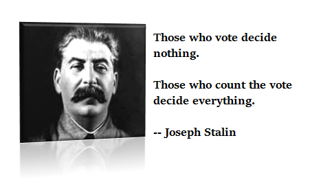
stalincountthevote

Cameron wanting to stay in the EU when it is a total disaster is indicative of someone who puts politics before his own country. If Britain votes to leave, and they will probably rig that vote as they did the Scottish Vote to separate from the UK, Europe will see a contagion of massive proportions and the EU will collapse because they tried to make this a political United States of Europe rather than an economic union. My guess: Cameron and the EU will rig any BREXIT vote to ensure it remains with the sinking ship. If Britain leaves, the EU collapses.

A DETAILED LIST . . .


Hey that looks just like the list I made out … lol

Analysis of Global Temperature Trends, January, 2016 What’s really going on with the Climate?


The analysis and plots shown here are based on the following: first NASA-GISS temperature anomalies (converted to degrees Celsius so non-scientists will understand the plots) as shown in their table LOTI, second James E. Hansen’s Scenario B data, which is the very core of the IPCC Global Climate models (GCM’s) and which was based on a CO2 sensitivity value of 3.0O Celsius, lastly, a plot based on an alternative climate model designated ‘PCM’ based on a sensitively value of 0.65O Celsius.

Note: I am making a revision to my model based on some new information that will make my climate model more accurate; even with the NASA/NOAA data manipulation which is in full force now. I expect to have this work completed by the next post for January 2016 data. This change has been completed and this paper uses the new a revised model. This change was to link the developed patterns to multiples of Pi which did in fact make an improvement and reduced errors from NASA observations.

An explanation of the alternative model designated, PCM, is in order since many have interpreted this PCM model as a statistical least squares projection of some kind. Nothing could be further from the truth. A decade ago when I started this work the first thing I did was look at geological temperature changes since it is well known that the climate is not a constant; I learned that in my undergrad geology and climatology courses in 1964.

The following observations give a starting point to any serious study. First, there is a clear movement in global temperatures with a 1,000 some year cycle going back at least 3,000 to 4,000 years; probably because of the apsidal precession of about 21,000 years for a complete cycle. However about every 10,000 years the seasons are reversed making the winter colder and the summer warmer in the northern hemisphere. 10,000 years from now the seasons will be reversed. Secondly, there are also 60 to 70 year cycles in the Pacific and the Atlantic oceans that are well documented. Lastly we also know that there are greenhouse gases such as carbon dioxide. The National Academy of Sciences (NAS) estimated that carbon dioxide had a doubling rate of 3.0O Celsius plus or minus 1.5O Celsius in 1979.

The core problem with the current climate change theory is that the IPCC still uses the NAS 3.0O Celsius as the sensitivity value of carbon dioxide and a number in that range is required to make the IPCC GCM’s work. The problem with using this value is it leaves no room for other factors and hence the need of the infamous hockey stick plots of the IPCC from Mann, Bradley & Hughes in 1999. The PCM model is based on a much lower value for carbon dioxide consistent with current research that places the value between 0.65O and 1.5O Celsius per doubling of carbon dioxide. If the long and short movement in temperatures and a lower value for carbon dioxide are properly analyzed and combined a plot that matched historical and current (non manipulated) NASA temperature estimates very well can be constructed. This is not curve fitting.

The PCM model is such a construct and it is not based on statistical analyses of raw data. It is based on creating curves that match observations (which is real science) and those observations appear to be related to the movement of water in the world’s oceans. The movements of ocean currents are well documented in the literature. All that was done here was properly combine the separate variables into one curve which had not been previously done, to my knowledge. Since this combined curve is an excellent predictor of global temperatures unlike the IPCC GCM’s, it appears to reflect reality a bit better than the convoluted IPCC GCM’s, which after the past 19 years of no statistical warming have been shown to be in error.

Now, to smooth out highly erratic monthly variations a 12 month running average is used in all the plots. This information will be shown in four tables and updated each month as the new data comes in about the middle of the month. Since no model or simulation that cannot reasonably predict that which it was design to do is worth anything the information presented here definitively proves that NASA, NOAA and the IPCC just don’t have a clue.

Note, starting in late 20014 and continuing to the present NASA has made major changes to the way they calculate the values used in their table LOTI. These changes have significantly increased the apparent global temperatures (political reasons) and these changes are not supported by satellite data; so they are probably not real. For example in the report issued in April 2010 the following temperatures were reported March 2002 102, January 2007 108. The January 2016 report shows March 2002 90, January 2007 95 and January 2016 as 111 but was it and will it say there? This paper uses the questionable NASA data since it is all that is available at this time. Prior to this “change” the PCM plot showed almost no error for NASA data as can be seen in the plots posted here last year.

Four Charts

The first plot, UL is a plot of the NASA temperature anomaly converted to degrees Celsius and shown in red with a black trend line added. There has been a very clear reversal in the upward movement of global temperatures since about 2001 and neither the UN IPCC nor anyone else has an explanation for this 13 years later. Since CO2 has continued to increase at what could be argued an increasing rate, this raises serious doubts about the logic programmed into all the IPCC global climate models.

The next plot UR, also in red, shows the IPCC estimates of what the Global temperature should be, based on Hansen’s Scenario B, with the NASA actual temperatures’ subtracted from them. Therefore this plot represents a deviation from what the Climate “believers” KNOW what the temperature should be; with a positive value indicating the IPCC values are higher than actual and a negative value indicating the IPCC values are lower than actual, as measured by NASA. A black trend line is added and we can clearly see that the deviation from expected is increasing at an increasing rate. This makes sense since the IPCC models project increased temperatures based primarily on the increasing level of CO2 in the earth’s atmosphere. Unfortunately, for them, the actual temperatures from NASA are trending down (even as they try to hide the down ward movement with data manipulation) since other factors are in play, therefore each year the gap between them widens. Since we have 13 years of observations’ showing this pattern it becomes hard to justify a continuing belief in the IPCC climate models, there is obviously something very wrong here.

The next plot LL shown in blue is based on the equations in the PCM climate model described in previous papers and posts here and since it is generated by “equations” a trend line is not needed. As can be seen the PCM, LL, there is a 69.1 year cycle that moves the trend line up and then down a total of 0.29O Celsius and we are now in the downward portion of that trend (-.01491O C per year) which will continue until around 2035. This short cycle is clearly observed in the raw NASA data in the LOTI table going back to 1868. Then there is a long trend, 1036.7 years with an up and down of 1.65O Celsius (.00396O C per year) also observed in the NASA data. Lastly, there is CO2 adding about .007O Celsius per year so they basically wash out at -.0039 O C per year, which matches the current holding pattern we are experiencing. After about 2035 the short cycle will have bottomed and turn up and all three will be on the upswing again. These are all round numbers shown here as representative values.

The last plot LR in blue uses the same logic as used in the UR plot, here we use the PCM estimates of what the Global temperature should be with the NASA actual temperatures’ subtracted from them. A positive value indicates the PCM values are higher than actual and a negative value indicates the PCM values are lower than expected. A black trend line was added and it clearly shows that the PCM model is tracking the NASA actual values very closely. In, fact since 1970 the PCM model has rarely been off by more than +/- 0.1 degrees Celsius until the last few months where the manipulation showed up and has an average trend of almost zero error, while the IPCC models are erratic and are were approaching an error rate of over +0.4O C above expected until the last few months.

Note: Since I first started posting this monthly analysis a year and a half ago NOAA and NASA were directed make the global temperatures fit the political narrative that the planet was over heating and something drastic need to be done right now. The problem was as shown in this analysis the “real” world temperatures were not at the level that the IPCC GCM’s said they should be. Major adjustments to the data have been made that give the illusion that temperatures are going up even though they are not. However, as this analysis shows even with the manipulation that has destroyed all credibility from NOAA and NASA they cannot get the global temperatures even close to what their false theory claims they should be.

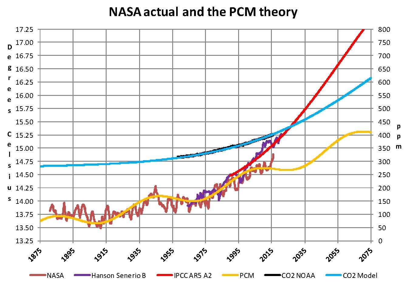
The next Chart shows the PCM model and all the various government plots related to climate change from 1875 through 275. Clearly within the next dozen years we will know one way or the other which kind of climate model works. One based on observations and the other based on questionable science. There is no disrespect meant against the real climate scientists that have been marginalized this disrespect is meant for the political scientists who are the worst kind as they work for money not for the truth.
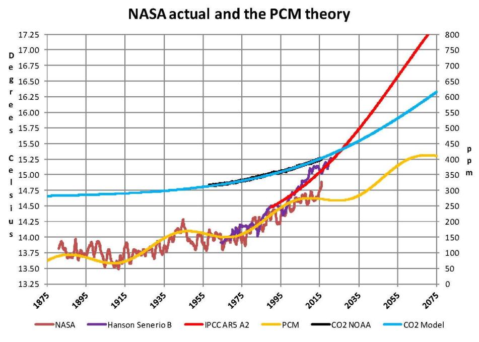
Present

In summary, the IPCC models were designed before a true picture of the world’s climate was understood. During the 1980’s and 1990’s CO2 levels were going up and the world temperature was also going up so there appeared to be correlation and causation. The mistake that was made was looking at only a ~20 year period when the real variations in climate move in much longer cycles. Those other cycles can be observed in the NASA data but they were ignored for some reason. By ignoring those trends and focusing only on CO2 the models will be unable to correctly plot global temperatures until they are fixed.

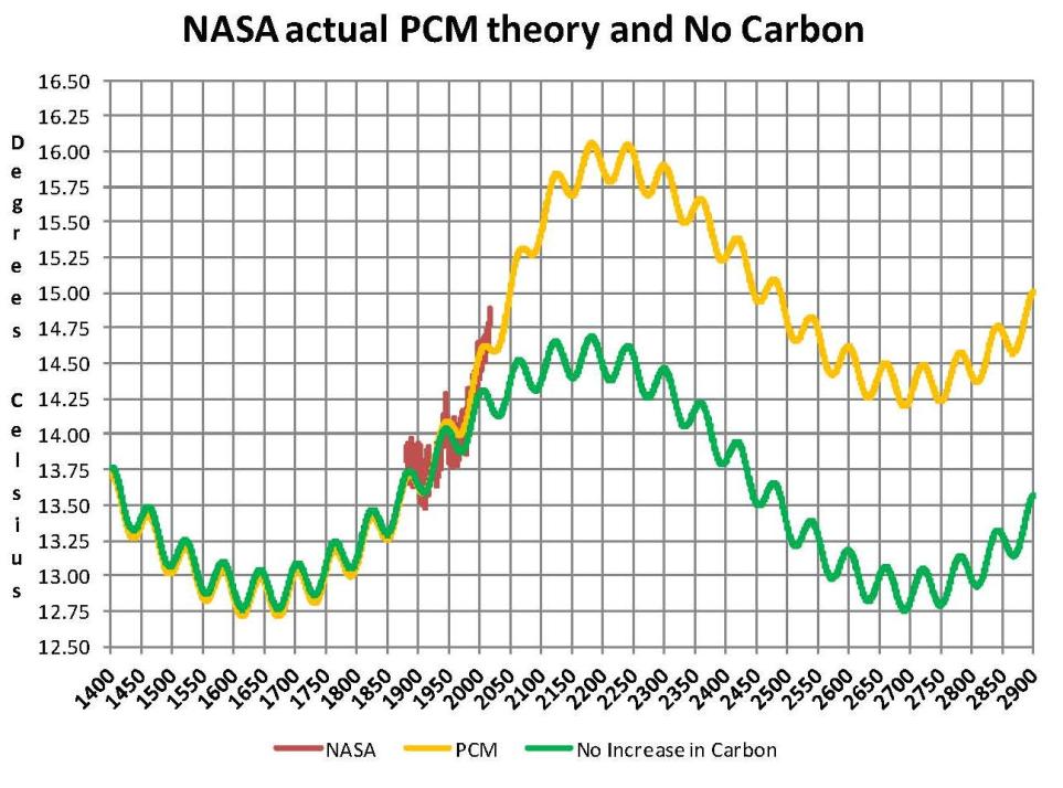
Lastly, the next chart shows what a plot of the PCM model, in yellow, would look like from the year 1400 to the year 2900. The plot matches reasonably well with history and fits the current NASA-GISS table LOTI data, in red, very closely, despite homogenization. I understand that this model is not based on physics but it is also not curve fitting. It’s based on observed reoccurring patterns in the climate. These patterns can be modeled and when they are, you get a plot that works better than any of the IPCC’s GCM’s. If the conditions that create these patterns do not change and CO2 continues to increase to 800 ppm or even 1000 ppm than this model will work into the foreseeable future. 150 years from now global temperatures will peak at around 15.75 to 16.00 degrees C and then will be on the downside of the long cycle for the next 500 years. The overall effect of CO2 reaching levels of 1000 ppm or even higher will be about 1.5 degrees C which is about the same as that of the long cycle. The Green plot shows the pattern with no change in CO2 from the pre-industrial era of ~280 ppm.

Carbon Dioxide is not capable of doing what Hansen and Gore claim!
Future

The purpose of this post is to make people aware of the errors inherent in the IPCC models so that they can be corrected.

The Obama administration’s “need” for a binding UN climate treaty with mandated CO2 reductions in Europe and America was achieved as predicted at the COP12 conference in Paris in December 2015. To support this endeavor NASA will be forced to show ever increasing global temperatures that will make less and less sense based on observations and satellite data which will all be dismissed or ignored. Within a few years the manipulation will be obvious even to those without knowledge in the subject.


Sir Karl Raimund Popper (28 July 1902 – 17 September 1994) was an Austrian and British philosopher and a professor at the London School of Economics. He is considered one of the most influential philosophers for science of the 20th century, and he also wrote extensively on social and political philosophy. The following quotes of his apply to this subject.

If we are uncritical we shall always find what we want: we shall look for, and find, confirmations, and we shall look away from, and not see, whatever might be dangerous to our pet theories.

Whenever a theory appears to you as the only possible one, take this as a sign that you have neither understood the theory nor the problem which it was intended to solve.

… (S)cience is one of the very few human activities — perhaps the only one — in which errors are systematically criticized and fairly often, in time, corrected.

How NASA manipulates the numbers to give the result that they want


NASA-GISS publishes a table Land Ocean Temperature Index (LOTI) of temperature values around the middle of each month that gives their estimate of the global temperature in anomalies. This table shows the current month and it goes back, by month, all the way to January 1880 which represented 1,626 values with the January 2016 report. Anomalies are calculated by taking the estimated temperature say 15.2 degrees Celsius and subtracting 14.0 degrees Celsius from it leaving 1.2 degrees Celsius which is then multiplied by 100 giving us an anomaly of 102; it’s their system not mine. The 14 degrees Celsius was calculated back in the 1980 as the average temperature for the period from 1951 through 1980 or 30 years. Why that period I don’t know as it has no scientific significance. My guess is it was the period that the people working on this project like James E. Hanson grew up in, but whether that is true or not using those years as a base for anything makes no sense. This paragraph is required so anyone looking at the Chart that follows will be able to understand what the numbers mean.

When I started this climate research 10 years ago it was the result of work I was doing in the field of electric vehicles and I needed to find the amount of fossil fuels that were available to determine if electric vehicles were viable. Also prior work I had done at General Electric had indicated that there were many problems with actually trying to switch to electric cars from petroleum based. Progress has been made but there are still many issues that prevent a total conversion to electric. However this subject dragged me into the changing climate issue which at the time I had no reason to believe what NASA and James E. Hansen were saying was not true. That assumption proved to be very wrong after only a few months of studying the issue and that started me on seeing what the real reasons for the changing climate we had was.

My research during 2005 through 2007 was in collecting information on the subject and it soon became obvious that there was something wrong; the IPCC hockey stick graph and geological temperature records were at odds and one or the other was wrong. The key was the sensitivity value of Carbon Dioxide CO2 which tells us how much of an effect CO2 has on temperatures. The science is far from settled on this key value and from 1979 to the present the published papers have lowered the estimate of that key number from 3.0 degrees Celsius to closer to 1.0 degrees Celsius per doubling of CO2. The higher value is required to make the man made part of the changing climate real but the lower value appears to be the correct one; which then seems to show that there are other factors effecting climate than CO2 and this became obvious 12 years ago when the increase in Global temperature appeared to slow down or even stop; and this was called the ‘pause’. And this pause was supported by satellite data so it was hard to hide

However, politics came into play as many uneducated policy makers were tricked into supporting the claim that CO2 increases were going to be the world’s biggest problem ever. This belief had much support from various political factions that provided money and ground troops to get the message out. So, now today, with so much political capital invested in the concept facts could not be allowed to stand in the way and so NOAA and NASA were directed to adjust the global temperatures to support the movement and that culminated with the Paris climate treaty signed in December 2015 at COP21. The following Chart shows how this was done by changing all the values in the NASA LOTI table and an explanation follows the chart.

NASA MANIPULATION

This Chart was made from 14 different NASA LOTI tables as downloaded from the NASA-GISS web site over the past 8 years and listed by date on the x axis. Each LOTI report has a temperature value for each month from the date of the report going back to January 1880 and since these values are recalculated every month in software there are variations in those values and so to remove the random changes blocks of values were averaged i.e. the first one in green January 1880 through December 1899 is 20 years containing 240 values. Then that block was plotted for each of the 14 different reports up to the base period. This block is very erratic moving first down and then up so there must be something in the software that causes that based on what they programmed in to all the other periods. I left it in here only to show the strange movements in the published temperatures provided by NASA. The next block is from January 1951 to December 1980, 30 year period, is the base period that NASA which was described in the first paragraph of this short paper. In the above chart it shows as a solid black line at the 0 point on the chart. Starting in 1940 we move to 10 year blocks of 120 values to see greater resolution. The most current block 2010 to 2019 shows the most manipulation.

Now what stands out in this chart are two things the first is that the plots for the blocks of years move up and down which means that the temperatures for that block of years is moving which doesn’t seem reasonable as they are in the past so how is that possible. Further, random fluctuations would be averaged out when considering 120 or 240 values. In general as shown in the straight red trend line above the black base line which moves up and the blue straight trend line below the black base line which moves down we can see that the past gets colder while the present gets warmer; both after they are first published. Each point on the chart is for the same time period and the same number of values with the exception of the most current block labeled at 2010-2019 which is currently at 60 values since we are only half way through that period. This last period is the most interesting since we can see a very large increase in the values in the first few months of 2015, black oval.

The second point is not so obvious and this that the base period black plot of 30 years from 1951 through 1980 is very stable and does not move. With what happens to all the other periods moving all over the place that is not possible unless it is not allowed to move. This is one of the reasons why that period should not have been picked as the base, however now that they did they are forced to make those 360 values, when averaged, equal zero or their system falls apart. A base period cannot fall in the middle of the measurements you are analyzing when you don’t have hard values to measure against.

Since the past can’t change except in Orwell’s 1984 the current movement of temperatures that support the myth of manmade climate change can only be by manipulation of the NOAA and NASA data sets. What this administration is currently doing is no different than what The Catholics did to Galileo in 1633 when he was sentenced to house arrest after a long battle proposing that the earth moved around the sun not vice versa. Today any work questioning that man is causing the temperature of the planet to rise to unheard of levels is ridiculed and banned and some have even proposed prison to utter that thought.

Since it is now 100% certain that NOAA and NASA are changing data to support a political view those organization are now nothing more than propaganda organs of the political class and have become high priests of a cult which has nothing to do with true science.

Making America “Great” Again


Post by Paul Eidelberg

Donald Trump’s political leadership in the presidential race may be attributed to what Lou Harris calls “orneriness,” which he attributes to the American character in his book The Next American Civil War.

Harris foresees a revolution of the American middle class against the “Establishment,” or what men like Ted Cruz terms the “Washington Cartel.” This cartel is led by the intellectual elite, a product of American universities like Harvard, Yale, and Stanford.

Just as this elite scorned Trump in the New Hampshire primary, which he won because of the more decisive votes of the less educated, this political bias of academia may propel Trump to the White House. None of his rivals exhibit “orneriness.” They are more or less milquetoast politicians.

Although Trump lacks class, his orneriness endears him to the unwashed populists. This reminds me of Truman’s victory over New York Governor Thomas E. Dewey in the 1948 election.

Dewey appeared as a stuffed-shirt “establishment” man. Of course, unlike the egotistical Donald Trump, Truman was a plain or humble person from Independence Missouri, in contrast to the big-time New York attorney.

Also, today’s voters are more susceptible to showmanship, which Trump displays far more than his “nebbish” rivals – to use a Yiddish word for a milk-and-toast politician. Americans want to be entertained, especially today when America, under Obama, displays anything but manliness, let alone aggressiveness, vis-à-vis Islamic contempt for America.

Trump capitalizes on this Islamic arrogance, its insult to American greatness. Hence he doesn’t need to discuss issues, which, after all, are hardly discussed by his rivals.

And so, this 2016 presidential campaign is a “made-in-Hollywood” affair. Personality reigns supreme, larded with  democratic vulgarity.

The great 19th century French novelist, Gustav Flaubert, foresaw that this vulgarity would hold center stage in this era of triumphant democracy, which, he said, would make “any man of taste want to vomit”!

No one should be surprised, therefore, if Trump wins the presidency. How ironic! Democracy, or the rule of the many, of those who have to work for a living, elects a vulgar plutocrat to make America great again”!

Amid Growing Backlash Pope Francis and The Vatican Back Down Urgently – (W/ Viral EU Video)…


The Pope’s comments were totally out of line with a mam of the cloth of any religion — but this was “Totally” inappropriate for the catholic Pope. I glad I’m Russian Orthodox not a Catholic.