Armstrong Economics Blog/Politics
Re-Posted Jun 25, 2018 by Martin Armstrong
QUESTION: You seem to be somewhere between left and right-believing in government restraint and showing that it pursues its own self-interest which leads to corruption and in the end the fall of the state. Is that a fair statement of your philosophy?
KP
ANSWER: I am against the Marxist views and I am against the extreme right and believe that more in liaise-fair because the government is incapable of manipulating the economy (the people) and when it does, it inevitably turns on the interest of some special group. I certainly do not believe in separating children from their parents and I do not agree that someone who came here as a child and grew up here, married, and had children with a bonafide American should be deported. Family and God should come BEFORE the state. The French legal system recognizes the old Roman tradition that nobody in one household can be compelled to testify against you. In the British/American common law system, the only such privilege extends to a spouse and not even your children. So I firmly disagree with that principle and view that family should ALWAYS come before the rights of a king, state, or minister. So what does that make my personal philosophy? Left or Right or somewhere in the middle? I am not even sure.
The battle between the left and the right far too often fails to ever look at some middle ground. That is most likely about 40% of the population. When we look at the popular vote during presidential elections, the highest anyone ever received was Johnson and that was 60.8%. In reality, there is a middle ground that constitutes at least 15% of the population for they are the people who determine who is really president. You have the extreme left and the extreme right and no matter what evidence you put forth they will never change their mind so why bother.
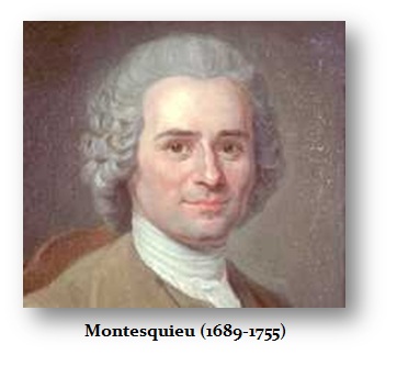
Government is no different from any private organization or individual. It will ALWAYS pursue its own self-interest. The examples of corruption are just so pervasive and this is due to the simple fact that there are no checks and balances. It was Charles-Louis de Secondat Montesquieu, baron de La Brede et de (1689-1755) who came up with the tripartite form of government separating the power of legislative, executive and judicial. Our problem today is that there is no separation of power for the government appoints the judges and thus they are not independent. Ben Franklin’s proposal was to adopt the Scottish system and private lawyers should nominal judges not politicians. We did not follow that system and as such we are incapable of achieving honest government for judges will always rule in the government’s favor – hence our 98.5% conviction rate. When does the government ever be more than 60% right about anything?
Montesquieu’s The Spirit of Laws was profound and demonstrates that he indeed acquainted himself with all the various schools of thought before him, yet he did not identify himself with any particular school. I too have indeed sought to follow this model myself. Of the many subjects covered, it was his coverage of three main topics that were the most influential in recasting the Age of Political Enlightenment leading to the climax of monarchy and the dawn of republicanism.
The most important of these subjects was his classification of governments that abandoned the traditional divisions of monarchy, aristocracy, and democracy. Montesquieu added to this primary division the republic that he conceived as being based upon virtue. He got that one wrong. Monarchy he saw as based upon honor, and despotism that he believed was based upon fear. Montesquieu saw this critical role of government-centered in how the policy was conducted. However, it was his brilliant concept that the only way to defeat tyranny was the Separation of Powers. This is why we have all our problems because the Judiciary is not on our side.
Here, Montesquieu divided government into legislative, executive, and judicial branches. Montesquieu wrote that “there is no liberty if the power of judging be not separated from the legislative and executive powers.” Id./at 181. Showing how this idea influenced the foundation of the United States, we find this very passage quoted in the Federalist No: 78, p523 (J. Cooke ed. 1961).
Montesquieu in his Grand Tour around Europe observed governments of all forms and saw how they had manipulated the laws to benefit themselves. The objective of his brilliant idea of the “Separation of Powers” was to prevent “the same monarch or senate” from “enact[ing] tyrannical laws” and from “execut[ing] them in a tyrannical manner.”
The judges of the times were merely agents of the state as most have become again today. They lacked independent concepts and for the times, Montesquieu believed that making judges independent would eliminate tyranny. But that tyranny still engulfed the judiciary for the executive selected the judges, and the legislature ‘anointed them. Once the legislative branch became career politicians and they were selected by parties, they defeated all the safeguards that Montesquieu envisioned. Thus, the system very much devolved precisely because of Machiavelli’s observation that history repeats because of the fact that the passions of man never change. Thus, modern incarnations of so-called democracies have devolved into the same tyrannical states that pursue the self-interests of government at the expense of the governed. Thus, precisely what Montesquieu saw and tried to prevent, has merely found the cracks in the sidewalks and the weeds of tyranny have once again sprouted to bath in the warm rays of the son Both Thomas Jefferson and Montesquieu saw the danger in judges.
Montesquieu’s Separation of Powers was perhaps the most influential chapter of his entire work located in book xi, chapter 6. This was penned in 1734 and was one of his first observations. His third doctrine was the idea that climate contributes to political influence. Montesquieu took care to point out that climate was but one of many factors that contributed to secondary causes that combined into what he called a general spirit within society. This climate factor combined with religion and law. Throughout history, the weather had been a primary influence behind migrations. As national states would rise and borders became enforced, the natural flows of migrations have been curtailed greatly and forced underground.
Montesquieu has brought understanding to the new Age of Political Enlightenment and others such a David Hume, said that his work would have the admiration of all ages. He was a man of honor. He was always modest and saw in his work a sense of comradeship insofar as he had collected the knowledge of the times and brought it together by simply seeing into the past and present and envisioning a collective understanding. He was even asked to write brief accounts on democracy and despotism for an encyclopedia, but he declined to state he had already had his say on those subjects.
Yet Montesquieu must be understood from his place and time in the evolution of the political economy. Everyone is influenced by their experience. The idea of becoming “worldly” by taking the Grand Tour, exposed the mind to different points of view. Yet, to comprehend how he arrived at his ideas, we must also place him in the context of the times.
There were three French philosophers on the political economy who were influenced by the events of the French King Louis XIV. These were Sebastien Le Prestre, Marechal de Vauban. (1633-1707), Pierre Le Pesant, signeur de Boisguilbert (1646-1714), and Charles-Irenee Castel, abbe de Saint-Pierre (1658-1743). From these three men, we have the beginnings of thinking about the fiscal management of the state. Vauban had advocated the abolishment of taxes and replacing them with a tithe. “while Vauban’s calculations were greatly exaggerated, he was effectively arguing for indirect taxation. His plan was put in place in 1718 in some regions but proved to be unworkable at this point in time resulting in its abandonment in 1722-1723.
Boisguilbert rejected the ideas of Vauban, yet agreed that there should be a single tax. He viewed the current scheme of collecting taxes as too corrupt. Joseph Schumpeter (1883-1950) took the position that the Physiocrats who ultimately influenced Adam Smith to counter with his Wealth of Nations in 1776, was the precursor to this entire line of thought. Boisguilbert also insisted upon the fact that since the aristocrats to a large extent were a privileged class that did not contribute to the tail le tax in France and thus he disagreed that there could be a single tax to replace all at the rates Vauban believed. Boisguilbert concluded it was better to have one single high tax than numerous small taxes. He argued it had to be equitably distributed, and fixed from the outset since the greatest resistance was too arbitrary justice and taxation. He argued for a land tax as used in England that was one-fifth of revenues, and in Holland it was one-third. He assumed that this tax could be collected with the least amount of coercion. There was serious resistance to taxation from the 14th Century onward. There was the Great Tax Revolt in England during 1381, the Cade rebellion of 1450 from which we have Shakespeare’s most famous line, “The first thing we do is kill all the lawyers” reflected the fact that the “lawyers” were the King’s who were prosecuting the tax evasions. Then there was the Cornwall revolt of 1497 running through to the agrarian revolts between 1628 and 1632. Tax rebellions were of three general types, pure taxation, revolts under the guise of religious Reformation that was really the confiscation of the monasteries in 1536, and the anti-seigneurial revolts that rejected the French “droit du seigneur” (right of the lord) to sleep the first night with the bride of anyone of his vassals. Often the bride could be redeemed by paying a fee to the feudal lord. These revolts occurred in 1549, 1607, and 1628-1632.
The Charles-Irénée Castel, abbé de Saint-Pierre perhaps had the most criticism for the taxation policy of Louis XIV. His work was perhaps the most castigated of the three, but his concept of fiscal reform (taille tarifee) proposed in 1717 described 17 sources of wealth that he envisioned people will voluntarily reveal their wealth. This scheme of direct taxation has today dominated tax collecting, yet it was soundly rejected by the very founders of the United States.
This was the context in which we must understand Montesquieu for he was an important figure in the thought that stood between Saint-Pierre and the Physiocrats. The Seven Years’ War (1756-1763) had cost France most of its foreign trade. Thus, the ideas of the Physiocrats that it was ONLY agriculture that provided the dynamic process of income generation clearly provide a contrast to the political ideas of Montesquieu. Even Thomas Jefferson and John Adams in America believed that it was agriculture that was the pillar of the economy and real wealth.