This is one of those unbelievable stories of how Climate Change is being taken to such an extreme, we will unleash a serious wave of deaths from both starvation and coming freezing temperatures without fuel. The Dutch government actually is planning to buy out and close as many as 3,000 farms in the country, which set off a major protest with growers stood against their insane leaders’ attempt to now cut the country’s nitrogen emissions by 50% according to the EU deadline of 2030. This is all in the face of a total lack of ANY scientific evidence that any of this has ever changed the climate which has historically always changed.
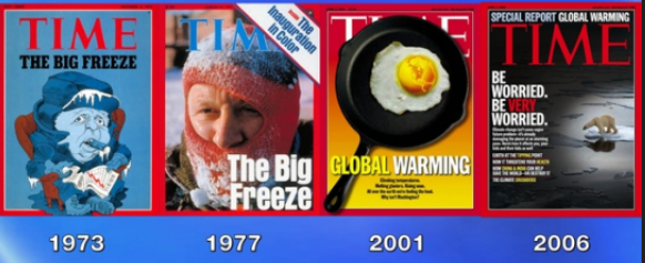
Nobody will address how all the so-called scientists swore we were headed into an ice age during the 1970s. Then Al Gore singled handedly turned it around and said no – it’s global warming. Then to cope with bouts of cold weather, they called it Climate Change so if it was hot or cold they would NEVER be wrong.
These Dutch politicians have now said that they plan to allocate some $25 billion to buy out farmers stripping them of their farms and livelihood. They want to now purchase between 2,000 and 3,000 Dutch farms stripping them of their property rights and the very freedom that is the distinction between a free society and an authoritarian dream of relentless and endless power.
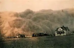
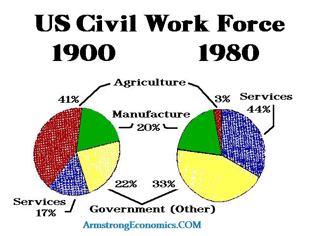
Where the Great Depression was made really “great” because there was also an environmental crisis known as the Dust Bowl, this time politicians want to create the same crisis all over again. Agriculture accounted for 40% of the Civil Workforce at the time in the USA. This is what drove unemployment to 25%. This time, we have politicians deliberately seeking to create a major food crisis all in the name of Climate Change.
It took the Dow Jones Industrials 26 years to ever retest the 1929 high. The Great Depression upended the civil workforce. It took World War II to create employment and to reduce the world population to enable everything to restart from square one. Ironically, it took the combustion engine to replace the labor in agriculture just to prevent massive starvation. Now that is what they want to destroy in addition to crops.
The Dutch plan to halve its nitrogen emissions by 2030 in accordance with European Union conservation rules, looks to be far more drastic. To meet that target, the government estimates that 11,200 farms will have to close, and 17,600 others will have to reduce their livestock numbers significantly.
What we must understand is that just back in the 1980s, the Netherlands was deeply concerned that they would be unable to feed its 17 million people. They were on a mission to produce twice as much food using half as many resources in a country that is just a bit bigger than the state of Maryland.
Netherlands’ policies to expand food production were accomplished and they became the world’s second-largest exporter of agricultural products by value behind the United States. Therefore, this sudden attack on farming is more than just a U-Turn. With the Netherlands as a major food producer is among the largest exporters of agricultural and food technology, this threatens food shortages spreading as a contagion.
The Netherlands produces 4 million cows, 13 million pigs, and 104 million chickens annually and is Europe’s biggest meat exporter. The EU is out to upend the economy of the Netherlands all for this fictional Climate Change theory. The Netherlands also provides vegetables to much of Western Europe. They have nearly 24,000 acres — almost twice the size of Manhattan — of crops grown in greenhouses that require less fertilizer and water. Dutch farms use only a half-gallon of water to grow about a pound of tomatoes, while the global average is more than 28 gallons.
What is taking place in the Netherlands is a very dark omen for humanity. The most efficient nation on earth for producing food is to be destroyed all for CO2. These people will not be satisfied until the death rate rises and civil unrest explodes as people turn hungry. As they say – even an honest man will become a thief when starving.
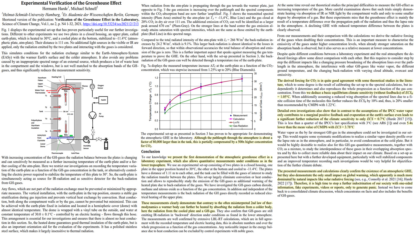
“…With no feedback effects at all, the change would be just 1 degree Celsius, climate scientists agree…” So, for ECS there is no positive feedback and global warming is just made from models, not reality. So, what did this article find the ECS to be? 0.7, or less than 1 degree celsius
2022 / November / 24 / Study Finds The CO2 Greenhouse Effect Is Real…But Dangerous Global Warming From Rising CO2 Is Not
German physicists claim to have experimentally demonstrated the greenhouse effect from greenhouse gases like CO2 and CH4 is a real phenomenon, but assess the climate sensitivity to a doubling of CO2 with feedbacks is “only ECS = 0.7°C … 5.4x lower than the mean value of CMIP6 with ECS = 3.78°C.”
“The derived forcing for CO2 is in quite good agreement with some theoretical studies in the literature, which to some degree is the result of calibrating the set-up to the spectral calculations, but independently it determines and also reproduces the whole progression as a function of the gas concentration. From this we deduce a basic equilibrium climate sensitivity (without feedbacks) of ECSB = 1.05°C. When additionally assuming a reduced wing absorption of the spectral lines due to a finite collision time of the molecules this further reduces the ECSB by 10% and, thus, is 20% smaller than recommended by CMIP6 with 1.22°C.”
“Detailed own investigations also show that in contrast to the assumptions of the IPCC water vapor only contributes to a marginal positive feedback and evaporation at the earth’s surface even leads to a significant further reduction of the climate sensitivity to only ECS = 0.7°C (Harde 2017 [15]). This is less than a quarter of the IPCC’s last specification with 3°C (see AR6 [1]) and even 5.4x lower than the mean value of CMIP6 with ECS = 3.78°C.”
“The presented measurements and calculations clearly confirm the existence of an atmospheric GHE, but they also demonstrate the only small impact on global warming, which apparently is much more dominated by natural impacts like solar radiative forcing (see, e.g., Connolly et al. 2021 [16]; Harde 2022 [17]). Therefore, it is high time to stop a further indoctrination of our society with one-sided information, fake experiments, videos or reports, only to generate panic.”
Posted originally on the conservative tree house on November 26, 2022 | Sundance
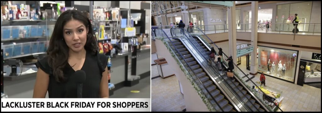
“Crowds? I see nothing. I’m surprised,” retail worker Jeremy Pritchett told FOX 2. “Normally, it’s wrapped all the way around the building. Today: no one.”
That’s the typical ground report from areas all over the country. No one, literally almost no one, is doing any holiday shopping and the traditional Black Friday rush to get deals and discounts just didn’t happen. Financial media are scratching their puzzlers, perplexed with furrowed brows.
Interestingly, almost every financial media outlet is using the same Retail Federation talking point about anticipating an 8% increase in holiday sales this year. Apparently, pretenses must be maintained. Meanwhile, news crews and camera crews are having a desperate time finding any holiday shopping to use as background footage for the claims that sales are strong.
“Look, over there. There’s a person buying something. Oh, wait, no, that’s just an employee dusting the empty cash register.” At a certain point, one would have to believe reality would run head-first into the mass delusional pretending. Maybe this holiday season will be it, maybe not.
Reuters – […] About 166 million people were planning to shop from Thursday’s Thanksgiving holiday through this coming “Cyber Monday,” according to the National Retail Federation, almost 8 million more than last year. But with sporadic rain in some parts of the country, stores were less busy than usual on Black Friday.
“Usually at this time of the year you struggle to find parking. This year, I haven’t had an issue getting a parking spot,” said Marshal Cohen, chief industry adviser of the NPD Group Inc.
“It’s a lot of social shopping, everybody is only looking to get what they need. There is no sense of urgency,” Cohen added, based on his store checks in New York, New Jersey, Maryland and Virginia.
At the American Dream mall in East Rutherford, New Jersey, there were no lines outside stores. A Toys ‘R’ Us employee was handing out flyers with a list of the Black Friday “door buster” promotions. (read more)
It’s almost Kafkaesque to see how the media are continuing to maintain economic pretenses, yet the reality of a completely collapsed consumer economy is physically staring them in the face.
(Bloomberg) – Activity Light at One San Francisco Mall (4:40 p.m.) – At the Stonestown mall in San Francisco, shoppers were few and far between. The Target and Zara stores were mostly empty, and there was no line for the mall’s Santa Claus. Uniqlo and Apple were the busiest locations, but they still weren’t crowded.
[…] Crowds were thin in the late morning at the Stamford Town Center mall. Kay Jeweler, empty. Safavieh, empty. Only a couple of people waited at the checkout line at Forever 21 and just a few were in line for a purchase at Barnes & Noble.
[…] At a Target store on Chicago’s North Side, the parking lot was barely half full at about 9 a.m. local time. Shoppers were greeted with $3 ornaments and discounted Christmas trees when entering, and the store seemed calm and relatively quiet.
[…] The Macy’s in Stamford, Connecticut, was neat and orderly — maybe a little too neat and orderly on a day associated with shopping chaos. The furniture section was nearly deserted, though there were more shoppers looking at shoes. (read more)
Key to me is “…Why is albedo change important? Because the IPCC theory of CO2 effect on GW assumes that the earth’s albedo has been constant (or not changed much) and CO2 (and other greenhouse gases) thru Radiative Forcing effect GW. The resent satellite data says this is not true...”
**From web sources: “,… in 1697 the Dutch explorer Willem de Vlamingh discovered black swans in Australia, upending the belief” (that all swans were white) “and transforming how we understand the natural world. …the phrase “black swan event” came to refer to an event that suddenly proves something that was previously thought to be impossible.”
(This paper is a continuation of my previous paper (1) with new data that reaches the conclusion that “CO2 is innocent but Clouds are Guilty” )
Part I: CO2 is Innocent but Clouds are Guilty.
Our tax dollars have been at work with NASA for the last 20+ years putting satellites in orbit to detect and measure the “CO2 effect” on Global Warming, GW. After 20 years, the CERES satellite (and others) has discovered that cloud reduction is the major effect on GW for those 20 years. Two papers published in 2021 reach this conclusion, Dübal and Vahrenholt, (2) and. Loeb, Gregory et al (3)
These new papers do claim some sign of CO2 effect (and other greenhouse gases) on GW; but the papers show the dominate effect on GW for those 20 years was the cloud reduction effect (albedo reduction- warming). This paper will show that the observed cloud reduction will account for all the GW in those 20 years and back to 1975, leaving no GW left over for the CO2 effect on GW. Cloud reduction is albedo reduction, (albedo: color of the earth, black, 0.0, is hot and white, 1.0, is cool). Another recently published paper (2021) by Goode et al (4) measuring earth’s albedo from moon shine also reports the same reduction in albedo as the CERES data of both Dübal and Loeb: one can only conclude that for 20 years of data the albedo change is real.
Why is albedo change important? Because the IPCC theory of CO2 effect on GW assumes that the earth’s albedo has been constant (or not changed much) and CO2 (and other greenhouse gases) thru Radiative Forcing effect GW. The resent satellite data says this is not true. Cloud cover changes are best documented at “Climate and Clouds”(5) with links to the data source at “Climate Explorer” (6). “Climate and Clouds” conclude that cloud change only accounts for 25% of the GW. This paper will show an improved analysis of “Climate and Clouds” data agrees with the CERES data of Dübal and Loeb that cloud reduction is accounting for most if not all of the warming over CERES’s 20 years. Figures 1 and 2 show a graphic representation of what Dübal and Loeb observed in the CERES data and what was expected from IPCC Radiative Forcing, RF, theory. The shape (slopes) of the observed and expected are entirely different but the increase in the missing energy (Earths Energy Imbalance, EEI) is the same. The missing energy, EEI, is used to warm the earth though the energy balance equation:
Energy In = Energy out + Accumulation (EEI) Eq 1.
If the accumulation (EEI) is positive the earth warms if negative the earth cools.
Cloud reduction effects GW by reducing the amount of highly reflective clouds covering the earth and letting in more sun light to warm the earth, Cloud Reduction Global Warming, CRGW.
Is Cloud Cover Changing?
Yes, Cloud cover changes with seasons, hemisphere, altitude, and over time. Figure 3 shows the satellite data for cloud cover for the whole earth vs time (about 36 years). The sine-al nature of the graph is a seasonal variation shown in Figure 4. Figure 5 shows the hemispherical differences in cloud cover. The hemispherical and seasonal variation in cloud cover is related to the tilt of the axis (23.5’ north) of the rotating earth favoring the northern hemisphere with more sun light and the larger land mass of the northern hemisphere (Total land mass of the earth is 39% of that 68% is in the northern hemisphere and 32% in the southern hemisphere). It will be later shown that, these variables change the relative humidity which are responsible for the sine-al nature of the cloud cover.
For global warming the change in cloud cover over years is the variable of interest. The whole earth’s cloud cover (least squares fit from “climate Explorer” data) vs time in Figure 5 show a 0.075 % cloud change/year. Note the high degree of variability in Figure 5, some of this variability is theorized by Dübal and Vahrenholt, (2) to be due to the AMO (Atlantic Multi-decadal Oscillation) in the northern hemisphere which is a natural oscillation in ocean temperature with a period of 60-80 year and an amplitude of +/-0.2’C. (a period up swing of the AMO occurred in the 1985 to 2020 range and could be related to the peak in 1997 and flatting after 2000 in Figure 5). There is also a periodic swing in ocean temperature in the Pacific, PDO (Pacific Decadal Oscillation) in the southern hemisphere (commonly known as El Nino) with a period similar to the AMO of 60-80 years and a smaller amplitude of about +/- 0.1’C. The amplitude of each of these oscillations is smaller than the overall change in temperature and are not increasing over time. The periods of AMO and PDO seem to be opposite and may have some canceling effect on a global basis. Further explanation of these oscillations are best left up to the experts, in this paper, they are just potential noise makers to the cloud reduction data and emphasize the importance of long term data (the 36 years of cloud data may not be enough). The 36 year cloud cover decrease of 0.75% per decade will be used in calculations of cloud effected energy changes.
One more variable that needs to be considered in temperature vs cloud cover: Time delay, when clouds decrease part of the sun light fall on land and the rest on water. Land gives its energy back to the atmosphere quickly (over days), over water the energy is stored for years. Some have calculated up to 80 years for a step change in energy into the ocean to come the full equilibrium (20) and (21). This time delay is another reason to use long term slope date to analyze cloud change data. Our current 36 years of cloud data is probably not enough to complete our understanding of cloud cover and GW. It should be noted that surface sea temperature, SST, follows air temperature closely, questioning the significance of the time delay.
Cloud Cover Change vs Temperature Change
An empirical way to relating cloud cover to temperature is to divide the least squares fits of the temperature change by cloud reduction change over the 36 years of data. Figure 6 shows both least squares fits with the result of the ratio being -0.27 ‘C/% cloud change. “Climate and Clouds”(5) scatter plot of monthly temperature and cloud cover of the same data showed a least squares fit of -0.066 ‘C/% cloud cover; further emphasizing the need to use long term data to better understand cloud and temperature relationships. [“Climate4You” (5) web site is a product of ISCCP: (“Since July 1983, ongoing variations in the global cloud cover have been monitored by The International Sattelite Cloud Climatology Project (ISCCP). This project was established as part of the World Climate Research Program (WCRP) to collect weather satellite radiance measurements …”.) ] The “Climate4You” ratio only accounts for 25% of the observed ( 0.4 ‘C) 20 years of CERES data. Figure 6’s -0.27 ‘C/% cloud cover accounts for all of the observed temperature change.
Although significant, this ratio of temperature and cloud cover change is not the best way to prove the significance of cloud cover change. The CERES data is energy data, cloud cover change must be related to CERES energy observations. Table 1 converts the observed albedo from Dübal (2) to energy change (Short Wave, SW, in – SW out at Top Of the Atmosphere, TOA) and is shown in Figure 7. Table 2 uses the cloud cover from “Climate Explorer” least squares fit in Figure 5 and the Dübal “cloudy area” and “clear sky” albedo data to calculate the energy to the earth, the results are shown in Figure 7. The comparison of the two calculation is close enough to claim: the cloud cover change can account for all the temperate change and energy change observed in the 20 years of CERES data.
(Note: in Table 2 Dübal observed a small (but significant) change in the “Clear sky” albedo (decreasing). The “clear sky” albedo is the ground (land + ocean) color of the earth. Holding the cloud change constant shows this small albedo “clear sky” albedo change can account for 15% of the observed energy in the 20 years of CERES data. Cloud change is the major effect on GW)
Why a 1975 Zero for the CERES data?
Many researchers have noticed that the temperature vs time curve since 1880 is not linear, the data better fits an exponential or 2ed degree polynomial. One can also use two linear equations to fit the data, as shown in Figure 8. The intersection of the two lines is about 1975. The lower line has a poor R^2 and accounts for about 25% of the temperature rise. The second line has a much higher R^2 and account for about 75% of the rise. We have a lot more data in the 1975 to 2020 range so we should have a better chance of explaining GW in that range.
The extrapolated data and 20 years of CERES data in Figure 7 are overlayed on Figure 8 – a good fit. Table 1 and 2 show that albedo change and cloud cover change from 2001 to 2020 and from 1975 to 2020 can account for all the temperature change in each period. CRGW is a valid theory and should be considered by the IPCC.
How did this significant change in scientific understanding occur?
The 2021 papers by Dübal, Loeb, and Goode (and some others) verifying a 20-year change in the earth’s albedo is like a scientific “Black Swan Event” **. The earth’s albedo and cloud cover changing over time was totally unexpected (“all swans are white”). Albedo change being caused by cloud cover reduction was also unexpected prior to 2021. All previous methods of measuring albedo and cloud cover showed no change. There were modelers like Walcek (7) who predicted that if cloud cover changed it could be as significant as the predicted greenhouse gas GW. The effect of greenhouse gases could be measured in the lower atmosphere and was known to be saturated (all ready enough, more would not change GW). The IPCC needed a theory that could account for the observed GW with constant albedo and cloud cover – That theory was Radiative Forcing, RF. RF is a plausible theory but needed to be measured in the upper atmosphere. NASA sent up satellites to measure the RF (along with many other thing). NASA’s satellites changed the method of measurement and the accuracy and with 20 years of data could see the small differences in big numbers needed. And here we are today trying to get the IPCC to look at the “Black Swan”.
Models are also a contributing factor. There are climate models that use scientific laws and math (like IPCC’s Global Circulation Models, GMC’s) to calculate GW and like the simple models in Tables 1 and 2. Other models use statistical multi variable analysis, SMVA, to predict GW. The use of SMVAs can lead to some inaccurate conclusions. Good multi variable analysis design an experimental grid to avoid confounded variables, it is difficult to do this with natural data. In the case of GW, Cloud cover, relative humidity, albedo, specific humidity, CO2, and other GHGs are all confounded with the earth’s temperature change. Variables with high accuracy in measurement and definite trends, like CO2, will dominate in SMVAs, even if they have nothing to do with GW. Variables with poor measurement but good trends (but are the real effect on GW), like cloud cover, will show significance in SMVA’s but not eliminate variables like CO2. Results from a SMVA are not a proof. The IPCC’s SMVA model has a “dog’s breakfast” of variables in its AR6 model of GW, in AR6 cloud cover is not listed, but cloud density is, as a global cooling variable. In all fairness, AR6 was issued in 2021 the same time at the Dübal and Loeb papers – they may be looking at them now.
What is causing the reduction in Cloud Cover?
Cloud cover is part of the earth’s water cycle: the sun’s energy evaporates water, the water vapor makes clouds, and clouds make rain. We are looking for a disturbance in this natural cycle
The water cycle variables that are a signature of cloud cover change:
Long term Signature of Cloud Cover Reduction
1. Temperature increasing (less cloud cover – more sun’s energy to the earth, see Figure 8)
2. Specific Humidity increasing (a result of higher temperature and more evaporation the atmosphere can holding more water, see Figure 9)
3. Rain fall increasing (more energy in evaporates more water, (if not used for specific humidity increase) the water got to come back down. A statistical increase has been observed but very low R^2 – graph not shown)
4. Relative humidity decreasing (main effect on less clouds which leads to the other atmospheric variables, see Figure 10 and Figure 12)
This is a unique set of atmospheric variables only associated with cloud reduction.
Relative Humidity and Cloud Reduction
Relative Humidity, RH, has for a long time been associated with clouds. Figure 11 show a page from Walcek (7) 1995 report which show the decline in cloud cover vs RH observed by him and other researchers. The trend is there but the noise level is high. Satellites have improved the observation. “Climate and Clouds”(5) shows that different types of clouds form at different levels and that their formation may be triggered by things other than RH. Particulates (aerosols) and cosmic rays have been documented as sources of cloud formation. Even at 100% RH air can become super saturated and not form clouds. All the variables are probably responsible for the noise in Figure 11; but the general trend is RH. Of the three categories of clouds mentioned in “Climate and Clouds”(5) The only one that showed a significant reduction over time was the “Low Level” clouds, cumulus clouds. Cumulus clouds are about 28% of the total 63% cloud cover of the earth. The other clouds only create noise in the total cloud cover data. In “International Satellite Cloud Climatology Project” (8) Cumulus clouds were the only cloud types of nine types of clouds that showed reduction over time, see Figure 13.
Cumulus clouds are the ones most affected by changes in RH from the earth surface in that they are the ones in contact with low RH air first. The data in Figures 4, 5, and 6 contain all cloud types, but the yearly oscillations are related to similar changes in “low level” clouds and RH with time. These oscillations can be used to make a plot of RH vs cloud cover for all the monthly data in Figure 3 to produce the scatter plot in Figure 14. The data points used in the model in Table 2 are in red. Note that these points are within the range of the natural variation of the data.
The data in Figure 14 can be broken down into more detail to show the difference in monthly profiles between Northern Hemisphere (NH), Sothern Hemisphere and Time shift, see Figure 15. Note the expected difference in shape of the NH and SH plots, in some months they cancel each other and in other complement each other giving the overall results in Figure 4. In Figure 15 the cloud change in the Southern Hemisphere is greater than in the NH and the Sothern Hemisphere somewhat dominates the overall cloud change. All the plots shift with time as the relativity humidity decreases.
The Missing Energy in the Earth’s EEI, Eq 1
The missing energy in Figure 1 can go to the following paces see Table 7 for details:
· Warm the dry air in the atmosphere. (Small but significant)
· increase the moisture in the atmosphere and is the major use of EEI energy (specific humidity, Figure 9 and Table 7)
· increase precipitation (small)
· warm the land (small)
· warm the oceans (small, with a time delay)
The bulk of the energy goes into water increase in the atmosphere.
The Dübal and Loeb data can be used to estimate a degrees Celsius / W/m^2 energy change from short wave energy change of 0.3 ‘C per W/m^2.
Conclusion So Far
There is no doubt that albedo of the earth has changed over the last 20 years (and longer) and that this albedo change is due to cloud cover reduction (and a little “clear sky” albedo change). The cloud cover reduction is related to relative humidity reduction. Relative humidity reduction has been going since 1948 (possible longer). The cloud reduction data (starting in 1984) has been extrapolated back to 1975. Cloud reduction has been around for a while. CO2 is innocent but cloud cover reduction is guilty. Leaving the question:
Part II. Cloud reduction effects GW but ‘Man” is still Guilty.
What is affecting the Relative Humidity reduction?
The observation of relative humidity decreasing (see Figure 10 and 12) has long puzzled climate scientist. Most climate models show specific humidity increasing (which it does) and relative humidity staying the same. Papers by J. Taylor (9) and K. Willett (10) both express that increasing SH and decreasing RH is inconsistent with CO2 (and other GHGs) effect on GW with no explanation as to why. This paper gives an explanation.
The theory Cloud Reduction Global Warming, CRGW, has been proposed (1): “Man’s changes to land use effects the production of low relative humidity, RH, hot air rising to where clouds could be prevented (or destroyed) thus reducing the albedo of the earth”. This reduction in RH is triggered by a localized reduction (not an increase) in Specific Humidity, SH. This reduction in SH is occurring only on land and is over whelmed by the increase in SH from evaporation (from oceans) due to the lower Cloud Cover, CC. The relationship between SH, RH, and CC has a very large natural amplification factor.
The key to CRGW is water evaporation, transpiration, or run off on land. When water (rain or snow) falls on the land it can soak into the ground or run off. On land when ground water is not available the relative humidity drops. In any man-made structure that covers the virgin land prevents water from soaking in and increases the Run Off, RO. When water is not available for Evaporation or Transpiration, ET, the relative humidity drops. (ET is sometimes called Evapotranspiration.) Some man-made effects (anthropological global warming, AGW) sources of relative humidity reduction are:
· Cities
· Any man-made structure that covers the natural ground
· Forest to farm land or pasture land
· Pumping water from aquifers
· Forest fire land change.
· Flood water prevention like dams and levees.
· I am sure there are others
Figure 13 shows a very good depiction of the water cycle on earth. Of interest to the CRGW theory is the land part showing rain fall, evaporation, transpiration, and run off, RO. Note that the rain fall is the sum of the evaporation, transpiration, and run off. The evaporation is from water that has soaked in to the ground. Transpiration is water that evaporates through any kind of vegetation, trees have the highest. In the land water balance if any one of these changes it effects the others. An example: if the virgin land is cover with asphalt or concrete that prevents water from soaking in to the ground where vegetation can evaporate the water then the water will run off and the ET will decrease. Another example: If a forest is replaced with farm land or pasture the forest’s ground cover no longer holds water. The crops that replaced the forest are only growing part of the year and do not have the leaf area as the tree’s many leaves and deep roots, all this decrease the ET. A decreasing ET increases the Run Off, RO. This change in ET sets in motion a series of events on land where ET has been restricted:
1. RO increase making ET decrease, this lowers the local specific humidity, SH (SH % change is another measure of ET % change). The land-based change in RH vs SH is shown in Figure 17, showing a 21:1 ratio. Table 6 adjusts this relationship for the whole earth, down to 6.2 : 1.
2. As the ET decrease, this creates low relativity humidity, RH, air with SH change equal to the change in -RO(%) and +ET(%). In this step the RH and SH both decease. Note at this point the local SH decrease is opposite the observed global increase.
3. As the low humidity air rises (to where clouds form) the relative humidity, RH, drops even further. Another amplification occurs, 4.58 : 1, Figure 10 slope ratios, SH 850mb/SH 1000 mb..
4. The low RH air spreads around the world (mainly off shore) and reduces cloud cover, CC, this process has the smallest of amplifications, 1.2 : 1, In Table 3 dif. CC/dif. RH 850mb.
5. Less CC lets more sun’s radiation in. Table 6 shows the product of all these amplifications to be 34:1 change in CC per change in SH through this series steps of RH changes.
6. More radiation warms all earth’s surfaces. On land more radiation makes the relative humidity even lower.
7. On the oceans the radiation increase warms the water and evaporates more water increasing the global specific humidity, SH. This increase is greater than the local land decrease in SH resulting in the observed increase in SH.
8. The result is the rising SH and dropping RH. The localized short term ET effects are not seen on a yearly basis. (Figure 1 in (1) shows city examples)
This list of events is better seen by Figure 18. Figure 18 is a blowup of a small part of a Psychrometric Chart, PC, that best describes the earth’s atmosphere. Table 3 is a list of all the least squares fit data (from Figures in this paper) that are used to show the CRGW theory is valid. Table 4 puts this data in to a “Free on Line PC “, (11) to test the fit of actual 1975 and 2020 data to calculated data from (11). The low difference in Table 4 shows a good fit. The “Free on-Line Psychrometric Chart” is a good calculator for atmospheric changes.
Estimating ET changes
ET is somewhat like cloud cover; It varies a lot from season to season, hemisphere to hemisphere, and with land mass. What we are looking for is small changes over time (smaller than the cloud changes – remember the amplification factor).
The easiest to explain change is ET is Cities or better known as Urban Heat Islands, UHI’s, UHI’s got their reputation as heat island due the higher temperature from lower albedo and lower water, SH. The effect on RH was not appreciated until this paper and the previous paper. UHI’s temperature, SH, and RH behavior is predicted by a PC in (1). The UHI’s change in ET is related to run off, RO, increasing, (if precipitation cannot soak into the ground, it runs off and is not available for ET). The earths land surface is covered by 3% urban development, and about half of the population lives there. The structure that the other half lives in also covers the earth with roof tops and drive ways that do not allow water to soak in and also increasing the RO. That gives 6% of the earths land mass having an effect on the RO and ET. The amount of RO change for UHI’s is hard to find data on but a lab experiment by U of Colorado College of Eng. (16) shows a 20%-30% increase in RO. Table 5 uses 6% of land coverage and 25% change in RO.
RO changes from land use changes are also hard to find. One of the best reports on land change from satellite data is by Winkler K. et al (16) with data claiming 32% of the land has been changed by man. Most changes were virgin land to crop or pasture, some was reclaimed pasture back to forest. Run Off in the Mississippi river basin computer simulations is documented by Tracy E. et al (18) showing a range of RO from +45% to -25% depending on what was being converted to what. McMenemie C. (19) paper singles out damming rivers and putting in levies to prevent flooding to have a significant effect on ET.
Depleting aquifers effects the water table to lower and reduce the water available for ET thus making more low RH air. Most ground water from aquifers is recycled back as recharge yet the earths aquifers are decreasing. According to the web “Typically, 10 to 20 percent of the precipitation that falls to the Earth enters water-bearing strata, which are known as aquifers.” The 10 to 20 percent may not be shown accurately in Figure 16 (it is possible it is part of the RO). No data could be found on the total earth effect of lower ground water on ET or RH – it should not be insignificant.
The study of ET is a relatively new monitoring field. Most paper on the subject at less than 10 years of data and the emphasis of the studies are usually water management or carbon sequestration very little atmospheric specific humidity or relative humidity data is reported. Some satellite data is just started (< 5 yrs). The results of current papers are not consistent. Some examples: BaolinXue et al (23) shows no change in 20 years from rural land-based stations in the FLUXNET dataset (as expected on non-land change areas and not urban data). Samuel Zipper et al (24) have a short (4 year) but very good study of Madison Wi USA UHI showing a 5%/year drop in ET in a 20 km^2 radius of Madison central (not a statistically significant time). Qingzhou Zheng et al (25) study of a whole water shed (110 km^2) in China that included forest, crop-land, baron land, rivers, wetlands, and cities showed a 7% reduction in ET in 13 years, with the main factor being urban expansion.
This paper will use estimates of land change RO that is in the range of the publish data as shown in Table 5, 30% land coverage and 10% RO change. The man-made structure RO (% of global) added to the RO (% of global) totals 1.3% (% of global) (or -ET% change). It is not the intension of this paper to be an expert on ET change only to show this change can account for all the GW at 1.3% (% of global) from 1975 to 2020.
Explanation of Figure 18 model of the Path taken by the 1975 to 2020 climate change.
Figure 18 is a very blown-up Psychrometric Chart showing the chain of effects (the path) to the final 1975 to 2020 observed climate change. The parallel energy (all atmospheric changes occur at constant energy or a shift in energy) lines are established from the observed 1975 and 2020 data of 33.54 kJ/kg(da) for 1975 and 35.72 kJ/kg(da) 2020. The starting point is the 1975 SH at 7.7 g/kg(da) on the 33.54 kj/kg(da) energy line. The ET change of -1.3% (above) is about -0.1 SH change shown at 7.6 g/kg(da) in the Figure 18 model. The 34:1 natural amplification of this SH change (through RH changes) results in the CC reduction (see Table 6) and the energy shift to the 2020 parallel energy line of 35.72 kJ/kg(da). The hot low RH air evaporates water (increase SH), cools the air and increases the RH to the 2020 end point. This technique of tracing an energy, temp, SH, and RH path is standard in engineering heating cooling design.
Conclusions on the Effects of Relative Humidity Reduction Over Time.
The high sensitivity of SH to RH to CC is a natural phenomenon. The CC variation in Figure 3 is natural (effected by tilt of the earth and larger land mass in the NH) tracked by RH and SH. These natural CC variations are greater than the CC reduction observed. The natural laws used in the Psychrometric Chart show the high sensitivity of RH to SH. Using an estimate of RO in the range of publish data shows a good fit to observed data. This explains the rising SH and decreasing RH.
The modelers of the 1990’s where on the right track – if clouds change the results would be as strong as the that expected from CO2. The IPCC should evaluate CRGW theory.
Figures and Tables
Figure 1, Graph of what Dübal and Loeb both observed (all energy is TOA).
Figure 2, Graph of what was expected in the 20 years of CERES data based on IPCC Radiative Forcing theory of greenhouse gases.
Figure 3, Cloud Cover over 45 years from “Climate and Clouds”(5) shows the seasonal and time reduction in global cloud cover.
Figure 4, Breaking down Figure 3 data by average/month shows a low in cloud cover in the summer month (NH) and a high in the winter months (NH) due to larger land mass and axis tilt in NH vs SH. Later Figures shows the hemispherical contribution to this Figure. Relative Humidity from “NOAA Physical Science Laboratory” was added to show the good fit.
Figure 5, From “Climate Explorer” (6). Showing the difference in hemispherical cloud cover due to northern hemisphere getting more sun than the southern hemisphere. All data is 3 year smoothed.
Figure 6, Combine satellite data for cloud cover and temperature on graph to get a -0.27 ‘C/% cloud cover ratio. All data is 3 year smoothed.
Figure 7, Observed from Albedo change and Calculated from Cloud Cover Change in the 20 years of CERES data. A very good match.
Table 1, Albedo Change Model from Dubal (2) data. Extrapolation to 1975.
Table 2, Calculated energy change using Cloud change data from “Climate Explorer” and Dübal data for “cloudy area” albedo and “clear sky” albedo.
Figure 8, Dividing Temperature vs Time into two parts and overlaying SW energy change from albedo and clouds. Good fit to 1975 to 2020 data. All data is 3 year smoothed.
Figure 8a, 1975 to 2020 part of Figure 8 with actual data, least squares fit used for calculation. All data is 3 year smoothed
Figure 9, Specific Humidity vs time, note the break point at 1975. All data is 3 year smoothed
Figure 10, Relative Humidity vs year for ground level and cloud level. Cloud level RH much more sensitive than ground level RH. Cloud level RH will be used.
Figure 11 Copy of page from Walcek (7) showing the 1995 correlation of clouds and RH.
Figure 12, Relative Humidity at 850 mb (cloud level) vs time. Note difference between NH and SH. Good correlation, RH has been changing for a long time.
Figure 13, “International Satellite Cloud Climatology Project” (8) of just Cumulus cloud cover over 27 years. Cumulus clouds were the only ones changing of 9 cloud types studied.
Figure 14, Scatter plot of all the monthly data in Figure 3 and 12 to obtain a correlation between RH and Cloud Cover. Red dots are data used in the Model in Table 2.
Figure 15, Monthly plot of cloud cover in both northern hemisphere and southern hemisphere.
Figure 16. A good diagram of the water cycle on earth from Trenberth et al (13).
Figure 17. Relative Humidity vs Specific Humidity the average slopes, 21, will be used in Table 6 to show the natural change in RH/SH.
Figure 18, Path of energy and Specific Humidity, SH, change that accounts for the observed 1975 to 2020 change.
6. Climate Explorer web site Climate Explorer: Select a monthly field (knmi.nl) go to “Cloud Cover” click “EUMETSAT CM-SAF 0.25° cloud fraction” click “select field” at top of page on next page enter latitude (-90 to 90) and longitude (-180 to 180) for whole earth.
20.“How to Heat a Planet? Impact of Anthropogenic Landscapes on Earth’s Albedo and Temperature Mark Healey Lindfield”, Web file: www.scirp.org/pdf/ijg_2020062914563820.pdf
Posted originally on the conservative tree house on November 24, 2022 | sundance
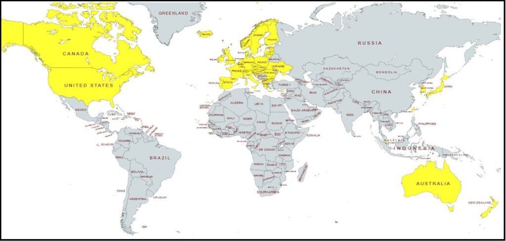
We have been closely monitoring the signs of a global cleaving around the energy sector taking place. Essentially, western governments’ following the “Build Back Better” climate change agenda which stops using coal, oil and gas to power their economic engine, while the rest of the growing economic world continues using the more efficient and traditional forms of energy to power their economies.
Within the BBB western group (identified on map in yellow), the logical consequences are increased living costs for those who live in the BBB zone, and increased prices for goods manufactured in the BBB zone. In the zone where traditional low-cost energy resources continue to be developed (grey on map), we would expect to see a lower cost of living and lower costs to create goods. Two divergent economic zones based on two different energy systems.
This potential outcome just seemed to track with the logical conclusion. The yellow zone also represented by the World Economic Forum, and the gray zone also represented by an expanding BRICS alliance. Against this predictable backdrop we have been watching various events unfold, some obvious and some less so.
Today, we get an obvious example:
NEW DELHI, Nov 24 (Reuters) – Fiat parent Stellantis (STLA.MI) has concluded it can’t currently make affordable electric vehicles (EVs) in Europe and is looking at lower-cost manufacturing in markets such as India, its chief executive told reporters.
If India, with its low-cost supplier base, is able to meet the company’s quality and cost targets by the end of 2023, it could open the door to exporting EVs to other markets, said Carlos Tavares, CEO of the group whose brands also include Peugeot and Chrysler.
“So far, Europe is unable to make affordable EVs. So the big opportunity for India would be to be able to sell EV compact cars at an affordable price, protecting profitability,” Tavares told reporters at a media roundtable in India late on Wednesday.
Stellantis is investing heavily in EVs and plans to produce dozens in the coming decade, but Tavares warned last month that affordable battery EVs were between five and six years away.
On his first visit to India since taking over as Stellantis CEO, he said the company was still working out a plan regarding EV exports from the country and had not yet taken any decisions. (read more)
.
Normally we would expect to see market forces determining the ultimate economic outcome. Historically, we would not expect government policy that puts their nation at an economic disadvantage. However, in this WEF controlled new western economic normal we see multinational corporations’ making decisions and government leaders creating policy to support the corporations.
There is money to be made by corporations within the climate change agenda, and there is money to be made by producing goods with low-cost wages and cheap materials. Eventually, if you keep following this to its natural conclusion, the entire yellow zone becomes a service driven economy.
Multinational corporations in control of government are what the BRICS assembly foresaw when they first assembled during the Obama administration. When multinational corporations run the policy of western government, there is going to be a problem. Brazil, Russia, India, China and South Africa (BRICS) saw President Obama sub-contracting, actually giving away, U.S. trade policy.
In the bigger picture, the BRICS assembly are essentially leaders who do not want corporations and multinational banks running their government. BRICS leaders want their government running their government; and yes, that means whatever form of government that exists in their nation, even if it is communist.
BRICS leaders are aligned as anti-corporatist. That doesn’t necessarily make those government leaders better stewards, it simply means they want to make the decisions, and they do not want corporations to become more powerful than they are. As a result, if you really boil it down to the common denominator, what you find is the BRICS group are the opposing element to the World Economic Forum assembly.
The BRICS team intend to create an alternative option for all the other nations. An alternative to the current western trade and financial platforms operated on the use of the dollar as a currency. Perhaps many nations will use both financial mechanisms depending on their need.
The objective of the BRICS group is simply to present an alternative trade mechanism that permits them to conduct business regardless of the opinion of the multinational corporations in the ‘western alliance.’
Again, if you follow the Build Back Better agenda to its natural conclusion, the entire yellow zone becomes a service driven economy.
The article has links to both his presentation and to the slides. It has hard to see the slides in the presentation.
By Andy May
Dr. Willie Soon gave a great presentation at the Federalist Society Chapter at the University of Chicago Law School on November 18, 2022. The title of his talk is:
“The Corruption of Environmental Rulemakings at the US EPA: Climate Change, Mercury Emissions, and Air Quality”Willie Soon, 2022
Dr. Soon’s slide deck is excellent reading and he has kindly sent it to me, you can download it here. If you prefer to watch his presentation, you can do so on YouTube here. Soon’s presentation starts about 22:46 minutes into the video.
Soon’s key points:
Given the daily, seasonal, and annual range of temperatures around the Earth, the warming of the past 125 years is trivial.
Except for ENSO variations, the global average surface temperature has hardly changed in over 20 years.
Willie humorously dismantles the article on him in Wikipedia and Gavin Schmidt’s criticisms, these slides are worth the download!
Willie plugs the article he wrote with 23 co-authors entitled: “How much has the Sun influenced Northern Hemisphere Temperature trends? An ongoing debate.” Seriously, this is probably the best climate change article written in the last thirty years in my humble opinion, I refer to it all the time. The bibliography alone is worth it. If you never read another climate article in your life, you should read this one. Download it here.
He destroys the Mercury pollution nonsense that is permeating the media. Possible spoiler, don’t drink Coca Cola!
Is it air pollution or weather?
Finally, President Dwight Eisenhower’s warning about “public policy [becoming] the captive of a scientific-technological elite” was correct:
“It is time to face a hard truth: the seventy-year experiment to federalize the sciences has been a failure. The task now is to prevent the Big Science cartel from further dehumanizing society and delegitimizing science. There is a second hard truth: the necessary reforms will not come from within. Rather, it will be the people and their representatives that will have to impose them. To restore science to its rightful and valuable place, break up the Big Science cartel.”(J. Scott Turner, Professor of Biology (emeritus), SUNY College of Environmental Science and Forestry, December 10, 2021)
The United Nations proposed a new method to funnel money out of developed nations during the COP27 meeting – climate reparations. The United Nations is still negotiating who will pay what, but rest assured, the US will likely pay the most. President Biden fully supports the idea in addition to the $1 billion he was granted last year to fight third-world climate change. China is considered a developing nation, according to the UN, and will not contribute to the global fund despite being the largest polluter in the world.
The ”loss and damage fund,” as it is known, would take money from rich nations in an attempt to change the weather and prevent natural disasters that would take place even if humans did not inhabit Earth. The funds would primarily be sent to countries in Latin America, Africa, and Asia. Fears are sparking that this would act as a confession, and developing nations could sue developed nations and/or businesses for additional compensation.
Trump attempted to get America out of the Paris Accord. The GOP-majority House will likely not vote in favor of this measure. Our best bet is to hope they kick the can down the road until Biden’s term has ended.
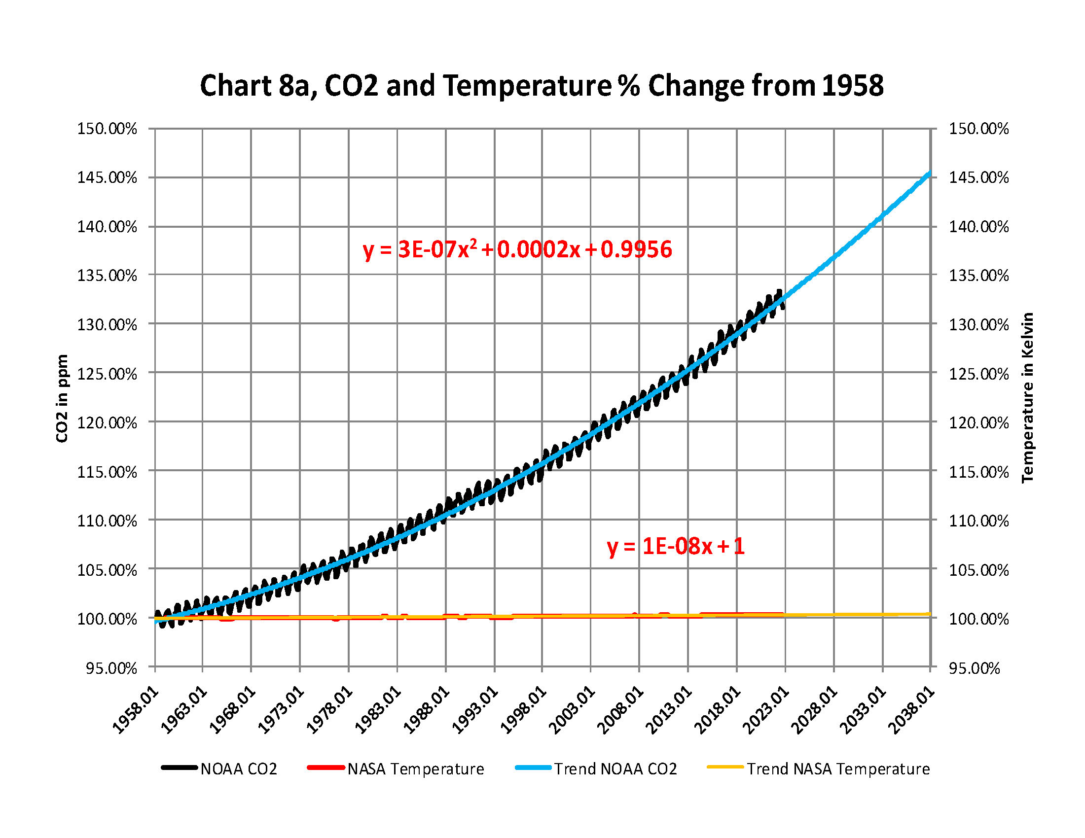
From the attached report on climate change for October 2022Data we have the two charts showing how much the global temperature has actually gone up since we started to measure CO2 in the atmosphere in 1958? To show this graphically Chart 8a was constructed by plotting CO2 as a percent increase from when it was first measured in 1958, the Black plot, the scale is on the left and it shows CO2 going up by about 32.4% from 1958 to October of 2022. That is a very large change as anyone would have to agree. Now how about temperature, well when we look at the percentage change in temperature also from 1958, using Kelvin (which does measure the change in heat), we find that the changes in global temperature (heat) is almost un-measurable at less than .4%.
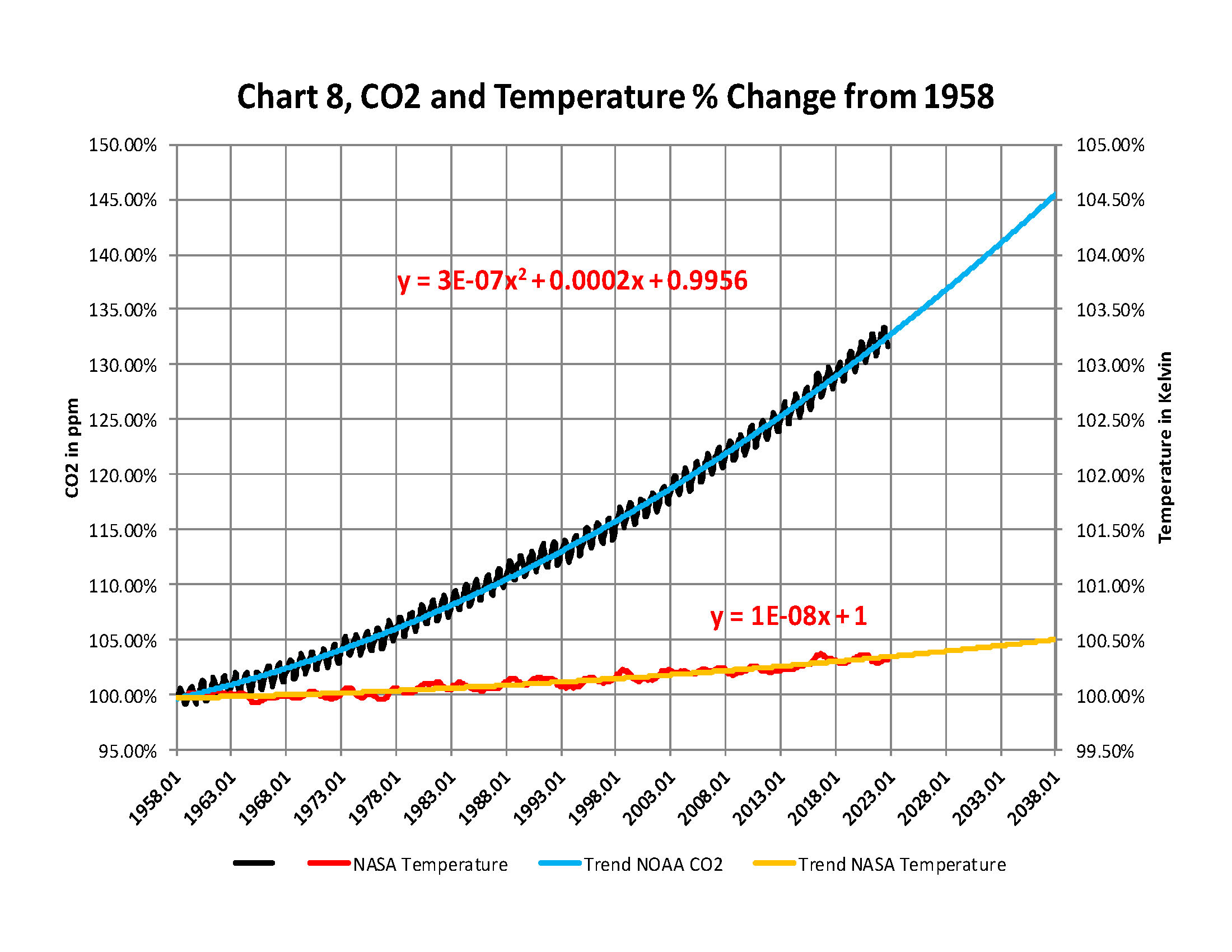
As you see the increase in energy, heat, is not visually observably in this chart hence the need for another Chart 8 to show the minuscule increase in thermal energy shown by NASA in relationship to the change in CO2 Shown in the next Chart using a different scale.
This is Chart 8 which is the same as Chart 8a except for the scales. The scale on the right side had to be expanded 10 times (the range is 50 % on the left and 5% on the right) to be able to see the plot in the same chart in any detail. The red plot, starting in 1958, shows that the thermal energy in the earth’s atmosphere increased by .40%; while CO2 has increased by 32.4% which is 80 times that of the increase in temperature. So is there really a meaningful link between them that would give as a major problem?
Based to these trends, determined by excel not me, in 2028 CO2 will be 428 ppm and temperatures will be a bit over 15.0o Celsius and in 2038 CO2 will be 458 ppm and temperatures will be 15.6O Celsius.
The NOAA and NASA numbers tell us the True story of the
Changes in the planets Atmosphere
The full 40 page report explains how these charts were developed .
Rules for thee, but not for me! The elites rushed to Egypt for the 2022 United Nations Climate Change Conference, commonly known as COP27, to discuss how the plebians can suffer under the excuse of climate change. Sharm el-Sheikh’s airport was renovated to accommodate these climate change pioneers who arrived in over 400 private jets.
A private jet can emit two tons of carbon dioxide in one hour, which creates 14X the pollution PER PASSENGER compared to a commercial aircraft. Around 33,000 people registered for the COP27 event. From the event’s website:
“The hope is that COP27 will be the turning point where the world came together and demonstrated the requisite political will to take on the climate challenge through concerted, collaborative and impactful action. Where agreements and pledges were translated to projects and programs, where the world showed that we are serious in working together and in rising to the occasion, where climate change seized to be a zero sum equation and there is no more ” us and them” but one international community working for the common good of our shared planet and humanity.”
“We must unite to limit global warming to well below 2c and work hard to keep the 1.5 c target alive. This requires bold and immediate actions and raising ambition from all parties in particular those who are in a position to do so and those who can and do lead by example,” the website also notes. They are requesting $100 billion USD annually to “build more trust between developed and developing countries.”
When big government comes knocking on your door this winter for running the thermostat too high, remember how these elites “fought” for us. They laugh at us from their ivory towers. Climate change initiatives have nothing to do with protecting the environment; they are intended to protect the elite’s wealth and power.
I have created this site to help people have fun in the kitchen. I write about enjoying life both in and out of my kitchen. Life is short! Make the most of it and enjoy!
This is a library of News Events not reported by the Main Stream Media documenting & connecting the dots on How the Obama Marxist Liberal agenda is destroying America


