Glenn Greenwald Published originally on Rumble on December 26, 2022
Glenn Greenwald is of of the few reporters left in the United States


Twitter File release #11 hits on the long-anticipated information surrounding how the platform was instructed by various government agencies to remove content adverse to the expressed opinion of CDC, HHS, and DHS officials. [Release #11 Here]
The first installment of the Twitter COVID-19 files comes from David Zweig, a writer for New York Mag, New York Times, The Atlantic and other publications. Because the U.S. Government COVID-19 information control operation was so extensive, there will likely be several Twitter File releases related to the SARS-CoV2 pandemic issue. However, in this first release Zweig starts to build the story of how the CDC and HHS set the foundation for the echo-chamber that ended with Twitter executives running amok.

[Twitter File #11 – Release Here]
As Zweig begins his review he noted, “The United States government pressured Twitter and other social media platforms to elevate certain content and suppress other content about Covid-19.” While the Trump administration was worried about information that would create panic, like runs on grocery stores, the Biden administration was more focused on content control to push the overall narrative about fearing COVID and the vaccination demand.
“When the Biden admin took over, one of their first meeting requests with Twitter executives was on Covid. The focus was on “anti-vaxxer accounts.” Especially Alex Berenson,” Zweig writes as he then begins to give examples of various medical professionals that were targeted by the White House and the platform.
The outcome of the HHS and CDC push circled around politics, which, when combined with the ideological perspectives of the Twitter executives, inevitably ended up making COVID-19 a political issue on the platform. Critics of COVID-19 policy were blocked, censored, removed and restricted. Advocates of government policy were enhanced, amplified, promoted and enlarged.
The scale of the issue meant supportive algorithms based on key words needed to be created, and the scope of the information battle necessitated the hiring of contractors. As Zweig notes, “contractors in places like the Philippines, also moderated content. They were given decision trees to aid in the process, but tasking non experts to adjudicate tweets on complex topics like myocarditis and mask efficacy data was destined for a significant error rate.”
The Biden administration wanted to use fear as a weapon to control public opinion of COVID-19. The aligned ideological Twitter executives also wanted to assist using fear and fought to controversialize and target any voice who downplayed the fear of covid. One of those pragmatic voices was President Trump.
President Trump sent out this Tweet in 2020 which was not well received by former FBI General Counsel, now Twitter General Counsel, Jim Baker:

Apparently, the phrase “don’t be afraid of Covid” was triggering for those who wanted fear and panic to be the prevalent perspective on the virus.
Twitter General Counsel Jim Baker asked the head of Twitter’s censorship group, Yoel Roth, why wasn’t this statement worthy of Donald Trump being removed for violating the Twitter Covid policy?
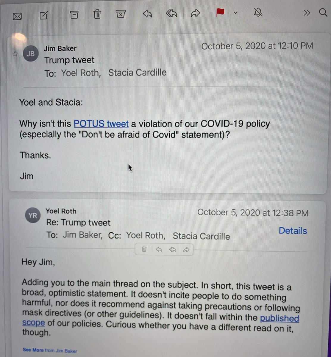
As you can see, Jim Baker wanted to censor the optimistic approach of President Trump in order to amplify the fearful and looming message.
The motive of Jim Baker, while undefined by Mr. Zweig, is transparent in hindsight.
The platform officials and the various officials in media, were promoting the fear and worry narrative as part of an election strategy to facilitate mail-in ballots. COVID-19 was as much, perhaps even more of, an election manipulation tool as it was a virus.
In the rest of the outline Zweig focuses on the professionals who were targeted by the information control campaign. “Twitter made a decision, via the political leanings of senior staff, and govt pressure, that the public health authorities’ approach to the pandemic – prioritizing mitigation over other concerns – was “The Science” . . .
Information that challenged that view, such as showing harms of vaccines, or that could be perceived as downplaying the risks of Covid, especially to children, was subject to moderation, and even suppression. No matter whether such views were correct or adopted abroad.”
The government, media and social media campaign to control information about COVID-19 was never about science or even the virus itself. The COVID-19 information control operation was always about control over the public. That campaign became political because the Biden campaign/administration, Democrats, media and the voices in control over social media weaponized it around their political beliefs.
The COVID-19 narrative becomes a tool to achieve a variety of objectives: debate controls; the deployed ‘excuse‘ for a very visible lack of voter enthusiasm for the puppet (Biden); the use of fraudulent ‘mail-in ballots’; the keeping of socially distant physical auditors, etc. Without COVID as a tool the manufactured process is more difficult. The ‘never let a crisis go to waste‘ strategy includes the creation of a crisis.
The COVID-19 narrative held four primary benefits. Without COVID weaponized we would not see:
.
Lastly, we know in hindsight; the 2016 presidential transition team carried a then unknown motive. Who was it that recommended: Dan Coats (ODNI), Michael Atkinson (ICIG), James Mattis (DoD), Dana Boente (DOJ-NSD then FBI counsel). Who was the one steering these placements from inside the transition team?
Who was in charge of the transition team and also in charge of the Trump COVID-19 task force?

Crossposted from https://wattsupwiththat.com/2022/12/20/climate-sensitivity-from-1970-2021-warming-estimates/
First note that a climate sensitivity of 1.0 means there is no sensitivity
Reposted from Dr. Roy Spencer’s Global Warming Blog.
by Roy W. Spencer, Ph. D.
In response to reviewers’ comments on a paper John Christy and I submitted regarding the impact of El Nino and La Nina on climate sensitivity estimates, I decided to change the focus enough to require a total re-write of the paper.
The paper now addresses the question: If we take all of the various surface and sub-surface temperature datasets and their differing estimates of warming over the last 50 years, what does it imply for climate sensitivity?
The trouble with estimating climate sensitivity from observational data is that, even if the temperature observations were globally complete and error-free, you still have to know pretty accurately what the “forcing” was that caused the temperature change.
(Yes, I know some of you don’t like the forcing-feedback paradigm of climate change. Feel free to ignore this post if it bothers you.)
As a reminder, all temperature change in an object or system is due to an imbalance between rates of energy gained and energy lost, and the global warming hypothesis begins with the assumption that the climate system is naturally in a state of energy balance. Yes, I know (and agree) that this assumption cannot be demonstrated to be strictly true, as events like the Medieval Warm Period and Little Ice Age can attest.
But for the purpose of demonstration, let’s assume it’s true in today’s climate system, and that the only thing causing recent warming is anthropogenic greenhouse gas emission (mainly CO2). Does the current rate of warming suggest (as we are told) that a global warming disaster is upon us? I think this is an important question to address, separate from the question of whether some of the recent warming is natural (which would make AGW even less of a problem).
Lewis and Curry (most recently in 2018) addressed the ECS question in a similar manner by comparing temperatures and radiative forcing estimates between the late 1800s and early 2000s, and got answers somewhere in the range of 1.5 to 1.8 deg. C of eventual warming from a doubling of the pre-industrial CO2 concentration (2XCO2). These estimates are considerably lower than what the IPCC claims from (mostly) climate model projections.
Our approach is somewhat different from Lewis & Curry. First, we use only data from the most recent 50 years (1970-2021), which is the period of most rapid growth in CO2-caused forcing, the period of most rapid temperature rise, and about as far back as one can go and talk with any confidence about ocean heat content (a very important variable in climate sensitivity estimates).
Secondly, our model is time-dependent, with monthly time resolution, allowing us to examine (for instance) the recent acceleration in deep ocean temperature (ocean heat content) rise.
In contrast to Lewis & Curry and differencing two time periods’ averages separated by 100+ years, our approach is to use a time-dependent model of vertical energy flows, which I have blogged on before. It is run at monthly time resolution, so allows examination of such issues as the recent acceleration of the increase in oceanic heat content (OHC).
In response to reviewers comments, I extended the domain from non-ice covered (60N-60S) oceans to global coverage (including land), as well as borehole-based estimates of deep-land warming trends (I believe a first for this kind of work). The model remains a 1D model of temperature departures from assumed energy equilibrium, within three layers, shown schematically in Fig. 1.

One thing I learned along the way is that, even though borehole temperatures suggest warming extending to almost 200 m depth (the cause of which seems to extent back several centuries), modern Earth System Models (ESMs) have embedded land models that extend to only 10 m depth or so.
Another thing I learned (in the course of responding to reviewers comments) is that the assumed history of radiative forcing has a pretty large effect on diagnosed climate sensitivity. I have been using the RCP6 radiative forcing scenario from the previous (AR5) IPCC report, but in response to reviewers’ suggestions I am now emphasizing the SSP245 scenario from the most recent (AR6) report.

I run all of the model simulations with either one or the other radiative forcing dataset, initialized in 1765 (a common starting point for ESMs). All results below are from the most recent (SSP245) effective radiative forcing scenario preferred by the IPCC (which, it turns out, actually produces lower ECS estimates).
The Model Experiments
In addition to the assumption that the radiative forcing scenarios are a relatively accurate representation of what has been causing climate change since 1765, there is also the assumption that our temperature datasets are sufficiently accurate to compute ECS values.
So, taking those on faith, let’s forge ahead…
I ran the model with thousands of combinations of heat transfer coefficients between model layers and the net feedback parameter (which determines ECS) to get 1970-2021 temperature trends within certain ranges.
For land surface temperature trends I used 5 “different” land datasets: CRUTem5 (+0.277 C/decade), GISS 250 km (+0.306 C/decade), NCDC v3.2.1 (+0.298 C/decade), GHCN/CAMS (+0.348 C/decade), and Berkeley 1 deg. (+0.280 C/decade).
For global average sea surface temperature I used HadCRUT5 (+0.153 C/decade), Cowtan & Way (HadCRUT4, +0.148 C/decade), and Berkeley 1 deg. (+0.162 C/decade).
For the deep ocean, I used Cheng et al. 0-2000m global average ocean temperature (+0.0269 C/decade), and Cheng’s estimate of the 2000-3688m deep-deep-ocean warming, which amounts to a (very uncertain) +0.01 total warming over the last 40 years. The model must produce the surface trends within the range represented by those datasets, and produce 0-2000 m trends within +/-20% of the Cheng deep-ocean dataset trends.
Since deep-ocean heat storage is such an important constraint on ECS, in Fig. 3 I show the 1D model run that best fits the 0-2000m temperature trend of +0.0269 C/decade over the period 1970-2021.

Finally, the storage of heat in the land surface is usually ignored in such efforts. As mentioned above, climate models have embedded land surface models that extend to only 10 m depth. Yet, borehole temperature profiles have been analyzed that suggest warming up to 200 m in depth (Fig. 4).

This great depth, in turn, suggests that there has been a multi-century warming trend occurring, even in the early 20th Century, which the IPCC ignores and which suggests a natural source for long-term climate change. Any natural source of warming, if ignored, leads to inflated estimates of ECS and of the importance of increasing CO2 in climate change projections.
I used the black curve (bottom panel of Fig. 4) to estimate that the near-surface layer is warming 2.5 times faster than the 0-100 m layer, and 25 times faster than the 100-200 m layer. In my 1D model simulations, I required this amount of deep-land heat storage (analogous to the deep-ocean heat storage computations, but requiring weaker heat transfer coefficients for land and different volumetric heat capacities).
The distributions of diagnosed ECS values I get over land and ocean are shown in Fig. 5.

The final, global average ECS from the central estimates in Fig. 5 is 2.09 deg. C. Again, this is somewhat higher than the 1.5 to 1.8 deg. C obtained by Lewis & Curry, but part of this is due to larger estimates of ocean and land heat storage used here, and I would suspect that our use of only the most recent 50 years of data has some impact as well.
Conclusions
I’ve used a 1D time-dependent model of temperature departures from assumed energy equilibrium to address the question: Given the various estimates of surface and sub-surface warming over the last 50 years, what do they suggest for the sensitivity of the climate system to a doubling of atmospheric CO2?
Using the most recent estimates of effective radiative forcing from Annex III in the latest IPCC report (AR6), the observational data suggest lower climate sensitivities (ECS) than promoted by the IPCC with a central estimate of +2.09 deg C. for the global average. This is at the bottom end of the latest IPCC (AR6) likely range of 2.0 to 4.5 deg. C.
I believe this is still likely an upper bound for ECS, for the following reasons.
Crossposted from https://wattsupwiththat.com/2022/12/18/urban-night-lighting-observations-challenge-interpretation-of-land-surface-temperature-observations/
Foreword by Anthony:
This excellent study demonstrates what I have been saying for years – the land surface temperature dataset has been compromised by a variety of localized biases, such as the heat sink effect I describe in my July 2022 report: Corrupted Climate Stations where I demonstrate that 96% of stations used to measure climate have been producing corrupted data. Climate science has the wrongheaded opinion that they can “adjust” for all of these problems. Alan Longhurst is correct when he says: “…the instrumental record is not fit for purpose.”
One wonders how long climate scientists can go on deluding themselves about this useless and highly warm-biased data. – Anthony
Guest essay by Alan Longhurst – From Dr. Judith Curry’s Climate Etc.
The pattern of warming of surface air temperature recorded by the instrumental data is accepted almost without question by the science community as being the consequence of the progressive and global contamination of the atmosphere by CO2. But if they were properly inquisitive, it would not take them long see what was wrong with that over-simplification: the evidence is perfectly clear, and simple enough for any person of good will to understand.
In 2006 NASA Goddard published two plots showing that the USA data[1] did not follow the same warming trend as the rest of the world. Rural data numerically dominate the USA archive, while urban data massively dominate almost everywhere else. Observations began very early in the USA – being introduced by Jefferson in 1776 – and that emphasis had already then been placed on providing assistance to farmers.

They are consistent with the ‘global warming‘ that so worries us today being an urban affair, caused not by global CO2 pollution of the global atmosphere but by the heat of combustion of petroleum we burn in our vehicles, our homes and where we work – all of which is additive to the radiative consequences of our buildings and impermeable cement and asphalt surfaces. However, towns and cities in fact occupy only a very small fraction of the land surface of our planet, about 0.53% (or 1.25%, if their densely populated suburbs are included) according to a recent computation done with rule-based mapping. But it is in this very small fraction of land surfaces that most of the data in the CRUTEM or GISTEMP archives have been recorded.
Consequently, very few surface air temperature observations have been made in the small villages which, with their farms and grazing lands, are scattered in the otherwise uninhabited grassland. forest, mountain, desert and tundra. Nor is it widely understood that our presence there has been associated with progressive change since the introduction of steel and steam to plough the grasslands and to cut forests for timber.[2]
A measure of the brightness or intensity of night lighting, the BI index, was derived by NASA from the work of Mark Imhoff, who calibrated and ranked night lights in seven stable classes – one rural, two peri-urban and four urban.[3] The BI indes for airport of Toulouse is at 59 and the central district of Cairo is at 167. Care must be take with apparent anomalies similar to that of Millau which is an active little town of 20,000 people but it has a BI = 0, as does Gourdon which has only 4000. This is because the MeteoFrance instruments at Millau have been placed on a bare hilltop on the far side of a deep, unbuilt valley adjacent to the town and so they record only the conditions of the surrounding countryside.
It is not only in major cities that the effects of urbanisation can be detected; this effect can also be detected in data from some very small places that would otherwise be considered rural as at Lerwick, a port in the Orkney Islands with a population of <7000. Here, the GHCN-M data from KNMI show a warming of about 0.9oC over the period 1978-2018, while during the same period the day/night temperature difference increased by 0.3oC. Retention of heat at night is characteristic of urban warming.
But Gourdon, a compact little rural village not far from my home in western France has a BI of only 7 for a population of only 3900. It is situated in farmland that was abandoned 150 years ago when the vines died, and it is now given over to sheep, goats and scrub vegetation. Little hamlets in this region are now often dark at night and their road signs may warn you that you are entering a ´Starlit village´.
Despite its deep isolation, there is a manned Meteofrance data station in Gourdon which over a 60-year period has recorded a very gradual and small summer warming since mid-20th century, associated with perfectly stable winter conditions.

Since buildings and human activity have undoubtedly changed at Gourdon in this long period, perhaps especially by the growth of rural tourism, this effect was probably predictable. The same is seen in data from other small places such as Lerwick, a port in the Orkney Islands with a population about twice that of Gourdon. Here, GHCN-M data from KNMI show a warming of about 0.9oC over the period 1978-2018 while during the same period the day/night temperature difference increased by 0.3oC.
The BI values for night lighting are in no way influenced by fact that the thermometric data with which each is associated have later been merged with data from another station to achieve regional homogeneity. Consequently, it is appropriate to associate them with night-light data in the hope of isolating the effects of local combustion of hydrocarbons in towns and cities, from what we must attribute to solar variation. The consequences of homogenisation on the surface air temperature data is avoided here by the use of GHCN-M data from the KNMI site – which are as close to the original observations, adjusted only for on-site problems, as is now possible to get.
The urban warming phenomenon has been observed and understood for almost two hundred years. Meteorologist Luke Howard (quoted by H.H. Lamb) wrote in 1833 concerning his studies of temperature at the Royal Society building in central London and also at Tottenham and Plaistow, then some distance beyond the town:
‘But the temperature of the city is not to be considered as that of the climate; it partakes too much of an artificial warmth, induced by its structure, by a crowded population, and the consumption of great quantities of fuel in fires: as will appear by what follows….we find London always warmer than the country, the average excess of its temperature being 1.579°F….a considerable portion of heated air is continually poured into the common mass from the chimnies; to which we have to add the heat diffused in all directions, from founderies, breweries, steam engines, and other manufacturing and culinary fire..’ [4]
To Luke Howard’s list must now be added the consequences of the combustion of hydrocarbon fuels in vehicles, mass transport systems, power plants and industrial enterprises located within the urban perimeter, cement/asphalt surfaces and their relative contributions day and night.[5]
The energy budget of the agglomeration of Toulouse in southern France is probably typical of such places: anthropogenic heat release is of order 100 Wm2 in winter and 25 W m-2 in summer in the city core, and somewhat less in the residential suburbs. Observations of resulting evolution of surface air temperatures in central Toulouse are compatible with the anticipated effect of the inventory of all heat sources seasonally. Below the urban canopy layer, a budget for heat production and loss through advection into surrounding rural areas has been computed and it is found that this loss is important under some wind conditions. In this and many other urbanisations, there is also an important seasonality of heat release by passing road traffic that forms a major component of the heating budget, since national highway systems commonly pass close to major centres of population.[6]
Larger cities, larger effects: in the core of the city of Tokyo during the 1990s the seasonal heat flux range was 400-1600 W.m-2 and the entire Tokyo coastal plain appears to be contaminated by urban heat generated within the city, especially in summer when warming may extend to 1 km altitude, much higher than the simple nocturnal heat island over large cities.[7] The long-term evolution of urban climates is well illustrated in Europe where, in the second half of the 20th century when their natural association with regional climate was abruptly replaced by a simple warming trend that took them almost 2oC above the base-line of the previous 250 years.

Although, globally, the energy from urban heat is equivalent to only a very small fraction of heat transported in the atmosphere, models suggest that it may be capable of disrupting natural circulation patterns sufficiently to induce distant as well as local effects on the global surface air temperature pattern. Significant release of this heat into the lower atmosphere is concentrated in three relatively small mid-latitude regions – eastern North America, western Europe and eastern Asia – but the inclusion of this regional injection of heat (as a steady input at 86 model points where it exceeds 0.4W m2) has been tested in the NCAR Community Atmospheric model CAM3.
Comparison of the control and perturbation runs showed significant regional effects from the release of heat from these three regions at 86 grid points where observations of fossil fuel use suggest that it exceeds 0.4 Wm-2. In winter at high northern latitudes, very significant temperature changes are induced: according to the authors, ‘there is strong warming up to 1oK in Russia and northern Asia…. the north-eastern US and southern Canada have significant warming, up to 0.8 K in the Canadian Prairies’.
The suggestion that the global surface air temperature data – on which the hypothesis of anthropogenic climate warming hangs – are heavily contaminated by other heat sources is not novel. The map below shows the locations of 173 stations used by MacKittrick and Michaels for a statistical analysis of the contamination of the global temperature archives by urban heat., using which they rejected the null hypothesis that the spatial pattern of temperature trends is independent of socio-economic effects which was, and still is, the position taken by the IPCC – for which MacKittrick was then a reviewer.[8]

In the present context, this study seemed worth repeating, so a file of 31 clusters of BI indices was gathered from the ‘Get Neighbours’ lists that are shown when accessing GISTEMP data. These clusters comprise 1200 data files representing 776 towns or cities and 424 rural places – of which 355 are totally dark at night. They therefore represent a wide range of individual station histories – many longer than 100 years – and are sufficient for the task. Just 53 of the 540 rural sites listed are in Western Europe, the remainder being located in the vast, night-dark expanses of Asia – where the data based on the arctic island of Novaya Zemyla includes only three with significant night lights, of which one is the city of Murmansk.
The cluster centred southeast of Lake Baikal includes two cities (329,000 and 212,000 inhabitants having BIs of only 28 and 13) together with 39 small places – of which 28 are totally dark at night – while that immediately to the west of Baikal includes 19 such places. But not all bright locations have large populations, because intensive industrial farms – solar panel energised – can dominate regional night lighting as it does at in some Gulf States: an experimental farm alone here generates a BI of 122, while the 3012 people who live at Shiwaik generate a BI of 181.
The map below indicates the central locations of 30 clusters in relation to the distribution of native vegetation type. [9]

Central stations of each cluster
Place name Radius km BI=0 BI>25 Npop<1K N E
1 Gourdon, France 288 5 1 6 44.7 01.4
2 Valentia Observatory, S. Ireland 400 14 2 14 51.9 10.2
3 Santiago Compostella, Spain 406 7 23 2 42.9 06.4
4 Muenster, Germany 109 1 7 0 52.4 07.7
5 Innsbruck, Austria 107 9 2 4 42.3 11.4
6 Bursa, Turkey 224 12 1 2 40.4 25.1
7 El Suez, Egypt 532 7 21 0 25.4 32.5
8 Abadan 628 6 17 0 30.4 48.5
9 Gdov, Russia 224 14 5 10 58.7 27.5
10 Saransk. W Russia 434 9 9 1 54.1 45.2
11 Tobolsk, Russia 482 8 7 5 58.1 68.2
12 Lviv, Ukraine 293 10 5 2 49.8 23.9
13 Simferopol, Crimea 397 14 4 2 44.7 34.4
14 Tulun , Russia 485 19 4 9 54.0 98.0
15 Tatarsk, Russia 308 14 1 6 55.2 75.9
16 Krasnojarsk, Russia 391 13 2 7 56.0 92.7
17 Ostrov Gollomjanny, Russia i 277 38 2 24 79.5 90.6
18 Malye Kamakuki, Russia 82 30 1 23 72.4 52.7
19 Kokshetay, Kazakstan 460 15 3 2 53.3 69.4
20 Cardara, Russia 212 12 0 1 41.3 68.0
21 Nagov, Russia 696 30 0 4 31.4 92,1
22 Selagunly, Russia 846 26 0 5 66.2 114.0
23 Loksak, Russia 493 31 0 11 54.7 130.0
24 Gyzylarbat, Russia 636 20 5 5 38.9 56.3
25 Ust Tzilma, Pechora Basin 451 16 1 7 65.4 52.3
26 Cape Kigilyak, Kamchatka 1055 37 0 9 73.3 139.9
27 Dashbalbar, Mongolia 435 29 1 6 49.5 114.4
28 Guanghua, China 465 17 2 ? 32.3 111.7
29 Youyang, S. Korea 417 26 0 ? 28.3 108.7
30 Poona, N. India 681 4 7 0 18.5 73,8
31 C. India 601 1 17 0 23.2 71.3
32 Mai Sariang, Burma 57 10 4 1 68.2 97.9
33 Central Japan 203 5 13 1 34.4 132.6
These data may be used to investigate the supposed warming of Europe and Asia that so worries the public. In far eastern Russia and neighbouring territories 8 clusters are listed which include 296 place-names lacking any night-lighting at all, together with just five small towns having night-light indices of only 1. In such places, it is the natural cycle of climate conditions – modified locally by progressive anthropogenic change in ground cover – that dominates the global pattern of air temperature, and in rural regions there is a rather simple relationship between population size and BI.
Towns and villages occupy only a very small fraction of the continental land surface of our planet, currently about 0.53% – or 1.25% if their densely-populated suburbs are included – according to a recent study using rule-based mapping. Although it is peripheral to the present discussion, it must be emphasised that conditions in the sparsely-inhabited rural or natural regions are not static at secular scale – everywhere, including in Asia, grasslands and prairies have been grazed or ploughed, and forests clear-cut and replaced with secondary growth.
Consequently, the distribution of population is highly aggregated and associated – as it must be – with regional economic development. This is illustrated in the images below which show that in western Europe access to the sea is critical, as it is in Japan, while in night-dark Ukraine and Russia it is the zones of temperate broadleaf forest and temperate steppe in which settlement and urban development has been most active.[10] The arctic tundra belt is very sparsely populated but does includes a few industrialised cities, of which Archangelsk is the largest.

Although, globally, the energy from heat of combustion is equivalent to only a very small fraction of the energy transported in the atmosphere, models suggest that it may be capable of disrupting natural circulation patterns sufficiently to induce distant as well as local effects on the global SAT pattern derived from observations. Significant release of this heat into the lower atmosphere is concentrated in three relatively small mid-latitude regions – eastern North America, western Europe and eastern Asia – but the inclusion of this regional injection of heat (as a steady input at 86 model points where it exceeds 0.4W m2) in the NCAR Community Atmospheric model CAM3 has important but distant regional effects, especially in winter.
Comparisons of control and perturbation runs show significant regional effects from the release of heat from these three regions at 86 grid points at which observations of fossil fuel use suggest that it exceeds 0.4 Wm-2: specifically, in winter at high northern latitudes, very significant temperature changes are induced: according to the authors, ‘there is strong warming up to 1oK in Russia and northern Asia…. the north-eastern US and southern Canada have significant warming, up to 0.8 K in the Canadian Prairies’. Especially in northern North America, where the instrumental record is excellent, this effect is readily observed night lighting is highly aggregated and associated – as it must be – with regional economic development. This is illustrated in the image above which shows that in western Europe access to the sea is critical, as it is in Japan, while in night-dark Ukraine and Russia it is the zones of temperate broadleaf forest and temperate steppe in which settlement and urban development has been most active.[11]
In eastern Asia, 8 clusters include 268 places that are dark at night, together with just 47 having some night-lighting, mostly of intensity <20. They include only one city (BI = 153). In such regions, it is the multi-decadal cycle of solar brilliance that dominates the evolution of air temperature, modified by local effects of change in vegetation and ground cover.
But it is really a misuse of the term ‘rural’ to apply it to the small inhabited places scattered across northern Asia, for this implies some similarity with landscapes such as surrounds Gourdon, devoted now or in the past to farming and herding. But small villages in asiatic Russia have nothing to do with rurality: their houses and streets have simply been set down in natural terrain – in the wildlands, if you will – that is subsequently ignored; there are no crops, gardens or greenhouses, and the activities of the population are not clear. The wide unpaved streets bear very few motor vehicles – and there is no street lighting. Many are described as administrative centres and some have a small dirt runway for light aircraft, while a few seem not to be connected to the rest of the world by dirt roads even seasonally,
Here are two small places in northern Siberia with very different seasonal temperature regimes, of which one is clearly well on its way to urbanisation. Each lies between 65-70oN on the banks of the river Lena.

Zhigansk is a long-settled little town founded in 1632 by Cossacks sent to pacify and tax the region; it is now an administrative centre housing 3500 people., laid out beside the river on a rectangular grid. Until the Lena freezes, it has no road access to the outside in winter.

Kjusjur, just south of the mouth of the Lena in a subarctic environment, was founded in 1924 as the administrative centre for this region, and has a population of 1345; routine meteorological data began to be collected in 1924 and continues today. About 100 small houses and one larger building are set on unpaved streets beside the stony bank of te river; it has neither runway nor river landing place, but rough tracks leave the settlement to north and south which must be impassable much of the year.[12]
Two motor vehicles can be seen in Kjusjur and a few small boats are pulled up on the beach, while there are about ten motor vehicles in Zhigansk and neither place has any street lighting. Zhigansk has a dirt airstrip with a radar installation that perhaps also houses the meteorological station. Each has a temperature regime appropriate to its situation, and although it was what I was looking for, I am surprised by the strength of the response to urbanisation at Zhigansk. I was also expecting that each would respond – at least in very general terms – to solar forcing, and so it does: the cooling of the 1940s and 50s which caused us so much concern in those years about a coming glaciation is clear.

A compilation of arctic data and proxies took 64oN as the limit of the Arctic region, within which 59 stations were used to analyse the pattern of regional co-variability for SAT anomalies based on PCA techniques.[13] This demonstrated quasi-periodicity of 50-80 years in ice cover in the Svalbard region: at least eight previous periods of relatively low ice cover can be identified back to about 1200.
Hindcasting climate states is not easy: a recent synthesis of tree-ring data from the Yamal peninsula rashly states that in Siberia the ‘industrial era warming is unprecedented…. elevated summer temperatures above those…for the past seven millennia‘. However, documents and observations show that this is one generalisation too far. In summer 1846, as recorded by H.H. Lamb, warming across the arctic extended from Archangel to eastern Siberia, where the captain of a Russian survey ship noted that the River Lena was hard to locate in a vast, flooded landscape and could be followed only by the ‘rushing of the stream’ which ‘rolled trees, moss and large masses of peat’ against his ship, that secured from the flood ‘an elephant’s head’.
The temperature reconstruction below is from annual growth of larches on the Yamal peninisula at the mouth of the Ob.[14] It testifies that the early decades of the 19th century did indeed include a period of very cold conditions on the arctic coast, while supporting the reality of periods of warmth likely to caused melting of the permafrost of tundra regions.

In any case, irruptions of warm Atlantic water into the eastern Arctic – including the present one – are well recorded in the archives of whaling, sealing and the cod fisheries. The present period of a warm Arctic climate is not novel and there is an abundant record from the cod fisheries in the Barents Sea and beyond, not to speak of the documentation concerning the intermittence of open seas from the sealers and whalers in northern waters.
The surface air temperature data are dominated by observations made in towns and cities so that the secular evolution of the climate is determined not by the gaseous composition of the atmosphere, nor by solar radiation: instead, it is dominated by the consequences of our ever-increasing combustion of fossil hydrocarbons in motor cars, public transit and home heating systems, as well as in the industrial plants and factories where most of us must work. To this must be added the daily accumulation of solar heat in the stonework or cement of our buildings facing each other along narrow passages.
One conclusion is unavoidable from this simple exploration of the surface air temperature archive: as used today by the IPCC and the climate change science community the instrumental record is not fit for purpose: it is contaminated by data obtained from that tiny fraction of Earth’s surface where most of us spend our brief span of years indoors.
Footnotes
[1] Hansen, NASA press release and J. Geophys. Res. 106, D20, 23947-23963.
[2] Ellis, E.C. et al. (2010) Glob. Ecol. Biogeog. 19, 589-606
[3] R.A. Ruedy (pers. comm)- see GISS notice dated Aug 28, 1998, at the Sources website
[4] from H.H. Lamb
[5] see for example, Li, X et al. (2020) Sci. Data 7, 168-177.
[6] Pigeon, G. et al. (2007) Int. J. Climat. 27, 1969-1981
[7] Ichinose, T.K et al. (1999) Atmosph. Envir. 33, 3897-3909, Fujibe, F. (2009) 7th Int. Conf. Urban Clim., Yokohama
[8] McKittrick, R.R. and P.J. Michaels (2004 & 2007) Clim. Res. 26 (2) 159-273 & J.G.R. (27) 265-268
[9] Map is from Gao and O’Neil (2020) NATURE COMMUNICATIONS |11:2302https://doi.org/10.1038/s41467-020-15788, image is from eomages.gf.nasa.go
[10] Map from Gao and O’Neil (2020) NATURE COMMUNICATIONS |11:2302https://doi.org/10.1038/s41467-020-15788, image is from eomages.gf.nasa.gov
[11] Ellis, E.C. et al. (date) Global Ecol. Geogr. 19, 589-60, and “Anthropogenic biomes: 10,000 BCE-2025 CE (doi.3390/land9050129v
[12] Images from Google Maps software
[13] Overland, J.A.. et al. (2003) J. Clim. pp-pp
19 Polyakov, I.V. et al. J. Clim. 16, 2067-77
Crossposted from https://wattsupwiththat.com/2022/12/18/data-shows-theres-no-climate-catastrophe-looming-climatologist-dr-j-christy-debunks-the-narrative/
Video: https://youtu.be/qJv1IPNZQao
Dr John Christy, distinguished Professor of Atmospheric Science and Director of the Earth System Science Center at the University of Alabama in Huntsville, has been a compelling voice on the other side of the climate change debate for decades. Christy, a self-proclaimed “climate nerd”, developed an unwavering desire to understand weather and climate at the tender age of 10, and remains as devoted to understanding the climate system to this day. By using data sets built from scratch, Christy, with other scientists including NASA scientist Roy Spencer, have been testing the theories generated by climate models to see how well they hold up to reality. Their findings? On average, the latest models for the deep layer of the atmosphere are warming about twice too fast, presenting a deeply flawed and unrealistic representation of the actual climate. In this long-form interview, Christy – who receives no funding from the fossil fuel industry – provides data-substantiated clarity on a host of issues, further refuting the climate crisis narrative.
2022 / December / 22 / What If Real-World Physics Do Not Support The Claim Top-Of-Atmosphere CO2 Forcing Exists?
What If Real-World Physics Do Not Support The Claim Top-Of-Atmosphere CO2 Forcing Exists?
By Kenneth Richard on 22. December 2022
The longstanding claim is CO2 (greenhouse gas) top-of-atmosphere (TOA) forcing drives climate change. But it is too cold at the TOA for CO2 (or any greenhouse gas) to exist.
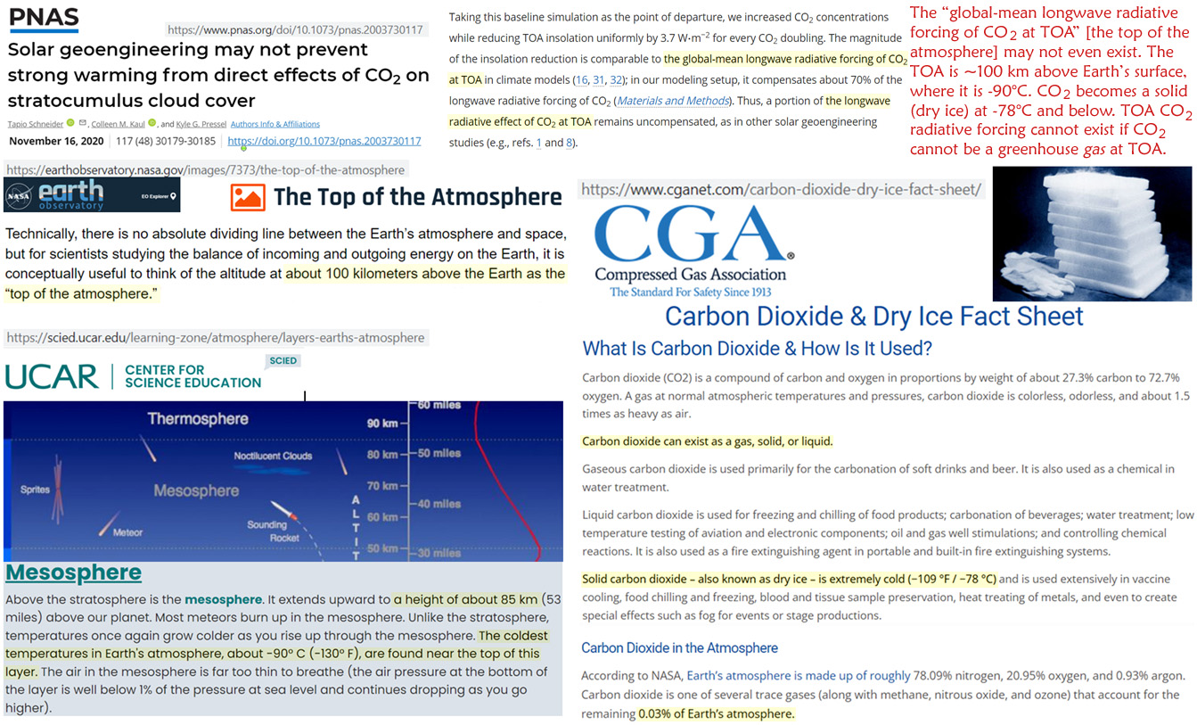
Image Sources: Schneider et al., 2020, NASA, UCAR, CGA
TOA greenhouse gas forcing is a fundamental tenet of the CO2-drives-climate-change belief system. And yet the “global-mean longwave radiative forcing of CO2 at TOA” (Schneider et al., 2020) may not even exist.
It is easily recognized that water vapor (greenhouse gas) forcing cannot occur above a certain temperature threshold because water freezes out the farther away from the surface’s warmth H2O goes.
According to NASA, the TOA is recognized as approximately 100 km above the surface. The temperature near that atmospheric height is about -90°C.
CO2 is in its solid (dry ice) form at -78°C and below.
Therefore, TOA CO2 radiative forcing cannot exist if CO2 cannot be a greenhouse gas at the TOA.


Anyone who trusts the government is an absolute fool. I have stated that the First Amendment was intended to protect us from free speech. The interpretation is that as long as the government does not “direct;y” censor the people, whatever social media does is fair game. But they have violated that line and have been acting UNCONSTITUTIONALLY by handing lists to Twitter of people they want to be censored. Since I was also blocked on Twitter, I assumed I too must have been on that list.
Yet Democrats like Adam Schiff, who in my opinion is a traitor to the Constitution, are clamoring to go after Musk and reestablish censorship of people. Back in 2012, President Obama had the Democrats give him the power to actually shut down the entire internet on claims of hacking. That’s right – the ENTIRE Internet! It was the Democrat Diane Feinstein for called Edward Snowden a traitor and would have gone for the death penalty because he exposed the government was illegally conducting surveillance of its citizens, which turned out to even be President Trump.
This is why the United States will collapse. It is simply beyond any control. As long as we have a representative form of government, a Republic, there is no hope for the future. This is why this time it will fall and hopefully we get a shot at creating a real democracy. Last time it was a collapse of Monarchy. The Founding Fathers had great ideas, but without term limits, you end up with a professional political class who sees us as the dirt beneath their feet. So post 2032, it will be interesting to see what will happen. I will have to be looking down from above.
The price for a dozen eggs continues climbing as explanations turn toward blaming bird flu. However, the avian influenza may explain a recent spike, but the longer duration of escalating food price commodities is much deeper than momentary fluctuations. These are energy dependent products.

As CTH noted last year, watch egg prices as a general gauge for overall food inflation (eggs hit almost every process in the supply chain), and watch potato availability to gauge overall row crop stability (staple commodity on every plate, venue).
Additionally, as previously noted, as energy prices continue rising pay attention to the prices on ‘organic’ products. Rising energy prices drive up costs for large commercially processed food supplies at a much higher rate than smaller organic production. People are starting to notice the ‘organic’ option is almost at price parity.
Wall Street Journal – […] Wholesale prices of Midwest large eggs hit a record $5.36 a dozen in December, according to the research firm Urner Barry. Retail egg prices have increased more than any other supermarket item so far this year, climbing more than 30% from January to early December compared with the same period a year earlier, and outpacing overall food and beverage prices, according to the data firm Information Resources Inc.
For supermarkets, eggs are a staple product that most consumers pick up on trips to the grocery store, similar to milk and butter. To maintain store traffic, grocers said they have been sacrificing some profits on eggs to keep prices for consumers competitive. Some suppliers are projecting potential relief in price by February or March, but cold weather could hamper production in the near term, executives said.
[…] Grocery prices have continued to increase this year because of what companies have said are higher costs of labor, ingredients and logistics, helping supermarkets generate higher sales and profits. Those factors have propelled egg prices, too. As eggs get more costly, some supermarkets are selling more organic eggs that are sometimes less expensive than conventional varieties, while suppliers say consumer demand has remained steady despite higher prices. (read more)
Additionally, the overall price for a Christmas meal is much higher than it was in 2021.
(Via Fox) […] The holiday dinner grocery basket is estimated to cost an average of $60.29, according to data from Datasembly. That’s 16.4% higher than last year’s basket when comparing the same exact basket of goods. It’s also double the year-over-year increase reported last year at 8.2%, according to the retail data firm.
[…] The 13 products included stuffing mix, corn, green beans, frozen apple pie, whipped topping, butter, cranberry sauce, bone-in spiral-cut ham, egg nog, homestyle biscuits, russet potatoes, white frozen young turkey and homestyle roasted turkey gravy.
According to the data, biscuits had the highest price increase year-over-year, rising 47.7%. Butter and russet potatoes weren’t far behind with prices rising 38% and 32.6%, respectively, the data showed. (read more)
Keep in mind, this week you should be seeing competitive pricing on beef, specifically standing rib roasts. Retailers will be competing with each other on the staple table items, and this creates an opportunity to buy and freeze beef at a lower price.
2023 will be a year when shopping smart will become increasingly important. Prices are likely to continue rising; one thing is certain, as long as energy costs keep increasing, food prices will not drop. Use the season(s) and holiday sales as opportunities to purchase specific items at lower prices; then store, freeze or can at home for use when the price of those same items is much higher.

COMMENT: Mr. Armstrong; I know you are very familiar with Ukraine. A friend of mine believes he met you in Kiev back in 2013. You and Henry Kissinger are the lone voices who have told the truth and how the West cares nothing about the people in the Donbas. When you attack a people’s religion, language, and culture, there is never any hope for peace. Zelensky and the West are trying to destroy us the same as the Romans attacking Jerusalem.
Thank you for telling our plight.
Anonymous
REPLY: You bring up an interesting analogy. Ukraine is being used as a pawn in this entire scheme to create World War III to justify defaulting on all debt – i.e. Schwab’s You’ll Own Nothing & Be Happy. You certainly have brought up a very good scenario.

The Great Jewish Revolt began during the reign of Nero (54-68AD) which was the first major rebellion of the Jewish people against the Roman occupation of Judea. It lasted from 66 – 70 AD and resulted in probably hundreds of thousands of lost lives and the ultimate destruction of their Temple. Most of our knowledge of the conflict comes from Roman-Jewish scholar Titus Flavius Josephus (37-100AD), who first fought in the revolt against the Romans, but was then kept by future Emperor Vespasian as a slave and interpreter. Josephus was later freed and granted Roman citizenship, writing several important histories on the Jews.
The fact is that the Romans had occupied Judea from 63 BC onward. While there were some tensions among the advocates of independence, the freedom of religion that had become the cornerstone of Rome was really its backbone. Yes, they conquered many lands. They allowed the people to retain their own religious beliefs and this the Christians would call paganism because there were many gods but none of them were viewed as a creator – more of superbeings who protected them.

Some complained about having to pay taxes to Rome. The story of the zealots trying to entrap Jesus into a conspiracy asking him where he stood on the question of taxation he resolved by asking whose portrait was on the coin. It was most likely Tiberius at the Time. He simply said give unto Caesar what is Caesar’s

The tension began to rise when Emperor Caligula (37-41AD) demanded in 39AD that his own statue be placed in every temple of the Empire. Caligula was rather mad and many say he saw himself as a god. Indeed, Zelensky has outlawed your religion as part of the Moscow Russian Orthodox Church demanding you now obey his replacement of a Kyiv Patriarch. The Romans did the same insofar as they appointed the High Priest of the Jewish religion.
Though the Zealots were always rebellious, Jewish tensions rose sharply when Nero plundered the Jewish Temple of its treasury in 66 AD. This followed the Great Fire of Rome and Nero was short of cash and he was the first to begin debasing the coinage. Like Henry VIII who also was broke raided the Catholic Church, Nero did the same to the Jews. He seized large amounts of silver from the Temple. The story of how the Jews also wanted their autonomy like the Donbas from Ukraine, in both cases there was a rise in nationalism with the aim of freeing the Holy Land from the earthly powers of the Romans, and in the case of the Donbas, the oppression of Ukrainians to the blind eye of the West.

In addition to the Romans, the Jewish peasantry was also angry with the corruption in the Jewish priesthood class as they were pawns of the Romans. It was the Jewish priests who turned Jesus over to the Romans. They were indeed very corrupt not unlike the corruption that had plagued the high priest in Rome who Julius Caesar was forced to overthrow. At the end, when Nero died leaving no heir, the Roman Empire fell into civil war. Vespasian (69-79AD) was forced to crush the Jews out of fear that if he did not, other provinces might rise up and demand freedom as well.
It is an interesting comparison as Kyiv has sought to oppress the Donbas and any student of history knows the hatred of Ukrainians v Russians. Why should the Donbas remain a second-class group of people oppressed by Ukrainians? The West only cares about destroying Russia and you are the pawn in the middle.

While the NY Times was still supporting Bankman-Fried, if the truth is ever really allowed to surface, you will find that FTX was I believe funneling kickbacks to the Democrats from the billions they handed Zelensky. Ukraine pleads for money and I have warned DO NOT SEND ANY FUNDS TO UKRAINE. If you want to help the people, donate to Red Cross – not the Ukrainian government. It is the most corrupt government at least in Europe if not the world. They keep putting out total BS to keep the money flowing. Why was Ukraine pouring money into FTX rather than taking care of its own people?
I was asked by a reporter from the NY Post did I think Republic National Bank was laundering money through my accounts with all the errors, AS THEY WERE DOING IN MADOFF! I told them I had no idea. The error would be backed out the next day and I did not see where it came from and if it went back to the same account or anyone. They do this ALL THE TIME! Madoff simply pled guilty and that prevents a trial so you will never know the truth. I believe he did so to protect his family. The banks claimed they had no idea! That was simply a lie. What about the regs – know your client? They do not apply when the banks are laundering money for someone in power.
Volodymyr Zelenskyy arrived in DC earlier today to visit the White House and deliver a speech before a joint session of congress. Dressed in his customary casual attire, Zelenskyy demanded representatives of the American people adhere to his demands and provide more taxpayer funding regardless of public opinion.
Tucker Carlson called out the ridiculous pantomime on display and the hubris of a character installed to operate the world’s biggest financial laundry operation. WATCH:
.
An example of the absurd Zelenskyy theater performance is below.
.
.

I have created this site to help people have fun in the kitchen. I write about enjoying life both in and out of my kitchen. Life is short! Make the most of it and enjoy!
De Oppresso Liber
A group of Americans united by our commitment to Freedom, Constitutional Governance, and Civic Duty.
Share the truth at whatever cost.
De Oppresso Liber
Uncensored updates on world events, economics, the environment and medicine
De Oppresso Liber
This is a library of News Events not reported by the Main Stream Media documenting & connecting the dots on How the Obama Marxist Liberal agenda is destroying America
Australia's Front Line | Since 2011
See what War is like and how it affects our Warriors
Nwo News, End Time, Deep State, World News, No Fake News
De Oppresso Liber
Politics | Talk | Opinion - Contact Info: stellasplace@wowway.com
Exposition and Encouragement
The Physician Wellness Movement and Illegitimate Authority: The Need for Revolt and Reconstruction
Real Estate Lending
