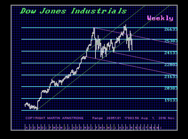
QUESTION: I could not attend the WEC. Cannot wait for the video and materials. I understand you said the US share market was poised to retest the underlying support into 2019. Can you elaborate?
Thank you so much
PY
ANSWER: The target and timing will be on the Private Blog. But generally yes. We will retest support before reacting to European events coming up near-term.
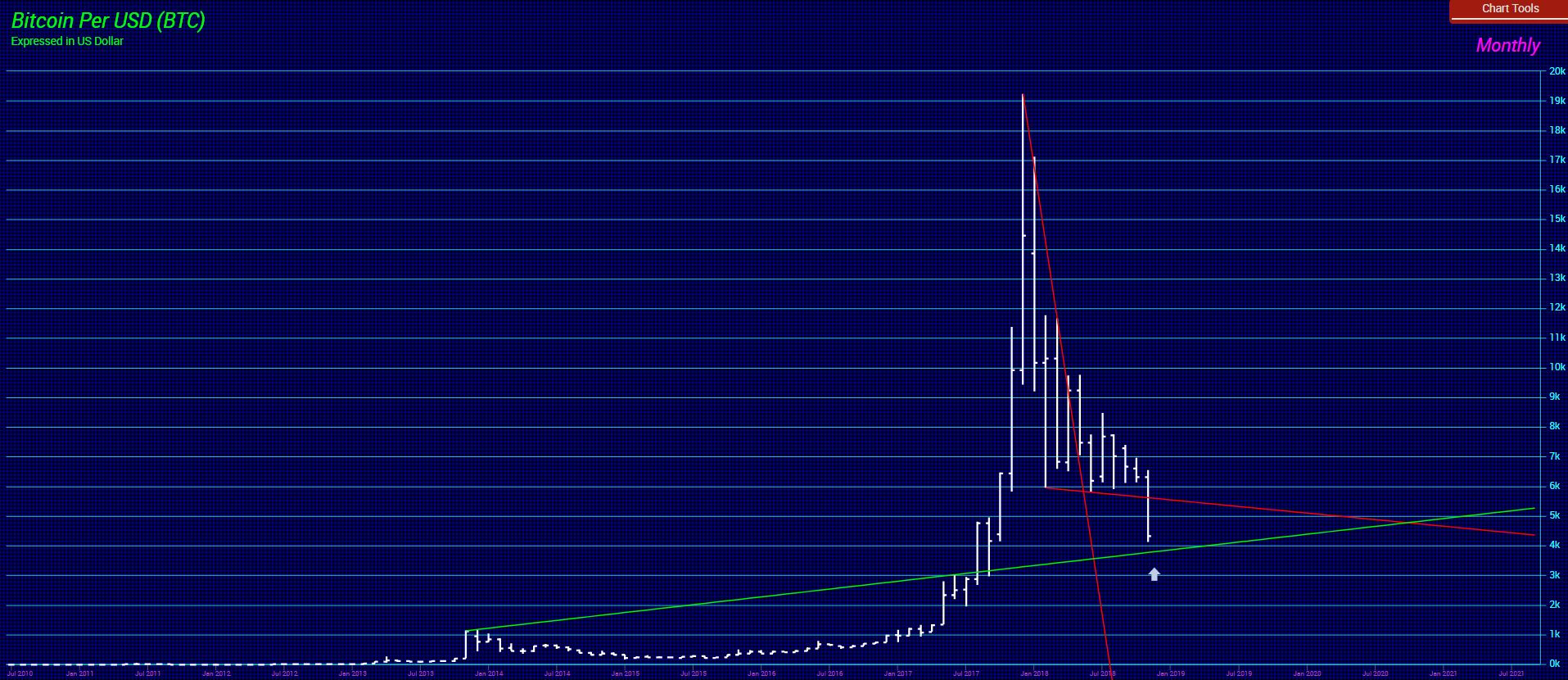
COMMENT: Mr. Armstrong; I just wanted to write to say thank you. You saved my marriage. My wife insisted I listen to you because you were right and got me out of gold. You also got me out of Bitcoin and I cannot thank you enough. These crazy people were touting a new age of knowledge and Bitcoin was going to kill the dollar and become the new reserve currency. Then one real nut said it was going to $250,000. You are right. When something spikes up like that, it grabs the emotions and you lose everything.
PF
ANSWER: There was no possible way governments would EVER hand over such power to Bitcoin. These people have no clue about the age of knowledge, for they are trapped in the age of stupidity. A monthly closing below 2950 will confirm the long-term trend is turning down. A year-end closing below 4150 will point to a drop back to 775 area. It was a trading vehicle – not an investment class for the long-term. With the IMF telling all central banks to create their own cryptocurrency and the introduction of Blockchain in experimenting with tax collection, we face a very different future due to technology. However, it will not be a world of free-market cryptos that bring governments to their knees.
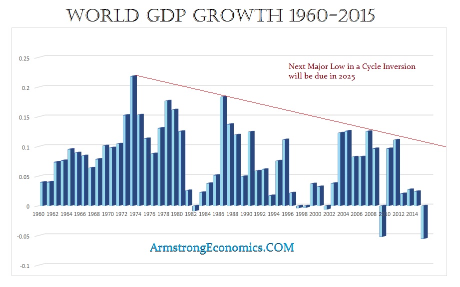
QUESTION: Mr. Armstrong; You mentioned that we should expect a further decline in the economy. Do you have a target for that decline?
Thank you
KT
ANSWER: The world economy has been in a prolonged economic decline as taxes have risen and regulation has expanded. As government hunts money everywhere, they are bringing the world economy into a major decline since the 1970s. The bottom in nominal terms appears to be 2025. However, in REAL TERMS, we are looking for a decline into 2035.8
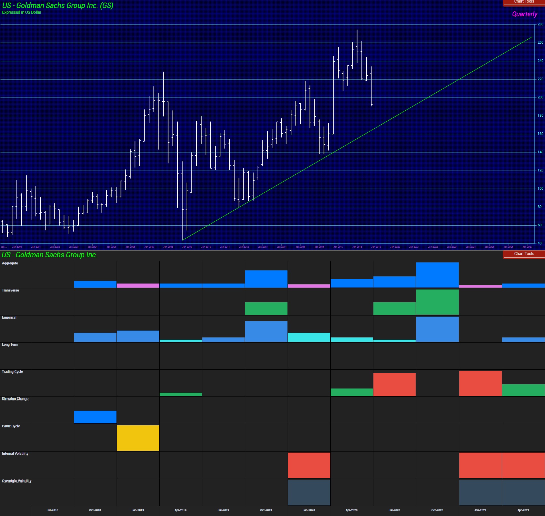
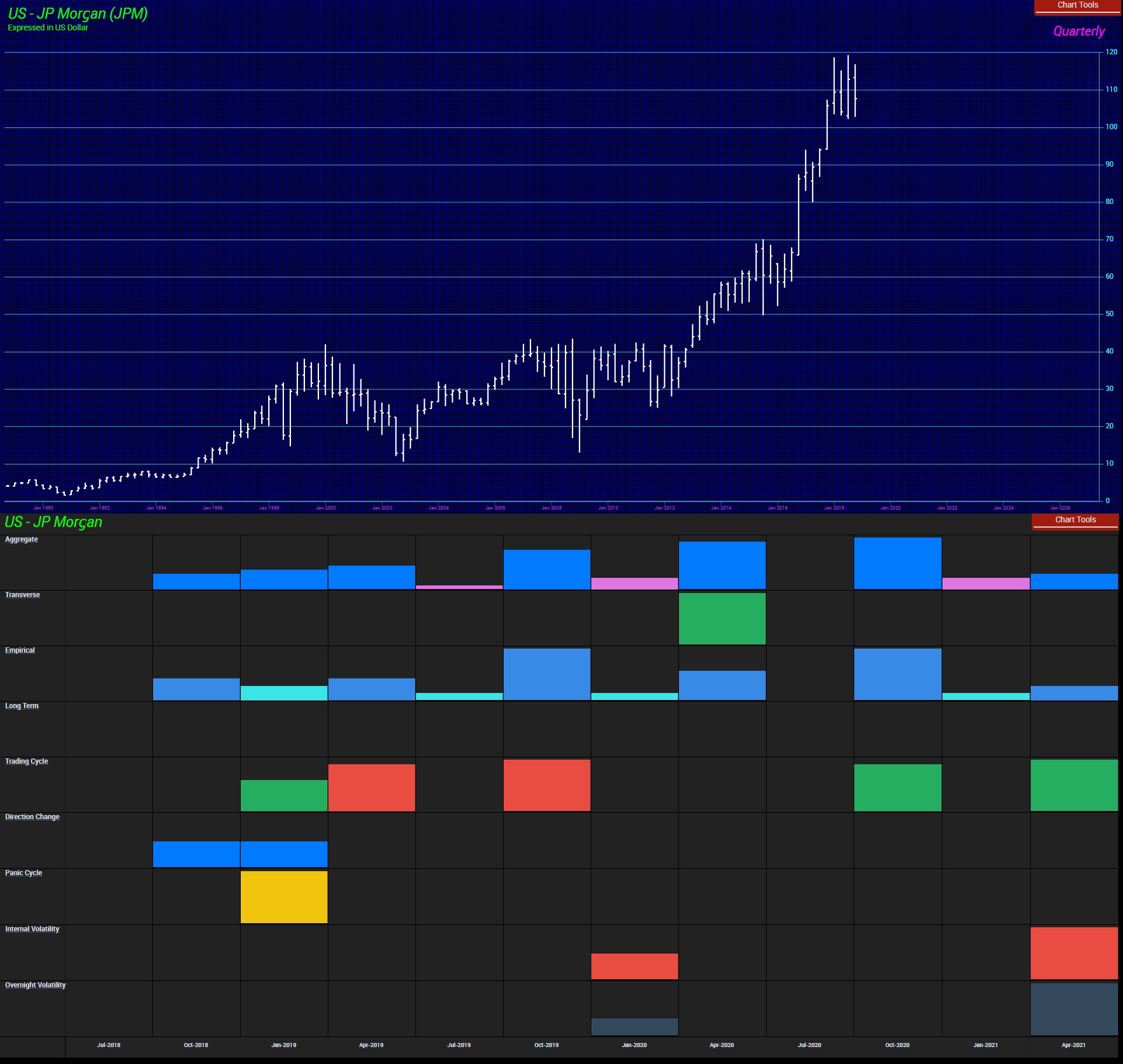
QUESTION: You mentioned that Goldman Sachs can take down the entire banking sector. Do you see this correlating in the future?
JF
ANSWER: Here is Goldman Sachs and JP Morgan. The first thing you will notice is that JP Morgan has been in a REAL bull market. Goldman has not. I am a firm believer that the markets instinctively forecast major future trends if you know how to read them. Now, look at the arrays. They both are showing the major target as the 4th quarter of 2020. JP Morgan shows the 2nd quarter of 2019 as a turning point. Look at the pattern difference with Goldman Sachs. There is no question that Goldman will do whatever it takes to try to survive calling in every political marker possible. However, because of this Malaysia scandal is worldwide involving four countries, pulling this off is not going to be easy. Its huge fees that were 10x that of any other firm to do this deal smells of something wrong. I know brokers who were denied the right to even bid on this project.
The bottom line is clear. Just go by the Reversals. Not even Goldman Sachs can overcome them.
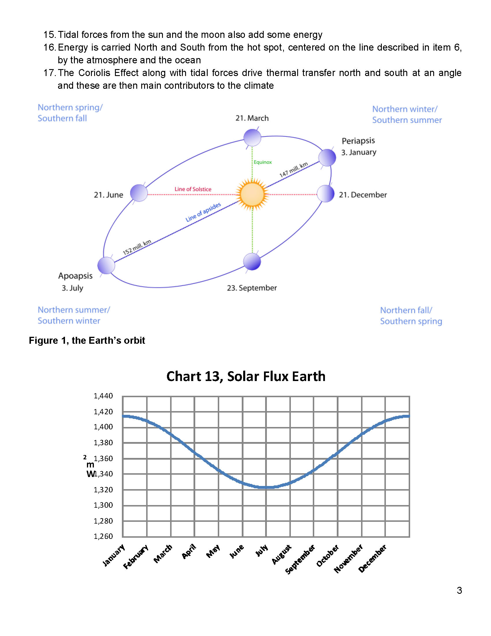
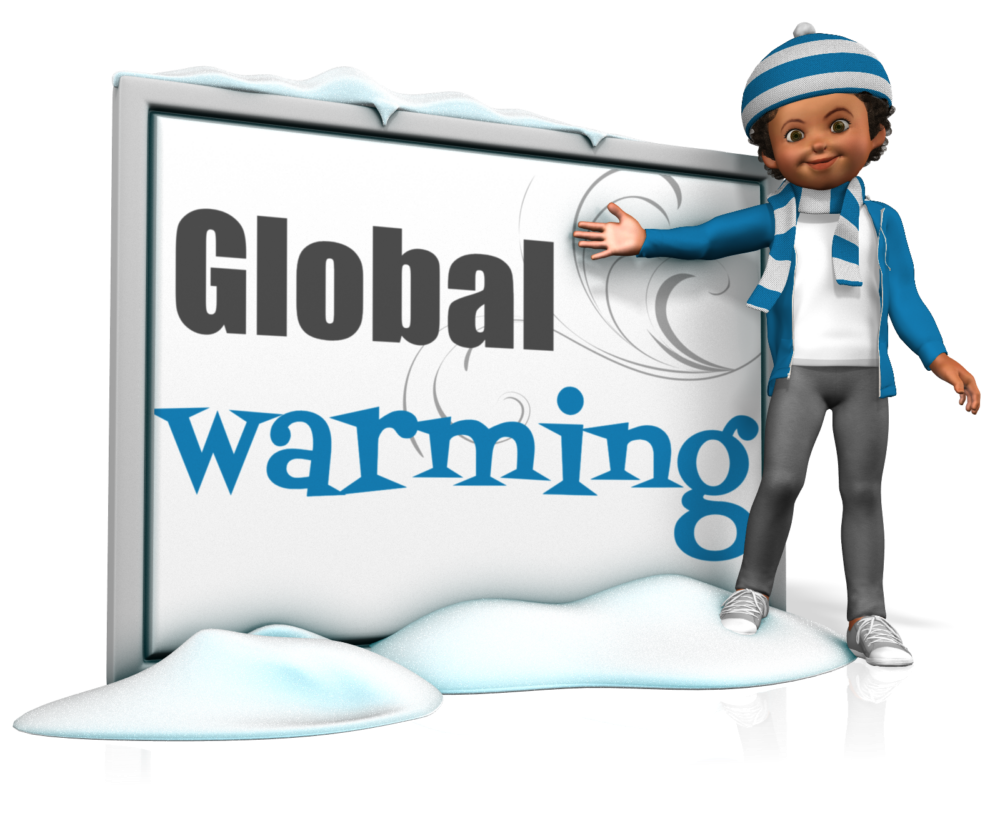
Despite the forecasts 20 years ago that snow would be a thing of the past, the last three winters have been getting progressively colder and nastier. Back in 1975, Newsweek predicted we were going into a new ice age until it became profitable to flip it into global warming to justify new taxes. Back in 1971, Stanford University professor Paul Ehrlich who wrote in 1968 his book The Population Bomb, forecast that by the end of the millennium in 2000, “the United Kingdom will be simply a small group of impoverished islands, inhabited by some 70 million hungry people.” He forecast that England will n0t exist in the year 2000. He later perhaps saw where the money was and flipped his forecast to catastrophic global warming. He then forecasts we would be resorting to cannibalism.
Now the UK facesCOLDEST winter for DECADE with heavy, early snowfall threatening to blanket the nation by Christmas. The interesting crisis we face is the overregulation which has raised the production cost of wheat in the United States and Australia. Australia used to be the cheapest place to grow wheat but as the environmentalists have dominated the regulations, the cheapest cost of producing wheat has shifted to Ukraine and Russia. We are totally unprepared for global cooling and we should be stockpiling grain reserves NOW!!!!
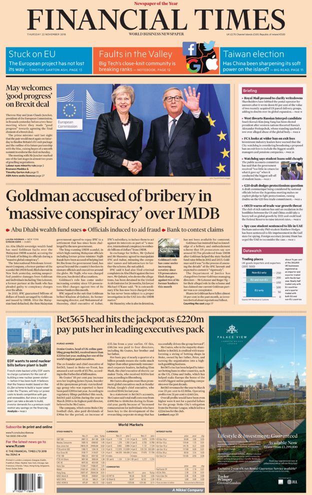
The Abu Dhabi sovereign wealth fund sued Goldman Sachs on the Pi Target, Wednesday, November 21st, 2018, for allegedly conspiring against the Middle Eastern fund to further a criminal scheme by Malaysia’s scandal-plagued 1MDB. The suit, filed in a New York court on behalf of Abu Dhabi’s International Petroleum Investment Company (IPIC), names Goldman Sachs as well as former Goldman officials who were charged by the US Justice Department in indictments unsealed earlier this month. “This action seeks redress for a massive global conspiracy on the part of the defendants to defraud and injure plaintiffs,” said the lawsuit, which also named former executives from IPIC and its subsidiary Aabar Investments.
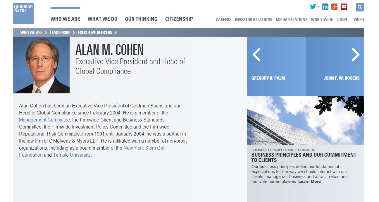
It was Alan Cohen who I believe was in charge of reviewing all deals as head of Global Compliance at Goldman Sachs and now he is at the top of the SEC. I believe he was given the job at Goldman Sachs because he threatened my lawyers to turn over all tapes I had of conversations with the various bankers including Goldman Sachs’ metal desk. It is now only logical that the Abu Dhabi sovereign wealth fund should also name Alan Cohen given he was the head of Global Compliance.
Here are just a few tapes that I found copies of. The bulk the SEC claimed were all destroyed in the 911 attack. There have continually been questions of the ethics inside Goldman Sachs. The entire crash in the world economy due to the Mortgage Back Securities were designed by Goldman Sachs. The major product they sold the day of the high of the ECM back in 2007 was widely touted as “Abacus 2007-AC1: Built to fail.”
As the Financial Post wrote: “Goldman has often been criticized for selling billions of dollars of debt securities, called credit default obligations (CDOs), filled with mortgages that the bank itself allegedly thought were overvalued.”
I believe it was Goldman Sachs who paid bribes to Russian politicians to recall Platinum from the market and temporarily stop sales to allegedly take an “inventory” of their stockpile. This sent prices soaring back in 1997. Russia stopped all shipments of Platinum and Palladium in December, was expected to resume exports. The hedge fund Tiger Management, a New York hedge fund back then, announced it sell some of its palladium holdings which it was believed held about one-fifth of the annual world supply of palladium (1.5 million ounces). This was followed by the silver manipulation in 1998 with most of the same firms involved.
The charging documents, unsealed in federal court on November 1st, 2018 refer to an unidentified Goldman executive as an unindicted co-conspirator who approved of the alleged bribery. The street rumor is that happens to be the executive Andrea Vella, who was Goldman’s co-head of Asian investment banking. Interestingly, Goldman Sachs suspended him the very same day that prosecutors unsealed the criminal complaints. It was also Andrea Vella was had to respond to cross-examination from Philip Edey QC, who was a lawyer acting on behalf of yet another government accusing Goldman Sachs of questionable dealings. That was the Libyan Investment Authority, which claims the investment bank took advantage of its financial illiteracy back in July 2008.
Let us not forget Goldman Sachs’ role in blowing up Greece and instigating the beginning of the Euro crisis. The crisis was created by a deal Greece struck with Goldman Sachs, that was engineered by Goldman’s CEO, Lloyd Blankfein. Blankfein and his Goldman team helped Greece hide the true extent of its debt, and in the process almost doubled it. The speculation back in 2015 was that Greece would file a lawsuit against Goldman Sachs for creating that debt crisis. There were the personal meetings between Greece and Gary Cohn to do that deal. When the client is a government, it ALWAYS involved the top people.
In 2001, Greece was looking for ways to disguise its mounting financial debt in order to just get into the Eurozone. The Maastricht Treaty required all Eurozone member states to show improvement in their public finances. Greece was heading in the wrong direction and Goldman Sachs came to the rescue. They arranged a secret loan of €2.8 billion and disguised it as an off-the-books “cross-currency swap” that was a complicated transaction in which Greece’s foreign-currency debt was converted into a domestic-currency obligation using a fictitious market exchange rate. They made 2% of Greece’s debt magically vanish from its national accounts. Goldman Sachs charged €600 million euros which was about 12% of Goldman’s revenue for 2001 giving them a record sales year.
Then the deal turned sour in the aftermath of 9/11 attacks when bond yields plunged. They resulted in a huge loss for Greece because of the formula Goldman had crafted to their benefit dictating the country’s debt repayments under the swap. By 2005, Greece owed almost double what it had put into the deal and thus we see the European debt crisis unfold.
Until 2008, European Union accounting rules allowed member nations to manage their debt with these so-called off-market rates in swaps. In the late 1990s, JPMorgan enabled Italy to hide its debt by swapping currency at a favorable exchange rate, thereby committing Italy to future payments that didn’t appear on its national accounts as future liabilities. However, what Goldman did to Greece made Italy look like child’s play.
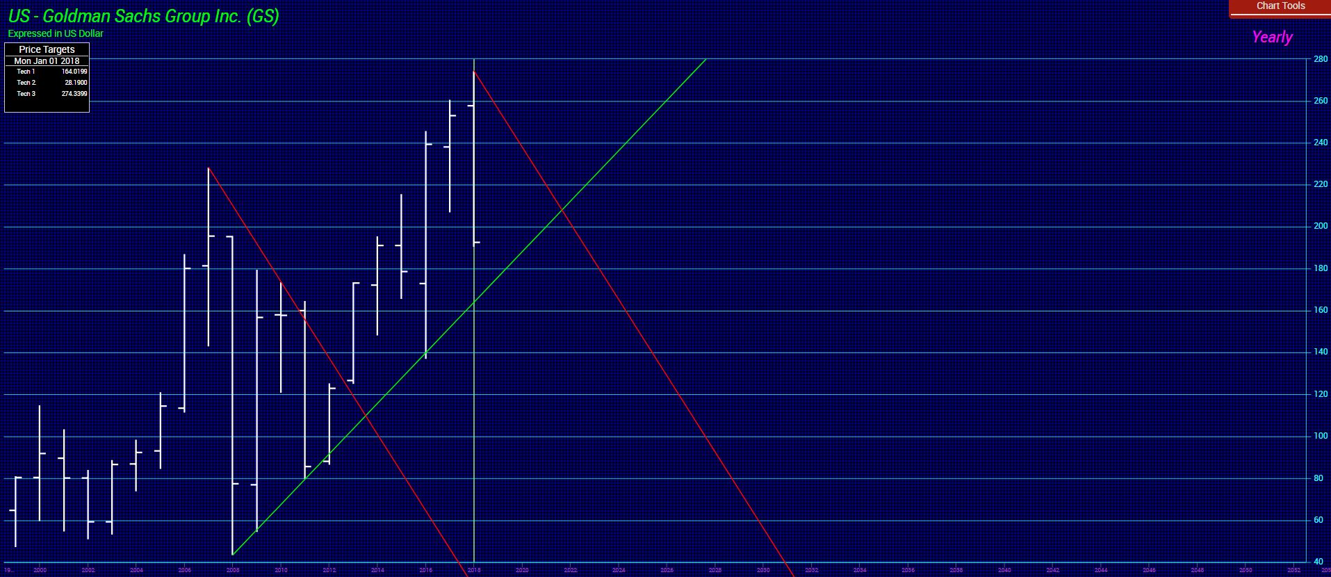
Goldman Sachs’ share price is going down hard into 2019. The 159 level will be critical on a closing basis for the year. If that is breached, then we could see very major implications for the firm whereby it may no longer survive. There is technical support between 174 and 164. From a cyclical perspective, Goldman Sachs has peaked as an institution as of 2017. It was founded in 1869 and 17.2 x 8.6 = 147.92. That means, in fact, the 2017 closing was the all-time high for Goldman Sachs and this incident is its Death knell. Goldman Sachs may be going down for the count.
August 2003 – Goldman Sachs creates Mortgage Back Securities & AIG Insures them
February 2006 – AIG Stops writing CDS on subprime mortgages
December 2006 – Goldman turns bearish on mortgage/real estate market
July 2007 – Goldman Sachs demands $1.8 billion in insurance from AIG
August 2007 – AIG posts $450 million as collateral
November 2007 – AIG posts $2 billion with Goldman on $3 billion demand
March 2008 – Goldman Sachs demands $6.6 billion from AIG
March 2008 – Bear Stearns collapses on 13th
August 2008 – Goldman Sachs takes a bearish view on AIG on 18th
September 2008 – Gov’t Bails out Fannie Mae on 7th
September 2008 – Lehman Brothers files for bankruptcy on 15th
September 2008 – Treasury Hank Paulson bails out AIG to save Goldman 16th
September 2008 – Paulson emails Congress with TARP 20th
September 2008 – Goldman Sachs & Morgan Stanley become banks 21st
October 2008 – Congress passes TARP on 3rd
October 2008 – Goldman Sachs demand another $1.3 billion from AIG
November 2008 – Federal Reserve creates Maiden III for Toxic Assets
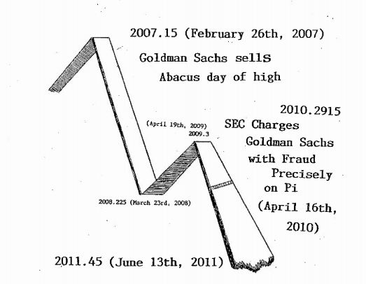
Here we have 2007.15 when Goldman Sachs sells precisely at the top of the ECM back in 2007 ABACUS2007-ACI which was a $2 Billion Synthetic CDO. It was then on the Pi Target when the SEC charged Goldman Sachs with fraud back on April 16, 2010, for that very transaction. Any small firm is imprisoned and stripped of its license. But Goldman Sachs has the SEC and the DOJ in its back pocket along with the judges and politicians. Now again on the precise Pi Target Abu Dhabi filed a lawsuit against Goldman Sachs Wednesday (Nov 21) for allegedly conspiring against the Middle Eastern fund to further a criminal scheme by Malaysia’s scandal-plagued 1MDB.
Because we have 3 countries now bringing charges and/or suits against Goldman Sachs, it appears that this will mark the beginning of the end for the firm. When the Euro cracks, they will also be blamed for their role in Greece and the rest of Europe. Don’t forget that Mario Draghi is also ex-Goldman Sachs. When the Euro cracks, there will be a microscope applied to every communication that was ever carried out between Draghi and Goldman Sachs. Every trade they have pulled off will be inspected with its tentacles into the European bond market.
After the government took down Solomon Brothers back in 1991 for manipulating the US Treasury Auctions, Goldman Sachs began a program of buying protection. They allegedly began aggressively funding politicians and then began stuffing their people in key places of government. They have been known as “Government Sachs” among dealers and they have held a power-house political hand in their back pocket. Our model, at least, warns that day is NOW OVER!!!!!!
The computer would have shorted Goldman Sachs if it could. The Global Market Watch has pinpointed a high and it warned this stock was moving into a Waterfall on the Monthly Level. This is one stock to get out of. We will see major new lows next year.
The real curious thing is that the Abu Dhabi sovereign wealth fund filed a lawsuit against Goldman Sachs precisely on the Pi Target Wednesday (Nov 21) for allegedly conspiring against the Middle Eastern fund to further a criminal scheme by Malaysia’s scandal-plagued 1MDB. So here we have the suit filed precisely on the Pi Target and precisely at the top of the ECM back in 2007, that is when Goldman Sachs sold ABACUS2007-ACI which was a $2 Billion Synthetic CDO. The SEC charged Goldman Sachs with fraud back in 2007 for that transaction, but of course, did nothing criminal because Goldman Sachs controls the SEC. Now the top adviser in the SEC is Alan Cohen who was head of Global Compliance and would have signed off on the Malaysian deal.
Them, on the Pi Target from the previous 8.6-year wave, April 16th, 2010, that is when the SEC charged Goldman Sachs with fraud with regard to the ABACUS2007 product. Here we now have Abu Dhabi filing suit for criminal fraud against Goldman Sachs precisely on the Pi Target of November 21, 2018.
We may FINALLY be witnessing the decline and fall of Goldman Sachs. Will do a more detailed report tomorrow – Black Friday
CTH has pointed, repeatedly, toward a very specific economic and financial dynamic because President Trump is uniquely focused on Main Street’s “real economy“.
Everything happening in/around the financial markets is very predictable when you focus on understanding the principles of Main Street MAGAnomics and how those basic principles diverge from Wall Street’s “paper economy” (currently weighted by tech stocks).
Everything is happening in a very predictable sequence. Few understand the MAGAnomic reset and what was predicted to happen in the space between disconnecting a Wall Street economic engine (globalism and multinationals) and restarting a Main Street economic engine (nationalism/America-First). In 2016 CTH explained where we would be today. With current Wall Street events, perhaps it is worthwhile remembering the CTH forecast.
President Trump’s MAGAnomic trade and foreign policy agenda is jaw-dropping in scale, scope and consequence. There are multiple simultaneous aspects to each policy objective; however, many have been visible for a long time – some even before the election victory in November ’16. What is happening within the financial markets should not be a surprise.
If we get too far in the weeds the larger picture is lost. Our CTH objective is to continue pointing focus toward the larger horizon, and then at specific inflection points to dive into the topic and explain how each moment is connected to the larger strategy.
Today, as a specific result of a very predictable stock market contraction, we repost an earlier dive into how MAGAnomic policy interacts with multinational Wall Street, the stock market, the U.S. financial system and perhaps your personal financial value. Again, reference and source material is included at the end of the outline.
If you understand the basic elements behind the new dimension in American economics, you already understand how three decades of DC legislative and regulatory policy was structured to benefit Wall Street, Multinational corporate interests, and not Main Street USA.
The intentional shift in economic policy is what created distance between two entirely divergent economic engines to the detriment of the American middle-class.
REMEMBER […] there had to be a point where the value of the second economy (Wall Street) surpassed the value of the first economy (Main Street).
Investments, and the bets therein, needed to expand outside of the USA. hence, globalist investing.
However, a second more consequential aspect happened simultaneously. The politicians became more valuable to the Wall Street team than the Main Street team; and Wall Street had deeper pockets because their economy was now larger.
As a consequence Wall Street started funding political candidates and asking for legislation that benefited their multinational interests.
When Main Street was purchasing the legislative influence the outcomes were -generally speaking- beneficial to Main Street, and by direct attachment those outcomes also benefited the average American inside the real economy.
When Wall Street began purchasing the legislative influence, the outcomes therein became beneficial to Wall Street. Those benefits are detached from improving the livelihoods of main street Americans because the benefits are “global”. Global financial interests, multinational investment interests -and corporations therein- became the primary filter through which the DC legislative outcomes were considered.
As an outcome of national financial policy blending commercial banking with institutional investment banking something happened on Wall Street that few understand. If we take the time to understand what happened we can understand why the Stock Market grew and what risks exist today as the financial policy is reversed to benefit Main Street.
Instead of attempting to put Glass-Stegal regulations back into massive banking systems, the Trump administration is creating a parallel financial system of less-regulated small commercial banks, credit unions and traditional lenders who can operate to the benefit of Main Street without the burdensome regulation of the mega-banks and multinationals. This really is one of the more brilliant solutions to work around a uniquely American economic problem.
♦ When U.S. banks were allowed to merge their investment divisions with their commercial banking operations (the removal of Glass Stegal) something changed on Wall Street.
Companies who are evaluated based on their financial results, profits and losses, remained in their traditional role as traded stocks on the U.S. Stock Market and were evaluated accordingly. However, over time investment instruments -which are secondary to actual company results- created a sub-set within Wall Street that detached from actual bottom line company results.
The resulting secondary financial market system was essentially ‘investment markets’. Both ordinary company stocks and the investment market stocks operate on the same stock exchanges. But the underlying valuation is tied to entirely different metrics.
Financial products were developed (as investment instruments) that are essentially wagers or bets on the outcomes of actual companies traded on Wall Street. Those bets/wagers form the hedge markets and are [essentially] people trading on expectations of performance. The “derivatives market” is the ‘betting system’.
♦Ford Motor Company (only chosen as a commonly known entity) has a stock valuation based on their actual company performance in the market of manufacturing and consumer purchasing of their product. However, there can be thousands of financial instruments wagering on the actual outcome of their performance.
There are two initial bets on these outcomes that form the basis for Hedge-fund activity. Bet ‘A’ that Ford hits a profit number, or bet ‘B’ that they don’t. There are financial instruments created to place each wager. [The wagers form the derivatives] But it doesn’t stop there.
Additionally, more financial products are created that bet on the outcomes of the A/B bets. A secondary financial product might find two sides betting on both A outcome and B outcome.
Party C bets the “A” bet is accurate, and party D bets against the A bet. Party E bets the “B” bet is accurate, and party F bets against the B. If it stopped there we would only have six total participants. But it doesn’t stop there, it goes on and on and on…
The outcome of the bets forms the basis for the tenuous investment markets. The important part to understand is that the investment funds are not necessarily attached to the original company stock, they are now attached to the outcome of bet(s). Hence an inherent disconnect is created.
Subsequently, if the actual stock doesn’t meet it’s expected P-n-L outcome (if the company actually doesn’t do well), and if the financial investment was betting against the outcome, the value of the investment actually goes up. The company performance and the investment bets on the outcome of that performance are two entirely different aspects of the stock market. [Hence two metrics.]
♦Understanding the disconnect between an actual company on the stock market, and the bets for and against that company stock, helps to understand what can happen when fiscal policy is geared toward the underlying company (Main Street MAGAnomics), and not toward the bets therein (Investment Class).
The U.S. stock markets’ overall value can increase with Main Street policy, and yet the investment class can simultaneously decrease in value even though the company(ies) in the stock market is/are doing better. This detachment is critical to understand because the ‘real economy’ is based on the company, the ‘paper economy’ is based on the financial investment instruments betting on the company.
Trillions can be lost in investment instruments, and yet the overall stock market -as valued by company operations/profits- can increase.
Here’s the critical part – Conversely, there are now classes of companies on the U.S. stock exchange that never make a dime in profit, yet the value of the company increases.
This dynamic is possible because the financial investment bets are not connected to the bottom line profit. (Examples include Tesla Motors, Amazon and a host of internet stocks like Facebook and Twitter.) It is this investment group of companies, primarily driven by technology stocks in the “tech sector” that stands to lose the most if/when the underlying system of betting on them stops or slows.
Specifically due to most recent U.S. fiscal policy, modern multinational banks, including all of the investment products therein, are more closely attached to this investment system on Wall Street. It stands to reason they are at greater risk of financial losses overall with a shift in economic policy.
That financial and economic risk is the basic reason behind Trump and Mnuchin putting a protective, secondary and parallel, banking system in place for Main Street.
Big multinational banks can suffer big losses from their investments, and yet the Main Street economy can continue growing, and have access to capital, uninterrupted.
Bottom Line: U.S. companies who have actual connection to a growing U.S. economy can succeed; based on the advantages of the new economic environment and MAGA policy, specifically in the areas of manufacturing, trade and the ancillary benefactors.
Meanwhile U.S. investment assets (multinational investment portfolios) that are disconnected from the actual results of those benefiting U.S. companies, highly weighted within the tech sector, and as a consequence also disconnected from the U.S. economic expansion, can simultaneously drop in value even though the U.S. economy is thriving. THIS IS EXACTLY what is happening!
We have been schooled over the past 40 years that Carbon Dioxide (CO2) is rising to levels never seen before on this planet and as a result the world’s average temperature is rising to levels that will, if nothing else, destroy large areas of the planet. The latest UN predictions indicate a major Catastrophe will happen by 2040 unless we do something drastic right now. This destruction will be from two factors; one, ocean levels raising and flooding all worlds coastal areas forcing the world population to higher ground; and two, even if those moves are accomplished the increased temperatures will bring massive storms that will ravage the areas not flooded. The only solution to prevent this from happening is, stop using carbon based fuels; petroleum, natural gas, and coal which, all, generate large amount of water and carbon dioxide and replacing them with wind or solar energy.
These dire projections are based on the belief that CO2 is the “primary” driver of global temperature changes; i.e. more CO2 in the atmosphere is very bad. This view is severally distorted and more likely entirely false. One can argue the reasons for these lies but it really doesn’t matter whether they are innocent or malicious in their construct; either way promoting something that is tearing up the worlds civilizations by misallocation of resources is very misguided.
Basic facts:
The planets global temperature is directly related to the energy arriving here from our sun
That energy manifests itself in a form which we call temperature
Temperature is a measure of the amount of heat (energy) that an object holds
The planets temperature is directly related to the amount of water in the atmosphere
Without water in the atmosphere the earth would be 330 Celsius colder and frozen solid
Carbon Dioxide (CO2) is a requirement for life to exist on this planet
More Carbon Dioxide (CO2) is better as planets grow faster, less Carbon Dioxide (CO2) is bad
Carbon Dioxide (CO2) only indirectly affects temperature probably less than 5% that of water
Climate is a measure of the average of all the factors that produce a stable environment
Weather is a measure of local factors that may make large changes in daily or seasonal conditions
The planets temperature in geological times ranged from170 Celsius +/- 60 Celsius
12,000 or so years ago the last ice age ended for no reason we can determine
The first thing that needs to be done when developing a theory is to identify and define the issue or problem. The issue was that after WW II there was a large buildup of industry required to rebuild the devastated planet and that rapid uncontrolled growth created real environmental problems. Much good resulted from the original environmental emphasis such as the creation of the Environmental Protection Agency, EPA, however, others in the 90’s saw a way to gain power and wealth by exaggerating aspects of the movement. During the 80’s and the 90’s global temperatures were going up so these people saw a way to increase the size and scope of government to their advantage with a carbon tax. They picked increased levels of CO2 in the atmosphere as the strawman argument and funneled large amounts of research money into universities to study how bad the increases were.
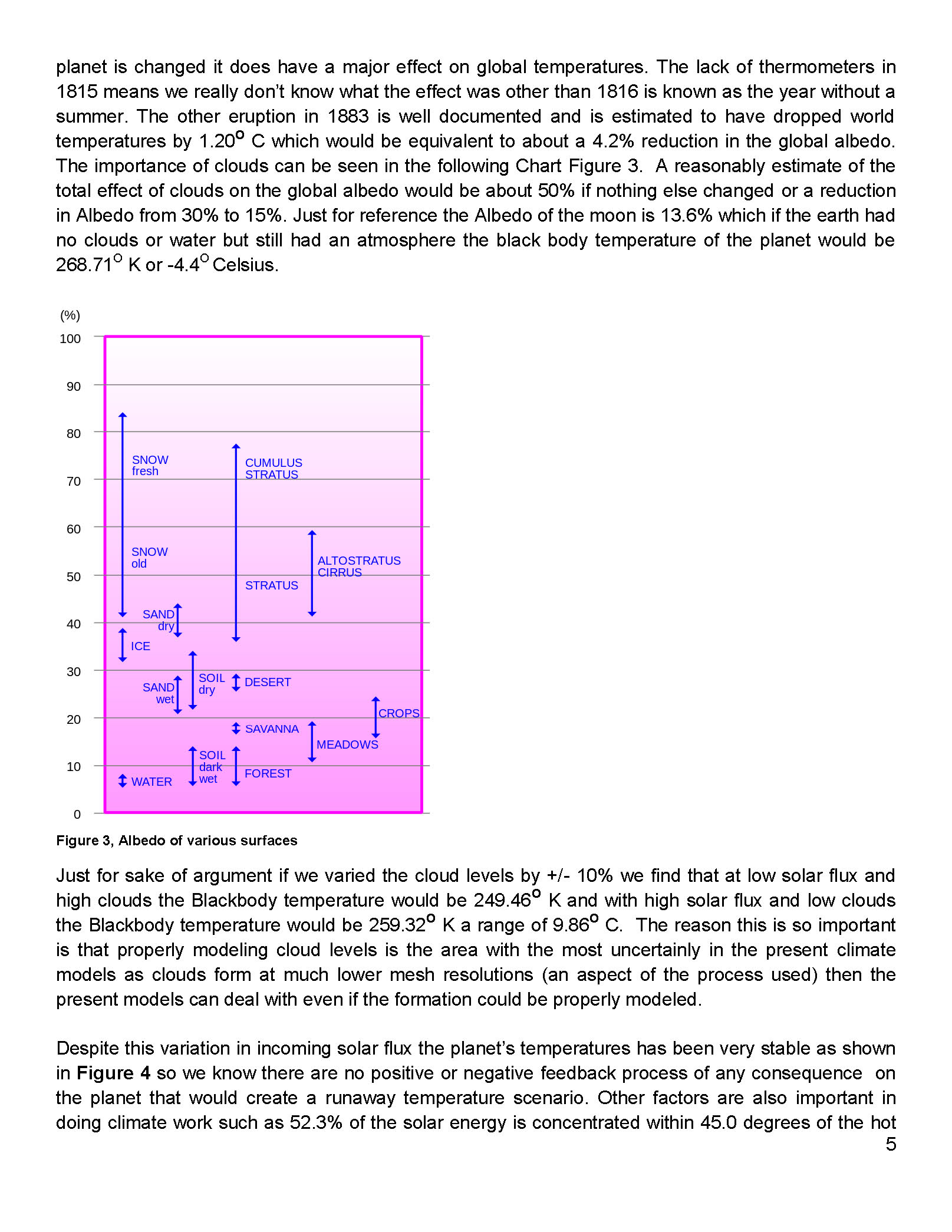
Unfortunately, federal grant money is “directed” money so it was given to find out how bad the issue was, not to find out if it was even bad or even real. Therein was the problem as this is a very complex math and physics study in a subject that had not been previously studied in detail such that 30 years later the key variables and relationship are still not known with specify. The mistake that was made in the attempt to quantify the apparent increase in global temperatures was that increased CO2 in the planet’s atmosphere was that CO2 was the ONLY REASON the global temperatures were increasing. Unfortunately this assumption was not true as there had been several warm and cold periods in history going back thousands of years. The previous little ice age in the seventeenth century was one of these and the warming we now have, about 10 Celsius, is partly from the northern hemisphere still coming out from that cold period.
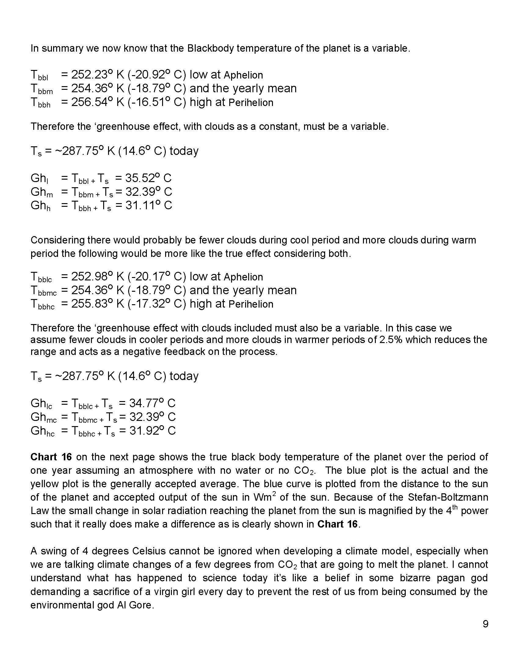
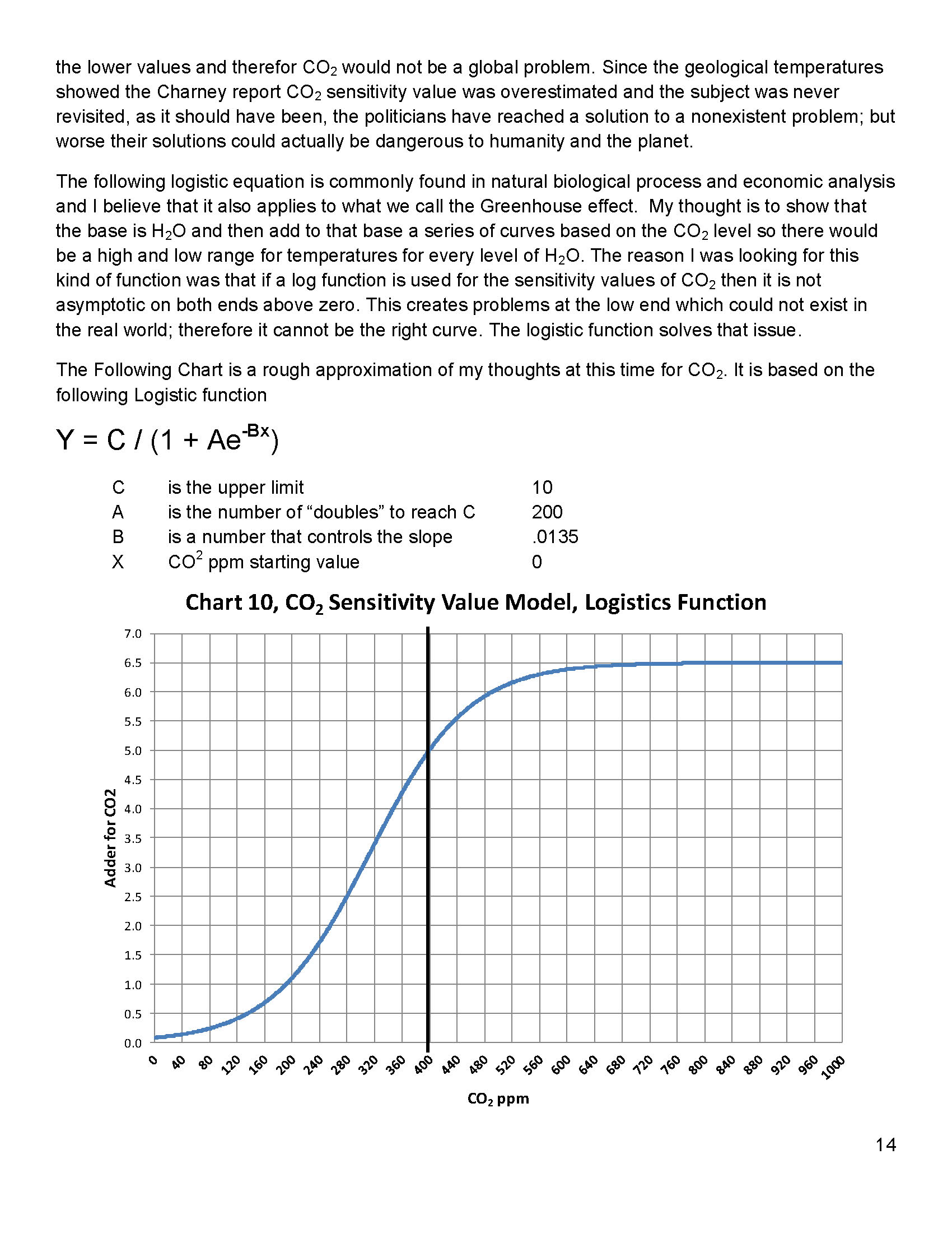
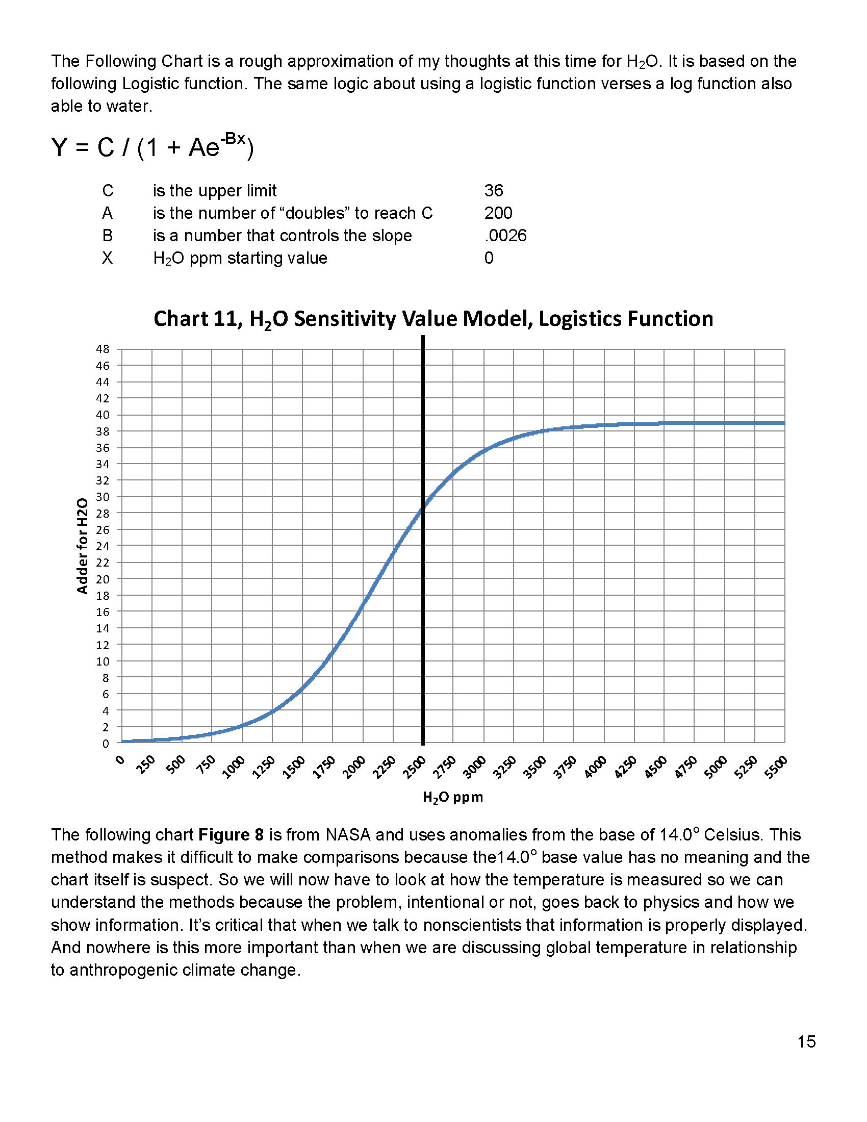
Next we’ll review some important information on temperatures and how it’s measured. We need to understand the details before we can draw conclusions. The problem, intentional or not, goes back to physics and how we show information. It’s critical that when we talk to nonscientists that information is properly displayed. And nowhere is this more important than when we are discussing global temperature in relationship to anthropogenic climate change.
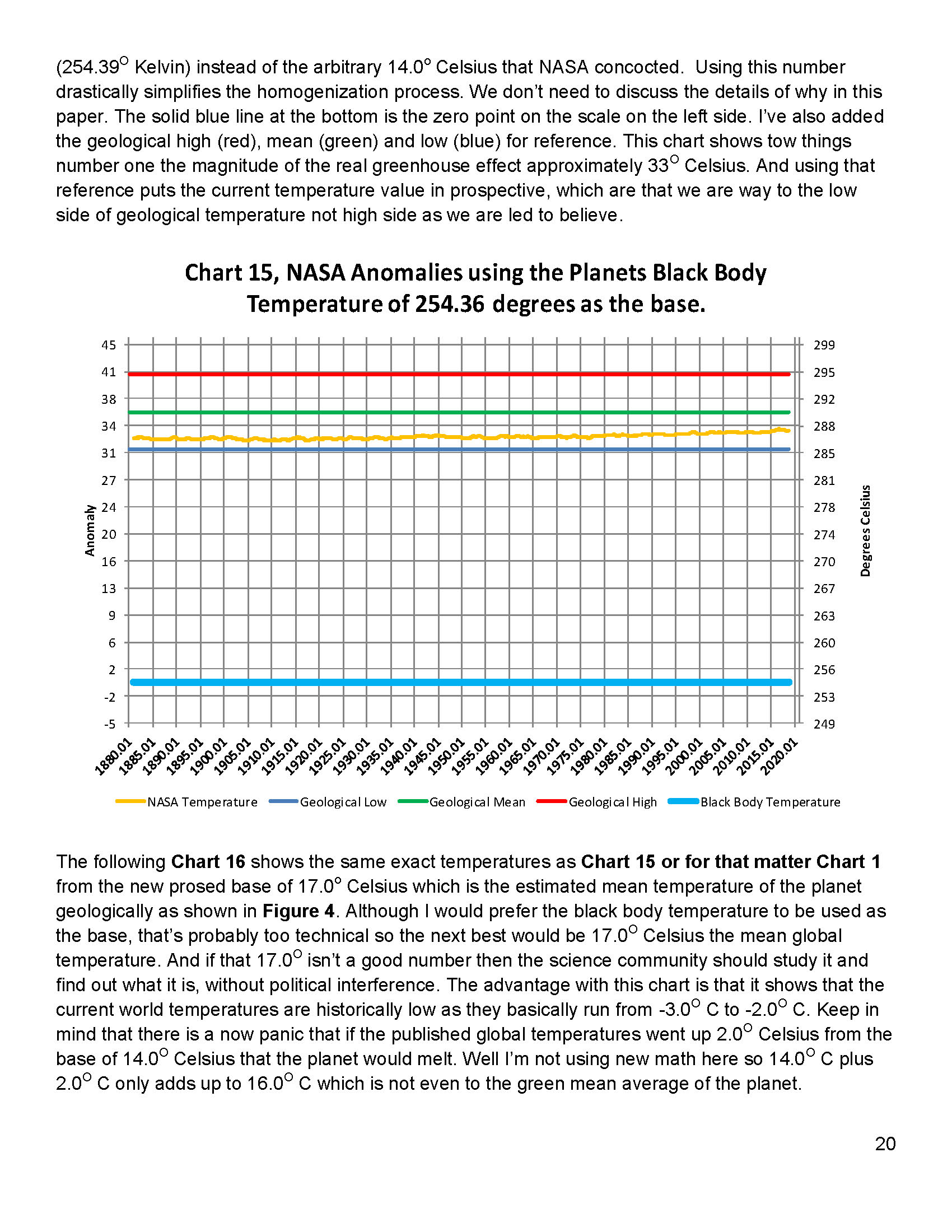
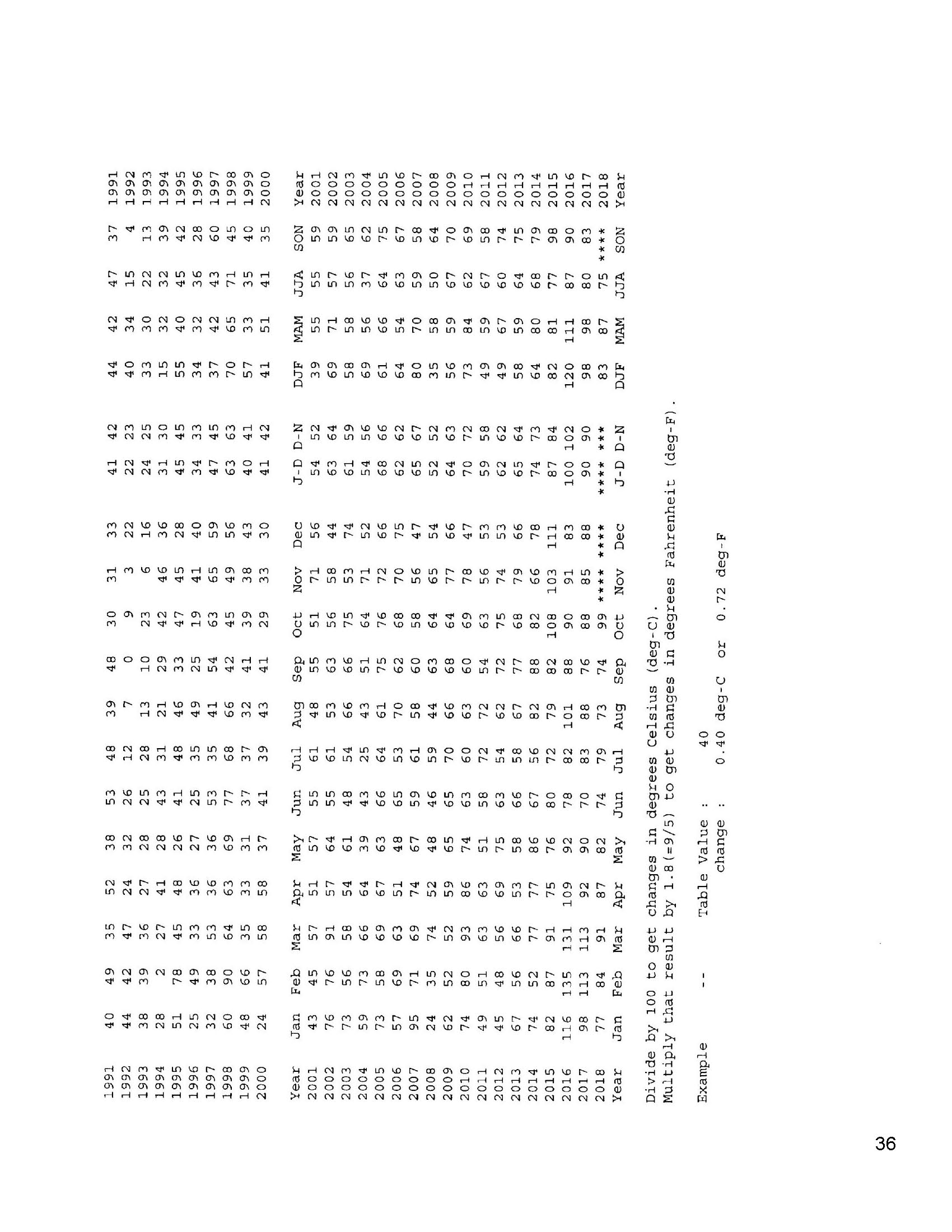
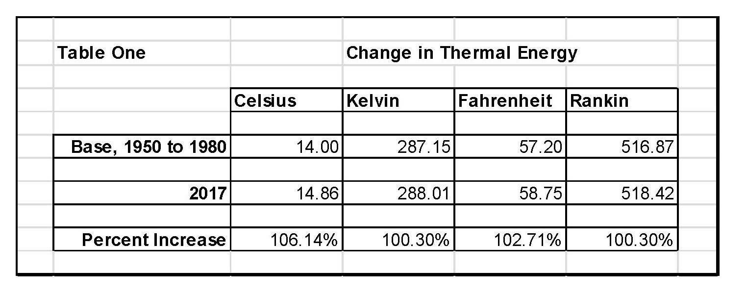
When we talk about climate (long term changes; centuries) or weather (short term changes; decades) local temperatures are going be in Celsius (C) in the EU and science, or degrees Fahrenheit (F) in America. The base temperature for the earth that NASA established is 14.00 C or 57.20 F; but these are both relative measures and do not tell us how much heat (thermal energy) is there. To know that we must use Kelvin (K) or Rankin (R) and that would be 287.150 K and 516.870 R all four of those numbers 14.00 C, 287.150 K 57.20 F, and 516.870 R are exactly the same temperature, just using a different base. But if the current temperature went from 14.00 C, to 14.860 C that is a 6.14% increase in C, an increase of 2.71% in F and an increase of .30% in K and R; so which one is real? The answer is .30% because Kelvin and Rankin are the only ones that measure the total increase in energy! Table One shows these relationships that we just discussed.
The next step is to plot Carbon Diode (CO2) from NOAA-ESRL and the estimated global temperature as published by NASS-GISS each month. As can be seen in Table One It doesn’t really matter whether we would use Kelvin and Rankin since the increase in thermal energy is exactly the same either way; but we’ll use Kelvin as that is the accepted norm in the scientific community for determining the amount thermal energy in any object especially when looking at changes in temperature or measuring the thermal energy in any object. There are other less known temperature scales that have specific purposes but they don’t really apply here in this subject.
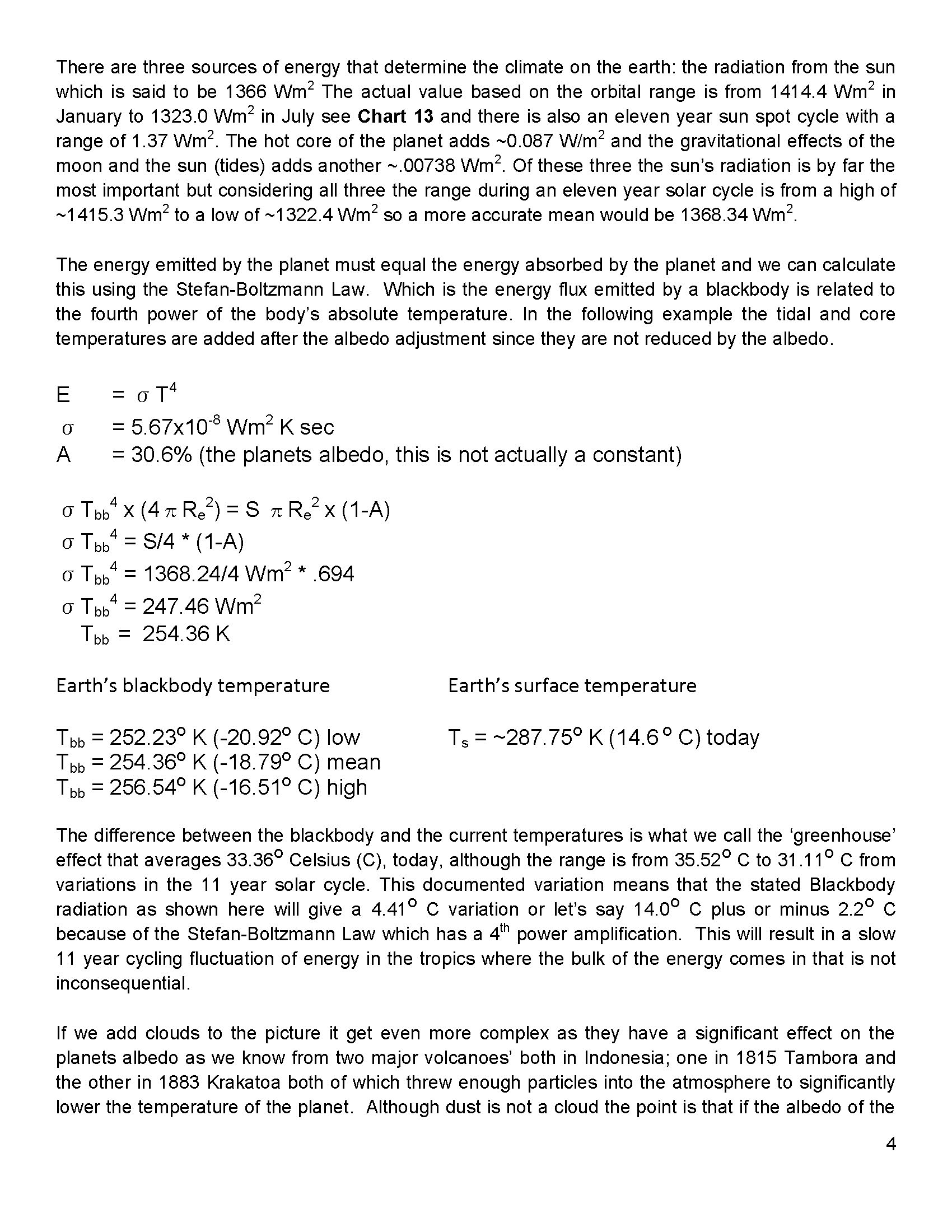
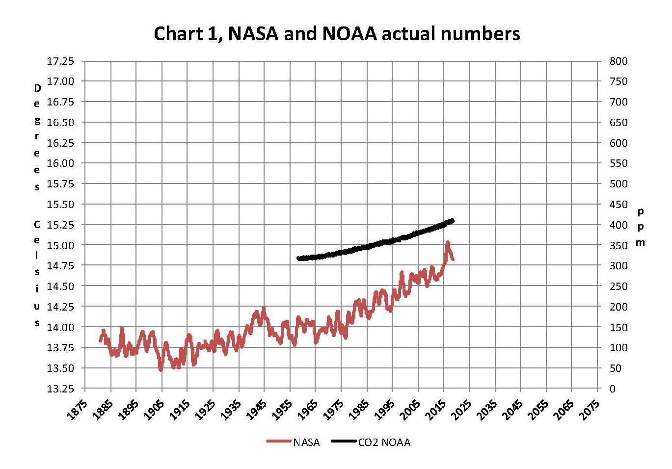
The important thing is how much has the temperature actually gone up since we started to measure CO2 in the atmosphere? To show this graphically Chart 8 was constructed by plotting CO2 as a percent increase from when it was first measured in 1958, the Black plot, the scale is on the left and it shows CO2 going up about 30.0% from 1958 to May of 2018. That is a very large change as anyone would have to agree. Now how about temperature, well when we look at the percentage change in temperature from 1958, using Kelvin, we find that the changes in global temperature are almost un-measurable. The scale on the right side had to be expanded 5 times (the range is 20 % on the left and 4% on the right) to be able to see the plot in the same chart in any detail. The red plot, starting in 1958, shows that the thermal energy in the earth’s atmosphere increased by .30%; while CO2 has increased by 30.0% which is 100 times that of the increase in temperature. So is there really a meaningful link between them that would give as a major problem?
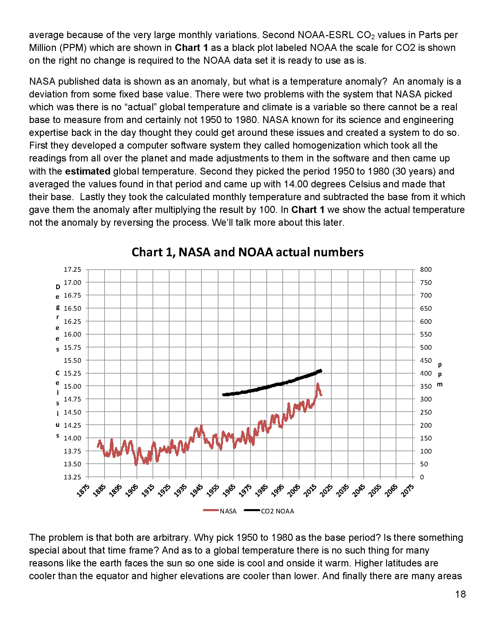
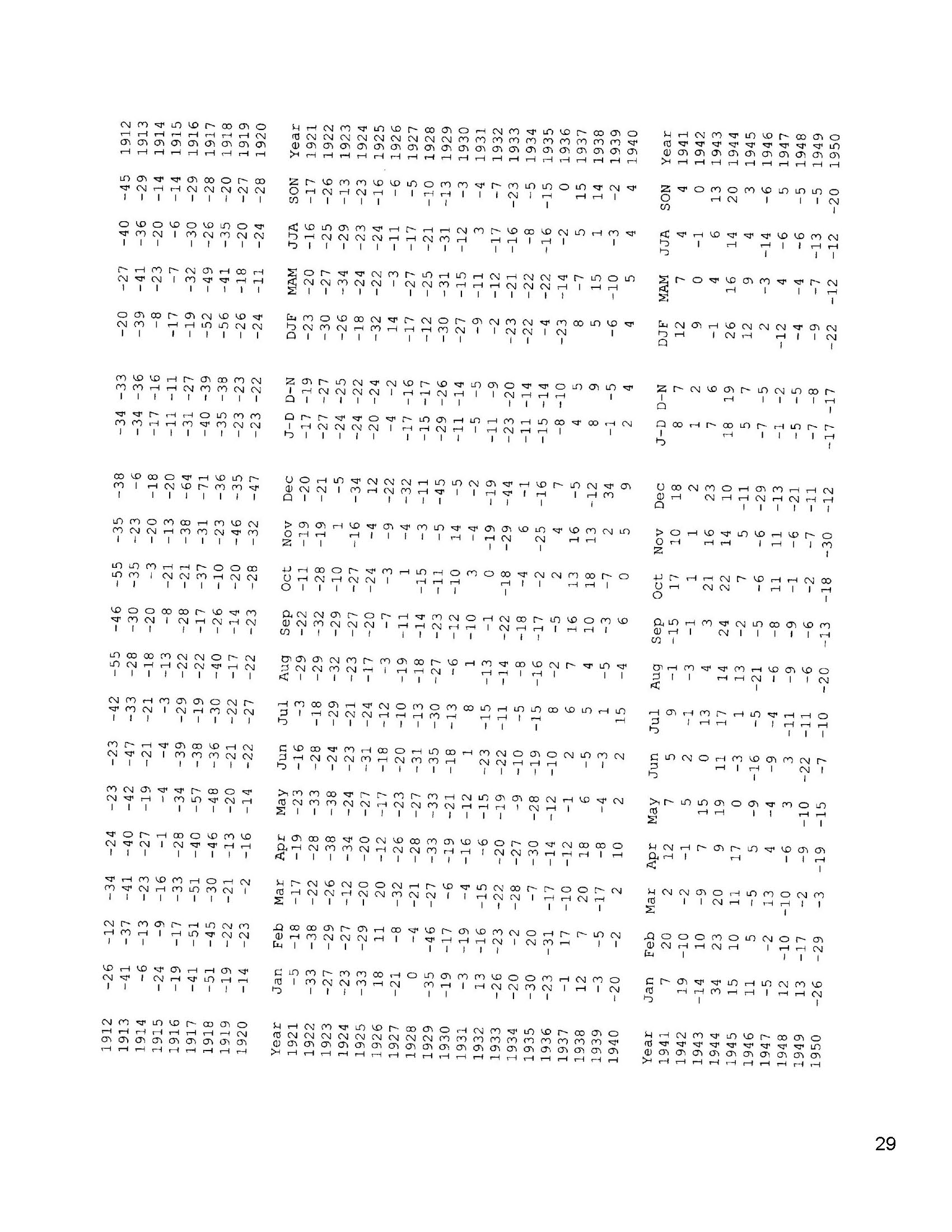
Chart 8 and all the rest of what is shown here in this paper are based on the following two data series. First NASA-GISS estimates of a global temperature shown as an anomaly (converted to degrees Celsius) as shown in their table Land Ocean Temperature Index (LOTI) and shown in Chart 1 as the red plot labeled NASA the scale for the temperatures is on the left. The NASA LOTI temperatures are shown as a 12 month moving average because of the very large monthly variations. Second NOAA-ESRL CO2 values in Parts per Million (PPM) which are shown in Chart 1 as a black plot labeled NOAA the scale for CO2 is shown on the right no change is required to the NOAA data set it is ready to use as is.
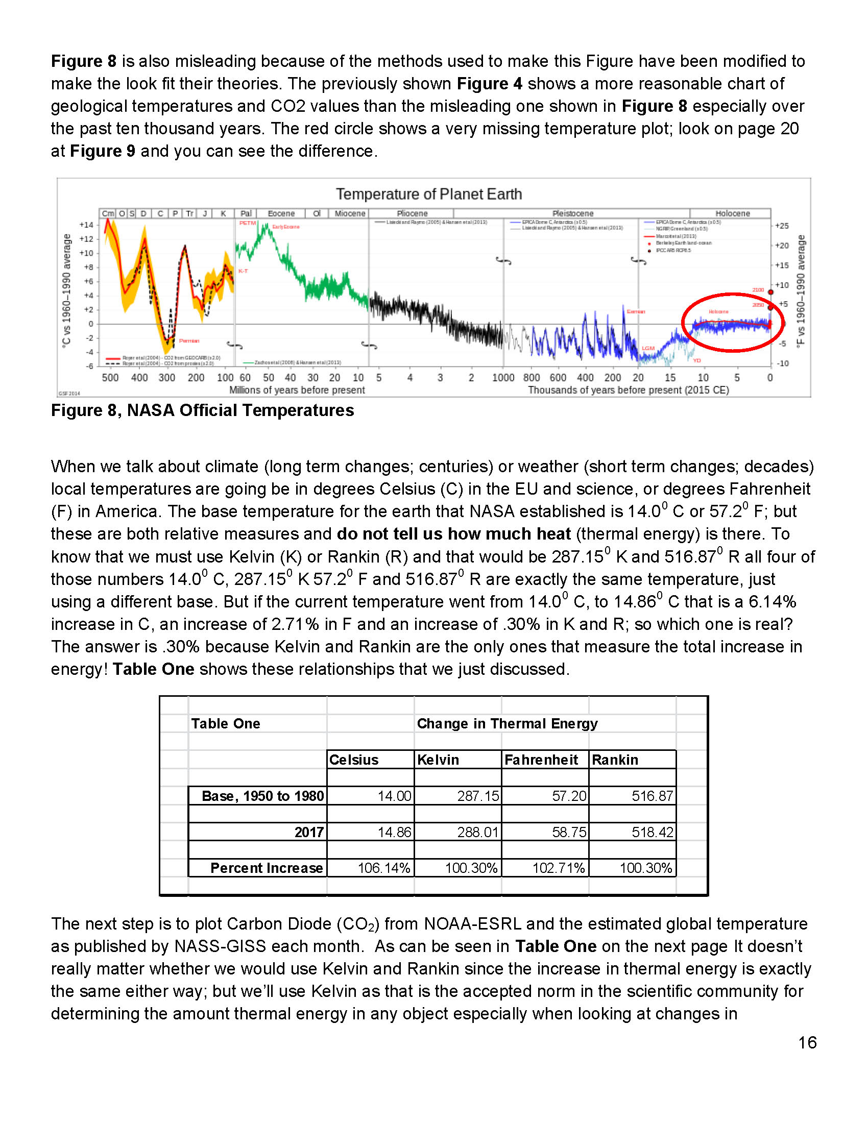
NASA published data is shown as an anomaly, but what is a temperature anomaly? An anomaly is a deviation from some base value normally an average that is fixed. There were two problems with the system that NASA picked which were number one there is no “actual” global temperature and two since climate is a variable and always has been so there cannot be a real base to measure from. NASA known for its science and engineering expertise back in the day thought it could get around these issues and created a system to do so. First they developed a computer model which took the readings from all over the planet and made adjustments to them in software which they called homogenization and came up with the estimated global temperature. Second they picked the period 1950 to 1980 (30 years) and averaged the values found in that period and came up with 14.00 degrees Celsius and make that their base. Lastly they took the calculated monthly temperature and subtracted the base from it which gave them the anomaly and multiplied the result by 100.
The problem is that both are arbitrary. Why pick 1950 to 1980 as the base period? Is there something special about that time frame? And as to a global temperature there is no such thing for many reasons like the earth faces the sun so one side is cool and onside it warm. Higher latitudes are cooler than the equator and higher elevations are cooler than lower. And finally there are many areas where there are no measurements taken. Therefore there is no one temperature only an artificial artifact solely dependent on the soundness of the software used to create that one temperature!
Chart 1 below is 100% accurate and based only on NASA and NOAA data as published.
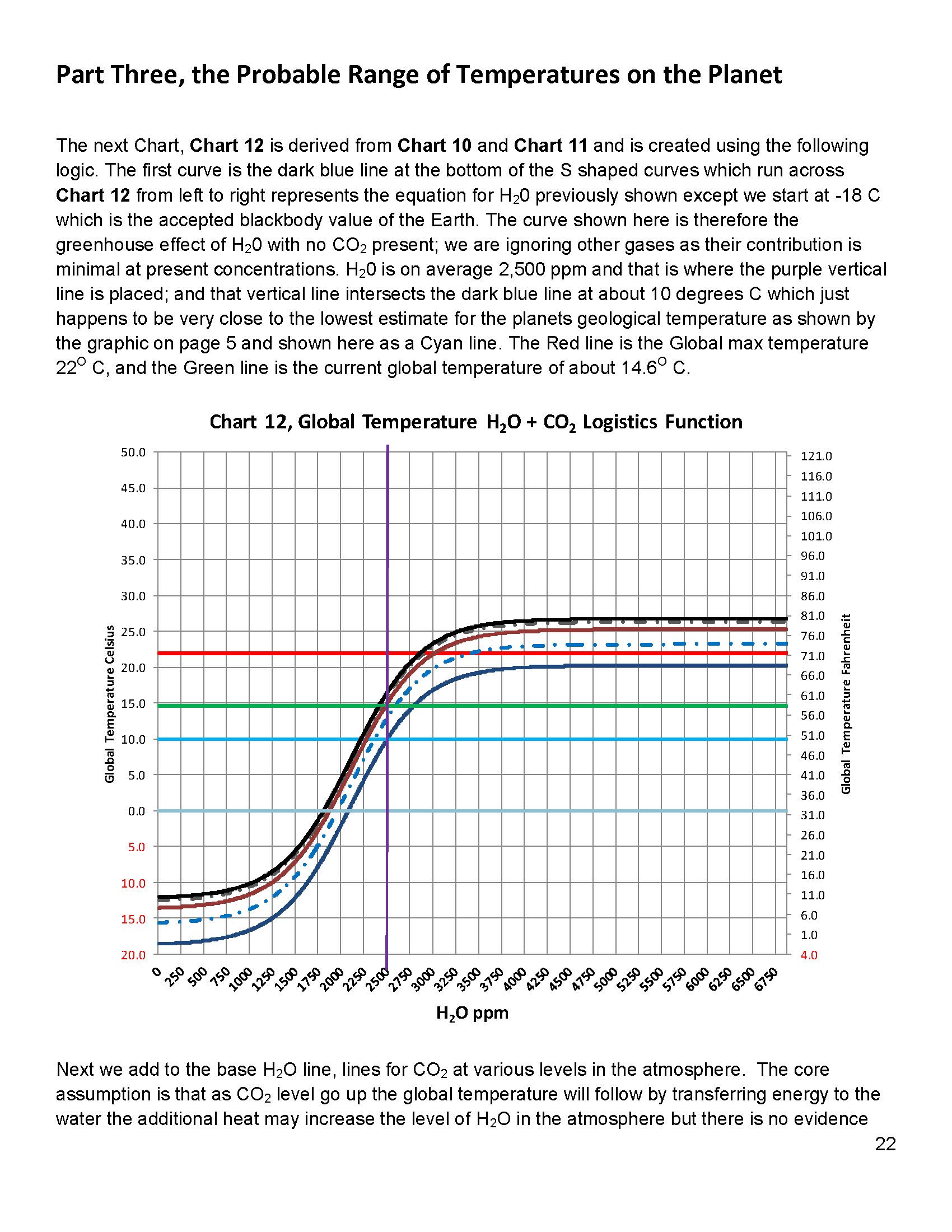
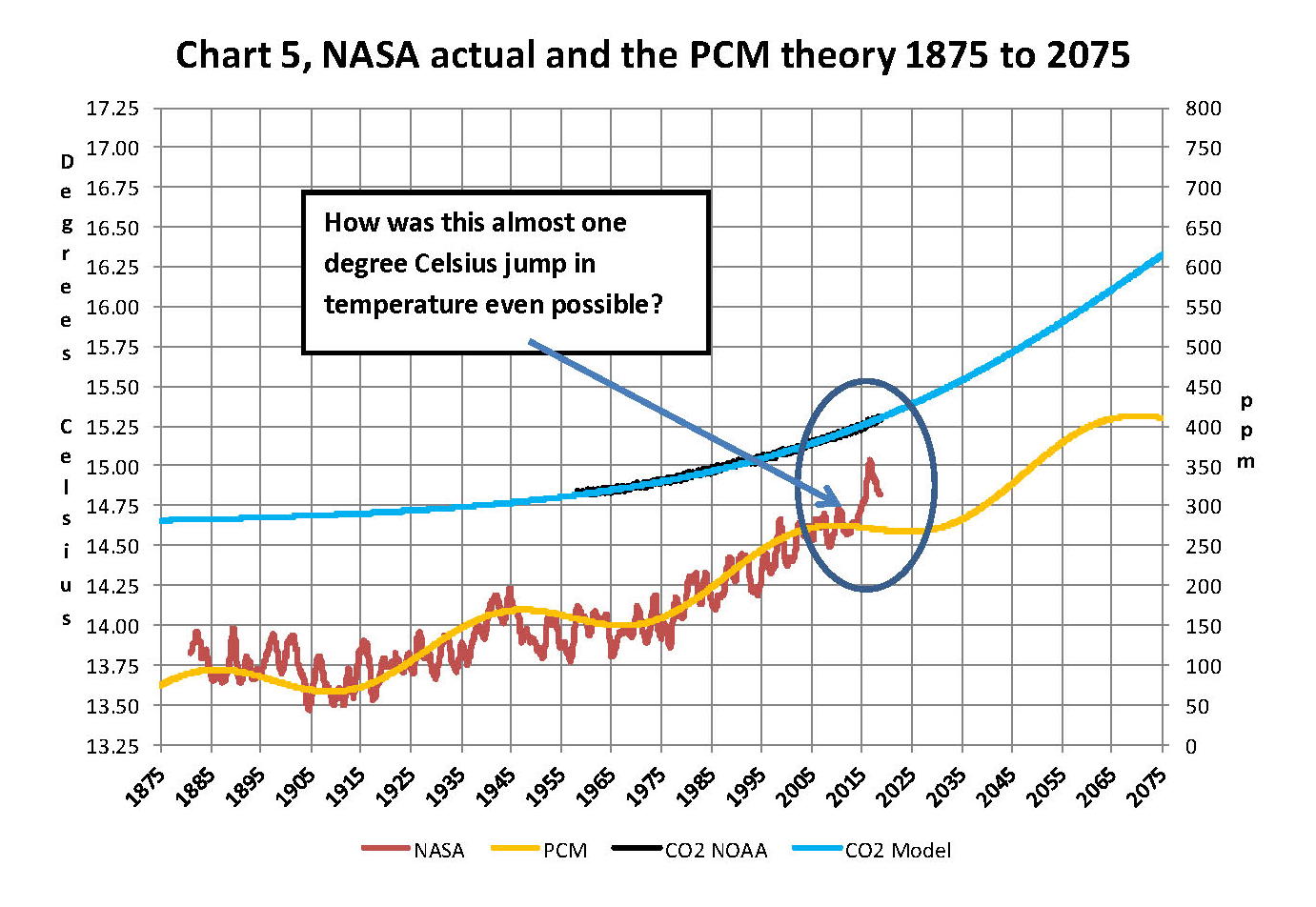
Now that we have a base to work with we are going to add to Chart 1 three things. The first is a trend line of the growth in CO2 since that is according to the government through NASA and NOAA the entire basis for climate change. That plot is superimposed over the black plot of the actual NOAA CO2 values as the cyan line labeled as the CO2 model and one can see there is a very good fit to the actual NOAA values so there should be no dispute about its validity, and it’s historically accurate. This plot allows us to make projections to future global temperatures according to the projected level of CO2The second added item is James E. Hansen’s 1988 Scenario B data, which is the very core of the IPCC Global Climate models (GCM’s) and which was based on a CO2 sensitivity value of 3.0O Celsius per doubling of CO2. This plot is shown here in lavender and is from a presentation that Hansen showed congress in 1988 to help support the UN in setting up the International Panel on Climate Change (IPCC). This plot is labeled as Hansen Scenario B which Hansen stated was the most likely to happen based on his 1979 climate theories’. The third item is the current plot of the most likely temperature of the planet based on the growth of CO2 published by the IPCC. This plot is shown in Red and is labeled as IPCC AR5 A2 as that is the table where the data was found. This plot is a GCM computer projection of the planets temperature based on the complex relationships developed by the IPCC primarily though NASA and NOAA.
It can be seen in Chart 2 that the lavender plot and the Hansen plot are very close from 1965 to around 2000. However there isn’t a good correlation between the growth in CO2 and the increase in the planets temperature, as shown in Chart 8. The CO2 is going up in a log function and the temperature was going up until 2000 then it plateaued from 2000 until 2014 where there was a mysterious spike up of .5 degrees Celsius just in time for COP21 in Paris. Then after CP21 was over the unexplained change in temperature started to come back down. The climate doesn’t make changes like what the NSA/NOAA data shows that would be weather if it even was real.
Chart 7 looks at the period from 2010 to 2020 so we can see where a change in CO2 of only a few ppm has caused a major change in the global temperature way beyond anything previously shown in any published NASA data. There are three ovals on Chart 7 one at the top of Chart 7 which is a black oval around the CO2 levels from 2010 to 2018 and it’s very obvious that there has been very little change, maybe 3 ppm a year Then at the bottom of Chart 7 is dark red oval around the NASA global temperature levels from 2013 to 2018 and its very obvious that there has been a sudden large change, almost .50 degrees Celsius in 3 years. There has never been such a large increase in temperature from such a small increase in CO2. By contrast the previous comparable period of the last part of 2010 through 2013 Blue oval shows about the same increase per year for CO2 but global temperature decreased.
An explanation is needed here as the NASA temperature plot in Chart 7 seems to show the jump in temperature in 2016 not 2015; this is a result of the very large jump in temperature shown by NASA. Since we are using a 12 month moving average and the increase occurred in only a few months it actually shifted the curve into 2016. The raw data for December 2012 was at a low of 14.44 degrees Celsius but by February 2016 the temperature was at a record high of 15.35 degrees Celsius a .91 degree Celsius increase, Red arrow. With the global temperature over 15.0 Celsius at COP21 in December 2015 at the Paris COP21 conference the climate accord was approved and the manipulation was a success. After COP21 the Fake Warming was no longer needed so we are now seeing a downward trend developing. The current temperature for June 2018 is 14.88 degrees Celsius.
In summary, the IPCC models were designed before a true picture of the world’s climate was understood. During the 1980’s and 1990’s CO2 levels were going up and the world temperature was also going up so there appeared to be correlation and causation. The mistake that was made was looking at only a ~20 year period when the real variations in climate move in much longer cycles of centuries which can be observed in the NASA data but they were ignored for some reason. By ignoring those actual geological trends and focusing only on CO2 the Global Climate Models will be unable to correctly plot global temperatures until they are fixed. Also the temperature data from 1850 to 1880 was dropped for some reason as it showed a lower temperature than would be expected. The lower temperatures’ in that period would have shown a shorter cycle they didn’t want shown.
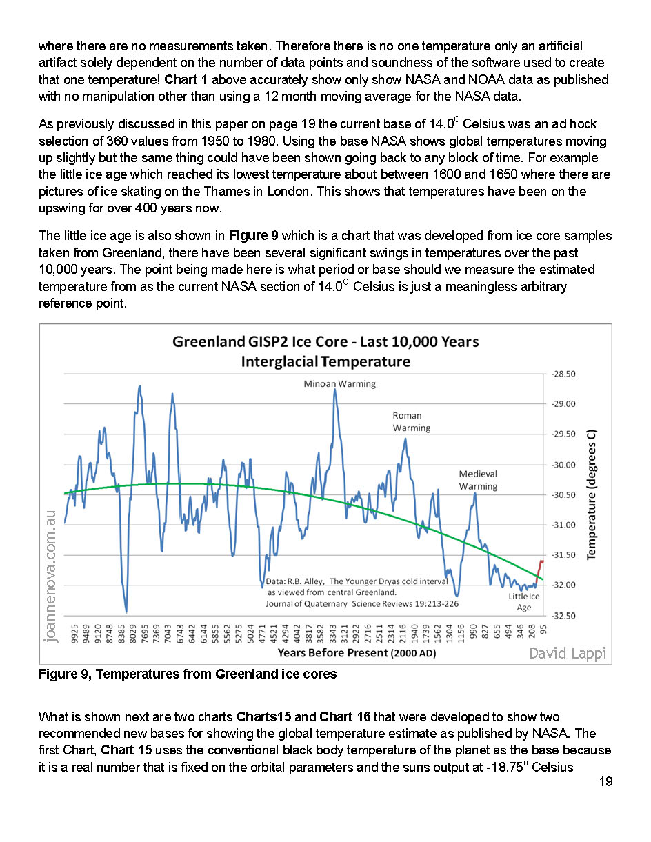
A decade ago when I started looking at “climate” change the first thing I did was look at geological temperature changes since it is well known that the climate is not a constant; I learned that 53 years ago in my undergrad geology and climatology courses in 1964. The next paragraph explains currently observed patterns in climate related to this subject and is historical accurate.
Ignoring the last Ice Age which ended some 11,000 years ago when a good portion of the Northern hemisphere was under miles of ice the following observations give a starting point to any serious study on the subject of climate. First, there is a clear movement up and down in global temperatures with a 1,000 some year cycle going back at least 3,000 to 4,000 years; probably because of the apsidal precession of the earth’s orbit of about 20,000 years for a complete cycle. About every 10,000 years the seasons are reversed making the winter colder and the summer warmer in the northern hemisphere. 10,000 years from now the seasons will be reversed again. Secondly, there are also 60 to 70 year cycles in the Pacific and the Atlantic oceans that are well documented. These are known as the Atlantic Multi Decadal Oscillations (AMO) in the Atlantic and as La Nina and El Nino in the Pacific. Thirdly, we also know that there are greenhouse gases such as carbon dioxide that can affect global temperatures. Lastly the National Academy of Sciences (NAS) estimated that carbon dioxide had a doubling rate of 3.0O Celsius plus or minus 1.5O Celsius in 1979 when there were only two studies available and one for sure and maybe both were not peer reviewed.
The result of looking objectively at the three possible sources of global temperature changes was a series of equations based on these observations that when added together produced a sinusoidal curve that seemed to follow NASA published temperatures very closely when first developed in 2007, and modified a few years later when it was found the short and long cycles were related to multiples of Pi. Since this curve was based on observed temperature patterns it was called a Pattern Climate Model (PCM) which has been described in previous papers and posts on my blog and since it is generated by “equations” many assume it is some form of least squares curve fitting, which it is not. It does seem to be related to ocean currents where the bulk of the planet’s surface heat is stored and cloud formation.
Chart 5 shows the PCM a composite of two cycles and CO2. There is a long trend, 1036.7 years with an up and down of 1.65O Celsius (.00396O C per year) we in the up portion of that trend. Then there is a 69.1 year cycle that moves the trend line up and then down a total of 0.29O Celsius and we are now in the downward portion of that trend (-.01491O C per year), which will continue until around ~2035. Lastly, there is CO2 currently adding about .0079O Celsius per year so together they all basically wash out at -.0039O C per year, which matches the current holding pattern we were experiencing until 2014. After about 2035 the short cycle will have bottomed and turn up and all three will be on the upswing again duplicating what was observed in the 1980’s. Note: the values shown here are only representative from what is in the model.
When using a 12 month running average for global temperatures up until 2014 the PCM model was within +/- .01 degrees of what NASA was publishing in their LOTI table since the early 1960’s as shown in Chart 5. Further the back projection of the PCM plot matched historical records and global temperatures going back past the time of Christ. It should also be considered that geologically CO2 levels have reached levels many times that of the current 400 ppm without destroying the planet so the current hysteria over the current very small numbers can only be explained by political science not real science.
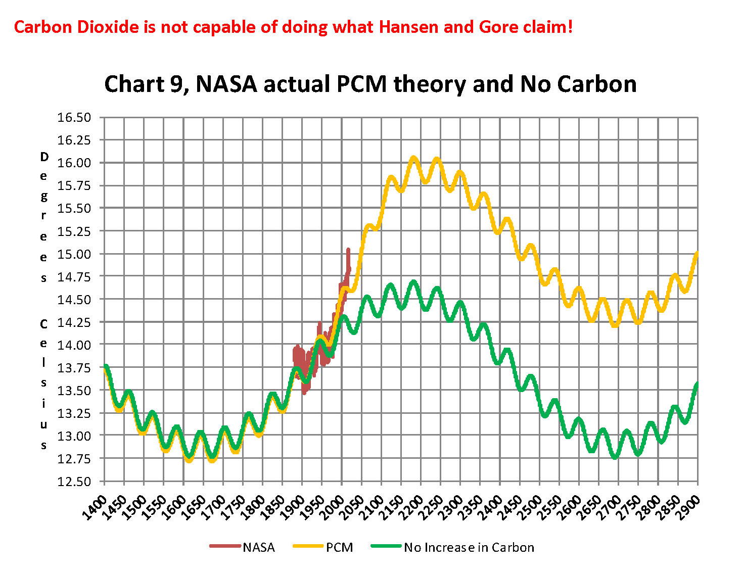
Lastly, Chart 9 shows what a plot of the PCM model, in yellow, would look like from the year 1400 to the year 2900. This plot matches reasonably well with recorded history and fits the current NASA-GISS table LOTI data, in red, very closely, despite homogenization. I do understand that this PCM model is not based on physics but it is also not some statistical curve fitting. It’s based on two observed reoccurring patterns in the climate and a factor for CO2. These patterns can be modeled and when they are, you get a plot that works better than any of the IPCC’s GCM’s. If the real conditions that create these patterns do not change and CO2 continues to increase to 800 ppm or even 1000 ppm then this model will work well into the foreseeable future. 150 years from now global temperatures will peak at around 15.750 to 16.000 C and then they will be on the downside of the long cycle for the next ~500 years.
The overall effect of CO2 reaching levels of 1000 ppm or even higher will be about 1.50 C which is about the same as that of the long cycle. The Green plot on Chart 9 shows the observed pattern with no change in CO2 from the pre-industrial era of ~280 ppm. CO2 cannot affect global temperatures more than 1.500 C +/- no matter what the ppm level of CO2 is. The reason being that the CO2 sensitivity value is not 3.00 per doubling of CO2but less than 1.00 C per doubling of CO2as shown in more current scientific work and it’s a logistics curve not a log curve.
The purpose of this post is to make people aware of the errors inherent in the IPCC models so that they can be corrected.
The Obama administration’s “need” for a binding UN climate treaty with mandated CO2 reductions in Europe and America was achieved as predicted at the COP12 conference in Paris in December 2015. To support this endeavor NASA was forced to show ever increasing global temperatures that will make less and less sense based on observations and satellite data which will all be dismissed or ignored. Within a few years the manipulation will be obvious even to those without knowledge in the subject, but by then it will be to late the damage to the reputation of science will have been done. Fortunately President Trump pulled us out of the bad agreement.
In closing keep this in mind. The current panic generated by the government using political science is that the current global temperature of around 15.0O Celsius is an increase of 7.14% from the 1960’s when the global temperature was 14.0O Celsius; and that does seem like a lot. However those views would be in error as the actual increase in thermal energy, as measured by temperature, would be only .35% because we must use Kelvin not Celsius when working with heat energy. When we use kelvin the temperature goes from 287.15O K to 288.15O K which is only .35% not 7.14% about 1/20 of what is implied by the IPCC. What the IPCC shows is not technically wrong as much as it is extremely misleading to anyone without a science background.
Sir Karl Raimund Popper (28 July 1902 – 17 September 1994) was an Austrian and British philosopher and a professor at the London School of Economics. He is considered one of the most influential philosophers for science of the 20th century, and he also wrote extensively on social and political philosophy. The following quotes of his apply to this subject.
If we are uncritical we shall always find what we want: we shall look for, and find, confirmations, and we shall look away from, and not see, whatever might be dangerous to our pet theories.
Whenever a theory appears to you as the only possible one, take this as a sign that you have neither understood the theory nor the problem which it was intended to solve.
… (S)cience is one of the very few human activities — perhaps the only one — in which errors are systematically criticized and fairly often, in time, corrected.
I have created this site to help people have fun in the kitchen. I write about enjoying life both in and out of my kitchen. Life is short! Make the most of it and enjoy!
This is a library of News Events not reported by the Main Stream Media documenting & connecting the dots on How the Obama Marxist Liberal agenda is destroying America

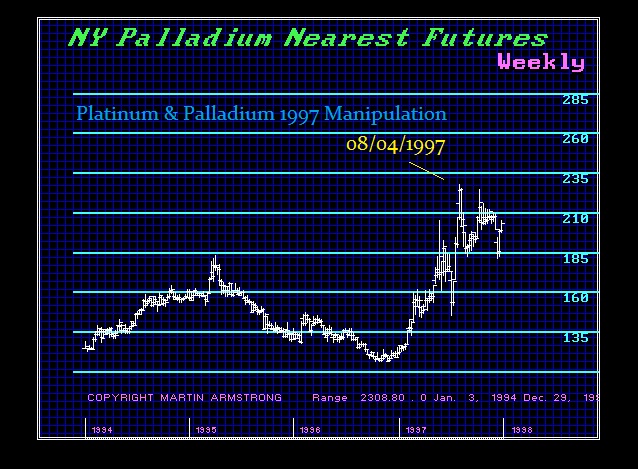
 I believe it was Goldman Sachs who paid bribes to Russian politicians to recall Platinum from the market and temporarily stop sales to allegedly take an “inventory” of their stockpile. This sent prices