American Media Blocked in Europe


The American media companies such as Tronc and Lee Enterprises are now totally dark in European Union countries. Some of those sites include the Los Angeles Times, the New York Daily News, the St. Louis Dispatch, the Chicago Tribune, and the Orlando Sentinel. It appears that various American media have decided to simply block Europe entirely rather than risk that they may publish a story that will inspire GDPR to be invoked on them in retaliation.

Day One Brings Complaints in Europe Against Google & Facebook


It took only one day for complaints to be filed against Google and Facebook under the new General Data Protection Regulation (GDPR). When Mark Zuckerberg testified in front of members of the European Parliament, he insisted that Facebook was ready for Friday the 25th when the GDPR, which is the European Union’s new strict data privacy going into effect. The very first day, complaints against Facebook and Google with others alleging that the tech companies are in violation of the law.

The GDPR was passed in April 2016 and instituted stringent new rules on any company that held consumer data. The real purpose of this is to prevent mass mailing and targeting people for political purposes. You have people like Clapper now claiming he “personally” believes Russia tipped the election because millions of people saw its propaganda. Of course, Clapper did that to other elections outside the USA besides tapping phones of world leaders including Merkel. The old problem is those in government have always assumed the people are stupid sheep because they have lied to them for decades and gotten away with it. The GDPR is all about trying to prevent real freedom of speech in fear that the people might listen and rise up.

The complaints target the user agreements of Google and Facebook which are notorious for being long and complicated to ensure people do not read everything before they click agree. Companies like Facebook and Google are supposed to let you know precisely what kind of data they’re collecting and/or selling about you.

The Facebook owns WhatsApp and Instagram individually as well. The allegations against Facebook and Google claim they are violating the GDPR because they are adhering to the letter of the law and not the “spirit” of the law. That’s what lawyers are for. They alleged that the companies aren’t really offering consumers a choice. You must agree to let Facebook and Google collect enormous amounts of data on you, or you can delete their services. There is no middle ground. It is their way or the highway!

The GDPR expressly allows any data processing that is strictly necessary for the service. However, using the data additionally for advertisement or to sell it on to other companies requires the users’ free opt-in consent. There has been no change to their policy providing “informed consent” about what kind of data Facebook and Google are collecting. Clearly, they are profiling people gathering information that they do not actually “need” to provide their services. GDPR actually exempts collecting data that is really necessary for providing that service and that does not require consent. Go beyond that and anything else requires a free “yes” or “no” option.

The real pro at this tactic is of course government itself. The freedom to travel is limited not just by requiring a passport, but you cannot use a car unless you obtain a drivers license. There is no “choice” in this matter. You consent to get a license or you walk. Just about every other registration process involves the surrender of constitutional rights. For example, you have to register with the SEC or CFTC to get a license in the financial world. However, part of that process is you are “waiving” your rights to search warrants and self-incrimination. A regulator need not go to court to come into your office and audit you. So the license is their way or the highway the same policies being imposed and followed by Google and Facebook. We wonder where they got the idea from?

Both Google and Facebook have stated publicly that they have prepared to be compliant under GDPR. The question turns on their: “you agree or get lost policy”. Both Google and Facebook are in fact adhering to the letter of the law. The GDPR doe not PROHIBIT this policy of consent or get lost. So they are not really in violation. This will be interesting to watch.

Roman Tax on Estate Auctions was the Outrageous Level of 1%


QUESTION: Mr. Armstrong; You recently showed a coin of the emperor Hadrian burning tax records. Was there a tendency to always raise taxes as we have today to extreme levels? It seems that our government here in BC just assumes everything you have belongs to them. We should be grateful for what they allow us to retain. That is really the attitude here in Canada. Has this been the norm for governments in general?

KV

ANSWER: Actually no. This attitude toward tax level over 10% is the product of Socialism. Even the notorious Emperor Caligula abolished taxes placed on auctions. This was the norm was that estates were liquidated and the proceeds went to the family. Augustus put in this auction tax which was effectively like an Inheritance Tax. It caused a lot of tax protests. The tax level was the outrageous level of 1%. The next emperor Tiberius bowed to the pressure and cut the tax in half to just 0.5%. Then Caligula followed Tiberius and he issued this coin announcing that the abolished the auction tax altogether. Note that the coin has SC meaning it was sanctioned by the Senate.

Overall, Rome did not have any direct taxation on income and this was the model for the Founding Fathers of the United States where the Constitution forbid direct taxation. The Roman Empire only imposed indirect taxes. It was Augustus who added to the taxes on harbors and manumission the centesima rerum venalium.  Augustus imposed the 1% tax on the price of articles sold at auctions. There was the quinta et vicesima mancipiorum, or 4% tax on the price of every slave purchased but a 5% if you freed a slave. Then there was the vicesima hereditatum et legatorum, of 5% on all inheritances above 100,000 sesterces, which did not fall to the nearest blood-relations, and on all legacies. The freedom of the citizens from direct taxation following the victory of the Punic Wars continued unimpaired. Emperor Caracalla in 212 AD granted to all free subjects of the Empire the right of citizenship, but it did not abolish taxation as was the case for those in Italy. The customs tax was 2.5% and there was a religious tax on Jews of an extra two denarii a year for not supporting the temples. Diocletian (284-305AD) removed the last distinctions between the inhabitants of Italy and of other parts of the Empire by introducing into Italy the same taxation as obtained in the provinces.

I think we all would prefer an Emperor with low taxation than career politicians who never leave office either and want everything we earn.

The 8.6-Year Frequency is Within Nature


QUESTION: You have noticed that the 8.6-year frequency even allowed you to see that volcanic eruptions would begin in 2018. Are there other examples from history where you have found this to also be true or was Hawaii just unique?

PK

ANSWER: Oh, there are plenty of examples. Let’s take one of the most famous volcanic eruptions in history – Vesusius. Everybody has heard of Pompeii which was destroyed by the eruption of August 24th, 79AD. That eruption was so violent, it hurled stone and ash 20,000 meters (65,000+ feet) into the sky which then came down and buried Pompeii and Herculaneum. There is even a current song out on the destruction of Pompeii by Bastille.

However, there was a major earthquake 17.2 years before (2 x 8.6) which took place in 62AD which was devastating and also produced a tsunami. On February 5th, 62 AD a powerful earthquake that was probably a 7.5+ in magnitude occurred, with the epicenter at Pompeii. The Latin adviser to Emperor Nero (54-68AD) Seneca the Younger wrote a description of the event. Sheep died from falling rocks and statues were toppled. He even said some people lost their minds and wandered around in their madness.

This earthquake was as significant and 1906 San Francisco earthquake which destroyed much of the city. Like the 1906 San Francisco Earthquake led to the Financial Panic of 1907, which inspired the creation of the Federal Reserve by 1913, almost 8 years following that disaster, we see similar reforms in Rome which also included a monetary system reform. Pompeii at the time had a population of at least 20,000 and was a tightly packed city which was not particularly favorable for surviving earthquakes. Much of the city was constructed from bricks which then to crumble easily. Seneca reported that while Pompeii was severely damaged, Herculaneum had far less damage while Naples was barely touched. He described the earthquake in vivid terms:

What hiding-place will creatures find, where will they flee in their anxiety, if fear arises from below and is drawn from the depths of the earth? There is panic on the part of all when buildings creak and give signs of falling. Then everybody hurls himself headlong outside, abandons his household possessions, and trusts to his luck in the outdoors. What hiding-place do we look to, what help, if the earth itself is causing the ruin, if what protects us, upholds us, on which cities are built, which some speak of as a kind of foundation of the universe, separates and reels?

The sixth book of his Naturales quaestiones entitled De Terrae Motu (Concerning Earthquakes)

February 5th, 62AD a tsunami or tidal wave hit Ostia, the port of Rome. Whatever could go wrong for Nero would go wrong until he was forced to commit suicide in 68AD. At that moment in history, there were perhaps 300-grain ships in the harbor waiting to unload. These ships would arrive from Alexandria and Carthage once a year and had the vital grain supplies for Rome for the entire year. All of them were engulfed by the tsunami and their cargoes lost. This natural disaster created rioting in Rome for the people feared they would starve and the bankers were in a state of panic down the Via Sacra, the Roman version of Wall Street. Nero was forced to respond taking a political action that began his downfall in popularity. Nero in 62AD rationed the stored grain supplies to the people of Rome. He issued this coin in 64AD, two years later, announcing that the damage to the port had been repaired.


Back at Pompeii, the earthquake affected the demographics of the city. The rich patricians who used Pompeii as a summer resort decided to move elsewhere and a new class of merchants and traders took their place and rebuilt the city. Dedicatory plaque at the Temple of Isis. This plaque declares that Numerius Popidus Celsinus provided the money to rebuild the Temple of Isis after the earthquake. Indeed, the process of repair was slow and extensive. We can still see the repair work in the ruins today. There were projects such as the embellishment of the Forum and repairing the city’s water supply which was also destroyed. Nero also had to contribute funds for the rebuilding of Pompeii. Perhaps, his second wife, Poppaea Sabina was Pompeian and that is where her family was located. The Villa Poppaea is an ancient Roman seaside villa located between Naples and Sorrento. The villa itself is quite a large structure situated in the ancient Roman town of Oplontis which most of it also remains about 35 feet below current ground level under modern Torre Annunziata.  Evidence suggests that it was owned by Emperor Nero, and it is believed to have been used by his second wife, Poppaea Sabina (30-65AD), as her main residence when she was not in Rome.

Then on the night of July 19th, 64 AD, a fire broke out among the shops lining the Circus Maximus. In a city of two million, was suffering under a very hot summer. Despite the claims that Nero started the fire, he himself was miles away in the cooler coastal resort of Antium. The ruins of the Villa Nero are to be found on the sea about 35 miles north of Rome in the modern town of Anzio.

Nevertheless, the Great Fire of Rome was no ordinary fire. The flames raged for six days before coming under control; then the fire reignited and burned for another three days. When the smoke cleared, 10 of Rome’s 14 districts were in ruin. The 800-year-old Temple of Jupiter Stator and the Atrium Vestae, the hearth of the Vestal Virgins, were gone. Two-thirds of Rome had been destroyed.

Nero returned to Rome to organize a relief effort, which he paid for from his own funds. Nero’s contributions to the relief extended to personally taking part in the search for and rescue of victims of the blaze, spending days searching the debris without even his bodyguards. These are not actions of a man who would have deliberately torched the city. Even after the fire, Nero opened the royal palace to provide shelter for the homeless and arranged for food supplies to be delivered in order to prevent starvation among the survivors.

Tacitus, in one of the earliest non-Christian references to the origins of Christianity, notes that the population searched for a scapegoat and rumors held Nero responsible. To deflect blame, perhaps Nero or someone in the administration targeted Christians. He ordered Christians to be thrown to dogs, while others were crucified and burned. But the citizens of Rome did not believe that the Christians had anything to do with the affair and preferred the political forces in play used this to blame Nero claiming he was trying to deflect blame. What we must understand of this period is that everything was seen as a sign or action of the gods. Indeed, the Rev Jerry Falwell and Pat Robertson both said on national television that the terrorist attack of 911 on the World Trade Center was the act of an angry God who allowed the terrorists to succeed in their deadly mission because the United States had become a nation of abortion, homosexuality, secular schools and courts, and the American civil liberties union. Back then, this was seen as the gods were angry with Nero for killing his mother Agrippina and Claudius’s son Britannicus.


Therefore, with the Pompeii Earthquake of 62, the tsunami that destroyed the food supply, and then the Great Fire of Rome all within a 2-year period, the people turned against Nero who they saw was the reason the gods were angry. It was Nero who began the first debasement of the Roman silver coinage. We do not know the exact date, but we can reach an approximate date being late 63 AD to the very worst 64AD. Therefore, it clearly appears that Nero increased the money supply post-Pompeii Earthquake of 62AD. Then the Great Fine his by July 64 AD and the amount of coinage increased output by Nero more than doubled.

Meanwhile, a continued period of seismic activity began over the course of 17 years (two 8.6-year cycles) right up until 79 AD when Mt. Vesuvius erupted destroying the towns was dangerous. However, the small tremors were only seen as signs from the gods, and the eruption in 79 of Mt. Vesuvius was largely unexpected.

Yes even Sports Comply with Cycles


COMMENT: Mr. Armstrong; I have a friend in the management of the NFL. I sent him your piece on the decline of their industry and how the protests we really turning people off. Well, they have now banned protests during the game. They revised their policy mandating that players and team personnel present on the sideline “shall stand and show respect for the flag and the Anthem.”

Just letting you know.

P

football

REPLAY: Yes, the viewership for the Superbowl peaked with the Economic Confidence Model in 2015 and then it began a three-year decline so far into 2018 it has reached a new 9-year low. This has been 3 years down since the major peak in 2015. Players have no right to protest when they are being paid for a job. No employee can say I am not coming to work because I want to protest Trump but you still have to pay me anyway. Personal time is personal. When you are on the clock, you are being paid for a specific job. We have simply put everything into the computer. Sports also peak with the economy and before it turns down hard.

Here is the attendance of the New York Yankees from 1913 (not TV viewership). We can see that attendance declined during the Great Depression, bounced after the war, dropped into 1972 following the collapse of Bretton Woods in 1971, and then began a broader rally that lasted 36 years until 2008. Baseball was also a leading indicator for the decline in viewership for the NFL. The decline post-2008 is mirroring the decline in liquidity in markets as well.

Jesse Livermore – Greatest Trader of All Time?


QUESTION: Dear Mr. Armstrong:

Thanks for your soon reply. I ask you:

1. Why do you consider Jesse Livermore the greatest investor of all time?. 2. Which are the main reasons?.

I look forward to hearing from you as soon as possible.

Sincerely,

JEMV

ANSWER: Jesse Livermore (1877 – November 28, 1940), was a famed American investor and security analyst who was not always right. He was famous for making and losing several multi-million dollar fortunes and renowned for his short selling during the stock market crashes in 1907 and 1929. I would not necessarily say he was the all-time BEST trader in history. He has often been regarded as such. Jesse was very good. He could have been a bit more disciplined, but perhaps that applies to us all. Just as I may regard Jesse as one of the best, Jesse Livermore called James R. Keene (1838-1913) the “greatest of them all” with no hesitation. I, however, disagree. There is a difference between a perpetual bull and someone who can play the short-side. It takes a “nose” to be the latter.

Keene also made and lost fortunes many times over. He made his first fortune in California trading stock in mining companies. He rose to the top and even became the present of the San Francisco Stock Exchange. In 1876, he moved to New York City where the big money traded. He began investing heavily in race horses. Then in 1884, he suffered tremendous losses in the Chicago grain market, which wiped him completely out. It was this loss that made me lose respect for him. He was betting on the long-side, not the short-side. He simply bought and held. That is not a “trader” in my book.

Yet, James began a remarkable comeback after he was hired by Wall Street investor William Havemeyer to manage a stock fund. His reputation grew and he was very good at market manipulation. He was then hired by J.P. Morgan and William Rockefeller to manage their funds. Keene knew how to “manipulate” markets to make money, but on the long-side. That is not a trader to me. Yes, he had a talent for marketing something to make a profit. But anyone can get rich with a buy and hold strategy. If they are completely wiped out in a crash, that proves they do not have a “nose” for trading. They are just the standard buy and hold variety.

Therefore, what I will say is this with respect to WHY I rank Jesse above Keene. Jesse began trading at the young age of fourteen, and I understand this because I began at the age of thirteen. Jesse ran away from home because his father wanted him to be a farmer. I did not run away from home, but my father wanted me to be a lawyer. What I can say from my personal experience is that some of us are just born with a “nose” for some talent. You see kids with amazing talents who sing or play a piano. Who knows where it comes from. All I can say is nobody taught me how to trade — I just did it. I suspect that Jesse was the same. He was born with a talent to see patterns within patterns and developed a “nose” for trading.

I too could smell the blood come from the tape of quotes and somehow had an instinctive “feel” for how a market would crash. I was named Hedge Fund Manager of the year back in 1998 because I made so much money shorting the markets for the Long-Term Capital Management Crash keying off of the Economic Confidence Model. But there was something in the air. I could smell it. Can’t really describe it. You feel it in your bones like a storm approaching. You just know. Jesse clearly possessed that same instinct. It was obvious from his trading. But Jesse may have made more money on the short-side, but that is because you just make far more money on a short in a crash compared to a long which is often like watching grass grow because it takes time. Jesse could see BOTH sides of a market. I have called bull markets and bear markets. That is a trader — not someone who is only a long-player. That is an investor and by no means a trader.

Jesse Livermore began his career by posting stock quotes at the Paine Webber brokerage in Boston. While working with the data, Jesse most likely saw the ebb and flow of the markets and the patterns within patterns. He would write down certain calculations he had about future market prices and then later check to see if he was correct. Some friend convinced him to put actual money on the market by making a bet at a bucket shop. By the age of fifteen, Jesse had made over $1,000 which was about an annual salary at that time. Because Jesse was a consistent winner, he was banned from most bucket shops from trading as they liked people who lost. This is probably why he left town and moved to New York City where he devoted all his energies to trading in the big markets.

Jesse did not always trade by his rules. He was famous for playing his gut feelings, selling Union Pacific Railroad short right before the 1906 San Francisco earthquake. The key to being a good trader, believe it or not, is never think about the money. If you think about the money, you freeze and cannot trade. I fully agree with Jesse’s comment after taking a loss:

“The loss of the money didn’t bother me. Whenever I have lost money in the stock market I have always considered that I have learned something; that if I have lost money I have gained experience, so that the money really went for a tuition fee. A man has to have experience and he has to pay for it.” 

I have personally said many times that one should appreciate victories but cherish losses. It is ONLY from losses that we learn HOW to trade!

Many people criticized Jesse’s famous trade going short at the top of Union Pacific. Many claimed it was just luck and judged him based upon the fundamentals since he sold it before the April 18, 1906, San Francisco earthquake. With hindsight, the California earthquake of 1906 ranks as one of the most significant earthquakes of all time. However, the market peaked in January 1906 so it was not a tricky trade simply because the earthquake after he went short. I gathered the data to see IF I would have taken that trade personally. I must confess, I would have shorted that stock at the same time. Why? Let’s look closely and I will explain this as a trader who always had a good “nose” for trends myself.

As the story goes, one day in early 1906, Jesse stopped into a brokerage office where he was vacationing. Some said it was the Breakers Hotel Palm Beach in Florida which had opened up in 1896, and others said it was Atlantic City. Both were “the place” to go back then to get some sun. I would assume in January to March he would have gone to Florida and not New Jersey.

Livermore sold short Union Pacific, which was THE railroad giant and this one share accounted for around 50%+ of the trading volume back then. Jesse picked up a pad and wrote an order to sell a thousand shares of Union Pacific. The broker thought it was a mistake. Surely, he would not short a stock that always went up. After the first sell, Livermore began to press the market selling 2,000 shares short. He did these trades while on vacation. Jesse then cut his vacation short and quickly jumped on the train and returned to New York City. He added to his position again and the next day the San Andreas Fault ruptured at 5:13 a.m. on April 18, 1906.

The Dow Jones Railroad Index had just been split off when the index began in 1885, tracking 14 shared composed of 12 railroads and two industrials. Because of mergers, the following year saw the index composed of 12 shares of which 10 were railroads and two industrials. In 1889, the index was now changed to 20 shares composed of 18 railroads and two industrials. Because of the Industrial Revolution was just starting, the index was split in 1897 into the industrials and the railroads. But it was the railroad stocks that were dominant until the Panic of 1907.

The Panic of 1901 is not high on the list of memories but it was an important event which actually resulted in the peak in most railroad shares. The Panic was in part caused by a manipulation on the New York Stock Exchange as the struggle between E. H. Harriman, Jacob Schiff, and J. P. Morgan/James J. Hill fought for the financial control of the Northern Pacific Railway, which has been the major focus of Jay Cooke back in the day of the Panic of 1873. As the market crashed, a compromise was finally reached and the players agreed to form the Northern Securities Company. Then in 1904, the Supreme Court ruled against them that it was a monopoly in Northern Securities Co. v. United States, 193 U.S. 197 (1904).

The market peaked on January 22, 1906, closing at 138.36 on the Dow Railroad Index. The night before the earthquake the index closed at 132.66. After the news hit New York and the full extent of the damage to the railroad was known, the traders panicked and Livermore sold even more shares short. When the market fell for 10 days straight, closing at 121.89 on April 28, Jesse brought back all of the shares and racked up a profit of a quarter of a million dollars on one trade.

When we look objectively at the position of the market, it is clear what Jesse saw. The railroad stocks overall had really peaked during 1901 and were devastated during that Panic. Then there was the Rich Man’s Panic of 1903 where the final low unfolded. The Panic of 1903 reached its nadir in the Industrial Index on November 9, 1903, while the railroads bottomed nearly two months before on September 28, 1903. Industrials were just getting started and were seen as the more risky market to play. John Gates (1855-1911), otherwise known as Bet-A-Million Gates because he was a huge gambler on horses, was considered one of the leaders of Wall Street. Gates was an industrialist who made his fortune by promoting of barbed wire. Gates went on a European business trip and vacation during 1902 and returned just in time for the 1903 panic. He was met at the dock by the press who wanted to hear his comments on the crash. He said:

“I am surprised at the condition of the stock market,” he told reporters who met his ship. “It is not natural. The causes are purely artificial, and they rest on a false basis. I do not believe there was ever a better time to invest in reasonable securities. I have come back stripped for the fray, and I am going down into Wall Street.”

Gates immediately formed a bull syndicate to buy up shares he believed were underpriced and of good value. Nevertheless, the market continued to trade against him during the spring of 1903 and then it resumed the decline during early summer.

The market really did not stabilize until late August when J.P. Morgan returned from his annual European art-collecting expedition. The mere presence of Morgan would calm markets. By October, the low was firmly in place with the railroad, but the industrials would have to wait for November before prices were on the way up.

The Rich Man’s Panic was the test before the rally into 1906. The little investor was out after 1901 and no longer trusted the market. Thus the recovery was in the hands of the investment bankers.


In 1923, the Wall Street Journal falsely accused Jesse Livermore of turning bullish on the market because he was friends with the president. The Journal accused him of trying to influence the presidential election. When the market broke out and rallied, all the other publications took swipes at the WSJ saying everyone reported Jesse’s comments “except” the WSJ. Livermore suffered at the hands of some in the press.

One of the primary reasons I would rank Livermore is the best trader is because he would take both sides of a market. By the end of the Panic of 1907, Jesse was worth at least $3 million and probably peaked at $100 million after the 1929 market crash. If we adjust this number for inflation, by 1932, Jesse was worth probably $1 billion in 2017 dollars. He subsequently lost that fortuned on the rally out of 1932. Livermore would add to positions as the market moved in his direction. Nevertheless, Livermore sometimes did not follow his own rules strictly. He claimed that his lack of adherence to his own rules was the main reason for his losses after making his 1907 and 1929 fortunes.

Jesse would lose money in the flat markets from 1908–1912. He was $1 million in debt and declared bankruptcy because of his poor trading, always looking for the big move. He proceeded to regain his fortune and repay his creditors during the World War I bull market after going into bankruptcy. Livermore owned a series of mansions around the world, each fully staffed with servants, a fleet of limousines, and a steel-hulled yacht for trips to Europe. He made money in bull markets and bear markets and lost in sideways markets.

Jesse appears to have misjudged the political change in 1932, and on March 7, 1934, Livermore was automatically suspended as a member of the Chicago Board of Trade. It was never disclosed to anyone what happened to the great fortune he had made in the crash of 1929. Many have debated that perhaps Livermore turned prematurely bullish and bought stocks and commodities long before the 1932 low. Other assume he failed to read the low. It is more likely that the Senate hearings into the short selling of the stock market weighed heavily on Jesse’s mind and he could no longer trade as he once used to.


So why did Jesse Livermore commit suicide? The most likely answer was the birth of the SEC. The sudden change in the atmosphere of trading would be fatal. Jesse Livermore had famously returned to the stock market twice before after going broke. However, the creation of the SEC contributed greatly to his loss of confidence and motivation that had been at the core of his character.

Nevertheless, on November 28, 1940, Jesse Livermore shot and killed himself in the cloakroom of the Sherry Netherland Hotel in Manhattan (lobby pictured above). The police revealed to the New York Tribune on November 30 that there was a suicide note of eight small handwritten pages in Livermore’s personal notebook. The police revealed a part of what it said:

My dear Nina,

Can’t help it. Things have been bad with me. I am tired of fighting. Can’t carry on any longer. This is the only way out. I am unworthy of your love. I am a failure. I am truly sorry, but this is the only way out for me.

Love,

Laurie

He left his family over $5 million in trusts. He is said to have suffered from depression in his final years. His oldest son, Paul, went on to become an actor

Weather Impacted Wars & Migrations in Pre-Recorded History


Archaeologists working in the wetlands of Denmark have uncovered 2,000-year-old human remains are revealing that the Germanic “barbarians” were engaging in warfare in northern Europe against other barbarian tribes which had nothing to do with Rome. The research, which was published today in the journal Proceedings of the National Academy of Sciences, provides a unique look at how Germanic tribes memorialized their battles. The sheer magnitude of the number of remains demonstrates that the Germanic armies were clearly organized with leadership. There are no recorded history of this people so all we have to go on are the things left behind.

One thing to emerge is that the climate in Northern Europe was turning very cold. Even by 170AD, when the Roman Emperor Marcus Aurelius was battling the Germanic attempts to invade the south most likely due to climate change. He wrote his Mediataions to keep his mind distracted from the cold at night. He sent his children home to Rome to live with their great-great-aunt Matidia because Marcus thought the evening air of the country was far too cold for them. He even asked his friend for “some particularly eloquent reading matter, something of “your own, or Cato, or Cicero, or Sallust or Gracchus—or some poet, for I need distraction, especially in this kind of way, by reading something that will uplift and diffuse my pressing anxieties.” id/ Ad Antoninum Imperator 4.1 (= Haines 1.300ff), qtd. and tr. Birley, Marcus Aurelius, 120.

It appears from this new evidence that as the weather grew colder and colder, barbarians first fought against each other for resources. It appears that after such inter-tribal warfare proved fruitless, this is when the Germanic invasions of Rome begin. The Germanic invasions of Rome began during 113 BC and lasted until they finally conquered Rome by 596 AD.

Germanic tribes did not produce coins of their own origin. The began manufacturing the first imitations presumably around during the last century BC/first century AD. These were imitations of denarii and quinari (half-denarius) of which a great number appear to have been struck over a wide-ranging territory. Obviously, the barbarian tribes had contact with Rome and imitated their coins, not as counterfeits, but to facilitate trade among themselves. Coins provide evidence of trade as well as political contacts extending into regions with no appreciable recorded history. Here is a Celtic imitation of a gold Stater of Philip II (359-336BC) of Macedonia.

Here we have a barbarian imitation of a barbarian imitation of a gold stater which appears to be a half-stater. This is an imitation made by the Swiss tribe of the Helvetii. Obviously, we have imitations of Greek coinage before Rome was important that included gold.

During the Roman Period, imitative denarii are observed across a large area of the Barbaricum world, in both the Western and the Eastern Germanic territory. We find especially denarii hoards range from Westphalia, Gotland, through Poland (the Przeworsk culture & Wielbark culture) to the Great Hungarian Plain, Moldova, Ukraine and southwestern Russia (Cherniakhiv/Sântana de Mureš cultures).

The great number of imitative coins with identical dies do surface a considerable distance apart suggesting that there was clearly an economic trade and that the imitations were being struck generally from specific centers. One center producing imitations appears to be of the Gothic region which was located in Ukraine (Cherniakhiv culture). There is an extensive concentration of imitative denarii recorded in this region and further east. The workmanship is reasonable, but still easily distinguished from genuine coins.

The early Celtic tribes generally copied Greek coins, but the iconography of imitative Greek staters appear more like abstract art than faithful designs attempting to actually imitate the Greek staters. In Ukraine, some imitative denarii were made of soft alloy, cast in bronze molds.

Some imitative denarii produced in Ukraine were pierced as was the case often in India where the coins would be strung together which was clearly a Chinese tradition. The Ukrainian imitations are often lighter and slightly smaller as well.

What is clear is that as the weather turned colder, the decline and fall of the Roman Empire began from about 180AD. This also appears to result in more frequent Germanic invasions from the North no doubt as weather reduced the food supply. A similar result appears between the Greek Heroic period and its Hellenistic period where Greece went into a Dark Age. This corresponds to the invasions of Northern Africa by the famous “Sea People” who were probably Greeks. The Philistine culture has revealed Maeceanisn pottery suggesting that they may have been in contact with the Sea People or may have merged with them. Recorded history is vague and there are indications of revolts even against Egypt by the Canaanites.

Climate Change & the 43-Year Cycle


QUESTION: Dear Martin,

I was browsing through the website of NASA and came across a graph (see attachment).
It shows the temperature differences between 1880 and 2012. As far as I can see there seems to be a +/- 40-year cycle. I have edited it with the red vertical lines. The end of the current 40-year cycle should be around 2020, which, if I am not mistaken, coincides with a date you have mentioned previously in one of your blogs. This could mean that around that date a new 40-year cycle should start and temperatures should decline. What is your opinion on this?

Best regards,

SG

ANSWER: Yes, no bad. Look closely. The Japanese data seems to be the least messed with. The others have recalculated the data numerous times to get the biggest effect. Our model shows a 43-year cycle to be precise. That is driven by the energy output of the sun for it tests back into ancient times as well. The Japanese data is the least “politically correct” data whereas the US versions have an agenda behind them to justify raising taxes as if we can really change the climate of the entire planet. They get away with this because they confuse people with pollution and climate change. Hospital waste dumped in the sea does not change the climate but is disgusting and dangerous in spreading disease.

The energy output of the sun peaked in 2015 and has been crashing faster than anyone thought possible. The fascinating thing as you look at the chart and see the cycle. They do not. They forecast linearly whatever trend is in motion will last forever.

Analysis of Global Temperature Trends, April, 2018, what’s really going on with the Climate?


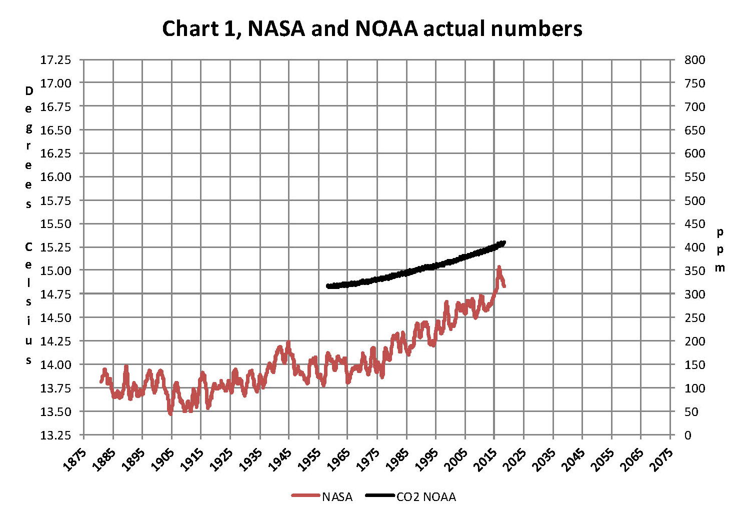
The analysis and plots shown here are based on the following two data series. First NASA-GISS estimates of a global temperature shown as an anomaly (converted to degrees Celsius) as shown in their table Land Ocean Temperature Index (LOTI) and shown in Chart 1 as the red plot labeled NASA the scale for the temperatures is on the left. The NASA LOTI temperatures are shown as a 12 month moving average because of the large monthly variation. Second NOAA-ESRL Carbon Dioxide (CO2) values in Parts Per Million (PPM) which are shown in Chart 1 as a black plot labeled NOAA the scale for CO2 is shown on the right. However if you don’t have time to read this entire report go to Chart 7 and it will show you exactly what is going on with CO2 and global temperatures; I guarantee that this chart is based on NASA data and is 100% accurate.

NASA published data as stated in the first paragraph is shown as an anomaly, but what is a temperature anomaly?  An anomaly is a deviation from some base value normally an average that is fixed. There were two problems with the system that NASA picked which were number one there is no “actual” global temperature and two since climate is a variable there cannot be a real base to measure from. NASA known for its science and engineering expertise back in the day thought it could get around these issues and created a system to do so. First they developed a computer model which took readings from all over the planet and made required adjustments to them which they called homogenization and came up with the estimated global temperature. Second they picked the period 1950 to 1980 (30 years) and averaged the values found in that period and came up with 14.00 degrees Celsius and make that their base.  Then they took the calculated monthly temperature and subtracted the base from it which gave them the anomaly. The problem is that both are arbitrary.

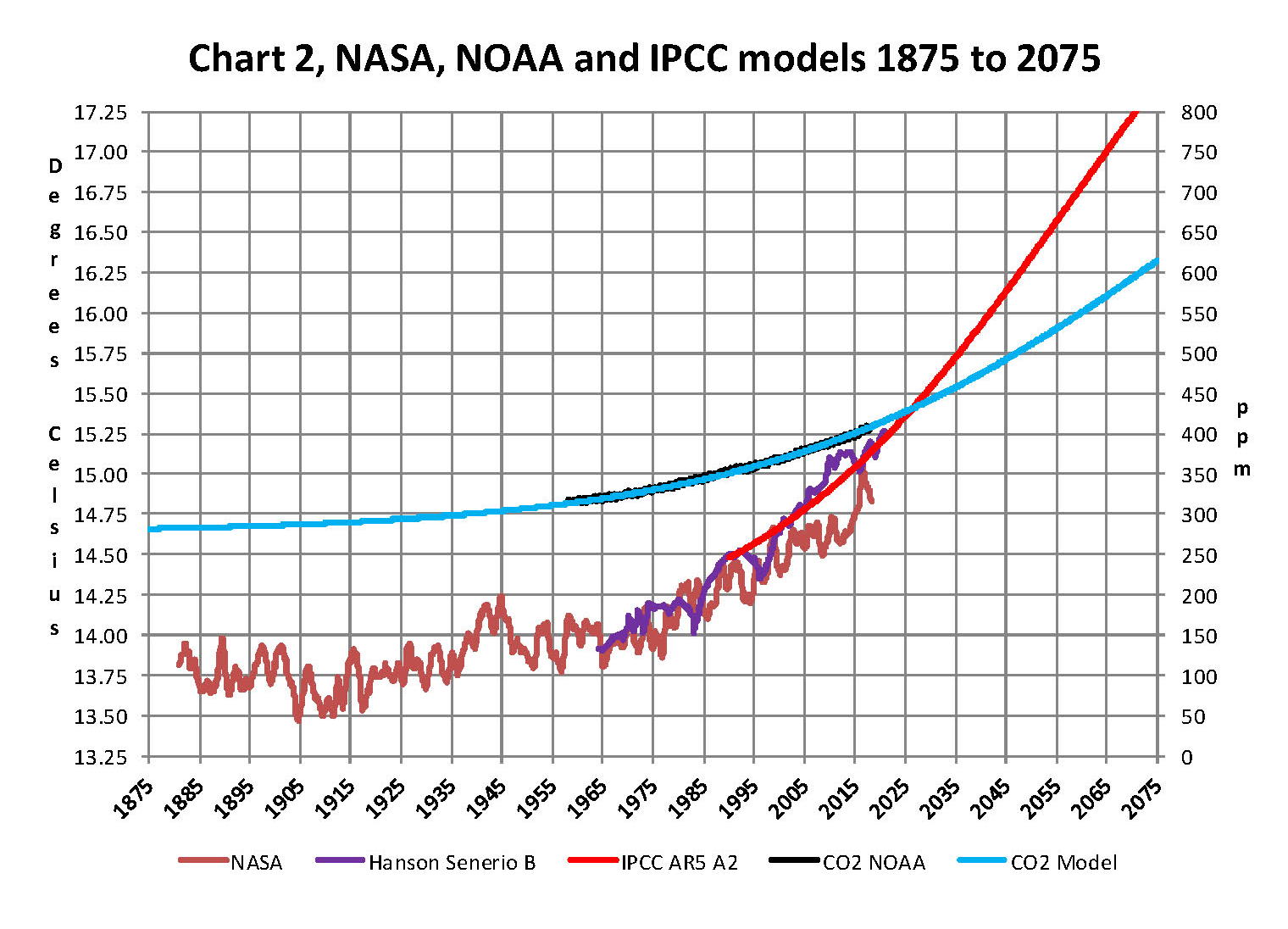
Now that we have a base to work with we are going to add to Chart 1 three things. The first is a trend line of the growth in CO2 since that is according to the government through NASA and NOAA the entire basis for climate change. That plot is superimposed over the black plot of the actual NOAA CO2 values as the cyan line labeled as the CO2 Model and one can see there is a very good fit to the actual NOAA values so there should be no dispute about its validity, and it’s historically accurate.  This plot allows us to make projections to future global temperatures according to the projected level of CO2 .  The second added item is James E. Hansen’s 1988 Scenario B data, which is the very core of the IPCC Global Climate models (GCM’s) and which was based on a CO2 sensitivity value of 3.0O Celsius per doubling of CO2. This plot is shown here in lavender and is part of a presentation that Hansen showed to congress in 1988 when the UN was about to set up the International Panel on Climate Change (IPCC) and this plot is labeled as Hansen Scenario B which Hansen stated was the most likely to happen based on his 1979 climate theories’.  The third item is the current plot of the most likely temperature of the planet based on the growth of CO2 published by the IPCC. This plot is shown in Red and is labeled as IPCC AR5 A2 as that is the table where the data was found. This plot is a GCM computer projection of the planets temperature based on the complex relationships developed on the levels of CO2 by the IPCC primarily though NASS and NOAA.

It can be seen in Chart 2 that the lavender plot and the Hansen plot are very close from 1965 to around 2000 after that, from 2000 to 2014, there is a very large and deviation reaching close to .5 degrees Celsius in 2015, which is not an insubstantial number.  Also of note is that there doesn’t seem to be a good correlation between the growth in CO2 and the increase in the planets temperature. The CO2 is going up in a log function and the Temperature was going down until 2015 and then there was a mysterious spike up. That unexplained change in temperature direction appeared to have occurred between 2013 and 2014 and is the subject of this monthly paper.

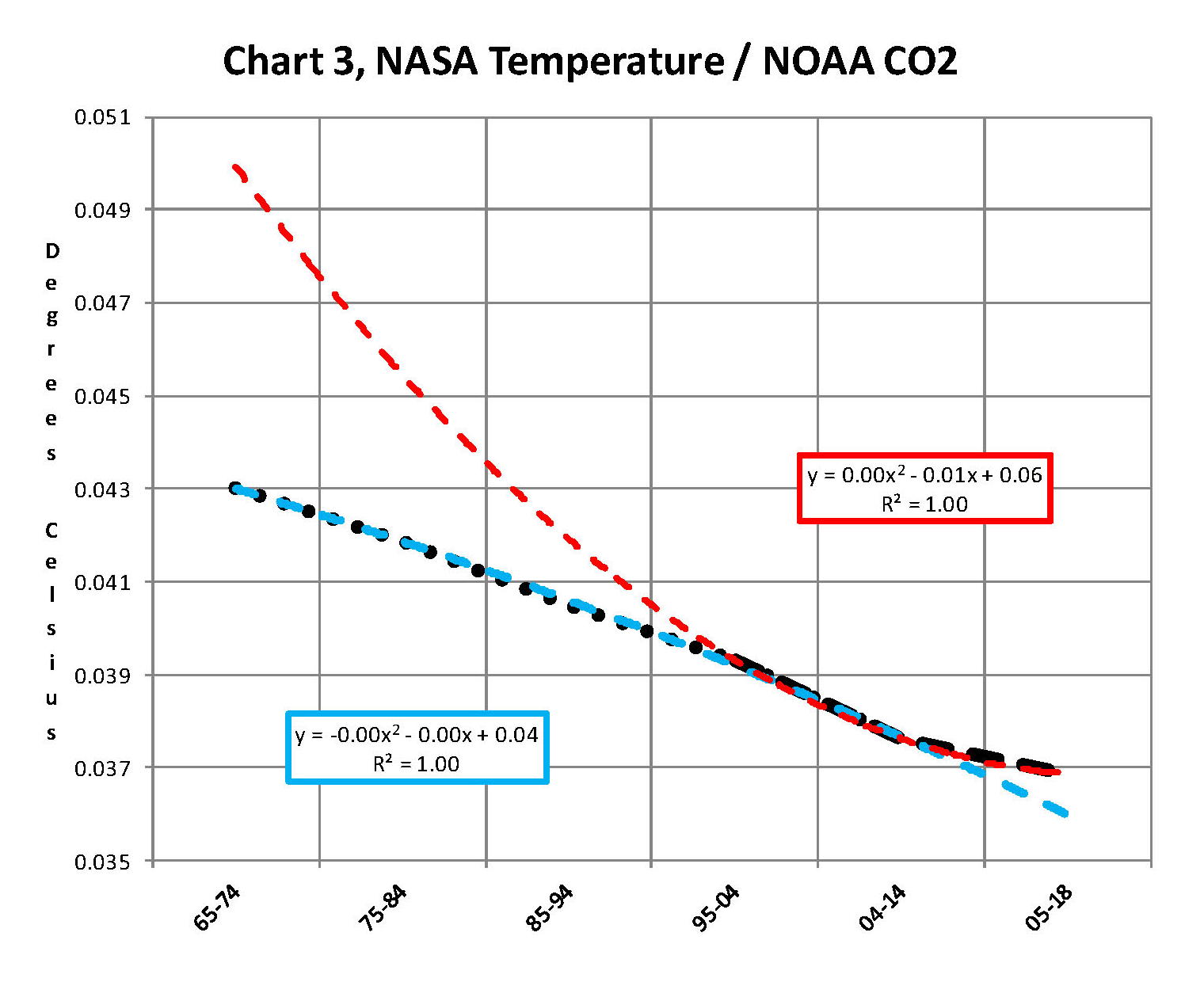
Next we have Chart 3 which is developed from the raw data from NASS and NOAA as shown in Chart 1.  This plot was made first by adding ten years blocks of temperature and CO2 as indicated in the Chart 1 and diving by 120 to give an average for each.  Then the average Temperature was divided by the average CO2 to give degrees of temperature increase per PPM of CO2. After that was plotted it appeared that there were two different curves. The first was from block 1965-1974 through block 2004-2014 shown as Black Dots and the second was from block 1995-2004 through block 2005-2017 shown as Black Dashes. When trend lines were added they were both almost perfect fits to the raw data and so you cannot see the data points very well on Chart 2.  These blocks were picked to represent the entire period of time where we had both NASA temperature data and NOAA CO2 levels.

On Chart 3 there are two sets of color coded information. The first is Cyan plot and the Cyan box with the equation in it along with the R2 value of 1.0 are for the first series from block 1965-1974 through block 2004-2014. The other is the Red plot and the Red box with the equation in it along with the R2 value of 1.0 which are for the first series from block 1965-1974 through block 2004-2017. We can speculate on how this change happened but it can’t be said that the plot change is not real; however additional data will be required to actually prove that something has changed.

In summary the Cyan data set indicates a diminishing effect of CO2 on global temperature for about 54 years and the Red data set represents an increasing effect of CO2 on global temperature for the past 3 years. Since both data sets have an R2 value of 1.00 the trend lines cannot be in question.

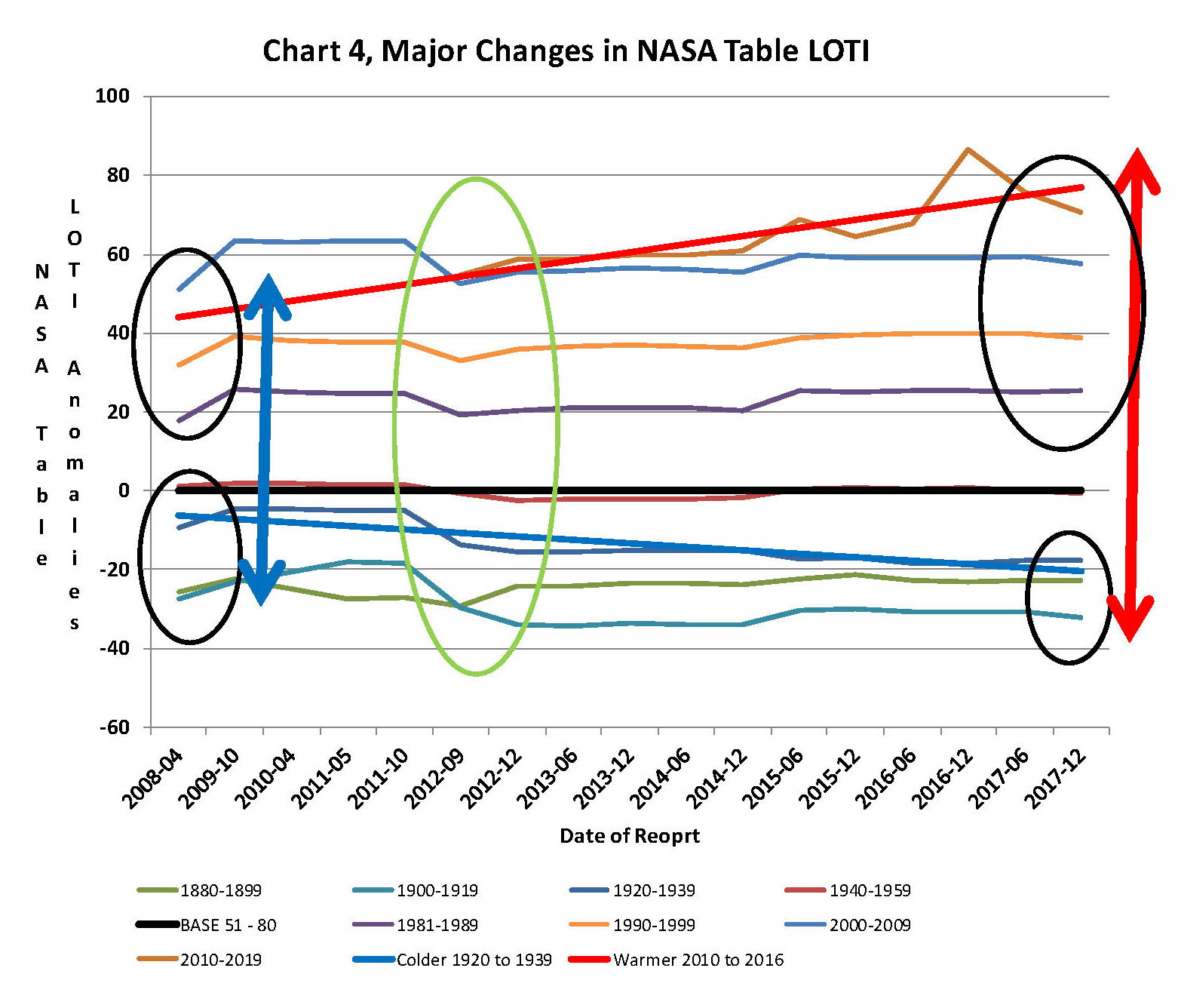
Continuing the analysis of what happened to the NASA data in table LOTI from Chart 3, the following Chart 4 was constructed from the same NASA data. It’s very sad to say but it seems to prove without much doubt that the global temperatures have been manipulated by NASA probably at the request of the federal government such that a case could be made for supporting the COP21 Paris climate conference in December 2015 by showing that the earth was much hotter than it actually was. The dates on the x axis are the date of the NASA LOTI download file. The plots for specific date groupings are set such that one can see what that date range did in each separate NASA download. The proof is shown in Chart 4 below and a discussion will follow below Chart 4 on how Chart 4 was constructed.

At the bottom of Chart 4 is a blue trend line of NASA LOTI temperatures prior to 1950 and starting in2012 the values started going down, getting colder. At the same time the NASA LOTI temperatures from 2012 to the present went up as shown in the red line.  There was no change in the base period, black line. This cannot happen with random variables they will cancel each other out; this could only be caused by specific program changes in the process that NASA and NOAA use, in other words it is intentional. So there can be no other reason but an attempt to support the adoption of the Climate accord agreement by the administration, and they were successful as it was agreed to in Paris at COP21.

How this table was constructed is important so a discussion is needed. As stated in the opening paragraph of this paper NASA publishes a table of the estimated global temperature each month as anomalies from a base of 14 degrees Celsius. This table starts with January 1880 and runs to the current date. The new table typical comes out mid-month with almost 1,700 values for the previous month. The process that is used to create this Table is very complex and is called homogenization. What that means is that the entire table is recreated each month and what that also means is that the temperature value for any given month is a variable.

When I realized the extent of that in 2012 I started to save the printouts of the NASA LOTI tables and I went back and found a few of them from when I started this project in 2007. When I started this project what I did is type in all the values from the NASA table into a spreadsheet each month which was a daunting task and I was very happy when NASA started to publish a csv file along with the text of the LOTI data. Then all I had to do is create a routine in excel that would turn the table format into a column format.  There are now 68 months in the spreadsheet, when I started this method in 2012 there were maybe only a dozen. The values are residing in the spreadsheet as columns going from left to right so that the individual months are lined up side by side. This makes comparison of months very easy. One note is required here, when I started this model in 07 and for several years thereafter all I was doing is adding the current NASA LOTI current months number to the existing file, a single column, and it never occurred to me that the prior numbers were changing. The past was fixed, so I thought. This was also the way I was entering the NOAA CO2 data which doesn’t change over time.

The original goal was to see if the changes were just random or rounding errors. If that was so then they would wash out over time especially if I grouped the monthly data into blocks. I’ve used both 10 year (120 values) and 20 year (240 values) blocks which would be enough to maintain a fixed number if it was random or rounding. What I found was something quite different after I had a dozen or so columns in the spreadsheet, it appeared that NASA was making the past colder and the present warmer. And the purpose of the previous two Charts 3 and 4 is to show the result. Chart 4 is a bit complex but I have not found a better way to show what happened.

From 1880 to 1960 I used four 20 year blocks.  Then I needed the base so there is a 30 year block from 1950 to 1980 and lastly four 10 year blocks from 1980 to the present. The last block is not yet complete as it will run to December 2019. Because the 30 year base block is fixed at 14.0 degrees Celsius there wasn’t much point in charting those individual yearly values even though there was some minor movement in those numbers. That raises an interesting issue for how can the base numbers not change and all the other numbers from 1880 to 2017 can change each month? A note, for each data set of years the plot on Chart 4 should be a straight line from left to right; very minor fluctuation would be OK. For example the plot for 1930 to 1949 (hidden behind the black plot) is what would be normally expected. This is the only plot that doesn’t show major manipulation.

In the four data sets in the 1880 to 1940 blocks in Chart 4 all have moved down probably about a .25 degree Celsius which is not insignificant. So the bottom line is that NASA made all the values from 1880 to 1940 colder by an average of a quarter of a degree Celsius. So that alone accounts for a high percentage of the supposed global warming that NASA shows. From 1980 to 2009 the data change appears to add another .1 degrees Celsius making the apparent differential between data from early 00’s to the present about .35 degrees greater than it was before 2009. That is not random that is a major change and clearly shows manipulation. I would probably never had caught this is if I hadn’t put the values in column format. Looking at all the data from 2008 to 2014 we find that around 2008 NASA showed that the planet had warmed about .75 degrees, Blue double arrow, from the 19th century. Then in 2014, four years later NASA showed that the planet had warmed about .95 degrees Red double arrow from the 19th century. However it gets a worse after that.

The change started in 2012, Green Oval, and Global temperature jumped almost a quarter of a degree by December 2015 just as the COP21 conference was in session. The temperatures kept going up with an eventual increase in global temperature of about 1.2 degrees Celsius in late 2016. At that point with the pressure off NASA appears to be erasing what they did as the global temperatures have now started back down.  I’m not sure how many know of this blatant manipulation but it is serious. This is not science.

Now we need to consider other factors than CO2 on Climate change.  The fault that occurred in the work that was done in the 1980’s was in assuming that there was an optimum or constant global temperature and therefore any change that was being observed was from the increasing amount of CO2 in the atmosphere.  There may have been correlation but it was never proved that there was causation (high R2 value) between CO2 and global temperatures; Chart 3 clearly shows there is not. With that assumption, which limited options, we moved from true science into the realm of political science.  True science has an open mind and finds relationships that work in matching observations with predictions.  Political science changes history and/or facts to match the desires of the politicians. Since the politicians control the money political science is what we get; which means that what we get may not be technically correct.

A decade ago when I started looking at “climate” change the first thing I did was look at geological temperature changes since it is well known that the climate is not a constant; I learned that 53 years ago in my undergrad geology and climatology courses in 1964. The next paragraph explains currently observed patterns in climate related to this subject and is historical accurate.

Ignoring the last Ice Age which ended some 11,000 years ago when a good portion of the Northern hemisphere was under miles of ice the following observations give a starting point to any serious study on the subject of climate. First, there is a clear up and down movement in global temperatures with a 1,000 some year cycle going back at least 3,000 to 4,000 years; probably because of the apsidal precession of the earth’s orbit of about 20,000 years for a complete cycle. However about every 10,000 years the seasons are reversed making the winter colder and the summer warmer in the northern hemisphere. 10,000 years from now the seasons will be reversed again. Secondly, there are also 60 to 70 year cycles in the Pacific and the Atlantic oceans that are well documented. These are known as the Atlantic Multi Decadal Oscillations (AMO) in the Atlantic and as La Nina and El Nino in the Pacific. Thirdly, we also know that there are greenhouse gases such as carbon dioxide that can affect global temperatures. Lastly the National Academy of Sciences (NAS) estimated that carbon dioxide had a doubling rate of 3.0O Celsius plus or minus 1.5O Celsius in 1979 when there were only two studies available and one for sure and maybe both were not peer reviewed.

The result of looking objectively at the three possible sources of global temperature changes was a series of equations based on these observations that when added together produced a sinusoidal curve that seemed to follow NASA published temperatures very closely when first developed in 2007, and modified a few years later when it was found the short and long cycles were related to multiples of Pi.  Since this curve was based on observed temperature patterns it was called a Pattern Climate Model (PCM) which has been described in previous papers and posts on my blog and since it is generated by “equations” many assume it is some form of least squares curve fitting, which it is not. It does seem to be related to ocean currents where the bulk of the planet’s surface heat is stored.

Chart 5 shows the PCM a composite of two cycles and CO2. There is a long trend, 1036.7 years with an up and down of 1.65O Celsius (.00396O C per year) we in the up portion of that trend. Then  there is a 69.1 year cycle that moves the trend line up and then down a total of 0.29O Celsius and we are now in the downward portion of that trend (-.01491O C per year), which will continue until around ~2035. Lastly, there is CO2 currently adding about .0079O Celsius per year so together they all basically wash out at -.0039O C per year, which matches the current holding pattern we were experiencing until 2014. After about 2035 the short cycle will have bottomed and turn up and all three will be on the upswing again duplicating what was observed in the 1980’s.  Note: the values shown here are only representative from what is in the model.

When using a 12 month running average for global temperatures up until 2014 the PCM model was within +/- .01 degrees of what NASA was publishing in their LOTI table since the early 1960’s as shown in Chart 5. Further the back projection of the PCM plot matched historical records and global temperatures going back past the time of Christ. It should also be considered that geologically CO2 levels have reached levels many times that of the current 400 ppm without destroying the planet so the current hysteria over the current very small numbers can only be explained by political science not real science.

The nest step in this analysis is to put all of the known data and projections into Chart 6 which contains: NASA’s temperatures plot, NOAA’s CO2 plot, the CO2 model plot, the PCM model plot, Hansen’s Scenario B plot, and lastly the IPCC AR5 A2 global temperature plot. With that done we can look at the results and try to make some sense of what is going on with the various arms of the federal government that are promoting that we tax carbon based fuels to eliminate them since they are responsible for the global temperature level  going up.  As previously stated when the government pours money into the sciences the sciences respond with technical papers the support the governments views, this is what I call political science verses real science as was done prior to the 1980’s; money talks and BS walks as everyone on the street knows.

Chart 6 shows a good overview and contains no data manipulation and the only change that was made was to convert the NASA anomalies back to degrees Celsius to make it more readable to lay people.  This is only a change in units and has no bearing on the look.  We also need to understand the NASA homogenization process and its relationship to the 30 year base period. The portion in the black circle contains the NASA base period of 14.00 degrees Celsius and the reason it’s brought up here is that the Homogenization process causes the global temperatures to move around since the entire data base all the way back to 1880 is recalculated each month.  But since the base has to stay at 14.00 degrees Celsius the program must be set to not allow changes in that period of time. I’m sure the programmers have fun with that. Prior work here has shown how this creates a teeter totter effect with the data plots, some of which have recently been significant.

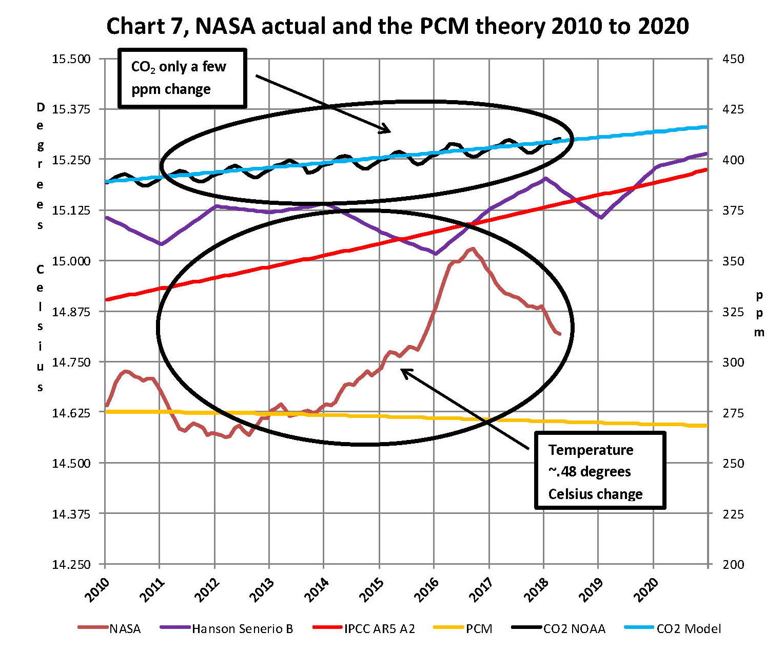
Next Chart 7 looks at the period from 2010 to 2020 so we can see where a change in CO2 of only a few ppm has caused a major change in the global temperature way beyond anything previously shown in any published NASA data. There are two black ovals on Chart 7 one at the top of Chart 7 which is a black oval around the CO2 levels from 2012 to 2016 and part of 2017 and it’s very obvious that there has been very little change, maybe 7 ppm or about 1.9%. Then at the bottom of Chart 7 is another black oval around the NASA global temperature levels for the same period and its very obvious that there has been a large change, almost .50 degrees Celsius or about 3.1%. There has never been such a large increase in temperature from such a small increase in CO2. By contrast the previous comparable period of the last part of 2010 through 2013 shows about the same increase for CO2 at 1.1% but no increase for global temperature but actually small decrease.

Clarification is needed here as the plot seems to show the jump in temperature in 2016 not 2015; this is a result of the large jump in temperature shown by NASA. Since we are using a 12 month moving average and the increase occurred in only a few months it actually shifted the curve into 2016. The raw data for December 2015 showed the temperature at 15.12 degrees Celsius compared to December 2014 where it was 14.78 degrees Celsius. The actual peak was in February 2016 at 15.35 degrees Celsius.   With the global temperature over 15.0 Celsius at COP21 the climate accord was approved and the manipulation was a success. After COP21 the need for Fake Warming was no longer needed and so we are now seeing a downward trend developing.

In summary, the IPCC models were designed before a true picture of the world’s climate was understood. During the 1980’s and 1990’s CO2 levels were going up and the world temperature was also going up so there appeared to be correlation and causation. The mistake that was made was looking at only a ~20 year period when the real variations in climate all move in much longer cycles of decades and centuries.  Those other cycles can be observed in the NASA data but they were ignored for some reason.  By ignoring those actual geological trends and focusing only on CO2 the Global Climate Models will be unable to correctly plot global temperatures until they are fixed. Also the temperature data from 1850 to 1880 was dropped for some reason as it showed a lower temperature that supported the PCM cycle shown in this paper.

In summary we have Chart 8 which shows why CO2 is not increasing the temperature of the planet by any meaningful amount. The problem, intentional or not, goes back to physics and how we show information. It’s critical that when we talk to non scientists that information is properly displayed. And nowhere is this more important than when we are discussing temperature.  When we talk about weather and local temperatures its going be in Celsius (C) in the EU or degrees Fahrenheit (F) in America e.g. for the base temperature that NASA uses it’s 14.00 C or 57.20 F; but these are both relative measures and do not tell us how much heat (thermal energy) is there. To know that we must use Kelvin (K) and that would be 287.150 K and all three of those numbers 14.00 C, 57.20 F, and 287.150 K are exactly the same temperature, just using a different base. But if the current temperature is 15.00 C that is a 7.1% increase in C, a 3.1% increase in F and a .35% increase in K; so which one is real? The answer is .35% because Kelvin is the only one that measures the total energy!

To show this graphically Chart 8 was constructed by plotting CO2 as a percentage increase from when it was first measured in 1958 the Black plot, the scale is on the left and it shows CO2 going up about 28.5% by February of 2018. That is a large change as anyone would agree.  Now how about temperature, well when we look at the percentage change in temperature using the proper units Kelvin we find that the changes in global temperature are almost un-measurable. The red plot, also starting in 1958, shows that the thermal energy in the earth’s atmosphere has varied by less than +/- .17%; while CO2 has increased by 28.3% which is over 80 times that of increase in temperature. So is there really a problem here?

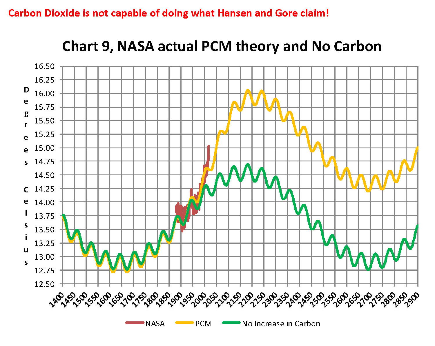
Lastly, Chart 9 shows what a plot of the PCM model, in yellow, would look like from the year 1400 to the year 2900. This plot matches reasonably well with recorded history and fits the current NASA-GISS table LOTI data, in red, very closely, despite homogenization.  I do understand that this PCM model is not based on physics but it is also not some statistical curve fitting. It’s based on observed reoccurring patterns in the climate. These patterns can be modeled and when they are, you get a plot that works better than any of the IPCC’s GCM’s. If the real conditions that create these patterns do not change and CO2 continues to increase to 800 ppm or even 1000 ppm then this model will work well into the foreseeable future.  150 years from now global temperatures will peak at around 15.750 to 16.000 C and then will be on the downside of the long cycle for the next ~500 years.

The overall effect of CO2 reaching levels of 1000 ppm or even higher will be about 1.50 C which is about the same as that of the long cycle.  The Green plot on Chart 9 shows the observed pattern with no change in CO2 from the pre-industrial era of ~280 ppm. CO2 cannot affect global temperatures more than 1.500 C +/- no matter what the ppm level of CO2 is. The reason being that the CO2 sensitivity value is not 3.00 per doubling of CO2 but less than 1.00 C per doubling of CO2 as shown in more current scientific work and it’s a logistics curve not a log curve.

The purpose of this post is to make people aware of the errors inherent in the IPCC models so that they can be corrected. 

The Obama administration’s “need” for a binding UN climate treaty with mandated CO2 reductions in Europe and America was achieved as predicted at the COP12 conference in Paris in December 2015. To support this endeavor NASA was forced to show ever increasing global temperatures that will make less and less sense based on observations and satellite data which will all be dismissed or ignored.  Within a few years the manipulation will be obvious even to those without knowledge in the subject, but by then it will be to late the damage to the reputation of science will have been done.

In closing keep this in mind. The current panic generated by the government using political science is that the current global temperature of around 15.0O Celsius is an increase of 7.14% from the 1960’s when the global temperature was 14.0O Celsius; and that does seem like a lot. However those views would be in error as the actual increase in thermal energy, as measured by temperature, would be only .35% because we must use Kelvin not Celsius when working with heat energy. When we use kelvin the temperature goes from 287.15O K to 288.15O K which is only .35% not 7.14% about 1/20 of what is implied by the IPCC. What the IPCC shows is not technically wrong as much as it is extremely misleading to anyone without a very strong science background.

Sir Karl Raimund Popper (28 July 1902 – 17 September 1994) was an Austrian and British philosopher and a professor at the London School of Economics. He is considered one of the most influential philosophers for science of the 20th century, and he also wrote extensively on social and political philosophy. The following quotes of his apply to this subject.

If we are uncritical we shall always find what we want: we shall look for, and find, confirmations, and we shall look away from, and not see, whatever might be dangerous to our pet theories.

Whenever a theory appears to you as the only possible one, take this as a sign that you have neither understood the theory nor the problem which it was intended to solve.

… (S)cience is one of the very few human activities — perhaps the only one — in which errors are systematically criticized and fairly often, in time, corrected.