
VOTING Ryan out would go a long way to saving the Republic. Trump gets it by not supporting Ryan and also McCain.
Monthly Archives: August 2016
Can Hillary Win?
Armstrong Economics Blog
Re-Posted Aug 3, 2016 by Martin Armstrong
QUESTION: Mr. Armstrong; Do you think that Hillary can win? And if so, what would happen?
Thanks
RP
ANSWER: Our model is not unanimous for Trump. There is technically a 25% chance that Hillary could win, which one of our four models projects a Democratic victory. However, if you look at the mainstream channels from CNN, CBS, ABC, and NBC, it is very clear they have an agenda to defeat Trump. Just like in Britain, they are starting to manipulate the polls already. I would not expect the polls to be fair or honest this year as was proven in the BREXIT vote. The elites are desperate to kill Trump and they will manipulate the polls just as they forced the head of Fox News out on the very day Trump was to deliver his acceptance speech. They rig and coordinate absolutely everything to prevent a Trump victory. This is all out political war. Make no mistake about that. Even the Republican elites like Paul Ryan and John McCain want to defeat Trump and will hail Hillary behind the curtain. Neither one wants an outsider who might expose their corruption. McCain voted to put a sales tax on the internet and then denied he voted for a tax increase claiming he was voting only to force collection of what was owed to the States. He is a two-face liar with a nasty temper who berates even a waitress for the slightest mistake.
The press is part of the establishment and have received their marching orders to push Hillary. They are vehemently against Trump as are all the Republican elites like Paul Ryan, John McCain, and Mitt Romney because those in Washington want to rob the people as always and are clinging to power. The claimed Billionaires for Hillary are buying the White House and various positions on committees for ego. Hillary’s pick for Secretary of the Treasury will be Larry Fink, Chairman and Chief Executive Officer of BlackRock. He will get to sell all his stock in Black Rock tax free. This is why these people take these positions in addition to ego. They have to sell their shares and the law allows them tax-free status because this is a requirement. Why do you think Robert Rubin and Hank Paulson from Goldman Sachs took that position. Besides helping Goldman, they get to cash out tax free.
Those in power in Washington fear a revolution is in the wind as they have watched in Europe. Politicians know all too well that what begins in Europe spread to the USA as a contagion in politics just as it does in fashion. So Hillary is one of them and both the Democrats and Republican elite are really behind Hillary to prevent any outsider from changing their power base.

I fully expect that those in power will rig the votes to try to make Hillary victorious just as they stole the election from Bernie in the primaries. You are talking about the most ruthless people in the country. You cannot get there if you have morals. I have stated before, the ONLY way Trump can win is with a huge turnout that is so overwhelmingly against Hillary. The press is now pushing the Libertarians because they believe that those who would vote for Trump will turn to the Libertarians and that will be a victory for Hillary. Our models have been showing a huge 3rd Party spike for 2016. The Press will now push the Libertarians to try to stop Trump and we should see that this election will produce the biggest percentage take of the vote for the Libertarians so far.

If Hillary wins, everything will begin to collapse much more rapidly and this may be part of the cycle since we are showing the earliest point for a monetary crisis reform in 2018. Hillary may be what is needed to push us over the edge. Hillary will approve all tax increases and send the economy down really hard especially since Social Security goes bust next year with medicare. Hillary’s Billionaires will be fine, but the rest of us will get royally screwed.

Hillary is owned by the NY Bankers. My own case began under the Clintons and I can tell you that Goldman Sachs ruled the court. The receiver Alan Cohen ordered all my lawyers to turn over all tapes I had documenting EVERY market manipulation from the early 1980s. They threaten to throw them in contempt with me unless they turned them over. They, all the evidence that would have been enough to hang every many bankers in New York City mysteriously was destroyed in the World Trade Center. Alan Cohen, the court officer, was then hired by Goldman Sachs and placed on their Board of Directors. He worked for the Court and Goldman Sachs simultaneously and would never resign from the court I believe because someone else would have began to investigate what was going on and this huge conflict of interest between the Court and Goldman Sachs. When Bush was elected in 2000, only then did the government offer me a deal to drop all the charges if I plead to some conspiracy with Edmond Safra, to which I declined. I stood up in court and objected to the seizure of all the tapes on the market manipulations to no avail.

Transcript of my Objection to the seizure of all my evidence against the bank manipulations
(see Goldman Sachs v Armstrong)
Goldman Sachs is under criminal investigation right now for the whole Malaysia deal. Goldman Sachs is being sued for $510 million currently and they are under criminal investigation. They would be prosecuted under a Trump White House for it would be pay-back time. You can bet that EVERY mainstream media supports Goldman Sachs and is fighting very hard to make Hillary the president. So I do not expect a FAIR election. There is way TOO MUCH at stake here and you can see it with Paul Ryan coming out against Trump to protect the status quo. Handing Trump’s wife a plagiarized speech was a deliberate attempt to make Trump look like a fool. Trump did not fire the speech writer warning that he has people inside his campaign that are Trojan Horses for Paul Ryan and crew. These people are against the country and will fight as dirty as they can and I would not expect the press to expose any truth about Hillary but to now try their hardest to stop Trump. Just watch the news and everything negative they can possibly do to Trump mainstream media will now unleash. Paul Ryan and other elite Republicans have surrendered to Hillary to keep the corruption in place.
As a result, I will say this. If Hillary wins, I would then fear the government because it will be controlled 100% by Goldman Sachs. My battle was against those in New York. But now, New York will seize control of Washington. I personally would have to consider leaving the United States for I do not believe there would be any hope left and the nation will fall into total corruption. Our models show that the West will fall and the Financial Capital will shift to China for the next wave starting in 2032.95. Hillary may be that final straw to help push Western society over the edge.
Would Trump be any better? I believe he is too independent to allow such corruption and that independence is what Paul Ryan fears. Goldman would probably be prosecuted under Trump, but the damage is far too great for this to be reversed where we save Western society. Hillary’s policies would just destroy the United States and Western Society as a consequence for we are already collapsing under socialism with massive unfunded pensions. Trump may put up a good fight, but he either surrenders to the elites naively or they will assassinate him because there is just too much at risk from their perspective to allow him to really change Washington.
 Hillary is a hard-core feminist and that is the only reason she has put up with Bill to win the White House for herself. No other female head of state or politician I have ever met was such a feminist. The audacity that women should just vote for her because she is a woman is a warning sign that she is taking the 1960s bra-burning war against men to the White House. Such a gender war is inappropriate for a head of state. Nevertheless, this has always been her agenda and with Hillary in the White House, these types of women are normally harder than men to deal with because they often feel they have to prove themselves. Hillary would be more prone to war because she feels she needs to prove a woman can be tough. So the future under Hillary will be much more chaotic. We already have Black Lives Matter rather than ALL LIVES MATTER and this helps to keep society fragmented. Turning the White House into a feminist agenda will surely achieve Julius Caesar’s policy to win – Divide & Conquer. Hillary’s quest for the White House knows no bounds. Her motto is indeed – Veni Vidi Vici (I came, I saw, I conquered)
ISIS Threatens Russia
Armstrong Economics Blog
Re-Posted Aug 3, 2016 by Martin Armstrong

As they lose ground in the Middle East, ISIS is continuing to lash out while expanding their terrorism since they cannot win the war. They have now come out and threatened Russia. “Listen Putin, we will come to Russia and will kill you at your homes … Oh Brothers, carry out jihad and kill and fight them,” a masked ISIS member threatened in a video posted online. We have to expect a sharp increase in terrorist plots in Eastern and Western Europe. Unfortunately, this is the trend into 2018.
Japan – Is this The End of the Govt Bond Rally?
Armstrong Economics Blog
Re-Posted Aug 3, 2016 by Martin Armstrong


Japanese 10-year bonds have crashed because the government is stopping its bond-buying program, at least for now. Prime Minister Shinzo Abe’s monetary policy is starting to demonstrate the dangerous position we face on a global scale with respect to interest rates and debt.
Japanese 10-year bonds have crashed since the Bank of Japan now holds over a third of the entire nation’s marketable government debt. By comparison, the Federal Reserve holds less than 20 percent of all US Treasuries, and this entire quantitative easing (QE) effort since 2007 to support the economy has utterly failed. The capital markets are demonstrating that the BOJ’s holdings of government debt threaten the world’s third-largest economy. This entire QE effort for these past 8.6 years is coming to an end. The JGBs have crashed and the Bank of Japan has suspended its buying for just now. This will indict the fate of interest rates moving forward.

We are looking at this same pattern beginning to emerge in other government bond issues. The entire QE program is wiping out pension funds and savers. With the four elections (Brexit, USA, France, & Germany), the degree of confidence in government debt should begin to decline sharply.
What Newt Gingrich Just Said About Khizr Khan and Hillary on LIVE TV Everyone Needs To Hear!
Trump knows that Khan supports Sharia Law and Sharia Laws makes women nothing more than cattle as they are only worth 1/3 as much as a man. So his comment was not against Khan it was about a belief structure that doesn’t allow women freedom — it was over the top of the heads of the media but the rest of us knew what he was really saying.
HOLLANDE MEDDLES IN AMERICA’S ELECTION… TRUMP MAKES HIM SICK!
I can believe that Hollande is against Trump because Hollande is a socialist and he is doing to France the same as Nicolás Maduro has already done to Venezuela and what Obama/Hillary has been planning to do to the US.
Obama Says Rejecting TPP Would Hurt U.S. Workers
Why anyone would believe anything that Obama would say after all the lies he has told us — give me a break.
Laughable Mainstream Media Apoplectic Because Trump Won’t Endorse Lyin’ Omnibus Ryan…
Ryan doesn’t deserve to be reelected so no loss there. GO TRUMP
96 Hours of Stunning Globalist Panic Continues – Tick Tock, Tick Tock…
If the Uni-Party actually see that their massive attack on Trump over basically nothing isn’t working and they start to see that the “monster” vote could be real they will panic and when that happens Nothing is off the table for they can not afford to let rump win.
Analysis of Global Temperature Trends, June, 2016, what’s really going on with the Climate?
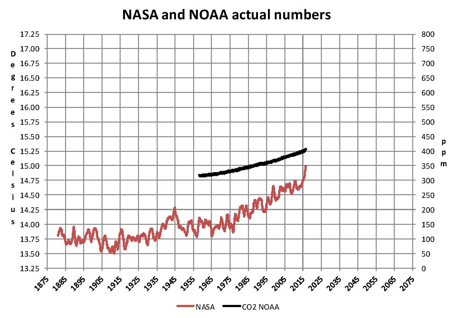
The analysis and plots shown here are based on the following two data series. First NASA-GISS estimates of a global temperature shown as an anomaly (converted to degrees Celsius) as shown in their table Land Ocean Temperature Index (LOTI) and shown in the following Chart as the red plot labeled NASA. This plot is shown as a twelve month moving average to minimize the large monthly swings and better show trends the scale for the temperatures is on the left. Second NOAA-ESRL Carbon Dioxide (CO2) values in Parts Per Million (PPM) which are shown in the following Chart as a black plot labeled NOAA. This plot is shown exactly as the data from NOAA is presented and there is no need for a moving average the scale for CO2 is shown on the right.
NASA published data as stated in the first paragraph is shown as an anomaly, but what is a temperature anomaly? An anomaly is a deviation from some base value normally an average that is fixed. There were two problems with the system that NASA picked which were number one there is no “actual” global temperature and two since climate is a variable there cannot be a real base to measure from. NASA known for its expertise back in the day thought it could get around these issues and created a system to do so. First they developed a computer model which took readings from all over the planet and made adjustments to them called homogenization and came up with the estimated global temperature. Second they picked the period 1950 to 1980 (30 years) and averaged the values and came up with 14.00 degrees Celsius and make that their base. Then they took that temperature and subtracted the base from it which gave them the anomaly. The problem is that both the base and the anomaly are arbitrary.
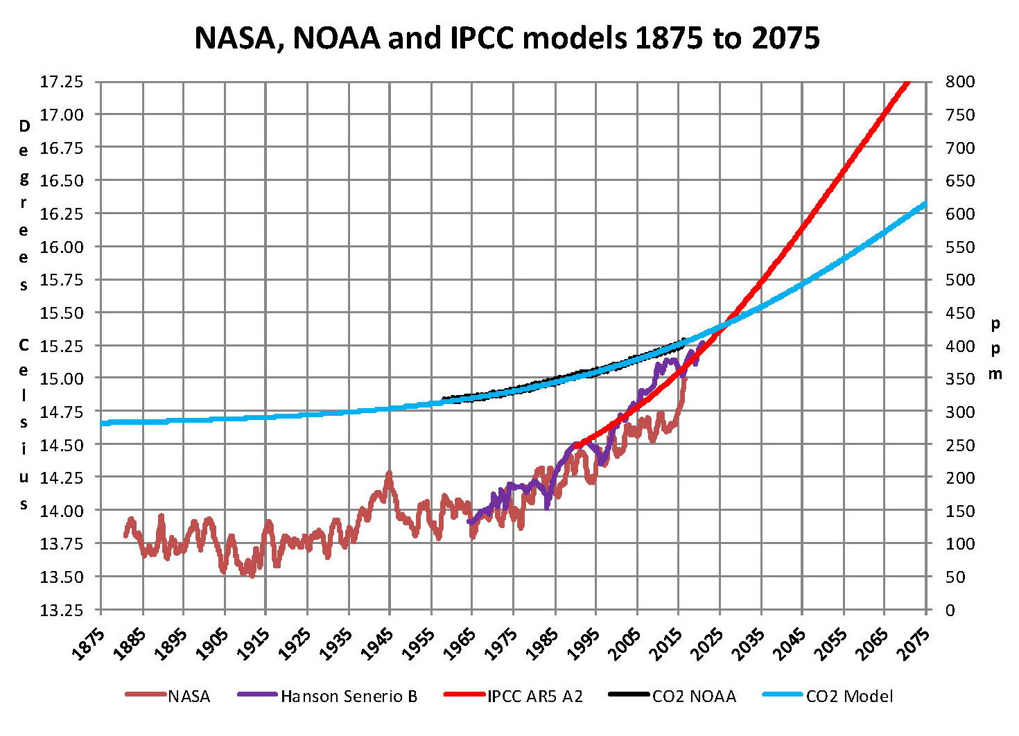
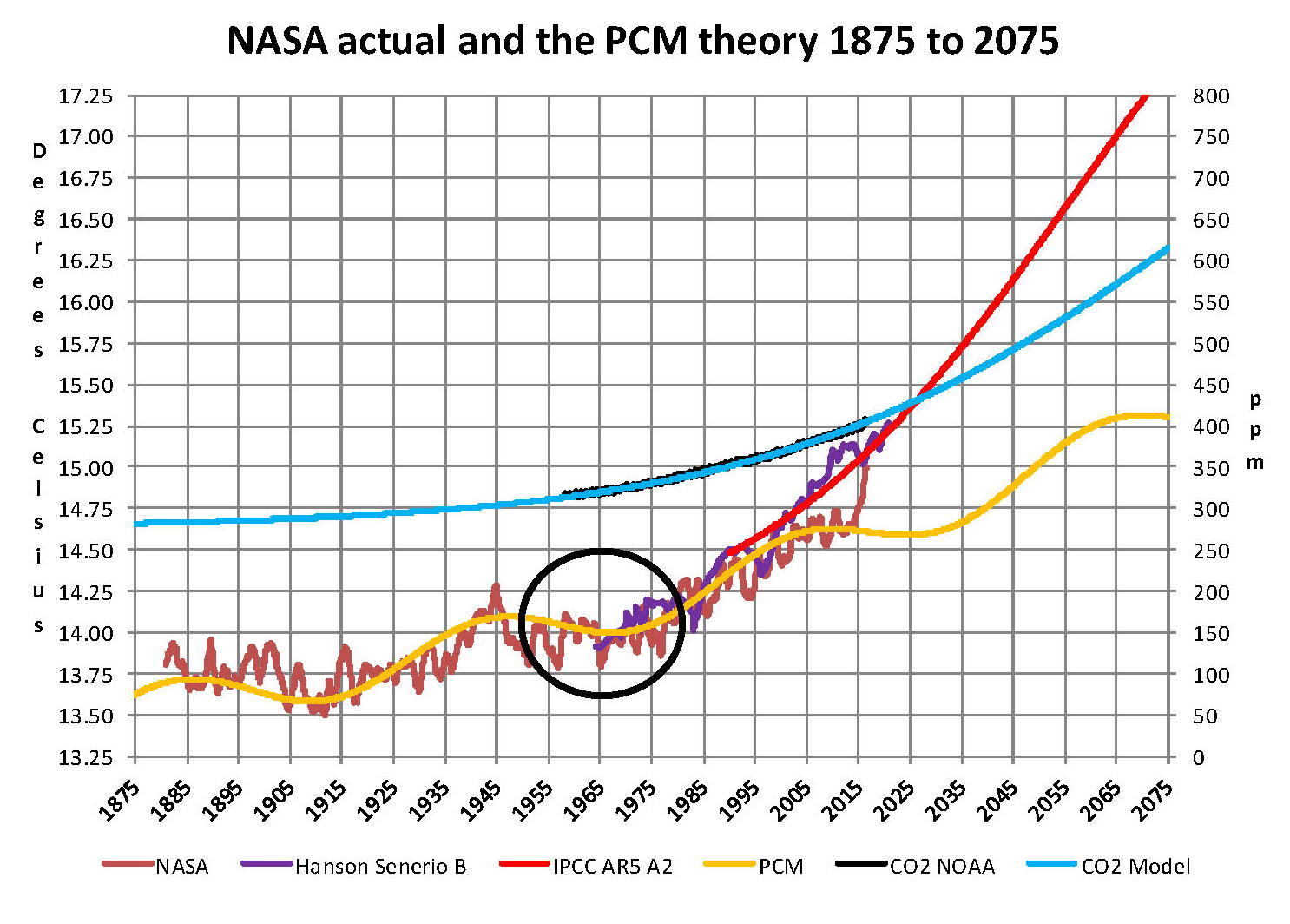
Now that we have a base to work with we are going to add to the previous Chart three things. The first is a trend line of the growth in CO2 since that is the entire basis for climate change according to the government through NASA and NOAA. That plot is superimposed over the black plot of the actual NOAA CO2 values as the cyan line labeled as the CO2 Model and one can see there is a very good fit to the actual NOAA values so there should be no dispute about its validity. This plot allows us to make projections as to future global temperatures according to the science. The second added item is James E. Hansen’s Scenario B data, which is the very core of the IPCC Global Climate models (GCM’s) and which was based on a CO2 sensitivity value of 3.0O Celsius per doubling of CO2. This plot is shown here in lavender and is part of a presentation that Hansen showed to congress in 1988 when the UN was about to set up the International Panel on Climate Change (IPCC) and this plot is labeled as Hansen Scenario B which Hansen stated was the most likely to happen based on his theories’. The third item is the current plot of the most likely temperature of the planet based on the growth of CO2 published by the IPCC. This plot is shown in Red and is labeled as IPCC AR5 A2 as that is the table where the data was found. This plot is a GCM computer projection of the planets temperature based to the complex relationships developed on the levels of CO2 by the IPCC through NASS and NOAA.
It can be seen in this Chart that the lavender plot and the Hansen plot are very close from 1965 to around 2000 after that, from 2000 to 2014, there is a very large and growing deviation reaching close to .5 degrees Celsius in 2014, which is not an insubstantial number. Also of note is that there doesn’t seem to be a good correlation between the growth in CO2 and the increase in the planets temperature. The CO2 is going up in a log function and the Temperature was going down in a log function until recently where it reversed and is now going up in a log function. That major change in direction that occurred in 20014 is the subject of this paper.
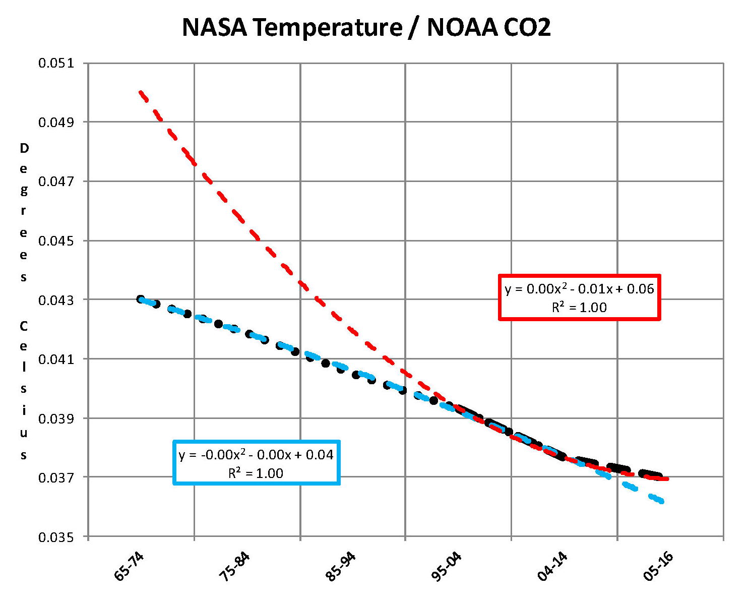
The next Chart is developed from the raw data from NASS and NOAA as shown in the first Chart. This plot was made first by adding ten years blocks of temperature and CO2 as indicated in the Chart and diving by 120 to give an average for each. Then the average Temperature was divided by the average CO2 to give degrees of temperature increase per PPM of CO2. After that was plotted it appeared that there were two different curves the first was from block 1965-1974 through block 2004-2014 shown as Black Dots and the second was from block 1995-2004 through block 2005-2016 shown as Black Dashes. When trend lines were added they were both almost perfect fits to the raw data and so you cannot see the data points very well on the Chart. These blocks were picked to represent the entire period of time where we had both NASA temperature data and NOAA Co2 levels.
On the following Chart are two sets of color coded information. The first is Cyan plot and the Cyan box with the equation in it along with the R2 value 0f 1.0 are for the first series from block 1965-1974 through block 2004-2014. The other is the Red plot and the Red box with the equation in it along with the R2 value of 1.0 which are for the first series from block 1965-1974 through block 2004-2016. We can speculate on how this change has happened but it cannot be said that the plot change is not real; however additions data over the next few years will be required to actually prove that something has changed.
In summary the Cyan data set indicates a diminishing effect of CO2 on global temperature for about 54 years and the Red data set represents an increasing effect of CO2 on global temperature for the past 2 years. Since both data sets have an R2 value of 1.00 the trend lines cannot be in question.
Before we get into a possible explanation to the drastic change from the Cyan data to the Red data that occurred in 20014 we need to consider other factors than CO2 on Climate change. The fault that occurred in the work that was done in the 1980’s was in assuming that there was an optimum or constant global temperature and therefore any change that was being observed was from the increasing amount of CO2 in the atmosphere. There may have been correlation but it was never proved that there was causation (high R2 value) between CO2 and global temperatures. With that assumption which limited options we moved from true science into the realm of political science. True science has an open mind and finds relationships that work in matching observations with predictions. Political science changes history and/or facts to match the desires of the politicians. Since the politicians control the money political science is what we get; which means that what we get may not be technically correct.
A decade ago when I started looking at “climate” change the first thing I did was look at geological temperature changes since it is well known that the climate is not a constant; I learned that 52 years ago in my undergrad geology and climatology courses in 1964. The next paragraph explains currently observed patterns in climate related to this subject.
Ignoring the last Ice Age which ended some 11,000 years ago when a good portion of the Northern hemisphere was under miles of ice the following observations give a starting point to any serious study on the subject. First, there is a clear up and down movement in global temperatures with a 1,000 some year cycle going back at least 3,000 to 4,000 years; probably because of the apsidal precession of the earth’s orbit of about 20,000 years for a complete cycle. However about every 10,000 years the seasons are reversed making the winter colder and the summer warmer in the northern hemisphere. 10,000 years from now the seasons will be reversed. Secondly, there are also 60 to 70 year cycles in the Pacific and the Atlantic oceans that are well documented. These are known as the Atlantic MultiDecadal Oscillations (AMO) in the Atlantic and as La Nina and El Nino in the Pacific. Thirdly, we also know that there are greenhouse gases such as carbon dioxide that can affect global temperatures. Lastly the National Academy of Sciences (NAS) estimated that carbon dioxide had a doubling rate of 3.0O Celsius plus or minus 1.5O Celsius in 1979 when there were only two studies available and one for sure and maybe both were not per reviewed.
The result of looking objectively at the three possible sources of global temperature changes was a series of equations based on these observations that when added together produced a sinusoidal curve that seemed to follow NASA published temperatures very closely. Since this curve was based on observed temperature patterns it was called a Pattern Climate Model (PCM) which has been described in previous papers and posts on my blog and since it is generated by “equations” many assume it is some form of least squares curve fitting, which it is not. It does seem to be related to ocean currents.
As can be seen in the following Chart the PCM there is a 69.1 year cycle that moves the trend line up and then down a total of 0.29O Celsius and we are now in the downward portion of that trend (-.01491O C per year) which will continue until around ~2035. This short cycle is clearly observed in the raw NASA data in the LOTI table going back to 1880. Then there is a long trend, 1036.7 years with an up and down of 1.65O Celsius (.00396O C per year) also observed in the NASA data. Lastly, there is CO2 adding about .0079 degrees Celsius per year so they all basically wash out at -.0039 O C per year, which matches the current holding pattern we are experiencing. After about 2035 the short cycle will have bottomed and turn up and all three will be on the upswing again. Note: the values shown here are only representative as the actual model uses many more places than what are shown here.
When using the 12 month running average for global temperatures up until 2014 the PCM model was within +/- .01 degrees of what NASA was publishing in their LOTI table since the early 1960’s as shown in the next Chart. Further the back projection of the PCM plot matched historical records and global temperatures going back past the time of Christ. It should also be consider that geologically CO2 levels have reached levels many times that of the current 400 ppm without destroying the planet so the current hysteria over the current small numbers can only be explained by political science not real science.
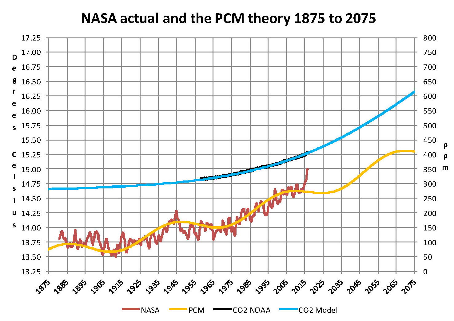
The nest step in this analysis is to put all of the known data and projections into one Chart which will contain: NASA’s table LOTI global temperature estimates, NOAA’s actual CO2 values, the CO2 model projections, the PCM model global temperature plot, Hansen’s Scenario B 1988 global temperature plot, and lastly the IPCC AR5 A2 global temperature plot. With that done we can look at the results and try to make some sense of what is going on with the various arms of the federal government that are promoting that carbon based fuels be eliminated since they are responsible for the global temperature level going up. As previously started when the government pours money into the sciences the sciences respond with technical papers the support the governments views, this is what is call political science verses real science as was done prior to the 1980’s; money talks and BS walks as everyone on the street knows. This Chart views a good overview of the current situation showing all the facts and all the projections.
This Chart contains no manipulation of the data and the only change that was made was to convert the NASA anomalies back to degrees Celsius to make it more readable to lay people. This is only a change in units and has no bearing on the look. A subject not broached here is that of the NASA homogenization process itself and the base period from 1950 to 1980. The portion in the black circle contains the NASA base period of 14.00 degrees Celsius and the reason it’s brought up here is that the Homogenization process causes the global temperatures to move around since the entire data base all the way back to 1880 is recalculated. But since the base has to stay at 14.00 degrees Celsius the program must be set to not allow changes in that period of time. I’m sure the programmers have fun with that. Prior work here has shown how this creates a teeter totter effect with the data plots, some of which have recently been significant.
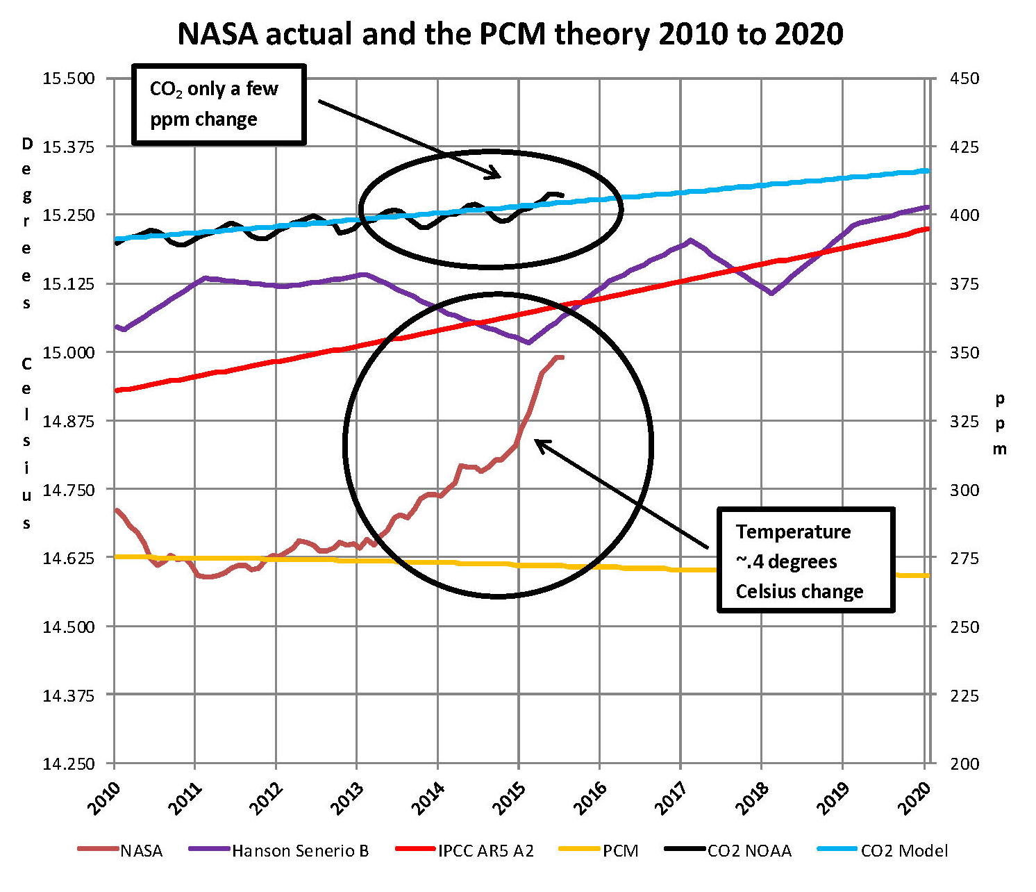
The next Chart will be a look at the period from 2010 to 2020 so we can see the detail of the past few years where a change in CO2 of only a few ppm has caused a major change in the global temperature way beyond anything previously shown in any published NASA data. There are two black ovals on the Chart one at the top of the Chart which is a black oval around the CO2 levels for 2014, 2015 and part of 2016 and it’s very obvious that there has been very little change, maybe 4 ppm or about 1%. Then at the bottom of the Chart is another black oval around the NASA global temperature levels for 2014, 2015 and part of 2016 and its very obvious that there has been a very large change, maybe .33 degrees Celsius or about 2.2%. There has never been such a large increase in temperature from such a small increase in CO2.
By contrast the previous comparable period of the last part of 2010 through 2013 shows about the same for CO2 at 1.1% but only a .2% increase for global temperature, basically flat. Worse it appears that this upward trend will continue as these values are based on a 12 month moving average and the current values being published by NASA have been very high for the past 6 months and so I would expect the NASA plot to be well over 15.00 degrees Celsius within a few months. In looking at the raw data for September 2015 and October 2015 there is a jump of about .25 degrees Celsius that is a very large number for one month and as we have shown here in a previous chart not reasonable at all and a perfect example of political science.
In summary, the IPCC models were designed before a true picture of the world’s climate was understood. During the 1980’s and 1990’s CO2 levels were going up and the world temperature was also going up so there appeared to be correlation and causation. The mistake that was made was looking at only a ~20 year period when the real variations in climate all move in much longer cycles. Those other cycles can be observed in the NASA data but they were ignored for some reason. By ignoring those trends and focusing only on CO2 the models will be unable to correctly plot global temperatures until they are fixed.
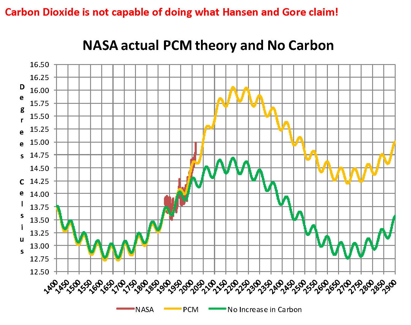
Lastly, the next chart shows what a plot of the PCM model, in yellow, would look like from the year 1400 to the year 2900. The plot matches reasonably well with history and fits the current NASA-GISS table LOTI data, in red, very closely, despite homogenization. I understand that this model is not based on physics but it is also not curve fitting. It’s based on observed reoccurring patterns in the climate. These patterns can be modeled and when they are, you get a plot that works better than any of the IPCC’s GCM’s. If the conditions that create these patterns do not change and CO2 continues to increase to 800 ppm or even 1000 ppm than this model will work into the foreseeable future. 150 years from now global temperatures will peak at around 15.75 to 16.00 degrees C and then will be on the downside of the long cycle for the next 500 years. The overall effect of CO2 reaching levels of 1000 ppm or even higher will be about 1.5 degrees C which is about the same as that of the long cycle. The Green plot on the Chart shows the observed pattern with no change in CO2 from the pre-industrial era of ~280 ppm.
The purpose of this post is to make people aware of the errors inherent in the IPCC models so that they can be corrected.
The Obama administration’s “need” for a binding UN climate treaty with mandated CO2 reductions in Europe and America was achieved as predicted at the COP12 conference in Paris in December 2015. To support this endeavor NASA was forced to show ever increasing global temperatures that will make less and less sense based on observations and satellite data which will all be dismissed or ignored. Within a few years the manipulation will be obvious even to those without knowledge in the subject, but by then it will be to late the damage to the reputation of science will have been done.
Sir Karl Raimund Popper (28 July 1902 – 17 September 1994) was an Austrian and British philosopher and a professor at the London School of Economics. He is considered one of the most influential philosophers for science of the 20th century, and he also wrote extensively on social and political philosophy. The following quotes of his apply to this subject.
If we are uncritical we shall always find what we want: we shall look for, and find, confirmations, and we shall look away from, and not see, whatever might be dangerous to our pet theories.
Whenever a theory appears to you as the only possible one, take this as a sign that you have neither understood the theory nor the problem which it was intended to solve.
… (S)cience is one of the very few human activities — perhaps the only one — in which errors are systematically criticized and fairly often, in time, corrected.
