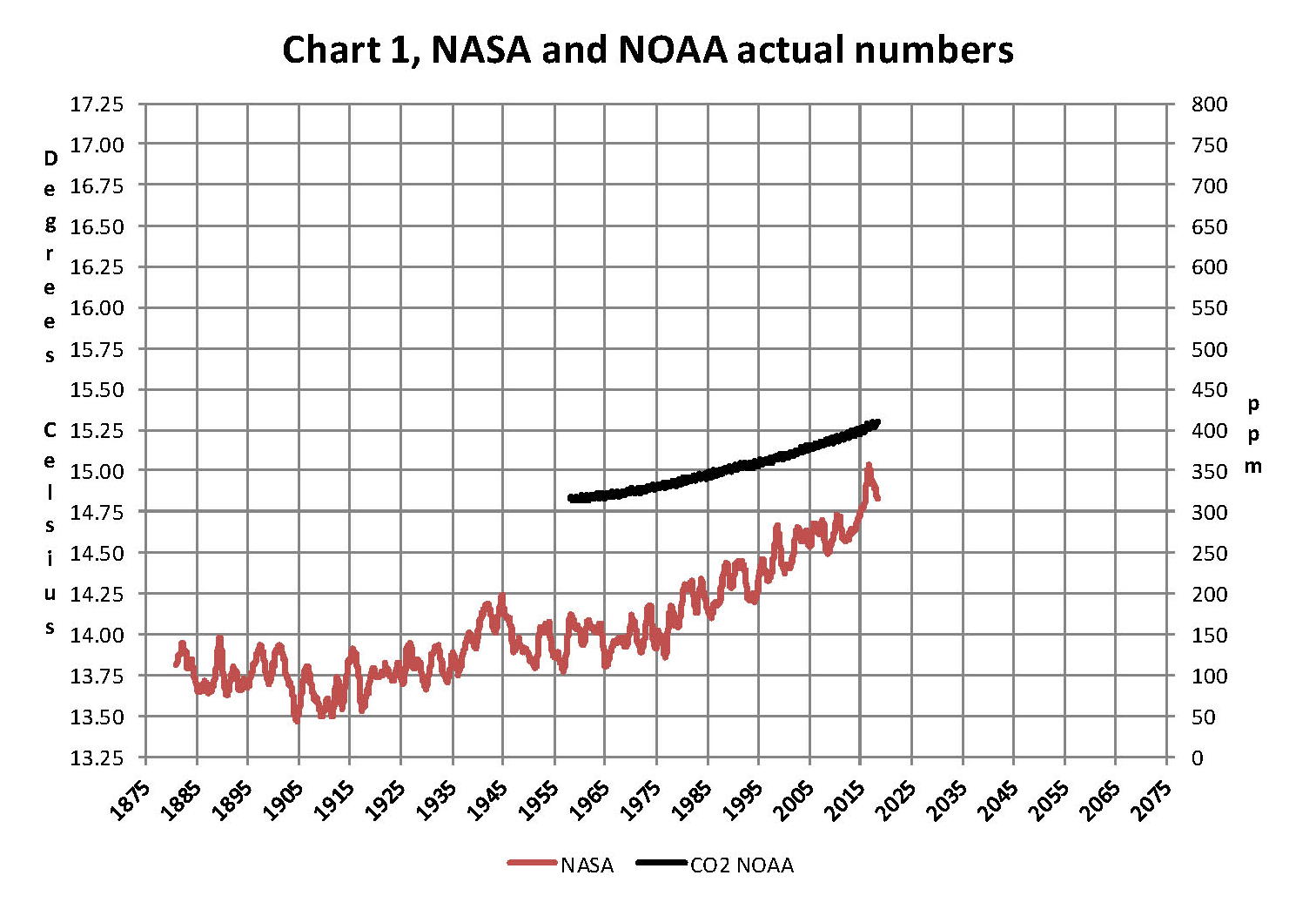
The analysis and plots shown here are based on the following two data series. First NASA-GISS estimates of a global temperature shown as an anomaly (converted to degrees Celsius) as shown in their table Land Ocean Temperature Index (LOTI) and shown in Chart 1 as the red plot labeled NASA the scale for the temperatures is on the left. The NASA LOTI temperatures are shown as a 12 month moving average because of the large monthly variation. Second NOAA-ESRL Carbon Dioxide (CO2) values in Parts Per Million (PPM) which are shown in Chart 1 as a black plot labeled NOAA the scale for CO2 is shown on the right.
NASA published data as stated in the first paragraph is shown as an anomaly, but what is a temperature anomaly? An anomaly is a deviation from some base value normally an average that is fixed. There were two problems with the system that NASA picked which were number one there is no “actual” global temperature and two since climate is a variable there cannot be a real base to measure from. NASA known for its science and engineering expertise back in the day thought it could get around these issues and created a system to do so. First they developed a computer model which took readings from all over the planet and made required adjustments to them which they called homogenization and came up with the estimated global temperature. Second they picked the period 1950 to 1980 (30 years) and averaged the values found in that period and came up with 14.00 degrees Celsius and make that their base. Then they took the calculated monthly temperature and subtracted the base from it which gave them the anomaly. The problem is that both are arbitrary.
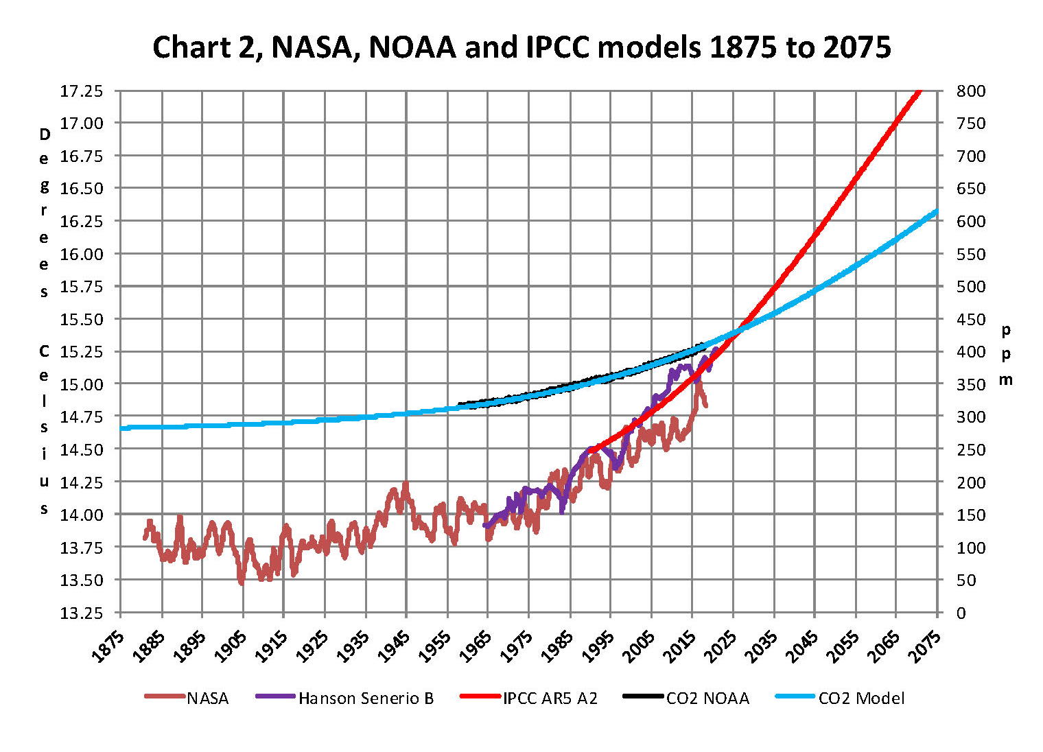
Now that we have a base to work with we are going to add to Chart 1 three things. The first is a trend line of the growth in CO2 since that is according to the government through NASA and NOAA the entire basis for climate change. That plot is superimposed over the black plot of the actual NOAA CO2 values as the cyan line labeled as the CO2 Model and one can see there is a very good fit to the actual NOAA values so there should be no dispute about its validity, and it’s historically accurate. This plot allows us to make projections to future global temperatures according to the projected level of CO2 . The second added item is James E. Hansen’s 1988 Scenario B data, which is the very core of the IPCC Global Climate models (GCM’s) and which was based on a CO2 sensitivity value of 3.0O Celsius per doubling of CO2. This plot is shown here in lavender and is part of a presentation that Hansen showed to congress in 1988 when the UN was about to set up the International Panel on Climate Change (IPCC) and this plot is labeled as Hansen Scenario B which Hansen stated was the most likely to happen based on his 1979 climate theories’. The third item is the current plot of the most likely temperature of the planet based on the growth of CO2 published by the IPCC. This plot is shown in Red and is labeled as IPCC AR5 A2 as that is the table where the data was found. This plot is a GCM computer projection of the planets temperature based on the complex relationships developed on the levels of CO2 by the IPCC primarily though NASS and NOAA.
It can be seen in Chart 2 that the lavender plot and the Hansen plot are very close from 1965 to around 2000 after that, from 2000 to 2014, there is a very large and deviation reaching close to .5 degrees Celsius in 2015, which is not an insubstantial number. Also of note is that there doesn’t seem to be a good correlation between the growth in CO2 and the increase in the planets temperature. The CO2 is going up in a log function and the Temperature was going down until 2015 and then there was a mysterious spike up. That unexplained change in temperature direction appeared to have occurred between 2013 and 2014 and is the subject of this monthly paper.
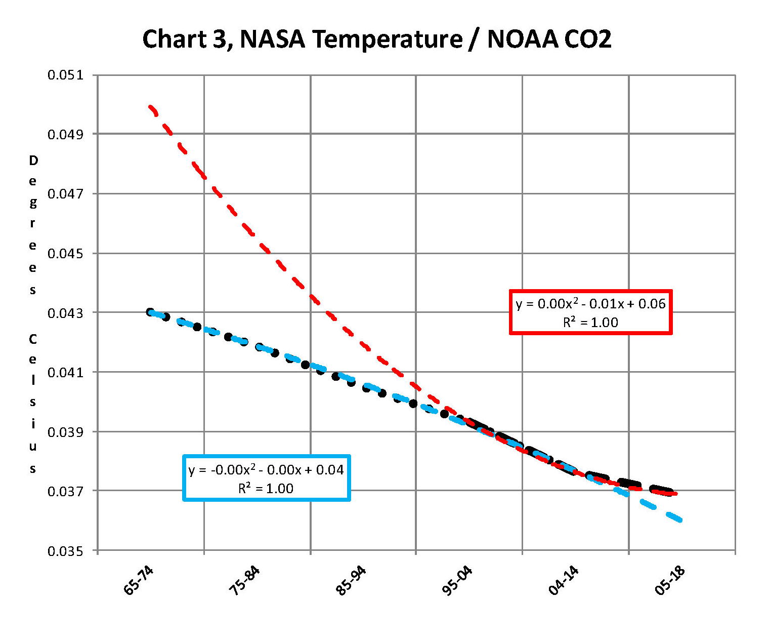
Next we have Chart 3 which is developed from the raw data from NASS and NOAA as shown in Chart 1. This plot was made first by adding ten years blocks of temperature and CO2 as indicated in the Chart 1 and diving by 120 to give an average for each. Then the average Temperature was divided by the average CO2 to give degrees of temperature increase per PPM of CO2. After that was plotted it appeared that there were two different curves. The first was from block 1965-1974 through block 2004-2014 shown as Black Dots and the second was from block 1995-2004 through block 2005-2017 shown as Black Dashes. When trend lines were added they were both almost perfect fits to the raw data and so you cannot see the data points very well on Chart 2. These blocks were picked to represent the entire period of time where we had both NASA temperature data and NOAA CO2 levels.
On Chart 3 there are two sets of color coded information. The first is Cyan plot and the Cyan box with the equation in it along with the R2 value of 1.0 are for the first series from block 1965-1974 through block 2004-2014. The other is the Red plot and the Red box with the equation in it along with the R2 value of 1.0 which are for the first series from block 1965-1974 through block 2004-2017. We can speculate on how this change happened but it can’t be said that the plot change is not real; however additional data will be required to actually prove that something has changed.
In summary the Cyan data set indicates a diminishing effect of CO2 on global temperature for about 54 years and the Red data set represents an increasing effect of CO2 on global temperature for the past 3 years. Since both data sets have an R2 value of 1.00 the trend lines cannot be in question.
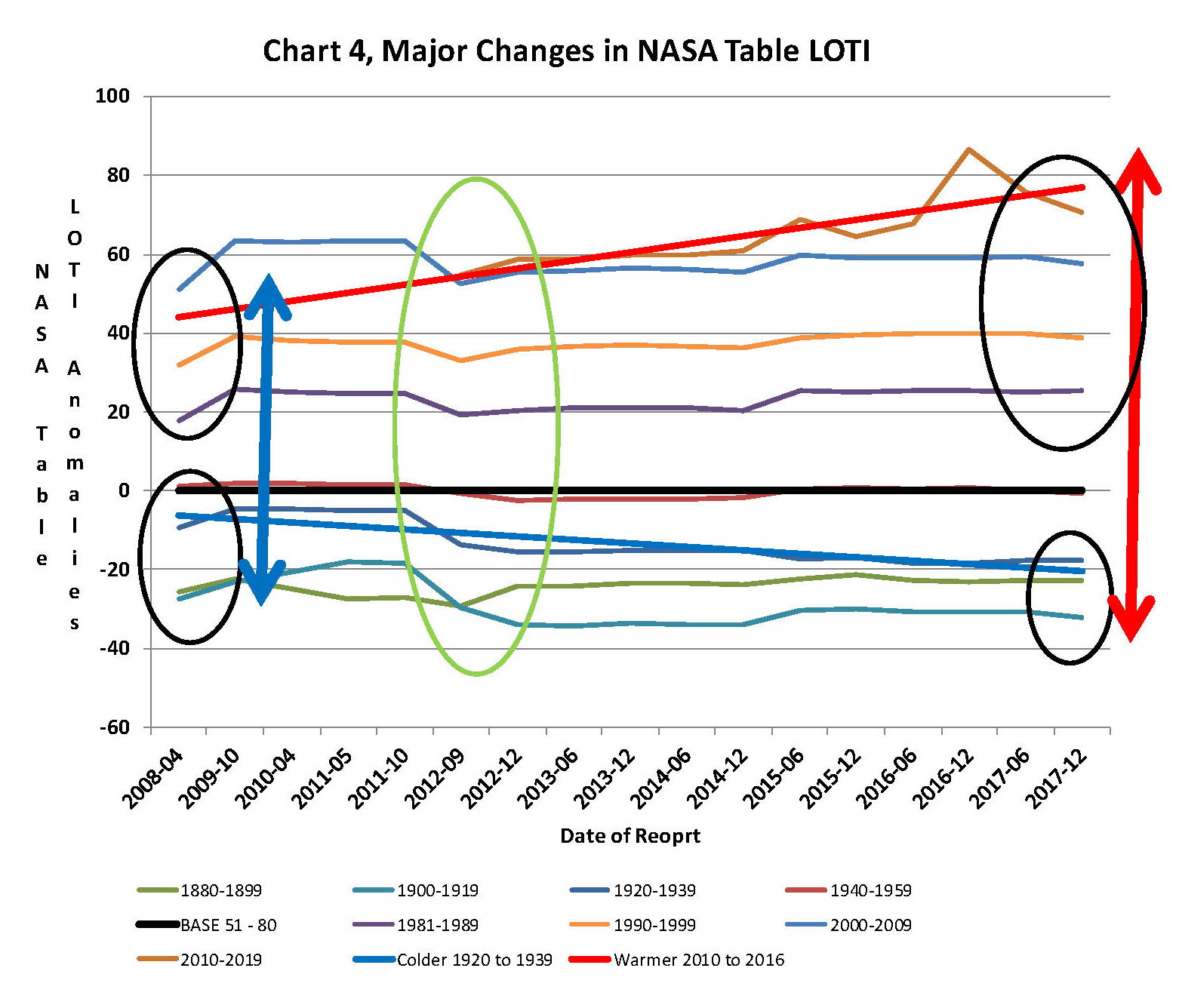
Continuing the analysis of what happened to the NASA data in table LOTI from Chart 3, the following Chart 4 was constructed from the same NASA data. It’s very sad to say but it seems to prove without much doubt that the global temperatures have been manipulated by NASA probably at the request of the federal government such that a case could be made for supporting the COP21 Paris climate conference in December 2015 by showing that the earth was much hotter than it actually was. The dates on the x axis are the date of the NASA LOTI download file. The plots for specific date groupings are set such that one can see what that date range did in each separate NASA download. The proof is shown in Chart 4 below and a discussion will follow below Chart 4 on how Chart 4 was constructed.
At the bottom of Chart 4 is a blue trend line of NASA LOTI temperatures prior to 1950 and starting in2012 the values started going down, getting colder. At the same time the NASA LOTI temperatures from 2012 to the present went up as shown in the red line. There was no change in the base period, black line. This cannot happen with random variables they will cancel each other out; this could only be caused by specific program changes in the process that NASA and NOAA use, in other words it is intentional. So there can be no other reason but an attempt to support the adoption of the Climate accord agreement by the administration, and they were successful as it was agreed to in Paris at COP21.
How this table was constructed is important so a discussion is needed. As stated in the opening paragraph of this paper NASA publishes a table of the estimated global temperature each month as anomalies from a base of 14 degrees Celsius. This table starts with January 1880 and runs to the current date. The new table typical comes out mid-month with the values for the previous month and for March 2018 there were 1,659 values. The process that is used to create this Table is very complex and is called homogenization. What that means is that the entire table is recreated each month and what that also means is that the temperature value for any given month is a variable.
When I realized the extent of that in 2012 I started to save the printouts of the NASA LOTI tables and I went back and found a few of them from when I started this project in 2007. When I started this project what I did is type in all the values from the NASA table into a spreadsheet each month which was a daunting task and I was very happy when NASA started to publish a csv file along with the text of the LOTI data. Then all I had to do is create a routine in excel that would turn the table format into a column format. There are now 65 months in the spreadsheet, when I started this method in 2012 there were maybe only a dozen. The values are residing in the spreadsheet as columns going from left to right so that the individual months are lined up side by side. This makes comparison of months very easy. One note is required here, when I started this model in 07 and for several years thereafter all I was doing is adding the current NASA LOTI current months number to the existing file, a single column, and it never occurred to me that the prior numbers were changing. The past was fixed, so I thought. This was also the way I was entering the NOAA CO2 data which doesn’t change over time.
The original goal was to see if the changes were just random or rounding errors. If that was so then they would wash out over time especially if I grouped the monthly data into blocks. I’ve used both 10 year (120 values) and 20 year (240 values) blocks which would be enough to maintain a fixed number if it was random or rounding. What I found was something quite different after I had a dozen or so columns in the spreadsheet, it appeared that NASA was making the past colder and the present warmer. And the purpose of the previous two Charts 3 and 4 is to show the result. Chart 4 is a bit complex but I have not found a better way to show what happened.
From 1880 to 1960 I used four 20 year blocks. Then I needed the base so there is a 30 year block from 1950 to 1980 and lastly four 10 year blocks from 1980 to the present. The last block is not yet complete as it will run to December 2019. Because the 30 year base block is fixed at 14.0 degrees Celsius there wasn’t much point in charting those individual yearly values even though there was some minor movement in those numbers. That raises an interesting issue for how can the base numbers not change and all the other numbers from 1880 to 2017 can change each month? A note, for each data set of years the plot on Chart 4 should be a straight line from left to right; very minor fluctuation would be OK. For example the plot for 1930 to 1949 (hidden behind the black plot) is what would be normally expected. This is the only plot that doesn’t show major manipulation.
In the four data sets in the 1880 to 1940 blocks in Chart 4 all have moved down probably about a .25 degree Celsius which is not insignificant. So the bottom line is that NASA made all the values from 1880 to 1940 colder by an average of a quarter of a degree Celsius. So that alone accounts for a high percentage of the supposed global warming that NASA shows. From 1980 to 2009 the data change appears to add another .1 degrees Celsius making the apparent differential between data from early 00’s to the present about .35 degrees greater than it was before 2009. That is not random that is a major change and clearly shows manipulation. I would probably never had caught this is if I hadn’t put the values in column format. Looking at all the data from 2008 to 2014 we find that around 2008 NASA showed that the planet had warmed about .75 degrees, Blue double arrow, from the 19th century. Then in 2014, four years later NASA showed that the planet had warmed about .95 degrees Red double arrow from the 19th century. However it gets a worse after that.
The change started in 2012, Green Oval, and Global temperature jumped almost a quarter of a degree by December 2015 just as the COP21 conference was in session. The temperatures kept going up with an eventual increase in global temperature of about 1.2 degrees Celsius in late 2016. At that point with the pressure off NASA appears to be erasing what they did as the global temperatures have now started back down. I’m not sure how many know of this blatant manipulation but it is serious. This is not science.
Now we need to consider other factors than CO2 on Climate change. The fault that occurred in the work that was done in the 1980’s was in assuming that there was an optimum or constant global temperature and therefore any change that was being observed was from the increasing amount of CO2 in the atmosphere. There may have been correlation but it was never proved that there was causation (high R2 value) between CO2 and global temperatures; Chart 3 clearly shows there is not. With that assumption, which limited options, we moved from true science into the realm of political science. True science has an open mind and finds relationships that work in matching observations with predictions. Political science changes history and/or facts to match the desires of the politicians. Since the politicians control the money political science is what we get; which means that what we get may not be technically correct.
A decade ago when I started looking at “climate” change the first thing I did was look at geological temperature changes since it is well known that the climate is not a constant; I learned that 53 years ago in my undergrad geology and climatology courses in 1964. The next paragraph explains currently observed patterns in climate related to this subject and is historical accurate.
Ignoring the last Ice Age which ended some 11,000 years ago when a good portion of the Northern hemisphere was under miles of ice the following observations give a starting point to any serious study on the subject of climate. First, there is a clear up and down movement in global temperatures with a 1,000 some year cycle going back at least 3,000 to 4,000 years; probably because of the apsidal precession of the earth’s orbit of about 20,000 years for a complete cycle. However about every 10,000 years the seasons are reversed making the winter colder and the summer warmer in the northern hemisphere. 10,000 years from now the seasons will be reversed again. Secondly, there are also 60 to 70 year cycles in the Pacific and the Atlantic oceans that are well documented. These are known as the Atlantic Multi Decadal Oscillations (AMO) in the Atlantic and as La Nina and El Nino in the Pacific. Thirdly, we also know that there are greenhouse gases such as carbon dioxide that can affect global temperatures. Lastly the National Academy of Sciences (NAS) estimated that carbon dioxide had a doubling rate of 3.0O Celsius plus or minus 1.5O Celsius in 1979 when there were only two studies available and one for sure and maybe both were not peer reviewed.
The result of looking objectively at the three possible sources of global temperature changes was a series of equations based on these observations that when added together produced a sinusoidal curve that seemed to follow NASA published temperatures very closely when first developed in 2007, and modified a few years later when it was found the short and long cycles were related to multiples of Pi. Since this curve was based on observed temperature patterns it was called a Pattern Climate Model (PCM) which has been described in previous papers and posts on my blog and since it is generated by “equations” many assume it is some form of least squares curve fitting, which it is not. It does seem to be related to ocean currents where the bulk of the planet’s surface heat is stored.
Chart 5 shows the PCM a composite of two cycles and CO2. There is a long trend, 1036.7 years with an up and down of 1.65O Celsius (.00396O C per year) we in the up portion of that trend. Then there is a 69.1 year cycle that moves the trend line up and then down a total of 0.29O Celsius and we are now in the downward portion of that trend (-.01491O C per year), which will continue until around ~2035. Lastly, there is CO2 currently adding about .0079O Celsius per year so together they all basically wash out at -.0039O C per year, which matches the current holding pattern we were experiencing until 2014. After about 2035 the short cycle will have bottomed and turn up and all three will be on the upswing again duplicating what was observed in the 1980’s. Note: the values shown here are only representative from what is in the model.
When using a 12 month running average for global temperatures up until 2014 the PCM model was within +/- .01 degrees of what NASA was publishing in their LOTI table since the early 1960’s as shown in Chart 5. Further the back projection of the PCM plot matched historical records and global temperatures going back past the time of Christ. It should also be considered that geologically CO2 levels have reached levels many times that of the current 400 ppm without destroying the planet so the current hysteria over the current very small numbers can only be explained by political science not real science.

The nest step in this analysis is to put all of the known data and projections into Chart 6 which contains: NASA’s temperatures plot, NOAA’s CO2 plot, the CO2 model plot, the PCM model plot, Hansen’s Scenario B plot, and lastly the IPCC AR5 A2 global temperature plot. With that done we can look at the results and try to make some sense of what is going on with the various arms of the federal government that are promoting that we tax carbon based fuels to eliminate them since they are responsible for the global temperature level going up. As previously stated when the government pours money into the sciences the sciences respond with technical papers the support the governments views, this is what I call political science verses real science as was done prior to the 1980’s; money talks and BS walks as everyone on the street knows.
Chart 6 shows a good overview and contains no data manipulation and the only change that was made was to convert the NASA anomalies back to degrees Celsius to make it more readable to lay people. This is only a change in units and has no bearing on the look. We also need to understand the NASA homogenization process and its relationship to the 30 year base period. The portion in the black circle contains the NASA base period of 14.00 degrees Celsius and the reason it’s brought up here is that the Homogenization process causes the global temperatures to move around since the entire data base all the way back to 1880 is recalculated each month. But since the base has to stay at 14.00 degrees Celsius the program must be set to not allow changes in that period of time. I’m sure the programmers have fun with that. Prior work here has shown how this creates a teeter totter effect with the data plots, some of which have recently been significant.

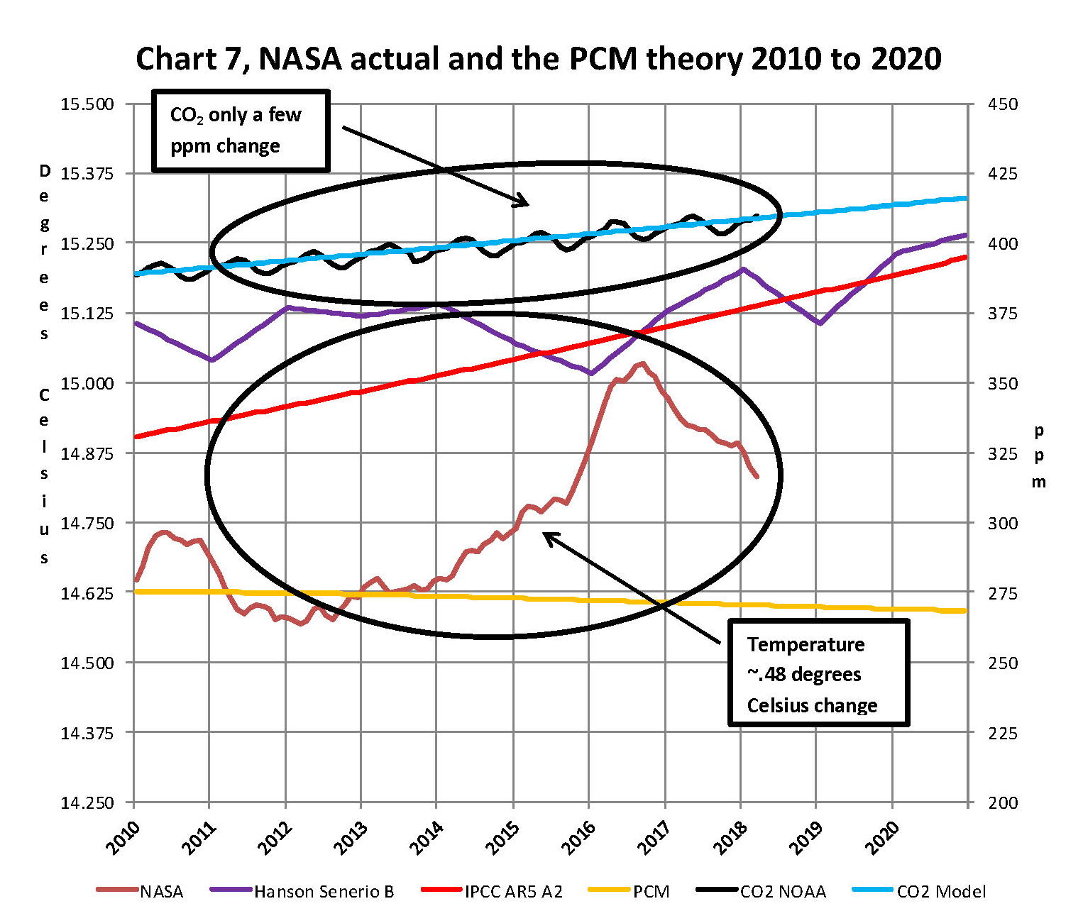
Next Chart 7 looks at the period from 2010 to 2020 so we can see where a change in CO2 of only a few ppm has caused a major change in the global temperature way beyond anything previously shown in any published NASA data. There are two black ovals on Chart 7 one at the top of Chart 7 which is a black oval around the CO2 levels from 2012 to 2016 and part of 2017 and it’s very obvious that there has been very little change, maybe 7 ppm or about 1.9%. Then at the bottom of Chart 7 is another black oval around the NASA global temperature levels for the same period and its very obvious that there has been a large change, almost .50 degrees Celsius or about 3.1%. There has never been such a large increase in temperature from such a small increase in CO2. By contrast the previous comparable period of the last part of 2010 through 2013 shows about the same increase for CO2 at 1.1% but no increase for global temperature but actually small decrease.
Clarification is needed here as the plot seems to show the jump in temperature in 2016 not 2015; this is a result of the large jump in temperature shown by NASA. Since we are using a 12 month moving average and the increase occurred in only a few months it actually shifted the curve into 2016. The raw data for December 2015 showed the temperature at 15.12 degrees Celsius compared to December 2014 where it was 14.78 degrees Celsius. The actual peak was in February 2016 at 15.35 degrees Celsius. With the global temperature over 15.0 Celsius at COP21 the climate accord was approved and the manipulation was a success. After COP21 the need for Fake Warming was no longer needed and so we are now seeing a downward trend developing.
In summary, the IPCC models were designed before a true picture of the world’s climate was understood. During the 1980’s and 1990’s CO2 levels were going up and the world temperature was also going up so there appeared to be correlation and causation. The mistake that was made was looking at only a ~20 year period when the real variations in climate all move in much longer cycles of decades and centuries. Those other cycles can be observed in the NASA data but they were ignored for some reason. By ignoring those actual geological trends and focusing only on CO2 the Global Climate Models will be unable to correctly plot global temperatures until they are fixed. Also the temperature data from 1850 to 1880 was dropped for some reason as it showed a lower temperature that supported the PCM cycle shown in this paper.
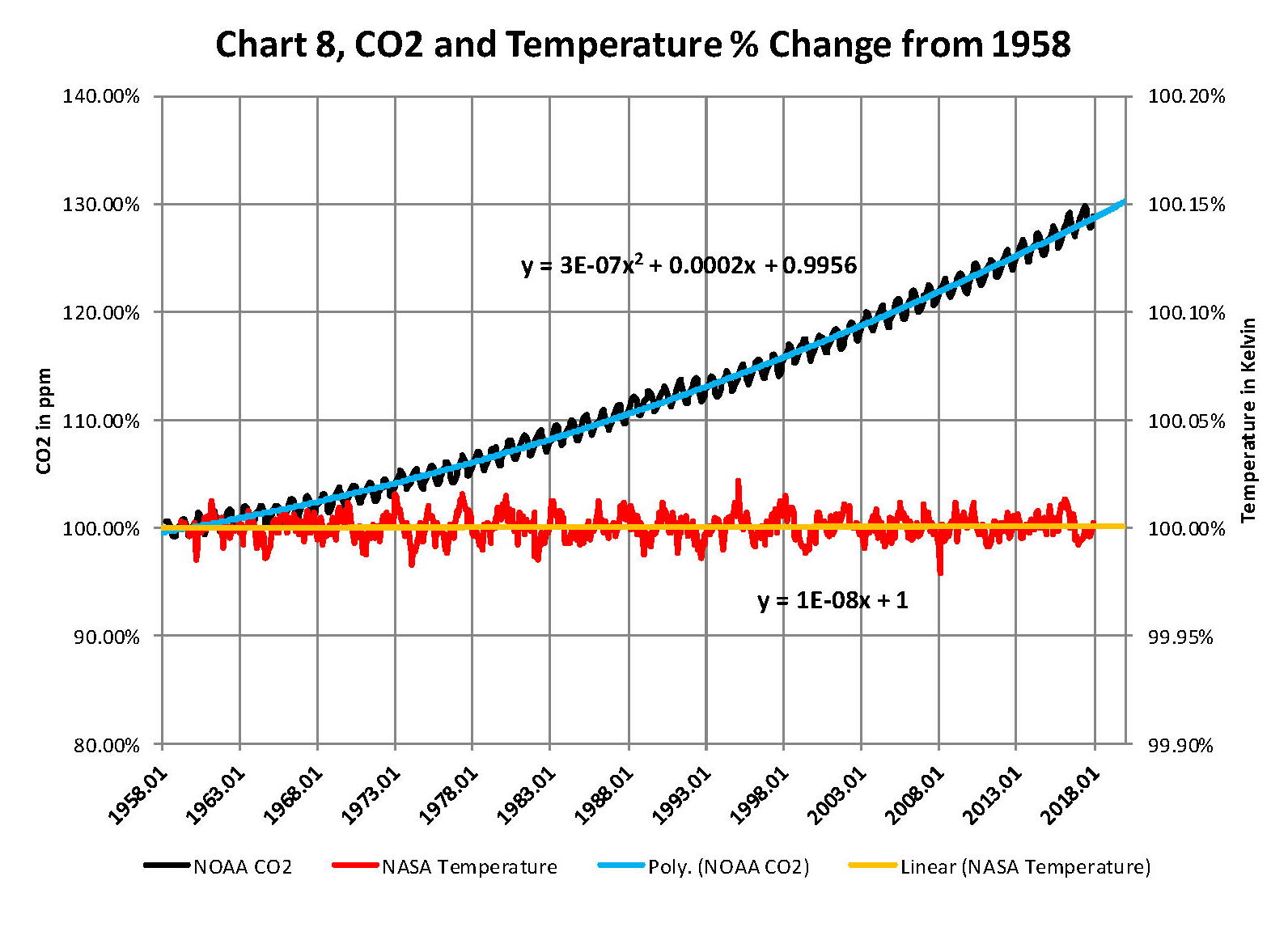
In summary we have Chart 8 which shows why CO2 is not increasing the temperature of the planet by any meaningful amount. The problem, intentional or not, goes back to physics and how we show information. It’s critical that when we talk to non scientists that information is properly displayed. And nowhere is this more important than when we are discussing temperature. When we talk about weather and local temperatures its going be in Celsius (C) in the EU or degrees Fahrenheit (F) in America e.g. for the base temperature that NASA uses it’s 14.00 C or 57.20 F; but these are both relative measures and do not tell us how much heat (thermal energy) is there. To know that we must use Kelvin (K) and that would be 287.150 K and all three of those numbers 14.00 C, 57.20 F, and 287.150 K are exactly the same temperature, just using a different base. But if the current temperature is 15.00 C that is a 7.1% increase in C, a 3.1% increase in F and a .35% increase in K; so which one is real? The answer is .35% because Kelvin is the only one that measures the total energy!
To show this graphically Chart 8 was constructed by plotting CO2 as a percentage increase from when it was first measured in 1958 the Black plot, the scale is on the left and it shows CO2 going up about 28.5% by February of 2018. That is a large change as anyone would agree. Now how about temperature, well when we look at the percentage change in temperature using the proper units Kelvin we find that the changes in global temperature are almost un-measurable. The red plot, also starting in 1958, shows that the thermal energy in the earth’s atmosphere has varied by less than +/- .17%; while CO2 has increased by 28.3% which is over 80 times that of increase in temperature. So is there really a problem here?
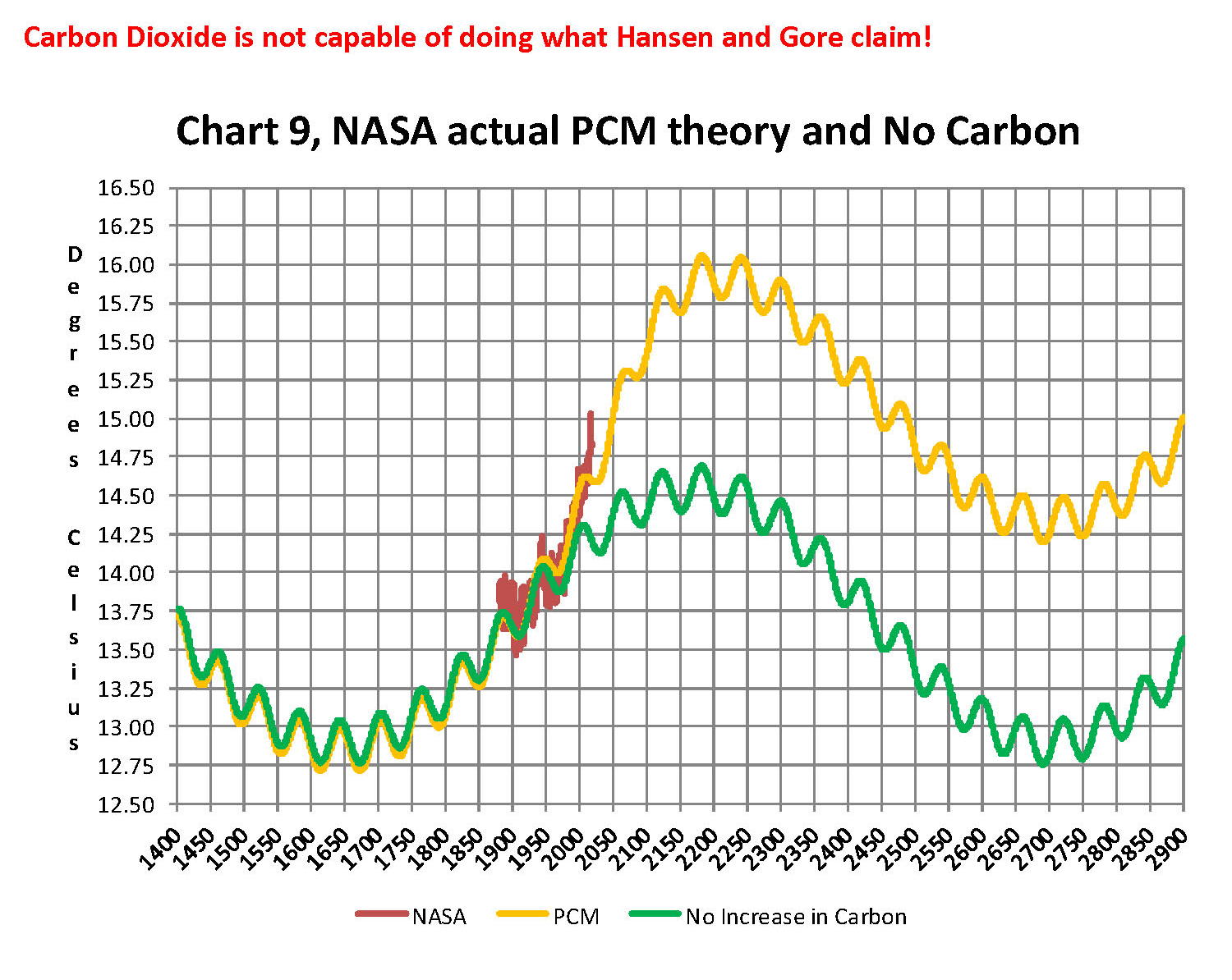
Lastly, Chart 9 shows what a plot of the PCM model, in yellow, would look like from the year 1400 to the year 2900. This plot matches reasonably well with recorded history and fits the current NASA-GISS table LOTI data, in red, very closely, despite homogenization. I do understand that this PCM model is not based on physics but it is also not some statistical curve fitting. It’s based on observed reoccurring patterns in the climate. These patterns can be modeled and when they are, you get a plot that works better than any of the IPCC’s GCM’s. If the real conditions that create these patterns do not change and CO2 continues to increase to 800 ppm or even 1000 ppm then this model will work well into the foreseeable future. 150 years from now global temperatures will peak at around 15.750 to 16.000 C and then will be on the downside of the long cycle for the next ~500 years.
The overall effect of CO2 reaching levels of 1000 ppm or even higher will be about 1.50 C which is about the same as that of the long cycle. The Green plot on Chart 9 shows the observed pattern with no change in CO2 from the pre-industrial era of ~280 ppm. CO2 cannot affect global temperatures more than 1.500 C +/- no matter what the ppm level of CO2 is. The reason being that the CO2 sensitivity value is not 3.00 per doubling of CO2 but less than 1.00 C per doubling of CO2 as shown in more current scientific work and it’s a logistics curve not a log curve.
The purpose of this post is to make people aware of the errors inherent in the IPCC models so that they can be corrected.
The Obama administration’s “need” for a binding UN climate treaty with mandated CO2 reductions in Europe and America was achieved as predicted at the COP12 conference in Paris in December 2015. To support this endeavor NASA was forced to show ever increasing global temperatures that will make less and less sense based on observations and satellite data which will all be dismissed or ignored. Within a few years the manipulation will be obvious even to those without knowledge in the subject, but by then it will be to late the damage to the reputation of science will have been done.
In closing keep this in mind. The current panic generated by the government using political science is that the current global temperature of around 15.0O Celsius is an increase of 7.14% from the 1960’s when the global temperature was 14.0O Celsius; and that does seem like a lot. However those views would be in error as the actual increase in thermal energy, as measured by temperature, would be only .35% because we must use Kelvin not Celsius when working with heat energy. When we use kelvin the temperature goes from 287.15O K to 288.15O K which is only .35% not 7.14% about 1/20 of what is implied by the IPCC. What the IPCC shows is not technically wrong as much as it is extremely misleading to anyone without a very strong science background.
Sir Karl Raimund Popper (28 July 1902 – 17 September 1994) was an Austrian and British philosopher and a professor at the London School of Economics. He is considered one of the most influential philosophers for science of the 20th century, and he also wrote extensively on social and political philosophy. The following quotes of his apply to this subject.
If we are uncritical we shall always find what we want: we shall look for, and find, confirmations, and we shall look away from, and not see, whatever might be dangerous to our pet theories.
Whenever a theory appears to you as the only possible one, take this as a sign that you have neither understood the theory nor the problem which it was intended to solve.
… (S)cience is one of the very few human activities — perhaps the only one — in which errors are systematically criticized and fairly often, in time, corrected.