A word to the wise. Any American traveling to Europe, you are better off hiring a limo driver or call Uber than drive yourself. In Europe, they have speed cameras everywhere. If you are 1 KM over the speed limit in Switzerland, the camera goes off and you have a fine. It’s not like America where even on an interstate highway with a 65 mph limit, traffic typically moves at 80 mph and police will start to look at you over 80. Local municipalities are different. Some of them are so broke they make up stuff.
In Europe, they fine you using cameras, which are also illegal in the USA. You have a right to confrontation and a camera cannot testify against you in court. Those state who adopted the red light cameras used them for revenue, but you would not get any points on your license because they too were unconstitutional.
The Europeans are simply totally insane. They fine you in proportion to what you can pay. In Britain, they are setting this at 175% of the weekly wage. So if you were a CEO earning $25 million a year, your fine will be $841,346.
In 2010, motorcycle was clocked at 164 mph. They let him keep his license if he paid $12k to Canadian authorities for speeding ticket. Then there is Finland which also adjusts speeding ticket fees based on the driver’s annual income. One driver caught doing a measly 15 over in a 50 mph zone and since he made about $7mil a year, his speeding ticket was almost $60K.
There was the Nokia phone director Anssi Vanjoki who was rising his Harley-Davidson in Helsinki, Finland and got tagged going 47 mph in a 31 mph zone. They fined him €116k. Straight out of the Communist Manifesto, in 2004, a 27-year-old heir to his family’s sausage business was hit with a with a $217k ticket for going 50 mph in a 25 mph.
Then there was the Swiss millionaire speeding at 85 mph in a 50 mph zone. The court said his net worth was $22.7m and since he had a previous speeding ticket, the court fined him $290,000. Yet even this is not the record for speeding tickets. The Swiss are simply really out worshiping Marx. A Swedish driver in a Mercedes-Benz SLR in Switzerland got caught going 186 mph. He was fined €650,000, which back in 2010, was $1 million.
Making fined based upon income is definitely the ultimate Marxist agenda. Worse yet, you are being caught by a camera and need not even be chased like in some Hollywood Movie like the Fast And Furious.
I’d love to believe that the collapse of this dead-end ideology is imminent, but when one looks at just the media situation in the entire Western world, and sets aside the political landscape, it is hard to fathom. With O’Reilly’s departure from FOX, and Murdoch’s sons taking over (who are both reportedly very progressive liberals), it seems that Socialism is on the grow. Care to comment and enlighten us some more? It would be vastly appreciated, thanks.
DA
ANSWER: The economics of the situation is what rules. That is why Communism failed. But keep in mind that this is the civil unrest. Socialism will not simply die and move into the light. It will rage, kick, scream, and try to take down everyone in the process. You can see it in these anti-Trump demonstrations. They claim to be for peace and against Trump because he is some sort of racist etc. etc etc. etc…..
Yet these are historically ALWAYS the most violent people. This is the subject of the next 2017 Cycle of War Report. The system is collapsing and all the taxes and fines the dream up in their minds cannot save the system. It will go bust. That is the end of Socialism the same as it was the end for Communism. Both are against human nature.
They say it is wrong to discriminate for race, religion, sex, or sexual orientation. But it’s OK to discriminate against anyone who disagrees with those in power or if they have material wealth above average. This type of discrimination is perfectly fine because it suits their agenda. What happens when the productive class refuses to produce? When Atlas Shrugged, it all comes crashing down.
Do you know that when Ayn Rand published that book, she received the worst reviews ever. The press was socialistic agreeing with FDR. Despite having the press trying to prevent people from reading it fearing the book would be against their socialistic philosophy, Atlas Shrugged has been ranked as #2 in the most influential books just behind the Bible ever written.
You really have to wonder how politicians ever come to these ideas that they have a right to discriminate and suppress anyone based solely upon what material things they possess. In France, the left is running to take 90% from the rich and hand it to everyone else. Why should they continue to invest, take risks, or even work for that matter. I would close up shop and just leave.
In February, the city of San Francisco came up with a new “free college” plan for city residents that included an added stipend for books and travel expenses. Of course, it was by no means “free” because they were raising taxes in the city to pay for it.
In Europe where education is free, kids keep going to school collecting degrees because (1) its free, (2) they cannot find a job, and (3) who wants to work and pay taxes? The education is really indoctrination and nobody ever learned how to actually do something from a school. Even doctors have to do an internship actually doing the job to get into the door.
Well now the state of New York has joined the socialist agenda of Marx and on April 9th, the N.Y. legislature passed “The Excelsior Scholarship” bill to grant free public college to state residents. On April 13th, N.Y. Governor Andrew Cuomo signed it into law.
The N.Y. college tuition of any state resident whose family earns up to $100,000 a year prior to the fall semester this year, $110,000 in the fall of 2018, and $125,000 in 2019 will be eligible. They have adopted the communist system where once you earned your free degree, you had to work for the state. Here, New York required that the student must stay in New York for four years after they graduate. If you cannot find a job in New York and there is one in California, sorry – you can’t take it.
Office of Management and Budget Director Mick Mulvaney appears on Bloomberg News to discuss the seismic, epic, thundershock confrontational clash that is about to take place between the Trump administration and the DC UniParty.
There are no adjectives capable of describing the scope and immeasurable scale of the battle that is about to transpire between the White House and the Democrat/Republican UniParty.
MONEY is where every entity within the full-swamp goes nuclear against President Trump and the administration. Despite all prior discussions toward this end, it is doubtful that more than one-in-a-million people can fully grasp the dynamic at play.
Because the procedural wonk is so inherently riddled with ten thousand tentacles of political schematics, I will defray the wonk-speak until after the video.
.
If you are interested in deep political weeds, keep reading. However, if you have blood pressure issues or are concerned about your physical or mental health, STOP HERE and go enjoy life. Believe me.
From a political perspective the outline of the assembled enemy forces are evident. Next week former President Obama is scheduled to reappear in Chicago. This is not coincidental. There are trillions of dollars at stake.
Every vested financial interest has been, and is now, prepared to do battle against President Trump. All of the body blows from the media, including their professional gaslighting efforts, was merely to soften Trump up for the pending attacks.
All of the previous accusations, ridicule, marginalization, probes and diminishment efforts by the media and their multinational corporate entities will pale in comparison to what lies ahead.
If you listen to Mulvaney carefully, and accept that the UniParty apparatus is real and purposeful, then you can see the scope of the financial strategy coming from DC. Remember, the BIG CLUB has paid for legislative policy. They will not allow those payments to be non-reciprocated, all of the DC politicians are now commissioned to fight without limits or rules on their behalf.
BIG CLUB: ♦Retention of ObamaCare. ♦Deep Federal Spending. ♦NO border wall. ♦Open-ended immigration until congress delivers comprehensive immigration reform to include amnesty. ♦Tax Cuts (corporate revenue enhancements).
♦House Speaker Paul Ryan will use the budgetary rules process, as a backdoor, to leverage the U.S. CoC Lobbyists construct of the Border Adjustment Tax (BAT).
♦No-one paid by the Big Club in Washington DC will willingly support the Border Wall.
Think about what Director Mulvaney is saying in the video above. Mulvaney is highlighting the point that tax/budget will either use the reconciliation process, or not – depending on the opposition and depending on the support.
Any budget can pass the house with a simple majority, the Republicans have full control.
However, when the budget reaches the Senate if they are going to use “reconciliation” (simple majority/republicans only) the budget must be revenue neutral beyond 10 years – if the tax plan/budget is going to be permanent.
If the Tax-Plan/Budget delivered to the Senate is not deemed revenue neutral (scored by CBO) beyond 10 years, it cannot be permanent and use the reconciliation process (simple majority). Such a plan must contain a sunset provision or an expiration date.
A permanent tax plan/budget that is: not deficit neutral, and beyond the 10 year scope, will require support from more than just 52 republican senators to pass; because it will mean long-term deficit spending.
Here’s where the FUBAR of the UniParty comes into play. This is not a Democrat -vs- White House issue.
President Trump cannot present a balanced budget with drastic cuts to government, because UniParty republicans will not support it. They, along with Democrats, will demand more spending.
Most of those same UniParty republicans are already opposed to the border wall. They view funding for the border wall as a negotiation tool to keep the federal government spending on other facets. President Trump cannot fund the wall, and simultaneously fund their big government spending indulgences without deficit spending.
Enter Paul Ryan.
Ryan will propose this Border Adjustment Tax, a program Trump hates, as the revenue tool to provide the funding for the tax/budget that contains the border wall funding.
See how that works?
[U.S. CoC and Ryan ] – The U.S. CoC get their B.A.T, which is essentially a tax against consumers allowing big corporations to fatten their bottom line, by forcing Trump to give up his border wall or go along with their proposal.
Wait, you ask: …what about renegotiated trade deals with (Mexico) via NAFTA that will, essentially, provide the revenue that more than pays for the wall?
Great question. Yes, the renegotiated NAFTA deals would easily provide the treasury revenue that will offset any wall expenditures.
However, now you understand why congress is refusing to accept the NAFTA “letter of intent” from Commerce Secretary Ross. The republican UniParty congress is blocking, well, actually they are ‘strategically delaying‘, Wilbur Ross from renegotiating the trade deal with Mexico – and by doing so they are blocking the revenue that would undermine their tax/budget scheme and argument in favor of the B.A.T.
Remember, accepting the letter of intent triggers the start of a 90-day waiting period before Ross can open NAFTA. Congress is waiting to accept, until the end of the 90-day period falls AFTER October 1st 2017, the beginning of Fiscal Year 2018.
This UniParty approach robs the White House from using the anticipated Mexican money as a point of reference (political talking point) for the current tax and budget proposals which begin October 1st for fiscal year 2018. (The B.A.T also impacts the possibility of a greater economic trade deal with Mexico from the tax side.)
See how that works?
[Hence, the blood pressure warnings]
This is not a Democrat party working against the White House. This is a republican UniParty working against the White House.
Speaker Ryan is positioning funding for the border wall contingent upon Trump accepting the blanket B.A.T as revenue to pay for it. This is the position of the Lobbyists within the U.S. CoC. If Ryan wins we are all screwed because essentially the tax revenue will be on our backs for every product imported and exported. But the big corporations love the enhancements to their bottom lines.
OMB Director Mick Mulvaney is trying to position and protect President Trump from having to accept the B.A.T. because the BAT is antithetical to the economic trade policy, targeted tariff approach, President Trump wants to take.
Simultaneously, Mulvaney is trying to get President Trump the initial start up money for the Border Wall so he doesn’t have to accept Ryan’s BAT.
Ergo Mick Mulvaney is trying to draw in Democrat votes to offset the scheme of Ryan which is relying only upon Republican votes. If Mulvaney can get Democrats to vote for funding the border wall by giving them funding to continue ObamaCare, Mulvaney won’t need Ryan’s BAT revenue because he’ll have votes to support a deficit bill.
However, Democrats don’t want the border wall either; but they also don’t want ObamaCare to collapse earlier due to funding shortages within the insurance reimbursement program (cost share programs).
FUBAR.
When challenged about the UniParty, it always helps to remind and re-emphasize to people that Republicans in congress (House and Senate – ’10 through ’16) fully funded all of Obama’s policies and programs.
During a press conference yesterday with Italian President Gentiloni, President Trump was asked about the future U.S. role Libya.
QUESTION: President Trump, do you see a role for your administration in helping stabilizing Libya? And do you agree that stabilizing Libya means combating terrorism and ISIS?
PRESIDENT TRUMP: “I do not see a role in Libya. I think the United States has right now enough roles. We’re in a role everywhere. So I do not see that. I do see a role in getting rid of ISIS. We’re being very effective in that regard. We are doing a job, with respect to ISIS, that has not been done anywhere near the numbers that we’re producing right now. It’s a very effective force we have. We have no choice. It’s a horrible thing to say, but we have no choice. And we are effectively ridding the world of ISIS. I see that as a primary role, and that’s what we’re going to do, whether it’s in Iraq or in Libya or anywhere else. And that role will come to an end at a certain point, and we’ll be able to go back home and rebuild our country, which is what I want to do.”
President Trump is taking the smart and strategic approach toward Libya having previously discussed the North African country extensively with President al-Sisi of neighboring Egypt.
The smart play is for the U.S. to maintain diplomatic relationships with Libya, while supporting Egypt and al-Sisi’s position of influence. Libya’s factional and tribal government is still missing the core elements needed for success – a stable central figure with broad moderate following.
History has shown that injecting U.S. opinion toward a centralized government that exists without leadership only brings a worse outcome.
Like Syria, Libya is a tribal nation with diverse ideological and regional perspectives. If there isn’t an existing structure of regional representation when the dictator is removed chaos is the outcome. However, once regional representative leaders are established, the bottom up approach can work better to find a unifying central figure.
President Donald Trump and Egyptian President Abdel Fattah al-Sisi began a diplomatic friendship in September ’16 before the U.S. election. Two weeks ago President al-Sisi visited the White House and both leaders warmly praised the relationship established.
[…] “I fully trust the capabilities of President Trump … he can succeed in so many fields that others cannot. I trust him wholeheartedly.”…
As a gesture of the shift in relationship between the U.S. and Egypt, and at the request of President Trump, President al-Sisi’s administration released two imprisoned aide workers. They arrived back in the U.S. late last night.
Maintaining a diplomatic approach, President Trump speaks little about the event except to express appreciation for the release.
(Via WaPo) […] President Trump and his aides worked for several weeks with Egyptian President Abdel Fatah al-Sissi to secure the freedom of Aya Hijazi, 30, a U.S. citizen, as well as her husband, Mohamed Hassanein, who is Egyptian, and four other humanitarian workers. Trump dispatched a U.S. government aircraft to Cairo to bring Hijazi and her family to Washington.
[…] The Obama administration unsuccessfully pressed Sissi’s government for their release. It was not until Trump moved to reset U.S. relations with Egypt by embracing Sissi at the White House on April 3 — he publicly hailed the autocrat’s leadership as “fantastic” and offered the U.S. government’s “strong backing” — that Egypt’s posture changed. Last Sunday, a court in Cairo dropped all charges against Hijazi and the others. (read more)
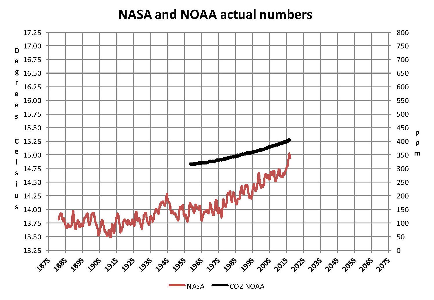
The analysis and plots shown here are based on the following two data series. First NASA-GISS estimates of a global temperature shown as an anomaly (converted to degrees Celsius) as shown in their table Land Ocean Temperature Index (LOTI) and shown in the following Chart as the red plot labeled NASA. This plot is shown as a twelve month moving average to minimize the large monthly swings and better show trends; the scale for the temperatures is on the left. Second NOAA-ESRL Carbon Dioxide (CO2) values in Parts Per Million (PPM) which are shown in the following Chart as a black plot labeled NOAA. This plot is shown exactly as the data from NOAA is presented and there is no need for a moving average the scale for CO2 is shown on the right.
NASA published data as stated in the first paragraph is shown as an anomaly, but what is a temperature anomaly? An anomaly is a deviation from some base value normally an average that is fixed. There were two problems with the system that NASA picked which were number one there is no “actual” global temperature and two since climate is a variable there cannot be a real base to measure from. NASA known for its science and engineering expertise back in the day thought it could get around these issues and created a system to do so. First they developed a computer model which took readings from all over the planet and made significant adjustments to them called homogenization and came up with the estimated global temperature. Second they picked the period 1950 to 1980 (30 years) and averaged the values and came up with 14.00 degrees Celsius and make that their base. Then they took the calculated temperature and subtracted the base from it which gave them the anomaly. The problem is that both the base and the anomaly are arbitrary.
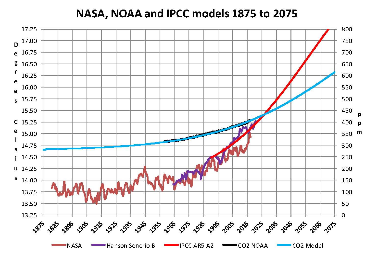
Now that we have a base to work with we are going to add to the previous Chart three things. The first is a trend line of the growth in CO2 since that is the entire basis for climate change according to the government through NASA and NOAA. That plot is superimposed over the black plot of the actual NOAA CO2 values as the cyan line labeled as the CO2 Model and one can see there is a very good fit to the actual NOAA values so there should be no dispute about its validity. This plot allows us to make projections as to future global temperatures according to the level of CO2. The second added item is James E. Hansen’s Scenario B data, which is the very core of the IPCC Global Climate models (GCM’s) and which was based on a CO2 sensitivity value of 3.0O Celsius per doubling of CO2. This plot is shown here in lavender and is part of a presentation that Hansen showed to congress in 1988 when the UN was about to set up the International Panel on Climate Change (IPCC) and this plot is labeled as Hansen Scenario B which Hansen stated was the most likely to happen based on his theories’. The third item is the current plot of the most likely temperature of the planet based on the growth of CO2 published by the IPCC. This plot is shown in Red and is labeled as IPCC AR5 A2 as that is the table where the data was found. This plot is a GCM computer projection of the planets temperature based to the complex relationships developed on the levels of CO2 by the IPCC through NASS and NOAA.
It can be seen in this Chart that the lavender plot and the Hansen plot are very close from 1965 to around 2000 after that, from 2000 to 2014, there is a very large and growing deviation reaching close to .5 degrees Celsius in 2014, which is not an insubstantial number. Also of note is that there doesn’t seem to be a good correlation between the growth in CO2 and the increase in the planets temperature. The CO2 is going up in a log function and the Temperature was going down in a log function until recently where it reversed and is now going up in a log function. That major change in direction that occurred between 2013 and 2014 is the subject of this paper.
The next Chart is developed from the raw data from NASS and NOAA as shown in the first Chart. This plot was made first by adding ten years blocks of temperature and CO2 as indicated in the Chart and diving by 120 to give an average for each. Then the average Temperature was divided by the average CO2 to give degrees of temperature increase per PPM of CO2. After that was plotted it appeared that there were two different curves the first was from block 1965-1974 through block 2004-2014 shown as Black Dots and the second was from block 1995-2004 through block 2005-2016 shown as Black Dashes. When trend lines were added they were both almost perfect fits to the raw data and so you cannot see the data points very well on the Chart. These blocks were picked to represent the entire period of time where we had both NASA temperature data and NOAA Co2 levels.
On the following Chart are two sets of color coded information. The first is Cyan plot and the Cyan box with the equation in it along with the R2 value 0f 1.0 are for the first series from block 1965-1974 through block 2004-2014. The other is the Red plot and the Red box with the equation in it along with the R2 value of 1.0 which are for the first series from block 1965-1974 through block 2004-2016. We can speculate on how this change has happened but it cannot be said that the plot change is not real; however additions data over the next few years will be required to actually prove that something has changed.
In summary the Cyan data set indicates a diminishing effect of CO2 on global temperature for about 54 years and the Red data set represents an increasing effect of CO2 on global temperature for the past 2 years. Since both data sets have an R2 value of 1.00 the trend lines cannot be in question.
Before we get into a possible explanation to the drastic change from the Cyan data to the Red data that occurred in 20014 we need to consider other factors than CO2 on Climate change. The fault that occurred in the work that was done in the 1980’s was in assuming that there was an optimum or constant global temperature and therefore any change that was being observed was from the increasing amount of CO2 in the atmosphere. There may have been correlation but it was never proved that there was causation (high R2 value) between CO2 and global temperatures. With that assumption, which limited options, we moved from true science into the realm of political science. True science has an open mind and finds relationships that work in matching observations with predictions. Political science changes history and/or facts to match the desires of the politicians. Since the politicians control the money political science is what we get; which means that what we get may not be technically correct.
A decade ago when I started looking at “climate” change the first thing I did was look at geological temperature changes since it is well known that the climate is not a constant; I learned that 52 years ago in my undergrad geology and climatology courses in 1964. The next paragraph explains currently observed patterns in climate related to this subject.
Ignoring the last Ice Age which ended some 11,000 years ago when a good portion of the Northern hemisphere was under miles of ice the following observations give a starting point to any serious study on the subject. First, there is a clear up and down movement in global temperatures with a 1,000 some year cycle going back at least 3,000 to 4,000 years; probably because of the apsidal precession of the earth’s orbit of about 20,000 years for a complete cycle. However about every 10,000 years the seasons are reversed making the winter colder and the summer warmer in the northern hemisphere. 10,000 years from now the seasons will be reversed. Secondly, there are also 60 to 70 year cycles in the Pacific and the Atlantic oceans that are well documented. These are known as the Atlantic MultiDecadal Oscillations (AMO) in the Atlantic and as La Nina and El Nino in the Pacific. Thirdly, we also know that there are greenhouse gases such as carbon dioxide that can affect global temperatures. Lastly the National Academy of Sciences (NAS) estimated that carbon dioxide had a doubling rate of 3.0O Celsius plus or minus 1.5O Celsius in 1979 when there were only two studies available and one for sure and maybe both were not per reviewed.
The result of looking objectively at the three possible sources of global temperature changes was a series of equations based on these observations that when added together produced a sinusoidal curve that seemed to follow NASA published temperatures very closely. Since this curve was based on observed temperature patterns it was called a Pattern Climate Model (PCM) which has been described in previous papers and posts on my blog and since it is generated by “equations” many assume it is some form of least squares curve fitting, which it is not. It does seem to be related to ocean currents.
As can be seen in the following Chart the PCM there is a 69.1 year cycle that moves the trend line up and then down a total of 0.29O Celsius and we are now in the downward portion of that trend (-.01491O C per year) which will continue until around ~2035. This short cycle is clearly observed in the raw NASA data in the LOTI table going back to 1880. Then there is a long trend, 1036.7 years with an up and down of 1.65O Celsius (.00396O C per year) also observed in the NASA data. Lastly, there is CO2 adding about .0079O Celsius per year so currently they all basically wash out at -.0039O C per year, which matches the current holding pattern we are experiencing. After about 2035 the short cycle will have bottomed and turn up and all three will be on the upswing again. Note: the values shown here are only representative as the actual model uses many more places than what are shown here.
When using the 12 month running average for global temperatures up until 2014 the PCM model was within +/- .01 degrees of what NASA was publishing in their LOTI table since the early 1960’s as shown in the next Chart. Further the back projection of the PCM plot matched historical records and global temperatures going back past the time of Christ. It should also be consider that geologically CO2 levels have reached levels many times that of the current 400 ppm without destroying the planet so the current hysteria over the current small numbers can only be explained by political science not real science.
The nest step in this analysis is to put all of the known data and projections into one Chart which will contain: NASA’s table LOTI global temperature estimates, NOAA’s actual CO2 values, the CO2 model projections, the PCM model global temperature plot, Hansen’s Scenario B 1988 global temperature plot, and lastly the IPCC AR5 A2 global temperature plot. With that done we can look at the results and try to make some sense of what is going on with the various arms of the federal government that are promoting that carbon based fuels be eliminated since they are responsible for the global temperature level going up. As previously started when the government pours money into the sciences the sciences respond with technical papers the support the governments views, this is what I call political science verses real science as was done prior to the 1980’s; money talks and BS walks as everyone on the street knows. This Chart views a good overview of the current situation showing all the facts and all the projections.
This Chart contains no manipulation of the data and the only change that was made was to convert the NASA anomalies back to degrees Celsius to make it more readable to lay people. This is only a change in units and has no bearing on the look. A subject not broached here is that of the NASA homogenization process itself and the base period from 1950 to 1980. The portion in the black circle contains the NASA base period of 14.00 degrees Celsius and the reason it’s brought up here is that the Homogenization process causes the global temperatures to move around since the entire data base all the way back to 1880 is recalculated each month. But since the base has to stay at 14.00 degrees Celsius the program must be set to not allow changes in that period of time. I’m sure the programmers have fun with that. Prior work here has shown how this creates a teeter totter effect with the data plots, some of which have recently been significant.
The next Chart will be a look at the period from 2010 to 2020 so we can see the detail of the past few years where a change in CO2 of only a few ppm has caused a major change in the global temperature way beyond anything previously shown in any published NASA data. There are two black ovals on the Chart one at the top of the Chart which is a black oval around the CO2 levels for 2012, 2013, 2014, 2015 and part of 2016 and it’s very obvious that there has been very little change, maybe 7 ppm or about 1.9%. Then at the bottom of the Chart is another black oval around the NASA global temperature levels for 2012, 2013, 2014, 2015 and part of 2016 and its very obvious that there has been a very large change, almost .45 degrees Celsius or about 3.1%. There has never been such a large increase in temperature from such a small increase in CO2.
By contrast the previous comparable period of the last part of 2010 through 2013 shows about the same increase for CO2 at 1.1% but no increase for global temperature but actually small decrease. Worse it appears that this current strange upward trend will continue as the values shown here are based on a 12 month moving average and the current values being published by NASA have been very high for the past 7 months and therefore I would expect the NASA plot to be well over 15.00 Celsius within a few months and certainly before the end of 2016. After COP21 the need for Fake Warming was no longer needed and so we are seeing a downward trend developing. With the new administration we may see the end of data manipulation from NOAA and NASA and a return to real science political science.
In summary, the IPCC models were designed before a true picture of the world’s climate was understood. During the 1980’s and 1990’s CO2 levels were going up and the world temperature was also going up so there appeared to be correlation and causation. The mistake that was made was looking at only a ~20 year period when the real variations in climate all move in much longer cycles of decades and centuries. Those other cycles can be observed in the NASA data but they were ignored for some reason. By ignoring those trends and focusing only on CO2 the models will be unable to correctly plot global temperatures until they are fixed.
Lastly, the next chart shows what a plot of the PCM model, in yellow, would look like from the year 1400 to the year 2900. This plot matches reasonably well with recorded history and fits the current NASA-GISS table LOTI data, in red, very closely, despite homogenization. I understand that this model is not based on physics but it is also not true curve fitting. It’s based on observed reoccurring patterns in the climate. These patterns can be modeled and when they are, you get a plot that works better than any of the IPCC’s GCM’s. If the conditions that create these patterns do not change and CO2 continues to increase to 800 ppm or even 1000 ppm than this model will work well into the foreseeable future. 150 years from now global temperatures will peak at around 15.750 to 16.000 C and then will be on the downside of the long cycle for the next ~500 years.
The overall effect of CO2 reaching levels of 1000 ppm or even higher will be about 1.50 C which is about the same as that of the long cycle. The Green plot on the Chart shows the observed pattern with no change in CO2 from the pre-industrial era of ~280 ppm. CO2 cannot affect global temperatures more than 1.500 C +/- no matter what the ppm level of CO2is. The reason being that the CO2 sensitivity value is not 3.00 per doubling of CO2 but under 1.00 C per doubling of CO2 as shown in more current scientific work.
The purpose of this post is to make people aware of the errors inherent in the IPCC models so that they can be corrected.
The Obama administration’s “need” for a binding UN climate treaty with mandated CO2 reductions in Europe and America was achieved as predicted at the COP12 conference in Paris in December 2015. To support this endeavor NASA was forced to show ever increasing global temperatures that will make less and less sense based on observations and satellite data which will all be dismissed or ignored. Within a few years the manipulation will be obvious even to those without knowledge in the subject, but by then it will be to late the damage to the reputation of science will have been done.
Sir Karl Raimund Popper (28 July 1902 – 17 September 1994) was an Austrian and British philosopher and a professor at the London School of Economics. He is considered one of the most influential philosophers for science of the 20th century, and he also wrote extensively on social and political philosophy. The following quotes of his apply to this subject.
If we are uncritical we shall always find what we want: we shall look for, and find, confirmations, and we shall look away from, and not see, whatever might be dangerous to our pet theories.
Whenever a theory appears to you as the only possible one, take this as a sign that you have neither understood the theory nor the problem which it was intended to solve.
… (S)cience is one of the very few human activities — perhaps the only one — in which errors are systematically criticized and fairly often, in time, corrected.
The media is downplaying, and in most cases ignoring, the extreme nature of the crisis currently going on in socialist Venezuela under the Maduro regime. Most of the cries for help are from people begging the international media to cover their plight.
Some of the video and photography are stunning as millions of people take to the streets to protest a collapsing economy and food shortages while being met with tanks, guns and rogue militias hired by the government.
Some of the targeted citizens appear chosen at random. Some of the citizens are also desperate and fighting back. Warning – These images are graphic and the video feeds are also alarming. However, the media are barely reporting on any of this, and unfortunately, it looks like things are getting worse:
Even absent guns (anti-gun laws) people are driving back the military.
As this lady and her family was filming the armed official shooting in the street, he turned and shot at her in her home.
So much tear gas has been deployed people are fleeing their homes amid the confrontations. The local district medical units appear overwhelmed, and also fearful of being targeted.
This woman was shot in her home by either militia or Venezuelan guards.
I have created this site to help people have fun in the kitchen. I write about enjoying life both in and out of my kitchen. Life is short! Make the most of it and enjoy!
This is a library of News Events not reported by the Main Stream Media documenting & connecting the dots on How the Obama Marxist Liberal agenda is destroying America