
Posted originally on the conservative tree house on December 15, 2022 | Sundance
Friends, in the late summer and fall of 2021 CTH warned of massive waves of price increases that would push inflation to record highs. We watched as each wave arrived almost on schedule throughout 2022, and as a direct result of Joe Biden energy and economic policy, prices necessarily skyrocketed.
In essence in 2021 we were warning about the expenditure side of the ledger that all working-class and fixed income families would experience. We advised to take every proactive measure possible to avoid future price increases.
Now, unfortunately, we begin moving those same warnings to the other side of the ledger; because as a natural consequence of consumer checkbook pain, the financial pressure always transfers to the income and employment side of the economic dynamic.
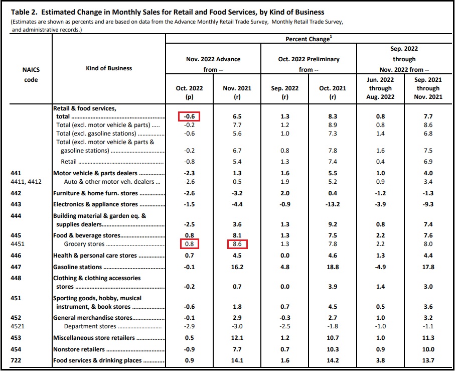
Keep in mind, retail sales are calculated in dollars spent by consumers. November 2022 retail sales as reported by the commerce department today [DATA pdf], reflect a 0.6% decrease in spending vs October. November data includes Thanksgiving, Black Friday and the traditional early holiday shopping. 0.6% less dollars were spent, despite prices being double digits higher than the prior year.
When the prices you are charging for goods and/or services are 10, 20, even as high as 60 percent more than prior year, yet your sales are running flat to negative – that means consumer purchases of those goods/services are substantially lower.
If you were selling 100 widgets for $1 each in 2021, you gross $100. If your widgets now sell for $1.25 and you gross $94 in 2022 sales, you have sold 75 widgets.
In 2021 you sold 100 widgets, in 2022 you sold 75 widgets, a difference of 25 widgets.
Everything attached to the raw material, creation, manufacturing, distribution and sale of those 25 missing widgets is no longer part of the economic activity associated with your widget business. You are now telling your suppliers you don’t need as many widgets, because they are not selling. You have lost 25% of your business in this scenario.
Everything associated with the drop in consumer spending now begins to downsize. Downsizing means less labor needed. This process triggers the economic impact shifting from the consumer sales side of the ledger to the income side of the ledger for employers, employees and workers.
If this consumer spending trend continues, and there is absolutely no reason to think it will reverse, we are entering a phase of serious financial instability for the American worker, at a scale that will dwarf the 2006/’07 and ’08 recession.
I am not a doomsayer pundit on economic matters. I am a proactive planner on economic forecasts. With consumer credit costing more, with fed interest rates climbing, with import orders cancelled, with shipping costs dropping, with consumer spending contracting, with fewer units moving, with inventories climbing, all of the data only points in one direction.
Serious consumer defaults are looming.

Government policy has been hammering the demand side of the economy, proclaiming -falsely- that excessive consumer demand was the cause of inflation. This game of economic pretending is about to get very serious.
Consumer spending, as measured in actual units created and purchased in the economy, has been contracting since the third quarter of 2021 (started June, July, August ’21). Simultaneously, consumer spending as measured in actual dollars spent to purchase food, fuel and energy, has been skyrocketing. This is a supply side inflationary cycle with no soft landing.
(Wall Street Journal) – U.S. retail spending and manufacturing weakened in November, signs of a slowing economy as the Federal Reserve continues its battle against high inflation.
November retail sales fell 0.6% from the prior month for the biggest decline this year, the Commerce Department said Thursday. Budget-conscious shoppers pulled back sharply on holiday-related purchases, home projects and autos. Manufacturing output declined 0.6%, the first drop since June, the Fed said in a separate report.
The Fed on Wednesday raised its benchmark interest rate 0.5 percentage point to a 15-year high and signaled plans to continue lifting rates through the spring. Fed officials have increased rates at the fastest pace since the 1980s to cool the economy and bring down inflation, which is running near a 40-year high.
“Most households are acting strategically, planning for a road ahead that may be more difficult to traverse, with higher interest rates, the housing slump, and ongoing inflation—and the very real possibility of a recession,” said Craig Johnson, president of the retail consulting firm Customer Growth Partners. (read more)
Businesses are going to start cutting expenses in order to survive.
The number one expense for almost all businesses is the labor cost.
Non-essential and high wage labor is going to get removed first.
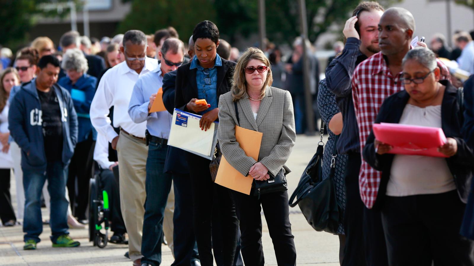


 Figure 1: Incremental warming effect of CO2 alone [1]
 Figure 2: Typical grid used in climate models [2]
 Figure 3: Global weather stations circa 1885 [3]
 Figure 4: How grid cells interact with adjacent cells [4]
 Figure 5: IPCC models in forecast mode for the Mid-Troposphere vs Balloon and Satellite observations [5]
 Figure 6: Comparison of the IPCC model predictions with those from a harmonic analytical model [6]